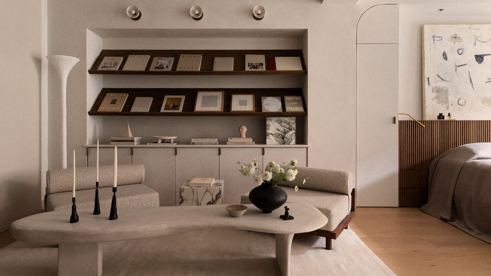
We're all familiar with the associations with minimalism. Cold, stark, and clinical are three words thrown about when the style is mentioned, but it's been given an unfair reputation, as there is much more to the style than what first meets the eye.
So, what is minimalism? Well, it's a style that falls somewhere between midcentury modern and Scandinavian. At its core, minimalism strives for the utmost curation through careful balance and precision. It's all about the less is more approach when channeling minimalist decorating principles, bringing in pieces intentionally rather than half-heartedly or absent-mindedly.
Here to prove that minimalist interiors can still feel warm and welcoming, we spoke to interior designers who have embraced this classic interior design style for years. They provided us with an array of useful ideas and inspiration, so we've created a list of the best 10 minimalist decorating ideas for those looking to bring sophistication and serenity into the home.
1. Layer up textures
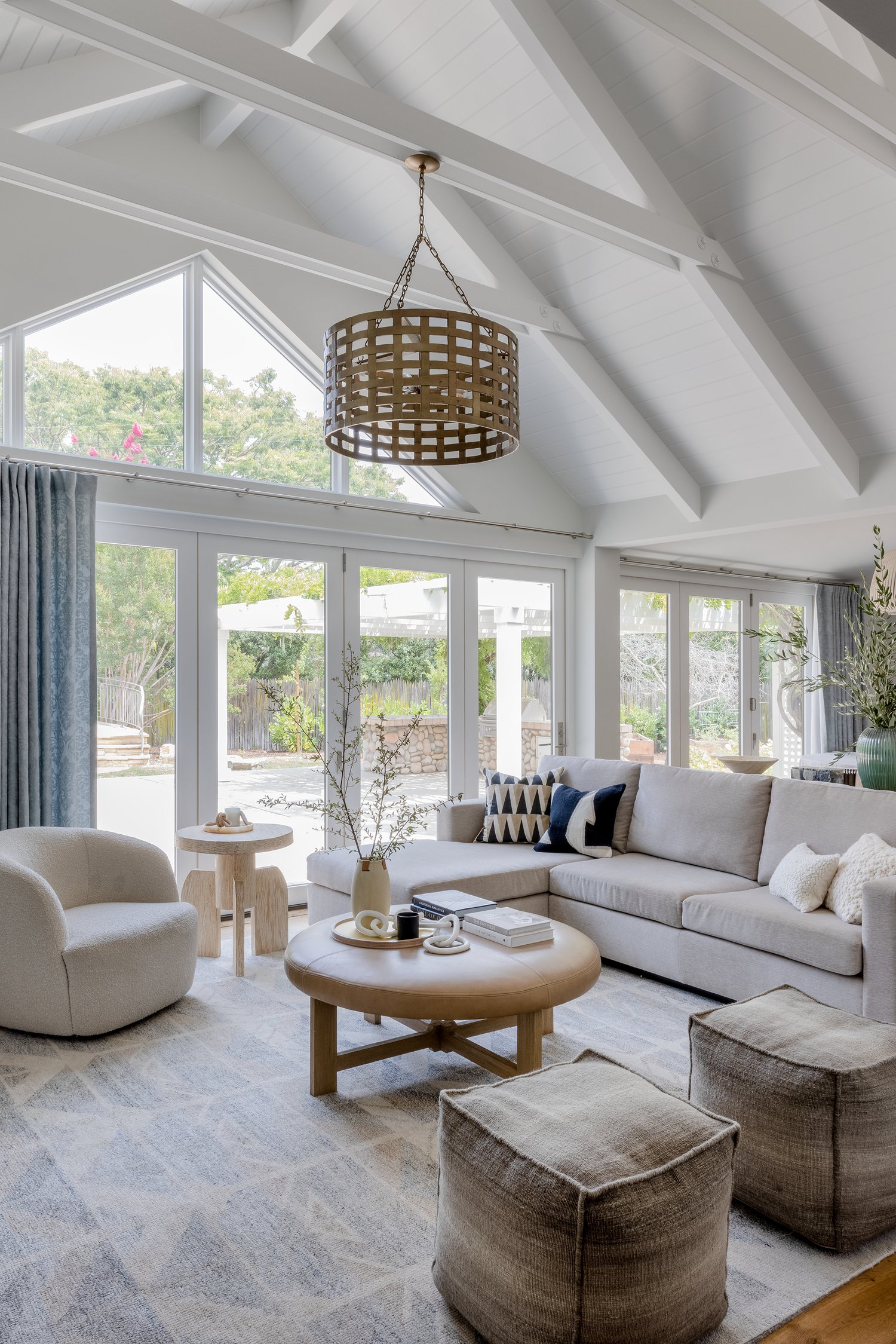
Using texture in interior design is key if you want to create a minimalist space that still feels welcoming and lived in. Colors and shapes tend to be kept fairly stripped back so it's textures and finishes that will add interest and depth to minimalist rooms. Layering up textures will also ensure that your rooms still feel very warm and welcoming, as well as decidedly minimalist.
This minimalist living room was designed by Kendra Nash, she explains: 'The goal was to keep the space neutral, yet interesting with slight patterns, textures, and architecturally interesting furniture pieces.'
'Careful consideration is essential when selecting decor for minimalists, as it's easy for it to appear cluttered or unbalanced. When contemplating decor choices, opt for the most cherished items and present them in the best light,' adds Kashi Shikunova Director of YAM Interiors. 'Layering texture into the minimalist design is a personal preference of mine, as a skillfully executed minimalist aesthetic is warm and balanced.'
'The addition of varied textures, soft hues, and natural materials such as stone or wood can contribute to a gentle and inviting atmosphere. Incorporating handcrafted items that show subtle imperfections adds a genuine and unique charm to the space. I love blending softer contours alongside crisp, unadorned lines, creating a dynamic and harmonious arrangement.'
2. Keep the color palette soft and warm
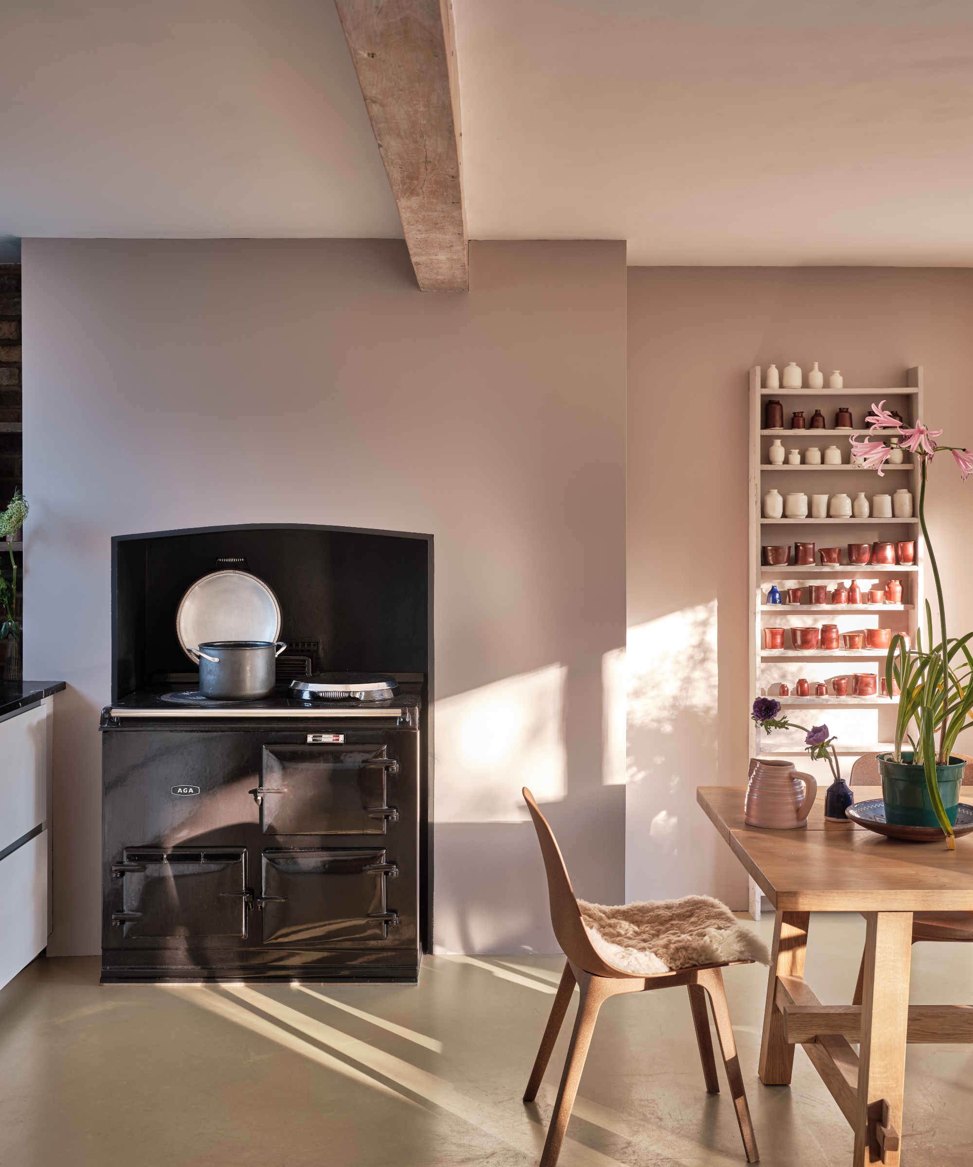
White room ideas are the color often associated with minimalist style. Clean, crisp and the perfect backdrop for some statement silhouettes, it certainly fits the aesthetic. But the trouble with white is that it can come across as quite stark and clinical in its purest forms. So, for a more comforting, but still neutral, minimalist palette, look to the warmer side of neutrals – warm whites, soft greys, and creamy beige tones.
'Whilst whites seem the natural destination for a minimalist space, look to whites that are more nuanced rather than true,' suggests Patrick O'Donnell of Farrow & Ball. 'Consider something with a specific undertone that will carry with the sparse elements of the interior, this could be anything that has a specific undertone, be it green, blue, or even the softest pink note.'
'Err on the side of more earthy whites or neutrals – something with a little brown-ish warmth. These will bring a balance, so whilst the interior may be blessed with a lack of clutter, a gentle neutral will add a dash of character whilst letting your aesthetic bent breathe!'
3. Incorporate meaningful trinkets
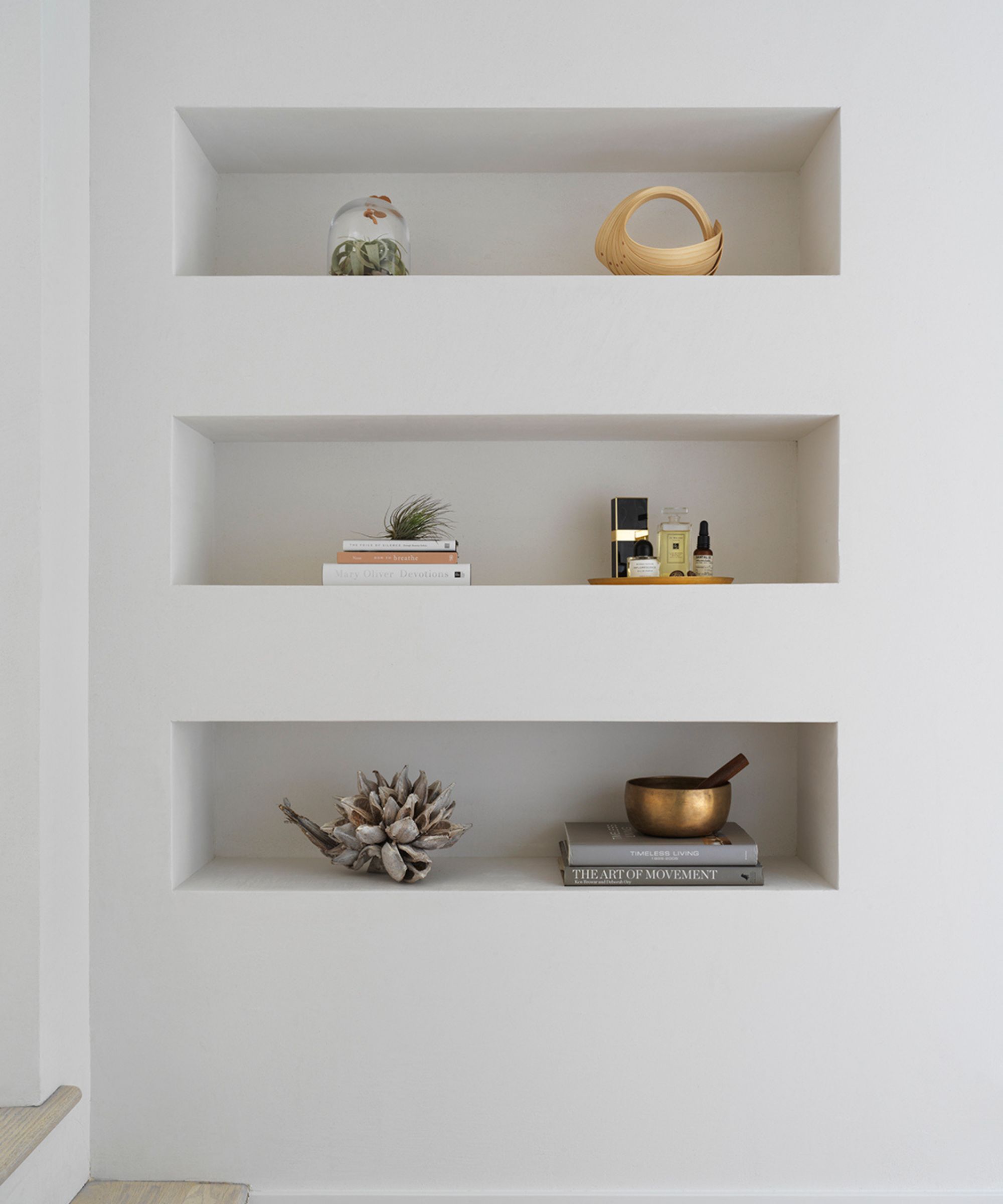
Incorporating meaningful decor will give your scheme purpose, it's important in any style of space. You'll feel far more connected to a room that's been decorated with thoughtful pieces versus one that's been designed without thought or enjoyment.
Minimal rooms can feel clinical, so to defeat typical minimalist decor myths, scatter sentimental trinkets throughout a room to ensure it will continue to inspire and uplift you. Whether it's your most prized vase at the center of a table or a stack of your all-time favorite reads on a shelf with other ornaments, these pieces will tell your story and connect you to the scheme as a whole.
Organic materials like onyx will give your scheme patina and character. These bookends are classic in shape and will elevate a bookshelf whilst ticking the minimalist box.
Fill with jewellery or leave bare, this marble trinket tray will give a simple shelf some luxury and timelessness. Pair alongside other meaningful pieces for a considered set up.
Photographs are a classic way of making a room feel more inspiring and personal. A thoughtful frame like this marble variety will give a treasured picture even more importance.
4. Not all minimalist spaces are about neutrals, so be brave with color
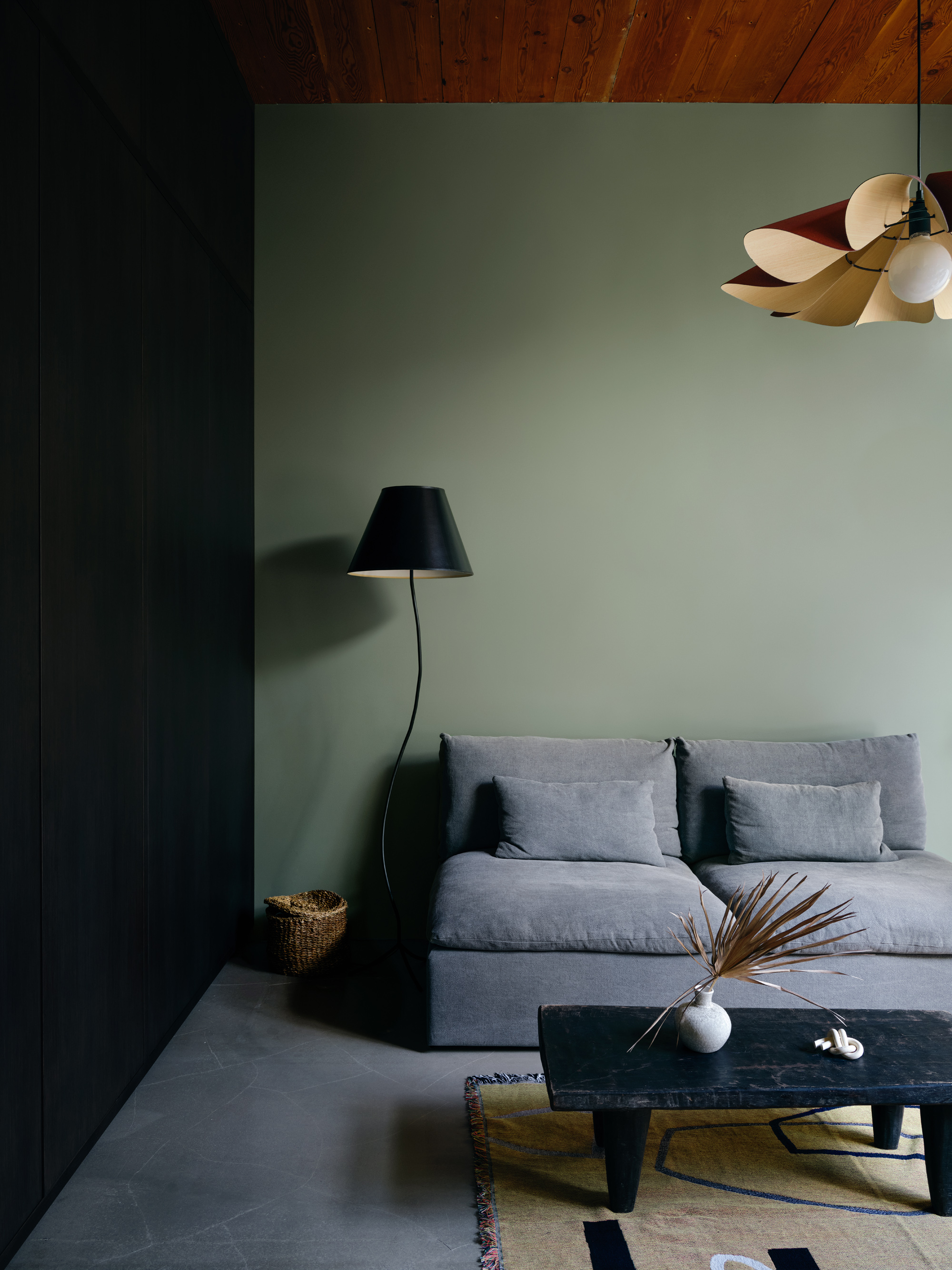
When you think of a minimalist color scheme, your mind perhaps goes to whites, greys, beiges, and perhaps an accent of black. But a minimalist style can be adapted to suit any color palette, not just neutrals.
If you like the more pared-back aesthetic but want your rooms to feel more inviting, color is the way to do it. Stick with the simple, sleek shapes and don't clutter the space with too many pieces of furniture, but make the color palette deeper, more jewel-like. You'll create a space that's sumptuous and luxurious but still feels decidedly minimal.
Case in point, this living room and home office, designed by Bespoke Only. The black, grey, and sage green color scheme is so deep and rich, and the mix of textures too fills this otherwise very minimal space with interest.
'We always like to incorporate texture and tactility to create depth in an otherwise pared-back space, through materials and layering. This room is a home office suite that opens out to a private courtyard. We loved the abundance of light and wanted to really create the connection with the landscape outside – both the wood ceiling and olive green walls are the subtle touches to bridge the inside and outside,' explains the studio's founder, Melissa Lee.
5. Focus on beautifully made statement pieces
Despite its name, since minimalism went mainstream, it's such an easy trend to bring into your home quickly and cheaply. Every high street brand makes replicas of the classic minimalist pieces, which is great that it's making this look more accessible, but if you are really committed to the trend, invest in quality over quantity.
Don't try and transform your home and make it 'minimal' in one online shopping haul. Remember the whole less is more concept that pretty much sums up this style? Minimalist is about focusing on quality – well-made, beautifully designed pieces that are classic and will last.
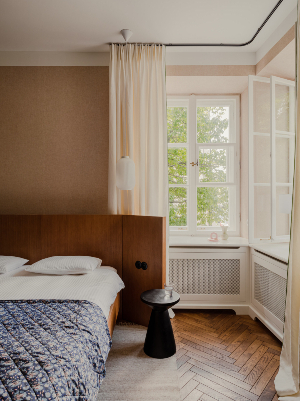
Count the pieces of furniture you can see in this minimalist bedroom. Two. The bed and the bedside table. And yet they both bring so much into the room you really don't need anything else.
'This project was created in a modernist tenement house. The modernist style is characterized by a more modest decoration but a great emphasis on functionality, ergonomics, and the quality of the materials used,' explains Marta Chrapka, founder of Colombe. 'In this project, we had a lot of original preserved elements and we wanted to emphasize those. Woodwork, windows, window sills, tiles, they were all original and were a great inspiration.'
'With a minimalist style, the focus is on the quality of the materials used. Because they are used sparingly, we pay attention to almost every element in the interior, and precision of workmanship and high quality are mandatory,' she adds.
6. Scatter metallic accents for variety
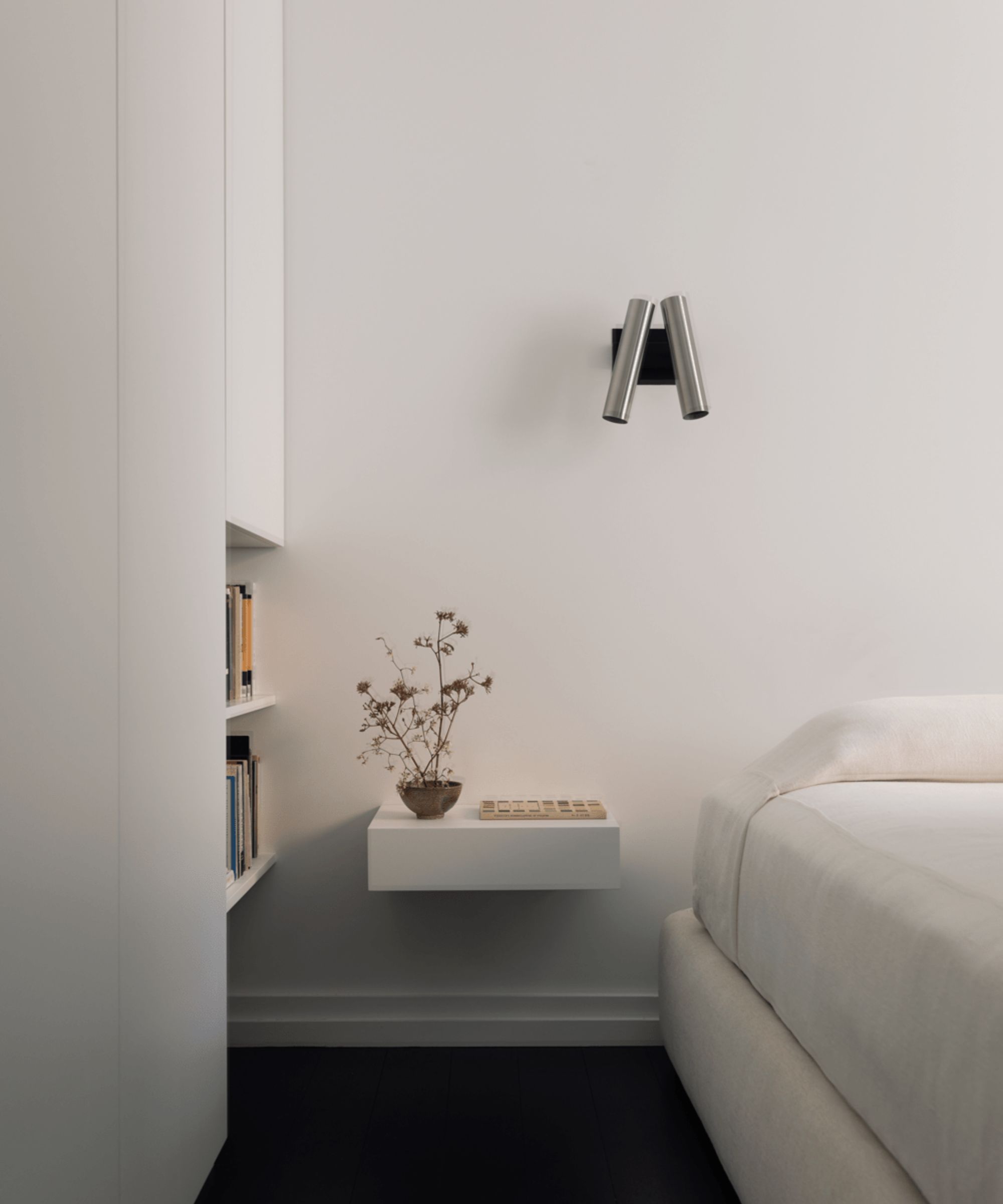
While you may not have considered decorating with silver for a minimalist design, metallic accents are a simple yet impactful way of incorporating variety and contrast, pairing beautifully against a white or neutral wall or surface.
Take the room (pictured above) as an example. Magdalena Keck has fitted a midcentury modern style silver sconce above the bed, providing the area with some variety and sleekness. The light isn't incongruous and in fact, ties in with the curated feel of the scheme, making the room feel even more streamlined and sophisticated.
If decorating with metallics seems a little bold, incorporate small accents such as lighting or hardware, as these will make all the difference to a one-dimensional room without dominating and detracting from the beauty of your other pieces.
Place at the heart of a dining table or on a console in an entryway for a modern look that embraces minimalism and all it has to offer.
To create contrast, fill this vase with a single vibrant stem for a simple yet sophisticated display that will elevate any shelf or table.
This stylish table lamp is reminiscent of classic midcentury design. It's a lasting style that will blend into any room in the home, bringing shine and sleekness to a minimal room.
7. Incorporate classically minimalist shapes
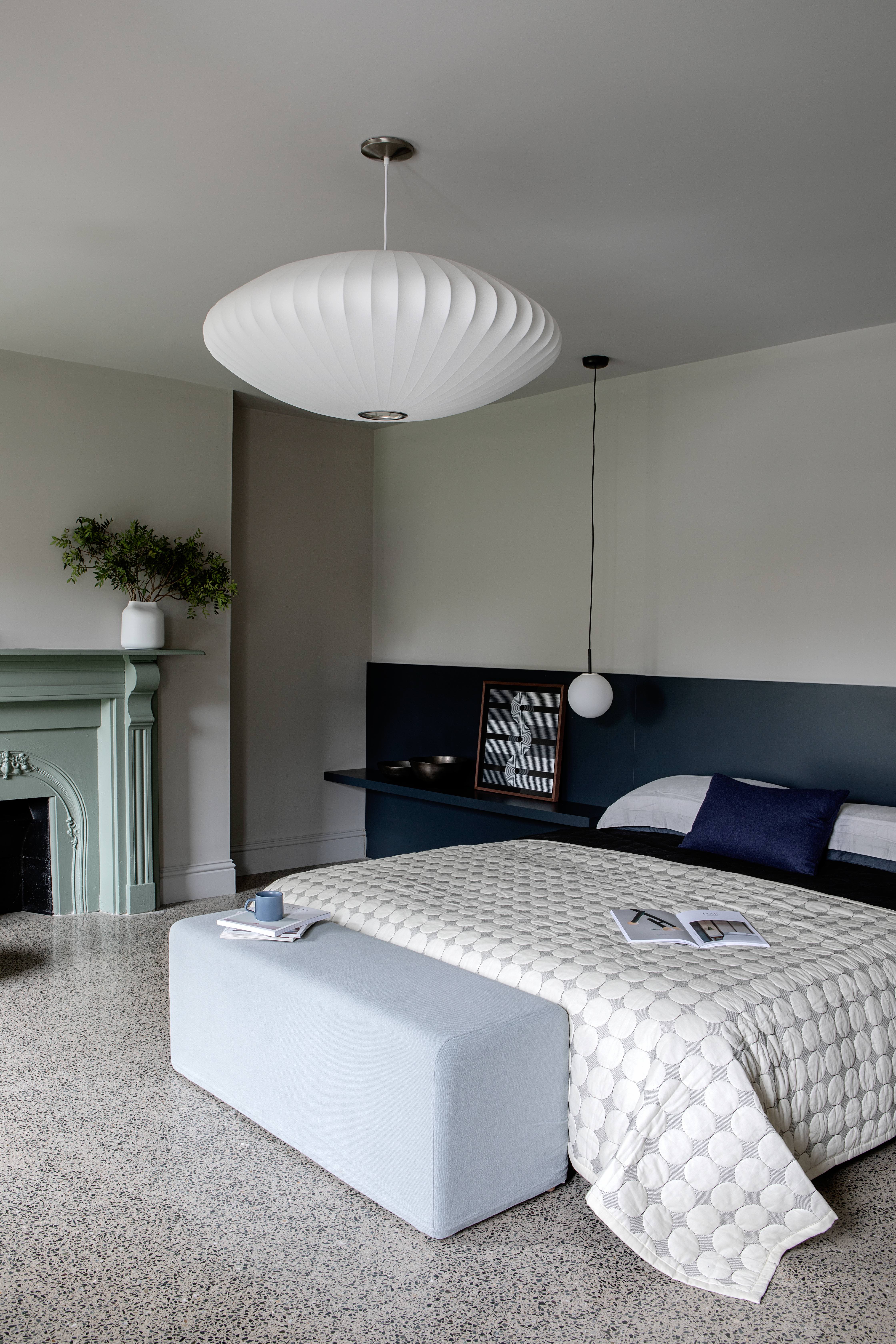
A big part of minimalism is the shapes and silhouettes. Since there's not always a ton going on in terms of color or the amount of furniture in the room, every piece of furniture or decor you do bring needs to give something. So look for designs that have something statement about them, whether that's the fact they are oversized, have a funky outline, or are made from a material you wouldn't expect.
The bedroom lighting used in this space design by Kingston Lafferty draws a lot of the focus. It's minimal, and yet statement and perfect for this very calming bedroom, which needs that key focal point to ground the room. 'We wanted to ensure this guest bedroom exuded a timeless calm with colors that wouldn’t date. Purbeck Stone from Farrow & Ball forms the basis of the space, wrapping all surfaces it touches in its neutral, putty-like hue, including the ceiling, doors, and skirting, and is enhanced by the contrasting navy tone. Simplicity is very effective at creating a sense of calm,' explains the studio's founder, Roisin Lafferty.
8. Create depth with millwork and molding
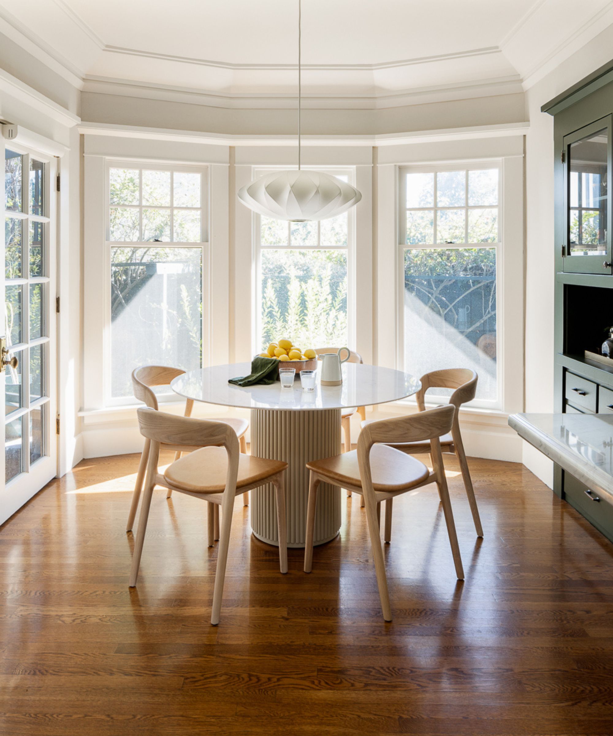
Architectural accents can provide a beautiful contrast against the simplicity of a minimalist scheme. Whether it's some ornate crown molding or decorative millwork, traditional features give a one-tone room some depth and variety, giving you more to look at the longer you gaze.
There are plenty of ways to add architectural charm to a room that doesn't have any, so fear not if your home lacks period features, as adding these in is entirely possible with a good design and professional builder. Decorating with white can feel a little flat, so adding architectural intricacy creates another layer of interest in your minimal scheme.
The ceiling trim idea pictured above elevates a simple room, framing the window and providing the minimal kitchen with a layer of interest.
Yena Jung of By Yena Designs suggests using cabinetry ideas to bring depth to your minimalist kitchen. 'Designing your walls by adding custom millwork through cabinetry, especially on white walls, is the most elevated way to stay minimalist, but finishing your home design with style.'
9. Use organic materials
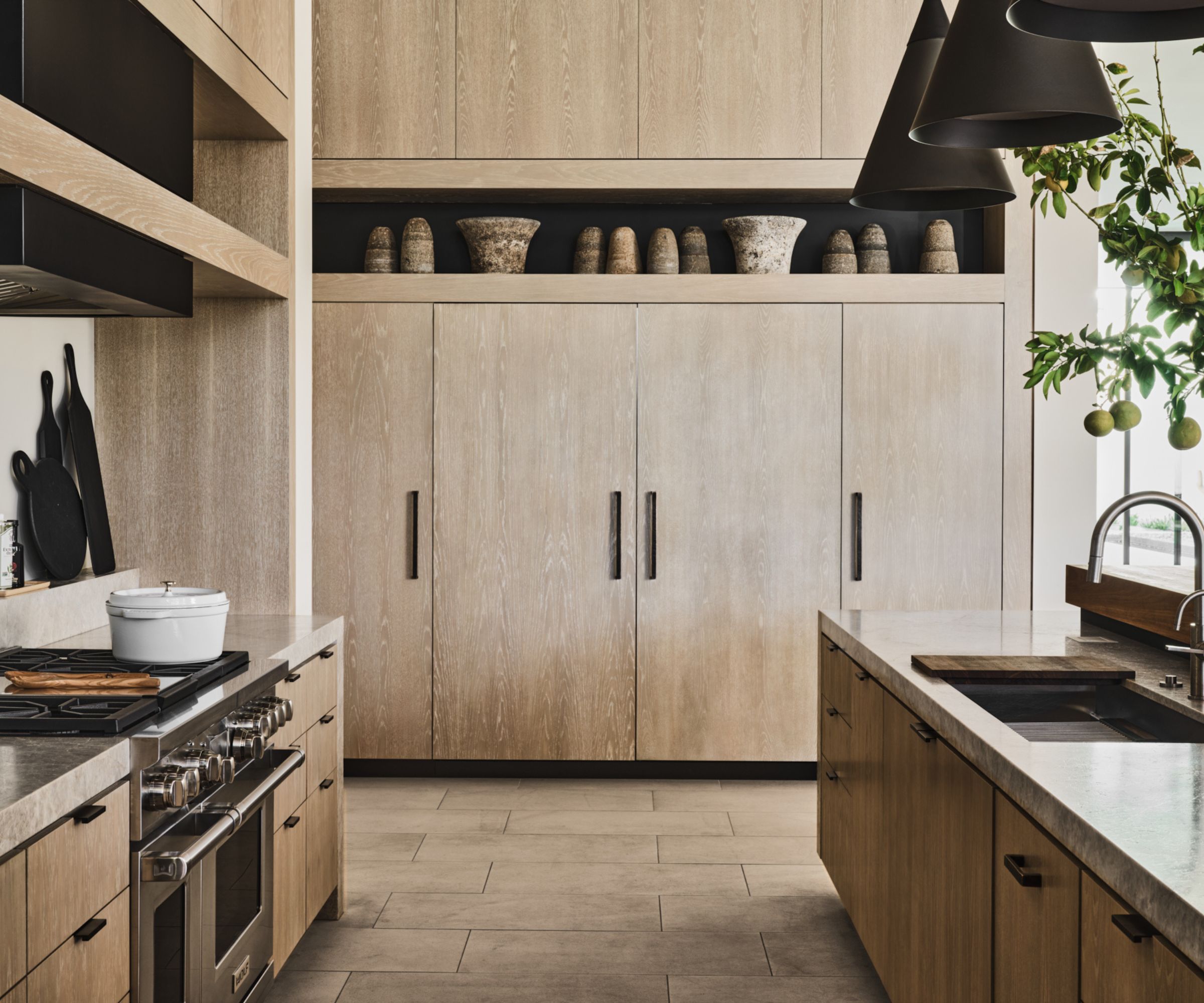
Texture in interior design is important in any space, minimalist or not, but the neutral color palette of a minimal room means it needs texture even more than other styles. One of the best ways to warm up a pared-back room is layering organic materials, like wood, stone, and natural fabrics, as this will give your space a more serene feel filled with depth.
Jordan Yasgoor, creative director of Reid Witlin Textiles, explains the benefits of using organic materials in a minimal space. 'Minimalist design in 2025 is all about warm minimalism – balancing simplicity with texture and depth. While neutral palettes remain gorgeous, timeless, and elegant, layering textures within those neutral tones is key to avoiding a flat, dull feel. In both hospitality and residential design, we're seeing spaces come alive through materials like boucle, raw woods, honed stone, soft linens, and matte ceramics.'
A marble island or some wood kitchen cabinet ideas (like the room pictured above) will make all the difference to a minimal kitchen, bringing warmth and variety.
10. Opt for one sculptural piece of furniture
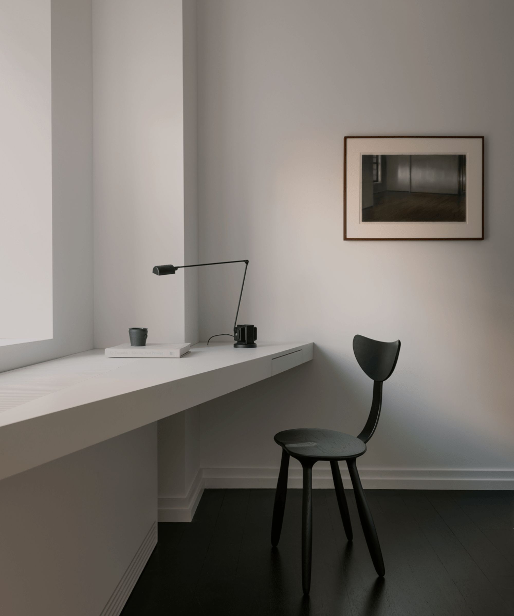
Creating impact with neutral colors isn't easy. Layers of textures can bring interest, but incorporating one statement piece of furniture will provide a minimal room with some much-needed drama and purpose and bring your scheme to life.
Take inspiration from the latest furniture trends and opt for a sculptural, well-crafted piece that ties in with minimalist design but also contrasts. Whether it's a curved armchair or an asymmetrical dining table, uniquely shaped pieces will lift the room and provide the space with even more depth.
Genevieve Webb and Ashley Mutch of Feather Hill Interiors say, 'A sculptural piece, whether it is a chair, a sofa, a light fixture, or a hand-formed ceramic, can create interest without overcrowding the space, keeping everything clean, open, and intentional.'
Small but mighty, this handcrafted stool would make a welcome addition to a minimal living room. Place beside an armchair or sofa for a convenient yet stylish setup.
Simple yet elegant, this midcentury-inspired chair will bring some authenticity to your space. With its subtle stripe and smooth legs, it's an example of timeless design that will last through the ages.
Uniquely shaped, this side table will help your minimal scheme come to life. Adorn with a vase or an angle poiser for a considered arrangement that nods to the minimalist style without feeling bland.
Our minimalist decor ideas have no doubt saved you from asking, 'Is minimalism out of style?' Despite sometimes being considered cold and clinical, minimalist schemes are just as characterful and inviting as other styles when designed intentionally and thoughtfully.


