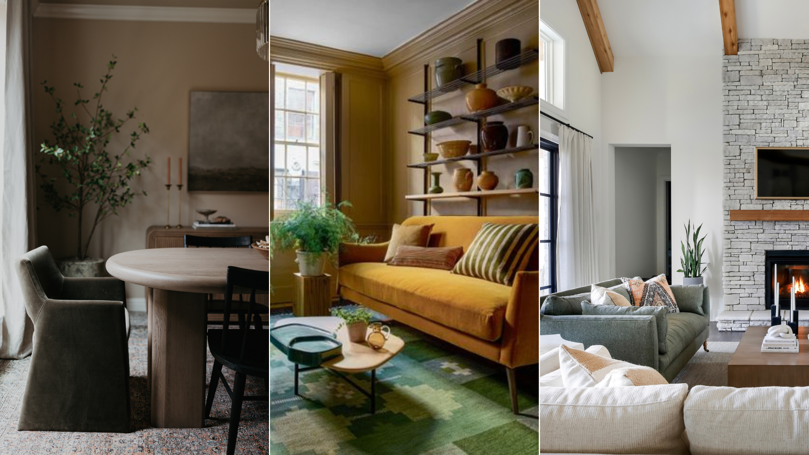
Color can be tricky. Pack too many shades into a small space, and it can become overwhelming to the eye, but stick to just one and the room will feel lifeless in an instant. Finding the perfect balance sometimes feels like a never-ending battle.
However, introducing a tonal scheme into your interior design is a foolproof way to tie all of your design elements together, leaving you with an elevated and cohesive look. Using several shades from the same color family, this method requires careful planning but delivers incredible results, plus it leans into a lot of color trends for 2024 that involve softer, more layered schemes.
We spoke with interior design experts to get their best advice for creating a playful yet sophisticated tonal scheme in any room of the house.
What is a tonal scheme?
A color scheme is well and good, but a tonal scheme takes any space to the next level. A tonal palette consists of multiple shades, or tones, of the same color family. The origin shade offers a base, while the other variations build off of it, contributing to a perfectly curated room.
While tonal schemes can easily be achieved by sticking to beiges and decorating with neutrals, this technique can be used with any color you like. Try out a blue tonal scheme, for example, by starting with a light-hued blue, and layering with brighter pops of cobalt and darker accents of navy.
How to achieve a tonal scheme in your home
Though the concept of a tonal scheme is quite easy to grasp, putting it into practice can be tricky. But with this expert-approved advice, you'll be putting together the living room of your dreams in no time. By going beyond the color wheel by featuring various textures and focal points, your home will look both colorful and coordinated.
1. Begin with the basics
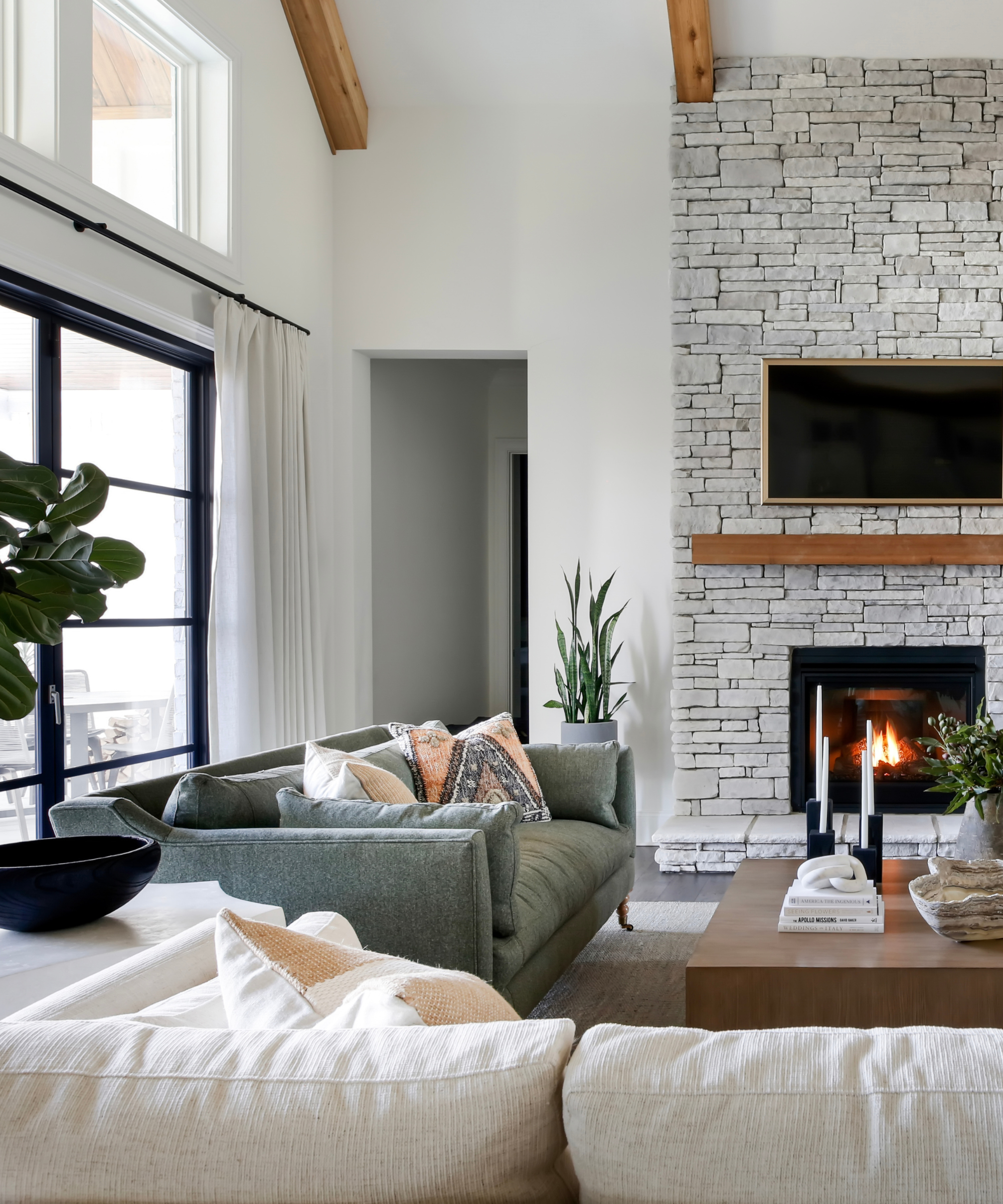
When it comes to color, experimentation is key – but there are some guidelines that can help move the decorating process along.
Kathy Kuo, interior designer and CEO of Kathy Kuo Home, says that starting with a more muted shade will allow you to let your creativity shine later on in the design process. Not only will you create a tonal scheme that's balanced, but you'll be left with a space that's serene – and not overpowering.
'I always like to say that there really are no hard and fast rules when it comes to color schemes, but a good piece of guidance with tonal schemes is to try it with a more neutral tone or an earthy tone before experimenting with super bright colors. Try a sage green, for example – you can mix that with seafoam, moss, and forest green and you're guaranteed a result that feels very organic and soothing,' says Kathy.
2. Incorporate layers and texture
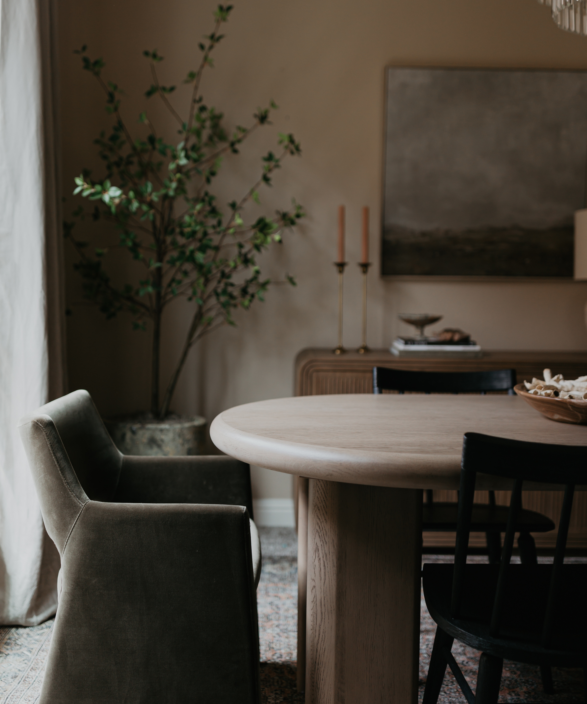
To avoid a color scheme that leans a bit too monotonous, venture into interesting textures and patterns that match the overarching theme. In a kitchen, try patterned backsplash and plush, upholstered bar stools to create contrast.
In the living room, intricately patterned throw pillows and a tactile area rug will transform a space from dull to delightful without too much of an investment.
'Playing up patterns and texture within the tonal family is a surefire way to keep a space from falling flat. Embracing patterns and incorporating layers of texture through textiles, art, or decorative objects creates depth and a visually interesting space,' says Audrey Scheck, designer, and founder of Audrey Scheck Design.
3. Focus on depth and movement
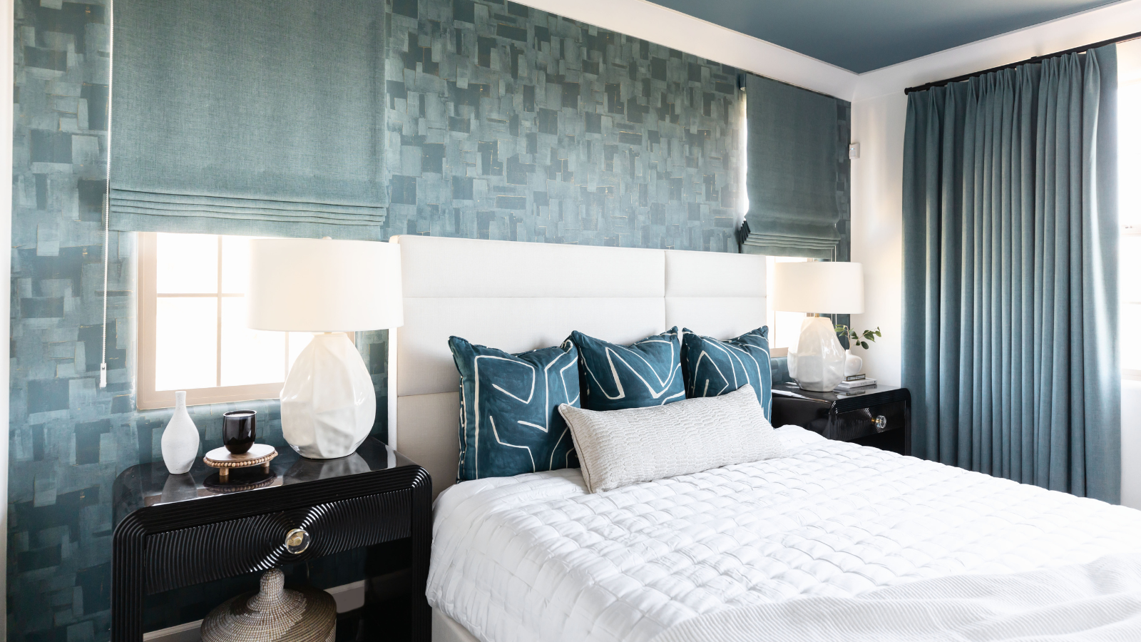
Paying special attention to pattern and texture comes with other benefits as well – these visual elements will add depth and movement, making any space feel more sophisticated and lively. Choose textural accessories that demand attention to avoid an uninteresting design scheme, says Lauren Lerner, CEO and founder of Living with Lolo.
'One effective approach for introducing texture in such a setting is through the use of carefully selected drapery, such as flowing curtains or textured blinds, which can create a sense of movement and dimension,' she says.
Plus, you don't have to stick to the accessories when looking to add depth to a space. Lauren says that detailed furnishings such as woven chairs or side tables add appeal to a room that's decorated with a tonal scheme.
4. Let outdoor scenery shine

Tonal schemes can work beautifully alongside natural scenery. If you're lucky enough to have a lovely view out your window, it's important not to overpower the outdoors.
Devon Wegman, design director and founder of Devon Grace Interiors, says that choosing your color palette mindfully will help your view – whether it's a lovely countryside or by decorating with artwork – take center stage.
'We often gravitate towards black and white backdrops for areas where we know there will be dramatic artwork or the views from the space are the focal point. This allows the space to not compete and amplifies the colors of nature being pulled in through the windows, or of artwork on the walls. When a space has big windows, and the outside is a huge part of the indoor space, we like to celebrate that by keeping the interior palette more muted and monochromatic to celebrate the views,' says Devon.
5. Don't limit yourself to neutrals
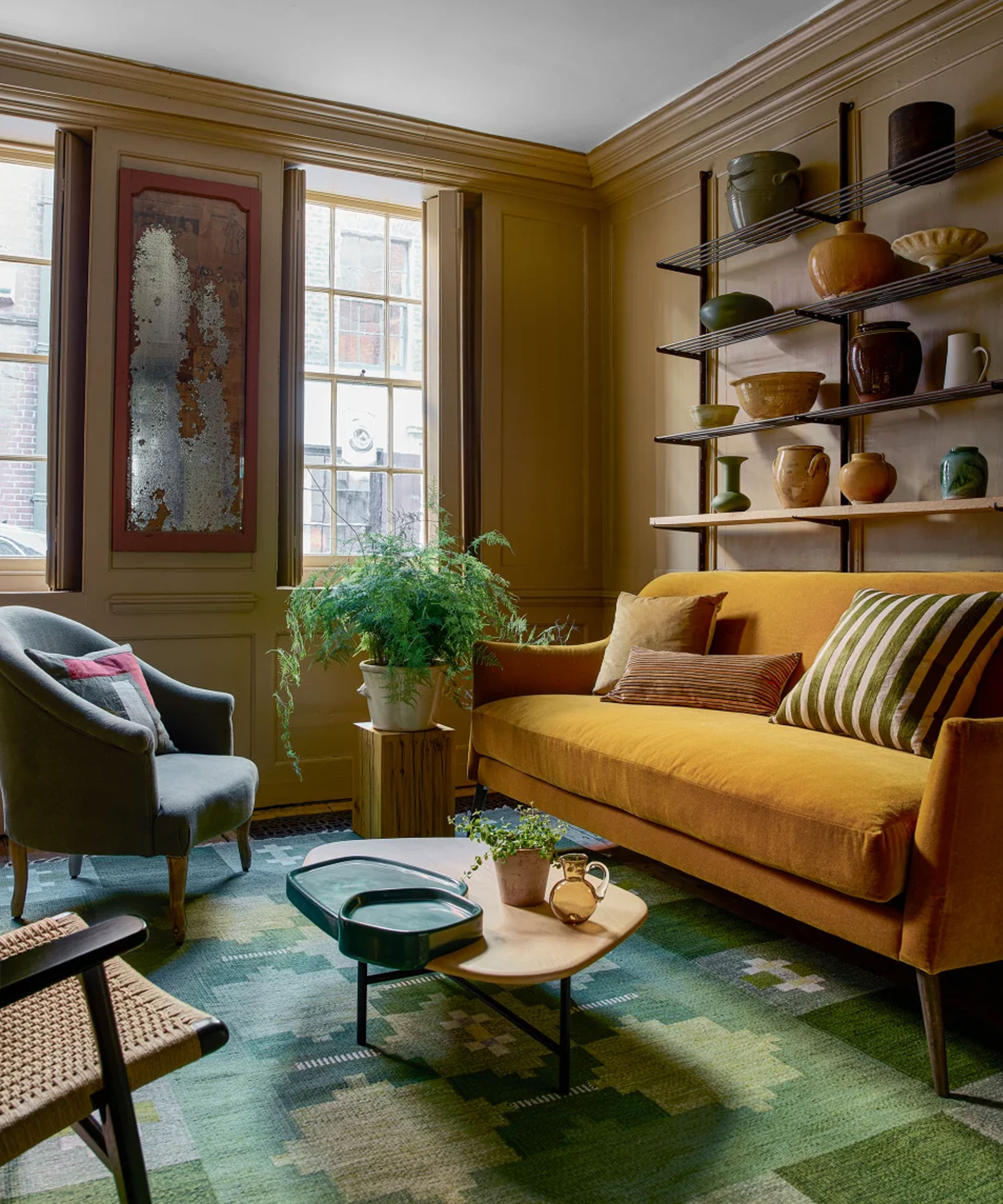
'Whilst a tonal scheme is most popularly used with neutrals, tonal decorating shouldn’t be limited to a beige color palette,' says Tom Rutt, interior designer and founder of TR Studios.
Though it can be tempting to stick with plainer colors, some of the best tonal schemes incorporate clever combinations of bright hues. Blues, greens, and purples are cool-toned colors that work beautifully in just about any room when mixed with intention.
What proportions work best for color combinations?
When mixing and matching different colors within your tonal scheme, it's easy to get overwhelmed. You won't want the base color to make up most of the room, but adding in too much of the secondary tones can add visual clutter. Tom suggests using the 70-20-10 rule as a general guide.
Using your base color for about 70 percent of the space, and choosing other tones to take up 20 and 10 percent each can help you to create cohesion. Audrey, on the other hand, suggests a 60-30-10 ratio. But both designers suggest using these proportions very loosely – while they can be useful as guideposts, tonal scheme spaces offer a bit more flexibility.
With a cohesive color palette composed of carefully chosen tones, you'll be well on your way to an elevated, comfortable living space that screams sophistication. Remember to incorporate textures, depth, patterns and elements you already have in the house to truly master the look. And the best news? A tonal scheme can carry your home's design style well into the future.
'A monochromatic palette creates a serene, classic space that clients can incorporate their own art and accessories into and change over time,' says Devon.


