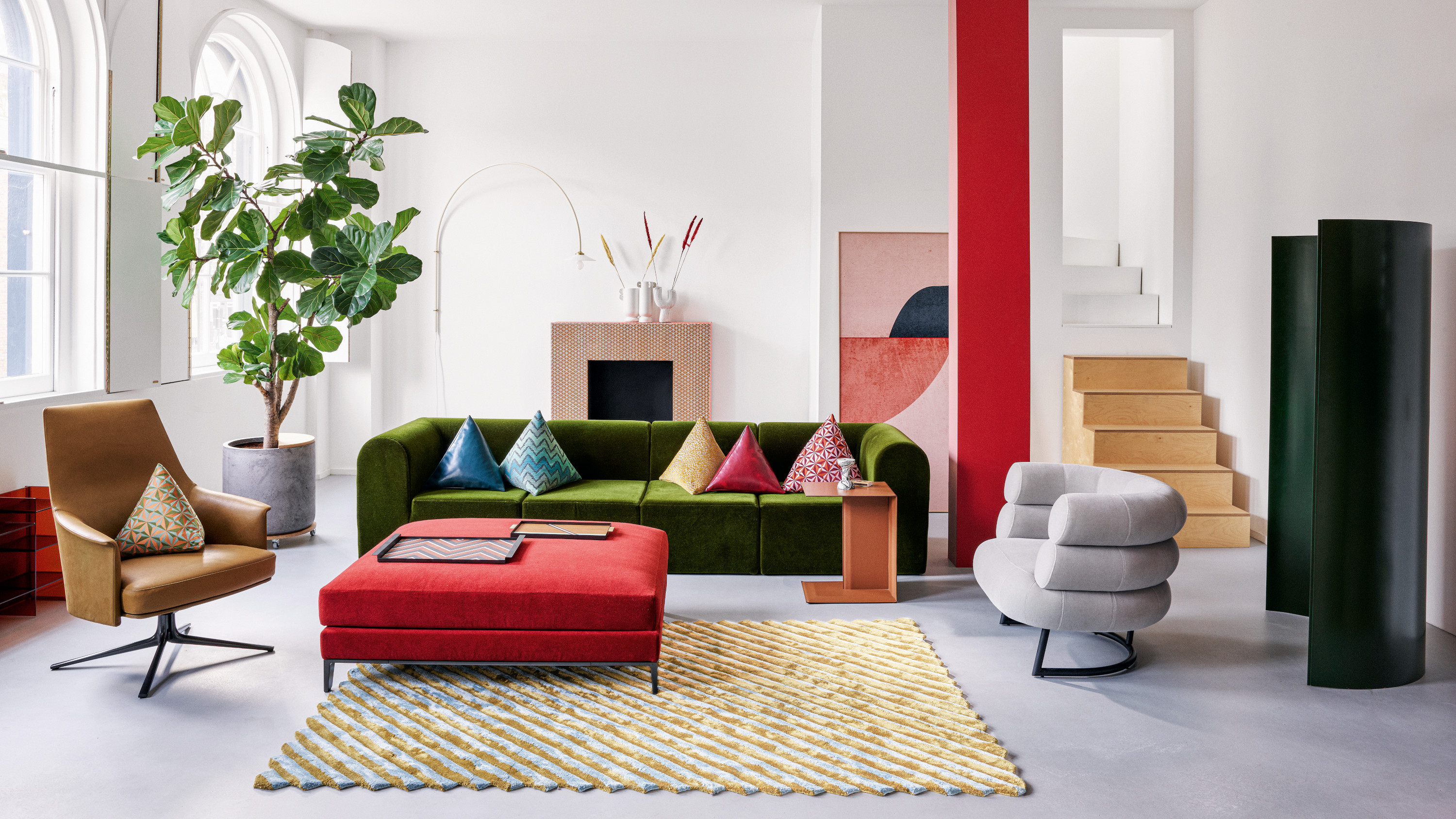
Design rules can be tricky, can't they? Rather than being set in stone, so many of them do actually become outdated as time and trends move on – meaning breaking them can result in a fresh and more contemporary look.
The same goes for color rules – as designers experiment more and more with color, they often find that the best schemes are those that don't follow traditional wisdom. In fact, following some time-honored color rules can actually make a scheme feel a little outdated.
So which outdated color rules are designers breaking right now – and are there any they still stick to? We spoke to the experts to find out.
1. Always be guided by the color wheel
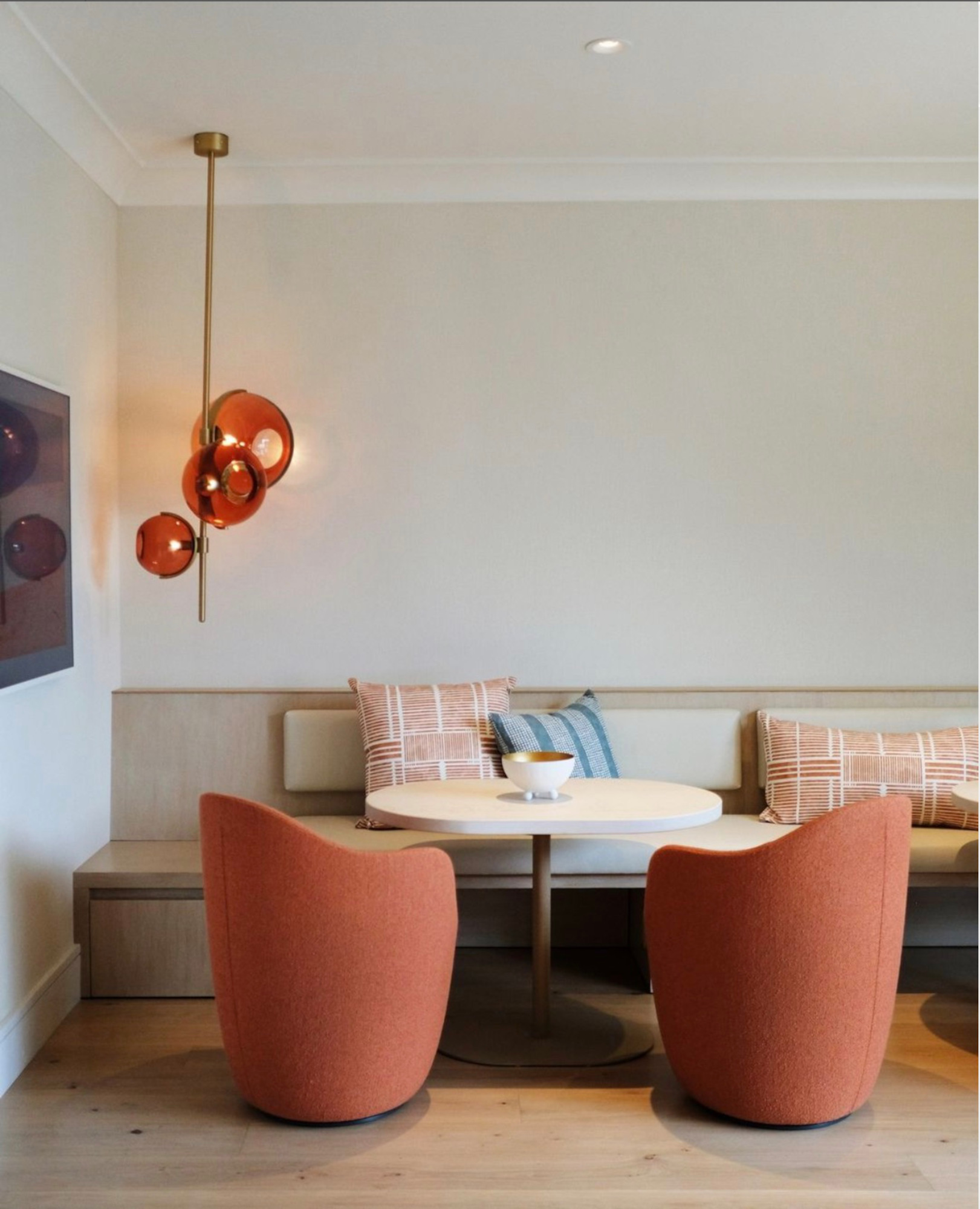
Of course there are plenty of times when the color theory wheel comes in handy – there’s a reason so many designers still turn to it often, after all. But that doesn’t mean you can’t (and shouldn’t!) deviate when it feels right. ‘Certainly the classic color rules have a place for helping to organize and plan a space, but as a maximalist, I like to encourage our clients to reach beyond the rules and follow instinct,’ says Tamara Kaye-Honey, founder of Montecito and Pasadena-based House of Honey.
Sabra Ballon, principal designer at San Francisco's ballonSTUDIO, turns to another guiding principle alongside the color wheel, one that’s a lot more intuitive: those of the German artist Josef Albers. ‘His leading theory was that the color you perceive is relative to what color is next to it: “Colour is the most relative medium in art,”’ Sabra explains. ‘When it comes to color, my only rule is, the more you look, the more you see, so get lots of practice combining colors.’
‘Some of our most beautiful spaces evolved through the process of contrast and tension in elements that might not seem likely pairings on paper,’ adds Tamara. ‘I believe design is an active conversation, and each element makes a contribution, so allowing each to have a different point of view can be the difference between a room that looks decorated versus a room that is inviting.’
2. Don’t have more than one bold color in a room
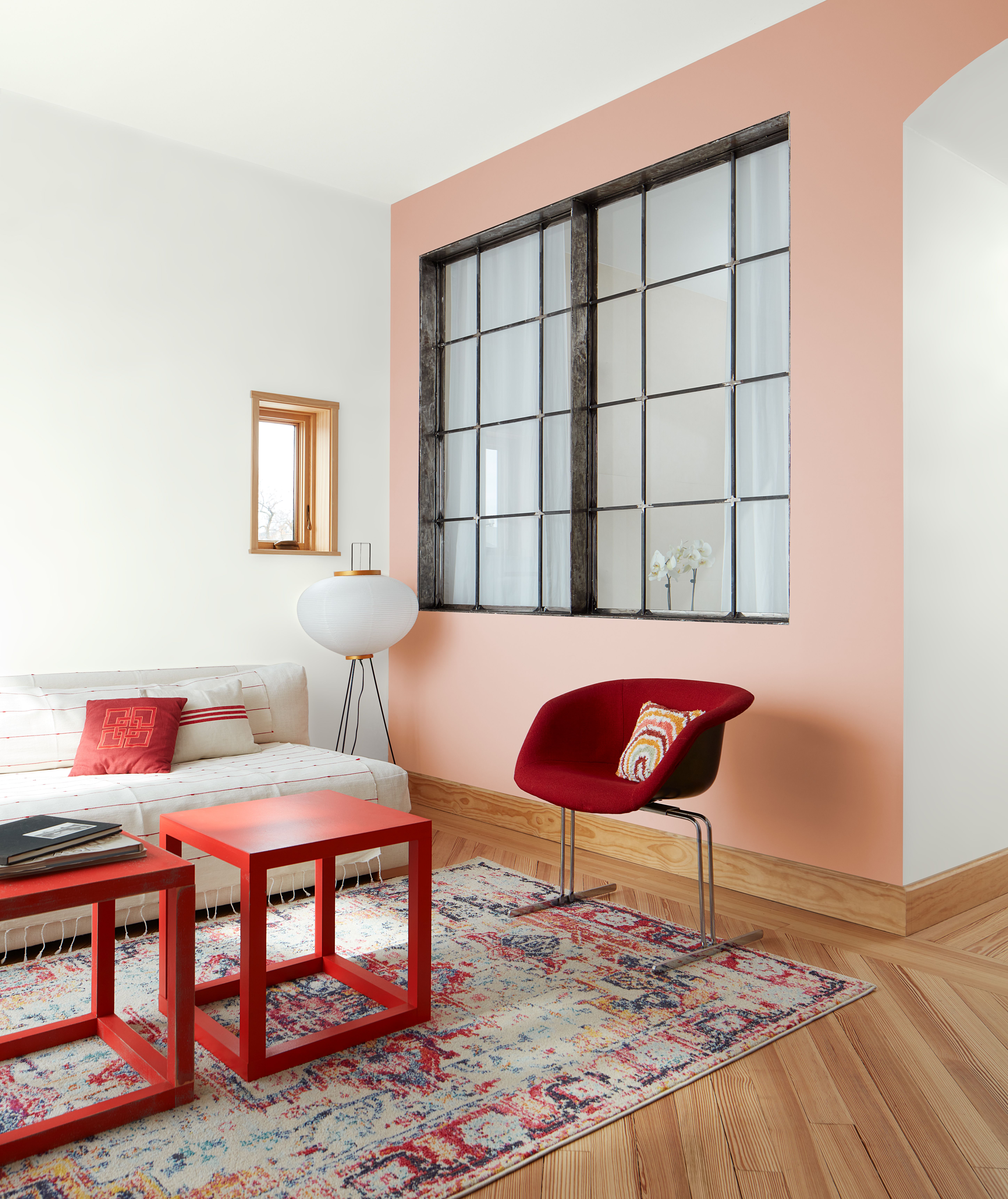
Gone are the days of an accent wall being the only splash of boldness in your scheme: interiors are far braver these days, and that includes using multiple bold colors in one room. ‘It's not uncommon to see rooms fully saturated in a single color – another look I love – but to see a strongly colored room highlighted by equally intensely colored drapery or furnishings is a bit more unusual,’ says Louisville, Kentucky interior designer Bethany Adams. ‘I like the challenge of pairing bold colors and making the rooms look cohesive – not crazy.’
There is, however, something to be said for restraining yourself a little. ‘Not enough color variation in a room can make your space feel flat and boring, but too much variation can lead to a space feeling overwhelming and cluttered,’ says Laura Chappetto Flynn, owner and lead designer of Chicago's Element Design Network. ‘Whether your preferred colors are bright and bold or muted and serene, if you choose four or five hues and play with balance, you will achieve an interesting and cohesive space.’
3. Never use dark colors in small rooms
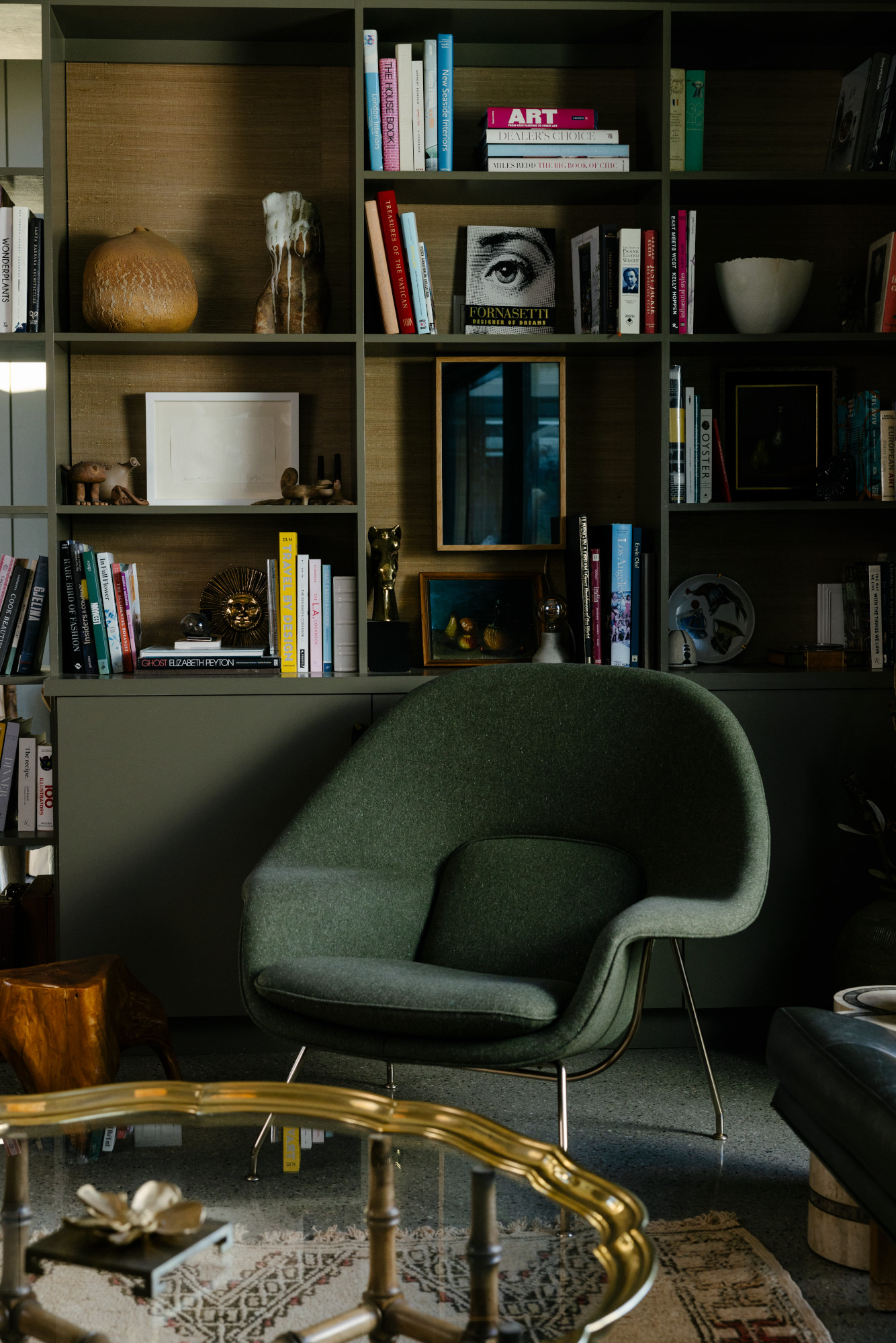
This rule has been debunked many times, but it’s worth repeating for those still sticking to light shades for their small rooms. ‘When applied thoughtfully, rich colors in a smaller space can amplify its character and create a captivating, intimate atmosphere,’ says Monika Nessbach, founder and chief interior designer of Designbar in Charlotte, NC. ‘Pair darker walls with clever lighting, mirrors, and strategic furniture placement to prove that breaking this old rule can lead to unexpectedly remarkable results. Defying conventions can breathe new life into the design, proving that rules are made to be creatively bent or artfully shattered.’
‘We believe that you can create more intimate, cozy, and sexy spaces by using color to its fullest,’ adds Tamarra Younis. ‘Don't be afraid to paint every wall and the ceiling in that bold color you've been dreaming about.’ There’s one caveat, though: ‘The key to making this work is to not take half measures,’ she adds. ‘If you decide to go this route you have to commit fully and really go for it.’
4. Ceilings should always be painted white
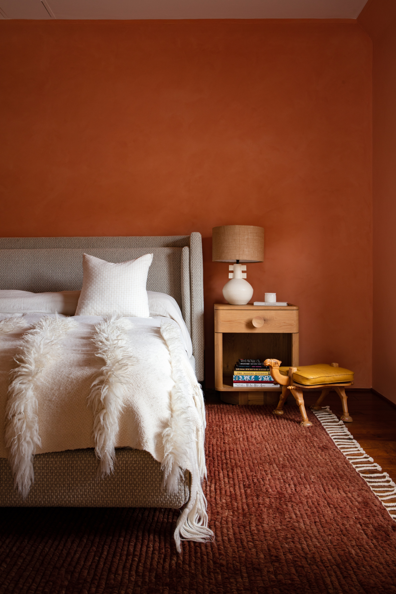
If you’ve tried color drenching already, you’ll know that a white ceiling can be the death of a good scheme. And while there’s still a place for a plain fifth wall, the best painted ceiling ideas include an element of color. ‘We never paint ceilings white,’ says Katharine Rhudy, principal designer at New Orleans practice Reed & Acanthus. ‘We typically custom color with a hint of blue or continue the wall color to the ceiling, which makes the room look bigger and the ceiling look higher.’
For people who feel all-over color is a bit much, try a more tonal approach by applying a lighter shade of your walls’ hue on the ceiling. It still feels approachable if you’re used to a more traditional way of decorating – but avoids the starkness that a white ceiling can bring to a scheme.
5. Your home should be color-cohesive
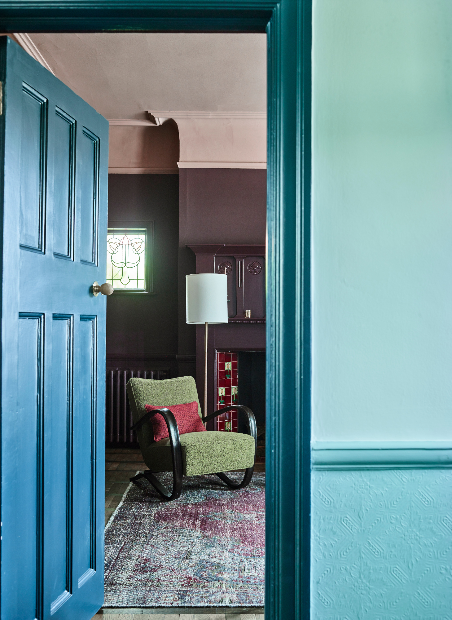
A home that’s too matchy-matchy from room to room can actually feel quite dated. And when there’s such a strong argument for designing a room based on how you want it to feel – energetic in a kitchen, say, and soothed in a bedroom – one color scheme isn’t going to work for all. ‘We love to give rooms off the main hallway a bold punch, allowing them to stand on their own,’ says Kate Duffy of Atlanta-based design firm Duffy Scott Interiors.
Still, it helps to have a thread through your space, and for Julee Wray, principal designer at Truss Interiors in Denver, Colorado, it’s a tonal one. ‘Tonally, colors need to be the same throughout so they speak to each other nicely, she explains. ‘For example, if you have a muddy blue in one room, keep the adjacent room's color muddy as well.’
And one rule to follow…
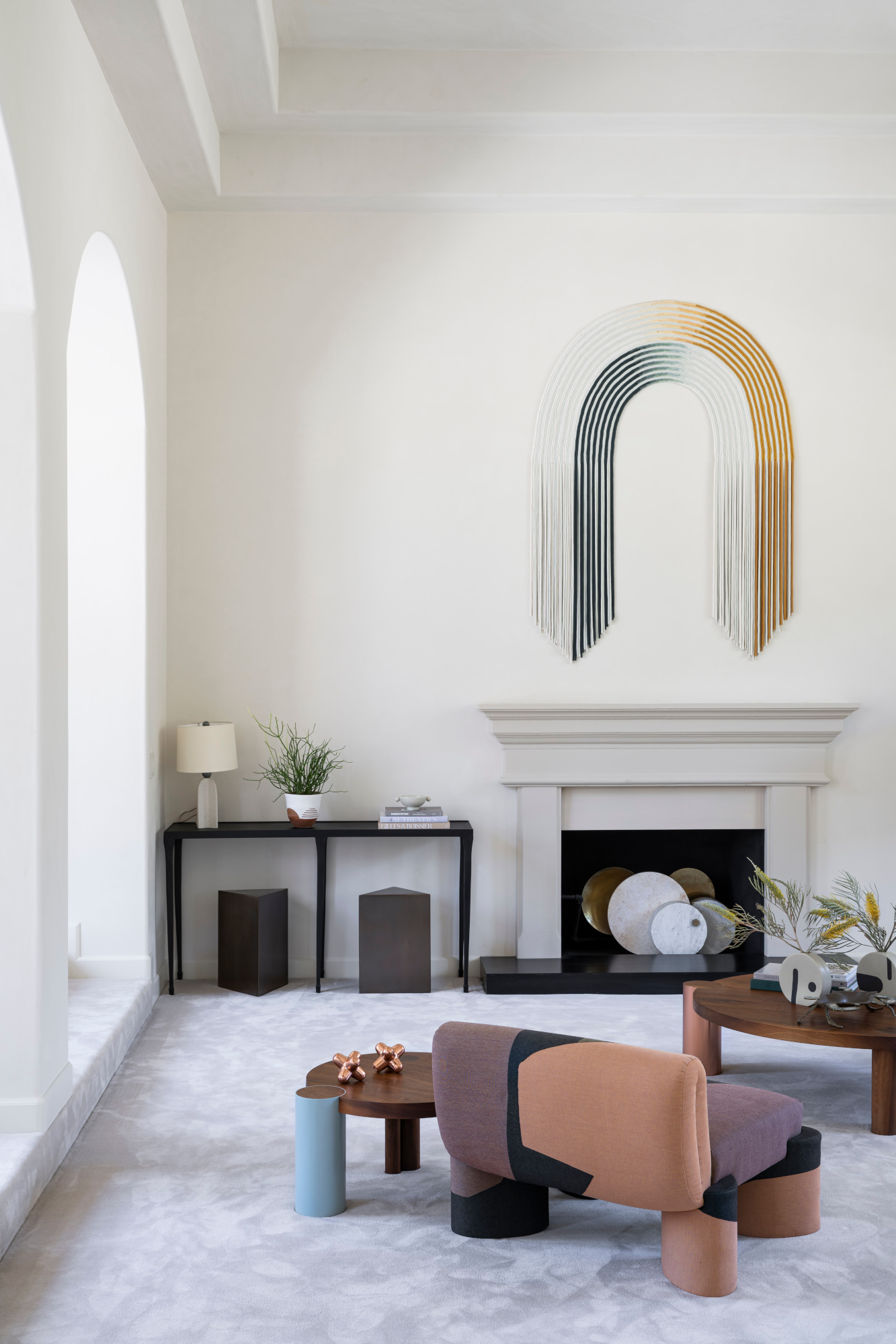
While we’re all for breaking decorating rules, there are some guidelines that prove themselves useful time and time again. The one we use the most? The 60-30-10 rule. ‘When it comes to jazzing up interiors and color theory, this rule, I think, is a must,’ says Monika Nessbach. ‘60% of your main hue lays the foundation, like the canvas for your masterpiece. 30% splashes in a (complementary) color, which gives life to furniture and drapes. And finally, 10% for that unexpected "pop!" It's like the surprise twist in a great story. Think accent pillows, quirky art, or a sassy lamp. This rule's like a foolproof recipe for your visual cocktail – balanced, bold, and always leaving you thirsty for just a bit more.’


