Lighting is a critical component to consider in the kitchen for both functional and aesthetic purposes. All too often people overlook important kitchen lighting design rules, failing to equip their cooking spaces with appropriate fixtures, and making a number of mistakes that can easily be avoided.
These design faux pas are, at best, superficial problems that don't make your space look its best, but at worst they can make your kitchen difficult to use — too bright or too dark — and generally create an unwelcoming feel.
Below, interior designers have helped us shed some light when it comes to kitchen lighting design; what you should avoid, and more importantly, what to do instead. Here are five kitchen lighting design rules to remember.
1. Place Lighting Above Work Stations

Interior designer Allison Lind, founder of Seattle-based Allison Lind Interiors, notes that a popular kitchen lighting idea is to install recessed lights equally spaced out across the kitchen ceiling in a uniform grid. While this symmetry certainly looks good, it isn't necessarily the best approach.
“The problem? When you’re standing at the sink or island or other work zone, unless you’re on the shorter side of the height spectrum, the light is typically casting down towards the back of your head, and your head is now blocking the light from reaching your work space,” Allison explains.
Instead, she recommends placing lights above each work zone and skipping a “messy” recessed lighting layout. “You can consider decorative work lights, like a pretty pendant over the sink, or a library sconce over a baking station,” she adds.
Designer Linda Hayslett, founder of LH.Designs, agrees, adding that you also don't want to rely solely on recessed lighting in a kitchen for other reasons as well. “While these are practical, they can make the space feel flat and lack personality,” she says. “Kitchens are such a central part of the home and the lighting should reflect both function and warmth.”
Price: $69.99, Was: $89.99
This set of two pretty, battery-operated wall sconces can be placed anywhere in your home as they don't require wiring. If you're looking to add alternative light sources to your space, this is an elegant, and highly-rated option.
2. Don't Go Too Matchy-Matchy

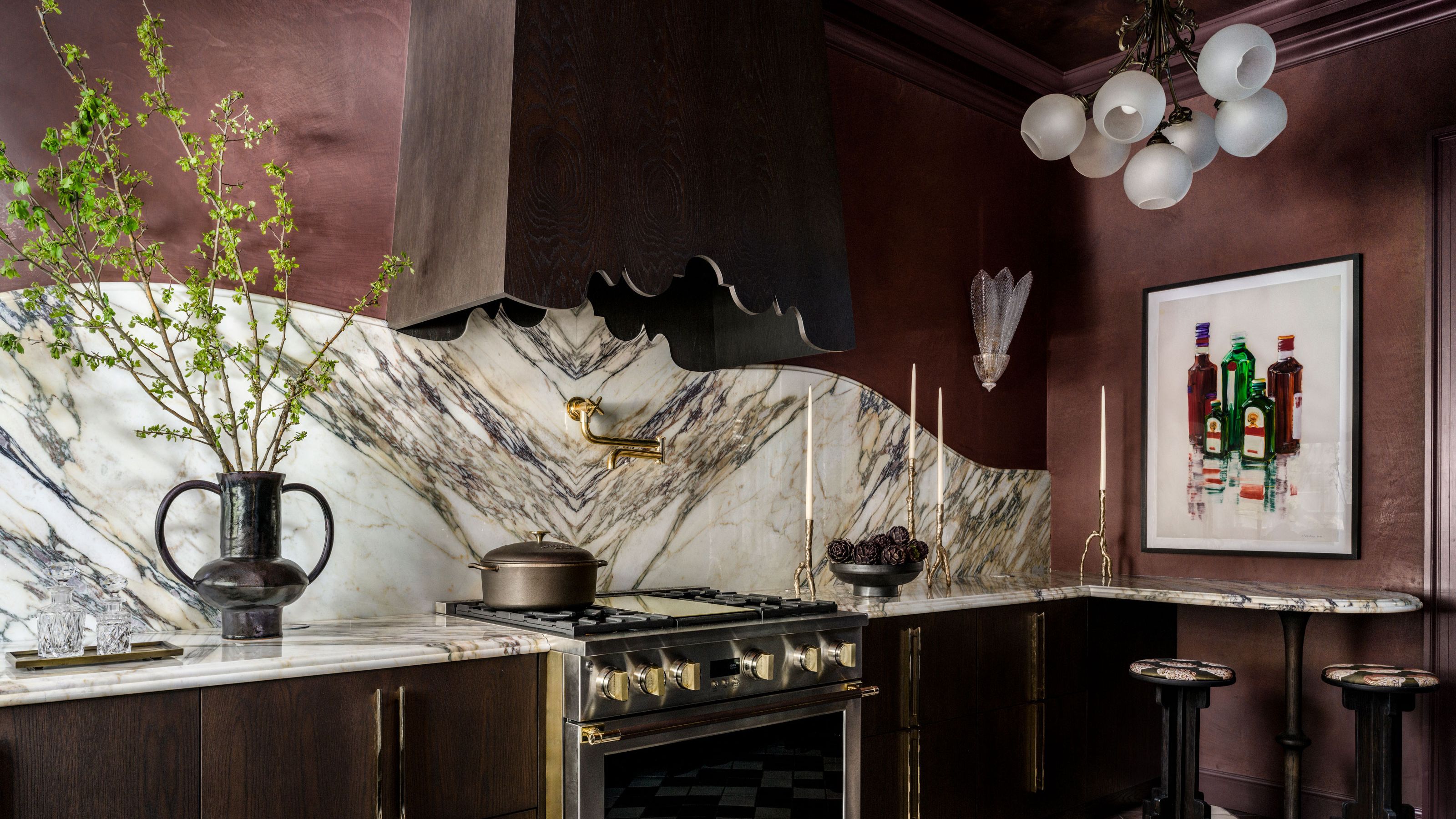
Skip matchy-matchy lighting in the kitchen and instead choose pieces that complement each other but aren’t exactly the same, advises interior designer Kristen Peña, founder of K Interiors.
“When you directly match pendants and wall sconces it feels a little boring,” she says. “Mixing styles and even periods can go a long way in creating a unique and interesting space.”
When it comes to lighting trends, there are so many styles to be inspired by, and it's an easy way to introduce character to your space. To ensure they still look cohesive, try to find features that unite them, like choosing similar metal finishes or shapes, or simply embrace their uniqueness.
3. Use Color and Materials to Create Contrast

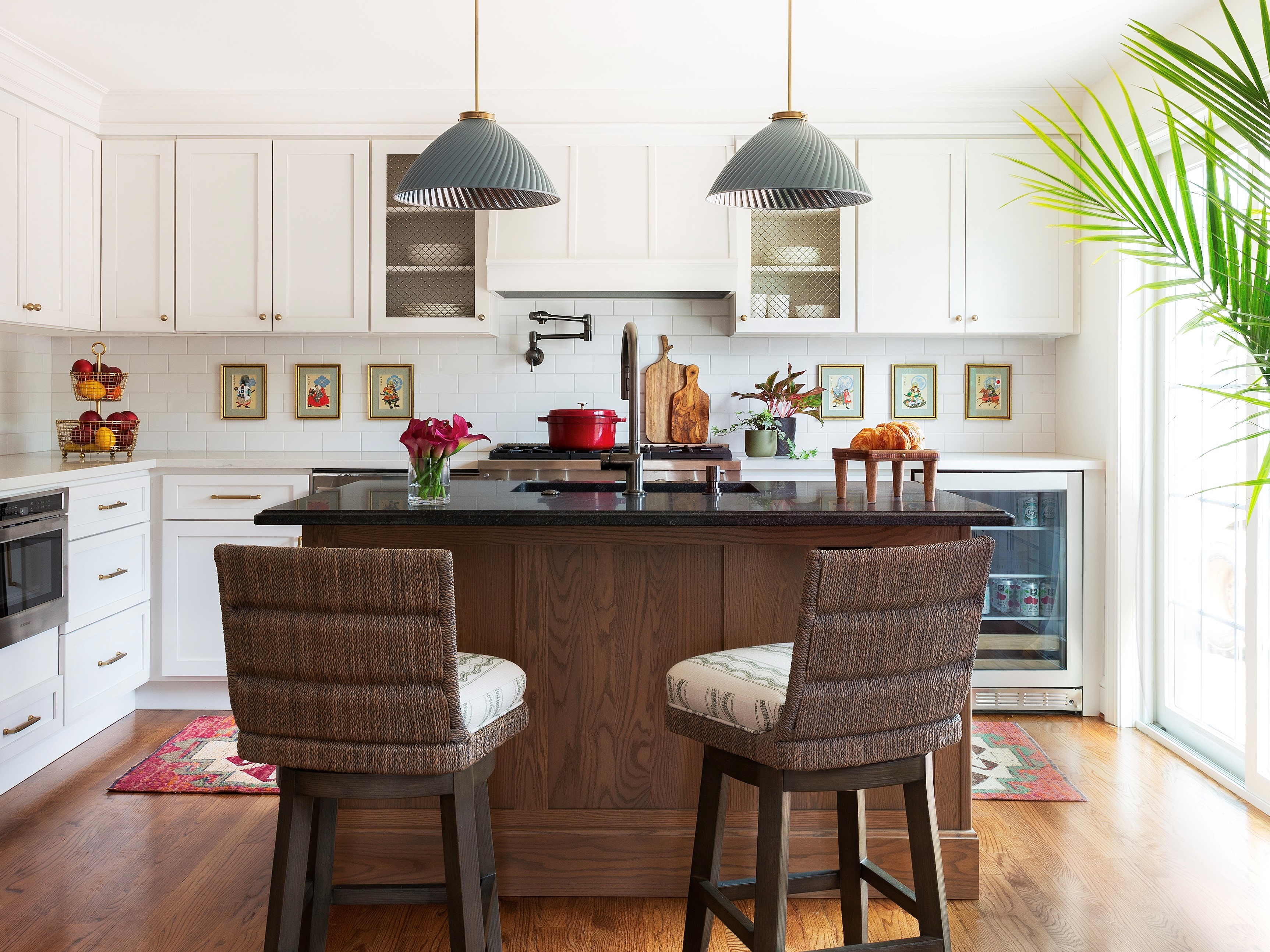
Too many matching 'moments' in a kitchen is a faux pas according to most designers. Jeanne Barber, the founder of Camden Grace Interiors, warns against coordinating your lighting color with your kitchen cabinet color ideas.
“We always cringe when we see white kitchens with white pendants — talk about blah,” she says. “When the cabinets match the color of the pendants, there is no visual depth, and it can feel like you're in a whiteout snowstorm.”
Instead, she recommends installing fixtures that are colorful, textural (rattan is a favorite material), or shiny (go metallic). “Creating contrast against your cabinets will instantly up your style game,” she says.
In the Connecticut kitchen shown above, Barber contrasted the cabinets with a moody gray/green pendant from Hector Finch that features swirled mirrored glass on the inside to bounce light around the space, creating plenty of visual interest.
Price: from $119.99
Rattan pendant lights will instantly add warmth and character to your space, and pop against most cabinetry and benchtop colors. This chandelier-style makes a statement on it's own, but looks equally striking when styled in a series.
4. Keep Scale Top of Mind

Your lighting should always be an appropriate scale in any room of the home, but definitely in the kitchen. Nothing makes a space look less expensive than lighting that doesn't fit with the dimensions of the room.
“Using the wrong size light fixtures in a kitchen can throw off the balance of the overall design,” says Molly Torres Portnof, the founder of DATE Interiors. “Choose fixtures that don't overwhelm the space or, on the flip side, feel way too small — proportion is key!”
Price: $219.99, Was: $233.99
Opting for a multi-light pendant light can help you get the scale and placement of multiple lights right, as most of the work has been done for you. This elegant style — part of Kelly Clarkson's collection with Wayfair — also comes in a range of finishes.
5. Space Your Lighting Correctly

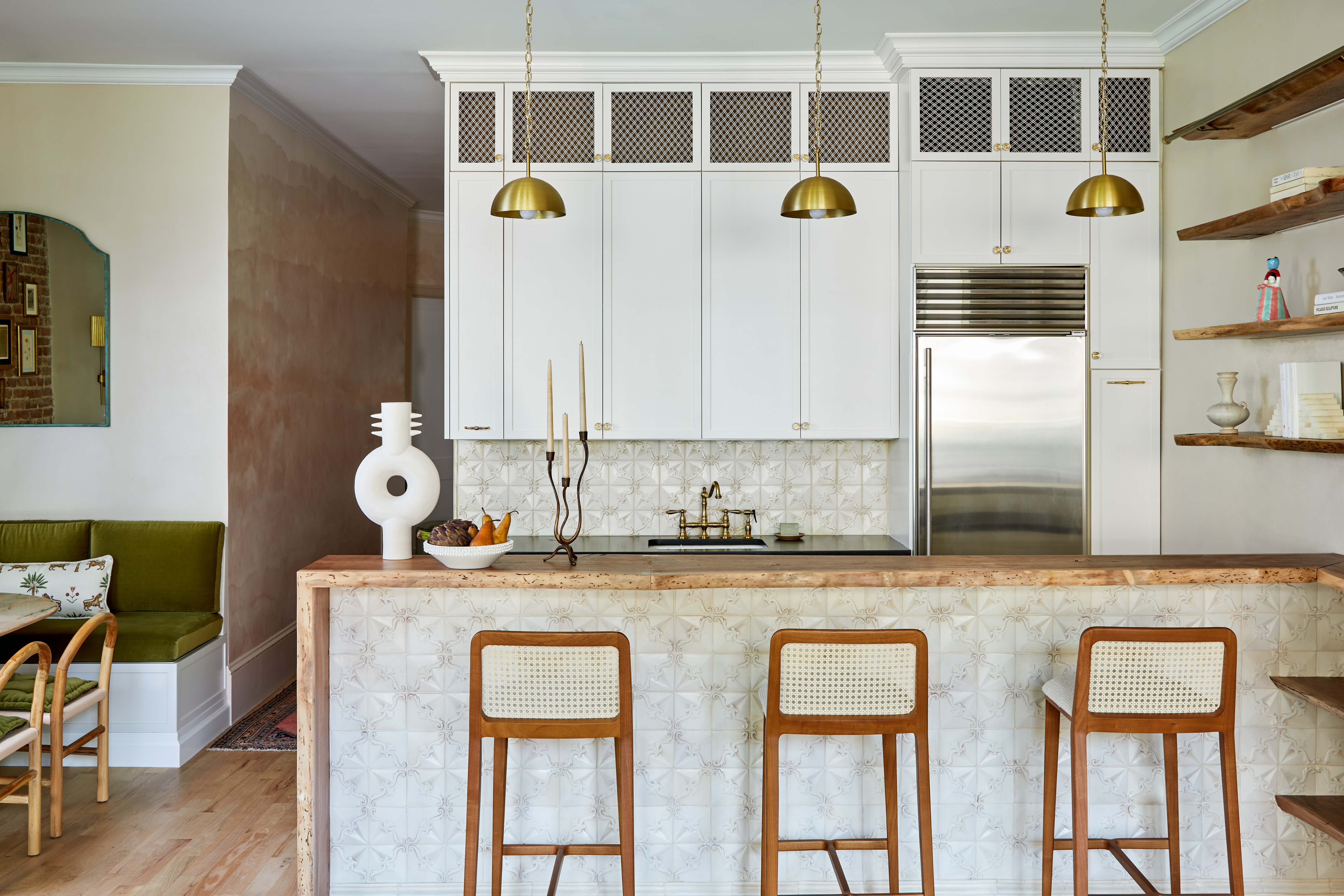
Once you've found fixtures that are properly scaled to the size of your kitchen, you need to ensure you space them adequately. “Underwhelming or incorrectly placed pendants can make the island feel dim or cramped,” Linda Hayslett says.
When in doubt, size up when ordering pendants and be sure to place them evenly, she adds, noting that she “loves using larger pendants to create a focal point while providing essential task lighting.”
The way you balance them in the space can also help make lights that would otherwise feel too big or small for the space, feel more intentional.
With both functional and aesthetic ramifications, following these kitchen lighting design rules will ensure you design a space that looks good and works well. This is a room that you'll interact with daily, so it's important to make sure it had been designed well.


