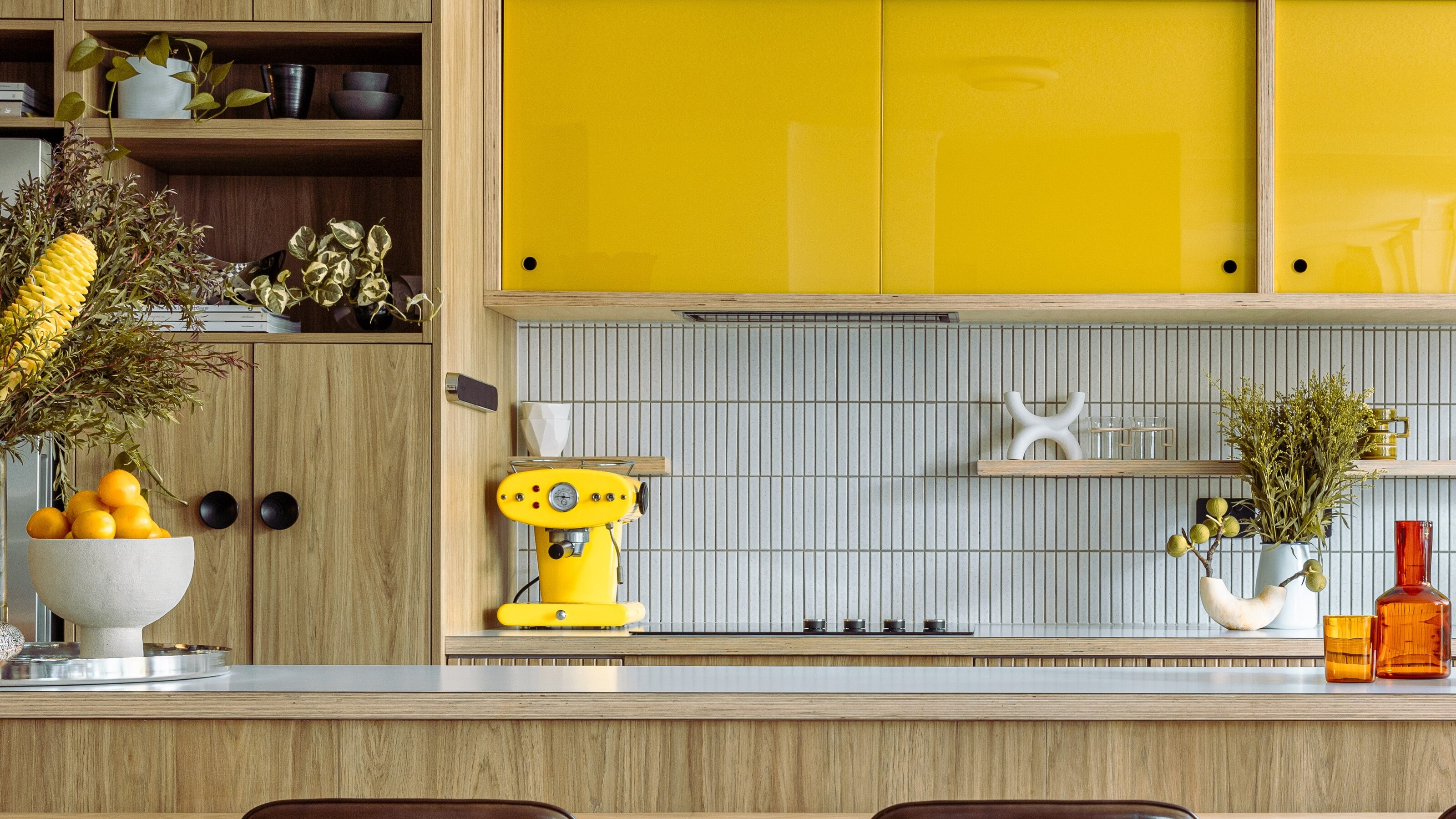
The perfect backsplash blends form and function, providing a wipeable surface that protects your kitchen walls. But not only that, a backsplash is a design tool that helps break up the mass of wall with material, pattern, texture or a block of color to round out your kitchen scheme.
When it comes to kitchen trends, we're seeing a lot of expensive stone backsplash creating high-end kitchens with the likes of marble, granite and veined quartzite used to dramatic effect, but these styles aren't for every budget.
It doesn't mean you should give up hope on having a beautiful backsplash though, and there are lots of inexpensive ways to make this area the star of your kitchen. So put your DIY hat on, we've got some great suggestions for alternative kitchen backsplash ideas that don't cost a bomb, and crucially, look fantastic too.
1. Mirror
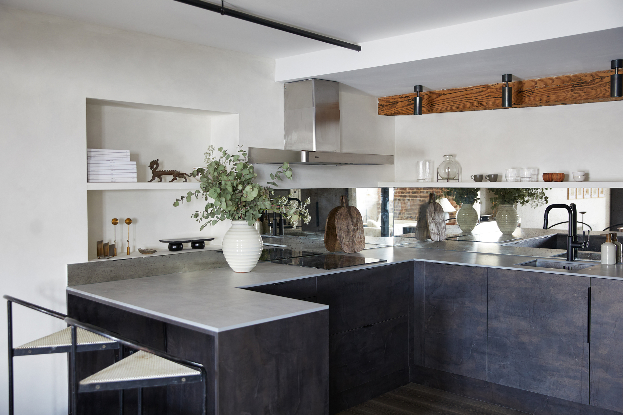
This mirrored backsplash from interior design studio Fare Inc is a sophisticated, sleek, and contemporary and bounces light around the space, bringing a silver sheen that works with the inky blue color palette.
Best of all, the mirror is a cheaper alternative to even some tiles. If you're really looking to cut cost corners, your mirror doesn't need to stretch the whole length of your kitchen, and a smaller rectangular section that sits behind your hobs and tap is simple and easy to DIY.
One concern with the mirror look is that smudges and dirt will really show up. But going for the burnished glass look is an easy antidote to this, also giving your kitchen a rustic farmhouse aesthetic. A good quality antiqued mirror panel can be a little more expensive, but far from the cost of natural stone, and there are cheaper alternatives, like mirrored tiles, too.
2. Stainless steel
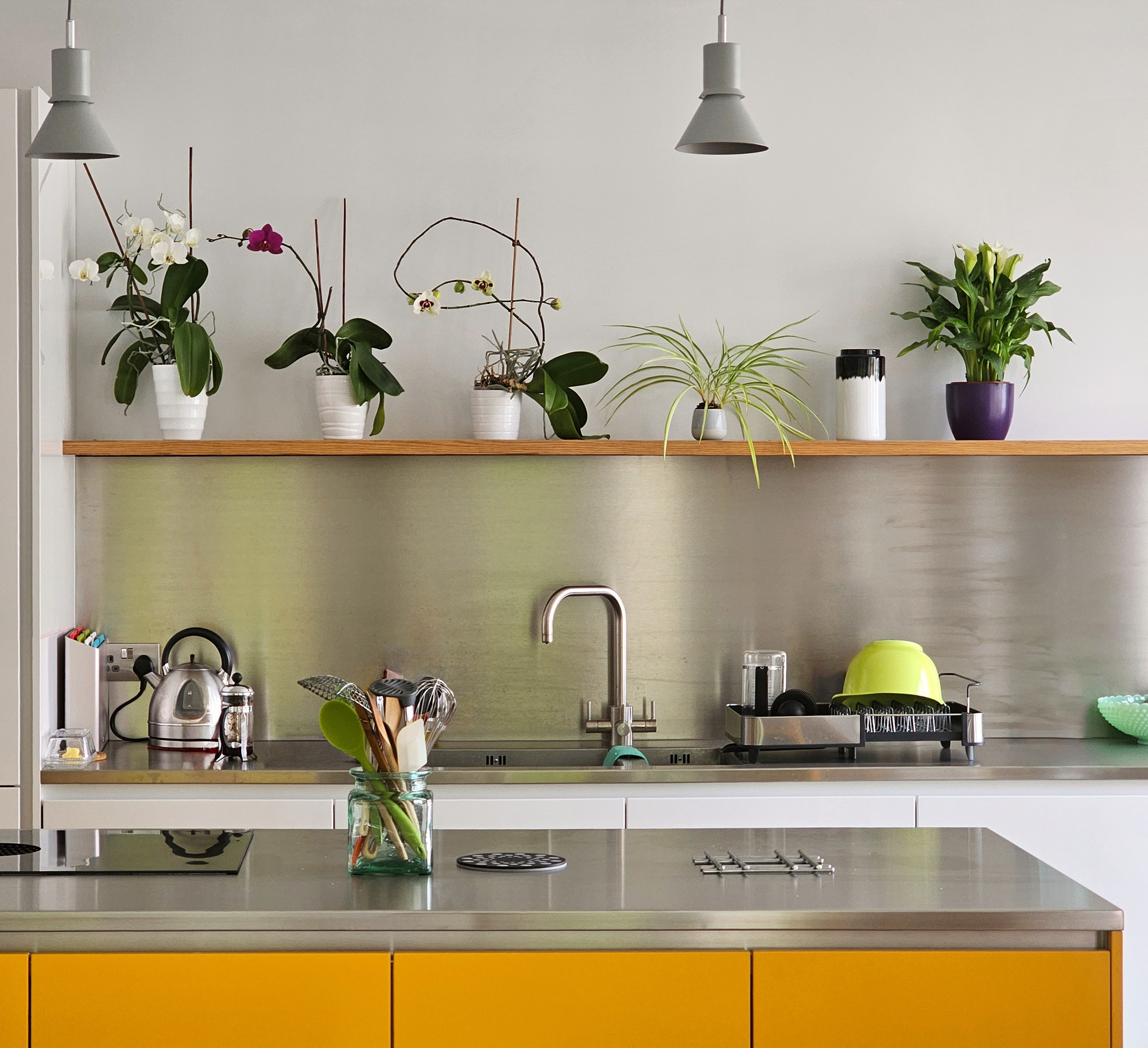
I'm a big fan of the stainless steel kitchen aesthetic, bringing a touch of industrial chic and giving the air of professional kitchens. Choose your larger big-ticket items in stainless steel, or introduce the material as an effective backsplash. Cheap to get hold of, easy to clean and with a luxurious finish that brings a reflective quality to your space, it's a great alternative.
'Stainless steel works out cheaper than marble and some Quartz,' says Richard Gill, director at Paul Archer Design who designed this space. 'It is worth noting that stainless steel is used in commercial kitchens for a reason. It's very robust.
'Another thing to consider is the surface scratches easily, this is all part of owning a stainless steel worktop, the first scratch will look out of place on a brand new worktop or splashback. Over time the scratches become part of the beauty.' In terms of cost, small single sheets say 23"W x 30"H are available for around $25 - $35.
'A key advantage is the sheet can be very thin when compared to alternative materials and can also be easily adhered to a wall. If joint lines are to be reduced, larger panels are available, but the cost will increase,' adds Richard.
3. Ceramic tile
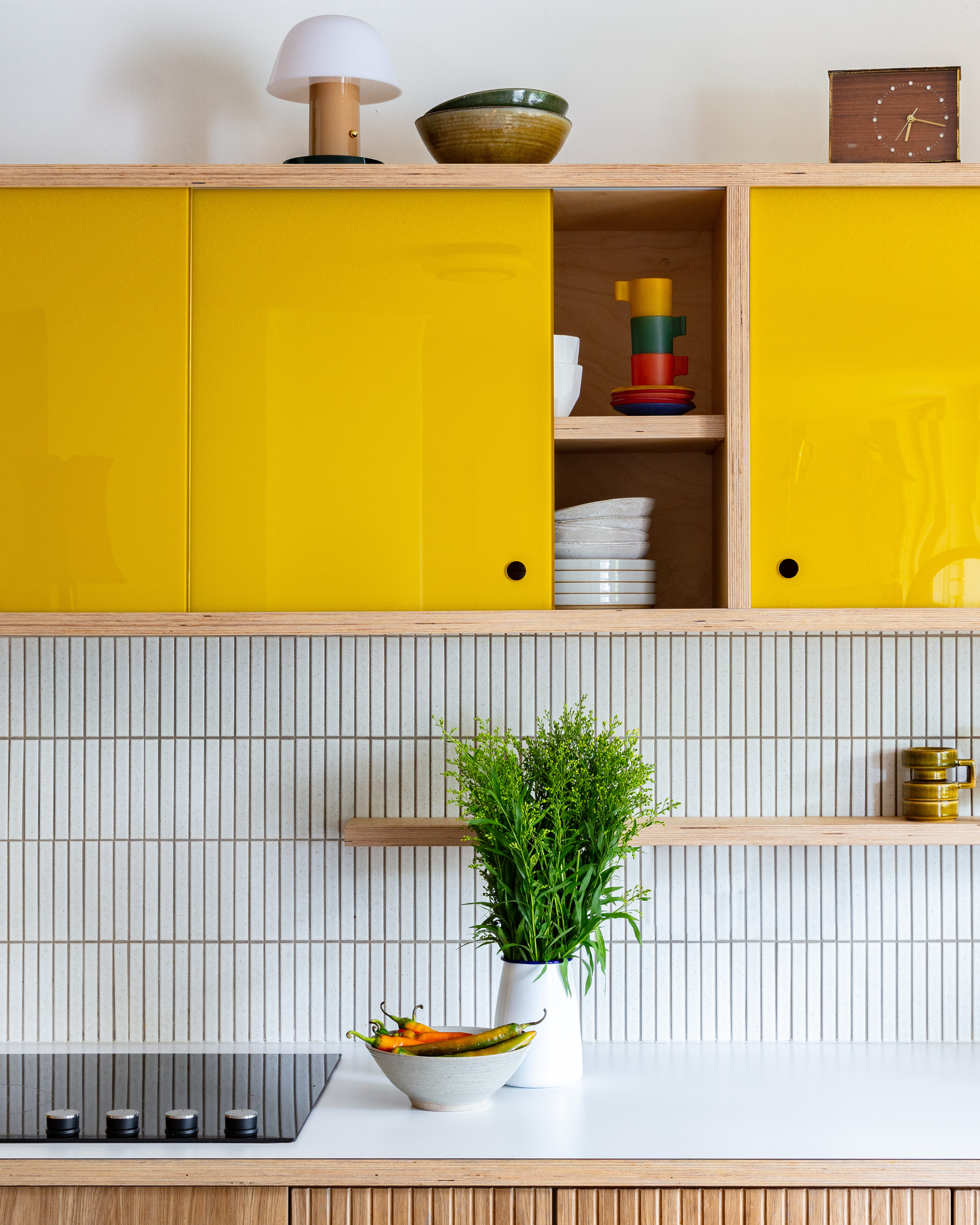
Kitchen tile doesn't always have to break the bank, and it is a cheaper alternative to the likes of quartz or marble backsplashes. 'Ceramic tile is a great option on a budget,' says Nadia Watts of Nadia Watts Interior Design.
What's more, with tile, it's more about the shapes you create against the grout lines and the way you lay your tiles that can look great, not necessarily the quality of the tile. 'A simple subway tile or the time-honored herringbone pattern will always remain classic styles for a kitchen backsplash,' says Kristina Phillips of Kristina Phillips Interior Design. Be sure to match the grout to the ground for a more streamlined, cleaner look, or consider tile and grout color combinations that offset well against each other.
‘Consider playing with pattern and grout thickness to bring a fresh look with a simple rectangular subway-style tile. In the past, we've stacked tile vertically and then increased the grout thickness on the horizontal lines to create a more interesting vertical and horizontal pattern,’ says Kate Marker.
Dimensions: 3'' W x 12'' L
Colors: White, vanilla, kale, green lake, gris, driftwood, black
Price: $119.33 per box
4. Brick
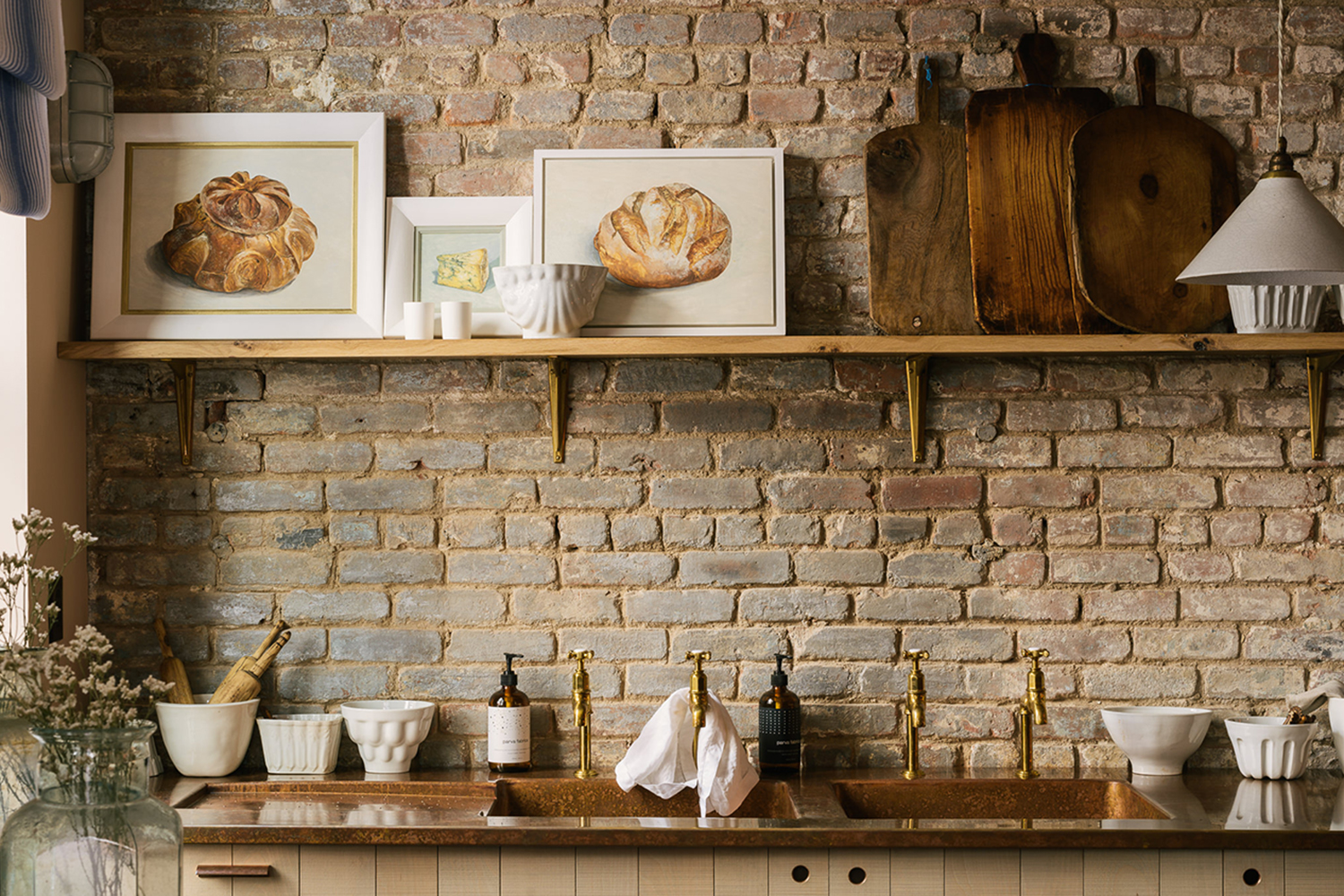
The exposed brick look is timeless, bringing an industrial kitchen look that feels effortlessly cool. It's also an inexpensive backsplash look that is pretty easy to achieve. You can also have fun with the way you lay your bricks, laying them almost like you would tiles with different angles or slanted for a different look.
If you have a lot of wall to cover, you can even angle some of the bricks outwards, making use of all sides of the brick to create smaller niches which you can use as mini shelves.
Just make sure you take care of it to make sure it lasts the test of time, says Jenny Thomas of kitchen experts, Tom Howley. ‘We would recommend a sealant for any exposed brick walls, partly because bricks are difficult to clean.'
5. Get rid of backsplash altogether
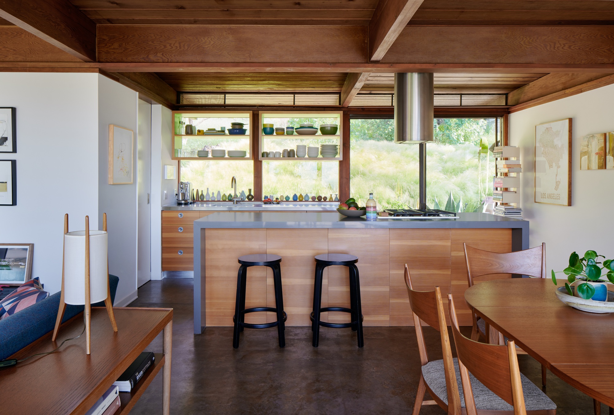
Lastly, if you're in the designing stage of your kitchen, depending on the layout of your home, it might be cheaper to forgo the backsplash altogether. There are plenty of incredible kitchens without backsplashes that look great, and don't compromise the durability of the space too much if planned with a little foresight.
If you're at the start of the remodel, use the space for a long, rectangular kitchen window that gives you a view and lets light in. Creating a feature out of this section is a great way to avoid paying for backsplash decor altogether, and glass is wipe-clean meaning it's easy to look after. '
'In our Rome House project, a house for a chef and an architect, the chef wanted the functionality and ease of a commercial kitchen, while the architect wanted a warm residential aesthetic,' explains Oonagh Ryan, founding principal of the architectural firm, ORA, who designed this space.
'The chef drove the material choices in the kitchen. Rather than utilizing a typical backsplash, the design sets the exterior windows directly on a stainless steel countertop, increasing natural daylight and expanding views to the outside.
'Open plywood kitchen shelving floats in front of the frameless glass, framing garden views, providing a display for the owner’s ceramics collection.'

