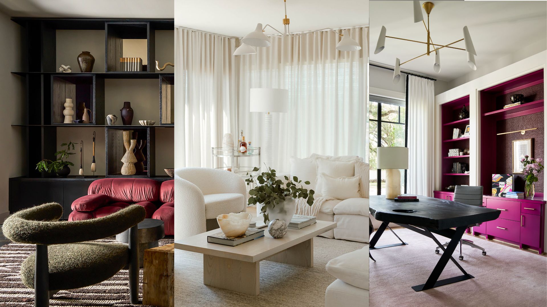
Expensive color combinations are those that designers are turning to most right now. The interior trend dial is set quite firmly towards spaces that make you feel wonderful, that exude a lavishness that is both opulent and inviting, allowing you to curl up in and feel comfortable in, while also giving you the sense of living your best life.
But in order to get that expensive feeling just right, tones need to be paired to perfection, colors contrasting in the most considered way. 'When balancing room color ideas, it is important to incorporate variations of shades and intensity,' says Lauren Svenstrup, founder of Chicago-based interior design firm Studio Sven. And it's this interplay that is where the notion of luxury truly comes in, a trick that these designers know exactly how to get right.
1. Dark pink and olive green
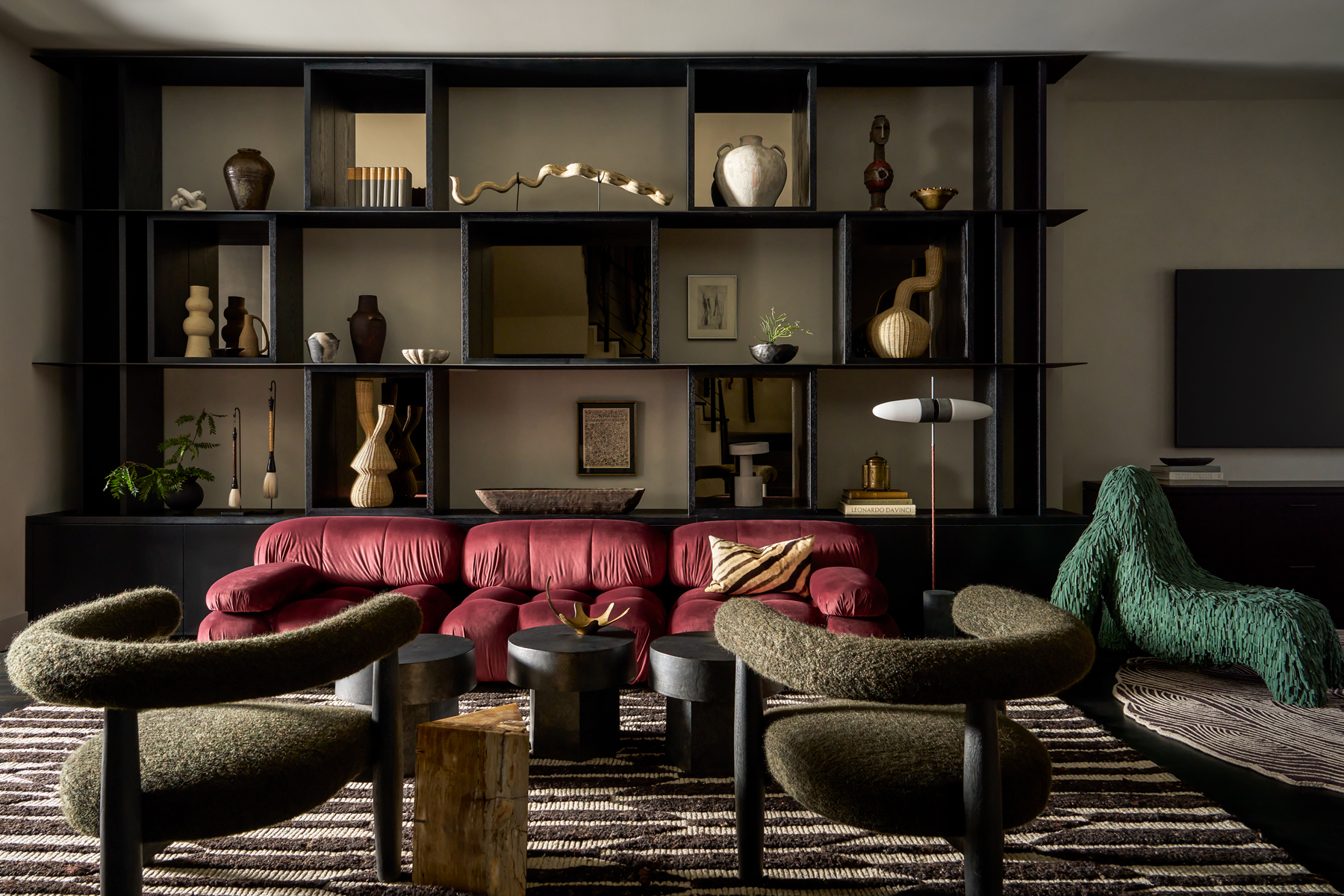
The feeling of luxury in this living room by Chicago-based interior design firm Studio Sven doesn't just come from the rounded forms of the accent chairs or Camaleonda sofa. In fact, it's the pairing of a deep, dusky rose on the couch and the sophisticated olive green walls, an adult update of the classic pea green and blush pink decor scheme.
The reason they look expensive together is that both colors are perfectly and considerately matched. 'We never shy away from a bold color, but knowing how to balance it is key,' says Lauren Svenstrup, the studio's founder. 'This home started with a neutral textural background of Revere Pewter Limewash [by Benjamin Moore] and blackened millwork, allowing for the standout hues to feel impactful and realized. The jeweled plum sofa is the most saturated, while also having a bit of a reflective nature. The suede fringe of the green gorilla chair is a step down in tone and softness, while the olive mohair barrel back chair has just enough color to tie the palette together and complement the brighter tones in the space.'
2. Mustard and teal
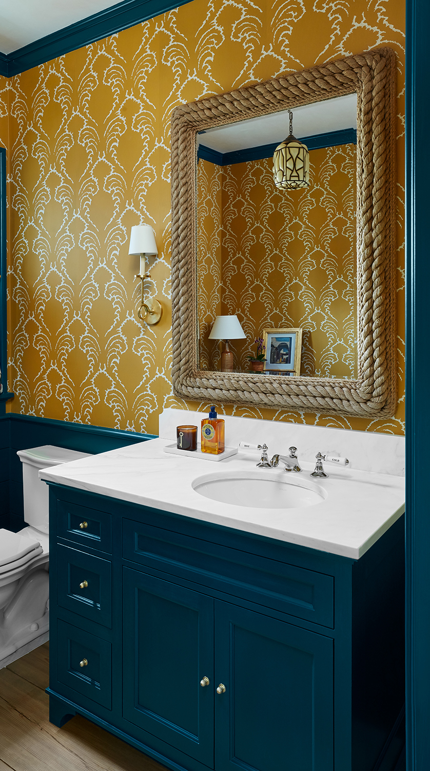
Powder rooms are perhaps the most fun places of the home to give an expensive decor twist. It's here that imaginations can run wild, being a room guests don't linger in but always remember if it's done well. Wisconsin-based interior designer Teresa Manns employed the theory behind the color wheel when looking to create an opulent scheme.
'The powder room color palette jumped off of the fabulous Pineapple Frond wall covering in Ochre by Soane,' Teresa says. 'I wanted to lean into a strong color with the trim to give the paper more zing so that the room felt energetic rather than somber. Blue and yellow are opposites on the color wheel, so while this mustard and teal combination skew slightly off, each has enough saturation that they embolden one another, giving the room a luxe feel.'
3. White and cream
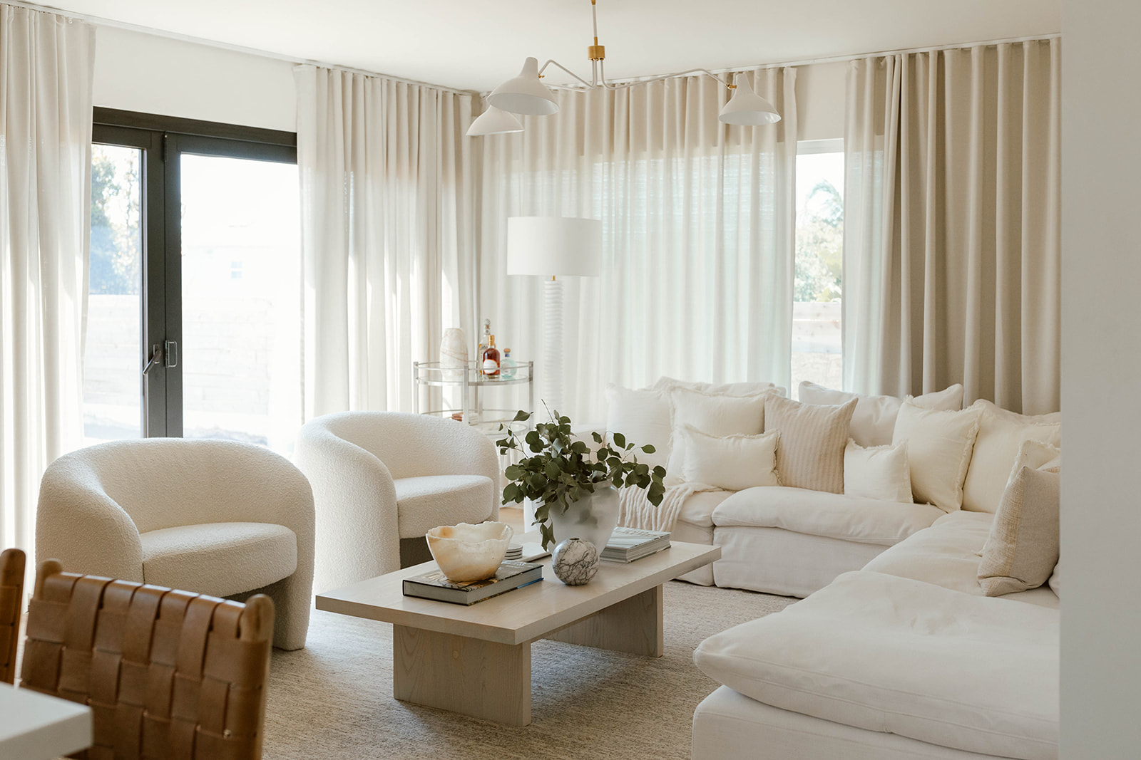
An all white space can look cold or clinical. An entirely cream room tends not to have enough variation of tone to feel interesting, reading as merely one-note, instead. But as this cream living room designed by California-based studio Design Hutch shows, pair the two and you've got an expensive color combination is both warm and layered.
'This is a layered space,' agrees the studio's principal and founder Brooke Spreckman. 'It is filled with a lot of soft neutral fabrics that all bring something of their own to the table. My main goal was to create a light and airy room, but in order to keep it from “flying away” I weighted it down with a lot of texture and neutral tones. I made sure to mix the types of white-like tones and various textures. Even the shade fabric is more of a cream that helps give the room an overall warm glow.
And it's that warmth that, when you're in it, feels expensive. Like the cosseting of a cream cashmere sweater or the charm of a white tux.
4. Black, white and fuchsia
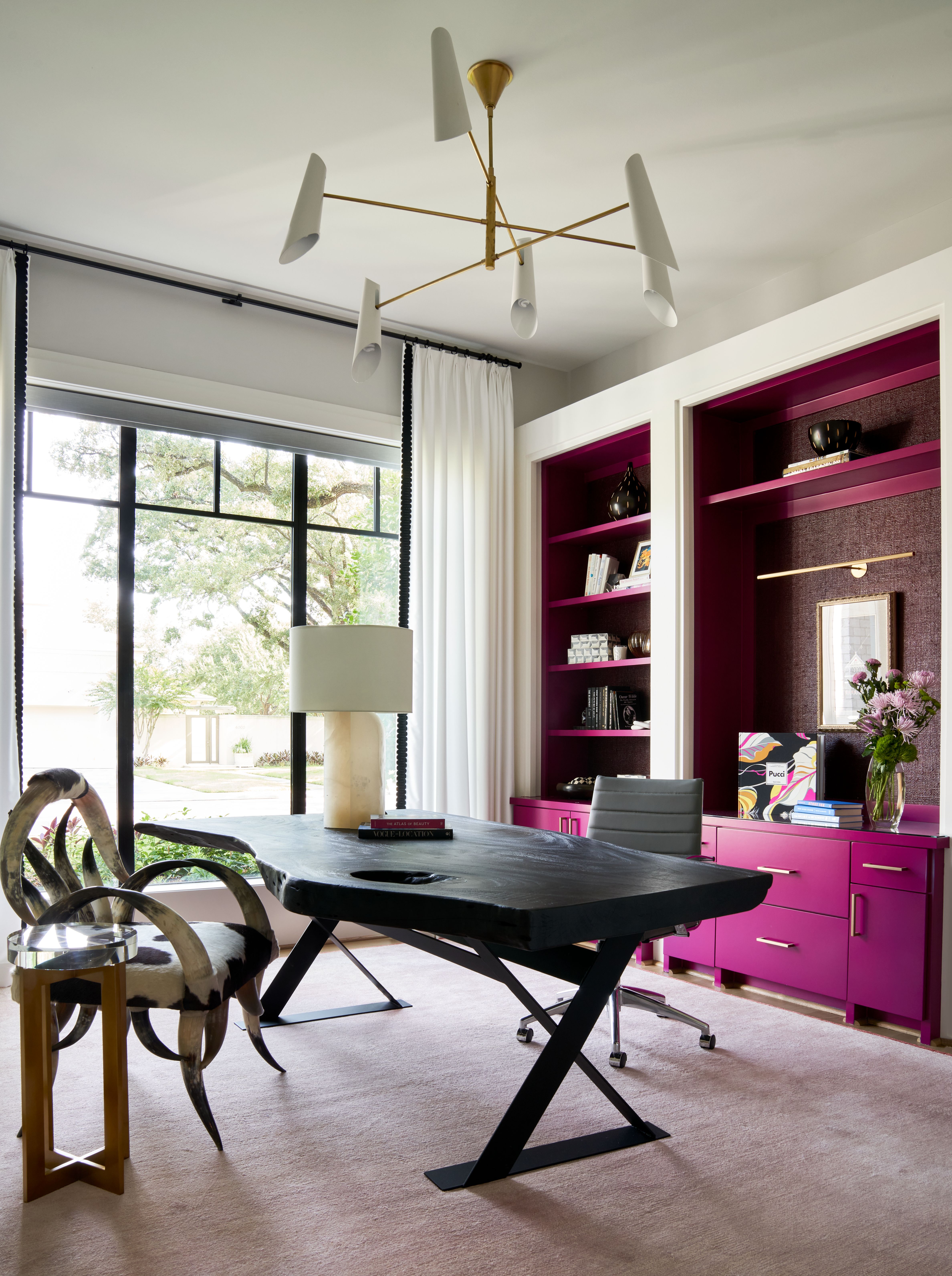
The opulence of this home office comes not just from the large desk and impressive light fitting, but from the hit of fuchsia used on the millwork, an addition that feels expensive primarily because it's so unusual to see it used so large. It implies that everything here was custom, and therefore luxe – even if the same impression can be applied with the right can of paint.
'We went with pink as it’s the client’s favorite color,' says Laura Umansky, founder of the Houston-based studio Laura U Design Collective. The trick to making it seem expensive, though, was in the richness of this deeper hue. 'We tested several colors onsite and there were definitely some other shades of pink we avoided that looked too youthful or too bright,' Laura adds. The cabinetry is given an opulent gleam by the gold hardware, and softened by the textured and lighter pink in the area rug.
5. Red and white
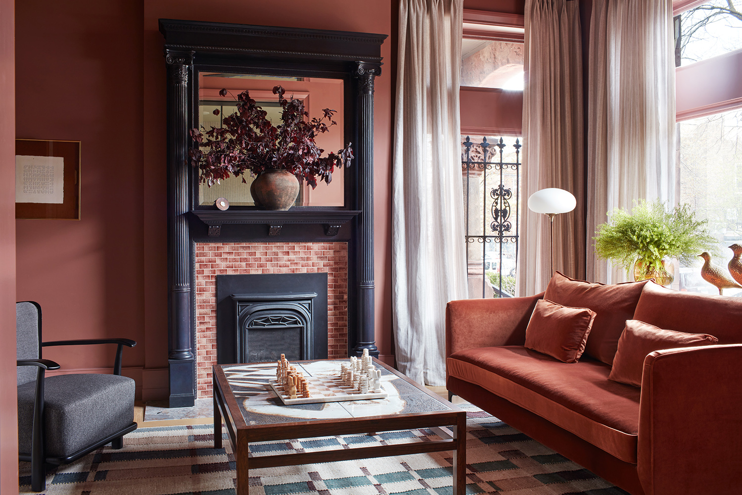
There has been a lot of discourse lately about the unexpected red theory, and how a dash of the color makes a room feel instantly more expensive. But what if you take that premise to the max? Chicago-based studio En Masse Architecture and Design completed the architecture on this home using deep shades of crimson to really highlight the height of the walls, forcing the eye to notice all that space. It was a very expensive-looking move.
But to stop the red from becoming too much like a 1970s take on luxury - think deep pile red carpet next to red velvet couches - the addition of white curtains creates a more contemporary feel, while detracting none of the lavishness. It cuts through the red's vividness, a little slither that only serves to make the main shade look even richer and, yes, more expensive.