If there’s one thing we know for sure, it’s that The Block teams are always onto the most up-and-coming design trends. Last year, Steph and Gian put Japandi on the map. This year, we’ve seen a spotlight on Coastal Grandma and Mediterranean with a modern twist. Week five’s main bedroom reveals were full of interior trends to take inspiration from. Here, we highlight five of the biggest ones.
The Block bedroom trends
Step aside beige and boucle, this is what’s in now.
1. Coffered ceilings
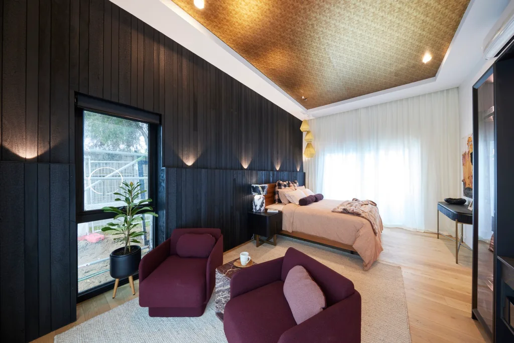
We’ve moved beyond feature walls, with feature ceilings being the next big thing. Coffered ceilings, which are recessed and often have sunken panels, bring an extra element of interest. These can be highlighted with lighting, as Ricky and Haydn did in their main bedroom. Or lined with wallpaper, as Kylie and Brad did with a bronze metallic design that completely shifted the mood of the room.
2. Asymmetrical details
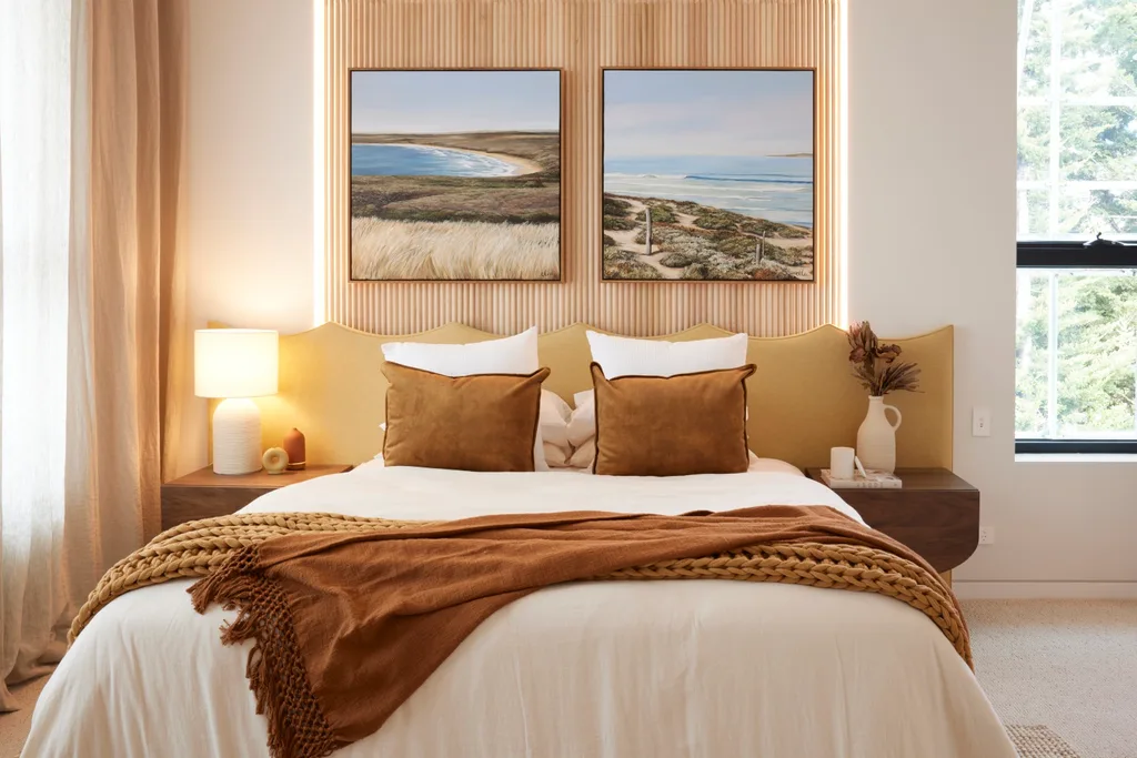
“Asymmetry seems to be really consistent through this season of The Block,” judge Marty Fox pointed out. Traditional design styles lean towards symmetry, as it gives a sense of order. Yet The Block team Mimi and Kristian are proving asymmetry can contribute to a calm space too. Their earthy and emerald-toned bedroom in week two had an asymmetrical bed backing that gave the room a contemporary feel. While it may be on trend, Marty stressed it shouldn’t come at the expense of functionality. He wished Mimi and Kristian had two bedside lamps in their main bedroom, instead of one. We hope they continue to embrace trending asymmetrical details, taking this feedback on board.
3. Curves and arches everywhere
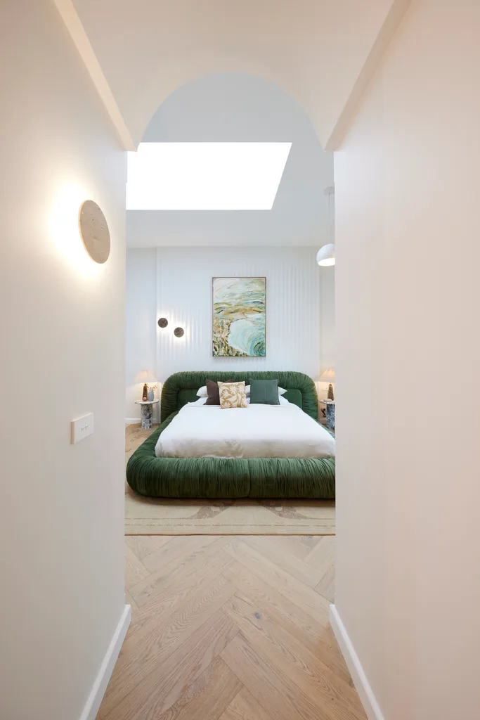
Arches are back in style in a big way and we’ve really seen them shine in this season of The Block. This week, Courtney and Grant went the extra mile by creating an arched entrance to their main bedroom. A curved wall was also created in their first bathroom and they had curved skirting boards in their guest bedroom, which judge Darren Palmer admired for the craftsmanship involved.
4. Next-gen timber panelling
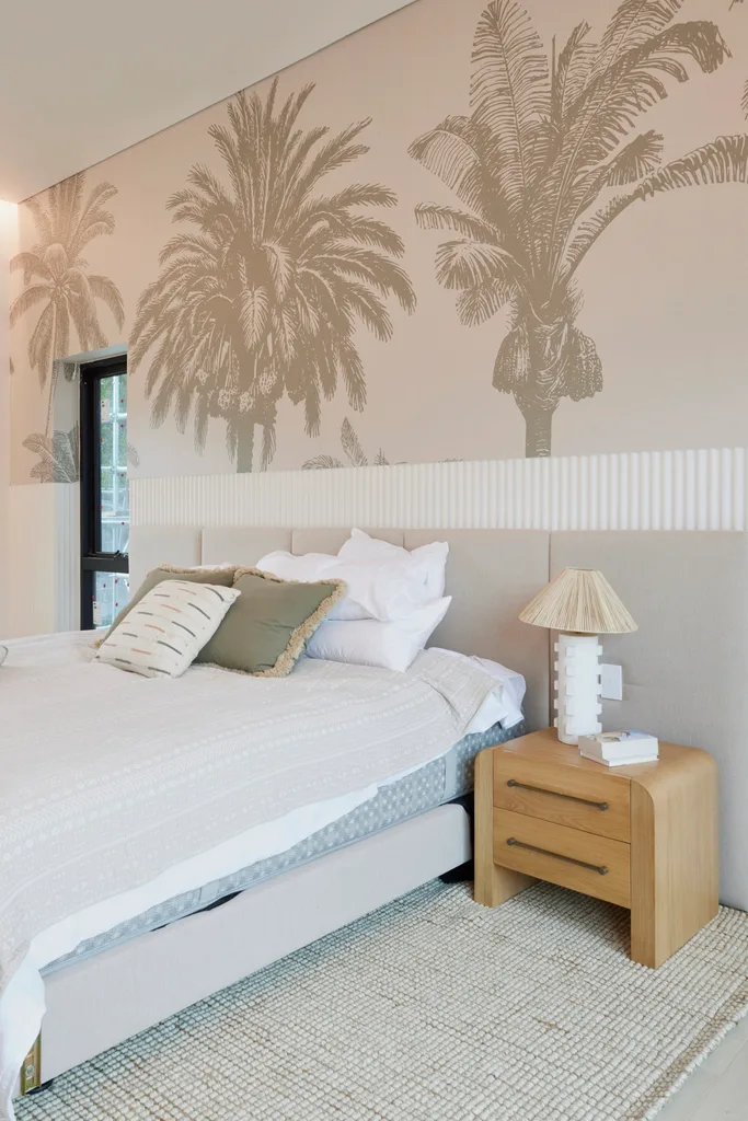
While VJ wall panelling was the big thing for a while there, we’re seeing other options rise in popularity. Modern white Porta panelled walls appeared in the bedrooms of a couple of bedrooms this week. But ‘shou sugi ban’ has been the breakout timber feature wall of the season. The charred black panels have become a consistent feature throughout Kylie and Brad’s moody modern beach house.
5. Toasty warm tones
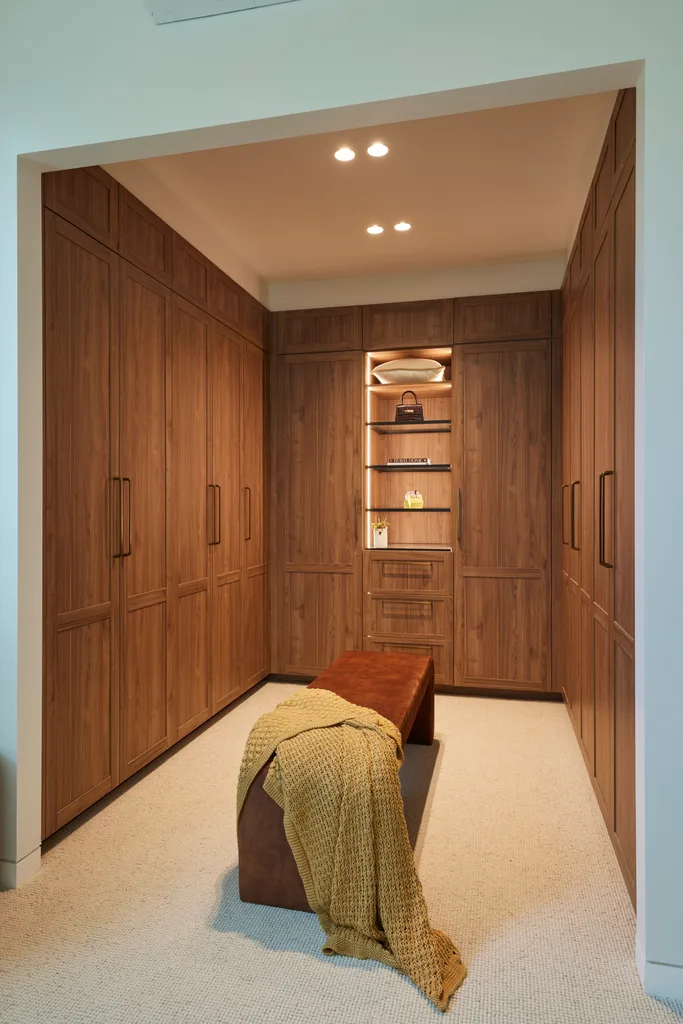
As was pointed out in Maddy and Charlotte’s main bedroom this week, there’s a shift towards rich, warm tones in interior design. “The walnut is definitely on trend,” Darren said, referring to the wardrobe. “These warm greys are definitely on trend.” Colour, pattern and personality are back in a big way.
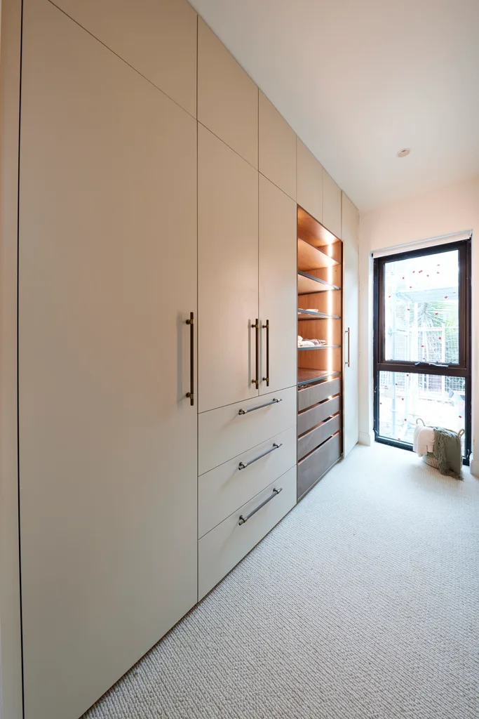
The Block 2024 main bedrooms and walk-in robes
Here’s how the teams went in week five.
Tied 1st place: Courtney and Grant
Looking around their room midweek, foreman and former contestant Dan Reilly, who appeared on the show with his partner Dani, was concerned. “Have you guys bitten off more than you can chew this week?” he asked. Yet Courtney and Grant were confident they could deliver – and they did, tying for first place with Mimi and Kristian. “This is 2024 style, next level,” Marty swooned seeing the finished result.

“It’s nothing we’ve ever seen before,” said Shaynna. “It has a very Italian feel to it.” The recessed curtains, plush green bed frame, Porta panelled feature wall and expansive skylight combined for elevated results.
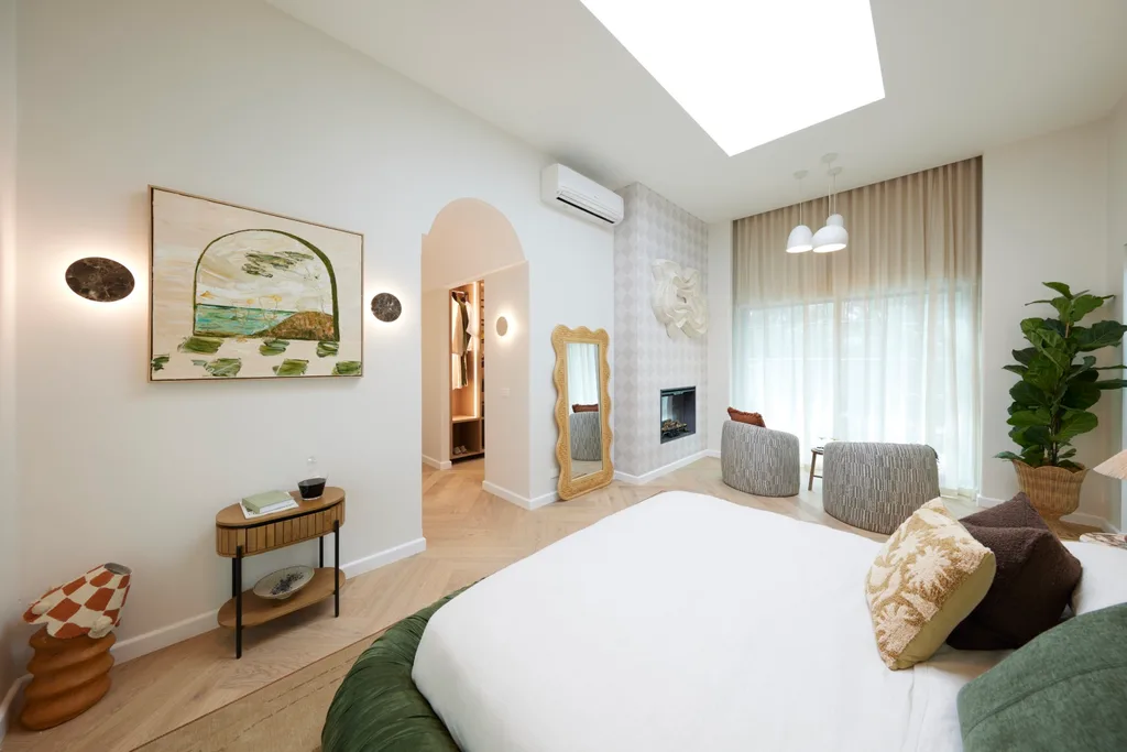
Although Marty didn’t like the “fake flames” in the fireplace, he felt buyers would become emotionally attached to the space. “This is the most marketable room we’ve seen so far on The Block,” he said. “These guys are operating in a league of their own.”
Score: 28/30
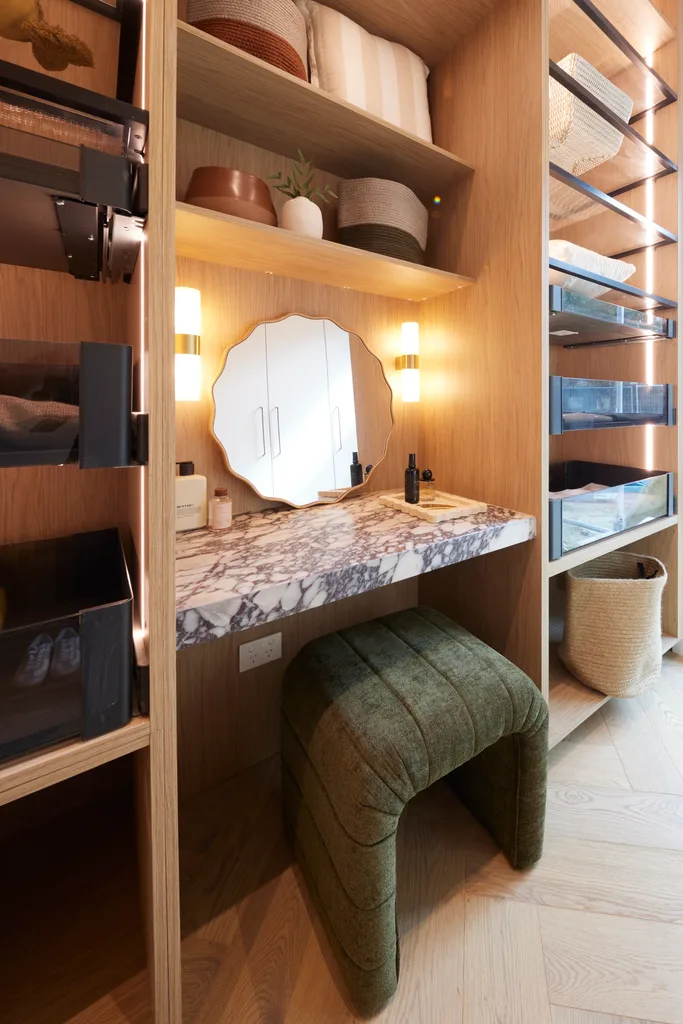
Tied 1st place: Mimi and Kristian
“This is by far the most hotel-like room that we’ve walked into, in terms of finesse, calmness and sophistication,” said Marty, who pointed out the waved bedhead from Steph and Gian’s brand Japandi Estate. The only double-storey house in The Block this year, its raked ceiling was an impressive sight. Even more impressive (in Darren’s opinion) were the sheer curtains designed on a rake in such a short timeframe.
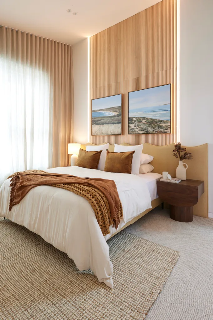
This team won the Hafele wardrobe upgrade, which gave their soothing room an extra touch of opulence. “This is not just a holiday home, this isn’t just a place to retire to,” said Shaynna. “They’ve created a lifestyle in this house. It feels coastal. It feels warm, it feels inviting. It says Phillip Island. I can imagine people wanting to buy this to live in for the rest of their life.”
Score: 28/30
2nd place: Kylie and Brad
This week cemented the feeling that Kylie and Brad had found a way to execute their bold style in a palatable way. “They’ve hit their look and feel now,” said Shaynna. The judges agreed the black ‘shou sugi ban’ wall was the hero, along with the statement metallic wallpapered ceiling. “Now they’re nailing the materiality,” said Marty, who felt the quirkiness would stand out for buyers.
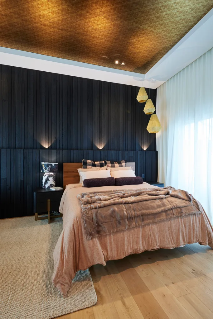
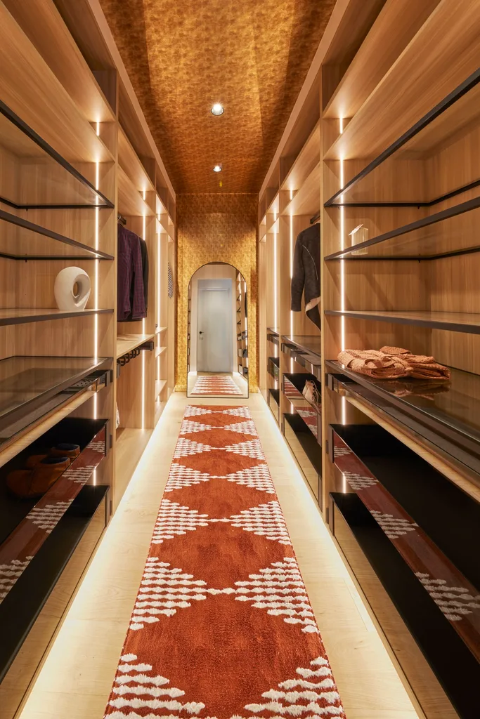
There were a few notes from Shaynna, who would have lowered the pendants next to the bed. Yet the wardrobe had them finishing on a high. “It’s like walking into a jewellery box,” said Darren. “I liked the wallpaper in [the bedroom], and I love it in here. It just looks so opulent and luxurious. This rug is such a good inclusion.”
Score: 27.5/30
3rd place: Maddy and Charlotte
New team Maddy and Charlotte replaced Jesse and Paige, who decided to leave the show. Visiting former contestants Ronnie and Georgia got them started with a room design that continued the aesthetic Jesse and Paige began in their house, but after coming on mid-week the sisters made some tweaks. “This is definitely an evolution of that modern colonial style,” said Darren.
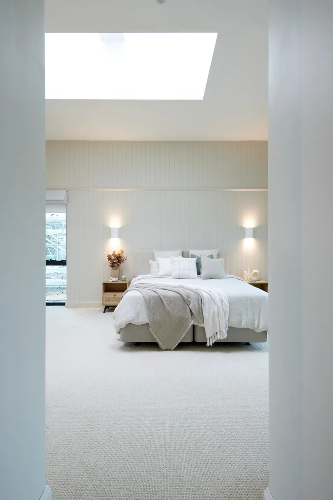
With fresh whites and a coastal feeling, Marty liked the new direction. “I love that they’ve elevated the space,” he said. “It feels a little bit more expensive.” There were some sloppy elements, but it was successful overall. “These guys know what they’re doing,” Marty said of the house-flippers moonlighting as accountants. “The fact they can pull this together in less than a week blows my mind.”
Score: 24.5/30
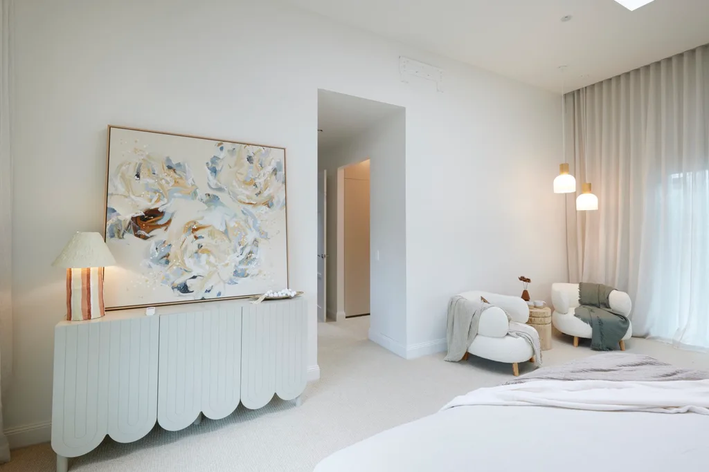
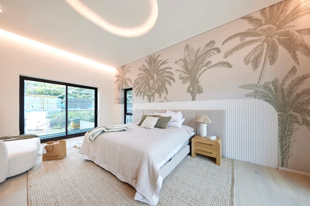
4th place: Ricky and Haydn
The holiday resort style continued in the boys’ main bedroom with palm tree wallpaper. “Look at that ceiling,” said Shaynna of the glowing halo in the coffered ceiling. The room was left unfinished, without window coverings or decor elements like a doona cover. “I wonder if the time and effort that went into that feature is the reason we don’t have sheer curtains hanging,” Marty pondered.
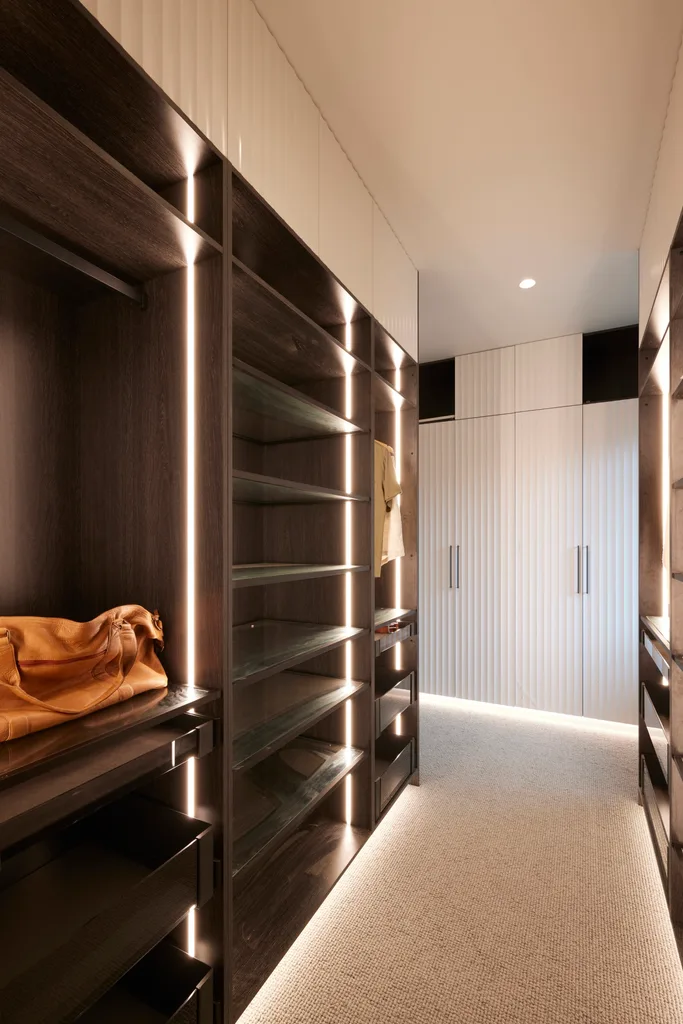
The wardrobe also left the judges underwhelmed. “I’m trying to understand why they put carpet here, walking straight from the bathroom,” said Shaynna. “Timber should definitely still be in here,” agreed Marty. The judges finished with a plea to Ricky and Haydn to step up the planning and attention to detail.
Ricky and Haydn: 21.5/30
Tune into The Block 2024 on Sundays at 7pm and Mondays, Tuesdays and Wednesdays at 7.30pm on Channel 9 and 9Now.
Take a tour of all The Block holiday houses so far
In case you missed it:
This article originally appeared on Home Beautiful and is republished here with permission.


