Entryways need to work hard, small entryways need to work even harder. We ask so much of these spaces, they need to be functional, provide storage for all sorts of (often quite bulky) items, and of course they need to do all this while looking wonderful too. The entryway is the first thing both you and your guests see, it can set the tone for the rest of your home, so aesthetics are as important as practicalities here.
When it comes to designing a small entryway that gets this perfect balance between form and function, the furniture you bring in and the way that furniture is laid out are key. You probably think you don't have much to play with in terms of layout options when square footage is lacking, so maybe it's better to look at what you should avoid doing and use that as your guide. We spoke with designers to find out what mistakes you can make when laying out a small entryway, and more importantly, how to avoid them.
1. Keep the layout open
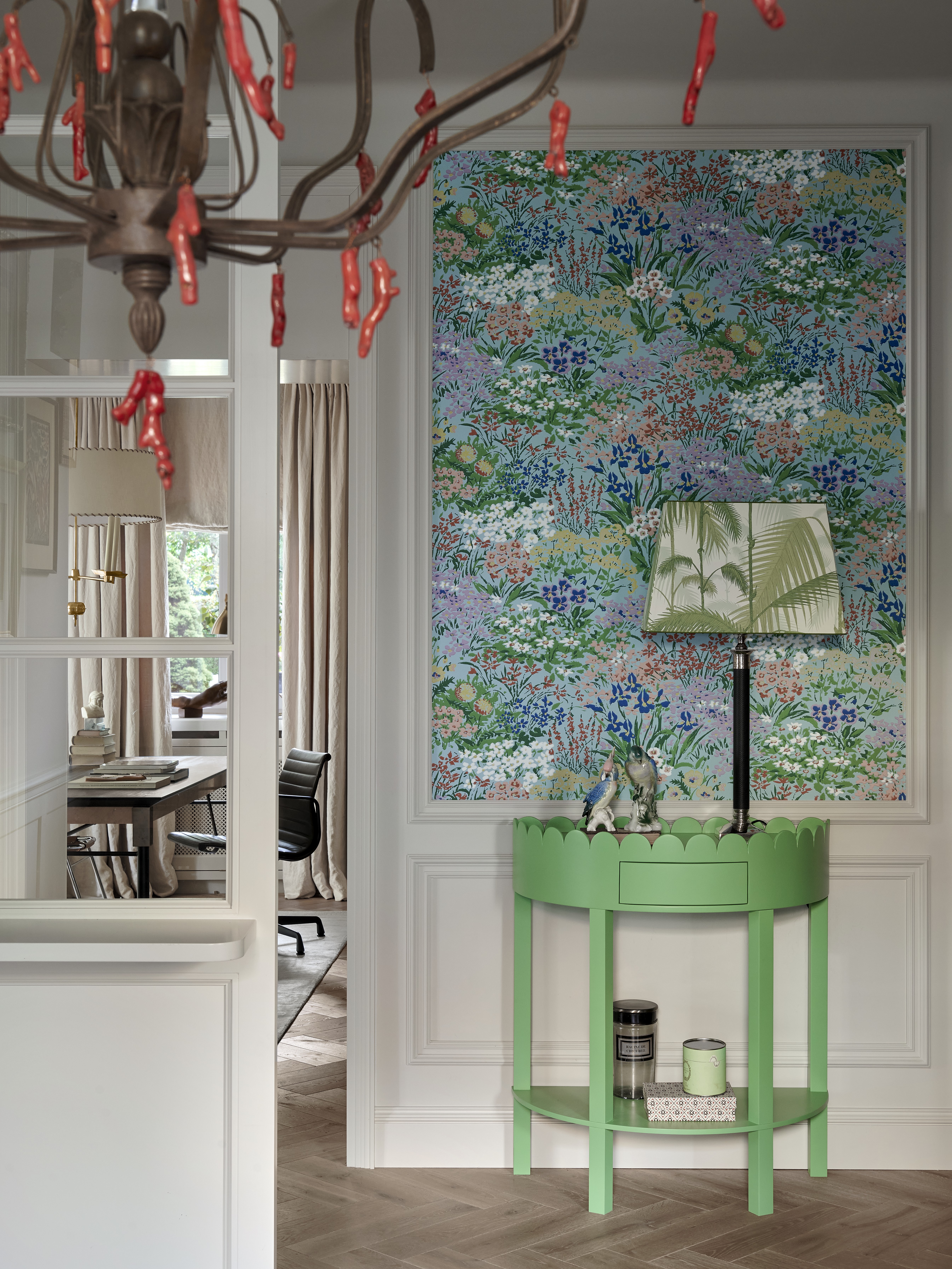
In any small room, you want the space to be as open as possible, you want to avoid anything that's going to add visual bulk or block light from flowing easily around the room.
'When designing a small entryway, certain layouts should be avoided to maintain a sense of openness and ease of movement. For example, avoid placing a large piece of furniture, like a heavy coat stand or bulky side table, directly opposite the entry door. While it might be functional, this creates a physical barrier that disrupts the flow of the space and can make the entryway feel cramped and unwelcoming.' explains designer Kati Curtis.
'Similarly, avoid positioning entryway furniture or decor that blocks the natural path from the entrance to the rest of the home. Such a layout can create a bottleneck effect, especially in high-traffic times,' she adds.
'When designing a small entryway, it's important to avoid layouts that can make an already small space feel cluttered or cramped. Steer clear of overly large or bulky furniture pieces that can obstruct the path and create a congested feel,' agrees Emma Deterding. 'It's also best to avoid placing furniture or decor items along the center of the entryway as this can impede movement and make the space feel even narrower. Opt for open, streamlined furnishings that help to create the illusion of space rather than anything extremely ornamental or detailed which can overwhelm the space further.'
2. Don't clutter the walls
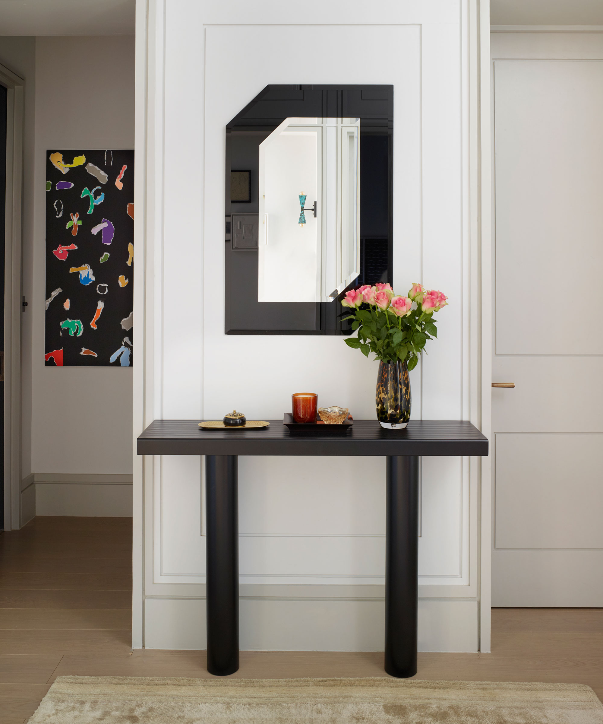
This is a tricky one, you don't want to add anything too central to your small entryway, as per the last point you don't want to break up the space, but equally you want to avoid crowding your walls with furniture too. The answer to pair back, bring in just a few pieces of hardworking furniture and keep your walls clear from too much decor. An entryway mirror above a slim line console or a set of prints nearly running along one wall is all you need.
Kati Curtis advises to, 'resist the temptation to line the walls with furniture or decor. This layout can eat into the available space and make the space feel smaller and more enclosed. Instead, to make the entryway feel bigger and more open, opt for a minimalist design with a few essential, well-placed functional pieces to maintain a sense of spaciousness.'
3. Pick the right sized furniture
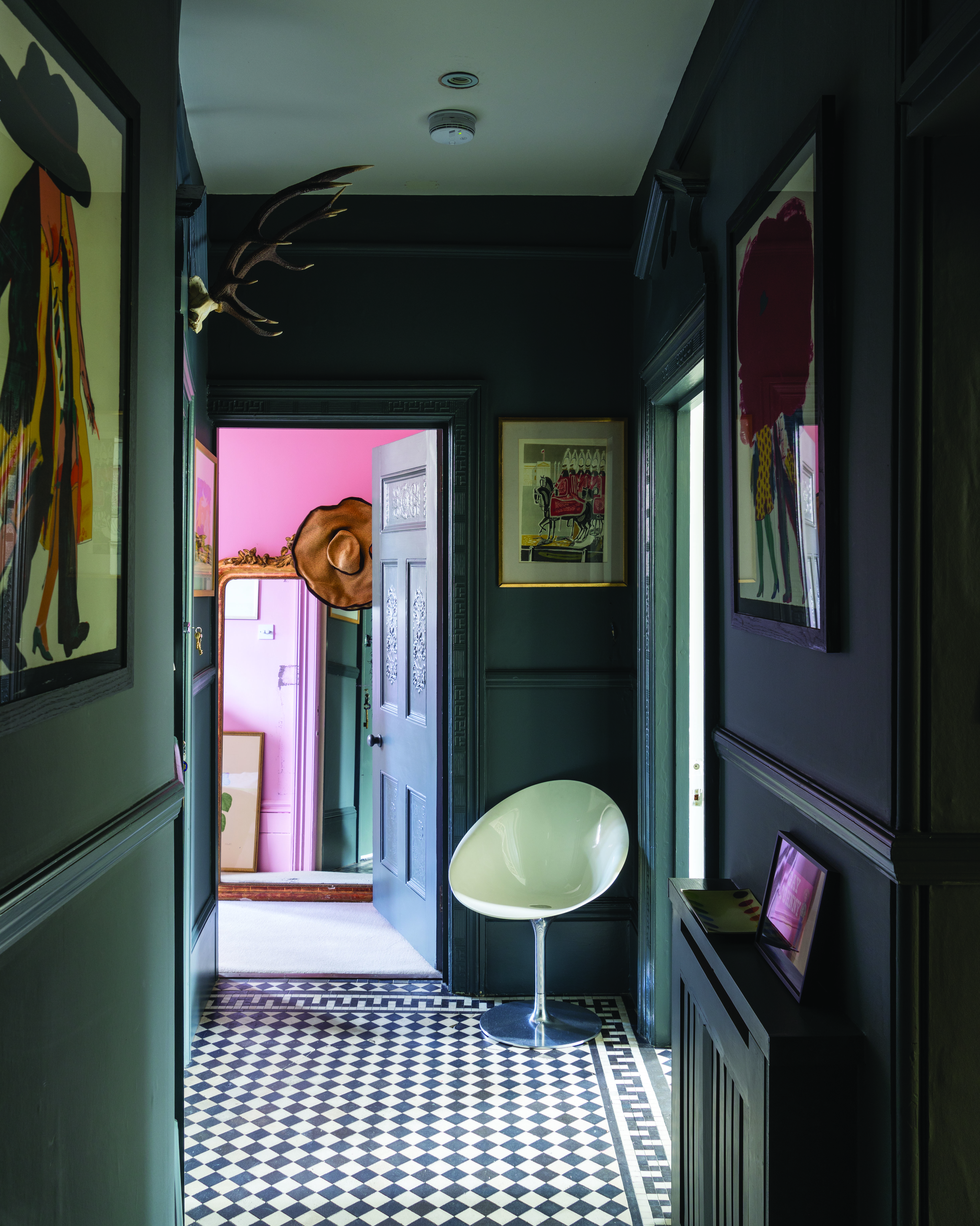
This is a key part of a successful entryway layout. You could follow all the layout rules, but if you furniture you choose is wrong the space is still not going to work. As we have now mentioned many a time, you want to avoid adding anything too bulky, nothing that's going to dominate the space and block the eyeline through the space.
'If you are tackling a small entryway get rid of large bulky consoles and sideboards,' suggest Jen and Mar, Co-founders of Interior Fox. 'Instead, opt for a smaller floating shelf. This will give you all the benefits of a table, but with a much slimmer frame, it keeps the floor clutter-free. Then maximize the wall space by adding in an oversized mirror that will bounce around the light and make the space appear much larger.'
Kathy Kuo agrees, 'I like to keep a small entryway nice and breezy and not too cluttered or claustrophobic. I would avoid large or bulky console tables and sideboards in favor of demilune consoles, benches with built-in storage, and stylish floor baskets. I'd also advise making use of your wall space with hooks and shelving so that you maximize your floor space where you can.'
But, that being said, you don't want to go too small with your entryway furniture either. Small furniture floating in a small space can make the room feel cluttered and actually end up looking smaller. 'The principal mistake in small entryway design is not getting appropriately sized furniture. If you have a small space and you put small furniture in it, sometimes that actually makes it feel smaller,' agrees Robin Gannon.
'Small foyers are like little jewel box areas. It’s the first entry point to the house, and you want to make a good first impression. Another thing that helps a small entryway not feel as small is if it’s lit well. You want to always find a place to drop your keys and place your bag, whether that’s a hook or a narrow table – but to me, it starts with ensuring you have the correct-sized furniture and lighting.'
4. Make your layout flexible
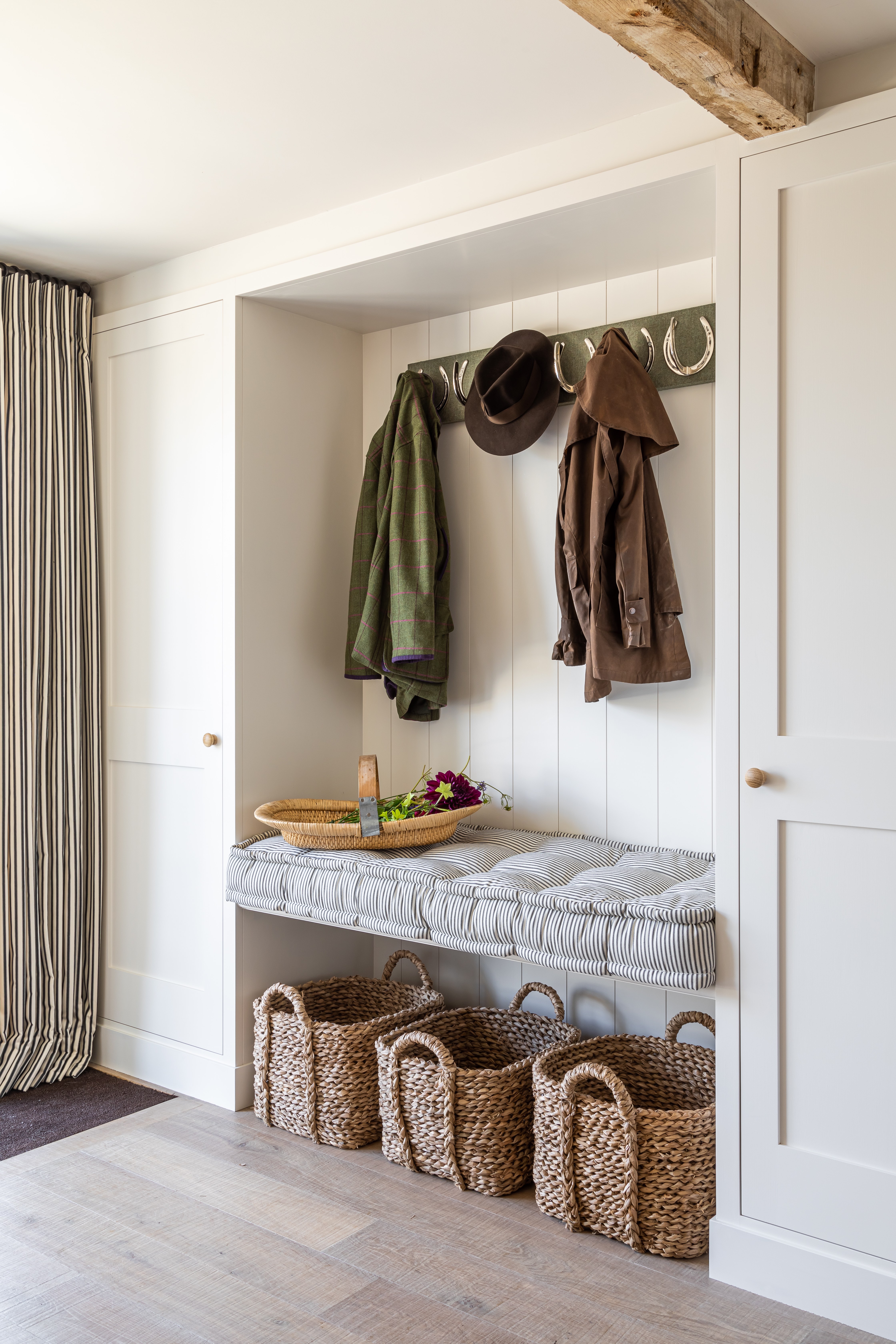
The most successful small space layouts are ones that have a bit of flexibility – furniture you can easily move when not in use, and just feel a bit less permanent work well with when space is tight. And for a small entryway, that means baskets. They corral clutter in a way that's aesthetically pleasing, they take up less space than a storage unit or bench, and they can be moved around the space if needed.
'I see a lot of mistakes when it comes to entryway storage. Many people seek out a storage bench, believing it to be the ultimate solution. However, a more flexible and practical alternative is a loose basket. While a storage bench might seem appealing, in reality, it often becomes an underutilized space and shoes just gather next to it. On the other hand, a loose basket provides an adaptable solution that can accommodate varying shoe sizes, is easier to access, and encourages more frequent tidying,' suggests Victoria Holly.
5. Don't hang a mirror opposite the front door
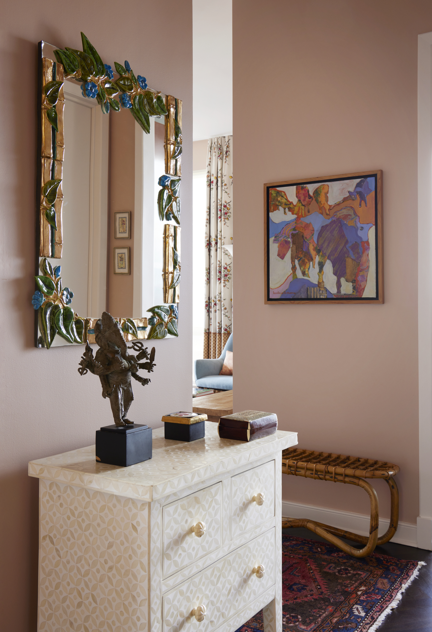
This can be tempting if you have a narrow entryway, however, it's actually very bad for entryway Feng Shui. As Kati Curtis explains, 'Always avoid positioning a mirror directly opposite the front door. According to Feng Shui principles, mirrors reflect energy, and in this case, the mirror would be pushing away all the good Chi (or positive energy) that flows into the house from the entrance. Instead of inviting this positive energy into your home, a mirror placed directly opposite the front door is said to reflect it back out, hindering the flow of prosperity and good luck into your abode.'
So instead, we would recommend placing a large, simple mirror on one of the walls so you still get all those space-expensing benefits, without the bad Feng Shui.
FAQs
How can you make a small entryway look bigger?
Color is going to have the biggest impact here. The safest bet is to go with a lighter entryway color – something fresh but warm like a pale beige or cream. Entryways usually lack natural light so you want to keep your color palette on the warmer side. And take that color over all the surfaces, walls, ceilings, and woodwork so you don't make the room dimensions too obvious.
Then you want to pick furniture that's going to keep the space feeling light and open. Look out for a console that's got a light silhouette, with fine lines and plenty of space for light to flow around. You could even go for just a floating shelf.
Rugs can help too. They bring texture and softness to this very practical room, and you can pick a design that's going to help the space look bigger – in a narrow entryway that might mean a runner with a subtle stripe or a circle rug can work well in a boxy entryway to distract from the corners of the room.
The main mistake when laying out an entryway is filling it will too much stuff. This is instantly going to make the room feel smaller and could affect how functional it is too. So really consider what you need in your entryway, how much storage do you need? Could you go built-in with your storage instead of adding furniture? Do you need a console to create a surface space for some handy storage and decor? Would a few stylish baskets do the job? Just keep it to a minimum (or as minimal as you can go so the space still works for your lifestyle) so the space feels as spacious and open as possible.


