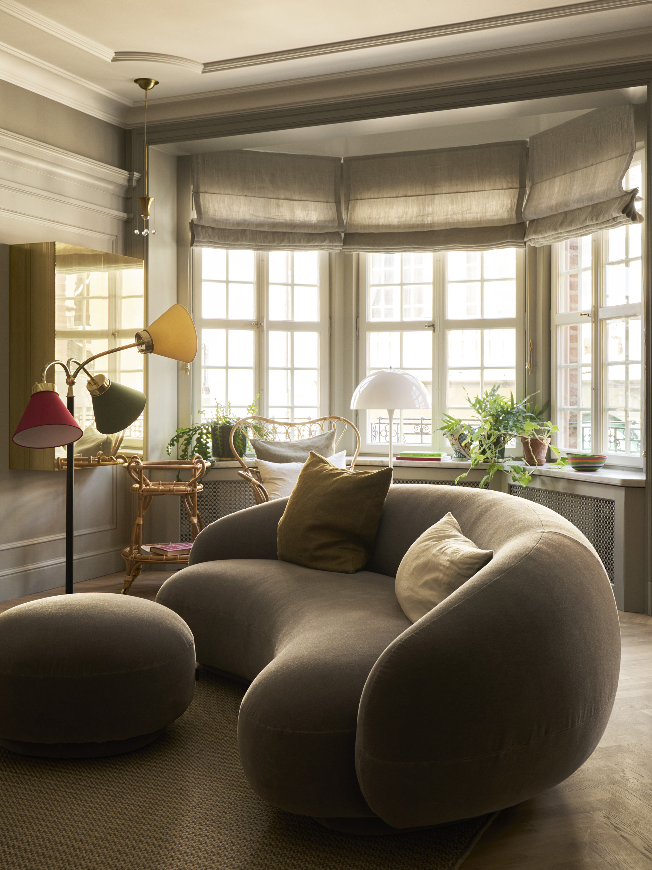
Some palettes outlast passing fads while others tend to date with time, which is why you might be pondering what color trends could be falling out of fashion in 2024. Overall, we're seeing interiors that display an ever-increasing appetite for color, whether that's soothing pastels, darker versions of warmer neutrals, or more polarizing shades like deep reds and dark purple.
Should your house be painted in a wonderfully airy shade of bright white, we're not saying you need to rush out in search of new paint. Nor are we recommending that die-hard neutrals lovers need to get on board with bold color.
However, if your home needs a refresh or you're ready for a change, we've compiled a few expert ideas that showcase some really easy ways to update your space. And, let's not forget that the beauty of a lick of paint is that it doesn't have to be a permanent fixture, so if you tire of your scheme in years to come, you can simply pick up a paintbrush and embark on another transformation informed by the latest color trends.
1. SWAP BRIGHT WHITE FOR WARM NEUTRALS
If you're seeking shades that will make your home feel more welcoming, Swedish boutique hotel Ett Hem offers no end of inspiration. Situated in a peaceful residential area of Stockholm, it caters for guests looking for a more personal take on luxury. Here, timeless interiors and inviting color palettes contribute to a distinctly Scandinavian balance of comfort and simplicity, without relying on the use of bright white.
The interiors are the work of Studio Ilse, who recently designed three new apartments for longer stays. 'The unique residences have the same warmth, comfort and design as the rooms and environments in the neighboring houses. They are a home away from home,' says Ilse Crawford, owner and creative director of Studio Ilse, of the concept.
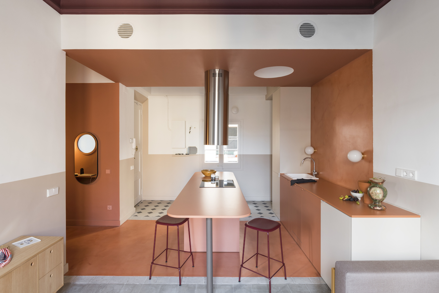
2. UPGRADE MILLENNIAL PINK TO TERRACOTTA
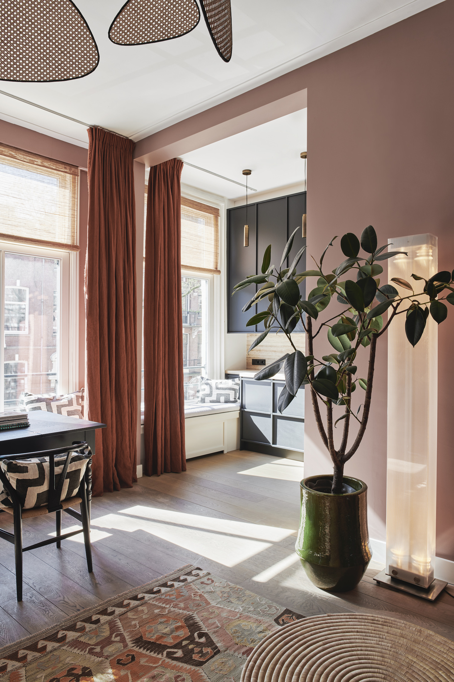
'You might not guess it, but this is in fact a bachelor pad. Not at all cold or distant, but rather joyous, which mirrors the owner’s personality,' says Nicole Dohman of Atelier ND Interior, who designed this Amsterdam abode. The apartment belongs film producer who loved the idea of color, but didn't know where to start. Fortunately, studio co-founder Nicole stepped in and devised a feel-good scheme that's underpinned by the use of a bold shade of terracotta.
A warm-toned hue such as this is a great alternative to the pale or saccharine pink that was once such an interior design trend, tempering pinkish notes with more sophisticated and earthy burnt-orange tones. And, just as pink is a known mood-booster, terracotta is both reassuring and uplifting, which the home's owner attests to: 'I feel both grounded and happy every time I walk into the front door,' he affirms.
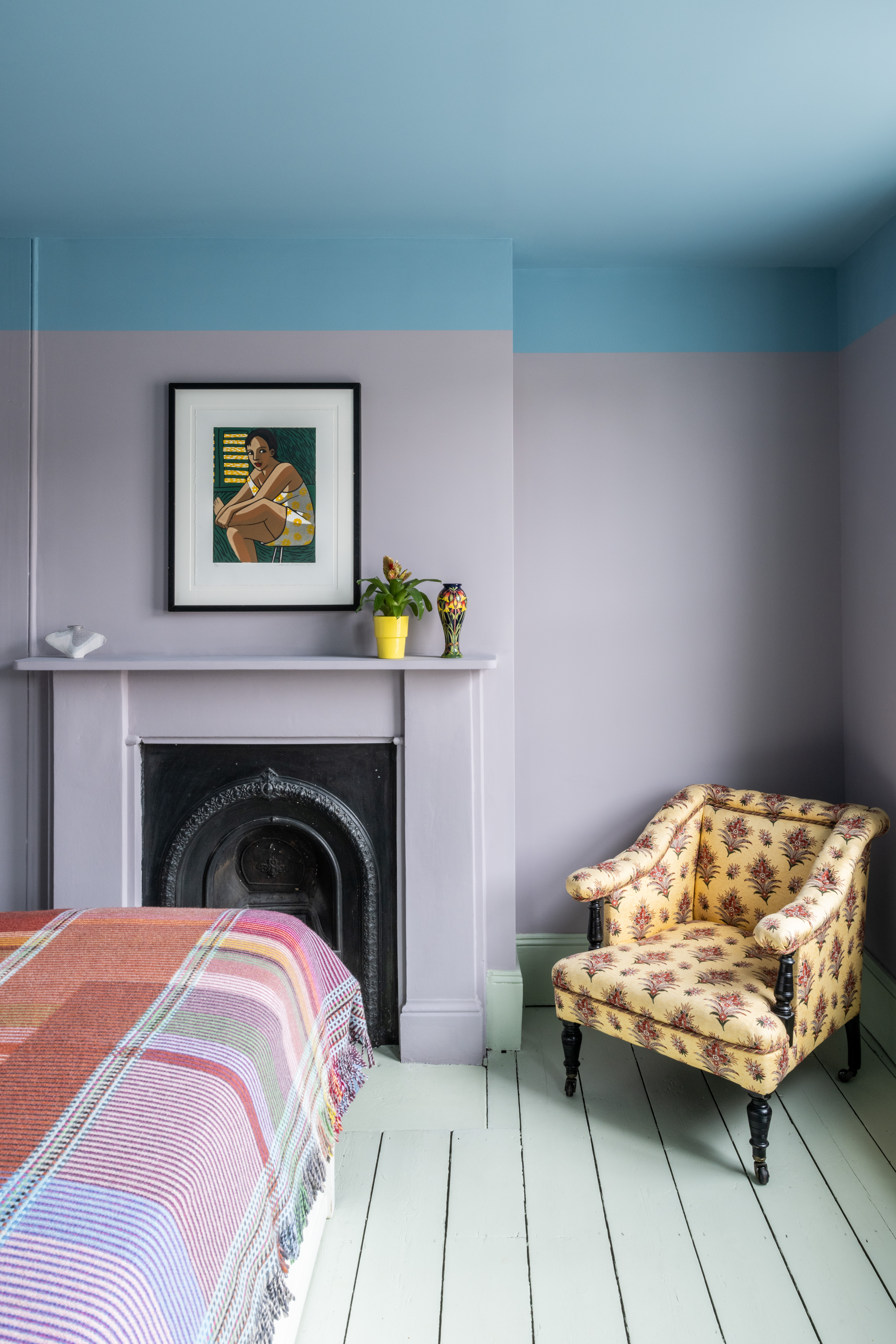
3. CONSIDER COLORED CEILINGS IN PLACE OF WHITE ONES
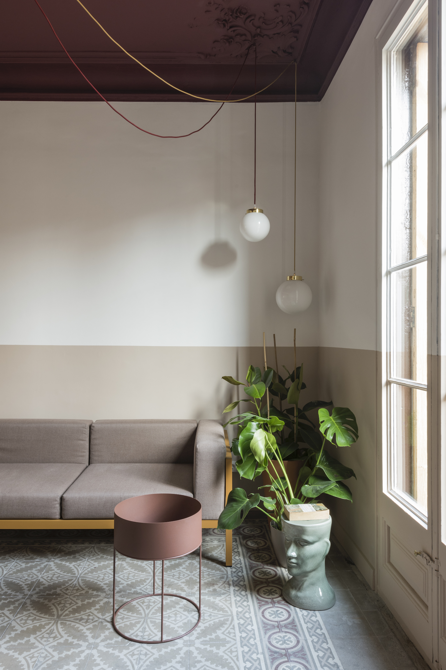
Serboli Bureau and Colombo Architecture combined forces to rescue this fire-damaged apartment on a top floor of a modernist building in the Born district of Barcelona. Their careful and creative renovation included a distinctive color scheme that extends all the way to the ceilings.
'The idea was to strengthen the chromatic difference between the more public rooms and the private spaces through the color of the ceilings,' says architect Andrea Serboli of the interior, which features warmer tones in the living spaces and cool shades in the bedrooms. 'Furthermore, the painted ceilings with darker tones makes the proportions of the rooms more harmonious and highlights the decorative moldings,' concludes Andrea.
4. SWITCH UP CHARCOAL HUES FOR COFFEE TONES
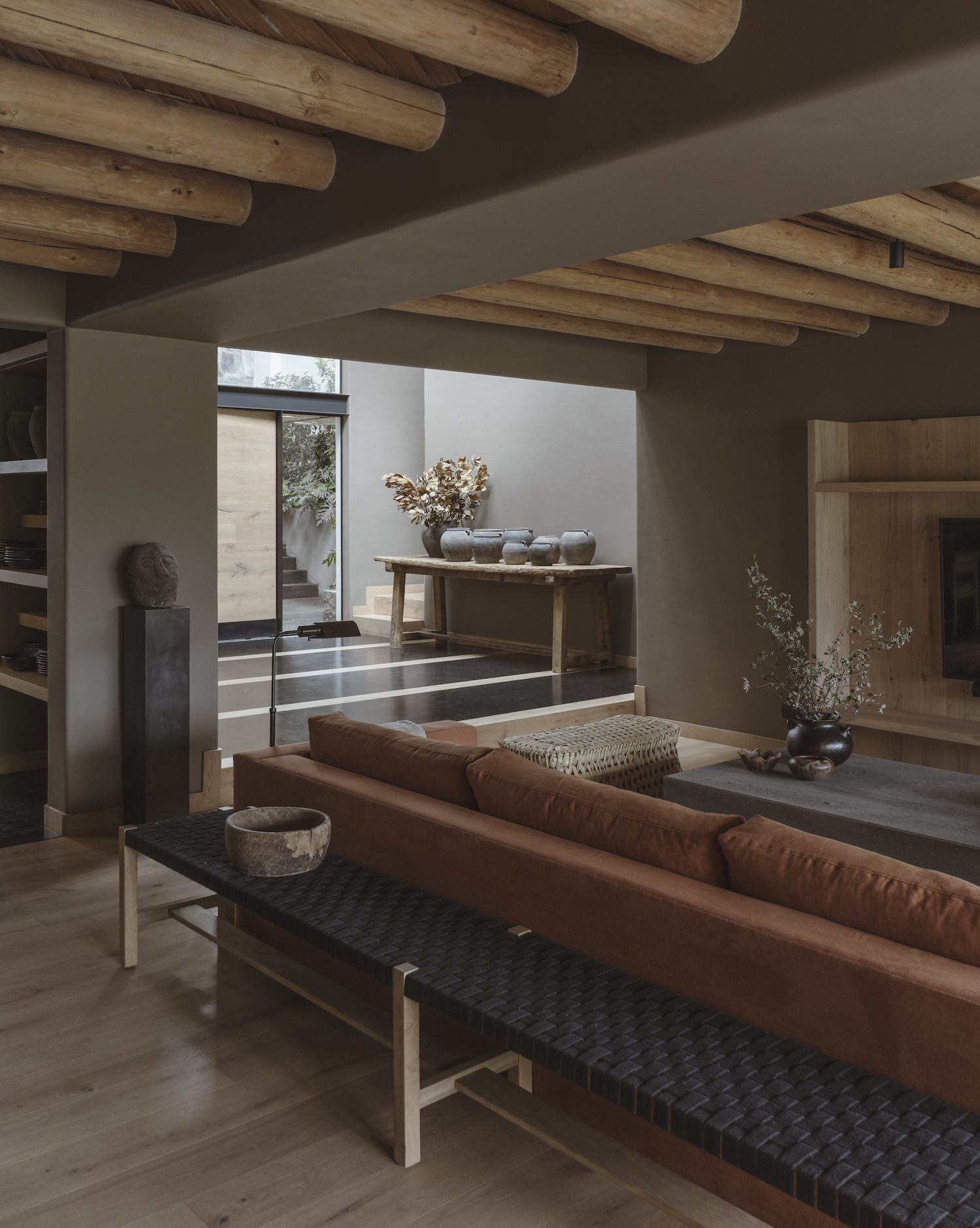
If you love the drama of dark grey but like the idea of something warmer and more original, then consider deep, dark taupe as an alternative. 'The aim of this project was to create a space using warm and natural colors that convey a sense of refuge and retreat,' says architect Mariana Morales of this Mexican home.
Despite opening up the interior to let more light into the living spaces, she chose to envelope the home in dark coffee tones as the color replacing grey in the scheme. 'The brownish-grey color on the walls invites you to feel nourished, cocooned and creates a space for repose and meditation,' continues Mariana, whose studio, Direccion, tranformed the 25-year-old lakeside residence into a more contemporary weekend escape.
5. CHOOSE PLAYFUL SHADES OVER MUTED PALETTES
‘Color can bring moments of joy, intimacy and personality to a home, and many of our clients are now choosing to add vibrancy to the place they spend most of their days,' says Jessica Williamson, Head of Interiors at Bradley Van Der Straeten Architects.
When the practice masterminded this transformation of a Victorian terraced home , they looked to its owners' love of design, color and pattern to provide the driving force for the project, and drew inspiration from their collection of art. In decorating with color boldly, each choice was carefully curated, adding depth and personality to different areas of the house, including the calm-and-cool pastel collective in the main bedroom.