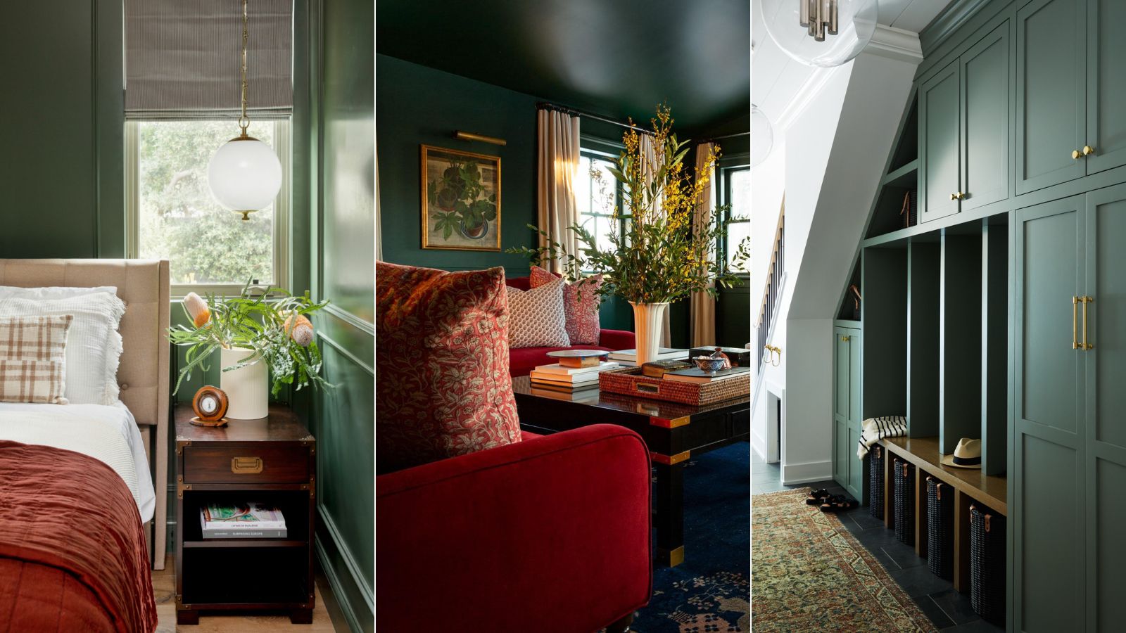
Green is such a classic shade. There's a variant to suit and style, from super dramatic yet cozy forest greens to incredibly light and fresh apple greens. But how do you pick the best green paint from so many options?
There are of course rules to follow on certain tones that will work with certain aspects, how dark you should depending on the size of your room etc. etc. But one of the best ways to find the top paint colors is to ask those who have experience using them in many different forms. So, we spoke with interior designers to get their advice on the best green paints they have ever used and how to decorate with green in a way that works with your style and your space.
5 green paints to try as chosen by interior experts
Green symbolizes renewal, positivity, and calmness which is why it's such a fabulous color trend to consider decorating with. It's also extremely versatile and goes looks great with white, black, blush, coral, and pink – to name but a few.
‘Greens are often relatively neutral. They are neither too warm nor too cool – this makes them very versatile, they can be used in lots of different spaces regardless of the tone of light,' says Ruth Mottershead, creative director, Little Greene.
But how do you choose a shade for your home? We asked five top interior design experts for their best green paints and why they love them so much.
1. Card Room Green, Farrow & Ball
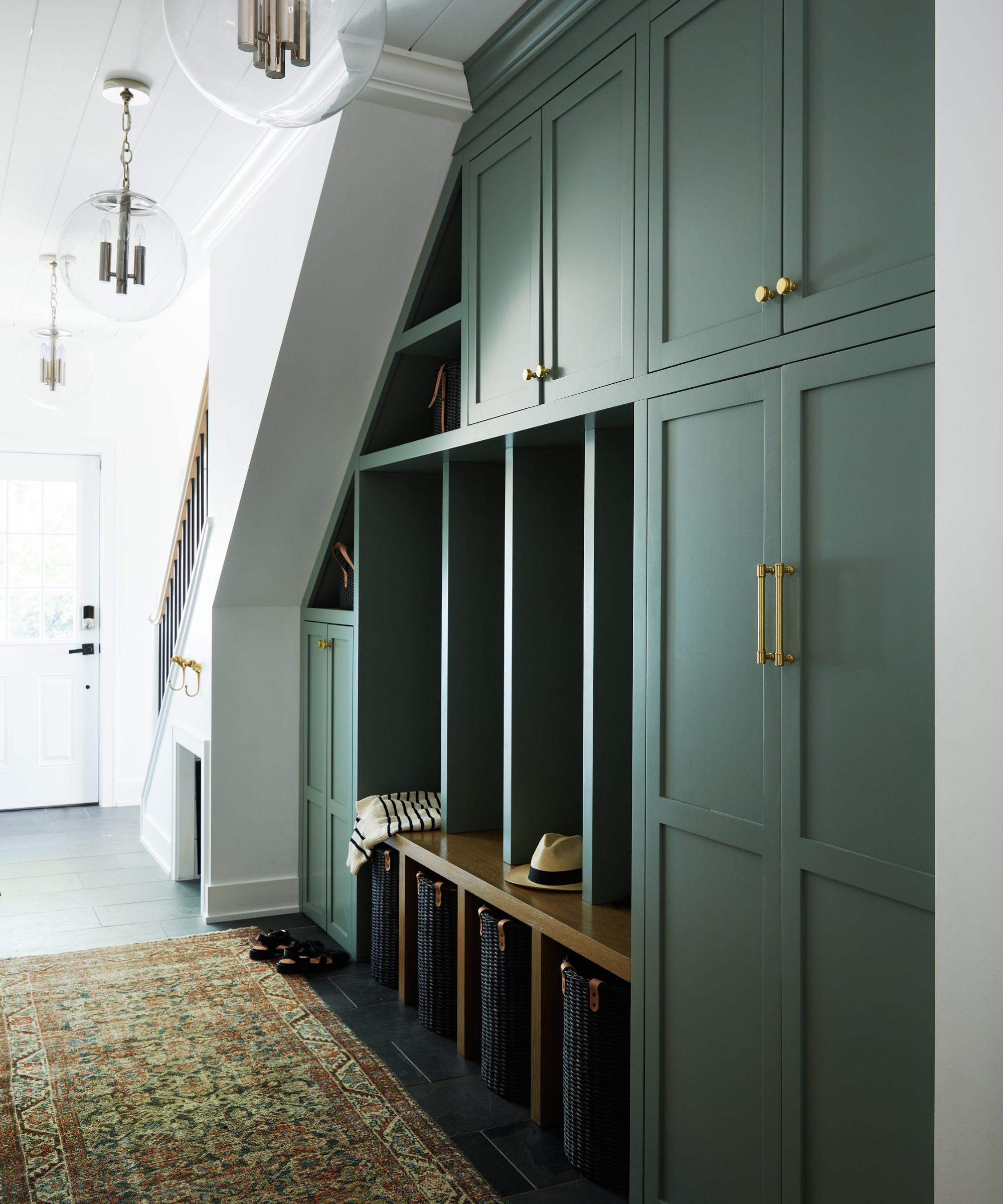
'We designed this mudroom using Farrow & Ball's Card Room Green,' say Monique Cahill and Jessica Quezada, founders and principal designers, JM Foundarie.
'This color is the perfect shade of green with grayish undertones. It’s a moody, warm green that has a lot of depth to it, and it perfectly complemented the vintage runner we sourced for this space. Like all Farrow & Ball colors, it has a tendency to shift and change with the light, and the more we see it the more we fall in love with it. It has the same vibes as the darker greens, but without being too dark.'
Card Room Green was named after the study-like rooms from the Victorian times. As it's a mid-toned green it can work with both lighter and darker shades making it a versatile choice.
2. Bakehouse Green, deVOL
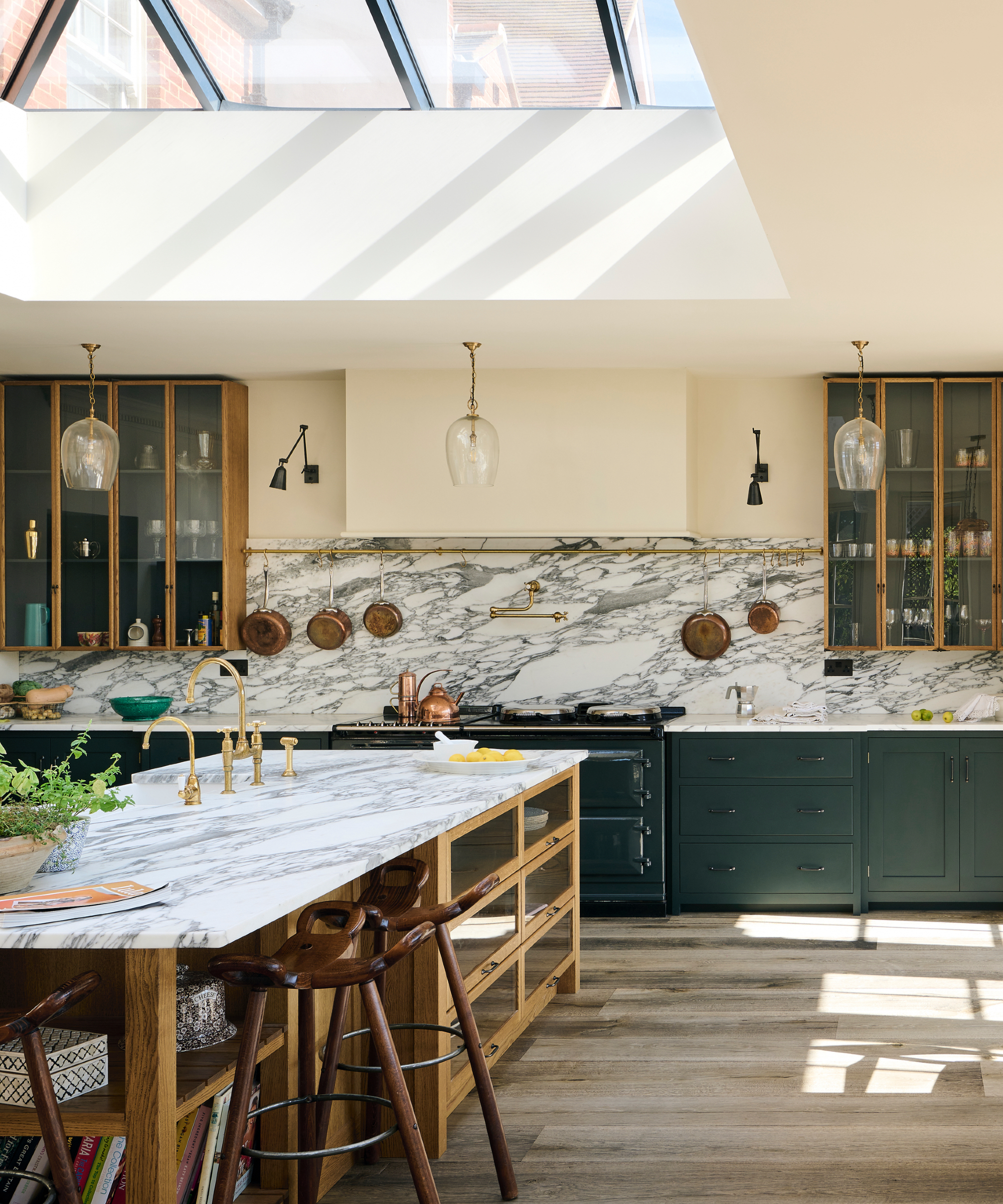
'Quite utilitarian and perfect for green kitchens, Bakehouse Green is a dark green that feels very old school, we love the way it instantly makes a piece of furniture feel very grown up and above fashion or trends. Mix with aged brass for a really classic look.' Helen Parker, creative director of deVOL.
Available in two finishes – furniture paint that has an authentic satin sheen, and a flat matt emulsion, both will give you a a depth of color that will enhance whichever space you use it in.
3. High Strung, Sherwin-Williams
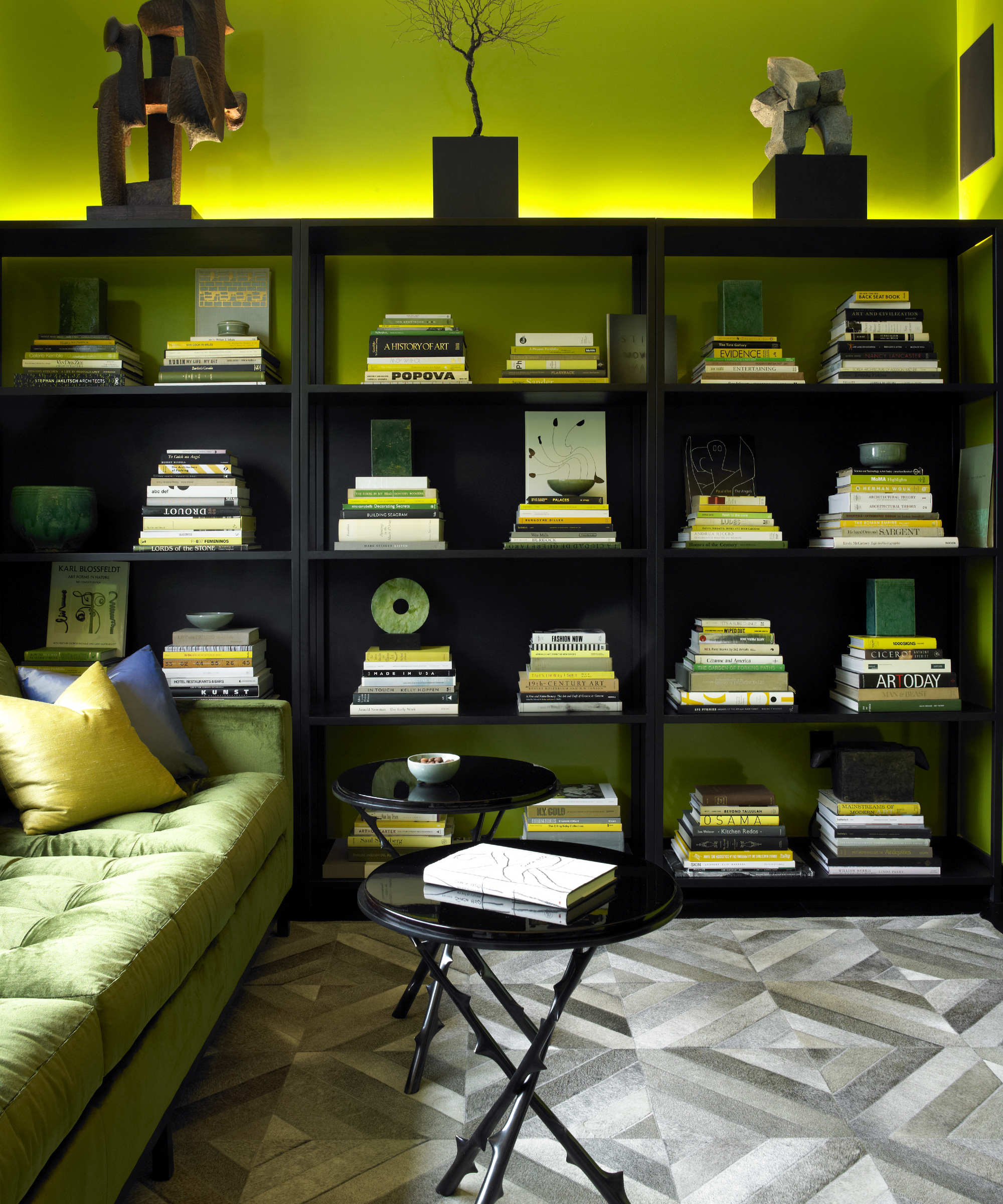
'We love High Strung – an acid green by Sherwin Williams because it adds a moment of surprise and because of its intensity, it feels fresh, referring to nature, though it’s a color we don’t see so often in nature,' says David Mann, president of MR Architecture + Decor.
If you want to push the boundaries with a color this intense then make sure you balance it with something else – in this case, David's used black which looks really contemporary with the zesty shade. White would work well as a color to pair with green.
4. Rosemary, Sherwin-Williams
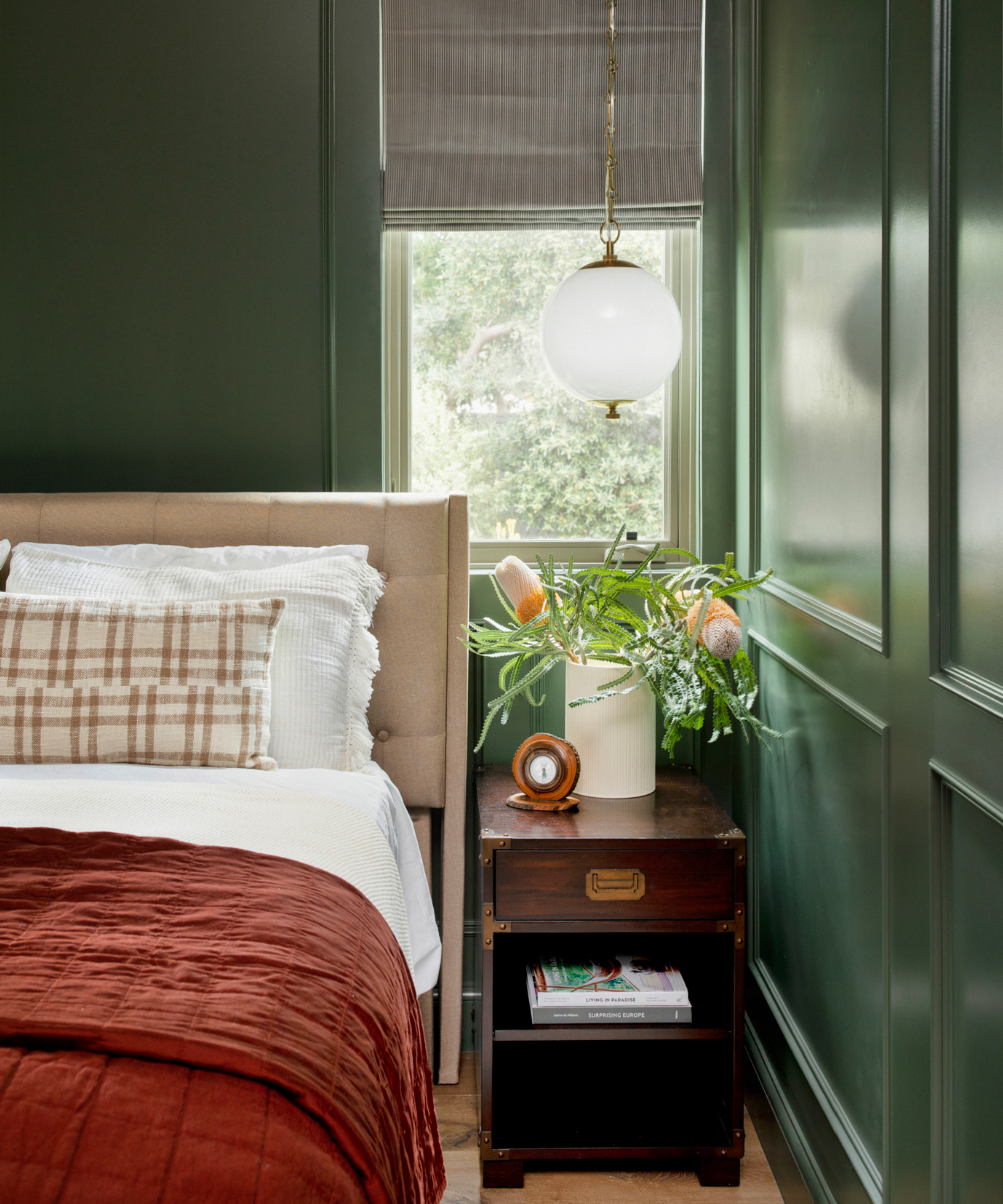
'As designers, we strive to always try new things and colors,' says Mollie Ranize, founder of DMAR Interiors. 'Going dark on all walls in a room can feel risky, but you can't go wrong when pulling a color from nature, like this cozy, saturated green. It's Sherwin Williams Rosemary, and in the semi-gloss finish on the fully paneled walls, the room almost twinkles depending on the time of day.'
Rosemary is a soothing organic green with a dark grey undertone, it looks great when decorating with antique pieces and crisp white woodwork, or give it a lift with a coral accent.
5. Sage & Onions, Little Greene
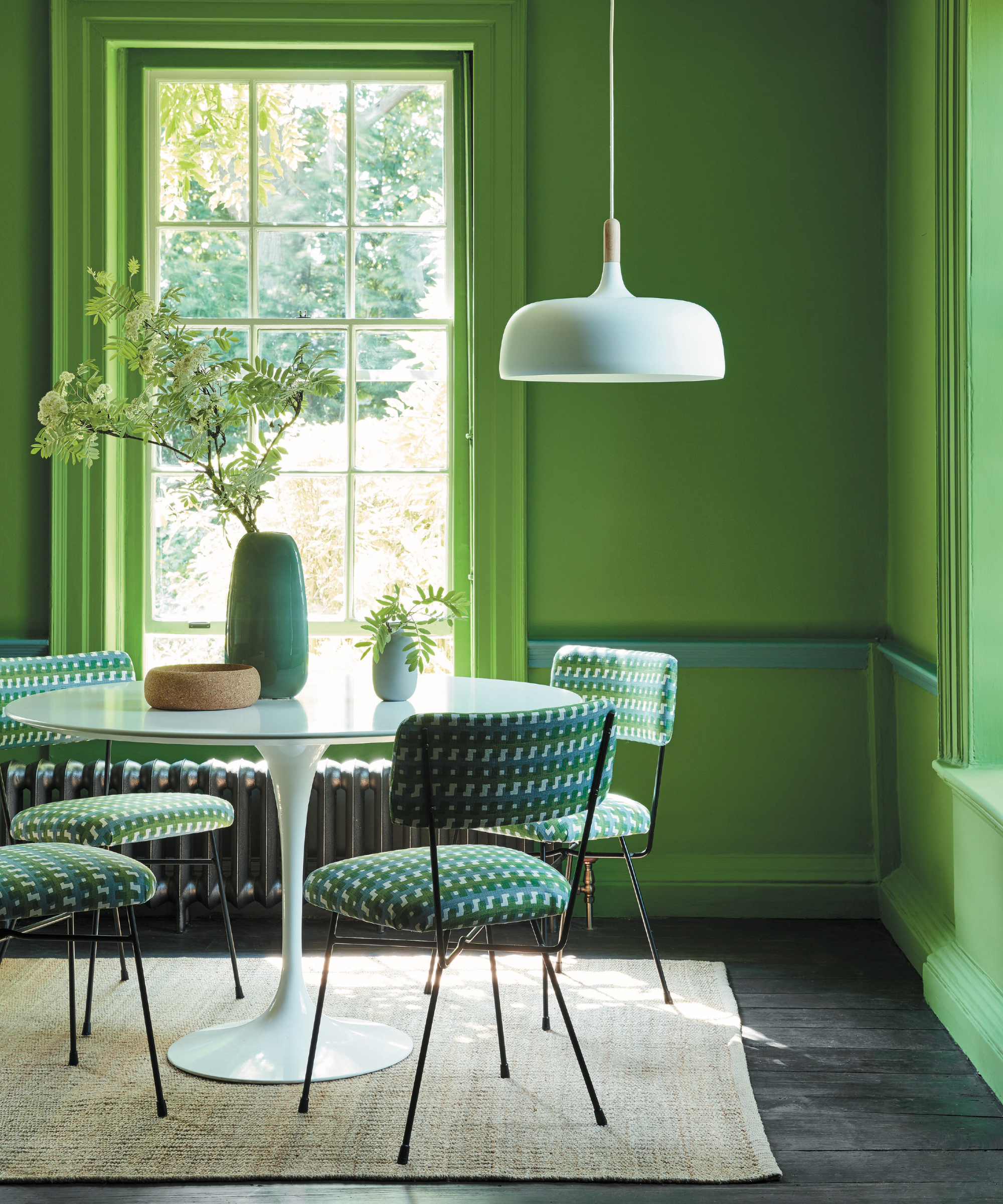
'Olives and deep greens work wonderfully in bedrooms because of the serene calming mood they create, and they also work well in rooms that overlook gardens as it gives that outside inside feel, whilst vivid, lively greens such as ‘Sage & Onions’, a particular favorite, work well in rooms that are made for entertaining, or see a lot of activity, such as kitchens, dining and living rooms, naturally lifting the mood and reflecting the energy of the space,' says Ruth Mottershead, creative director, Little Greene.
This beautiful bright green really will lighten and brighten a room. It looks fabulous when teamed with crisp white for a very fresh and invigorating look.
Green is a really usable color to consider for any room of the house. Its cheerful nature is pleasing to the eye and its links to nature make it a calming color choice. Teaming it with corals and pinks will create a modern yet cozy feel, or go for a minimalist look with jet black, navy, or white.


