With so many font pairings out there, it can be tricky trying to find the perfect combination. While we're spoilt for choice when it comes to typographical designs, it can feel like a double-edged sword that leaves us feeling overwhelmed. If this is sounding all too familiar, don't fret, we've consulted the experts to learn how to choose font pairings with ease.
While it can be tempting to follow the top typography trends or resort to the tried and true professional fonts for designers, sometimes a project needs something that feels unique. To help you get inspired, we've compiled some of our favourite font pairings, alongside helpful tips on how to combine fonts.
Font pairing tips
01. Check the proportions of your font pairings
Even if you're limited to the best free fonts, choosing font pairings can be tricky, but a good way to shape your decision is to consider the size of your fonts. If the X height (the size of the 'x' character) is similar in both of your choices, they'll likely complement each other, giving your project an element of cohesion.
02. Use different weights
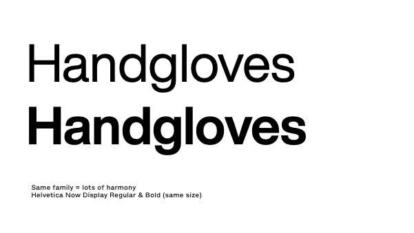
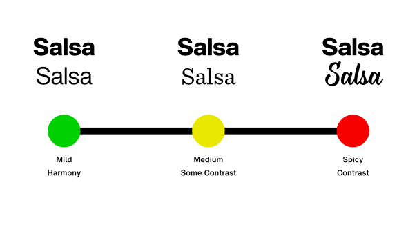
Terrance Weinzierl, creative type director at Monotype, suggests experimenting with different weights. "When using a single typeface family, different weights (like regular and bold) can create a cohesive, harmonious look. This is similar to using shades of one colour. On the other hand, choosing two fonts with similar characteristics adds interest without too much contrast, like using analogous colours. If you want more contrast, pairing complementary fonts, like a serif with a sans serif, can make your design pop."
03. Use font superfamilies
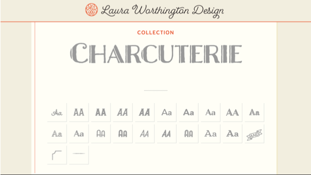
Terrance suggests considering typeface families that are packaged like kits. " Laura Worthington’s Charcuterie family is a great example. The family is not multiple weights of one design, but rather a curated combination of sans, serif, and script styles all designed to pair perfectly with each other."
04. Pair contrasting typefaces
Terrance suggests that beginners, avoid pairing fonts that are too similar, as they may feel redundant. "For example, avoid pairing two fonts from the same genre unless you have a clear purpose. It can be like mixing plaid and stripes. Instead, look for ways to create contrast through weight, width, or style. Superfamilies like Kairos or Macklin offer an excellent starting point. These families include both serif and sans serif options that are designed to work together seamlessly, giving you harmony and flexibility.
"As you advance, you can experiment with more sophisticated pairings. For instance, Helvetica (a clean, neutral sans serif) could pair well with Walbaum (a serif with similar proportions but more contrast), or with Sentinel, which offers a sturdier, less contrast-heavy option. You can also try pairing ITC Avant Garde Gothic with Lublin Graph, as both share geometric similarities, like their single-story "a" and similar proportions.
Looking for something more humanist? Try pairing Mundo Sans (modern and contemporary) with Dante (earthy with abrupt stroke joins), creating a balanced but distinct contrast."
05. Pair type sub-categories
'Serif' and 'sans serif' are very broad classifications, and each can be split into several sub-categories. Generally speaking, Old Style serifs such as Bembo, Caslon and Garamond will combine well with Humanist sans serifs like Gill Sans and Lucida Grande.
Transitional serifs have a stronger contrast between thick and thin strokes (examples include Bookman, Mrs. Eaves, Perpetua and Times). These pair with geometric sans serifs like Avant Garde, Avenir, Century Gothic, Eurostile, Futura and Univers.
Finally, modern serifs tend to have a very dramatic contrast between thick and thin for a more pronounced, stylised effect, as well as a larger x-height. This third sub-category includes Bodoni, Didot, New Century Schoolbook and Walbaum. Again, geometric sans serifs marry best with these.
06. Consider context
"Remember, font pairing is all about context," says Terrance. "Ask yourself: What message do you want to convey? If you need a professional, trustworthy feel, pairing a serif with a sans serif is a great choice. Want to convey warmth and approachability? Try combining a sans serif with a handwritten font.
"You can use your powers of observation to notice how typefaces are paired in the real world. Food packaging at the grocery store is a gold mine of typeface pairings, as are editorial sources like books, magazines, and websites. If you capture images for colour inspiration, you can do the same with typefaces."
07. Keep practising
"Practice is key," says Terrance. "As you experiment with font combinations, you’ll develop a feel for what works. Just as you pair food and clothes based on mood or context, font pairing is all about finding the right match for the message you want to convey. Whether you're aiming for a calm, understated design or something bold and energetic, the fonts you choose can help to set the tone."
If this all seems like a lot, don't panic. "Font pairing may seem complex, but with the right tools and practice, it becomes easier to navigate, offering endless possibilities to enhance your design," says Terrance.
Font pairing examples
01. Academia & Franklin Gothic SG
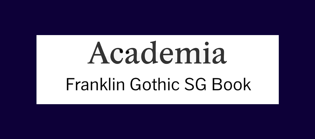
The clean-cut appeal of Academia and Franklin Gothic make them a perfect font pairing for simple stripped-back design projects that prioritise legibility and visual harmony. As a confident and classy serif font, Academia brings a touch of refinement that complements Fraklin Gothic's more contemporary and functional sans serif form. By pairing two of the most iconic typefaces ever made, you're guaranteed a timeless, classy look.
02. Playfair Display & Alice
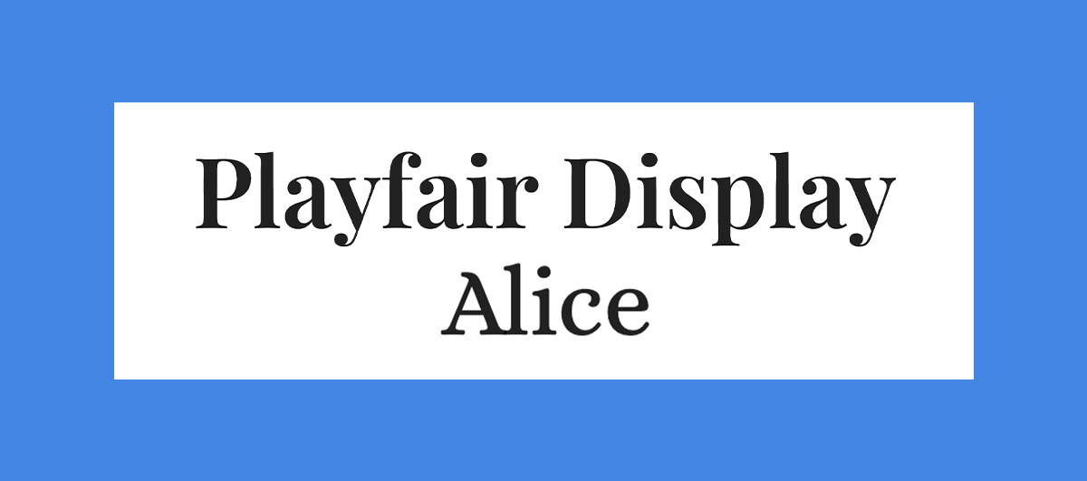
Playfair Display is a bold serif font that commands attention. With its more rounded flourishes, it has a more playful feel than your typical serif font, giving your headings a sense of authority while maintaining a sense of fun. Paired with Alice, the fonts marry together for a whimsical effect that gives your projects a dose of character without sacrificing on legibility and function.
03. Aldus & Astoria Sans

Aldus was created as a new form of Old Face typeface. It was named after famous Venetian printer Aldus Manutius and has the artful elegance of Renaissance-style typography. When paired with the more modern Astoria Sans, inspired by the humanist sans-serif Gill, the fonts create a clean and classic look that's perfect for many different projects.
04. Century Gothic & PT Serif

Century Gothic was originally made as a substitute font for Avant Garde. It's based on Monotype 20th Century and has been modified to fit contemporary digital systems, while still maintaining a classic feel. It pairs well with PT Serif, a classic font created by ParaType. This combination is naturally complimentary, giving a timeless effect that doesn't feel outdated or overused.
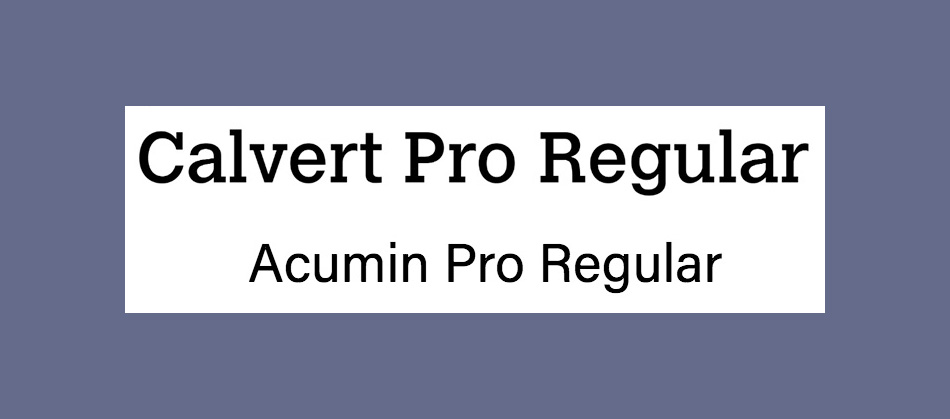
05. Calvert and Acumin
Named after its creator Margaret Calvert, Calvert is a punchy slab serif from Monotype. It comes in six styles: Calvert Pro and Standard, each with Light, Regular and Bold variants. For an ideal font pairing, try sans-serif Acumin. This typeface comprises a massive 90 different fonts (See our explanation of font vs typeface if you're not sure about the difference between the two). Designed by Robert Slimbach as part of the Adobe Originals initiative, this font requires an Adobe Creative Cloud subscription for access.
06. Montserrat and Courier New
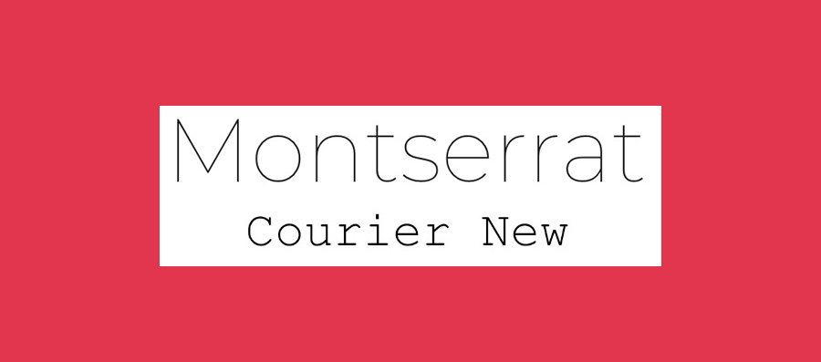
Google Font Montserrat was designed specifically for online use, while Courier New is a classic typewriter font (see our guide to the best typewriter fonts for more of those). Considering their very different purposes, you might not think this would make the best font pairing, but actually, they work perfectly together. Montserrat's light, modern sans-serif letterforms offset Courier New's heavier, retro vibe really well.
07. Alegreya Sans SC and Source Sans Pro
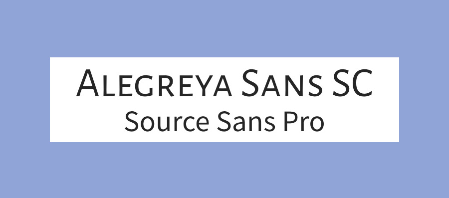
Designed by Juan Pablo del Peral for Huerta Tipográfica, Alegreya is a superfamily that includes sans and serif sister families alongside this small caps version. The family has a slightly calligraphic edge and is designed to be suitable for long blocks of text. However, the small caps variant is most suited to headers. We suggest pairing it with Source Sans Pro, Adobe's first open-source typeface family, designed by Paul D. Hunt.
08. Pacifico and Quicksand
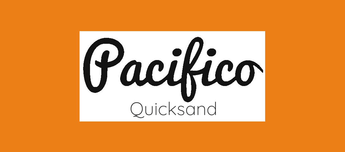
For a delightful font pairing with an unintentionally tropical theme, try Pacifico and Quicksand. Pacifico is a delightfully free and flamboyant brush font that's great for use in headings, while Quicksand is a sans-serif with rounded terminals and some quirky touches, including that distinctive descender on the uppercase 'Q'. Quicksand was actually also designed as a display typeface, but it offers enough clarity to work well at small sizes, too.
09. Julius Sans One and Archive Narrow
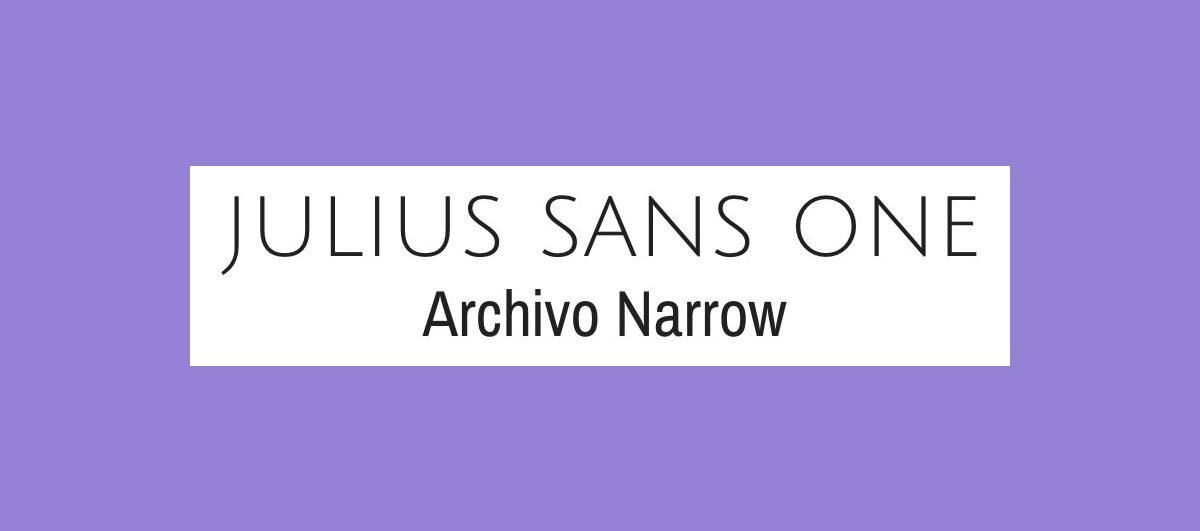
If you're looking for a smart, professional look, this is a great font pairing to try. Julius Sans One is an all caps font that only comes in one weight, but, with its fine stroke and broader baseline, it's a top choice for a display font. The more geometric Archivo Narrow is a perfect match and works equally well in print and digital.
10. Oswald and Lato

Launched in 2011, Oswald is a reworking of the 'Alternate Gothic' sans-serif type style. It makes a great pairing with Lato ('summer' in Polish), which is a warm yet stable sans serif. Both are available in a range of weights and variants, giving this font pairing a lot of versatility. As one of the most loved fonts (as revealed in a recent Adobe study), Lato's clean and timeless look is a timeless people pleaser.
11. Unifrakturcook & Podkova
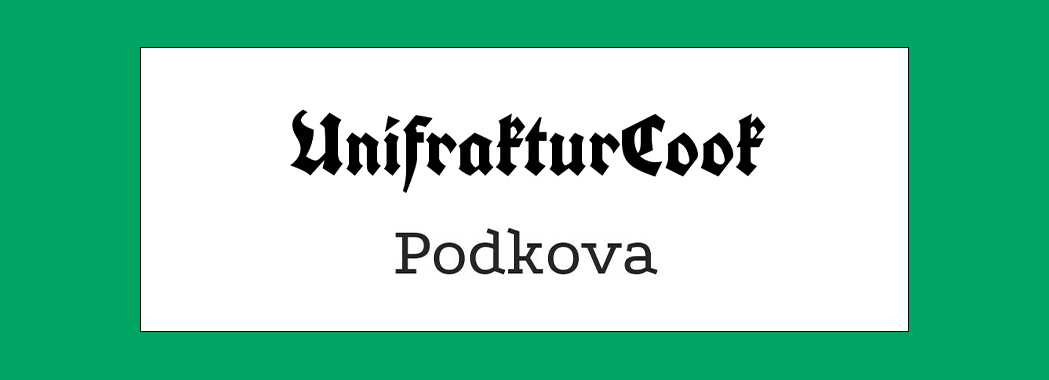
An unexpected but playful pair, Unifrakturcook and Podkova are a contemporary font pairing that brings a level of edge to your projects. Unifrakturcook is a bold blackletter font based on Peter Wiegel’s font Koch fette deutsche Schrift. As a title font, it brings a punchy authority that when paired with the more understated Podkova, gives your design an ultra-cool modern look.
12. Super Grotesk and Minion Pro
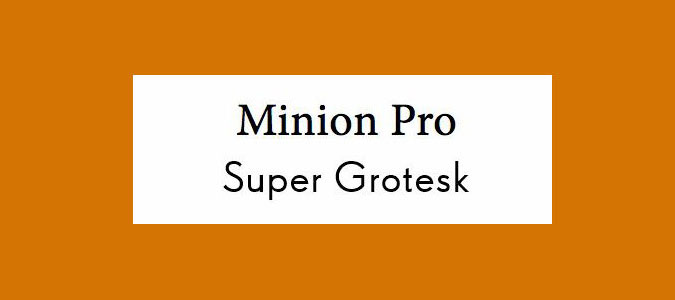
The ever-popular serifed Minion Pro works perfectly as a headline font when coupled with the nimble sans-serif Super Grotesk for body copy. Together, these fonts serve to create an effortless sense of modern elegance.
13. Nova Mono and Lato
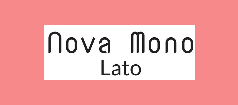
Nova Mono is only available in one style, but it's a style that's great for making a statement. Pair it with versatile sans serif Lato to stop things getting too crazy. Lato designer Łukasz Dziedzic wanted something that was nice and clear at small sizes (we'd suggest using it that way in this font pairing), but that revealed some stylised effects when used larger.
14. Gilroy and Jura
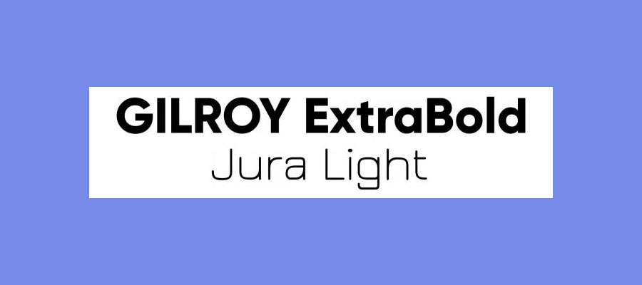
This pair of sans serifs works well to create a trendy, industrial look. Gilroy's geometric style in ExtraBold weight is ideal for headers, while Jura Light ofsets it nicely with its wiry, structured shape. The combination is good for adding a strong, technical feel to creative projects.
15. Orpheus Pro and Twentieth Century
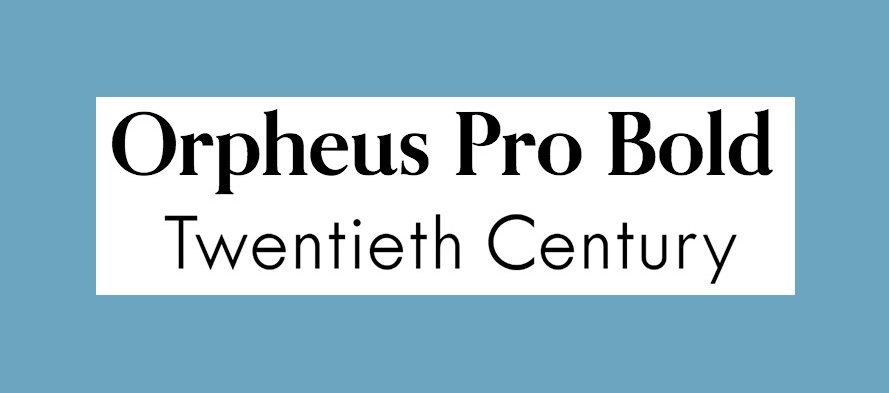
How about looking back at the 1920s with this typeface from designer Sol Hess for Monotype? Twentieth Century has an eye-catching Art Deco vibe (it's subtle here, but the glamour is amped up in the Twentieth Century Std Poster MT variant). For the perfect type pairing, try Orpheus Pro from Canada Type. This typeface was planned as a new version of Walter Tiemann's Orpheus and its italic companion font Euphorion, but ended up as something much more elaborate – if you're using it for display purposes, there are plenty of extensions, alternates, swashes, and ligatures to explore.
16. Playfair Display and Source Sans Pro
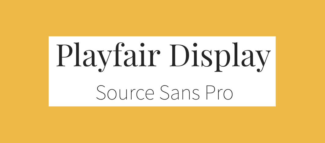
Dedicated display typeface Playfair Display boasts high-contrast for some old-fashioned charm. Meanwhile, Source Sans Pro is a modern sans-serif designed specifically for use in user interfaces. Together, they make a perfect pairing of old and new, with the understated Source Sans Pro letting Playfair Display really shine.
17. Rockwell Bold and Bembo
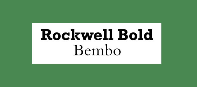
Designed in the 1930s, Rockwell is one of the classic slab serifs. It has a big personality and strong attention-grabbing potential when used bold. The much more conservative serif Bembo is neutral but versatile, making for a perfect contrasting font pairing.
18. Myriad Black and Minion

Myriad and Minion crop up in other font pairings in this list, but this combination is definitely worth considering too. The shouty, ultra-bold Black version of the former and the text weight of the latter can lend a clear hierarchy to designs.
19. Souvenir and Futura Bold
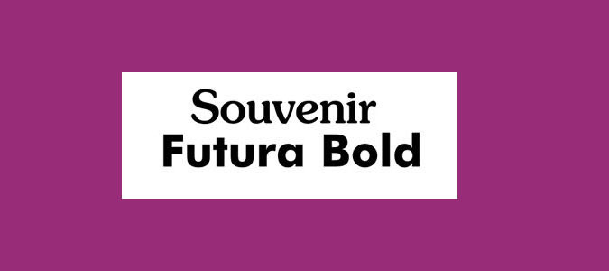
Mixing two strong typographic personalities rarely works because they end up fighting for attention. However, this is an exception. Souvenir is softer and more playful than many of its Old Style serif counterparts, while Futura Bold is quirky without being too dominant.
20. Aviano and Aviano Sans
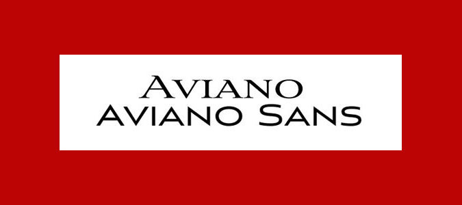
Only available in all-caps varieties, Aviano has sharp, edgy serifs that give it a distinctive personality. Capturing a spirit of luxury, Aviano could easily find a place among the best fashion logos, thanks to its slick design. Its sans-serif variant is smoother. Combine the two tilting typefaces together to established clear hierarchy in your designs.
FAQ
What font pairings should I choose for different types of projects?
The type of font pairings you choose is likely to vary depending on the type of project you're working on. For example, CVs need heavy headers and clean body text, while flyers and posters for events can work well when they have quirky or funky display text to grab attention, paired with a much cleaner body text for contrast and legibility of the important details.
Social media content is shown at relatively small sizes, so it needs both fonts to be quite clear, but you can still look for a bold, more stylish font for the display text and something nice and crisp for the body. A popular combination for event invitations is to use a script font for the display text and an elegant but clean and legible sans serif for the body copy.
Where can I find font pairing inspiration?
Hopefully, this list has helped you find a font pairing that suits your project, but if you're still hungry for more ideas, there are a number of font pairing websites that are handy for springboarding your ideas.
Monotype Font Pairing Generator – A playground to explore Monotype's vast range of fonts, this font pairing tool allows you to randomly generate a font duo until you find your perfect match. With options to like, dislike, lock and resize, you can curate your set with ease.
Fontpair – As the name suggests, fontpair is the perfect speedy companion for finding harmonious font couples. The interactive playground allows you to visualise your font choices across a range of contexts, from business cards to social media, making this a great choice to trial your potential pair.
Adobe Fonts Recommendations – Adobe offers a wide variety of fonts, but did you know it also has a handy section full of creative font recommendations? With staff picks, hidden gems and trending fonts, this creative hub is the perfect place to find inspiration.