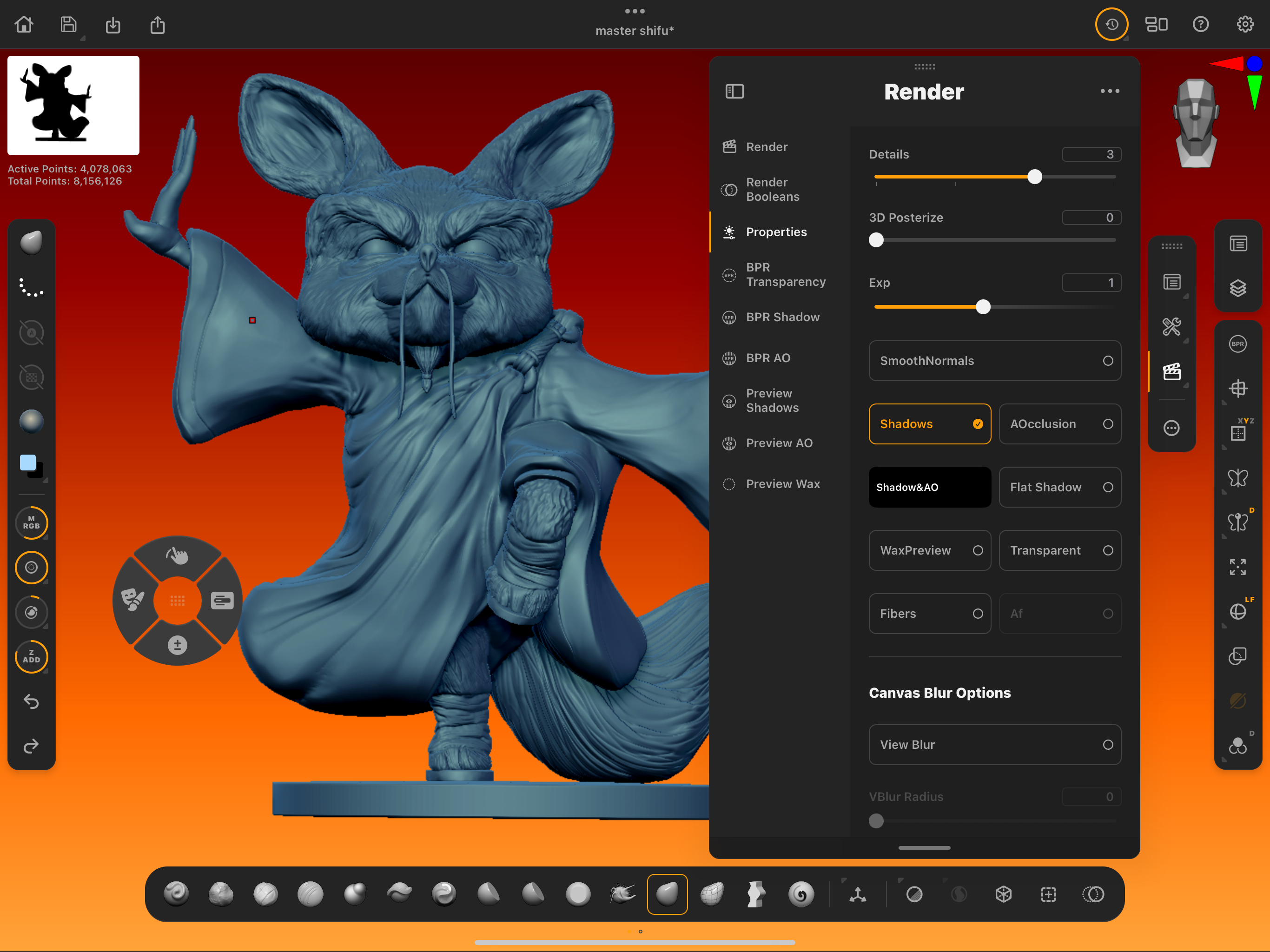
I’ve waited for 25 years for this app. Longer than mobile sculpting was even a thing. Longer than the iPad was a thing and longer than a lot of you might have been on the planet! ZBrush for iPad is Maxon's next big push into digital sculpting (not 3D modelling remember!) and it is the direct descendant of the granddaddy of all digital sculpting programs that we know today. (You can read my ZBrush for iPad review for my thoughts.)
The reason everyone is particularly excited is that the mobile version is like a cleaner, leaner version of the parent software and the development team has done away with a lot of the redundancies that are legacy issues from decades ago.
Remember, ZBrush started life as something called 2.5D rather than full polygonal modelling or 3D sculpting and the core program still has those tools in the interface. (Read our ZBrush: everything you need to know explainer for more insights.) Maxon purchased Forger App, which was the very first mobile sculpting app on the iPad, and whilst that performs well as a polygonal modeller (manipulating points, edges faces rather than organic sculpting) it was quickly superseded by Nomad Sculpt.
ZBrush for iPad is coming after the same market Nomad Sculpt has occupied and seeing as it dominates on the desktop Maxon will have the top spot firmly in its sights. So having spent six months using the pre-alpha and then the beta version how have I been finding it? What are my standout tools and features you really, really need to try? Lets see…
1. The streamlined UI
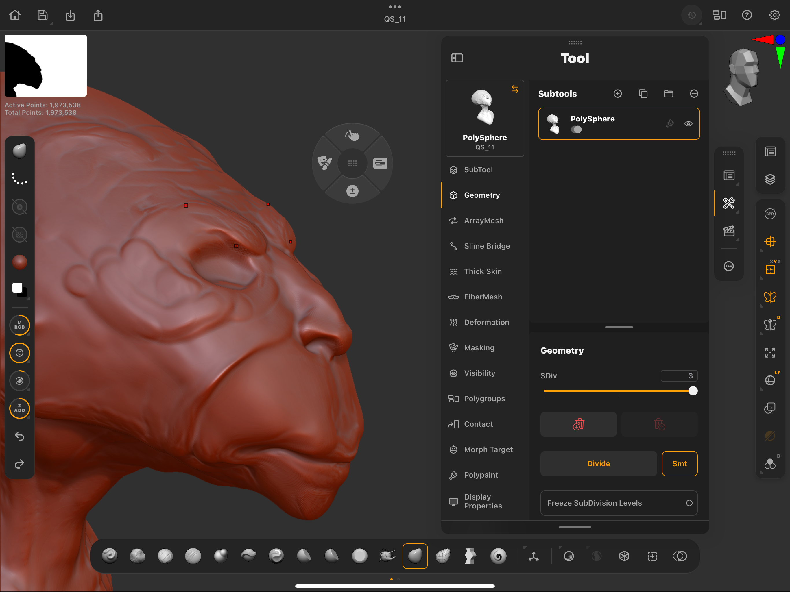
No hiding the strong points for click bait here. The interface is amazing. If you are a ZBrush desktop user you are going to be crying out for this type of interface for the original ZBrush, as that has been the most uttered gripe about ZBrush for over a quarter of a century (yes, really that long).
ZBrush has always had such a none standard layout and some odd quirks that always meant the fist time user could get stuck and frustrated in just a few minutes. Things like dropping a model to the canvas and then having to clear the screen and start again are gone now, for example.
The layout is very logical with clear dropdown menus and palettes where you would expect them to be. The workflow is now a pencil in your dominant hand and your finger on the screen as needed instead of the keyboard shortcuts. Your non-dominant index finger gets used a lot.
2. It's completely mobile
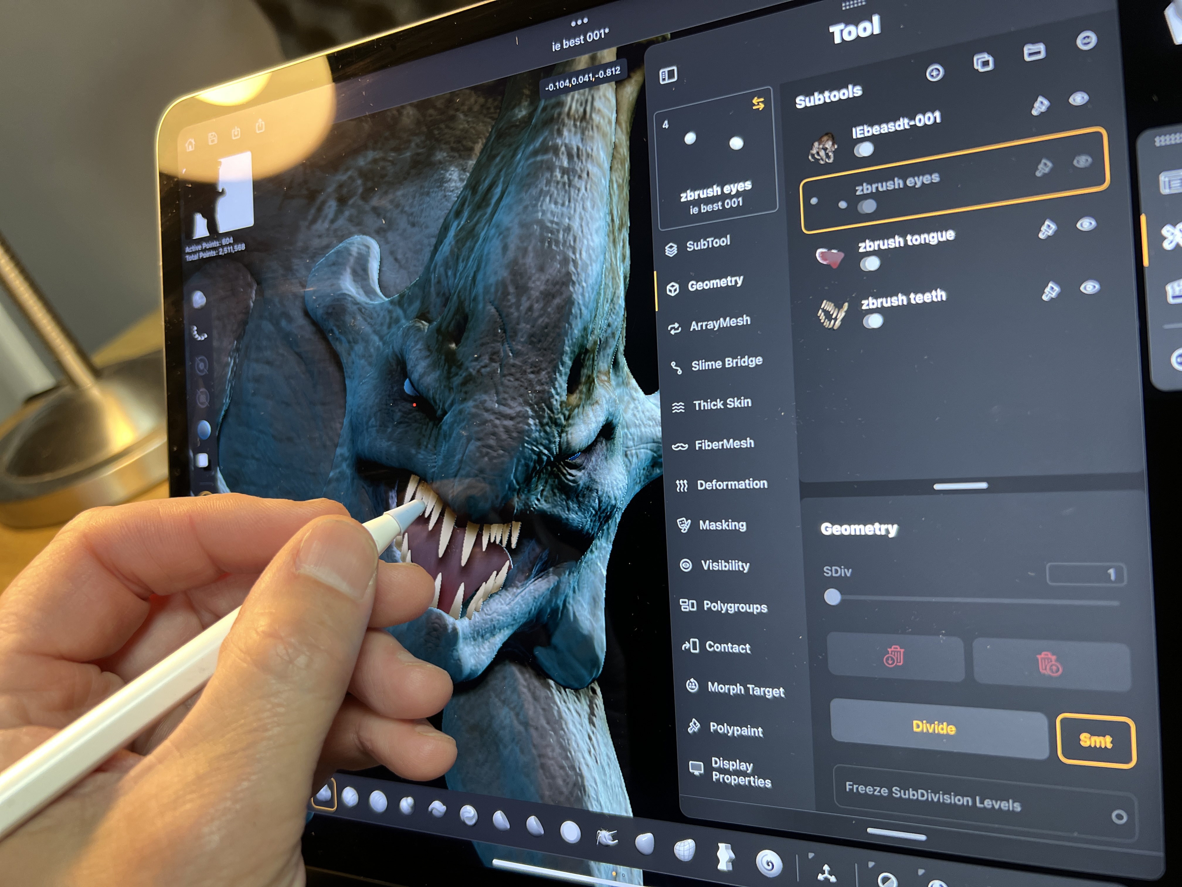
This might seem a little obvious, but the fact that this version of ZBrush is on iPad makes it uber-portable for a few reasons. For an idea of which iPad, read my ZBrush for iPad explainer.
You are sculpting directly onto the screen with an Apple Pencil, so right away you don’t need a graphics tablet. The experience is much more akin to using a 16-inch screen based drawing tablet, such as the Wacom Cintiq Pro 16, Wacom One or Xencelabs equivalent.
This brings me to the next point: there's no PC or Mac. Having no host computer connected means you don’t have wires connecting the devices. You are using a truly mobile device, one that is lightweight and very portable. It makes a huge difference if you are often away from the desk, traveling, working remotely or on long commutes.
Because of its portability and simplicity, sculpting on the couch is now an easy and pleasurable option. It won’t suit all artists' needs, but having both the option to use ZBrush desktop and effortlessly work in a more relaxed way, to have both options, is the golden ticket for me.
3. It's a standalone, new app
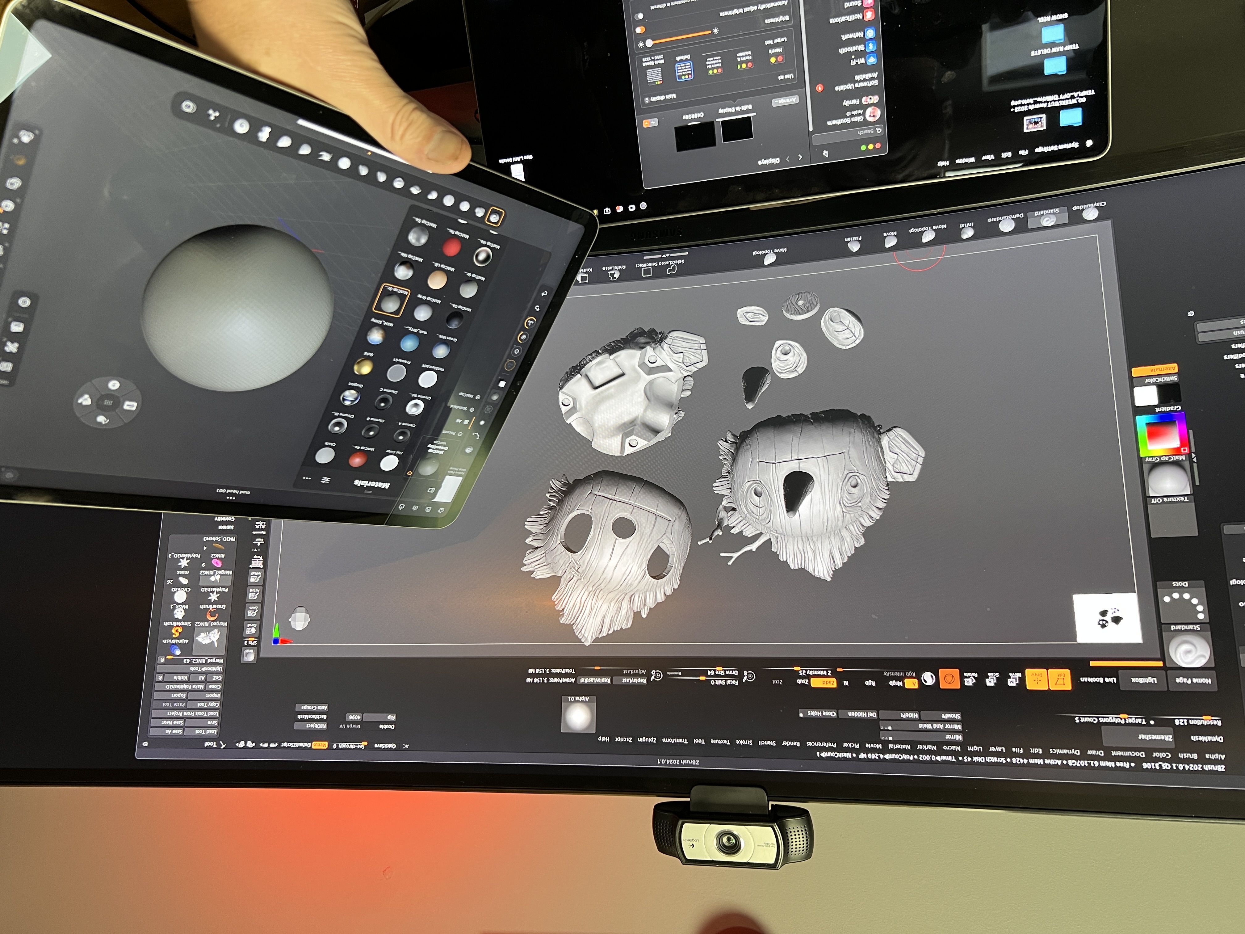
ZBrush for iPad is not 'ZBrush lite'; it’s not an improved edition of ZBrush Core with more brushes. This release is a genuine rewrite of the best digital 3D sculpting program ever made and Maxon has done a stand-up job in developing this first version. It's brand new and familiar all at once, in the best way possible.
There is a free option and a subscription version with lots of extra tools and features. The free version is not a demo or hobbled to the point where you can’t use it. You can do almost everything with a few key tools omitted.
My personal bug-bear was the omission of the Dam standard Brush (used for creases and wrinkles) in the free version as that is one of my top four most used brushes. But, I guess Maxon needs to give you a reason to upgrade.
4. The pricing feels right
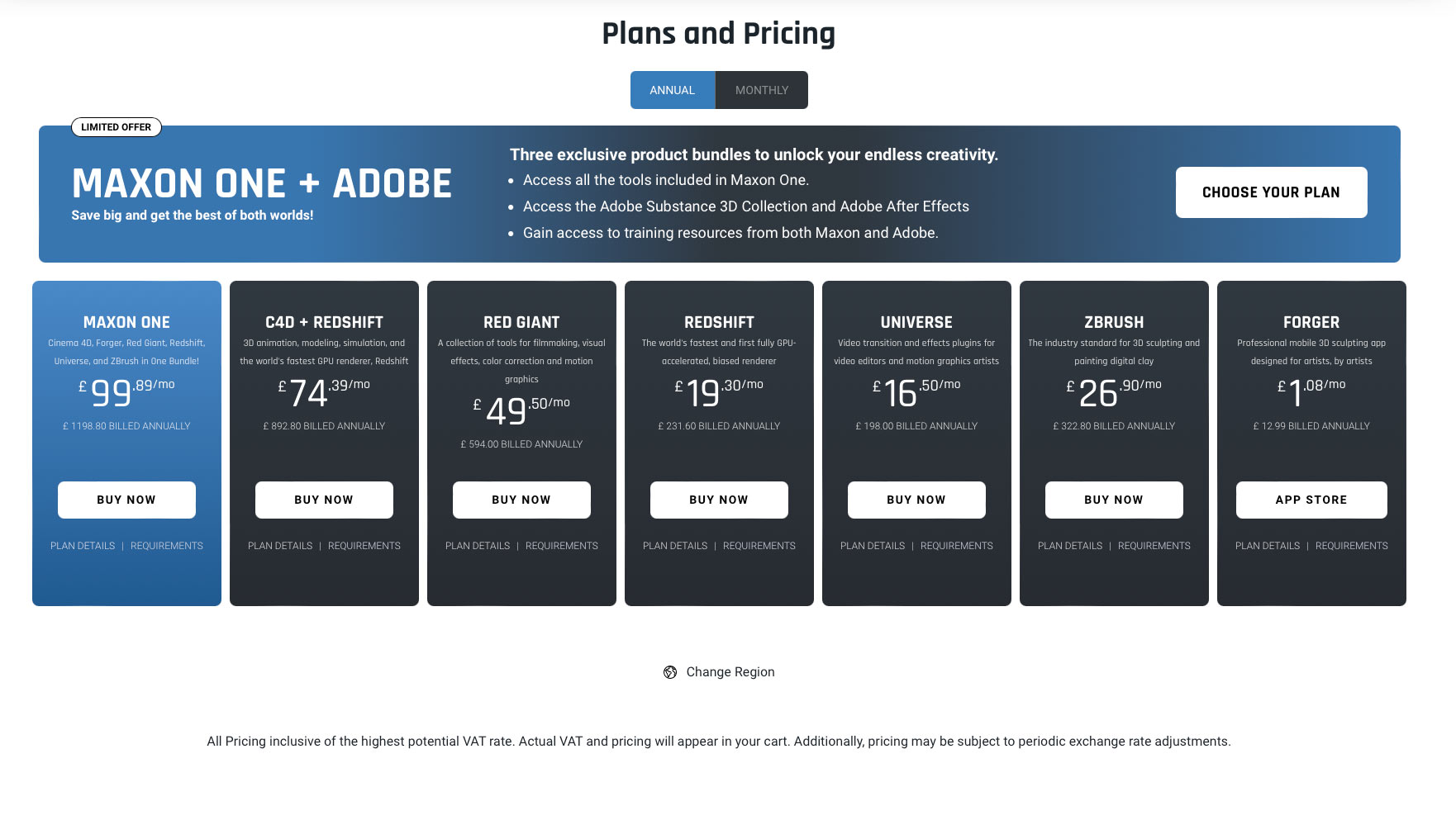
A dirty word in some circles, the subscription model does have its fair share of negativity attached to it. When Maxon purchased Forger App (one of the first mobile sculpting options on the iPad) it put this app into the Maxon store at $14.99 / £9.99 a month. Not a huge number until you consider that Nomad Sculpt which is far more refined, feature rich and has real-time rendering and is only £15.99 and one off payment with lifetime upgrades free.
This is the landscape that ZBrush for iPad is entering. The free option with a heavy amount of features if a great way to go up against Nomad Sculpt and over time artists may feel that ZBrush for iPad is a great introduction to digital sculpting, maybe even leading to a new career and an upgrade to the desktop version used in films and games the world over. Time will tell.
If you were to upgrade, ZBrush for iPad has a monthly $9.99 and an annual subscription of $89.99. The good news? Not only is the free version excellent, but ZBrush for iPad comes free with a ZBrush desktop subscription, which is $49 per month or $399 per year.
Sounds pricy? But what this boils down to is, Maxon is offering a free version to get newcomers interested with the option to stage your way into ZBrush, and maybe a whole new hobby or career in 3D art.
5. No real time render
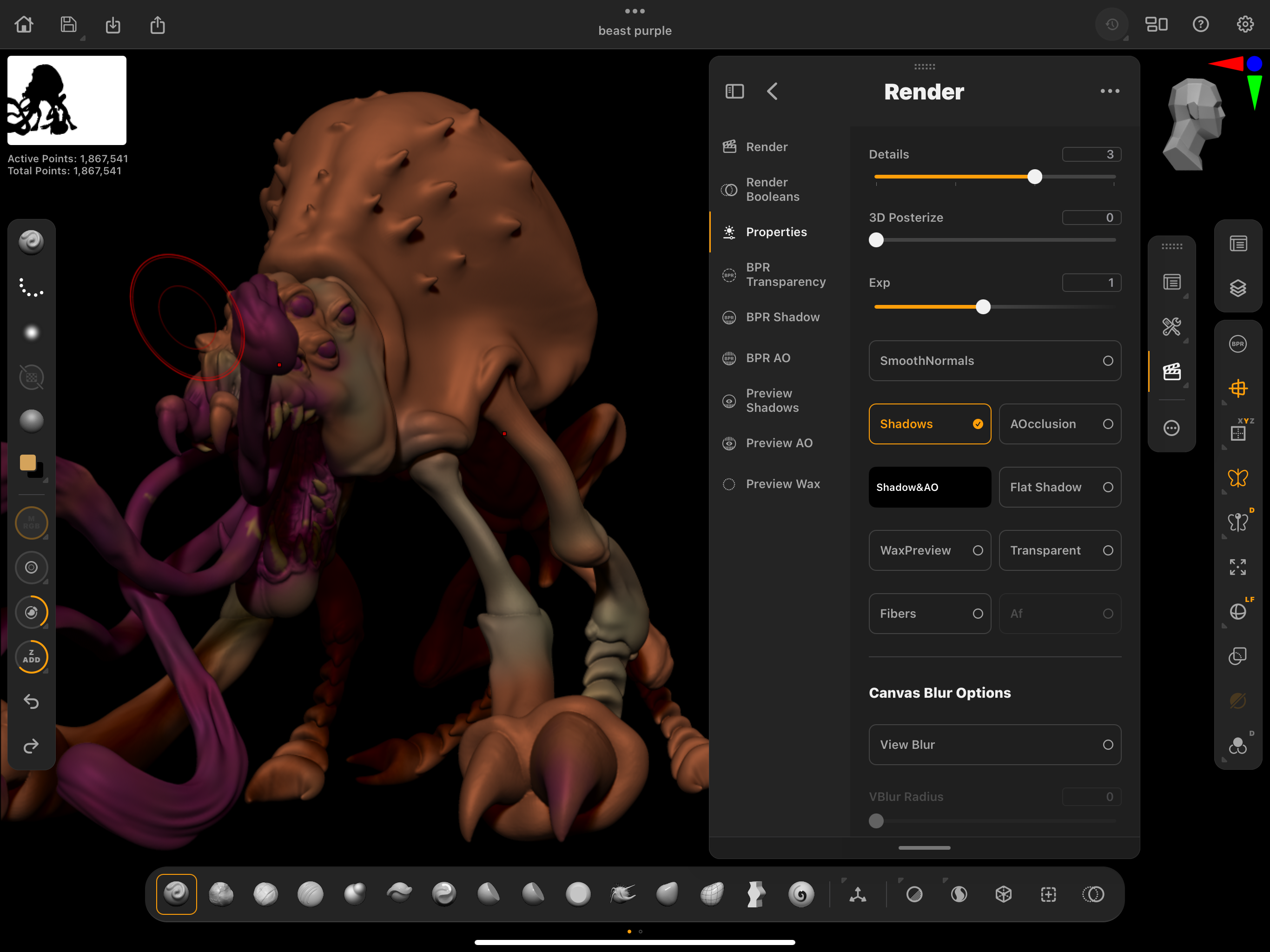
This is the one area where the competition wins outright. ZBrush for iPad does not have a real time rendering option. The desktop doesn't either but lots of the competition does offer it.
On the desktop we have Blender with the Eevee render option and Nomad Sculpt on the iPad has post processing and a real time solution that is very similar to that offered by SketchFab. No shock there as the Nomad developer worked for Sketchfab for quite some time.
Having taught these new tools extensively in recent years I can categorically say that new users love to have a real time option as they sculpt. Being able to light and render in realtime is almost essential these days and ZBrush iPad is launching without that, without a native real time renderer, is an option that would make a huge difference in converting users. (I expect it's on the whiteboard of features to add.)
ZBrush for iPad: final thoughts
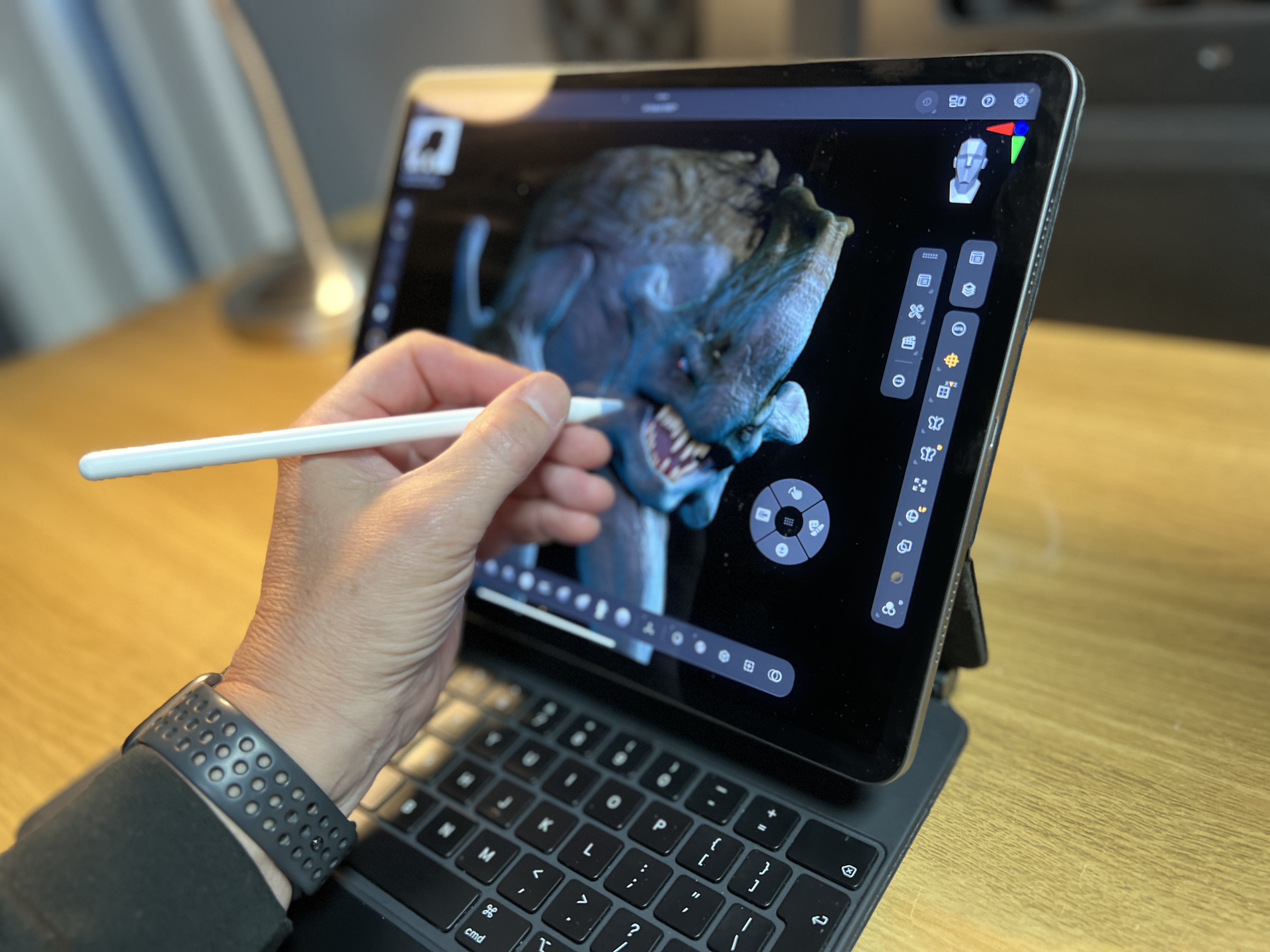
I’m 25 years into my digital sculpting career and I have been a ZBrush evangelist the entire time. I love the program, the Pixologic team that created it and especially what I can do with it, including 3DPrinting, modelling for video games, film and TV VFX, and even AR.
Maxon's mobile version has been created by a much bigger team than the original devs at Pixologic and is entering a very different market with established apps for competition.
But ZBrush for iPad has been made in the image of the original desktop software, with lots of the legacy issues resolved or removed. For this reason, ZBrush for iPad is a pleasure to sculpt and paint with.
If you need a new iPad to use ZBrush for iPad, then read our guide to the iPad generations, with new deals and prices regularly updated. You can also read our iPad Pro (M2) review and Apple Pencil Pro review.


