
The Dynamic Island on the iPhone 14 Pro and iPhone 14 Pro Max is either one of the best features Apple has added to the iPhone in years – or an oversized gimmick, depending on your perspective. What most people can probably agree on though is that it’s not currently being used to its full potential.
After all, this is an often extremely visible combination of hardware and software, and arguably the biggest visual change we’ve seen to the front of an iPhone since the iPhone X. So it makes sense that it should be extremely useful too.
The good news is that Apple is off to a solid start here. The core idea is strong, but the Dynamic Island has existed for close to a year now, so alongside the launch of the iPhone 15 we’d like to see it used in more and better ways, and we’ve got some suggestions...
What do we expect from the Dynamic Island on the iPhone 15?
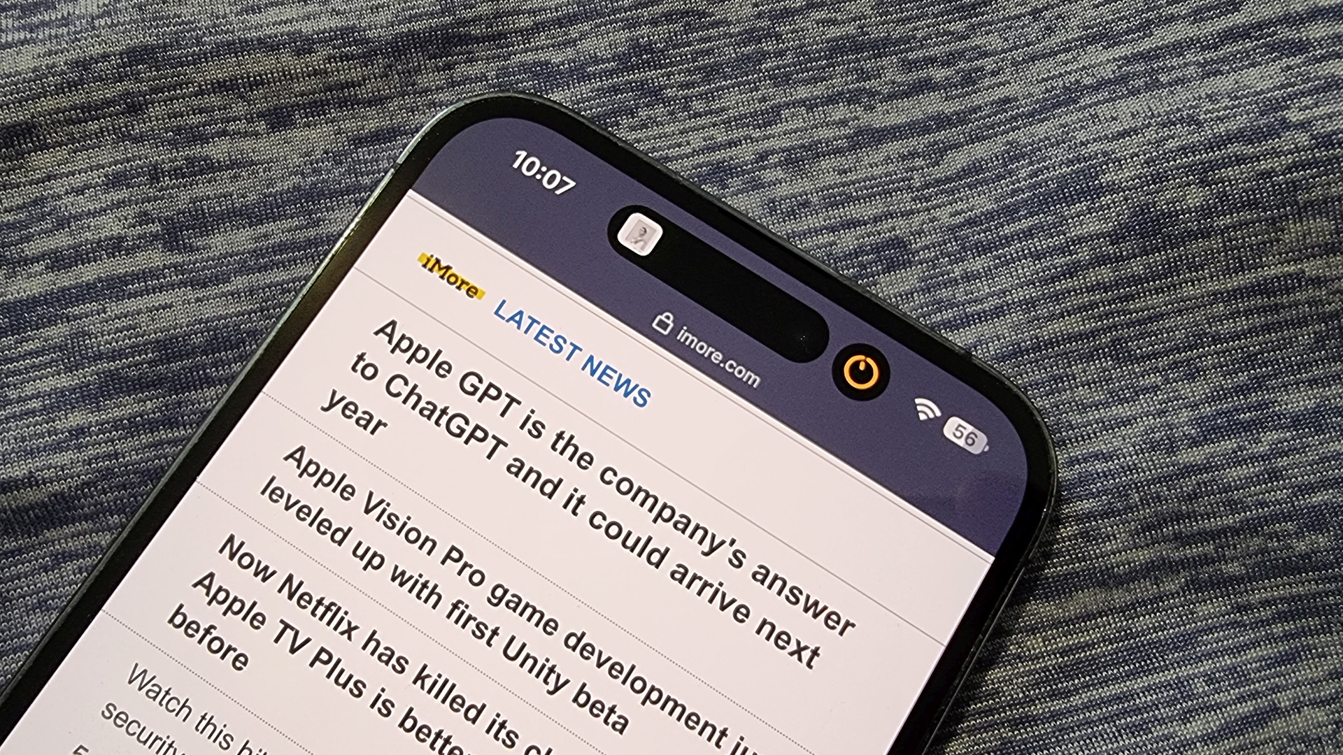
At this point, we’ve heard a lot of leaks about the iPhone 15 lineup, and from what we’ve heard, the Dynamic Island probably won’t be changing much – at least on the hardware side.
Ming-Chi Kuo (a reputable Apple analyst) has suggested that this time the proximity sensor will be placed inside the Dynamic Island, rather than below it as is the case on the iPhone 14 Pro and the iPhone 14 Pro Max, but that’s unlikely to make much of a difference either visually or in terms of what the Dynamic Island can do.
The big news is simply that the standard iPhone 15 and iPhone 15 Plus will probably also have a Dynamic Island, meaning Apple will have removed the notch from all of its latest mainline iPhone models.
But with the Dynamic Island likely being present on all four 2023 handsets, that’s all the more reason Apple should try and get the most out of it, because it looks set to soon go from a premium feature to a mainstream one.
How can Apple improve the Dynamic Island?
Okay, so from what we’ve heard so far the Dynamic Island will probably be more or less the same size and shape on the iPhone 15 line as it is on the iPhone 14 line. That means realistically any major improvements will probably happen under the surface or on the software side.
Thankfully, that’s the area where there’s the most potential for improvement too. The following then, are our suggestions for what improvements Apple could make.
Tap to expand
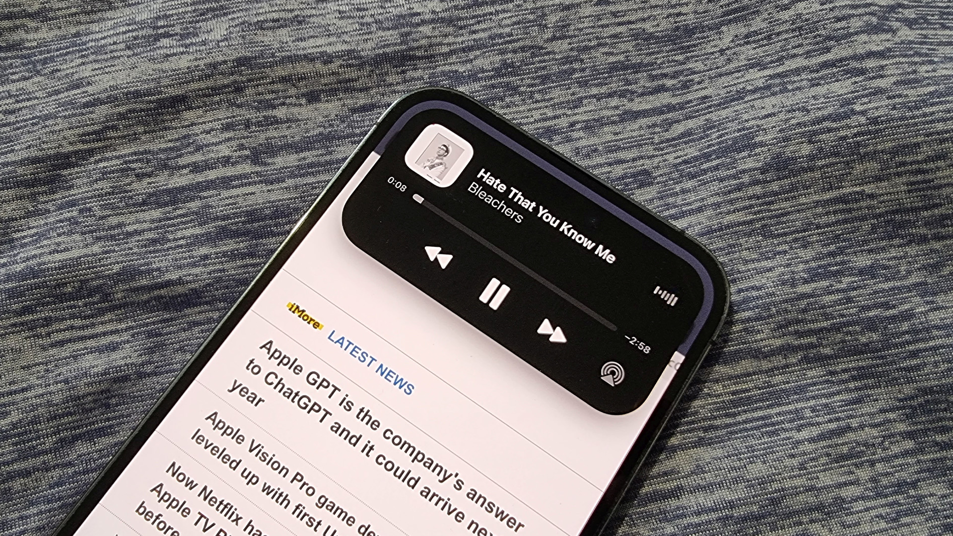
Right now, if you tap on what’s showing in the Dynamic Island it takes you straight to the associated app. If you instead want to expand the Dynamic Island so you can see more details or get some controls without leaving the screen you’re on, you need to long press it.
Arguably, that’s backwards. We want to see more ways to interact with the Dynamic Island, and to incentivize that a simple tap should be what gives you access to an expanded version of it. For the most part, we don’t really even need a shortcut to an app that’s probably no more than a tap or two away anyway, so make that the long press.
Of course, we’re sure that not everyone agrees, so ideally a toggle should be added in Settings, letting you decide whether you want to tap or long press to expand.
Integrate it with Siri
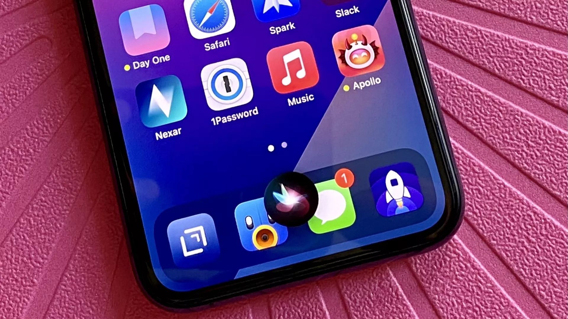
Right now, if you launch Siri on an iPhone 14 Pro, the Siri animation will appear at the bottom of the screen. Ask it a question, and the visual answer will be displayed on top of whatever screen you’re on, but separate from the Dynamic Island.
Why can’t this or the Siri icon be an extension of the Dynamic Island? Doing so would look slicker and leave the display less cluttered than having a Siri icon, Siri results, a Dynamic Island, and whatever you were doing prior to all this, all showing separately.
The Dynamic Island already has fantastic animations as it expands and contracts, so we’d love to see Siri itself get integrated into that, with its answers bursting out of the Dynamic Island.
We’re specifically highlighting Siri here, but similar integrations for Apple Pay and notifications would also be desirable, with the latter extending out from the Dynamic Island when you swipe down.
Leave apps in the Dynamic Island

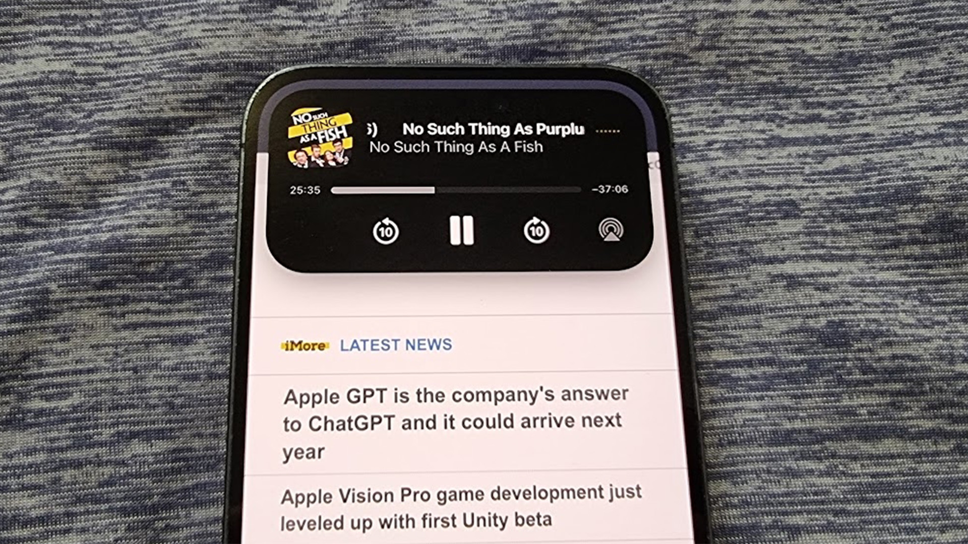
One other way the Dynamic Island could be improved is by leaving idle apps in there for longer. What do we mean by that? Well, if for example you’re listening to Spotify on your iPhone, you’ll see the track you’re listening to in the Dynamic Island.
That’s great, but if you then pause the music, you’ll find Spotify disappears from the Dynamic Island within a matter of seconds, so if you then want to later unpause the track you’ll have to open up Spotify again (or swipe down the Notification Center to access the widget there).
We’d like to see apps stay there a lot longer than that if nothing else is opened to replace them because as things are now, the Dynamic Island can feel a bit inconsistent as to whether you’ll be able to interact with an app through it.
Lock apps to the Dynamic Island
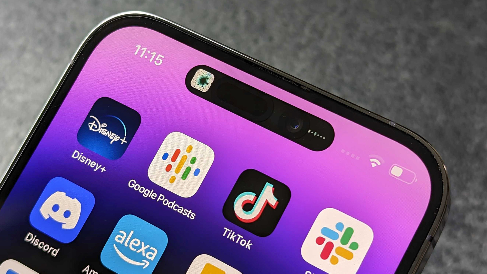
Similarly, we’d like the option to be able to lock an app to the Dynamic Island so that it doesn’t disappear at all – no matter how long you’ve left it or how many other apps you’ve used.
This would somewhat address the issue above, and would also be handy when you just want to prioritize what’s shown in the Dynamic Island. Currently, it can show two apps at once, but if you open a third app that has a Dynamic Island integration then one of the others will disappear, so this way you could control which ones stay.
Better yet, let us pin apps to it that don’t otherwise work with the Dynamic Island, so we can use it as a shortcut to these apps at times when we want quick or frequent access.
Get more apps on board
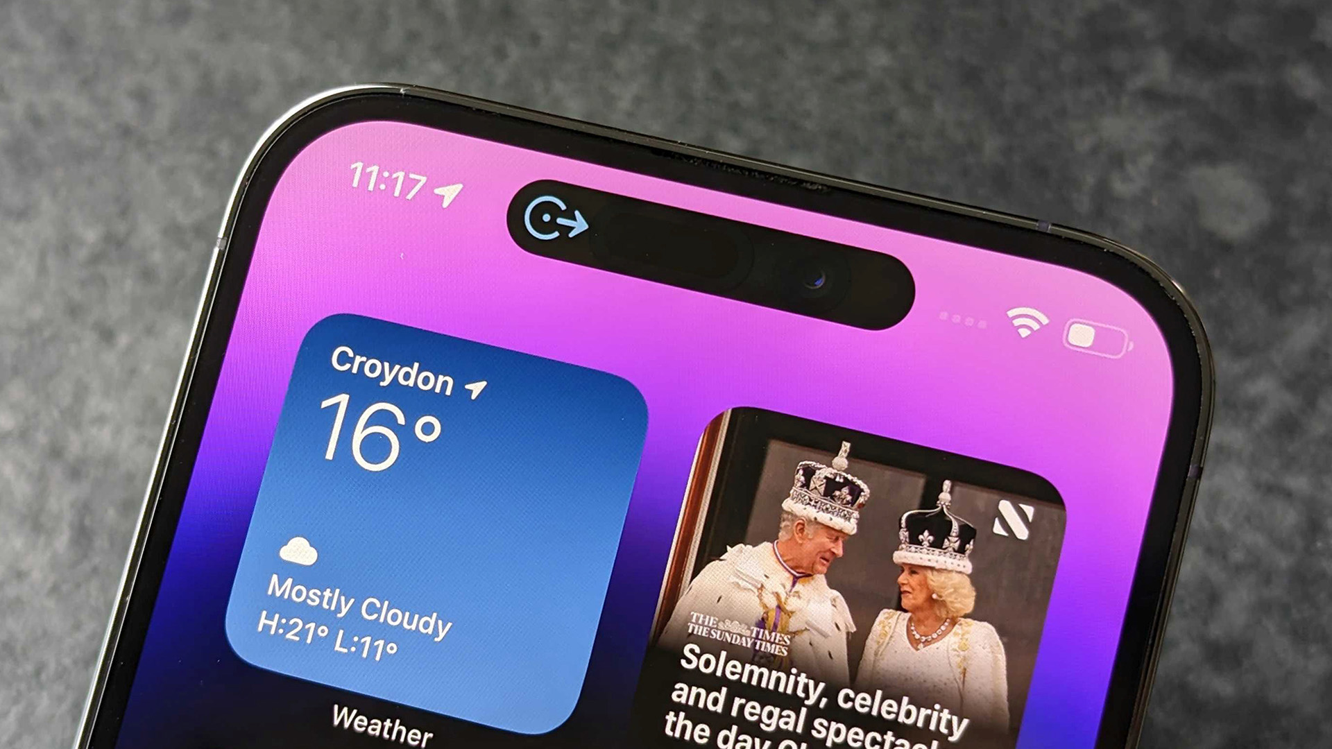
Perhaps the biggest area where we’d like to see improvements to the Dynamic Island though, is simply more apps integrating with it and in more interesting ways.
Currently a decent selection of apps do make use of the Dynamic Island, but a lot still don’t. Plus, many of those that do, don’t in particularly interesting or even useful ways, often just showing an icon or an animation rather than providing handy at-a-glance information or any sort of controls.
For example, if you ask Google Maps to navigate you somewhere, the Dynamic Island will just show a little blue arrow – and not even one that represents the direction you should be going. Long pressing to expand the island does nothing here either.
Apple Maps does better, as you’d hope coming from Apple itself, but even then a long press just provides a road name and distance – why couldn’t it display a small section of the map?
Or how about expanding what the Dynamic Island is capable of by, for example, having a notebook app that, when long pressing on the Island, brings up a small panel to write in and even a keyboard, so you can type out quick notes from any screen.
These are just a couple of examples, but in short, we want to see more apps using the Dynamic Island and for them to do more with it, rather than just the bare minimum.
The good news is, improvements are being made – Google Maps for one is set to offer turn-by-turn navigation within the Dynamic Island, and improvements to the Dynamic Island integration of other apps are sure to follow.
Final thoughts
These are just a few ways that Apple could improve the Dynamic Island for the iPhone 15, but as they’re software changes, they could also come to the Dynamic Island on the iPhone 14 Pro and iPhone 14 Pro Max, so everyone might benefit.
That’s if Apple – and app developers – decide to do these things. But as noted above we are gradually seeing more apps use the Dynamic Island – and use it in better ways, so that at least is improving.
The other changes would largely have to come from Apple, so could perhaps come with iOS 17 or a later software update – we should note that there are no real signs of these changes though, they’re just things that Apple really should implement.
Beyond that, there are hardware improvements that could be made too, like making the Dynamic Island smaller (or having it disappear altogether) when not in use, but that would mean shrinking the front-facing camera and Face ID components or hiding them under the screen, and we’re not expecting that to happen with the iPhone 15 line.
Still, if Apple implements the software changes above, it could really level up the Dynamic Island, and make it the widely used feature it deserves to be.


