White paint is often seen as the default to cover pretty much anything and everything in our homes, coating the walls and architectural features of most rooms. But it doesn’t have to be this way – in fact, there are areas of your home that shouldn’t be painted white. In fact, they would look so much better and work harder for the overall look of the space if they were painted a different colour.
So when it comes to certain DIY jobs, it’s better to leave even your best white paint alone and reach for another shade. Depending what it is that you're painting, it might not even be something overly vibrant – just changing from stark white to a neutral colour can be the perfect paint idea for your space and it often makes a world of difference.
‘White paint can be quite unforgiving,’ explains Tash Bradley, Lick’s director of interior design and colour psychologist. ‘It can highlight every imperfection on walls. It can also feel stark and uninviting in spaces that lack natural light. It also requires more maintenance, as marks, scuffs, and dirt are more visible compared to deeper tones.’
Bailey Oates, colour expert at Earthborn, adds, ‘While white can give a clean, modern appearance, they often lack the comfort, depth, and individuality that homeowners seek in their homes.'
1. The ceiling
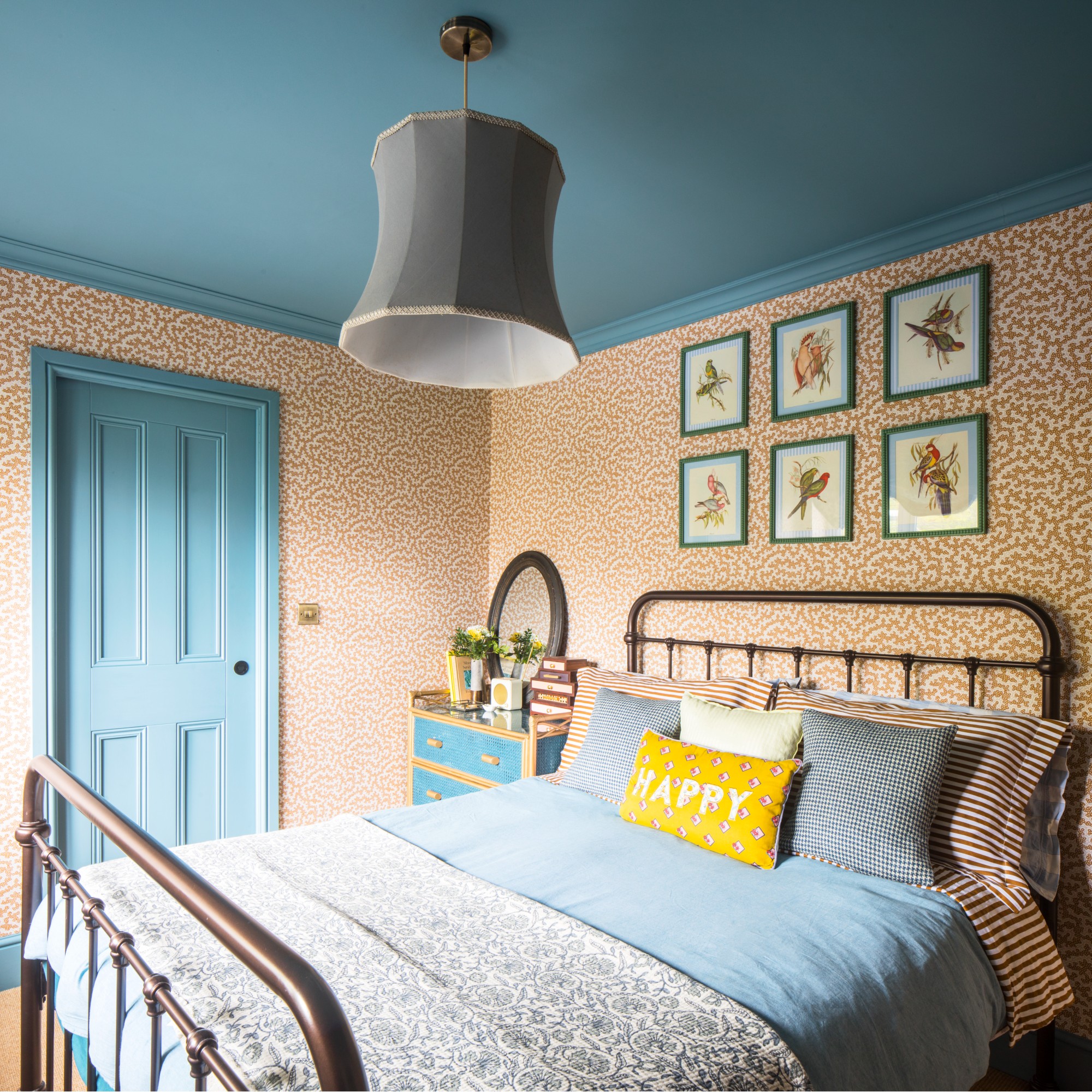
We’re starting with quite a controversial answer because the ceiling is a tricky one - and one that tends to be painted white more often than not. There are of course times that a white ceiling can work, especially if your walls are white, too. But there is a misconception that a ceiling should be always left plain white and that’s just simply not the case.
In fact, two of the biggest paint trends of this year are painting the ceiling a bold, contrasting colour and colour drenching, where one shade covers all the surfaces of a room - including the ceiling.
‘A painted white ceiling was a traditional way to make a room feel lighter and more spacious that became really popular way back in the 1940s and stuck until recently when lighting became a key feature of the home, multilayered and controllable,’ says Marianne Shillingford, creative director and colour expert at Dulux.
‘It still works today but somehow it looks odd when a beautiful wall colour stops dead at a sea of white overhead. Personally, I love a coloured ceiling. It’s the final piece of the jigsaw in pulling a look together and maybe because it’s still not something every home has, it feels quite special.’
When Dulux launched True Joy, its colour of the year for 2025, one of the ways the brand suggested using it was on the ceiling, and I still love that idea of a bright yellow ceiling reminiscent of a sunny sky.
Preferred partner
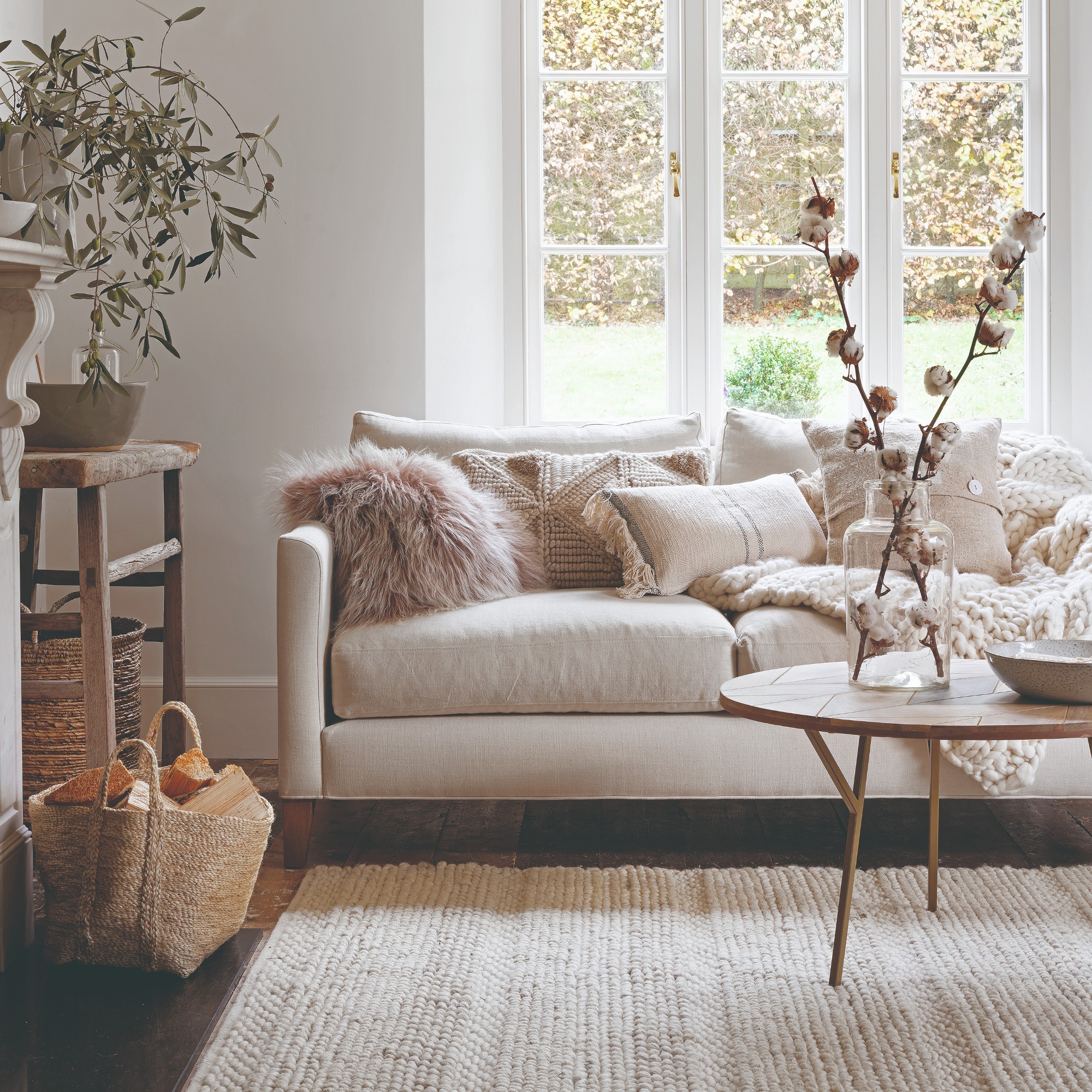
2. Open-plan spaces
Many of us love the idea of open-plan, white loft-like spaces flooded with light. But having such a huge canvas go to waste by choosing to make an open-plan living room plain white rather than making either a colour statement or using colour to zone different areas of the space feels like a missed opportunity.
‘Open-plan spaces, if painted entirely white, can sometimes feel flat and lacking in depth – adding tonal variation through soft neutrals or deeper shades helps create warmth and definition,’ says Tash at Lick.
A soft neutral is preferable in an open-plan space over plain white, but a pale, earthy shade of pink can work almost like a neutral and just as well. Setting Plaster is one of Farrow & Ball bestselling paint shades in 2025 and one that interior experts swear by.
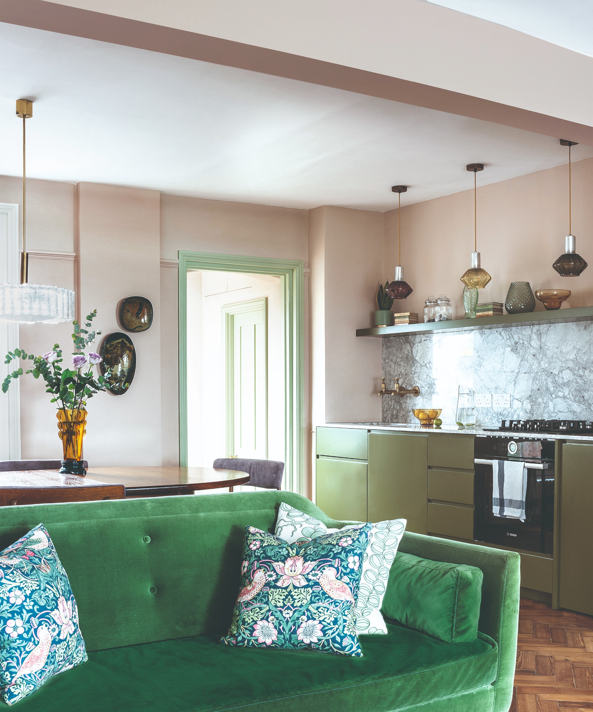
3. Skirting boards
‘Painting your skirting boards a simple white throughout your home is a way to connect all the individual rooms together so your home feels seamless and cohesive,' explains Marianne from Dulux. 'But it can also amplify dirt and scuffs so using other colours can be more practical and arguably more personalised and stylish.'
The prominence of white glossy skirting boards in UK’s homes is a pet peeve of many interior and paint experts, including interior designer Kelly Hoppen. As a result, most recommend opting for a coloured skirting boards.
‘Colour drenching skirting boards in the same colour as the walls creates a seamless, contemporary look, making a space feel bigger and more cohesive,' says Tash. 'If you want to highlight period features, using a slightly darker shade or an off-white with a softer tone can add elegance without feeling stark.'
If you're looking for some alternative skirting board colour ideas then forest green would be at the top of my list. Green has become one of the go-to decorating colours recently and a dark shade like this one on the skirting boards would make for a considered feature.
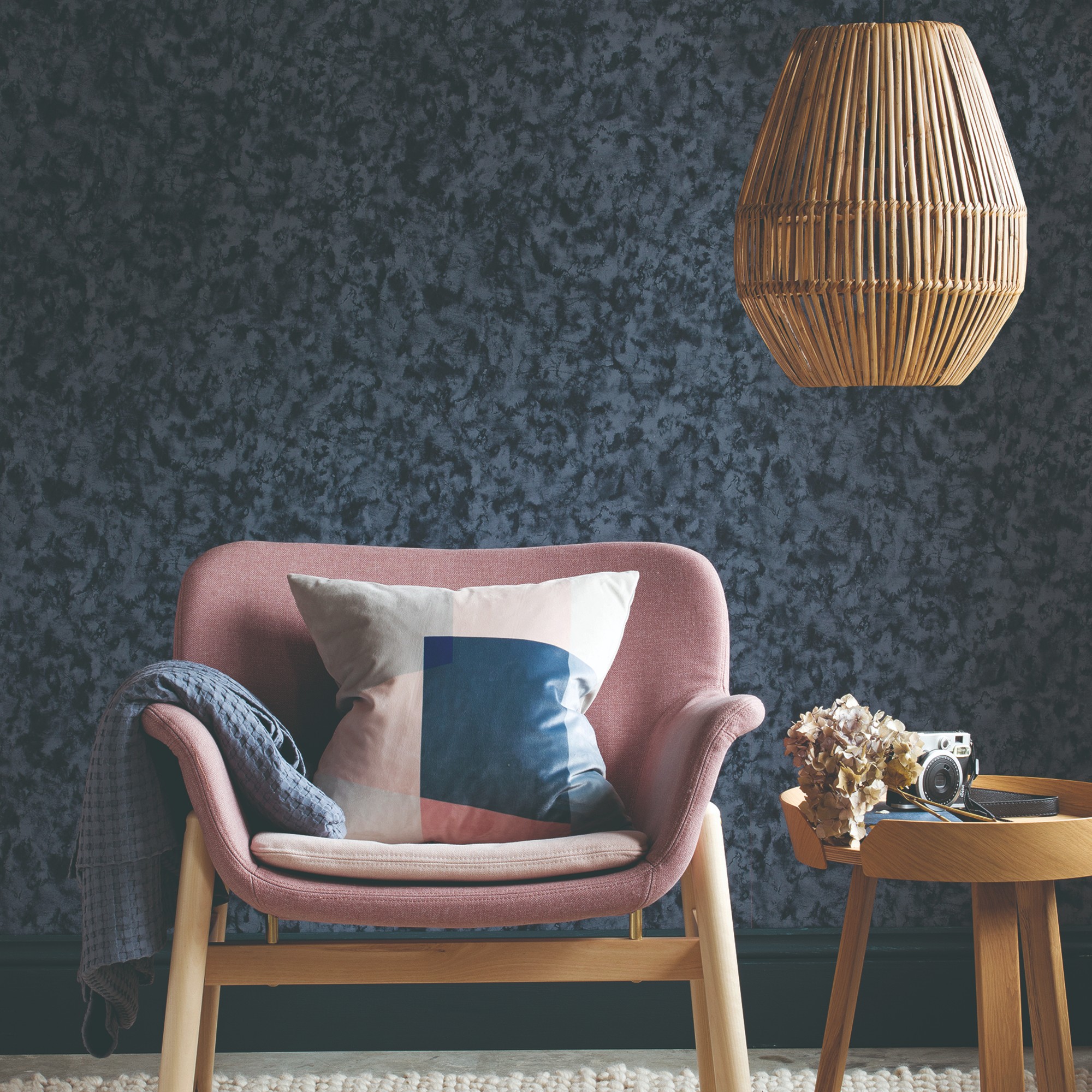
4. Dark, narrow hallways
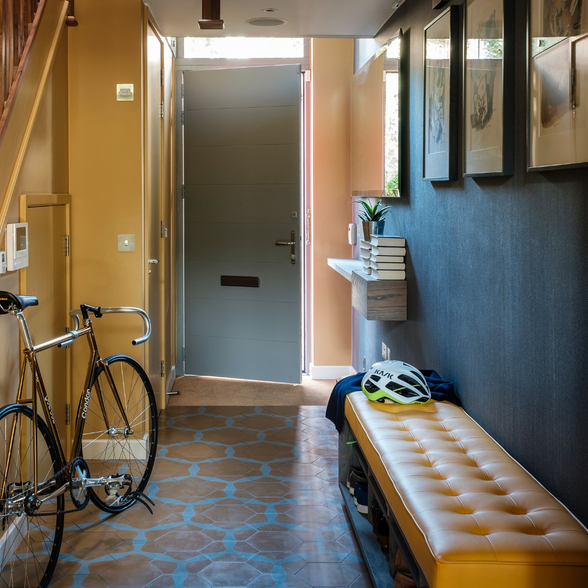
You’d probably think that white paint would make for a good narrow hallway idea in order to expand and brighten the space. But that’s not necessarily the case, especially if your narrow hallway lacks natural light.
‘In narrow hallways, white can feel stark and clinical rather than warm and inviting,' says Tash. 'And white in a hallway without much natural light can feel cold and flat. Instead, using a soft, warm neutral or even a deep, rich colour creates depth and makes the space feel cosier.'
If you're working with a dark, narrow hallway then a light colour with warm undertones will work best. I particularly love this baby blue from Lick, complete with warm yellow undertones.
Since these four spots that shouldn’t be painted white are quite unexpected, I fully appreciate that it these takes can be quite controversial, too. So are there any that you think shouldn’t be on this list? Or what would you add instead?