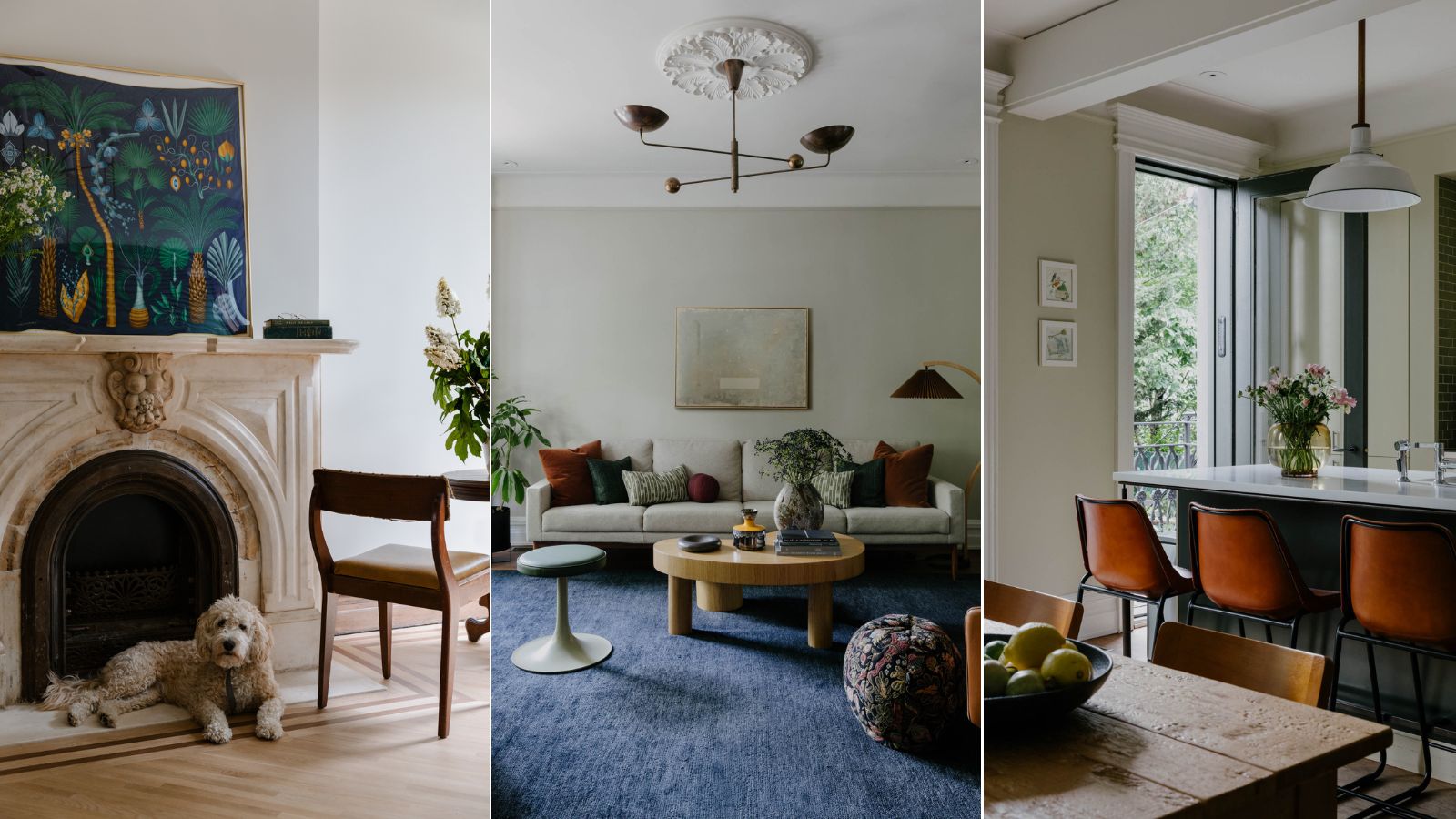
There's nothing quite as charming as a historic home, and Brooklyn brownstones represent the best of the best. Built largely throughout the 19th century, these iconic, stately properties line the streets of neighborhoods all across the borough. And while their exteriors represent the past, many have undergone recent updates that emulate high-end interior design styles across the board.
Often passed down through families through the years, or purchased for a hefty sum, it's not often that we get a glimpse of the stunning design schemes that blend enduring historic features with modern-day living. To get a peek inside, we spoke with experts from four New York City-based design firms.
Here, they share a bit more about the brownstone renovations they've completed, the challenges associated with reviving a historic space, and their favorite finishing touches that make these homes even more unique.
4 stunning brownstone remodels to inspire
Each of these four remodels retains architectural charm while expressing personality and character. Here, the designers behind each of the spaces explain what really goes into reviving a Brooklyn brownstone.
The Brownstone Boys
Jordan Slocum and Barry Bordelon, also known as The Brownstone Boys, have forged careers restoring and renovating these iconic properties. Transforming homes all across Brooklyn, from Flatbush to Fort Greene, they've become veritable experts in the delicate art of brownstone design. And earlier this year, they published For the Love of Renovating, an in-depth guidebook exploring the ins and outs of updating properties without compromising historic charm.
When the Brownstone Boys found this Bed-Stuy property, built in the late 1800s, they saw its potential – but quite a bit of work went into unearthing its timeless beauty. 'When we first saw it with homeowners Laura and Rebecca, we knew there was a TON of work to be done. From the dated front door to the uneven floors to boarded up stained glass windows, this project was a diamond in the rough. It became our largest restoration project to date,' Jordan tells H&G.
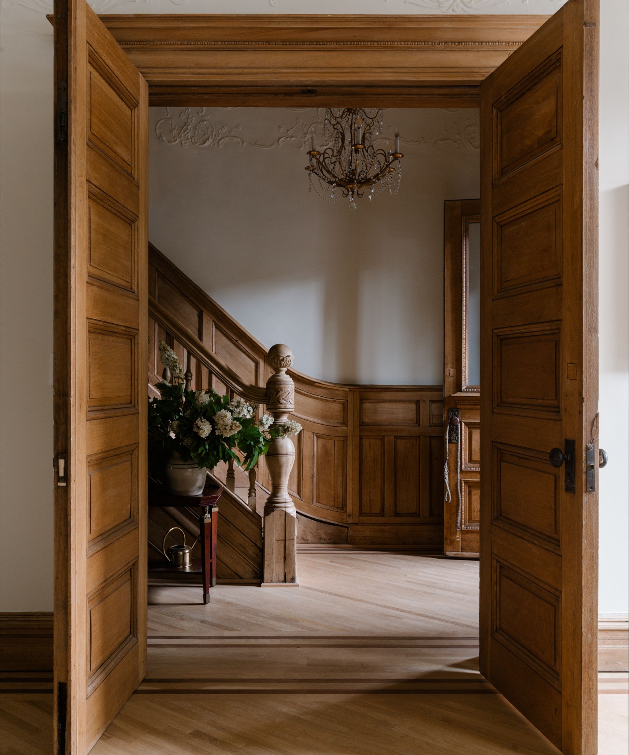
'Our biggest challenge was probably the process of restoring the staircase. This involved detailed and painstaking work stripping back so many layers of paint and stain. Seriously – if it could be applied with a paintbrush, it was covering this woodwork,' Barry adds. 'Then, we also had to straighten the staircase! Each of these elements required expert craftsmanship and plenty of elbow grease.'
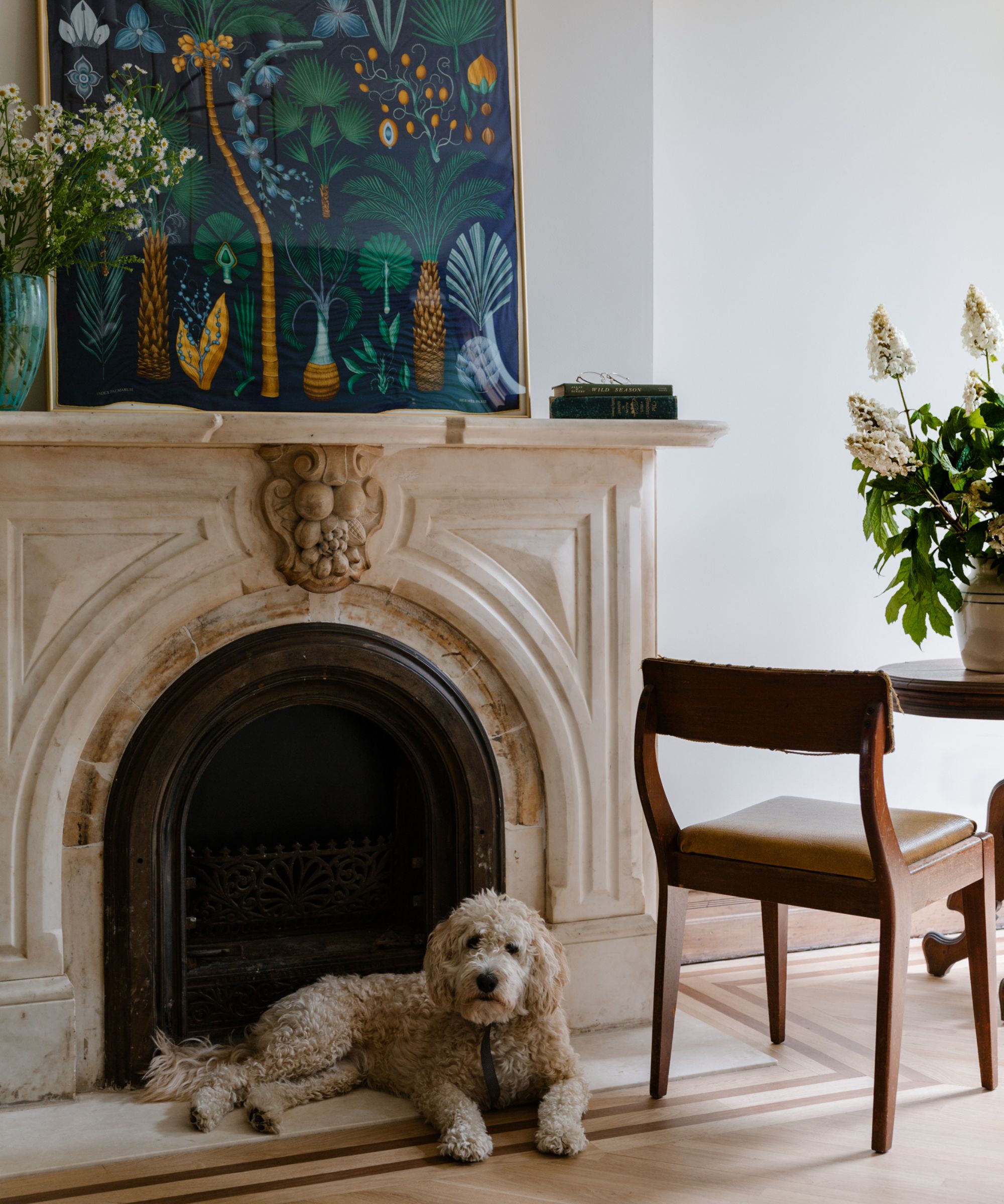
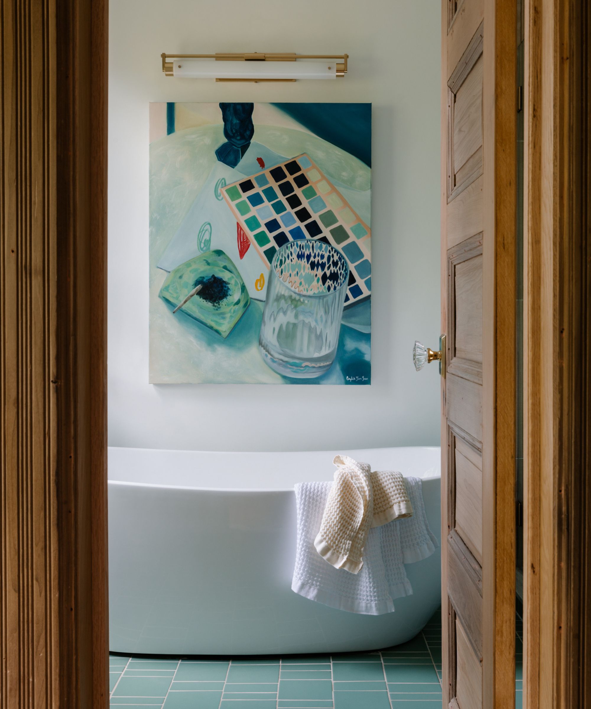
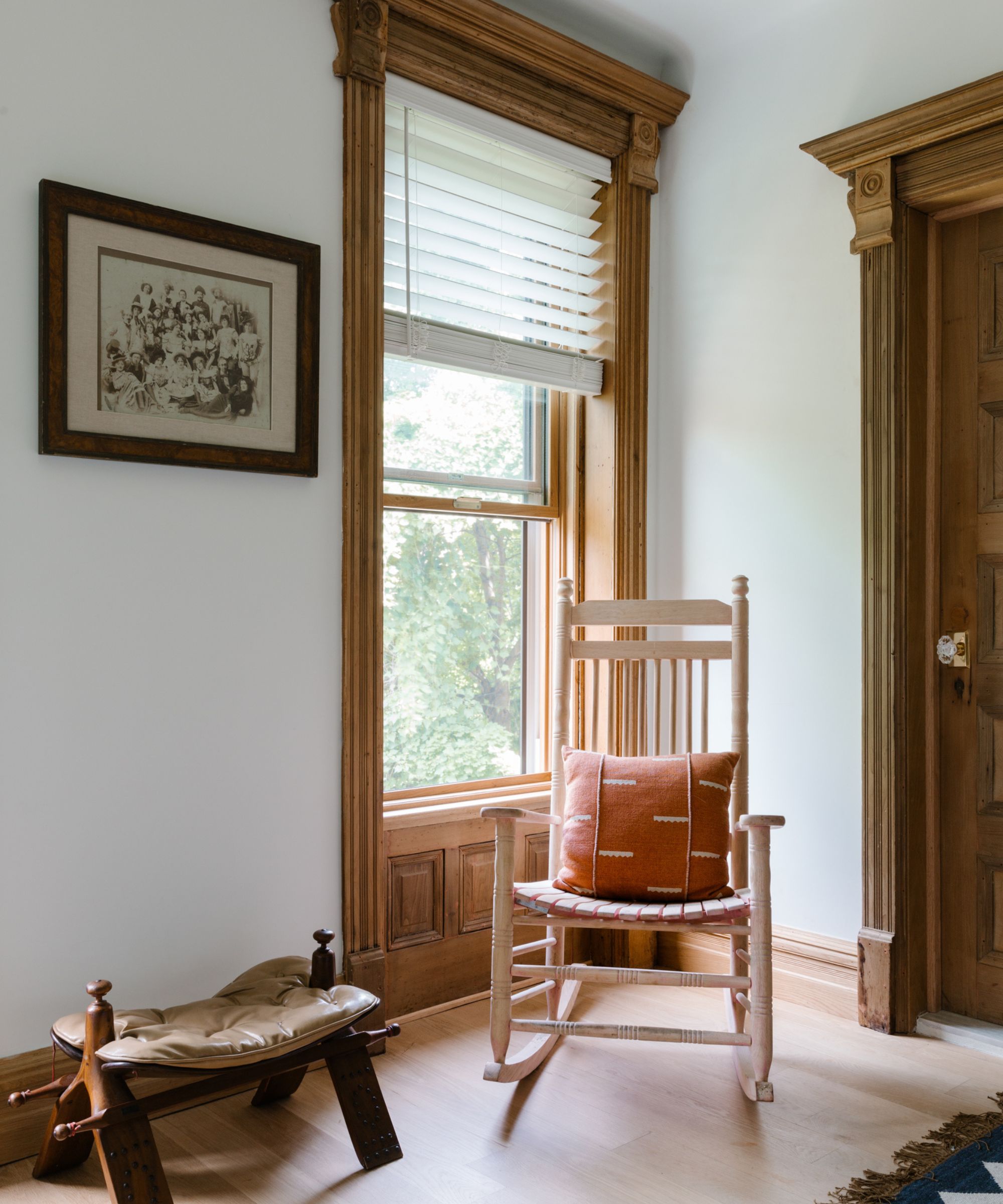
The finished space is respectful of the building's past while still fit for a busy family in the present day. With calming pops of color and natural wood finishes throughout, it's a serene escape within the city. Barry says that it's hard to pick a favorite element of the end result, but shares that the preserved architectural details and finishes make the whole space sing.
'If we had to choose one thing, it would be all of the wood we were able to strip and refinish in the home. From the walnut pocket doors (which are now fully functional) to the wainscoting, there was a LOT of wood in this home. We went with a natural finish to really show off the texture and quality of the woodwork,' he says.
'The style of the Gates House is a blend of historical elegance and modern functionality. The restoration really brought out the classic beauty of this early 20th-century home, while the modern touches, like the sleek kitchen, added balance. We don’t want families to feel like they’re living in a museum – so the home has to be a space that can grow with them, while respecting the home’s history,' says Jordan.
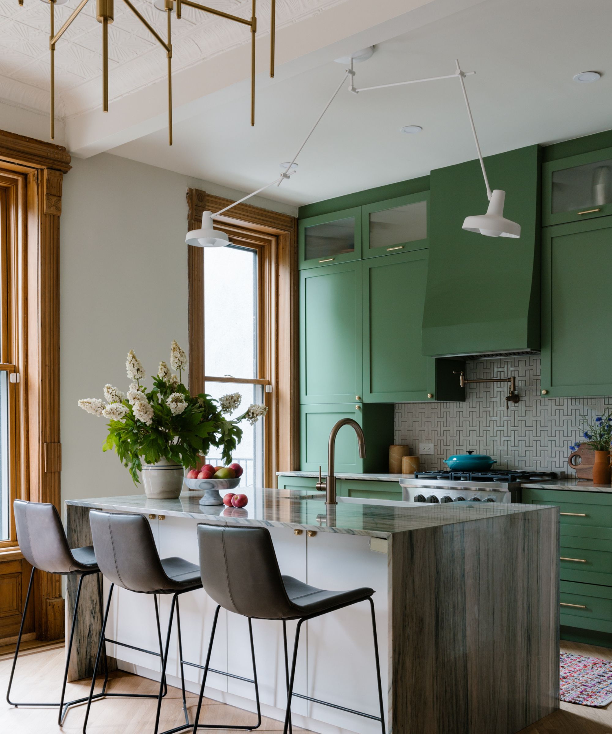
'This project reflects our deep appreciation for historical architecture and commitment to preserving the past. However, it also shows our love of bold color and pattern. From the unique backsplash in the kitchen to the dark and moody powder room, we added elements of contemporary flair,' says Jordan.
'We are so grateful to our wonderful homeowners, Laura and Rebecca, who were a dream to work with. It was essential that we create them a family home that they could raise their daughters in. It’s our privilege to take older homes that are rundown and give them a second chance, especially in our own neighborhood!' adds Barry.
Emma Beryl Interiors
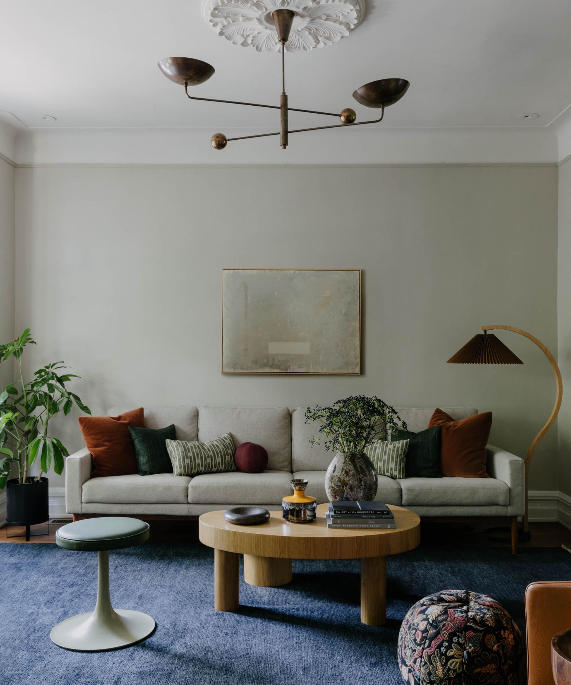
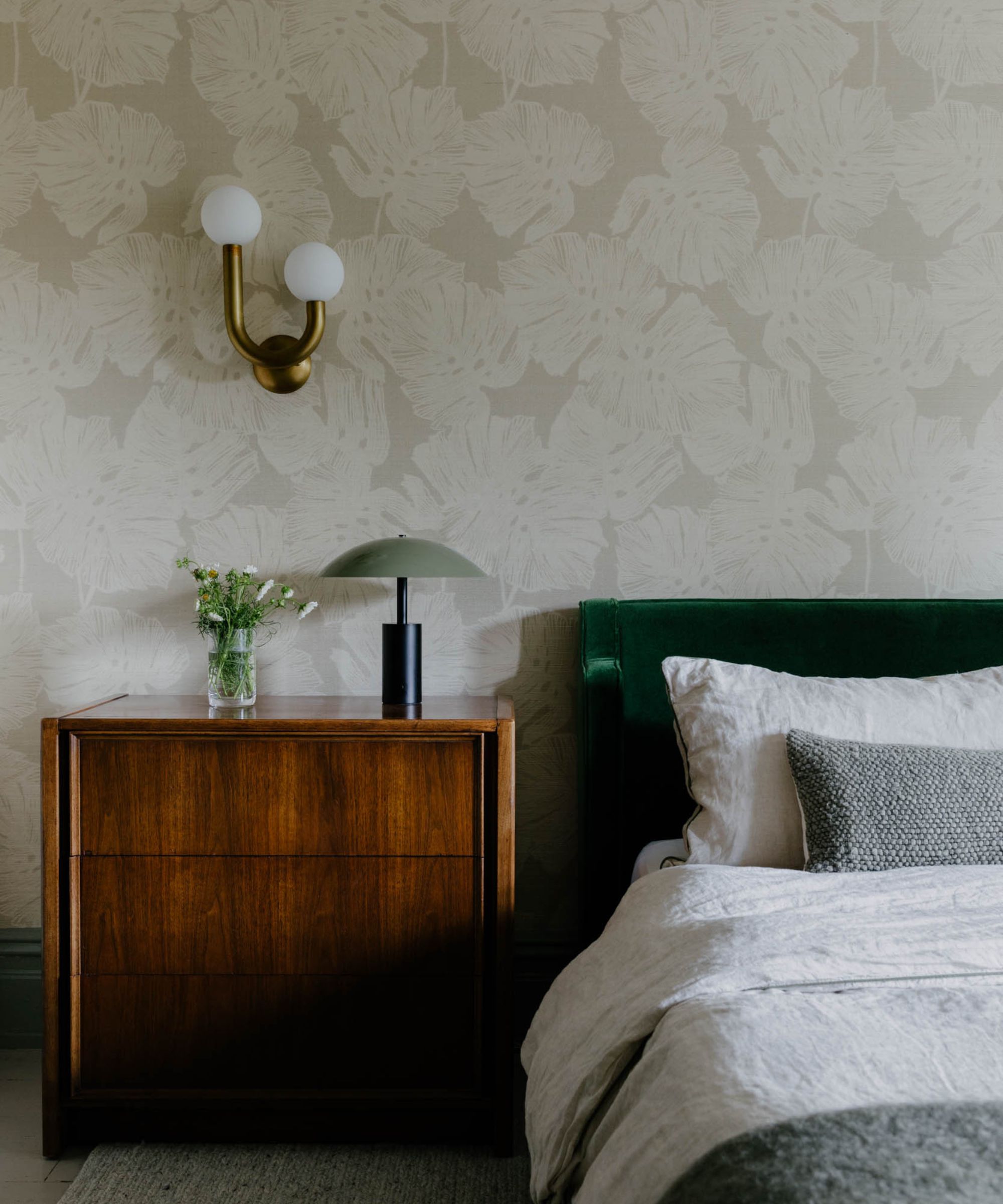
Emma Beryl, principal and founder of New York City-based Emma Beryl Interiors, renovated this gorgeous brownstone for a young family looking for a one-of-a-kind design scheme. Full of energizing colors and characterful accessories, the finished space combines the best of the historic property's architecture with eclectic pops. Emma tells H&G that her clients originally 'fell in love with the house' because it had been renovated for practical reasons, but still retained its 'original aesthetic.'
'Our task was to emphasize the special characteristics of the house and play up the charm,' says Emma. 'The interiors of many of the row houses in this area are practically identical – I even had a design colleague reply to an Instagram [post] of one of the spaces saying she was working on a house that looks almost the exact same. We wanted to make the house feel special for the clients so it was perfect for their lifestyle.'
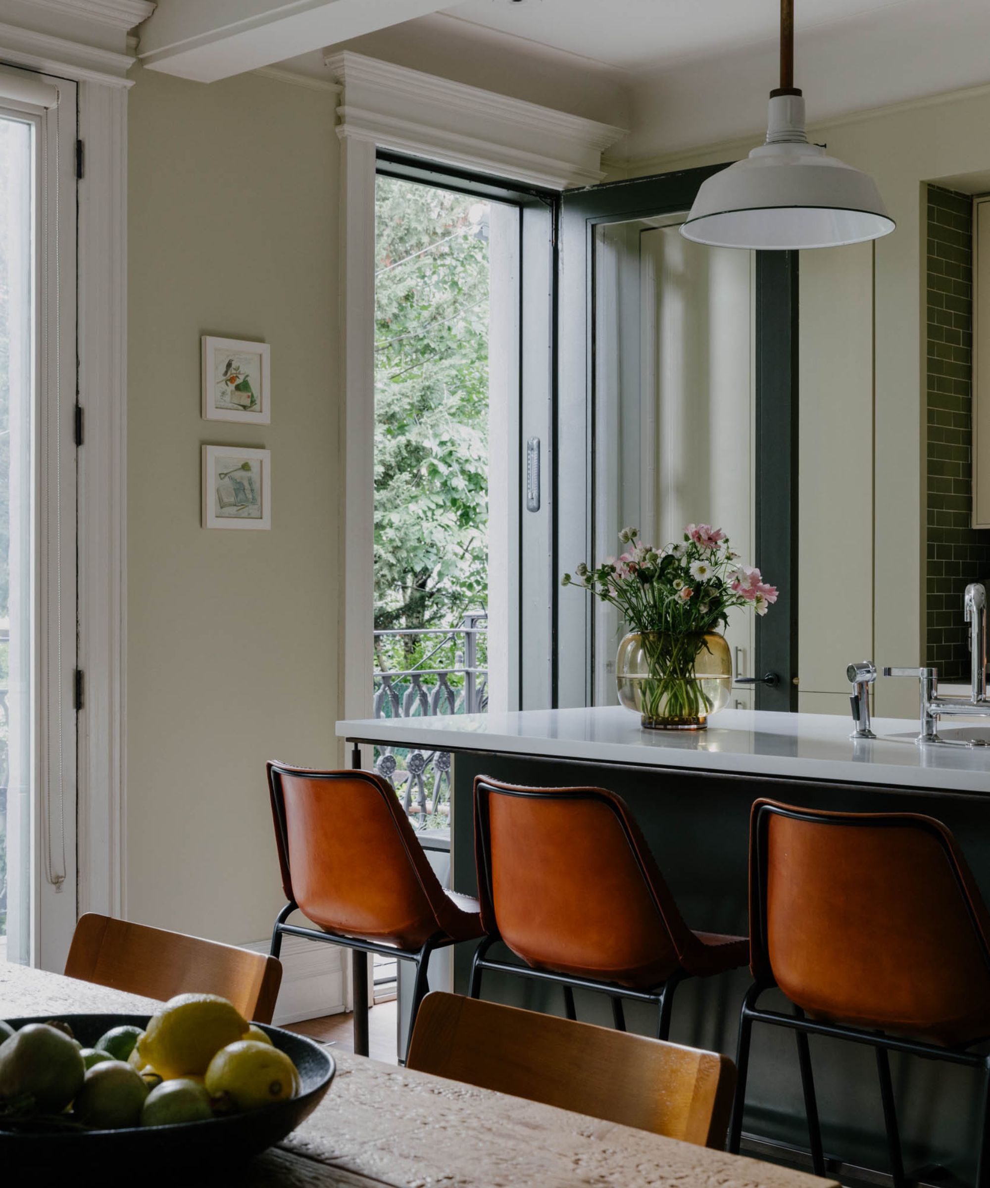
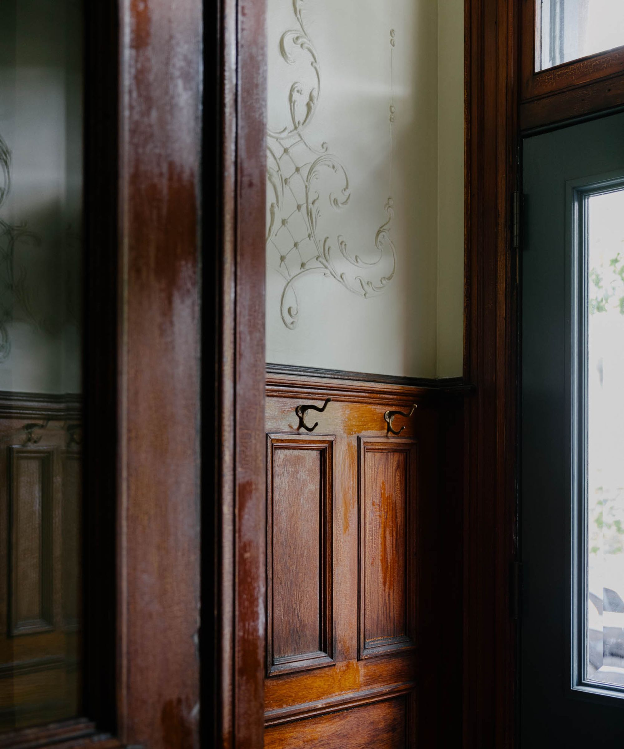
Despite the fact that the home underwent some work before Emma and the team got their hands on it, they still went in with some concerns common to renovating and decorating old houses – namely, lead paint.
'We wanted to strip down the closet cabinetry to embrace the more antique wood look but when looking into it we had to change our plan because it would expose the homeowners to lead paint,' says Emma. 'Instead, we kept the closet layout and used paint and accessories to integrate it into the bedroom design so it was cohesive, as it is open to the space.'
Each room has its own personality, but Emma describes the overall design scheme as 'Pacific Northwest-inspired mid-century modern with pops of traditional design aspects.' She aimed to 'complement the history of the house' while still going bold, showing off the interests and preferences of a growing family.
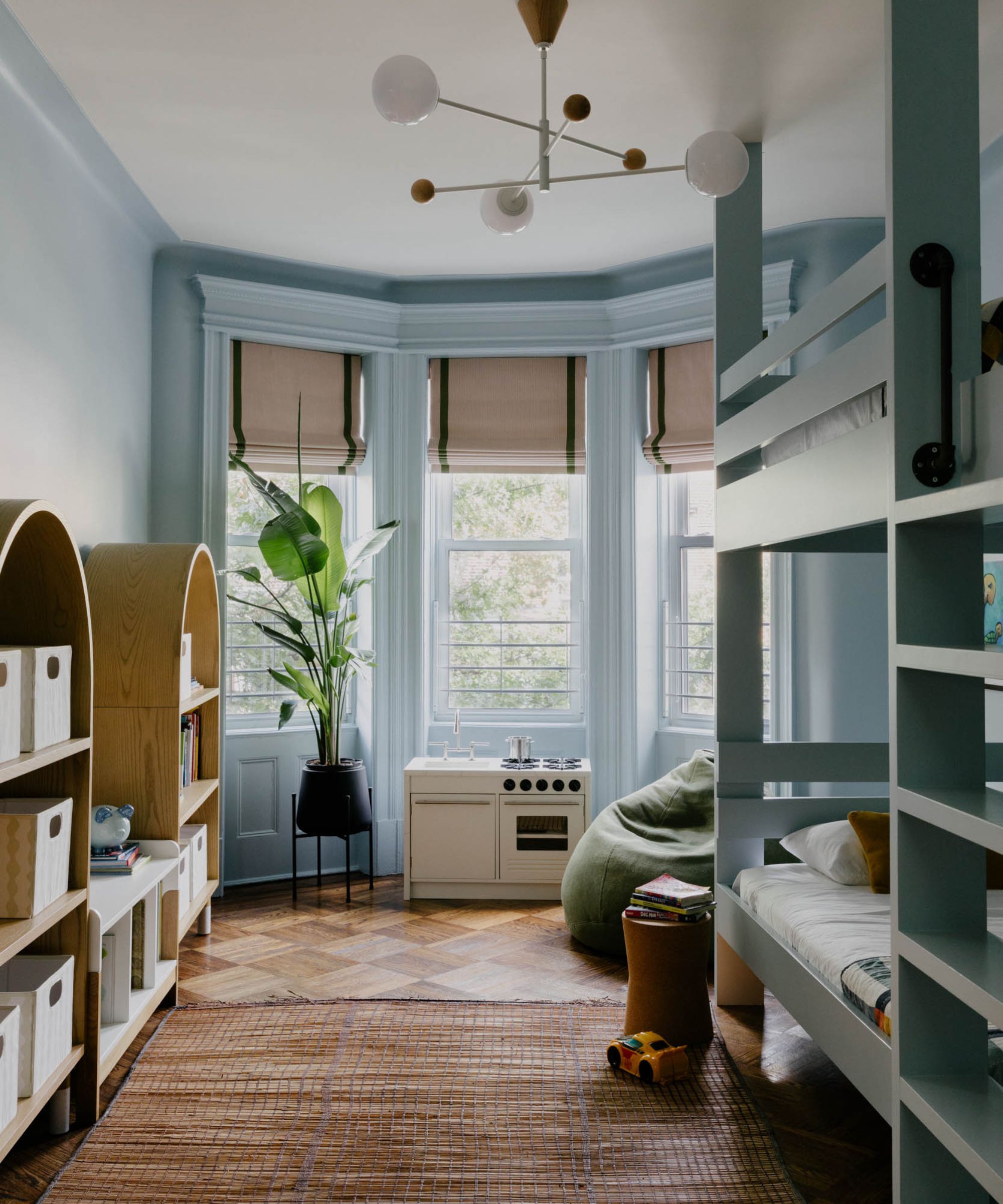
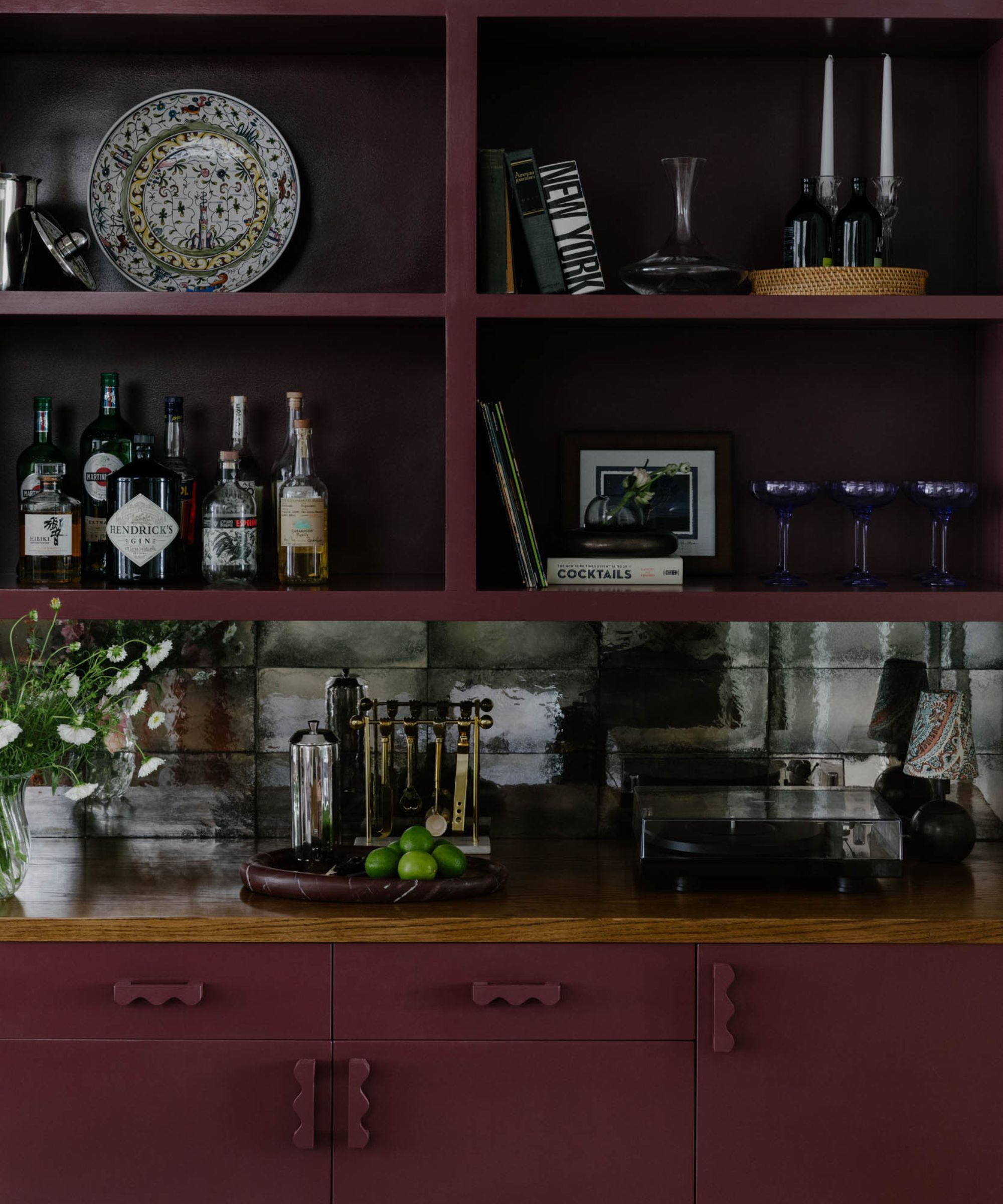
'This project was fun because the clients have young kids and wanted it to have color throughout,' says Emma. 'We ended up using colors in fun ways, and bright tones we may not have reached for originally. The clients also had such a positive reaction to the space when they saw it all come together after the install – it made reaching out of our design comfort style so worth it.'
Even though the home's style was a bit different for her firm, Emma says 'a few core decision-making factors' tie this home together with past projects: comfort and textured materials: 'We were able to bring these elements into the space in ways that allowed us to also embrace the clean lines of mid-century style.'
Jessica Gersten Interiors
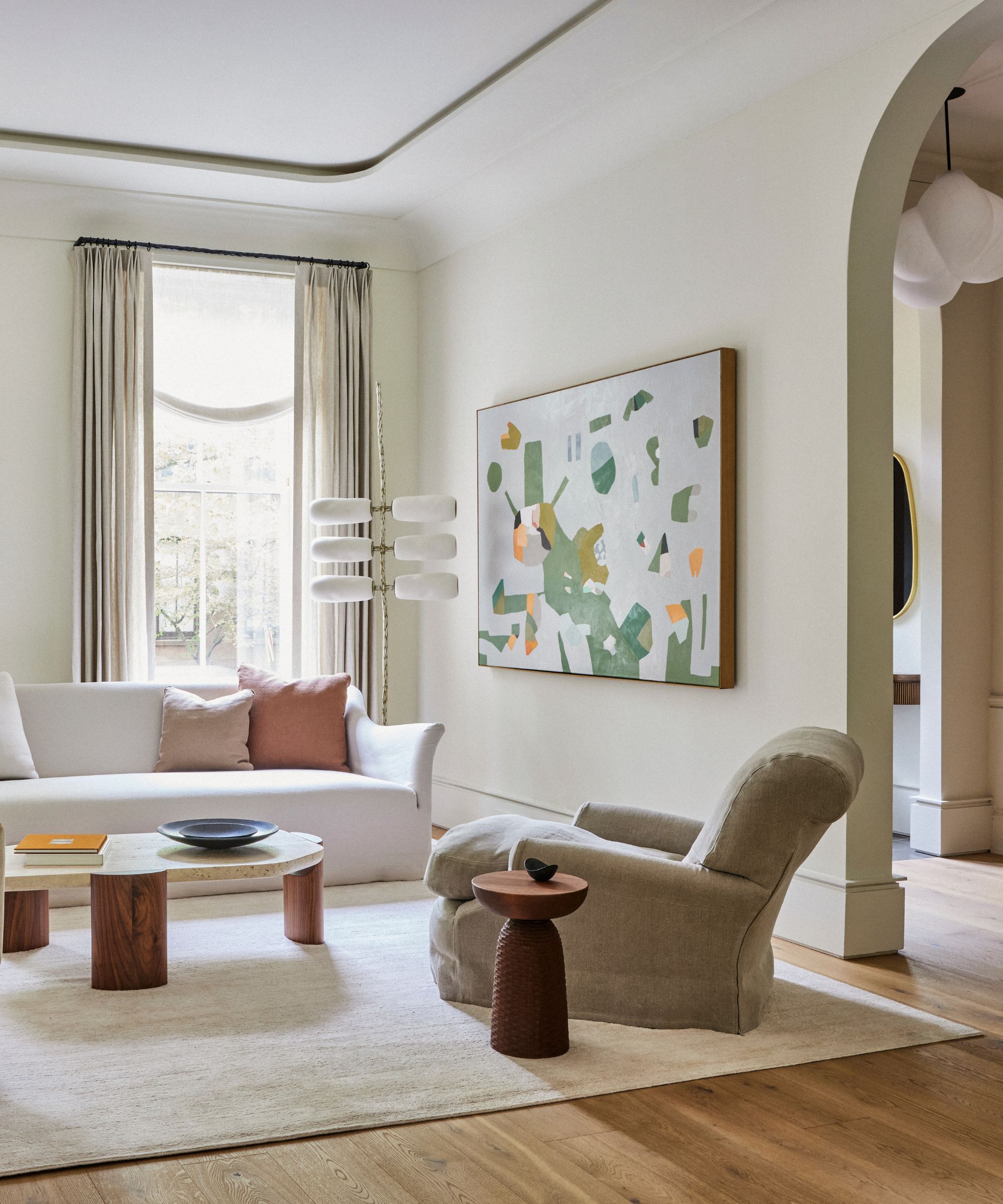
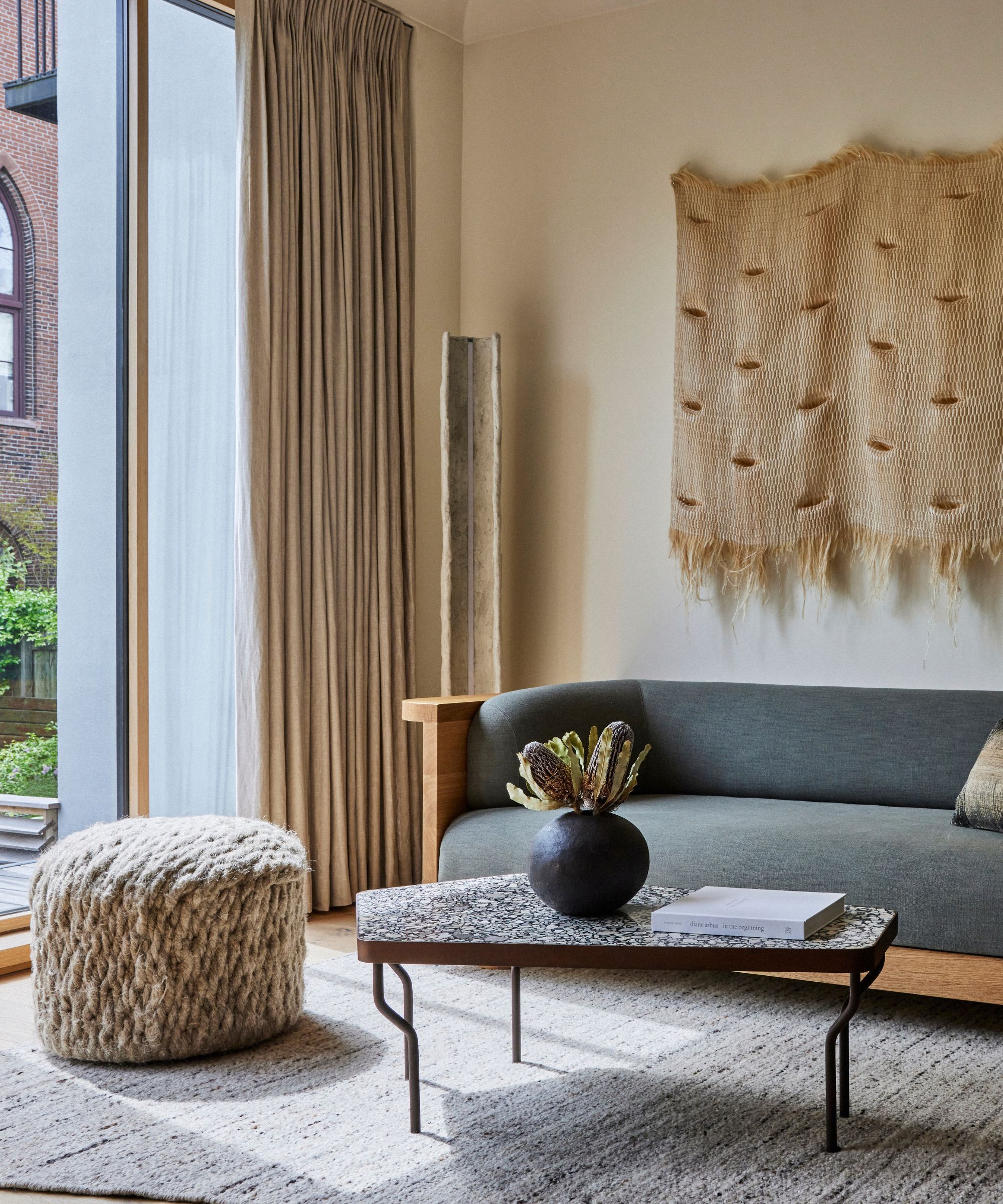
Jessica Gersten, founder and principal of Jessica Gersten Interiors, has assembled an impressive portfolio of high-end homes all across New York City. In this project, a Brooklyn brownstone with intricate, expressive details throughout, she demonstrates her trained eye and mastery of transitional interior design.
'The owner of the townhouse is a prominent figure in the home furnishings business. I was flattered that he contacted me to do this project. He came with inspiration and distinct ideas in mind of what he wanted to incorporate in his home. I had the big task of making sense of the ideas and determining how they all would come together,' Jessica tells H&G.
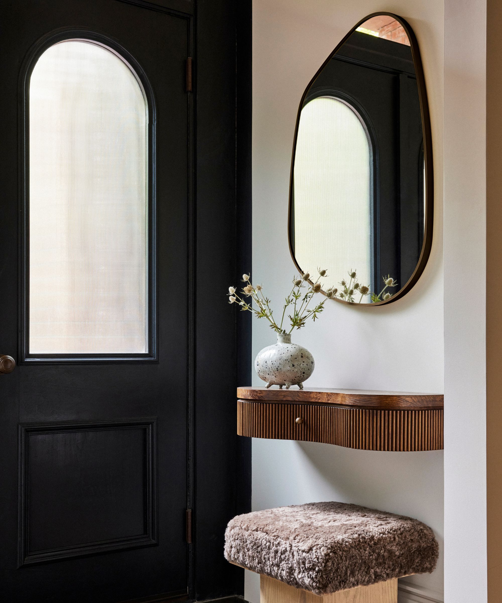
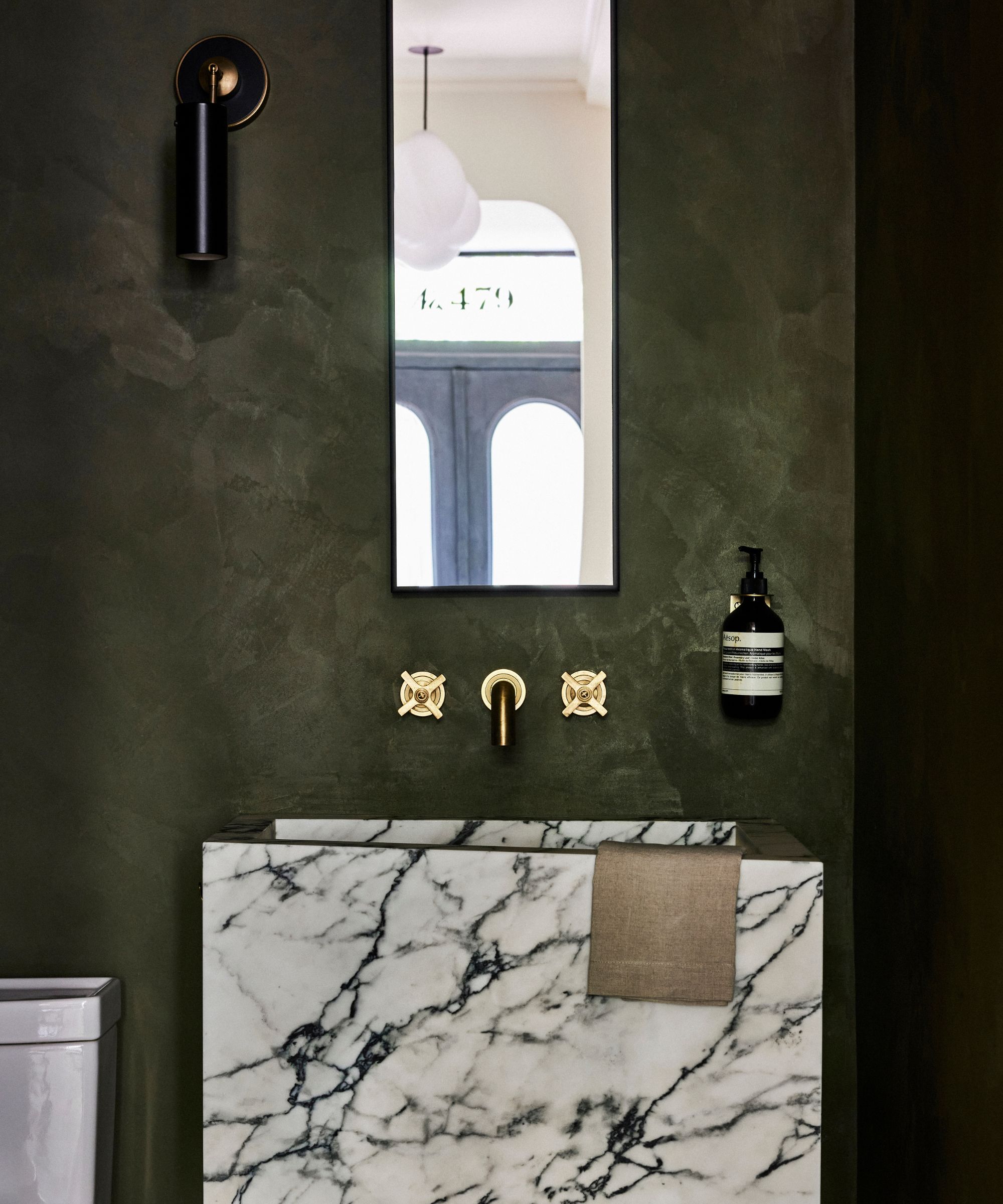
Jessica shares that the biggest challenge in putting this space together was fitting a historic property with modern-day storage and utility needs. Blending the home's original features with practical solutions for managing clutter and running a busy household proved quite difficult, but the end result doesn't show the struggle at all.
'Texture plays a big role in this project, from the wall hangings to the textured rugs and stone and Belgian linen all coming together to play!' adds Jessica, noting one of the home's comfort-forward, cocooning design elements.
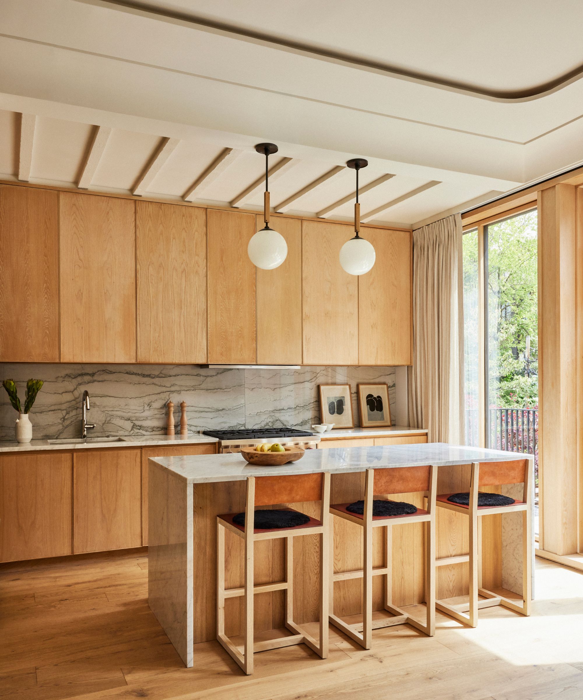
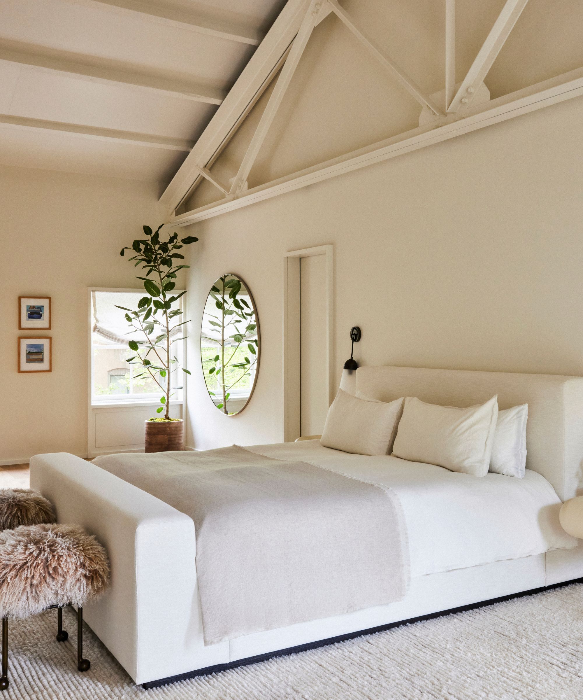
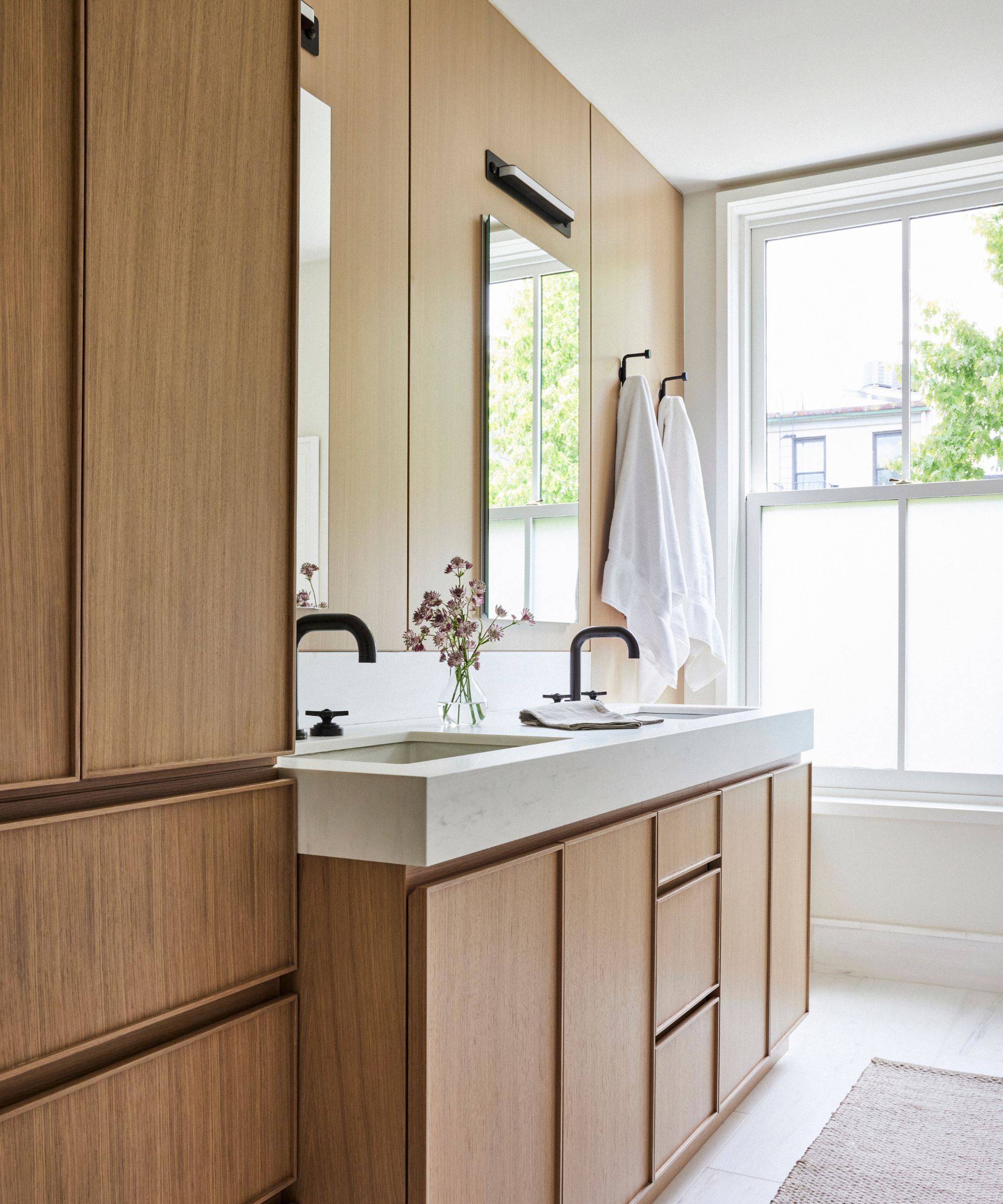
One-of-a-kind, luxurious furniture is scattered throughout the space, elevating each and every corner. From an intricately carved console table in the entryway to sleek and stylish bar stools in the wood-clad kitchen, no stone was left unturned. Jessica's personal favorite space, however, is the home's parlor floor.
'We purchased softer, deconstructed pieces from Studio Oliver Gustav and paired them with contemporary pieces from Christophe Delcourt and Emmanuel Simon. The result is super dynamic,' she says.
Jessica describes the completed space as 'ethereal modern,' a light and airy mix of nature-inspired and contemporary. 'Now that I came up with that term, "ethereal modern," I think it actually does represent my personal style very well,' she says. 'Modern is always the baseline, but nature always has a place in my work. That's where the ethereal comes in.'
Ben Herzog Architect
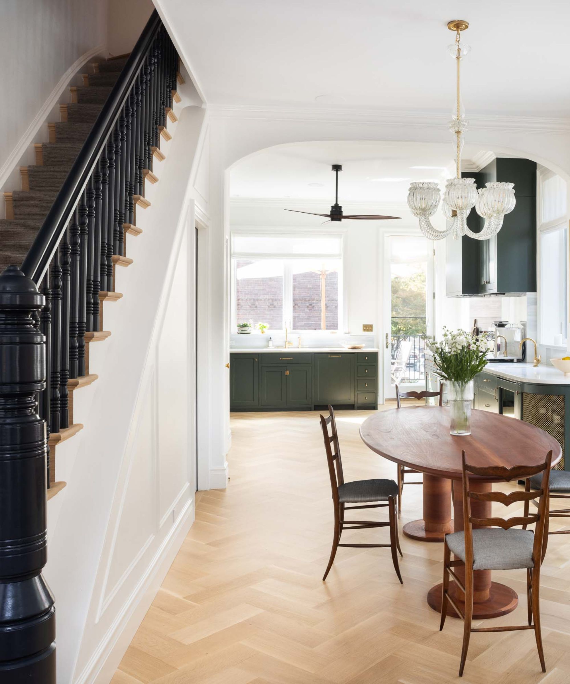
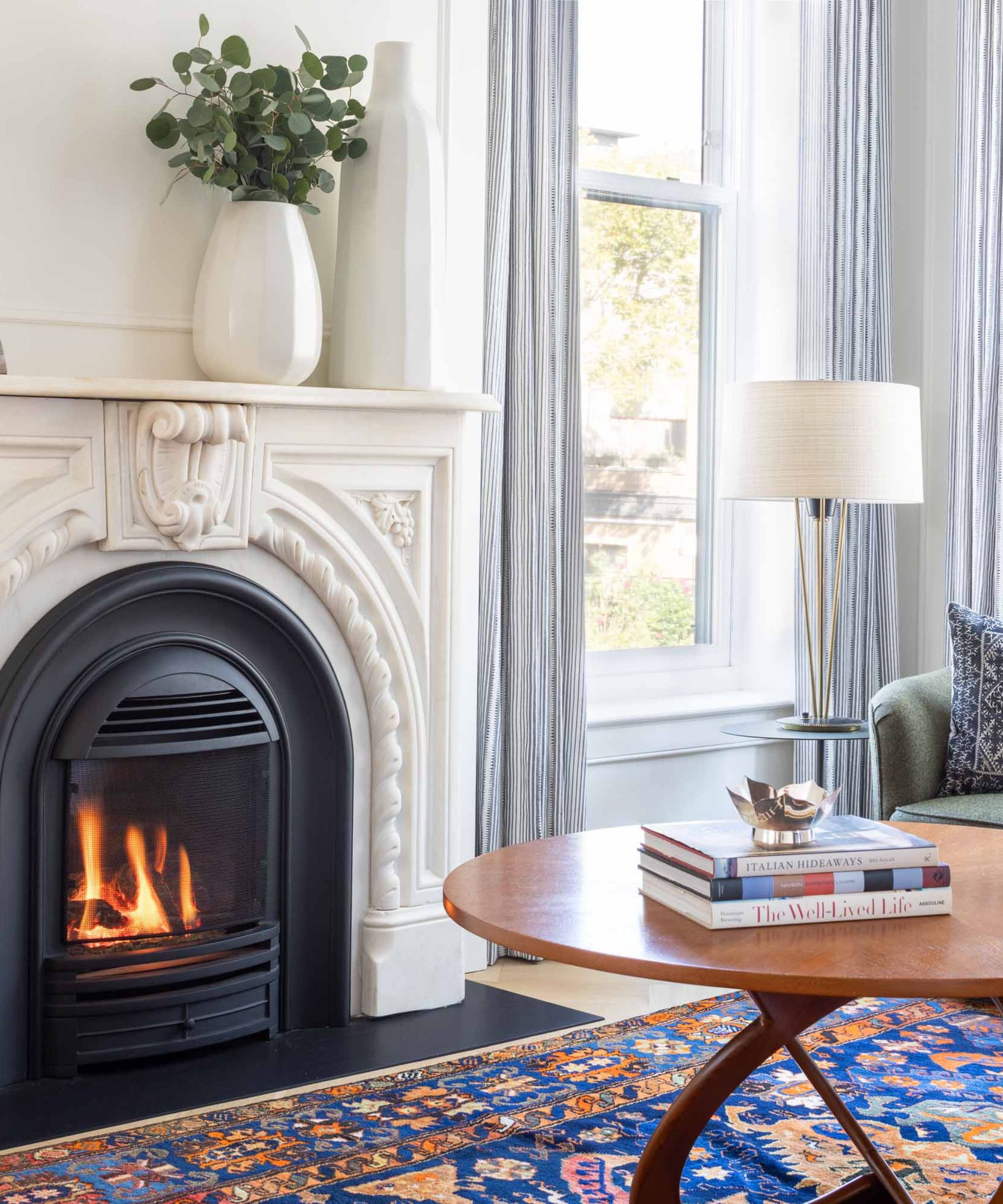
Located on a row of similar brownstones in Carroll Gardens, this property didn't stand out before Brooklyn-based Ben Herzog Architects stepped in. Now, its 'three dark apartments with an unpermitted rear addition' have been transformed into a spacious and airy two-family building with loads of charm and personality. Stephanie Leonard, an interior designer with the firm, shares that attention to detail was key when bringing this property back to life – both with the interior and exterior of the space.
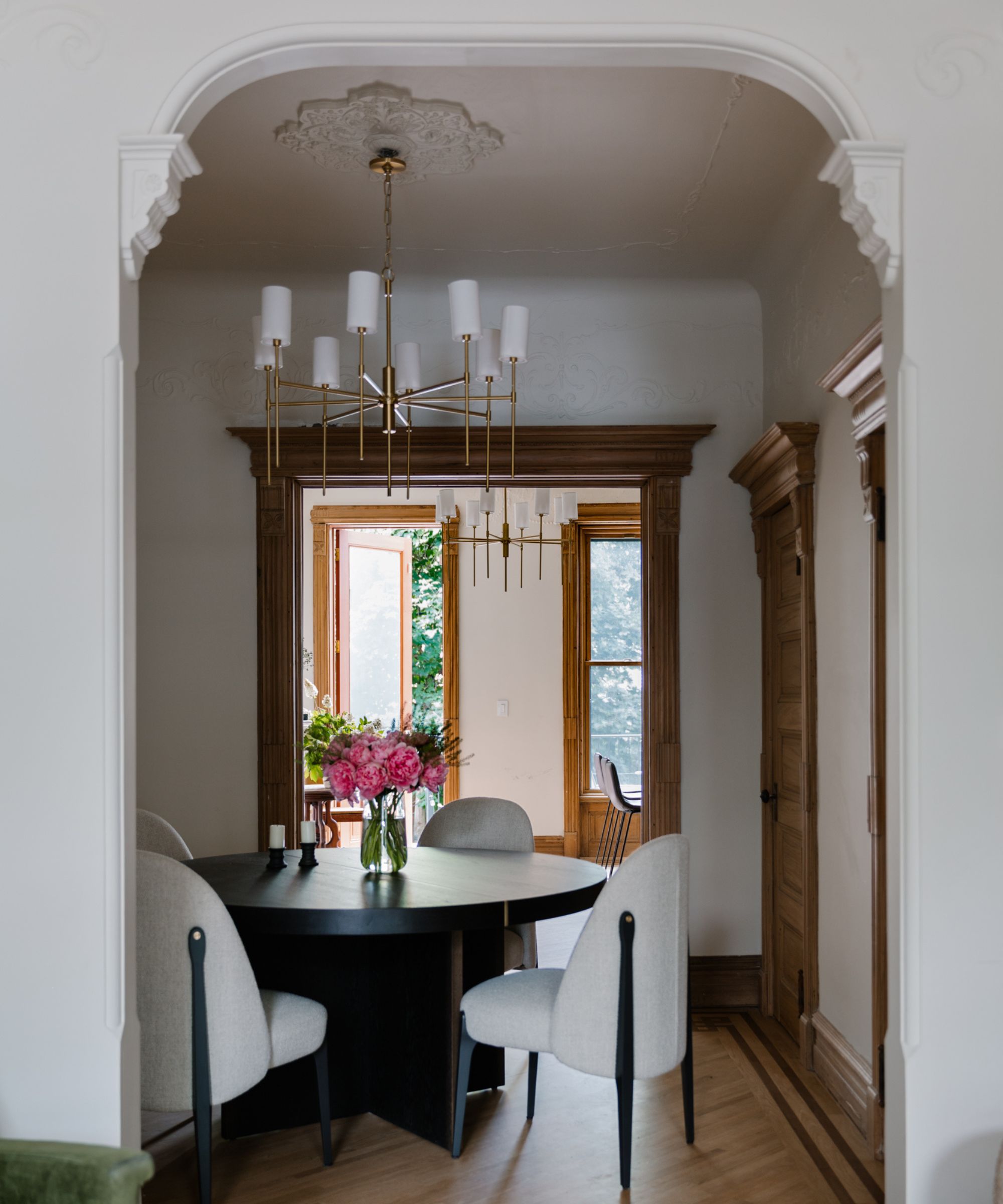
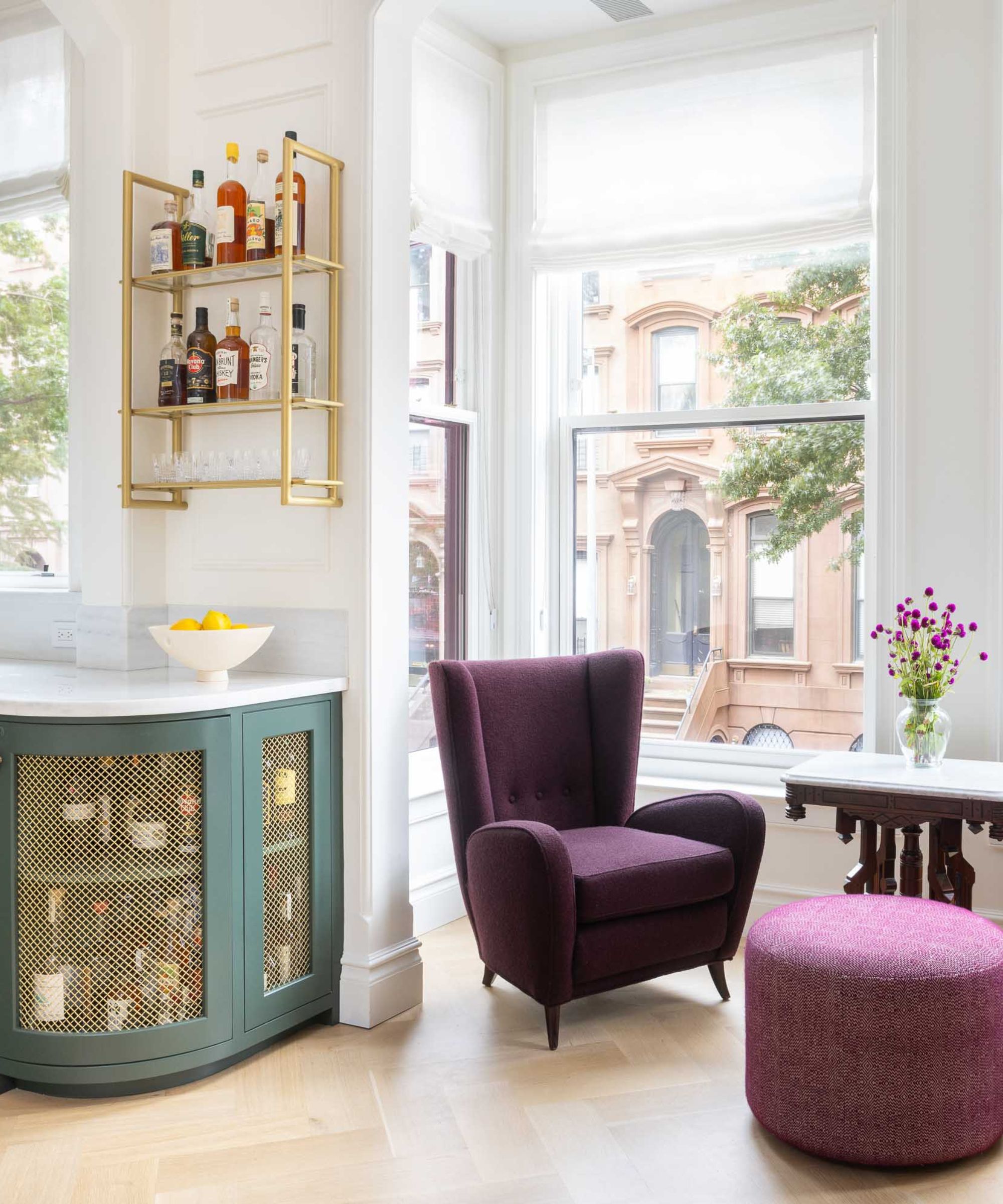
'The brownstone's front façade and cornice were restored according to a tax photo from the 1940s, while careful new window placement established a more symmetrical design on the long side of the house,' Stephanie tells H&G. 'We created arched parlor floor openings to add drama and act as transitions from the dining and living rooms to the kitchen, and to a cozy seating nook in a projecting oriel window.'
'Some additional rounded elements soften the otherwise rectangular box,' she adds. 'These include the bar cabinet projecting from the kitchen, the volume of the powder room, and the newly curved corners of the stairs, including a traditional "coffin corner" niche.'
One of the biggest challenges Stephanie and the BHA team dealt with during this remodel was the home's relatively narrow layout. To counter the claustrophobic feeling that resulted from narrow rooms with few windows, Stephanie shares that they embarked on quite a bit of restructuring.
'Like most brownstones, which typically only have windows on the front and back, the interiors were dark and cramped,' she says. 'But we took advantage of this corner property's assets. We removed walls to let the parlor level flow to the stairs, and added new windows, letting each floor feel wider and brighter.'
Each detail of the final space was crafted to make the space more livable, but also to reflect the homeowners' interests and personalities. For example, fleur-de-lis moldings on the home's exterior fence exhibit their love of New Orleans. Other details were put in place to reflect the brownstone's historic allure, too.
'The custom millwork piece with the mirror near the front entry door harks back to pier mirrors often found in old brownstones, while functionally it conceals an air conditioning unit. A rarity in this part of the city, a new curb cut, motorized gate and driveway lead to a prized parking space under the carport at the rear,' says Stephanie.
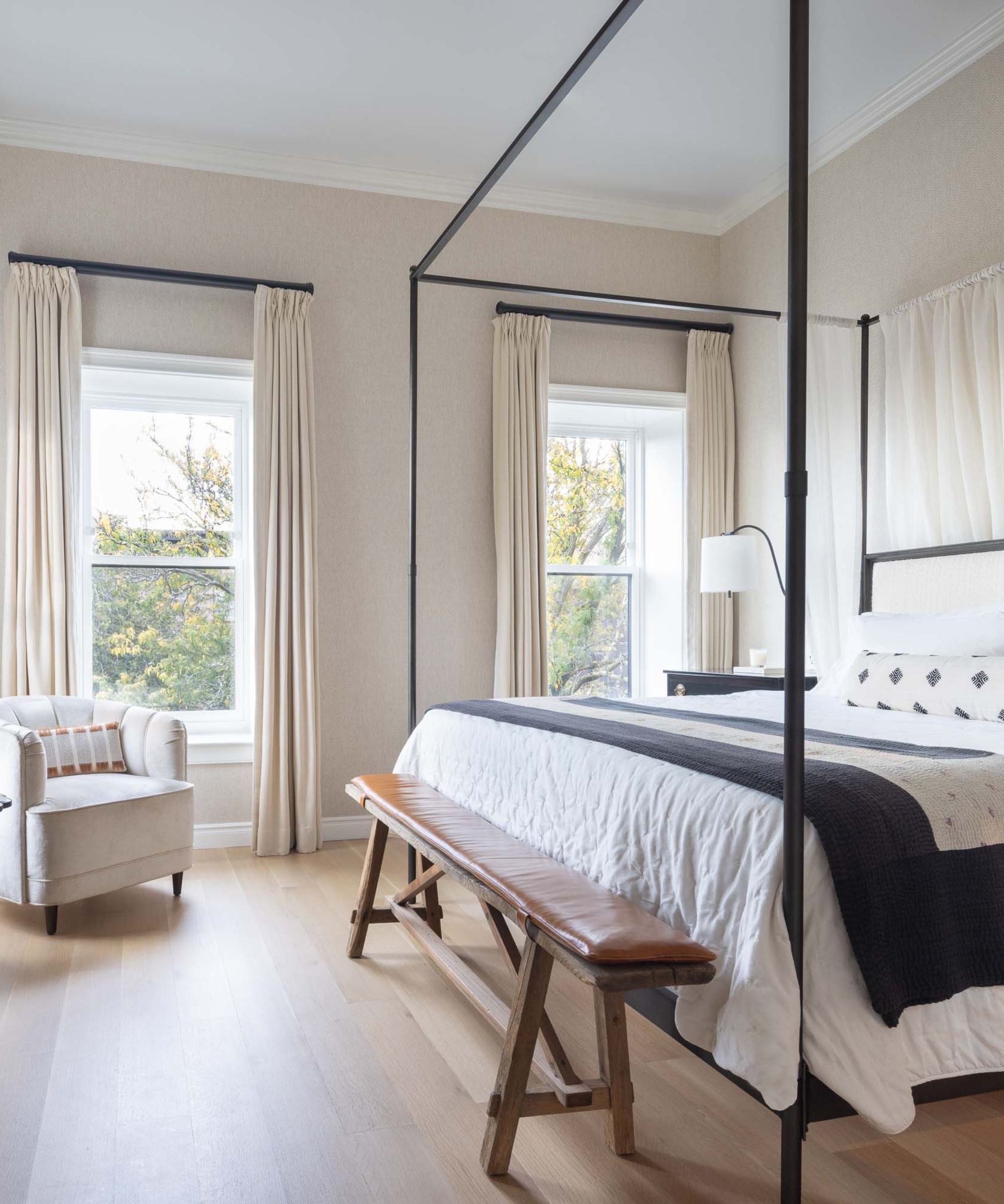
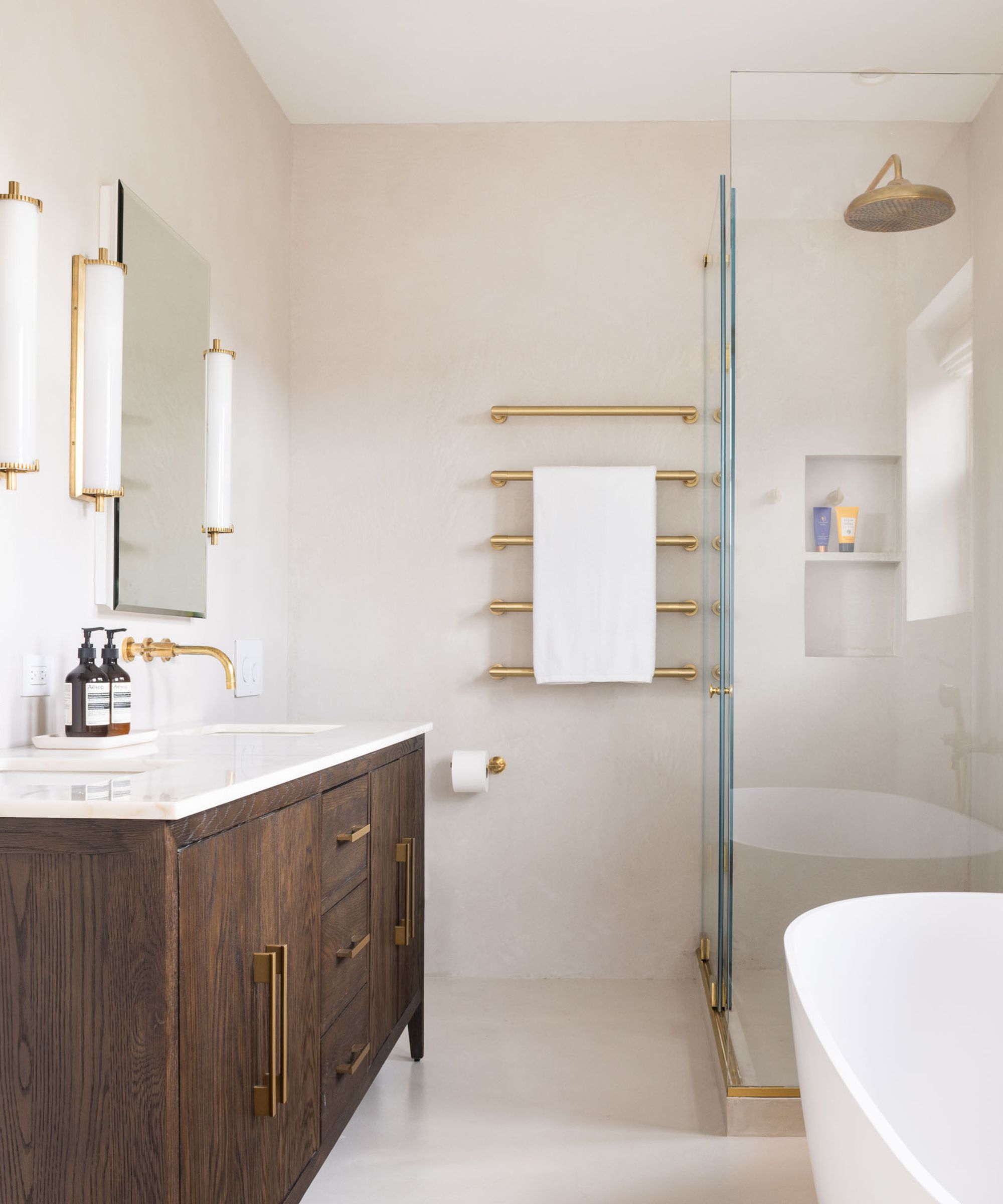
'This project has more of a transitional style. The clients wanted to keep the overall traditional feel of a brownstone while incorporating bright and lively colors and patterns,' says Stephanie. Her favorite part of the final result, the seating area and adjacent bar near the oriel window, exemplifies this style beautifully.
'We aim to create the best version of a house following the clients' taste, in this case using traditional elements but with a contemporary sensibility,' she says.
As it turns out, Brooklyn brownstones aren't just marvels on the outside. With a bit of TLC and a careful attention to detail, these properties represent transitional style at its absolute best.
.png?w=600)


