Having a design portfolio is essential for freelancers looking to attract clients, but standing out against the crowd is no easy task. Your portfolio is far more than just a collection of your work; it's your creative identity, so if you're looking for ideas to freshen up your portfolio, we've collected some of the best examples to help you get inspired.
While having a physical portfolio is great for in-person interviews, it's best to create an online portfolio to reach a wider audience. Once you've found the right design inspiration, check out our expert tips for creating a killer design portfolio.
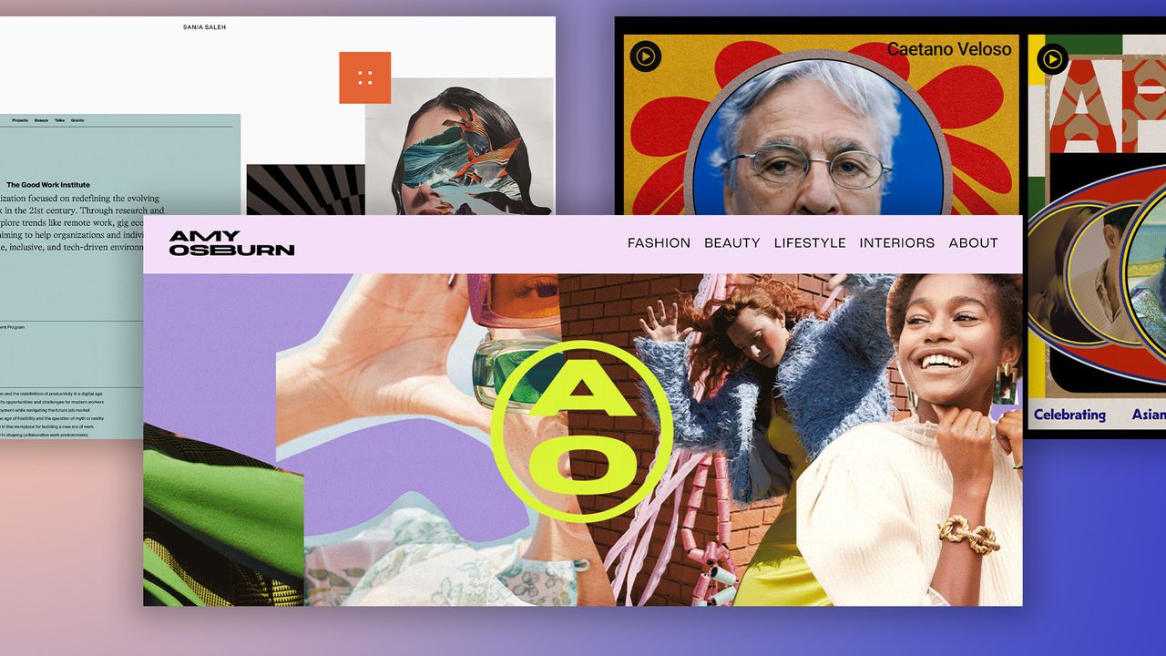
01. Sania Saleh: a model design portfolio
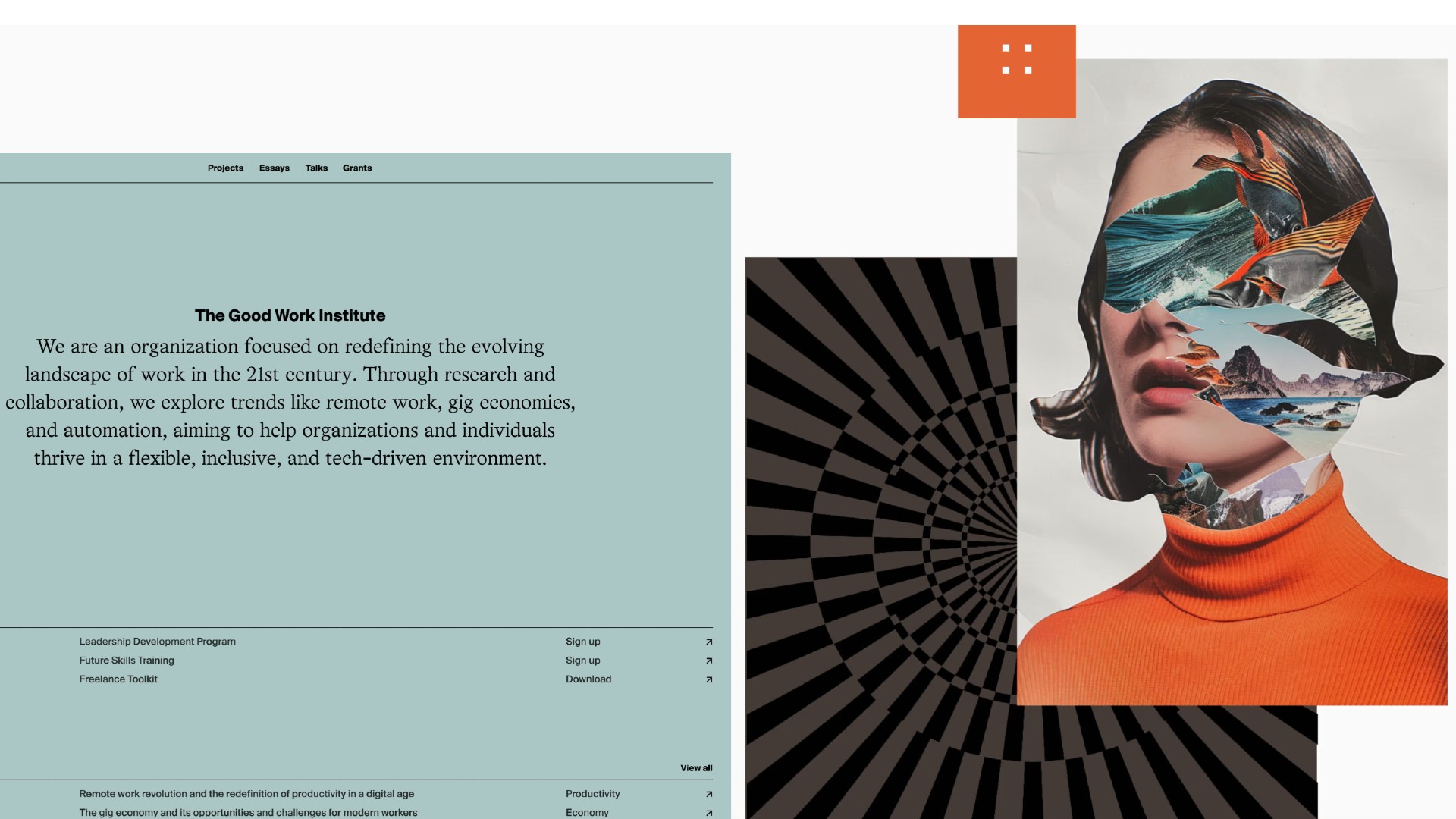
A London-based designer and director, Sania Saleh's portfolio exemplifies how to communicate comprehensive service offerings without overwhelming visitors. Her decade of industry expertise across brand strategy, web design and product development is presented in a clear, structured manner that emphasises both capability and approach.
As David Davies, design director at Design by Structure, says, this portfolio goes beyond just highlighting her career achievements, and quite right too. "A portfolio is more than just a place to showcase your work," he explains. "It’s also an opportunity to reveal who you are and what you stand for as a creative.
"Sania’s website accomplishes this with an impactful ‘collage’ style homepage that clearly outlines the type and quality of their work, leading to an about page detailing their approach and the core values they adhere to in every project. There’s no doubt left about who you’ll be collaborating with."
02. David Reid: contemporary and cutting-edge
David Reid is a designer based in Hong Kong. Previously head of brand and art director of Grana, he's currently working at IT as head of UI/UX. The edgy layout, image choices and design details of this portfolio all speak beautifully to the hip, cutting-edge nature of his projects.
David's clean and contemporary portfolio is a prime example of stripped-back design. It's unfussy, informative and sleek, letting his work do the talking. While many of the examples in this list make use of colour and eye-catching design, David proves that a sleek approach can be just as engaging for the right audience.
03. Gabrielle Adam: cutting-edge yet user-friendly
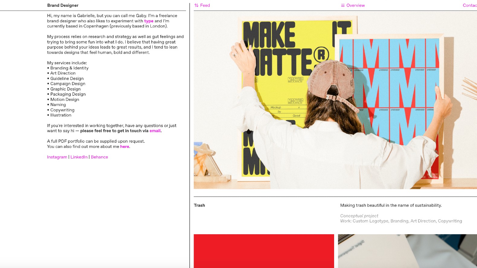
Gabrielle Adam is a freelance brand designer who also likes to experiment with type. Previously based in London, she's now living and working in Copenhagen, Denmark. Her portfolio is clear, simple and uncluttered, and yet its striking grid-based design looks utterly unique. Feeling more like a fashionable, cutting-edge zine than a traditional portfolio, this website nonetheless does an exceptional job at showcasing Gabrielle's work and allowing the viewer to navigate to detailed case studies that shed more light on her process.
04. Dan Machado: beautifully distinctive
Dan Machado is a product designer based in California who's passionate about all aspects of design. His portfolio does a great job of both visually showcasing his projects and providing text descriptions to give them context; so far, so straightforward. But the art direction of these case studies is distinct from anything you'll find elsewhere, proving that you really can be inventive and imaginative in your portfolio design, without doing anything to disrupt the viewer experience.
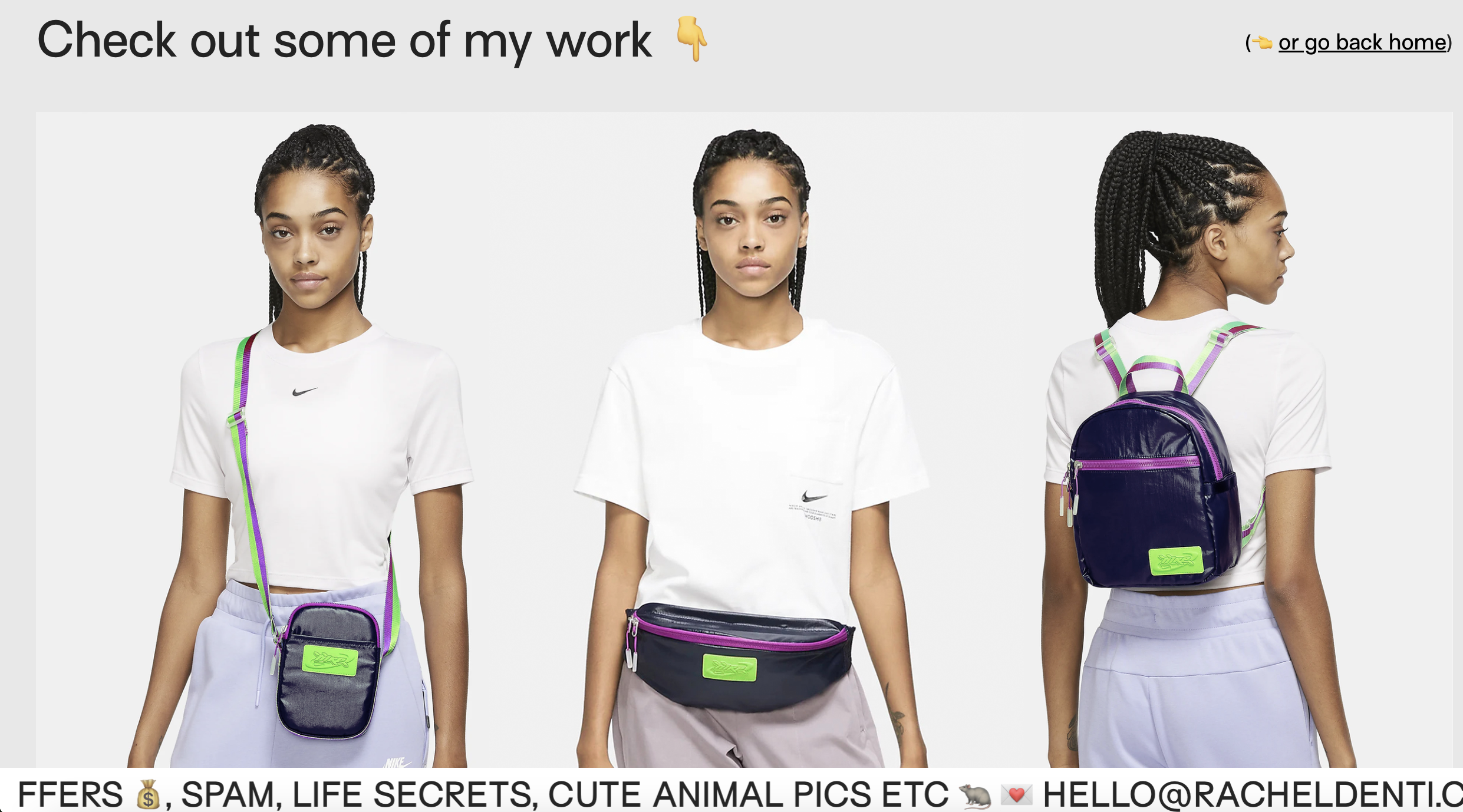
05. Rachel Denti: making a first impression
A Brazilian graphic designer and illustrator, Rachel Denti moved to New York in 2017 to work at Sagmeister & Walsh and is now a designer at Nike. Her portfolio immediately captures attention with its perfect balance of professionalism and personality. As Jessica Walsh, founder of &Walsh and Type of Feeling, puts it: "The moment you land on Rachel's portfolio, you immediately know who she is, where she works, and how to contact her."
What makes this portfolio particularly effective is its visual restraint. "Rachel offers a glimpse of her work while encouraging you to reach out for the full portfolio," enthuses Jessica. "This creates intrigue and engagement."
And that's not all. "Playful touches, like pictures of toast and pigeons, add personality and showcase Rachel's love for her craft without overshadowing the essential information," continues Jessica. "Overall, this portfolio strikes a perfect balance, highlighting a strong range of campaign, brand, and illustration work in a way that’s clear, focused, and visually uncluttered."
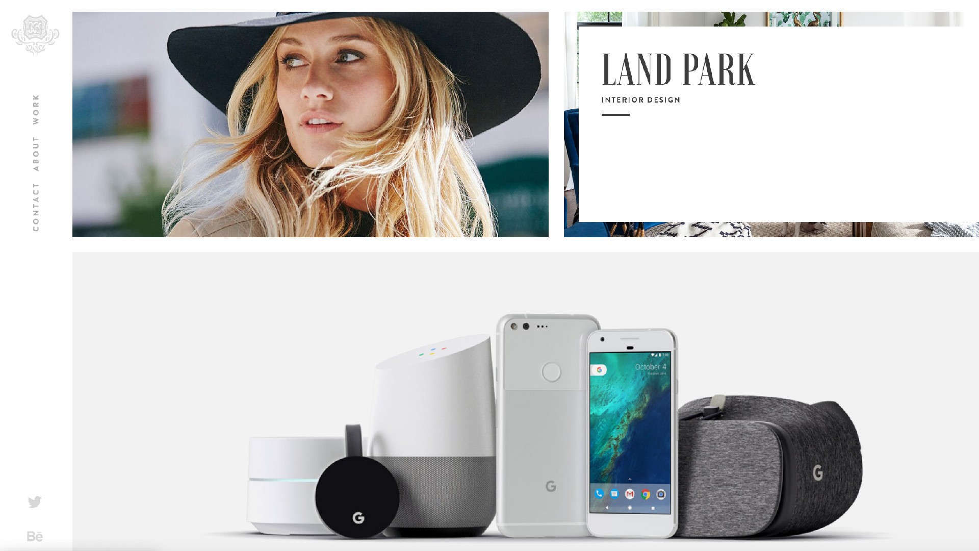
06. Andreas Wannerstedt: visual impact
Stockholm-based artist and art director Andreas Wannerstedt's portfolio demonstrates that one of the most powerful design portfolio ideas is also the simplest: letting work speak for itself.
Here, Andreas' hypnotic 3D sculptures and looping animations create an immediate impact, showcasing his projects for global brands like Google, Omega and Spotify. This approach to presentation is especially effective for work that relies heavily on visual impact.
"A picture tells a thousand words, which is exactly the approach Andreas has taken with this portfolio," says David Davies, design director at Design by Structure. "The homepage leads with captivating thumbnails and minimal descriptions, enticing you to discover more."
07. Timothy Maurer: let the work shine through
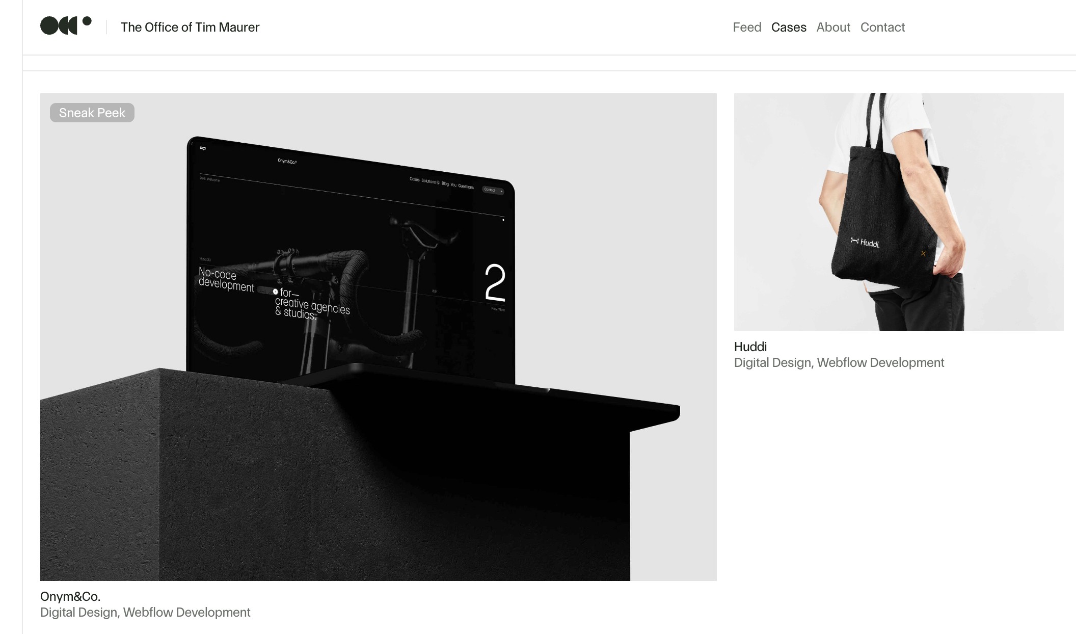
Many designers benefit from having lots of attractive case study work to populate their portfolio. But what if you work in something like UI design, whether the visuals are a little on the dull side? If that's the case, then a clean, simple, and project-focused layout is one of the best routes you can pursue. And you can take inspiration from this example from Timothy Maurer, an award-winning UX/UI designer and low-code developer.
Timothy' work isn't about glitz and glamour but about making functional and useful products that get the job done. And his clean-yet-quirky portfolio effortlessly reflects (and indeed embodies) that mission, by letting the work shine through a distraction-free user experience.
08. Amy Osburn: fun with fluorescents
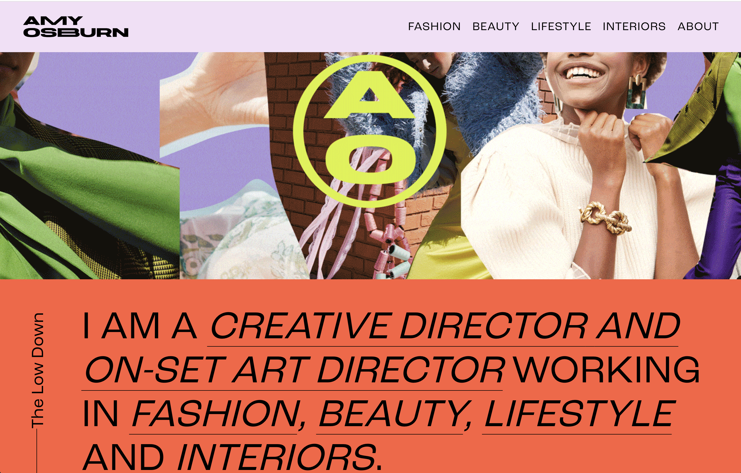
A 360 creative director with over 15 years of experience, Amy Osburn’s career spans several industries, incluidng fashion, home, beauty, wellness, tech, and celebrity. Based in LA, she's currently creative director for Old Navy. Her portfolio brings together all this work in a design that's bursting with fluorescent colour, typographic expressiveness and youthful energy, and you're left in no doubt where Amy is coming from, artistically and creatively.
09. Katyayani Singh: a multifaceted showcase
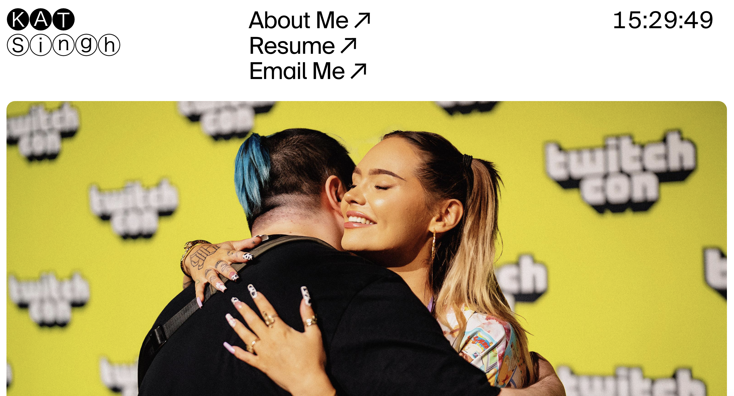
Based in Brooklyn, Katyayani Singh's work spans a range of media, from typography and photography to creative coding, sculpture, and traditional painting. Having worked at Twitch and &Walsh, she specialises in building scalable brand and identity systems, while examining how digital connectivity influences human identity and relationships.
Her portfolio stands as a masterclass in immediate engagement, reflecting her multifaceted approach to design. As Jessica notes, "Kat focuses on immersing you immediately into the work which is something I always appreciate. Her case study layouts are heavily image-driven, making it easy to quickly grasp her design style and the type of work she excels in—an approach I find especially effective when browsing portfolios.
"She brings plenty of personality into her About Me page," continues Jessica, "using playful emojis and engaging copy—something I always love in a portfolio. Beyond graphic design, she highlights her experience in sculpture, painting, typography, and drawing, showcasing a well-rounded creative background that can add depth to studio work. Kat also includes fun interactive moments, like the flying 'cool' button, which adds a touch of personality without being distracting—just pure fun."
10. Charlota Kolar Blunarova: clarity and purpose
An independent brand and web designer, IDEO CoLab Ventures design partner and co-founder of WE3, Charlota Blunarova's portfolio stands out for its direct, purpose-driven approach. It's a great example of how to communicate multiple professional roles while maintaining clarity.
"As someone who spends a lot of time reviewing portfolios and hiring designers, a simple portfolio that gets straight to the point often grabs my attention," says David. "Charlota's portfolio features rich thumbnails that instantly convey the type of work they undertake. A playful section showcasing experiments and tests adds another layer, further enhancing the narrative of her craft."
11. Isabella Atkinson: outstanding art direction


A website isn't the only way to deliver a portfolio. PDF portfolios are still a great alternative vehicle for presenting your work, and this more uncomplicated format arguably gives you greater scope for precise and beautiful art-direction.
That's certainly the case in the PDF portfolio of Isabella Atkinson, who's been a junior designer at Taxi Studio since completing a four-week internship in February 2024; we've featured seven of her pages in the image gallery above. We particularly love her well-curated, colourful images, her elegant layouts (worthy of a lifestyle magazine spread) and the economic way she provides context to her visuals in small but easily readable captions.
12. Gabriela Namie: motion in case studies
Gabriela Namie is an art director based in New York who's spent over 10 years harnessing systematic creative thinking to help brands come to life. Today she's VisD lead at Google's Seed Studio. Her portfolio stands out not just for her impressive career trajectory, including roles at Sagmeister & Walsh and YouTube Music, but for how well it communicates her impact on the design world.
As Jessica observes, "The moment I land on Gabi's portfolio, it's immediately clear that she's not just a talented designer and art director, but also a highly recognised creative force; with accolades from ADC, Young Guns, and LAA. Her role as a speaker further cements her as a leader in the field, someone who not only creates but also inspires." This leadership position is evident throughout her portfolio, which demonstrates both hands-on design skills and creative direction capabilities.
Something else that sets this portfolio apart is its dynamic presentation. "I love the use of motion in her case studies—it breathes life into the work, making the systems feel clear, engaging, and dynamic," Jessica says. "Another standout detail is how she explicitly calls out her role in each project. This level of transparency is invaluable when reviewing portfolios, making it easy to understand her contributions and the depth of her impact."
13. Simon Koay: dynamism and energy
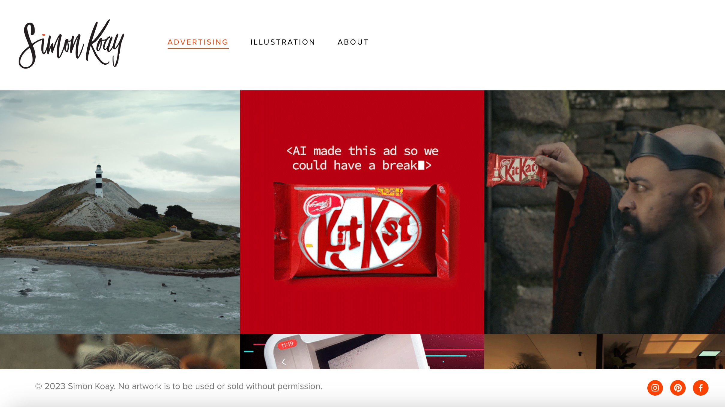
Simon Koay is an art director, illustrator and designer who grew up in New Zealand and is now based in Sydney, Australia. Built using Squarespace, his portfolio website shows that you don't need to know how to code to bring your design portfolio ideas to life. Instead, with a bit of creativity and curation, you can make something that looks as impressive as this.
While Simon's work is presented in a clean and straightforward grid format, this feels anything but cookie-cutter. Instead, there's a dynamism and energy to the layouts; plus the individual case studies feature all the granular detail, social assets and background information the viewer needs to truly get a handle on Simon's work.
14. Tom Seymour: bursting with visual energy
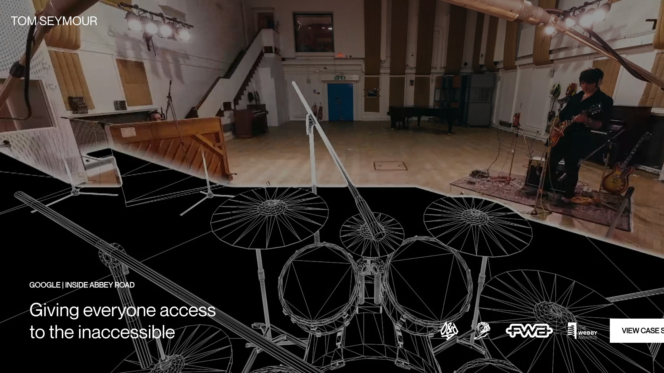
Webflow is another platform that lets you build interactive websites without knowing code; its free version is one of our favourite free website builders. And here's a good example of a portfolio built with it, made by Tom Seymour, a multidisciplinary freelance creative director who's led teams and projects at Google Creative Lab, Nike Oregon and Wieden + Kennedy London.
It's a real masterclass in how to present case studies of your work with a subtle (but palpable) sense of visual energy. We also applaud the considered inclusion of useful and interesting background details... without ever making the viewer feel overloaded with information.
15. Kele Dobrinski: a sense of class
Kele Dobrinski is a freelance art and design director based in California who's spent half of her career working with ad agencies scuh as Venables Bell & Partners, Goodby Silverstein & Partners and TBWA/Chiat/Day, and the other half with startups.
There's a real sense of class to Kele's portfolio, which lies in all the little details: the coat of arms-style logo, the elegant typography, the refined use of white space. This all dovetails nicely with the kind of projects she features, making it all feel a little like an upscale fashion magazine.
FAQs
What is a design portfolio?
A design portfolio is a curated selection of your best work which demonstrates your talents to potential clients. Whether you're a freelancer or an in-house creative, your portfolio is vital for showcasing your skills and displaying a diverse range of work. Your design portfolio should be a selection of your career highlights, including client samples that spotlight your professional work.
What should a design portfolio include?
While there are no strict guidelines, there are a few key things you should include in your design portfolio. Create a concise 'about' section that covers your education, experience, skills and most importantly, your contact information – you want to give potential clients a flavour of your personality but avoid rambling too much. When displaying your work, you want to curate your 'best bits'. Include a diverse range of formats and styles that demonstrate a range of skills – showcase what makes you unique!