As an integral part of memorable, successful design, good typography can influence the way we perceive and interact with the world around us.
Some fonts are more successful than others, and over the centuries, certain typefaces have risen to such prominence that they've become not just tools for communication but cultural symbols.
These typefaces have left an indelible mark on the world of design. Here, with input from industry experts, we explore ten of the most iconic typefaces of all time, examining their origins, characteristics, and the legacy they've carved in typographic history. For more on typography, see our typography through the decades series, and check out our what is typography? guide for the basics.
01. Säculum
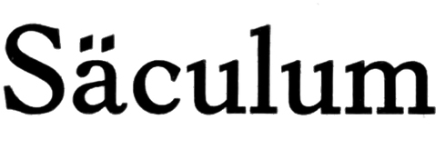
Chosen by Jack Goozee, designer at Taxi Studio, Säculum found favour in the print industry around the turn of the century.
Designed in 1908 in seven weights by Heinrich Hoffmeister, Jack points out that the type’s legacy was far-reaching. “This type family went on to inspire legendary type designer Adrian Frutiger, who created Univers, and Max Miedinger who designed Helvetica,” Jack explains. “So as the inspiration behind two of the world’s most widely used typefaces, it's undeniably iconic.”
02. Neue Haas Grotesk
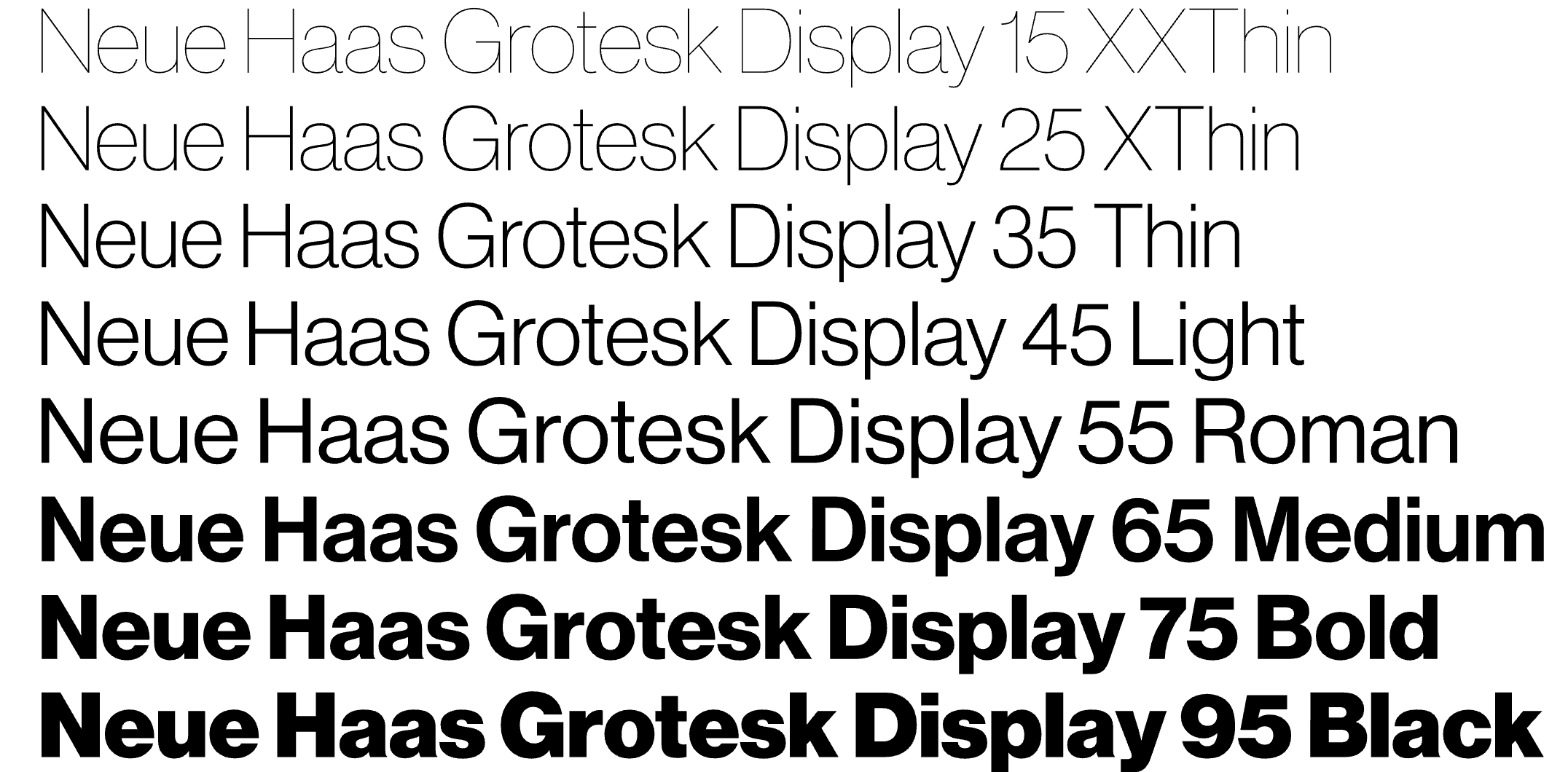
This interpretation of Helvetica was designed as part of Richard Turley’s bold 2010 revamp of Bloomberg Businessweek. "It has been beautifully restored for digital use, with characters today as fresh as they were in the 1950s," says David Airey.
The goal was to stay as true as possible to the original letterforms and spacing, rather than reinvent the wheel. Max Miedinger’s original design featured some fascinating alternates, like a cedilla resembling a flattened comma – apparently a Swiss preference at the time – but the real standout was the straight-legged 'R', now easily accessible in digital form.
03. Times New Roman
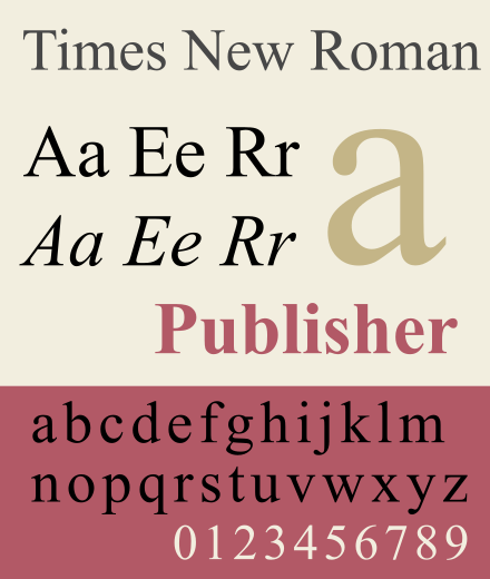
The history of Times New Roman is embedded in British media history. Commissioned by the British newspaper The Times in 1931, the type was designed by Stanley Morison and Victor Lardent and is characterised by its balanced proportions and structured serif letterforms.
Of course, as we know, the font became synonymous with academic and professional documents and its ubiquity in word processors like Microsoft Word through the 1990s and 2000s solidified its status as the default typeface for formal writing.
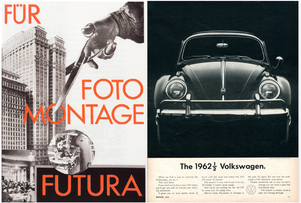
04. Futura
As a product of the Bauhaus movement, Futura was created by Paul Renner in 1927, and was concerned primarily with the ethos of functionality and geometric purity. It’s defined by clean, geometric shapes and lacks serifs, using a minimalistic design to convey a sense of modernity and precision.
Through the 20th century, it was used extensively in advertising; most notably in Volkswagen adverts, and it was even the typeface of choice for a plaque left on the moon by Apollo 11.
05. Akzidenz-Grotesk
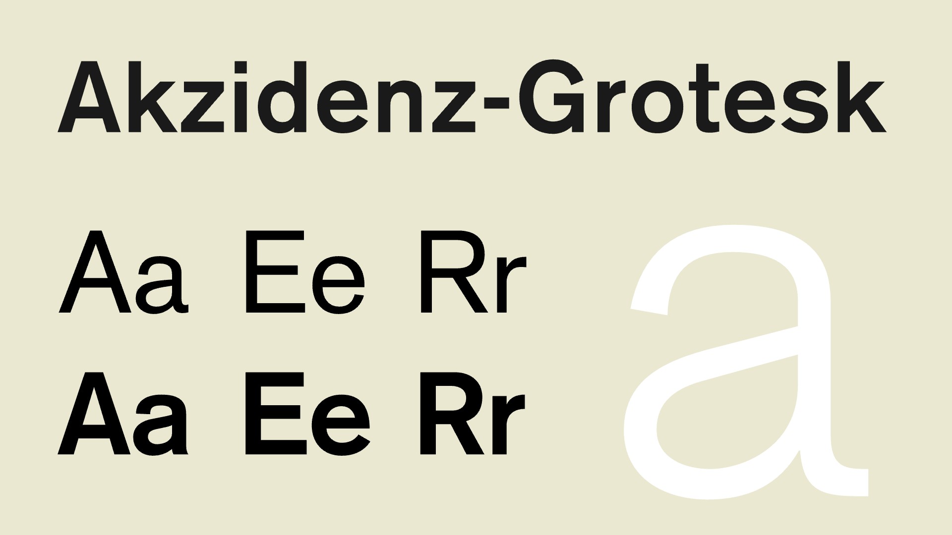
"I would rank Akzidenz-Grotesk as one of the most influential typefaces in the history of graphic design," says Julio Zukerman, type designer at Type of Feeling. "It is a sans-serif grotesque typeface (maybe the first), released in 1896 by Berthold Type Foundry, and some say that it paved the way for modern typography – especially in the development of the now so common neo-grotesque typefaces like Helvetica.
"It may not be as refined or as immediately recognizable today, but its influence is undeniable. It remains a cult classic among designers who appreciate its history and slightly imperfect, humanist grotesque charm," Julio adds.
06. Garamond
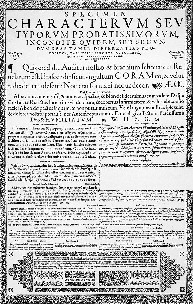
Garamond is a timeless font that has been historically used as a favourite type for large bodies of printed material – its well-proportioned characters make it one of the most beautiful and readable typefaces for book printing, as well as official documents or process-driven products like manuals.
Named after the 16th-century French type designer Claude Garamond, it has undergone numerous iterations, with the most notable revival in the early 20th century by Jean Jannon.
Celebrated by the print and artistic community, it’s rarely used digitally because it wasn’t designed with pixels and screen limitations in mind, but it has appeared in numerous campaigns for tech companies including Google and Apple.
In fact, it was the type used in Google’s first logo, and if you type in ‘Garamond Font’ into Google, you get to see a hidden feature of the platform as it turns your results page into displaying in Garamond.
07. Gill Sans
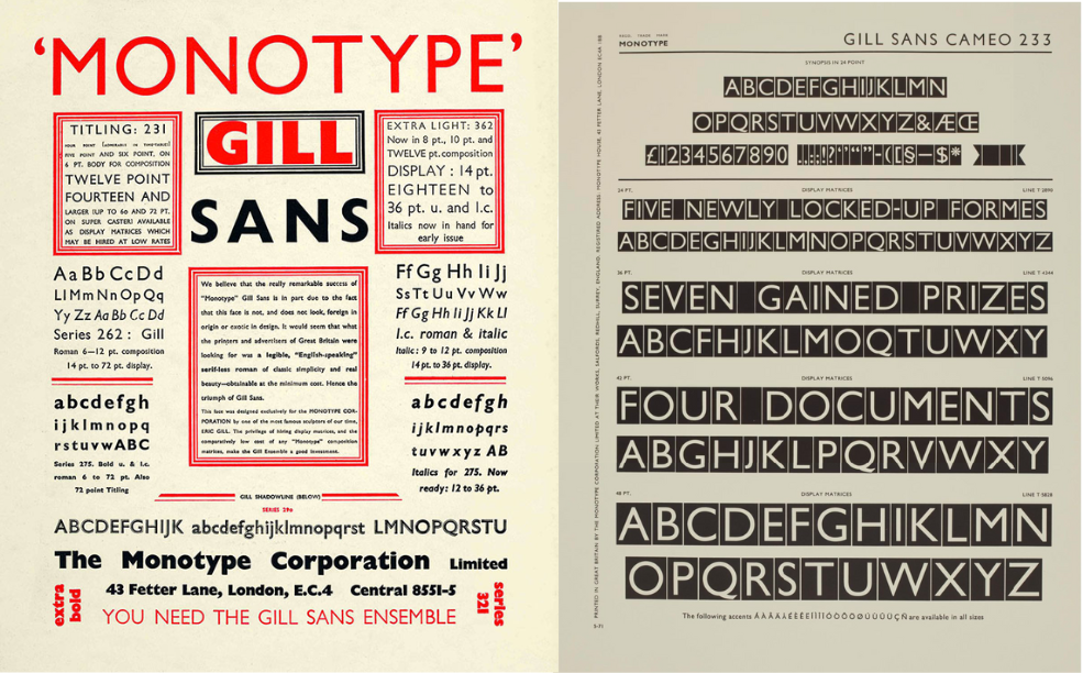
The origin of Gill Sans lies at the heart of the British design industry. Designed in 1928 by Eric Gill, it was inspired by the London Underground typeface of Edward Johnston and was launched by the British arm of Monotype shortly afterwards.
With a friendly, warm approach to its letterforms, it became a versatile type through the 20th century and has often been described as the ‘British Helvetica’ thanks to its lasting popularity. Famously, it became the standard of British Railways, cementing its position as an iconic typeface.
08. Courier
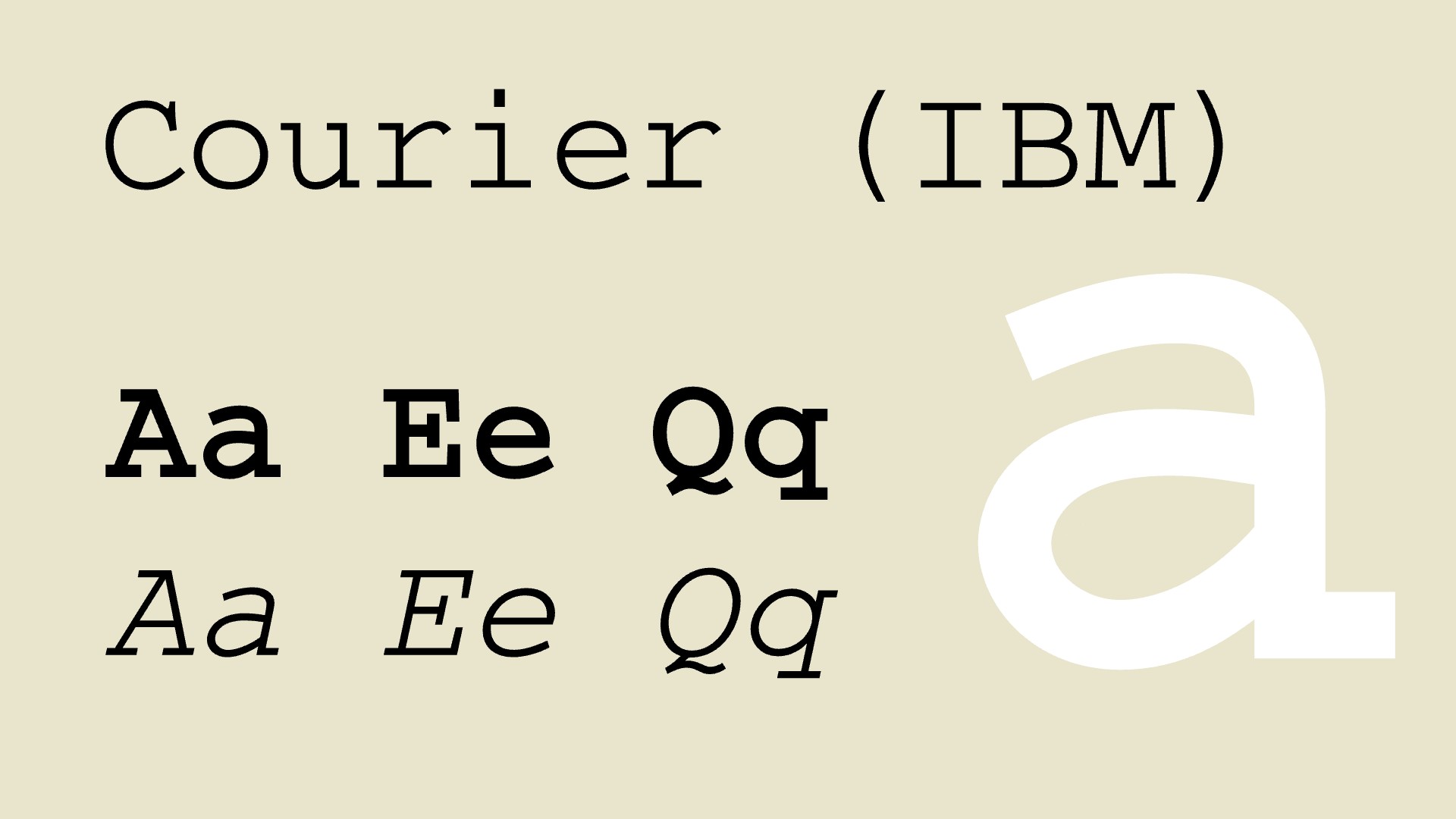
No list of iconic typefaces would be complete without a nod to the classic typewriter, and Courier, created in 1955 by Howard "Bud" Kettler for IBM, was designed to mimic the look of the analogue device. Its still one of the best typewriter fonts available today.
Its iconic status is now largely thanks to the fact that it has become somewhat of a symbol of the pre-digital age and can still be seen today in legal documents and scriptwriting, thanks to the lack of embellishment and its simple, no-nonsense aesthetic.
09. Helvetica
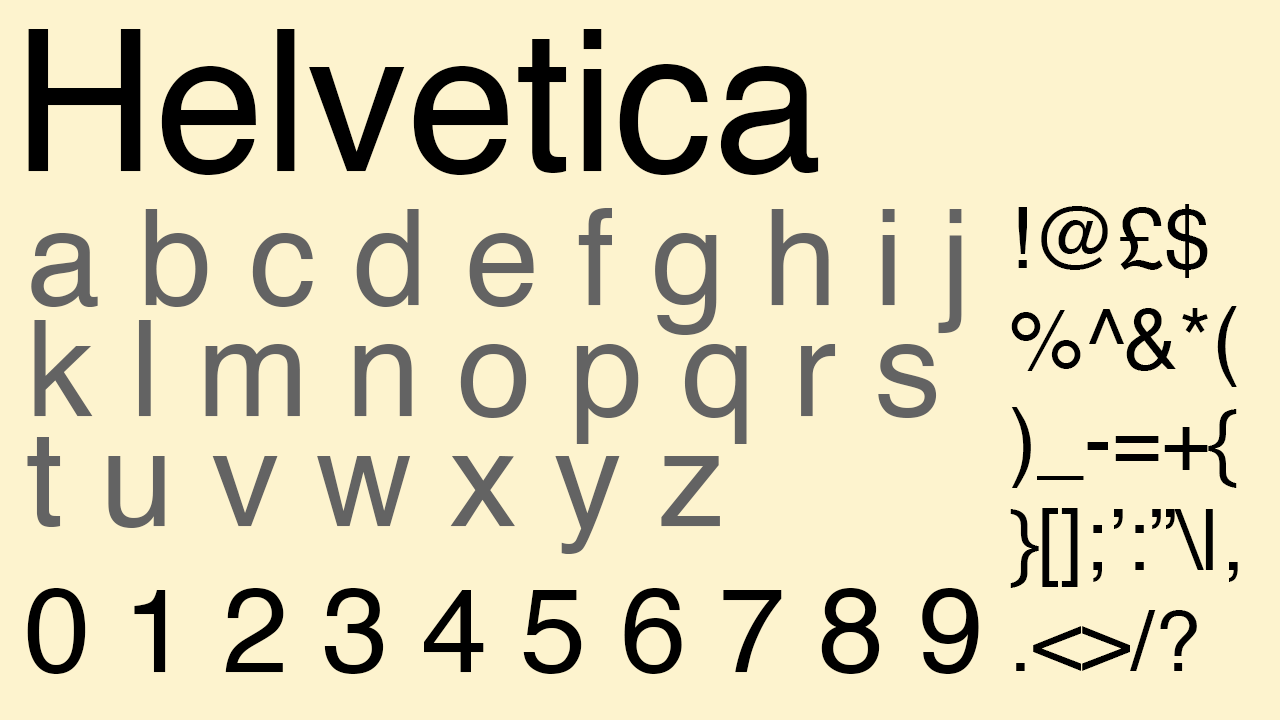
The ‘world’s most famous font,’ Helvetica barely needs any introduction, but an article on the most iconic typefaces wouldn’t be complete without a mention of this simple, efficient style.
It was designed in 1957 by Max Miedinger and Eduard Hoffmann, and was created in Switzerland, embodying the principles of the International Typographic Style, or Swiss Style. Known for its clean, neutral, design, its clarity makes it ideal for a wide range of applications, and to this day its influence is pervasive.
Major corporations like Apple, Lufthansa, General Motors and BMW have all used the type as a core element of their design system.
10. Bodoni
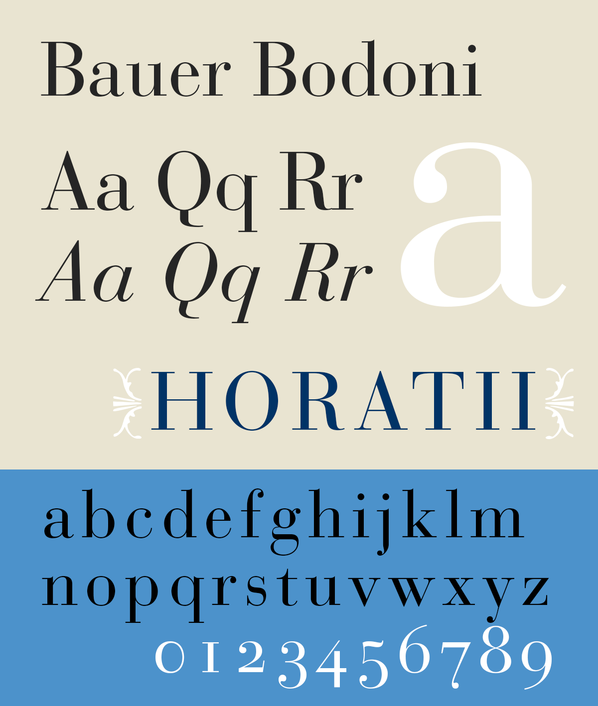
Designed by Giambattista Bodoni (“The King of Printers”) in the late 18th century, Bodoni is a quintessential example of the modern serif style.
It features high contrast between thick and thin strokes, along with flat, unbracketed serifs, presenting an elegant appearance which means its often used for headers and titles in print – fashion magazines and luxury branding to this day still use the font for its style and authority.
11. Franklin Gothic
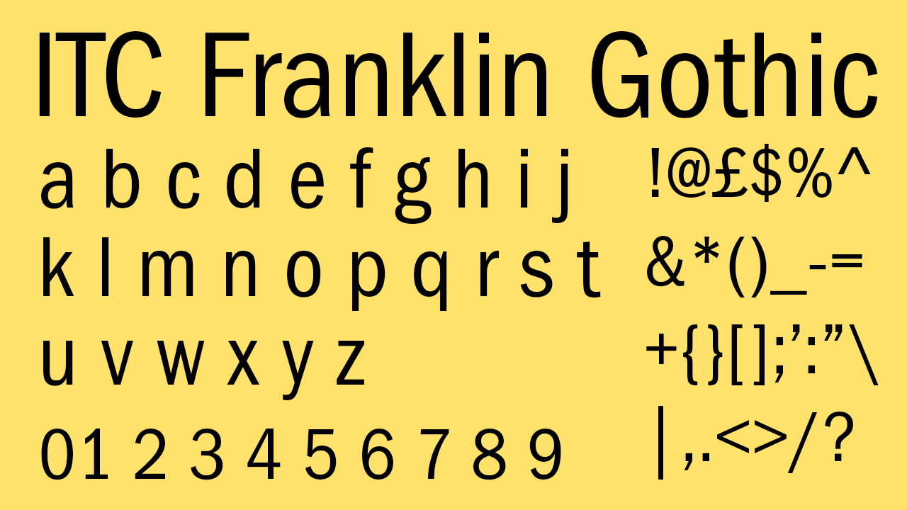
Designed in the early years of the 20th century by the American Type Founders (ATF), Morris Fuller Benton created Franklin Gothic in the grotesque style and it went on to become one of America’s earliest and most successful sans-serif typefaces.
Its slightly condensed form presents a strong appearance, and the type has been widely used in advertising, and signage, representing a robust approach to design. Throughout the course of the last century, many type producers created their own version of Franklin Gothic for distribution.
12. Comic Sans
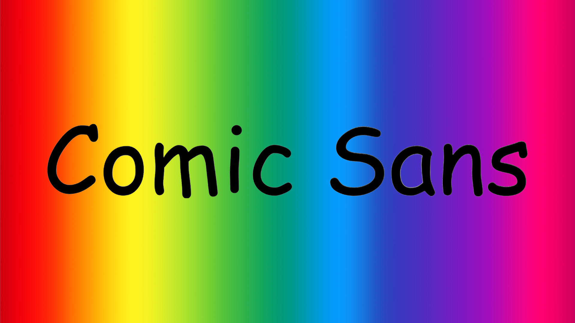
It feels that Comic Sans is the butt of all jokes in the type world, but iconic can be said to represent instantly recognisable – and for this – Comic Sans deserves a place on this list.
It was designed by Vincent Connare in 1994 for Microsoft, and was originally intended to be a friendly, informal typeface for use in comic book-style software.
It features rounded, playful letterforms that mimic the look of hand-drawn comic book lettering – despite retaining high legibility. It goes without saying that its misuse has made it a controversial figure.
13. Impact
‘This might just be the loudest typeface ever designed,’ says Lucas Luz, Associate creative director at &Walsh. Created by Geoffrey Lee, its ultra-thick strokes, condensed letterforms, and tight spacing were built for one thing: grabbing attention. It was made for headlines, posters, and any place where subtlety wasn’t the goal.
"While it was originally intended for print," Lucas points out, "it found its true cultural moment in the digital age; specifically, as the default meme font. The bold white text with a black outline? That’s Impact."
It became so ingrained in internet culture that it’s almost impossible to separate the typeface from the humour, irony, and absurdity of early 2000s meme aesthetics. Love it or hate it, Impact is everywhere, and that’s what makes it iconic. "Have you ever tried searching “Impact font” on Google? There’s an Easter egg!"
Want more great typography? See our lists of the best fun fonts, the best free script fonts and the best free graffiti fonts.