Despite the fact that most of us carry cameras more powerful than our ancestors could even dream up, many people still can’t take a photo to save their lives. But sometimes, beauty can emerge from chaos in the right circumstances.
The “Accidental Kubrick” online community shares pictures from mundane moments that could fit perfectly into a Stanley Kubrick film. From eerie similarities to “The Shining” to interesting, vintage designs, get comfortable as you scroll through, upvote your favorites, and be sure to share your thoughts and ideas in the comments section.
#1 Come Pet Us, Danny
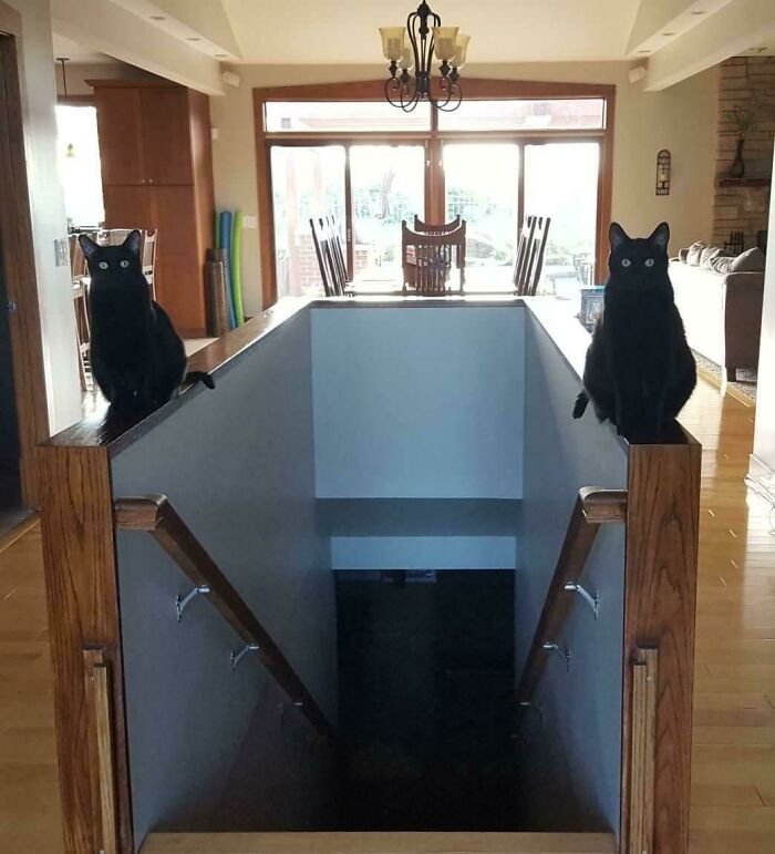
Image credits: thepastrix
#2 This 1969 German Swimming Pool
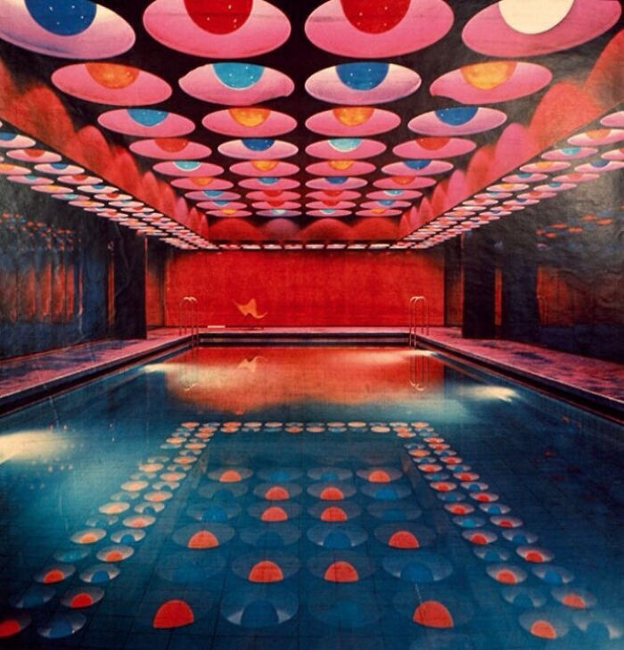
Image credits: blackabe
#3 The Reception Desk At General Motors Technical Center, 1965
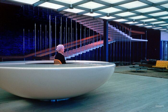
Image credits: PrussianScurvy
If you have come this far, there is a solid chance you have already seen one of Stanley Kubrick’s films. If not, here is a quick refresher. He directed, among other things, the Shining, 2001: A Space Odyssey, Eyes Wide Shut, and Full Metal Jacket. This alone is a pretty impressive filmography.
Much of his success comes from a sort of obsessiveness with getting details right. For example, Jack Nicholson reported that he would have the actors do over fifty takes of some scenes because he was still not satisfied with their performance. One can imagine the nearly absurd level of involvement he had with every other part of the film.
#4 Elton John's Walk-In Closet Dedicated To Just His Glasses
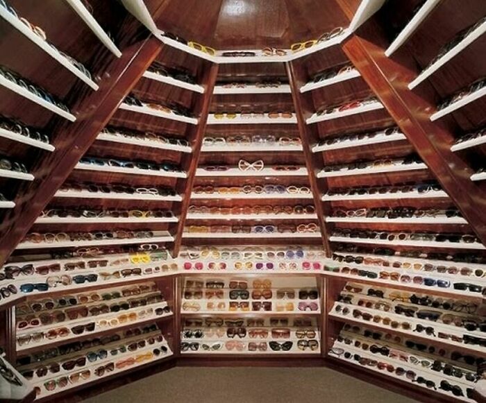
Image credits: ancientflowers
#5 An Enclosed Staircase
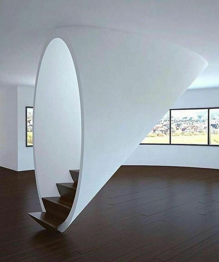
Image credits: Kubrickers
#6 Marienplatz Station, Munich, Germany
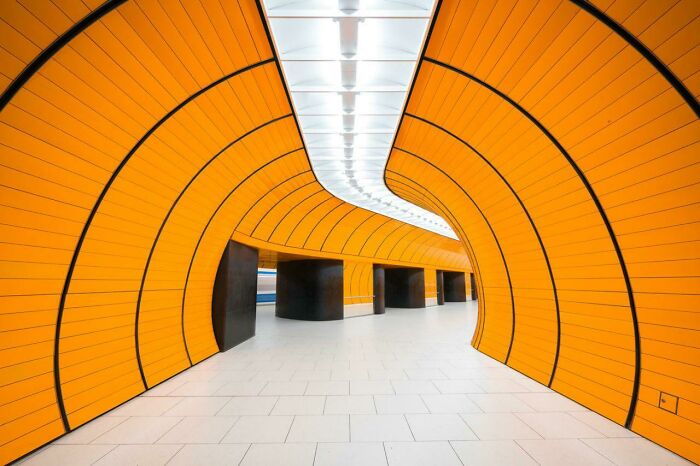
Image credits: Anna-Karenina_Katana
If fifty sounded absurd, you may be floored to learn that the staircase scene in The Shining took 127 takes, which left actress Shelley Duvall traumatized and in tears. Kubrick believed in pushing his actors as much as possible, as he believed that somewhere in all those takes there would be one or two perfect performances.
#7 Capsule Hotel In Japan

Image credits: ancientflowers
#8 The Exam Hall At My University
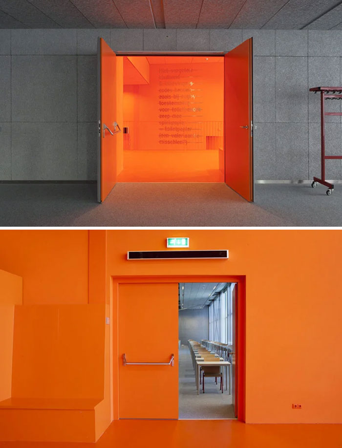
Image credits: DropporD
#9 The Red Hall, Seattle Library
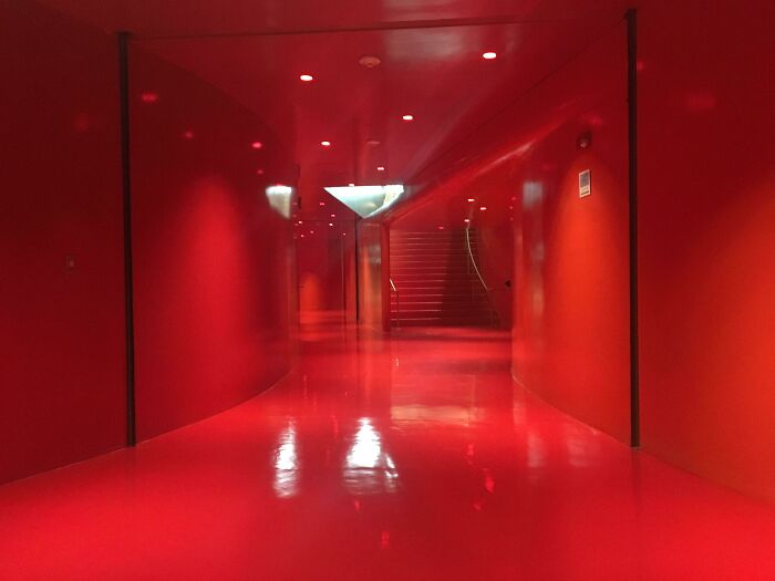
Image credits: AnsonKent
Despite this reputation, he did espouse a philosophy of appealing to the masses. One would think that a demanding, transgressive director would limit him or herself to something highbrow, but Kubrick stated that he wanted his films to more resemble pop music. He compared two viewers, an Alabama truck driver, and a Cambridge intellectual, and stated that his films are for both since their "emotions and subconscious are far more similar than their intellects."
#10 Come Moo With Us, Danny

Image credits: Steampunk_ukelele
#11 Bloody Waterfall In Antarctica. Red Color Comes From A High Concentration Of Iron In Water
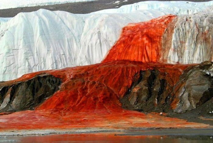
Image credits: insurgentpepper
#12 Hallway To Swimming Pool Area
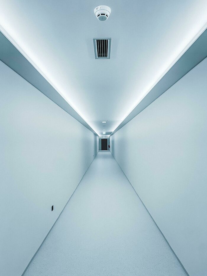
Image credits: ninja_lazorz
While a lot of discussions of Kubrick focus on his scripts and directing methods, it’s worth pointing out that he was in many ways comfortable around most parts of a movie set. Alexander Walker stated that he was one of the "very few film directors competent to instruct their lighting photographers in the precise effect they want." This is perhaps another reason why his style is so recognizable at a glance.
#13 Reminds Me Of 2001
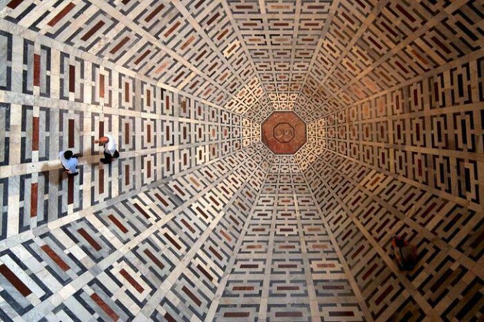
Image credits: nickaly
#14 If Stanley Kubrick Designed A Swimming Pool
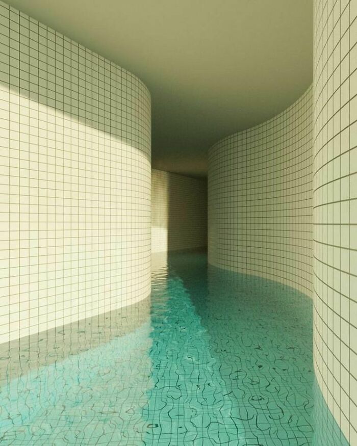
Image credits: reddit.com
#15 Pope Francis In An Empty St. Peter’s Square
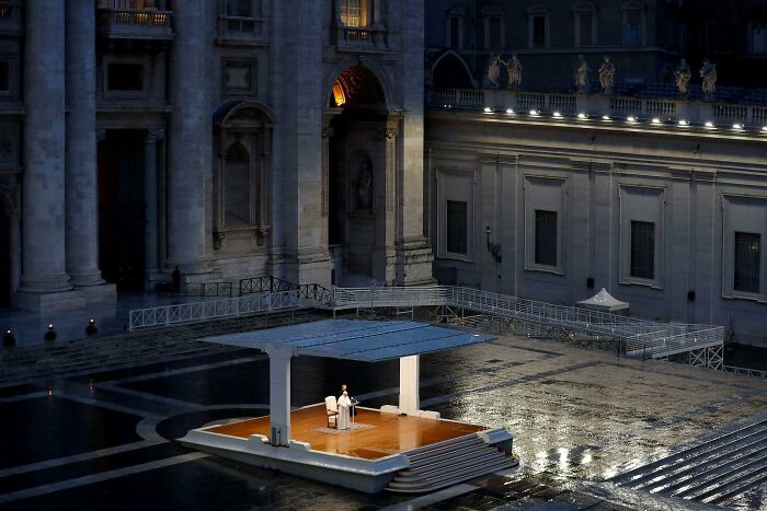
Image credits: impatrickt
Many critics believed that, first and foremost, he was a visual filmmaker, which is a somewhat reductive term, because aren’t they all? Indeed, part of his reputation may come from the fact that actors actually get interviewed, while most film journalists don’t spend a lot of time talking to the crew on any particular set.
#16 Room 237 Reacts Only
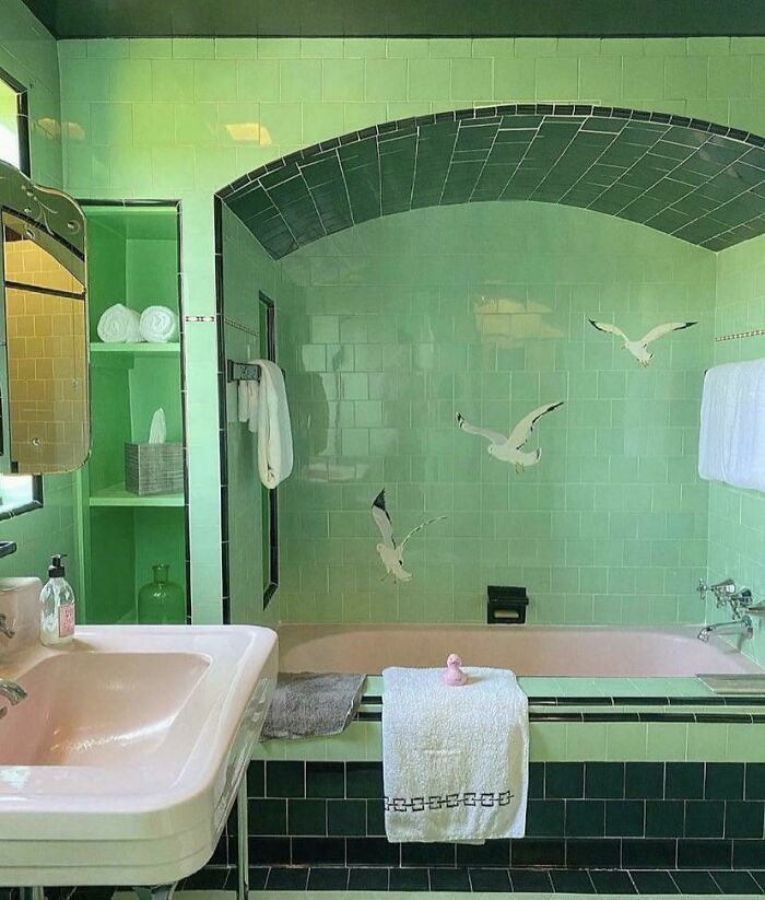
Image credits: greyishblue2
#17 Loft Space In The Netherlands
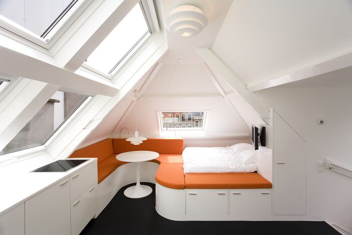
Image credits: Diagonalizer
#18 Heathrow, Some Hotel Lobby Circa 1968
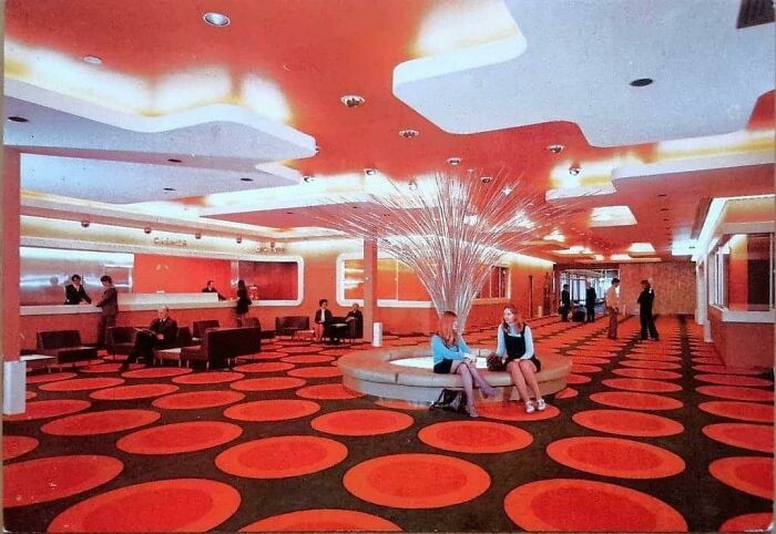
Image credits: reddit.com
He himself believed that a film's visuals were the easiest part for himself, which is quite a humbling thought, that one of the premier directors of our time, with a recognizable, still legendary visual style thought this was downright simple. Partially, this stemmed from the fact that he was very knowledgeable about filmmaking and wasn’t concerned with “getting his hands dirty” by personally directing camera placement, lighting, and even the choice of lenses.
#19 Elevator Aftermath

Image credits: IsItUnderrated
#20 Yep, It Reminds Me Of Stanley Kubrick Films
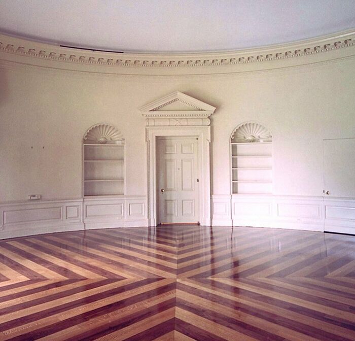
Image credits: PinkNinja_14
#21 The Inside Of A Toaster
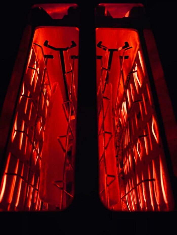
Image credits: FHM_IV
Indeed, he was so proficient behind the camera that cameramen around the world considered him one of the great among their profession, alongside his reputation as a director. Partially, this was his talented eye for shots, but it’s important to remember that Kubruck was also an early adapter of various bits of film technology, such as Steadicam and video assist.
#22 This Swimming Pool
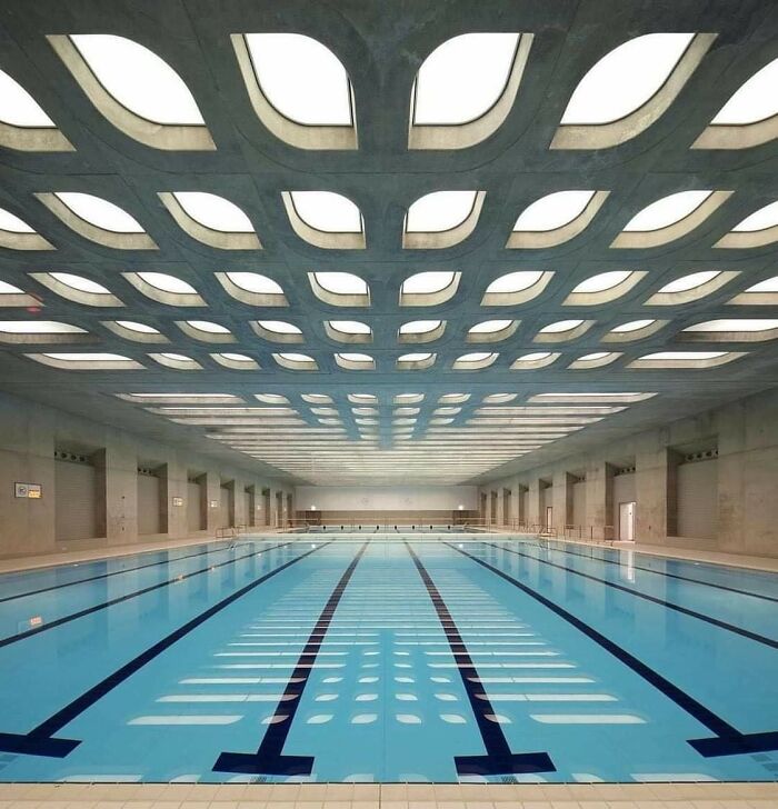
Image credits: steed_jacob
#23 Red / Oregon Wildfires Making It Look Straight Apocalyptic

Image credits: icecreamdoggo
#24 This Theatre Restroom In Japan
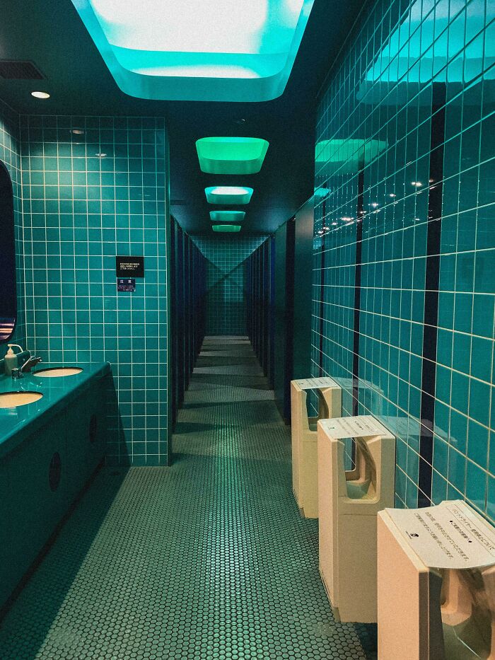
Image credits: beeekeeeper
As much as Kubrick was the undisputed master of his domain, it is visible just how much of this aesthetic was also directly related to the visuals and aesthetics of the time. Even 2001: A Space Odyssey now looks, if anything, quite vintage, even by the space-exploration standards of the year 2001.
#25 Inside A Fazioli Grand Piano

Image credits: CharlesBrooks
#26 Inside A Spanish Ferry. Shot On Film
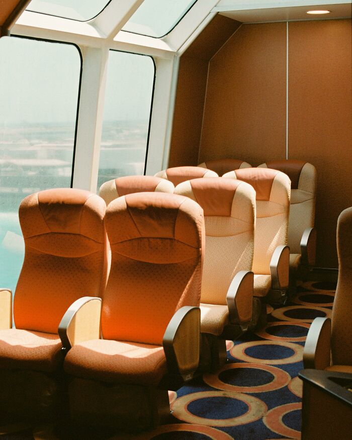
Image credits: dompuerta
#27 Very Kubrickian
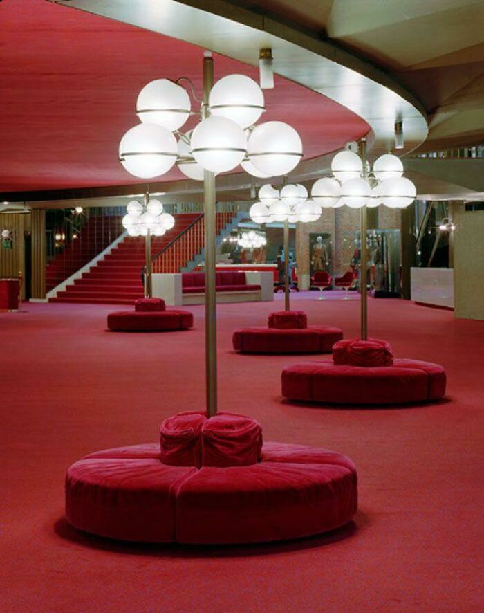
Image credits: RorasaurasRex
At the same time, it’s worth noting that many of the items here are as old as Kubrick’s films. Indeed, there is perhaps even some argument to be made that many of his visuals were directly inspired by the creative work of architects and designers out there. These ideas can be seen, almost directly transported onto his sets and in the costumes his characters wear.
#28 This House For Sale In Michigan
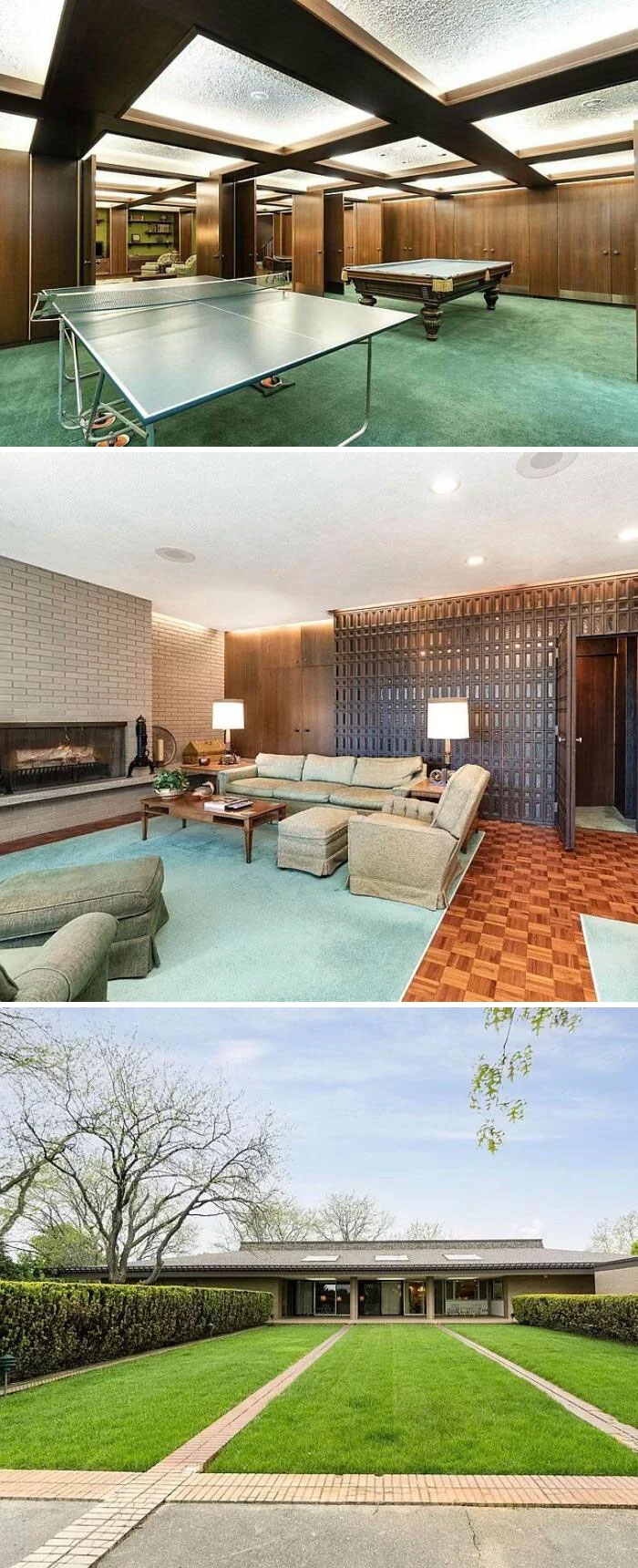
Image credits: Meetybeefy
#29 Escalating To Kubrick Level
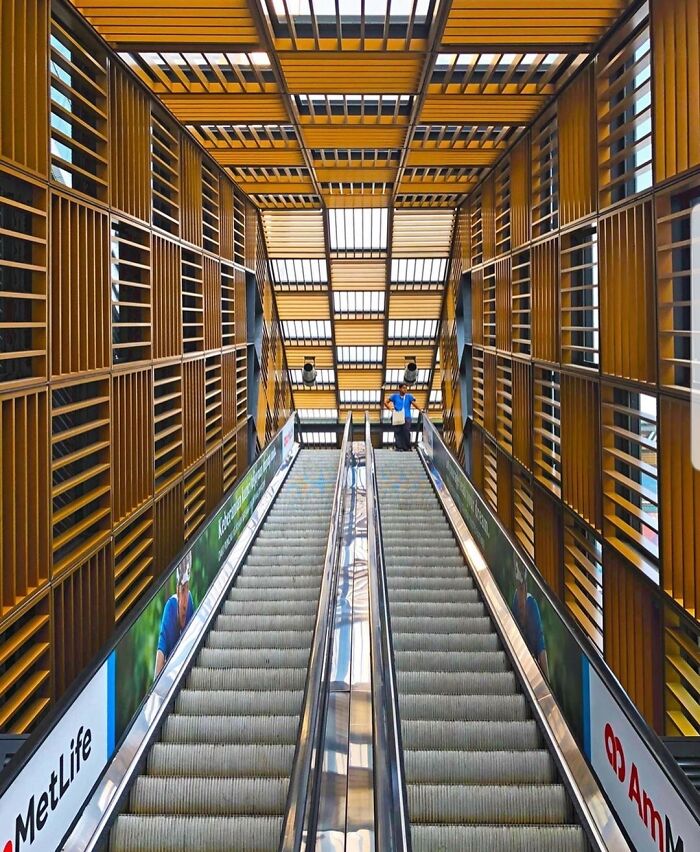
Image credits: cavemanleong
#30 Library Of The University Of Amsterdam
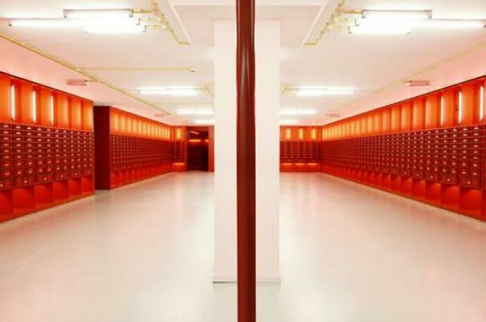
Image credits: vinofinotinto
Part of the appeal of Kubrick, beyond the obvious, is that he did quite aggressively push for his work to be relatable. Many of his films sometimes seem like they might veer into pulp scenarios, but his attention to detail and skill always elevate them. He believed that it was “better to adapt a book rather than write an original screenplay and that you should choose a work that isn't a masterpiece so you can improve on it.” If you want to explore more moments where films meet real life, check out Bored Panda's previous articles on "Accidentally Wes Anderson" and the online trend it later spawned.


