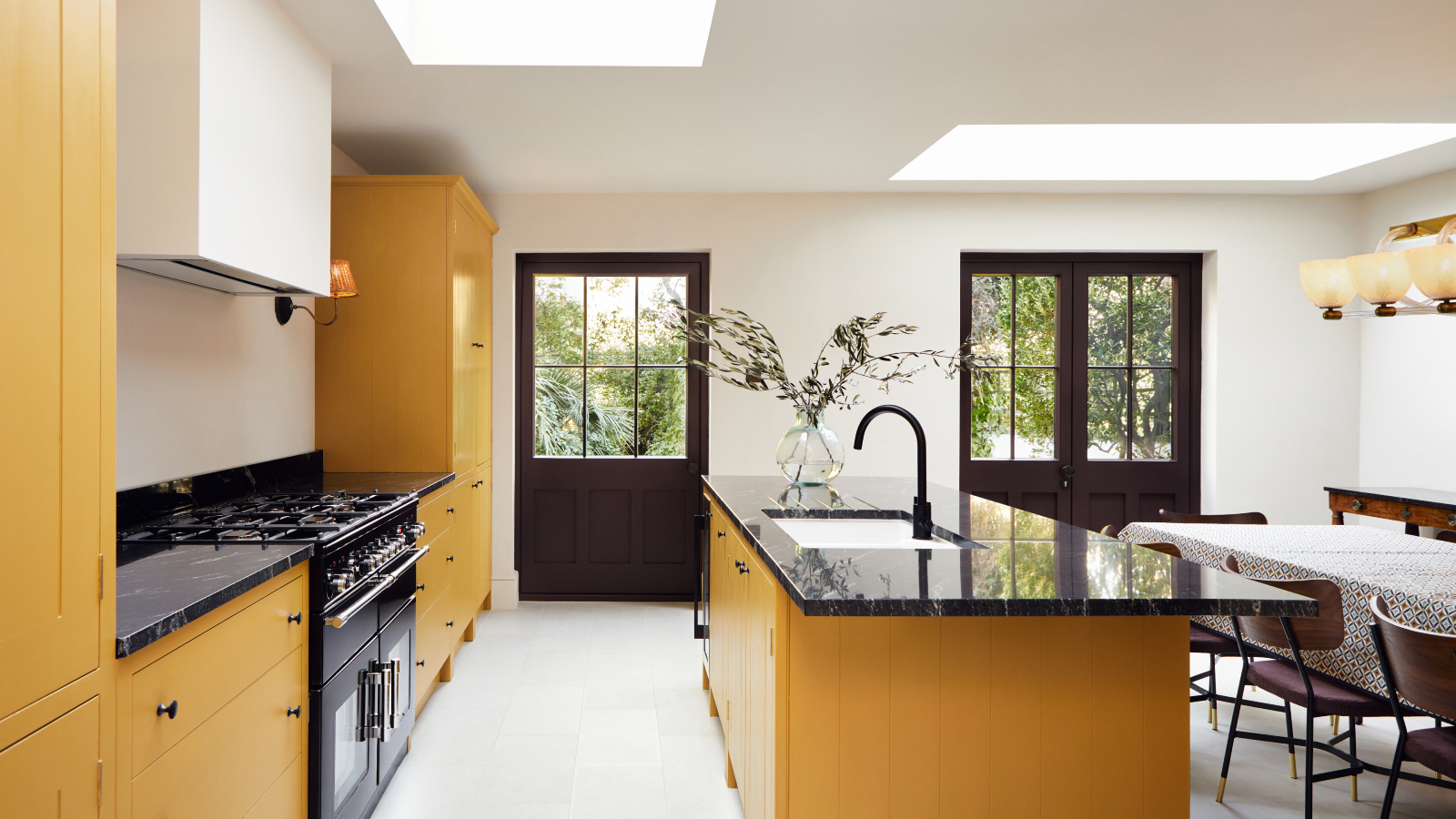
There are so many kitchen island color ideas to choose from these days, the world really is your oyster. But how do you choose what color is best for your kitchen island? Is a monochromatic simple palette of neutrals, whites, or glossy black preferential or do you dare to go bold with primary pops of bright color?
There are two main options – you can match it to the rest of your kitchen color scheme or have it in a stand-out shade that allows it to be the focal point.
We dive into the world of colored kitchen islands to discover if there are color and designs rule that should be upheld when deciding what color your kitchen island should be.
Why chose a colorful kitchen island?
Character and personality can be introduced to even the most modern or simple of kitchens by changing the use of color and materials introduced. The kitchen island can provide the perfect vehicle to introduce new colors or create contrast from the kitchen design.
There are kitchen island color ideas to suit any style – from dark and dramatic to a considered pop of color - which will you choose?
1. Linking up colors
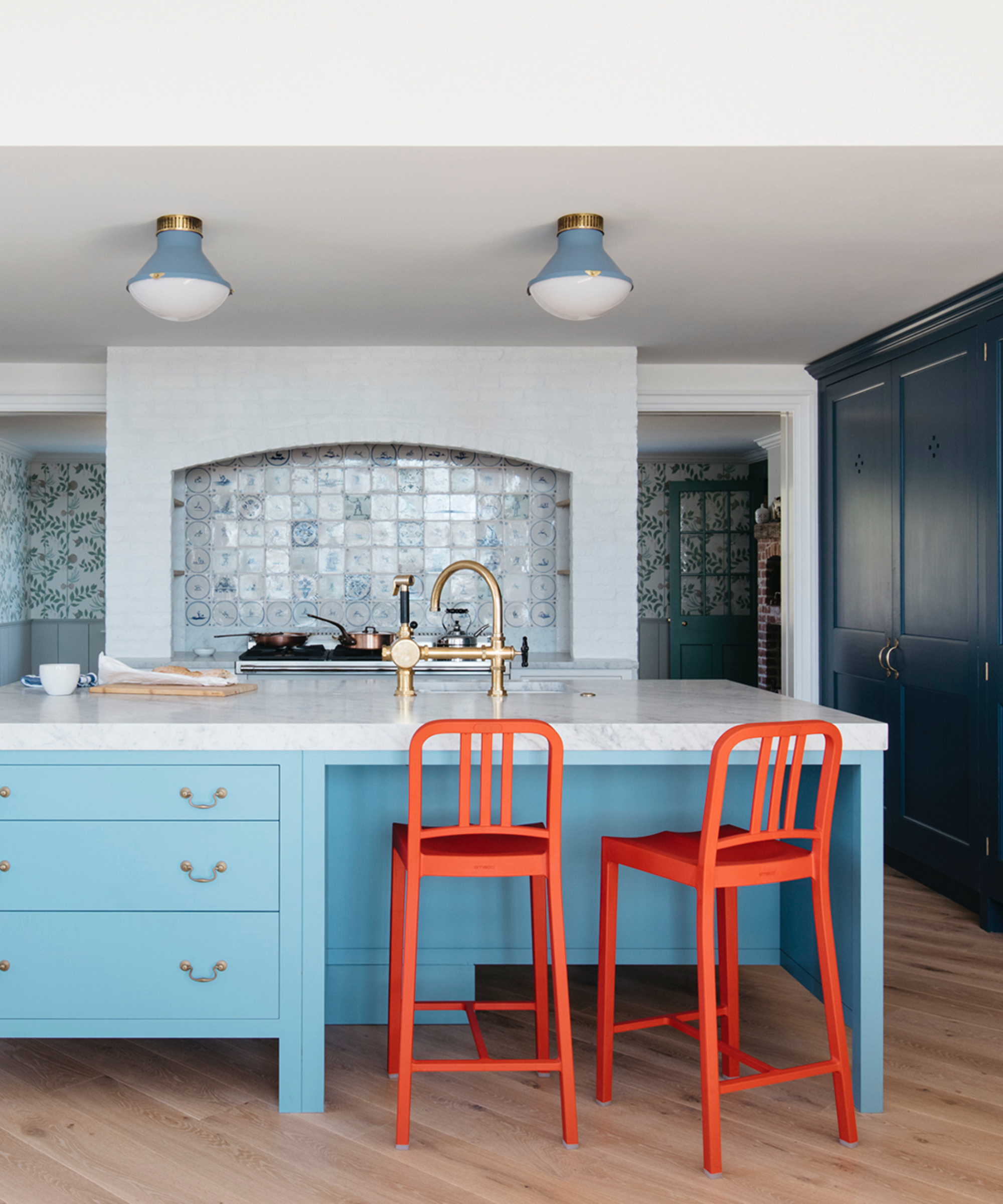
‘An island can act wonderfully as a link between two areas of a kitchen, both in terms of function as well as color.’ Explains Merlin Wright in Plain English. In this New York City kitchen, a mid-tone blue has been chosen to connect to the tall rich blue cupboards and the off-white dresser.
‘An island is a fun way to bring a stronger color into a space without dominating the entire room. Using a bold color below eye level allows it to almost fade away,’ Merlin adds. Bolts of bright colors were also introduced gently through the brightly painted stools and light fixtures above the island.
2. Choose muted tones for longevity
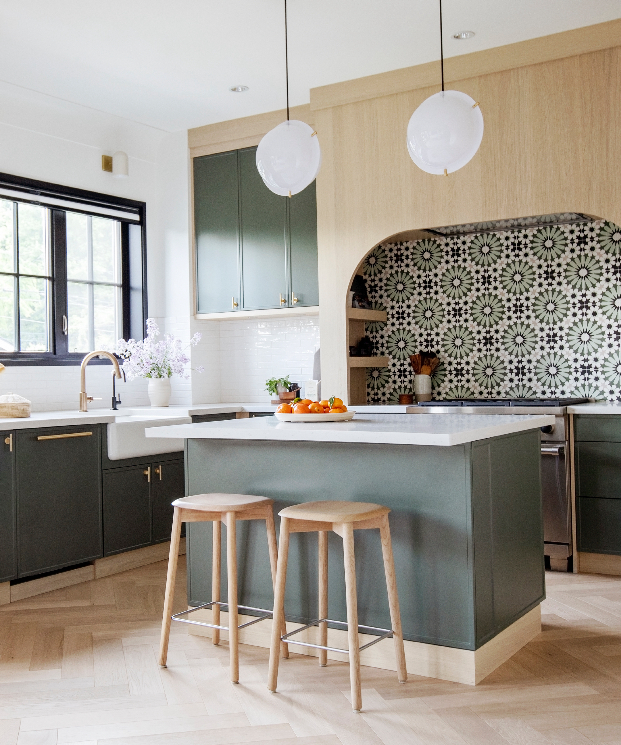
Interior design is all about standing out from the crowd, a colorful or contrasting piece of furniture like a kitchen island is a fun and simple way to achieve this. Ami McKay, president & principal designer of Pure Design, explains: ‘An island should stand out from the rest of the kitchen. I look at the materials we have chosen; the backsplash tiles, the wood, maybe the marble veins in a countertop, and finally, I choose the island color to pull it all together.’
Ami believes that choosing muted, earthier tones will ensure your kitchen island color choice will never go out of fashion, she says: ‘You can’t go wrong with more earthy and natural materials and colors, will have layers of light and dark for texture and depth.’
3. Mix up materials and textures
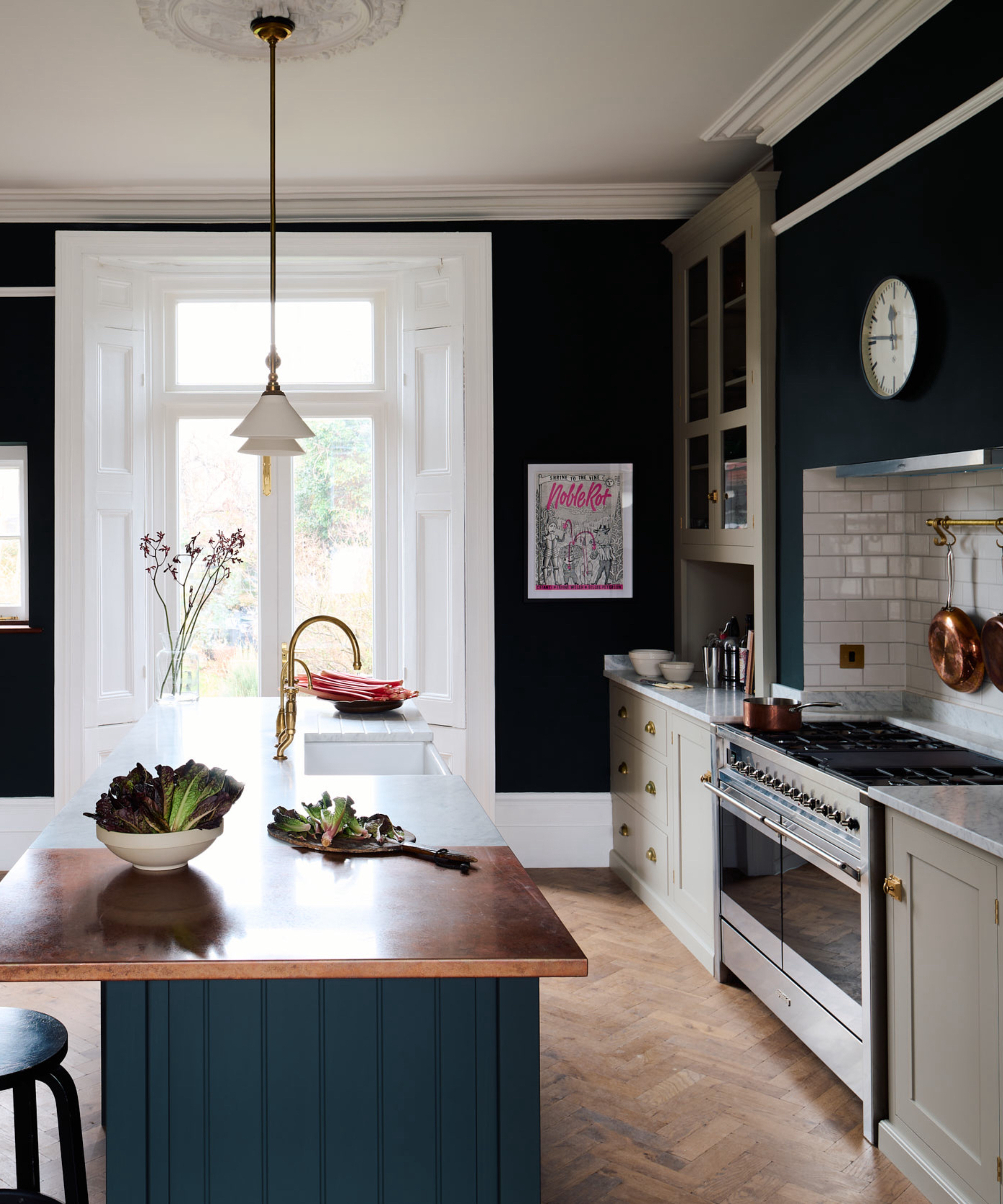
When redesigning your kitchen do not be swayed by the season. Consider the colors you chose for this room and how it will evolve throughout the year, in the darkest depths of winter and the brightest, sunniest, summer day. A mix of materials, and therefore tones could provide you with the depth of choice you need in the design.
This kitchen island is created with a range of materials and colors to suit the mood needed for every day of the year. An opulent, copper worksurface, looks elegant against the rich blue of the kitchen island, while the addition of white marble on one half of the countertop ensures that a fresh, clean, spring-like kitchen is always available here.
Pick a contrasting color
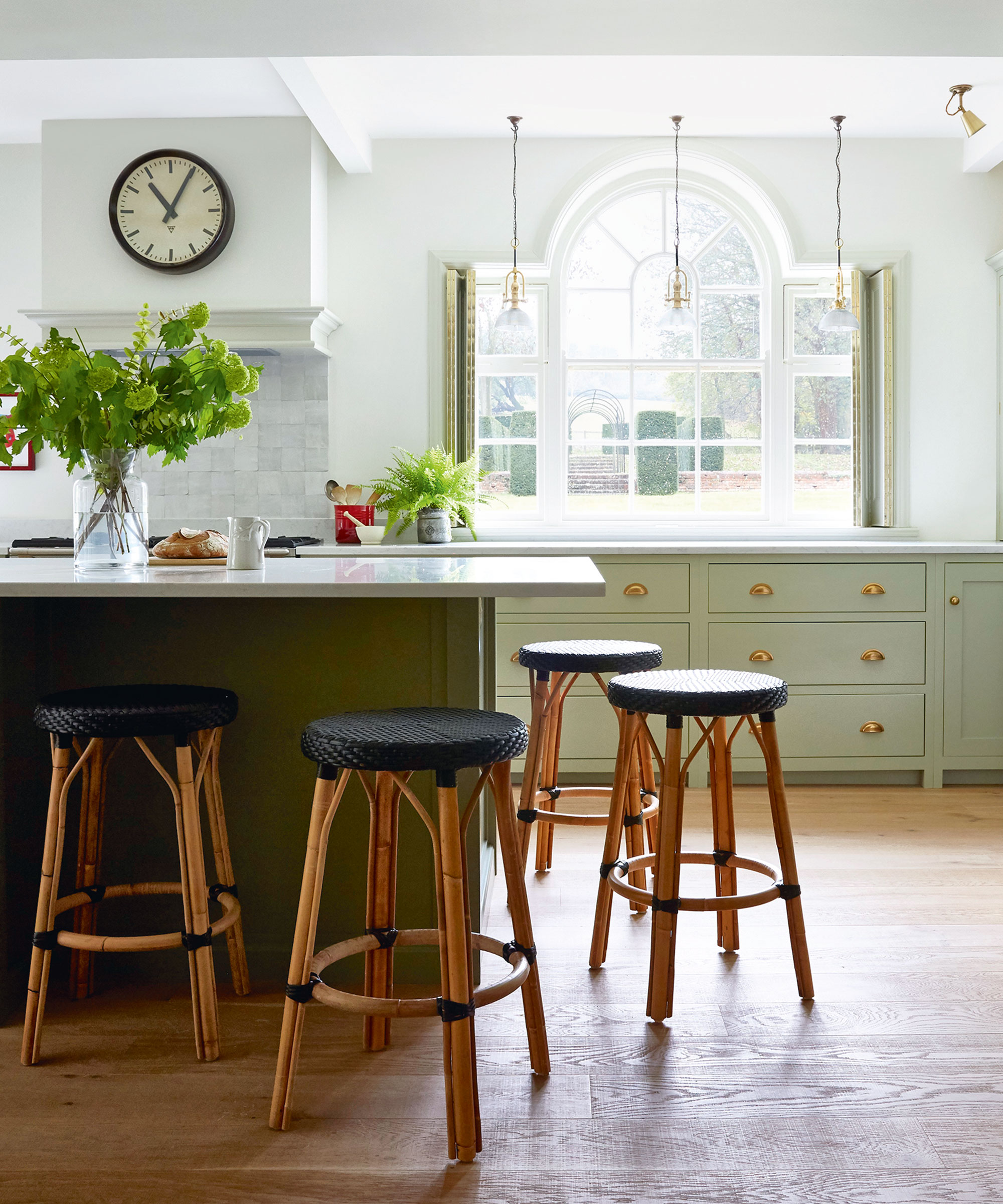
White, bright, crisp kitchens are extremely popular with homeowners. Introducing a contrasting color onto the kitchen island will bring in depth, layers, and interest to the overall design.
‘There are occasions when a contrasting color adds dimension, we love white, but sometimes you can have too much of a good thing. Using a contrasting color on this island anchors it to the center of the room and provides a focal point. When choosing something as bold as an accent color, we recommend referencing tones found in adjacent spaces, so that your island feels harmonious within the surroundings,' explain Mark Williams and Niki Papadopoulos of Mark Williams Design.
5. Add character with vintage additions
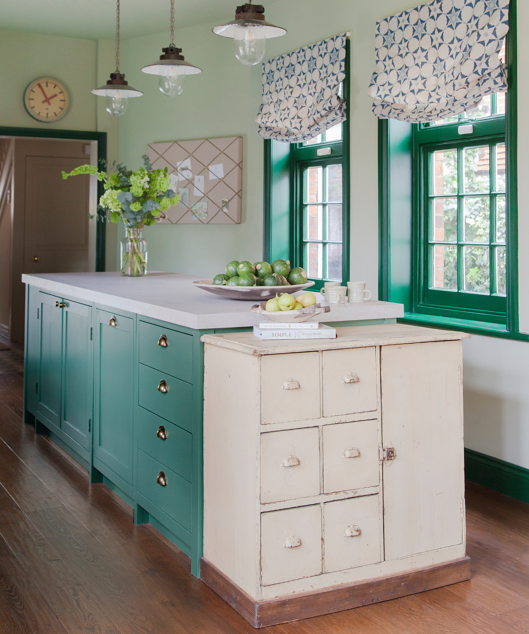
Painting your island a bolder color will add character to your kitchen. ‘There are a plethora of choices for adding interest to your kitchen island,’ says Felix Milns of HUX London.
‘Painting the island in a bolder color will instantly draw the eye and make a focal point of this sociable area of the kitchen, naturally drawing your guests towards it.’
This kitchen island has been painted in verdant green to connect with the window frames and paler green tones found on the walls. Paired with the vintage white sideboard and white countertop the looks feel fresh and bright.
6. Use materials to bring color in

There are never (too) many rules in design and paint is not the only way to bring color onto a kitchen island as Emily Flaxman, owner and principal designer at Flax Interiors, agrees:
'In this project, I brought a dash of color into the kitchen using a slab of bright teal Lavastone on the island. Lavastone is extremely durable, nonporous, resistant to heat and cold, and is available in a wide range of colors. This teal brings joyful happiness and is a statement piece to what would have been an otherwise neutral kitchen.’
7. Go bright and bold
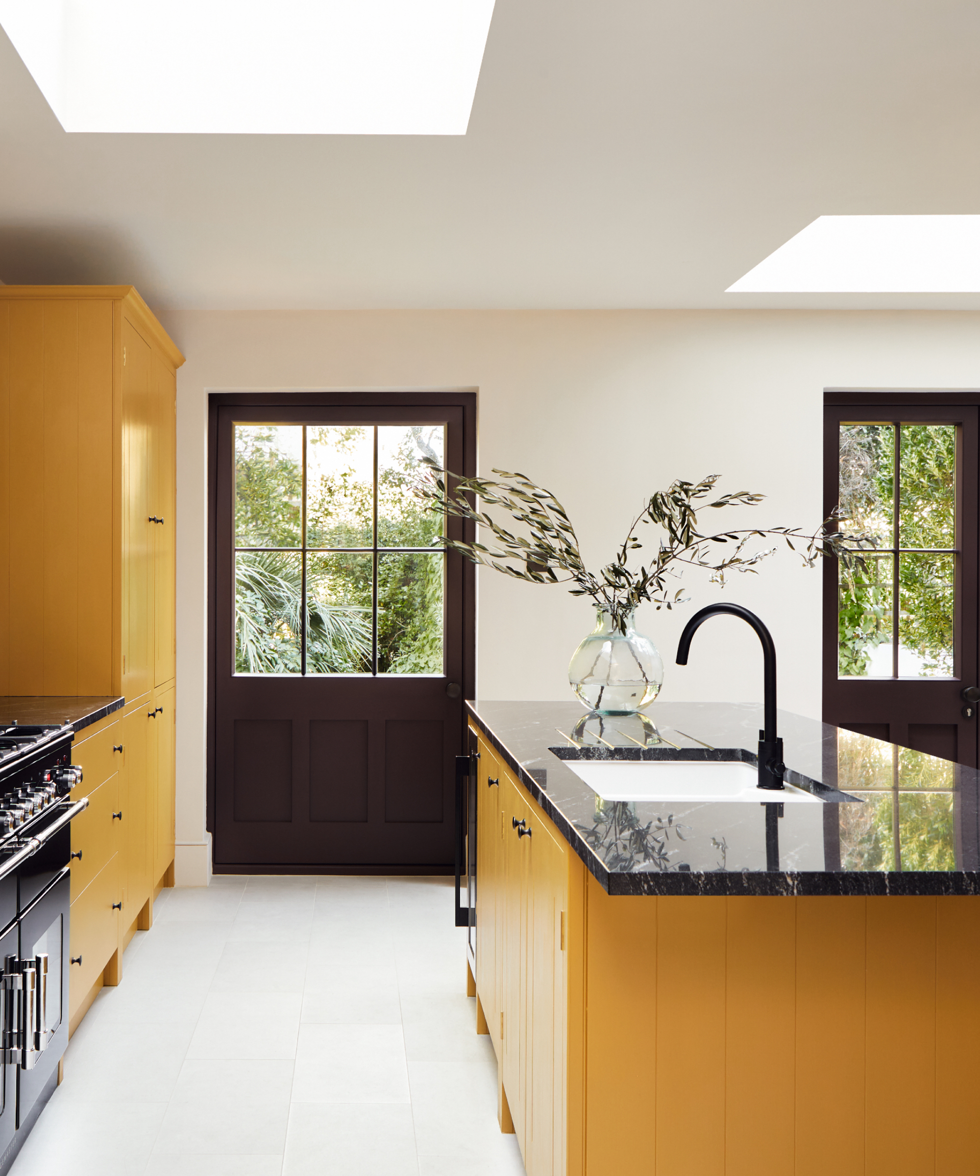
If you have the courage and vision, go all out, be bold, and embrace a bright color for your kitchen island. Strong, vibrant tones create a design statement and when contrasted with darker palettes as seen here create a grounded feel.
Dominic Myland, CEO of Mylands advises: ‘Kitchens are versatile and busy spaces, and painting your kitchen island is an easy way to add interest and create a striking focal point. Bright hues introduce a contemporary and bold touch, and a darker hue offers a striking contrast. Alternatively, soft pastel hues and neutral shades create a relaxed and pared-back scheme.’
8. Create balance with your color choices

Consider balance when choosing colors for your kitchen island, will the island color be in contrast with the rest of the cabinetry and kitchen furniture, or will it complement the color scheme? Both principles work, however, to create a balanced environment consider the colors introduced onto the cabinets, matching your island with this color or painting it in a shade that is slightly lighter or darker than the cabinets to provide harmony.
‘For this bold, colorful kitchen, we specified multiple paint colors for the walls and cabinets, so we kept the island the same as the cabinets. It is always about finding the right balance for the space,’ explains Rozit Arditi, principal Designer, at Arditi Design.
9. Invest in natural tones and materials
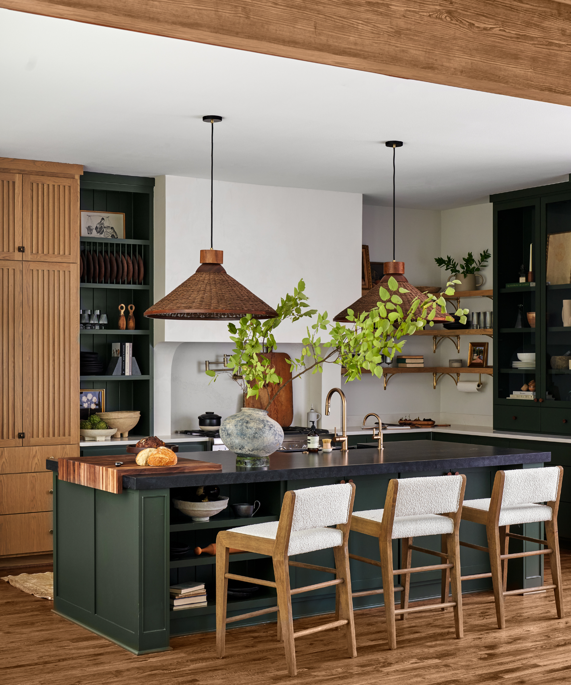
If your kitchen design includes natural materials such as wood or marble, then choosing softer, earthier tones related to the natural world for your kitchen will ensure that the overall design will feel organic and create a sense of well-being.
A deep green was selected here to complement the wood used throughout the rest of the design. Ginger Curtis, president at Urbanology Designs, says: ‘For this black quartz-topped kitchen island, we wanted something bold but not overwhelming, and slightly unexpected. We chose a deep shade of green, which is popular at the moment, over softer, paler greens. We are seeing a shift towards moodier colors in general with saturated hues that embrace a strong vibe.’
10. Take inspiration from travel
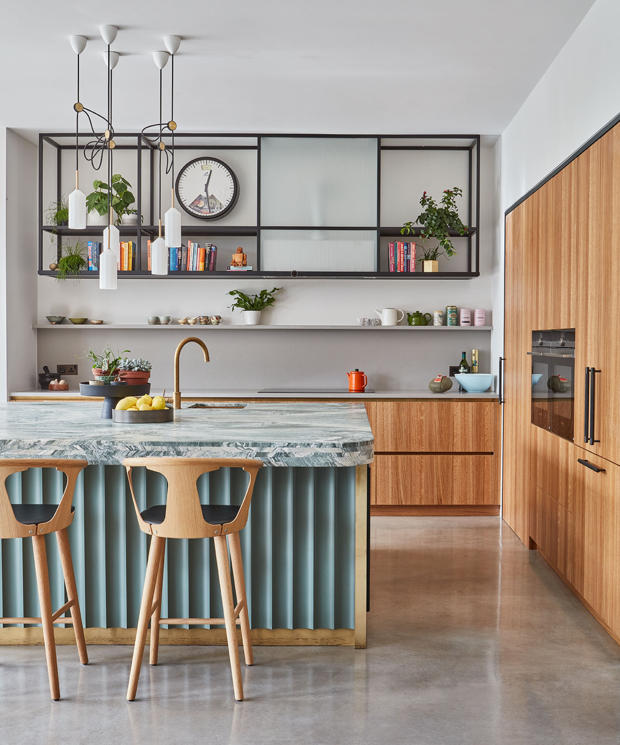
A plate from Turkey was the inspiration behind the design and color scheme of this kitchen and its pretty fluted pale green island, topped with blue and green-veined marble.
Jennifer Hamilton, director, at The Vawdrey House, explains: ‘Inspiration for a statement kitchen island color can be drawn from anywhere. Here, it came from a gorgeous ceramic plate from Turkey. A fleck of color within the plate was drawn out for a bold color within the kitchen.’
11. Follow the 60-30-10 rule
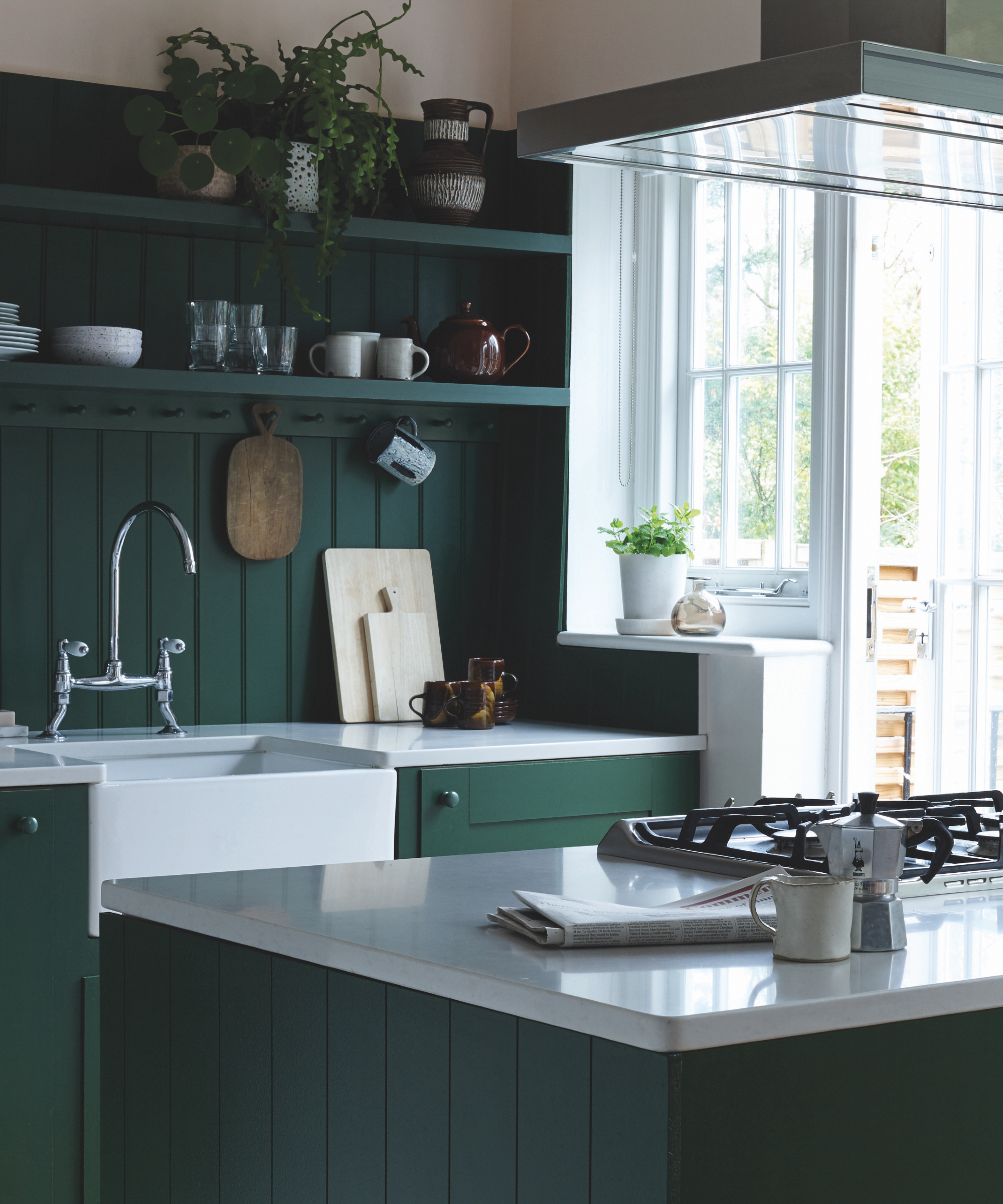
Consider the fundamentals of balance in interior design when choosing colors for your kitchen and kitchen island. The much-used 60-30-10 rule is a great tool to apply. In this kitchen the main color, 60%, is a rich forest green, the 30% tone is a soft pink, and the 10% white. Clearly a dream team of colors together and carefully chosen to complement each other and the space.
‘Depending on the scale of your kitchen choosing between pale to darker colors will depend on how dominant you want the island to sit in your space. Paler colors will make this area feel less weighty and dominant whilst darker colors will ground the furniture more in the space and it is often a great way to introduce a secondary or tertiary color into your kitchen,’ explains, international brand ambassador at Farrow and Ball, Patrick O’Donnell.
12. Embrace a dark and dramatic palette
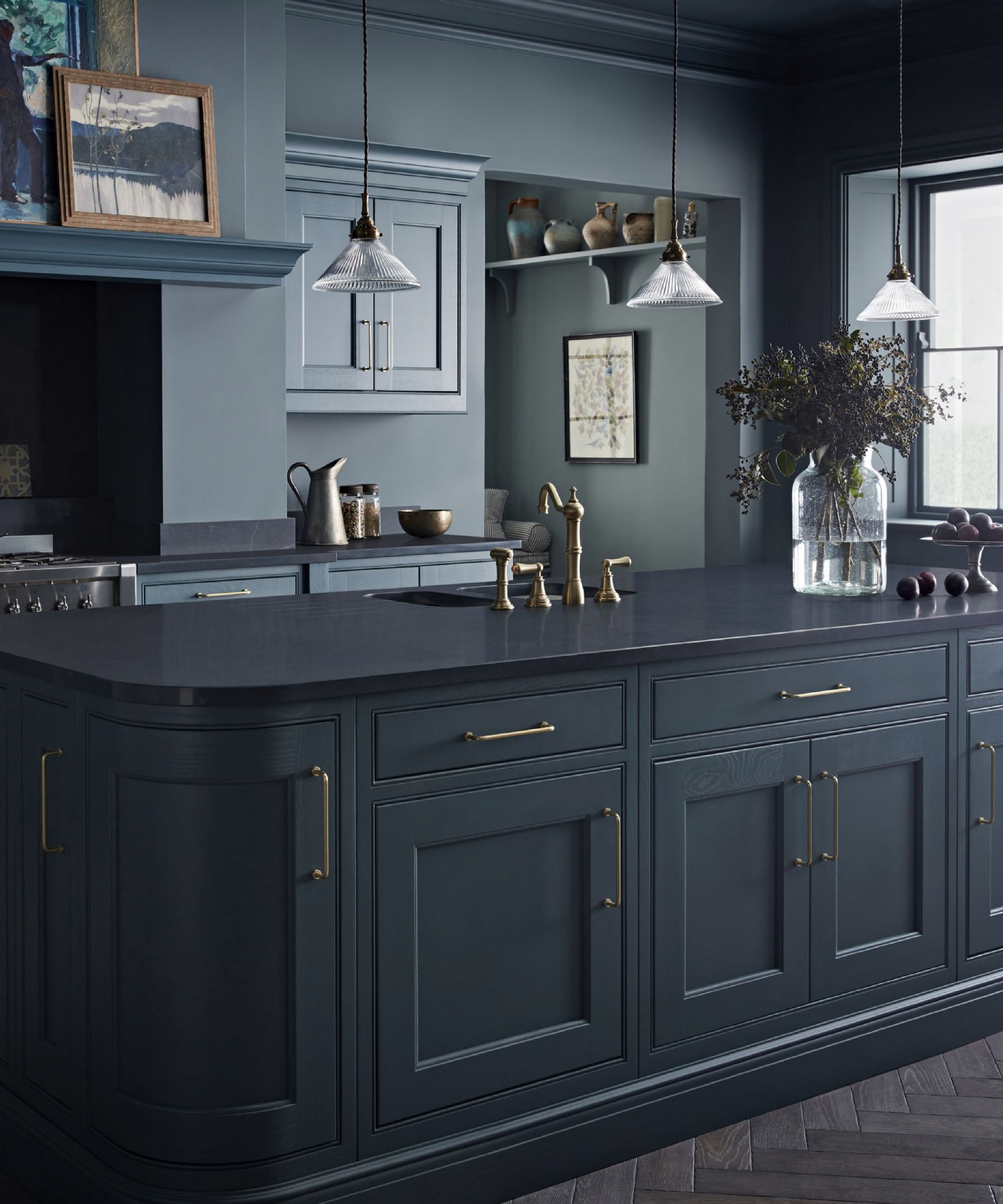
Impactful, chic and extremely stylish, use one rich and intense hue and go all out and work within the confines of that color. A powerful design statement that sweeps across the kitchen island, walls and cabinetry and ushers in a stunning and bold look.
Here, the kitchen island stands out as it's painted in the darker blue with the rest of the walls and cabinetry painted in a lighter but still intense shade.
FAQs
What colors should you choose for your kitchen island?
The kitchen island is so often the hub of the home, painting it a different color to the rest of the kitchen cabinetry will allow it to pop. There is no rule or limit to what color you can paint your kitchen island. Bold colors will create a statement and work well in a home that has color throughout.
Dark colors offer elegance, using one color throughout is bold and defining. Chose natural and earthier tones if you are working with natural materials. Softer tones will blend and feel gentle and calming. Remember, you can add color using different materials on the countertop, and texture with ribbing, panels, or curved details on the sides.


