When considering family room paint ideas, a number of factors will come in to play. As well as aesthetics, you need to determine how you want the space to feel. Are you looking for a room that's devoted to relaxation, or somewhere that's vibrant, colorful and uplifting?
Caroline Milns, Head of Interior Design, Zulufish, suggests that role of the traditional family living room is enjoying a revival. 'Interestingly the role of the family room has evolved in recent years, with the rise of popularity of snugs and flexible kitchen/dining spaces, which include living areas for sofas and home bars,' she explains. 'As a result, the more traditional sitting room where the family would gather with friends, read the newspaper or listen to music has been somewhat restored as a flexible space for all the family to enjoy.'
Family Room Paint Ideas for an Inviting, Ambiant Space
'A fresh coat of paint can breathe new life into the heart of your home, which is the easiest and most economical makeover option,' says Olivia Mase, VP of Design and Construction at Curbio.
There are a few things you need to consider when picking the right paint ideas for walls in a family room. Olivia continues: 'When choosing your color scheme for a family room, consider how much natural light the room receives and its direction. Lighter colors work well in rooms with limited natural light, while darker colors can add depth to sun-filled spaces.'
Olivia's tips on color throughout the room? She says: 'Refrain from matching everything perfectly. Mix different colors, textures, and patterns to create a dynamic and visually appealing space. Incorporate unexpected elements like a bold accent wall, colorful furniture, or vibrant accessories to showcase your confident style and personality.'
Another top tip is layer your colors within the same tonal family. Olivia suggests: 'Work with a considered layered scheme by choosing colors from the same tonal family with different depths.
'This adds dimension and complexity to the room while maintaining cohesion and harmony.
'Whether you're looking to cozy up a small living room or make a big statement in a large room, there are endless possibilities to explore.'
See our expert's favorite hues for family room paint ideas below.
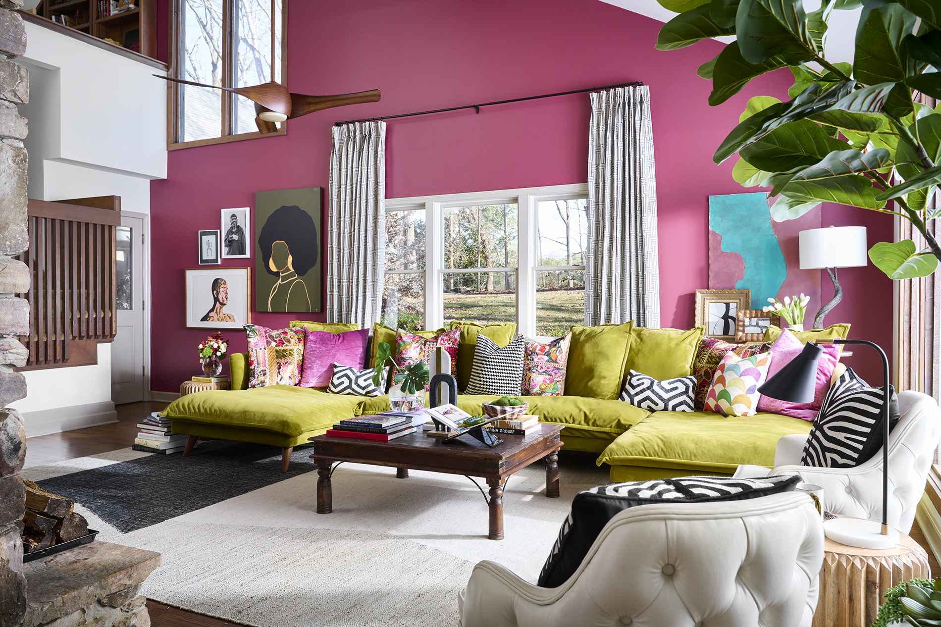
1. Go in bold with hot pink
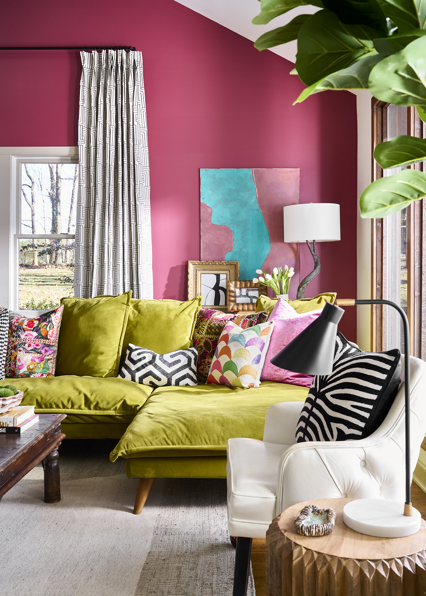
Color fans can embrace their creative side in a family room - a space that's all about enjoying each other's company and embracing personality.
Hot pink is always a fun and warming color to experiment with in a family room. Theresa Butler, Principal and Founder of Atlanta-based Theresa Butler Interiors, says of the space above: 'My client already owned the vibrant apple green sofa, and requested a continuation of bold, bright colors,' explains
'Among the fabric samples I showed her for decorative pillows was one from GP & Baker, which she adored. Drawing inspiration from this sample, I coordinated all the colors to harmonize together.
'The paint color, Sherwin Williams 6306 Cordial, a rich and deep shade of hot pink, was an ideal selection for extending the maximalism of color and pattern, creating a joyful, vibrant family room ambiance.'
2. Bring in biophilia with soft green
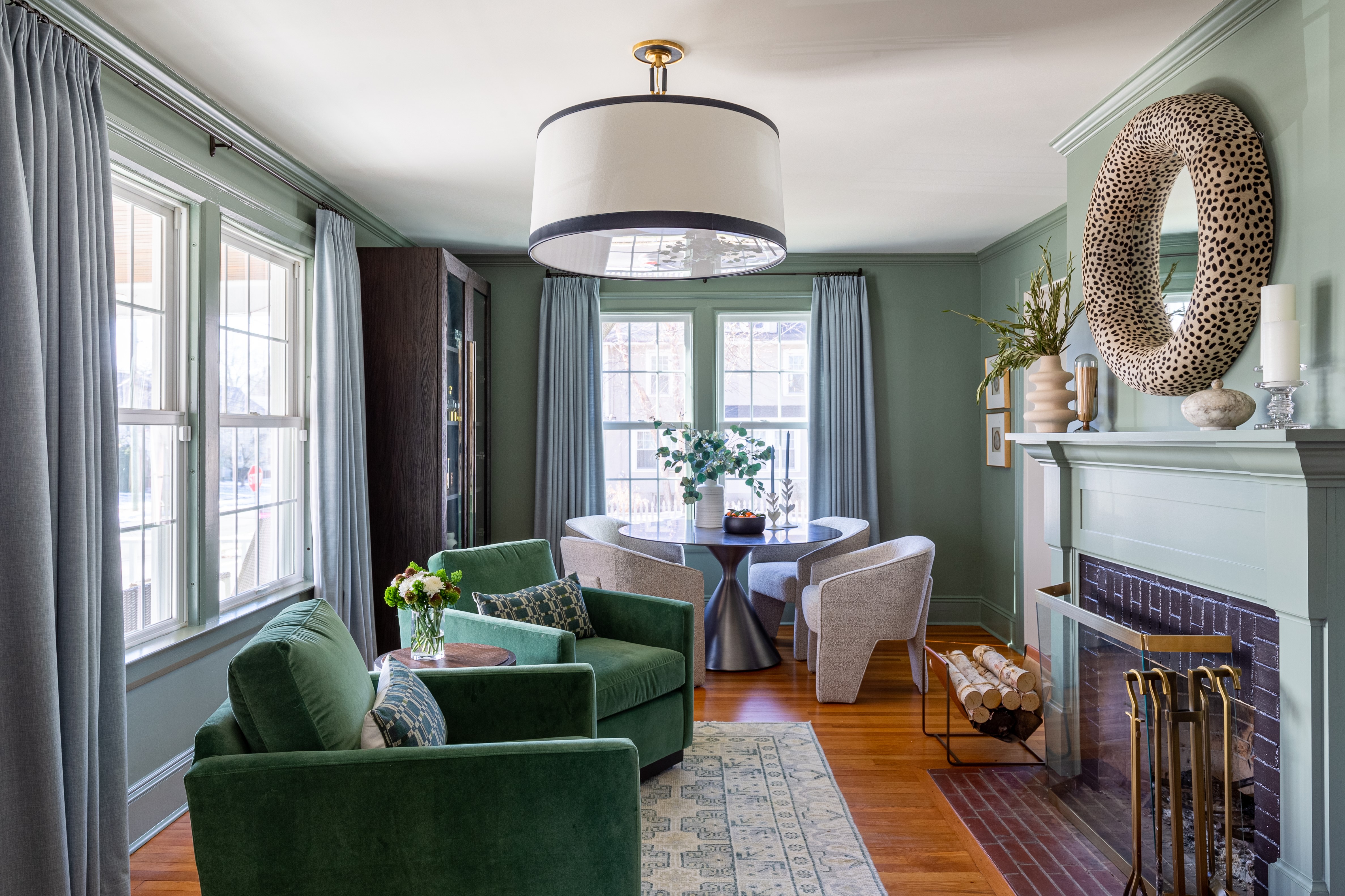
Drawing inspiration from nature can create a grounding yet interesting space, as this green living room goes to show. 'I love this color because it is green without being "too green",' says Jeanne Barber of Camden Grace Interiors, who created the space above using Farrow & Ball Card Room Green. 'The color shifts depending on the light and sometimes has more gray/blue undertones.
'The homeowners were looking for an inviting space where they could relax, read and socialize with each other without distraction,' Jeanne explains: 'They had a formal dining room that they never used and asked us to turn it into a moody and cozy family room. They didn't need a TV in the room but wanted to use it as a place to have conversation, enjoy the fire, and relax.
'We chose this green because it has soothing gray undertones. It is cozy and warm and looks great with the brick fireplaces.
'We painted the trim the same color and furniture/decor was all in a similar, monochromatic color palette, which made it a little more subdued and enveloping compared to rooms with more contrast.'
'Painting a living room a bold but soft color like Card Room Green catches your attention but isn't jarring,' she adds. 'It is inviting and makes you want to not only go into the space, but also spend time in there as well.'
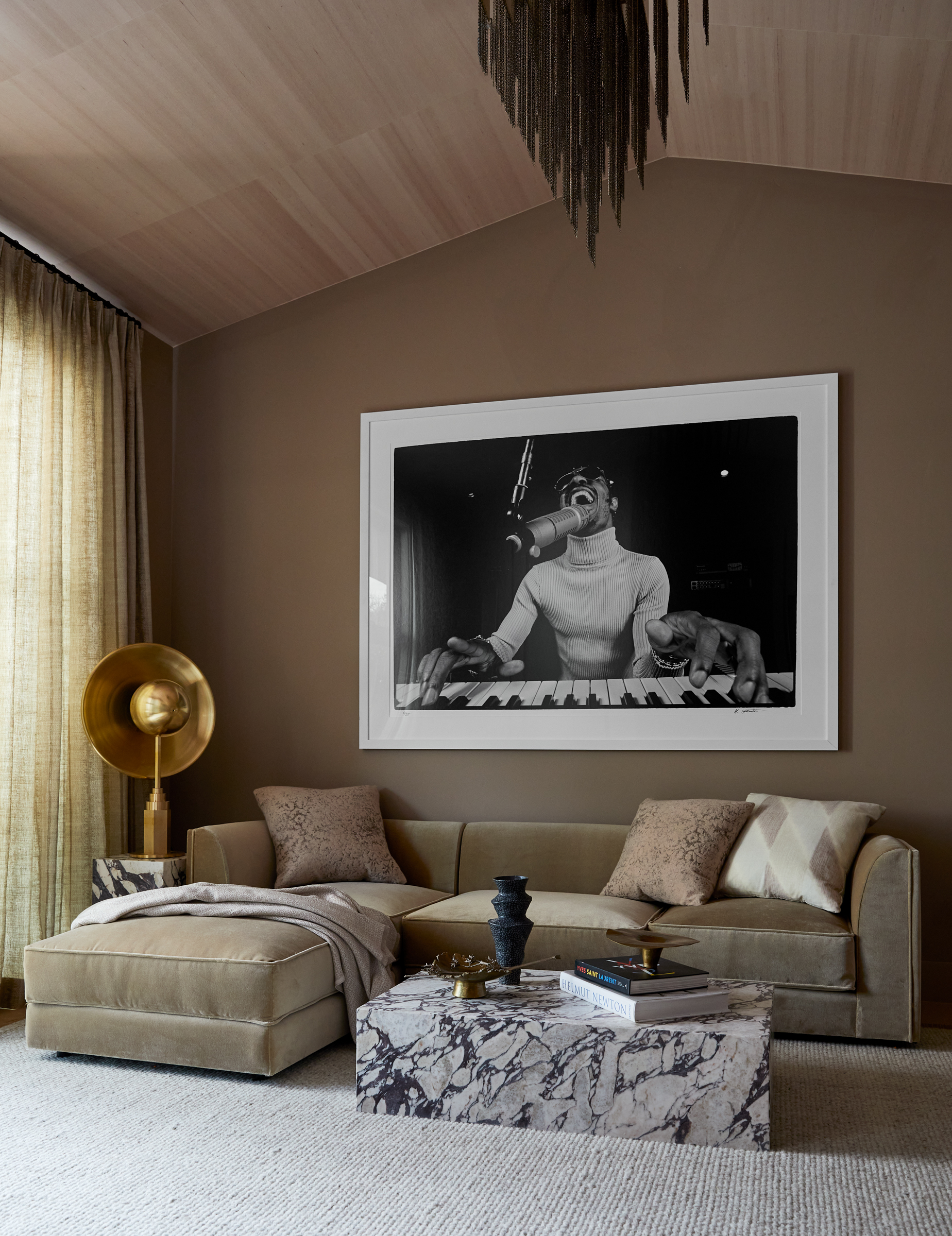
3. Choose a cosseting caramel
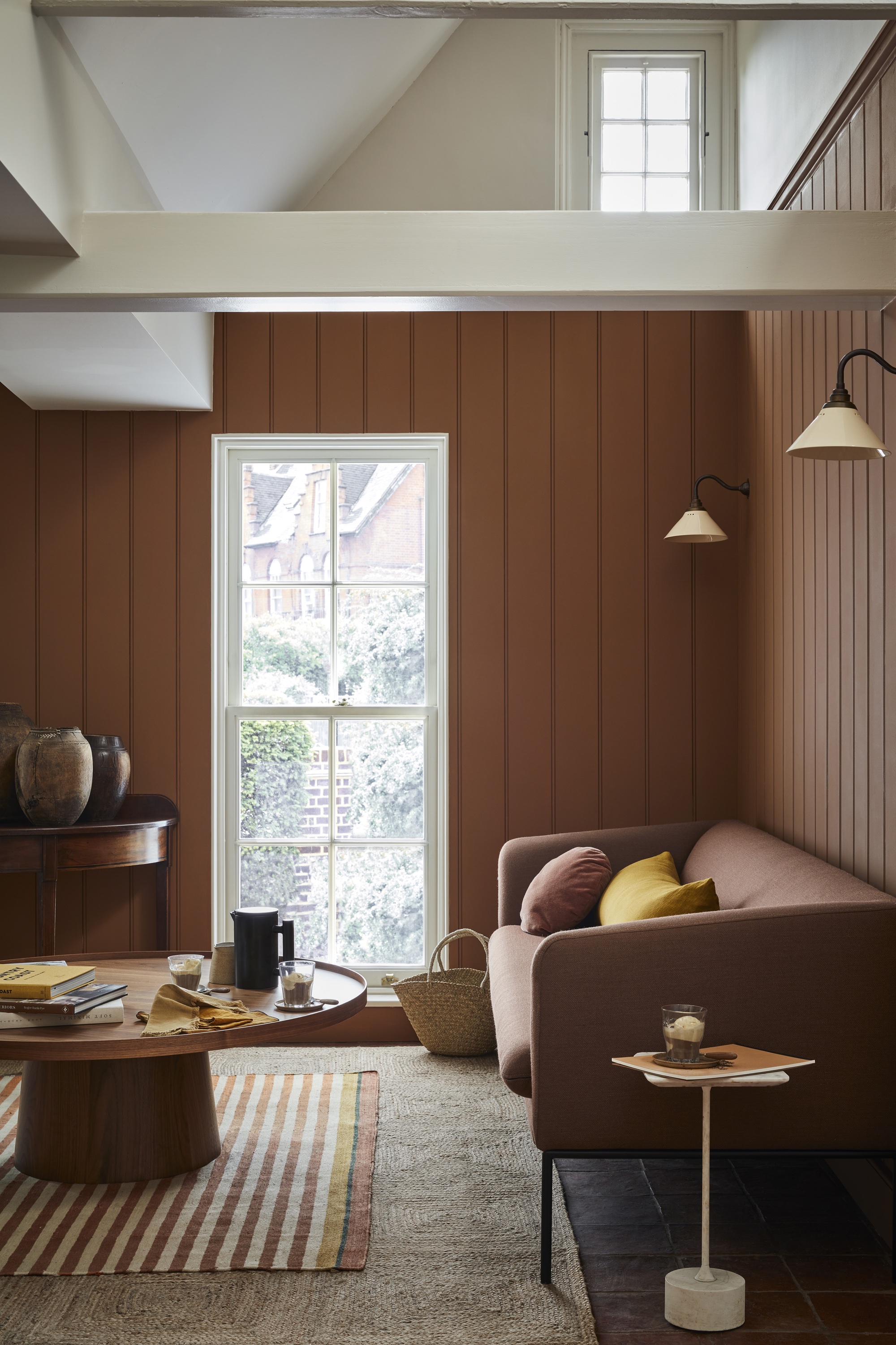
‘Create a rich, welcoming family room that will exude a sense of comfort with soothing darker and mid-tone caramels,' says Ruth Mottershead, Creative Director Little Greene. The indulgent mid- brown Affogato (seen above) perfectly combines the warmth of coffee with the gentle sweetness of vanilla hues to create a comforting color.
When it comes to colors that go with brown, 'pair with smart, dark brown (like Little Greene Chocolate Color or soft, off-black Lamp Black) to create an elegant contrast that will add a layer of sophistication,' Ruth suggests.
She adds: 'Consider extending this cosy ambiance by color drenching, painting the ceiling and woodwork in the same color as the walls. This will create really impactful environment perfect for relaxing together as a family.'
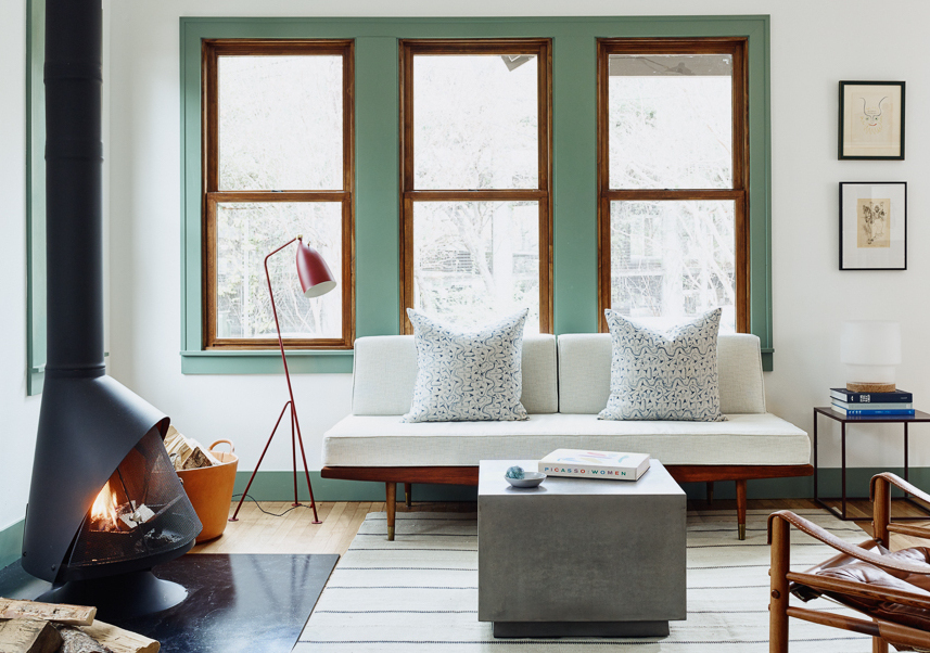
4. Set a Moody Yet Soothing Scene With Dark Green
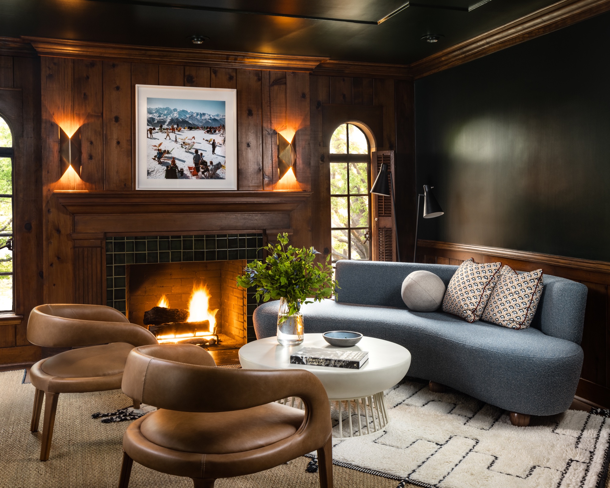
When it comes to bold living room color ideas, a dark hue will help to create a cozy cocooning space to retire to that also makes a dramatic visual impact. Dark green is a great choice for a moody shade, as it can be a little 'softer' than black or dark grey.
Eddie Maestri, Principal Architect and Creative Director of Maestri Studio, agrees. 'The goal of the room above was to be dark and moody, but we wanted to balance out the furnishings with some light and bright to compliment the other areas of the home,' he says of the dark living room above. 'We wanted a combination of formal elegance with relaxed comfort, drawing inspiration from upscale hotel lounges, but also Southern California.'
He adds: 'We found that green felt more soothing than other moody colors like navy or black, setting a perfect backdrop for entertaining and relaxing alike.'
5. Go for Grown-Up Pink
'Earthy, grown-up pinks, with a little brown/ochre note like Setting Plaster or Templeton Pink, will add warmth to any space,' says Patrick O'Donnell, a color consultant for paint brand Farrow & Ball. As well as being sophisticated, an earthy pink is another biophilic hue that allows you to connect with nature, creating a tranquil, calming space.
What's more, warm earthy hues will work in north facing living rooms and south facing living rooms alike. Patrick adds: 'These colors will glow in a south facing room and bring a much-needed cosy ambiance to awkwardly lit spaces such as north facing rooms.'
6. Turn to Terracotta
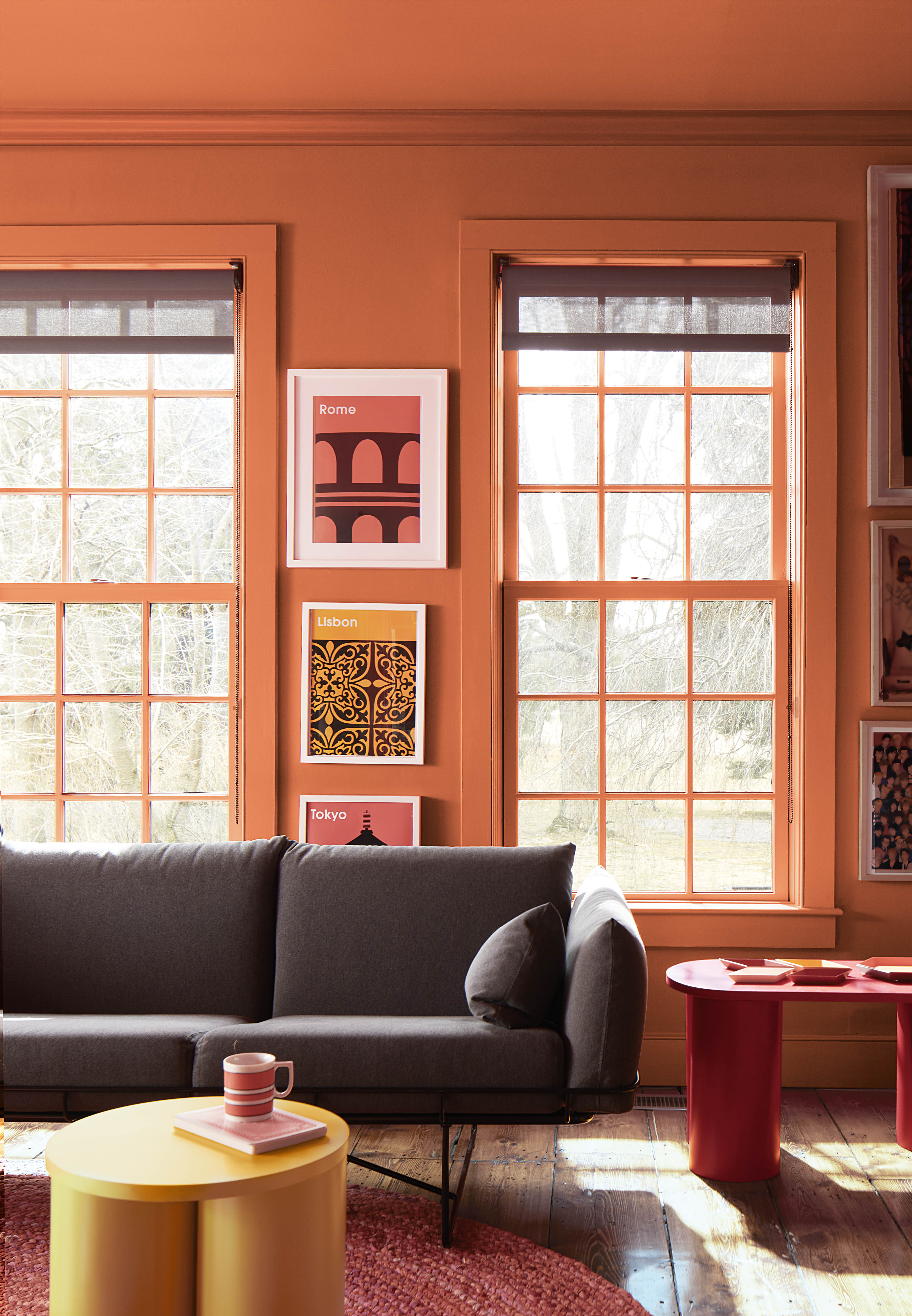
Like earthy shades but want a little more oomph? A rich terracotta is the perfect solution. 'Socializing and relaxing are key within family rooms and so it’s important to opt for a color scheme that fits with the mood or atmosphere you’re looking to create as well as establishing your signature style,' says Helen Shaw, a color expert for Benjamin Moore. 'Approachable and liveable, saturated shades of terracotta, such as Benjamin Moore Topaz, are easy to introduce into a scheme without having to overhaul your look.'
Helen adds that a rich terracotta can also play to different styles of decor, making it a versatile choice. She explains: 'Perfect for more casual and relaxed schemes when paired with rustic rattan textures and natural materials such as linen, it also works beautifully to add dimension and interest to more traditional, bolder schemes.'
7. Stay Neutral for a Calming Space
Sticking with a neutral color scheme is always a safe bet, and can be the ideal solution for a serene space that allows you to add depth through texture and layering.
'Choosing a neutral wall color like Sherwin Williams Greek Villa (seen above and below) for a family room provides a versatile and timeless backdrop,' says Marie Flanigan, Principal of Marie Flanigan Interiors.
'This neutral base allows you to incorporate your preferred color palette of more saturated tones through soft finishes and accents, such as throw pillows, rugs, and curtains.'
'The subtle wall color creates a calm and cohesive environment, while the pops of color in the accents add personality and vibrancy.'
Added bonus? 'A neutral wall color also gives you the flexibility to easily update the space by simply switching out soft finishes, ensuring that the room can evolve as your family grows and changes,' says Marie.
'This approach offers both aesthetic appeal and practical adaptability, making your family room a welcoming and dynamic space.'
8. Take On Teal for a Vibrant, Joyful Ambiance
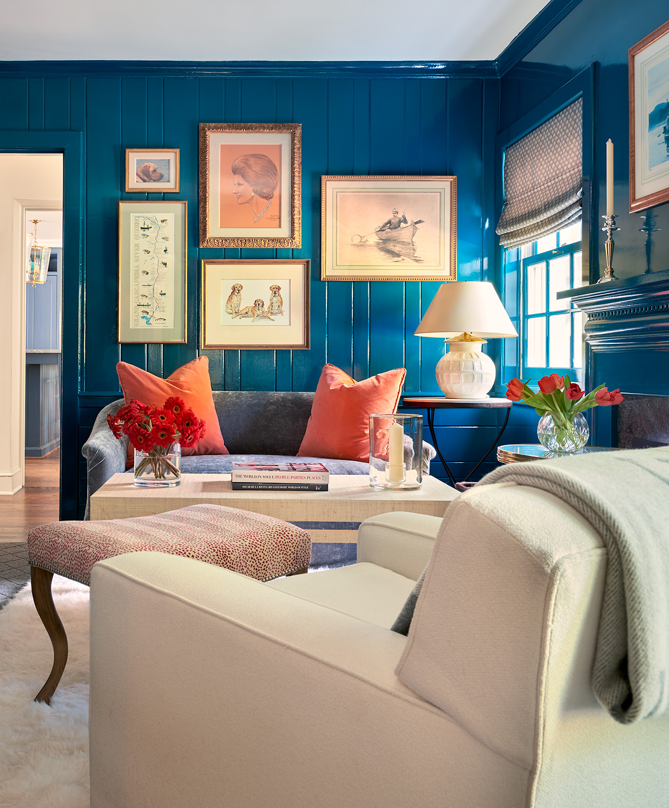
'When wanting to go for a paint color other than neutrals, it is best to go bold and confident,' says BVA BarnesVanze Architects in Washington, D.C.
'Don't be afraid to experiment with high contrasts and complimentary colors. This family room (above) boasts a high gloss turquoise wall paint that provides an energetic and fun environment.
'The bold color along with the pops of red and oranges are a great scheme for those who want a more lively approach to their family rooms.'
9. Relax with a Sky Blue Hue

Green isn't the only color that works well to add a biopihlic feel to your family room. A soft, sky blue is also a beautiful, calm-inducing hue.
One top shade? Skylight by Farrow & Ball. 'Skylight is such a versatile color,' says Gideon Mendelson, Founder and Creative Director of Mendelson Group. 'It’s a soft blue that feels fresh and clean. It's very calming and a nice setting for a monochromatic scheme. It also connects to the outdoors, helping to bring the outside inside.'
And Olivia Mase, VP of Design and Construction at Curbio, agrees blue is a lovely go-to for a family room, commenting: 'Shades of blue, from tranquil sky to deep navy, evoke a sense of calm and relaxation. Pair with crisp white trim for a timeless coastal look.'
10. Embrace Color Drenching for the Ultimate Cozy Vibe
The color drenching paint technique, in which walls, ceilings and trims are all painted the same color, is a tried-and-true way of creating a seriously cozy living room.
Color drenching is an effective way to create a cozy space that also simultaneously works to enhance the feeling of space by blurring boundary lines.
'Try one color all over,' suggests Farrow & Ball's Patrick O'Donnell. 'If you have low ceilings or small spaces, consider one color on every surface. Off-whites or mid neutrals should be your go-to here but do refer back to the consideration of aspects (e.g. think red based neutrals like Dimity for a north facing room whereas, in east facing, play to the early morning light and consider something like Pale Powder, the gentlest pale aqua).'
11. Dare to do a dark trim
Embrace bold colors like deep royal navy, rich emerald green, or dark charcoal for the trims (doors and windows, baseboard, stairs) to add drama and sophistication to a spacious family room.
'Dark trims will also help frame the walls and break up the room for a more intimate sitting area,' says Olivia Mase. 'These bold colors can infuse your family room with joy and energy, liven up the space, and make a playful statement. Dark trim colors can also create a cozy atmosphere and make a significant impact without overwhelming the room.'
What Two Colors Go Well Together in a Family Room?
'Mid greens are always a safe bet as they are calming and relaxing (just what you want to snuggle down on the sofa on a blustery day),' says Farrow & Ball's Patrick O'Donnell.
'Something more nuanced like French Gray, not too bright, creates a wonderful, restful environment. Team with a relaxed off white, rather than a pure white, for a gentle transition between walls and trim. Stirabout in Estate Eggshell would be a perfect pairing.'
Different depths of color from the same tonal family also always work well to create a curated space that has depth and dimension.
Or, try creating a complete contrast for added impact, suggests Curbio's Olivia Mase. She comments: 'Add visual interest and personality by mixing and matching contrasting hues.
'Pair warm tones like terracotta or mustard with cool shades like teal or indigo for a dynamic and balanced look. These hues evoke feelings of warmth and comfort and create a cozy and inviting atmosphere.
'Furthermore, these colors connect you with the outdoors, creating a biophilic feel that promotes wellbeing.'
What Color Should You Paint a Family Room?
First and foremost, you should paint your family room a color that brings you joy and that you favor the most.
There are no hard and fast rules, although there are some hues that will work particularly well in a family room. Olivia shares some of her top living room paint ideas below.
Cozy neutrals: 'Soft beige, warm taupe, or creamy ivory create a serene backdrop that complements any décor style. Add texture with plush throws and cushions for an extra cozy feel.'
Earthy greens: 'Bring the outdoors in with earthy greens like sage, olive, or moss. These hues promote harmony and connection with nature, perfect for a family room retreat.
Warm terracotta: 'Infuse warmth and personality with terracotta, rust, or clay tones. These rich, earthy hues add depth and character to your space.
Sunny yellows: 'Brighten up your family room with sunny yellow accents, or opt for a soft, buttery shade for the walls. Yellow fosters a cheerful atmosphere and uplifts the mood.'
Bold accents: 'Make a statement with a bold accent wall in vibrant red, teal, pink or mustard yellow. Balance with neutral furnishings for a calming effect or contrast for a dramatic impact.'
Monochromatic scheme: 'Choose varying shades of the same color for a cohesive and sophisticated monochromatic scheme. Experiment with tone-on-tone layers for added depth.'
Warm whites: 'Crisp white walls create a fresh, airy feel and are a blank canvas for colorful accents or eclectic décor pieces. Consider warm white tones with subtle undertones for added warmth.
Earth-inspired palettes: 'Draw inspiration from nature with earthy palettes like desert sands, ocean blues, or forest greens. These natural hues create a calming and grounding atmosphere.'