Pastels are big on our interiors radar right now, and these pastel living rooms will show you exactly how designers are using these underestimated colors in decorating schemes.
No longer considered too childish, these tones have made their way into modern interiors - from pale mint and soft pink to aqua and lemon, all can create sophisticated, contemporary, and ‘grown-up’ spaces.
Here's how to utilize the softness and coolness of these pastels as part of your living room color scheme
10 pastel living room ideas to obsess over
So why are pastels such an effective color palette to decorate with? 'The softness of pastel colors makes them very versatile and livable,' says Amy Krane, architectural color consultant and founder of Amy Krane Color. 'Pastels are colors muted by white and as such lack color saturation and vibrancy. This makes them able to combine with darker colors very well. Both mid-toned and darker colors work well with pastels and make for lovely combinations. Mixing colors of various lightness/darkness and saturation makes for a harmonious and well-balanced interior environment.'
1. Create a color block with pastels
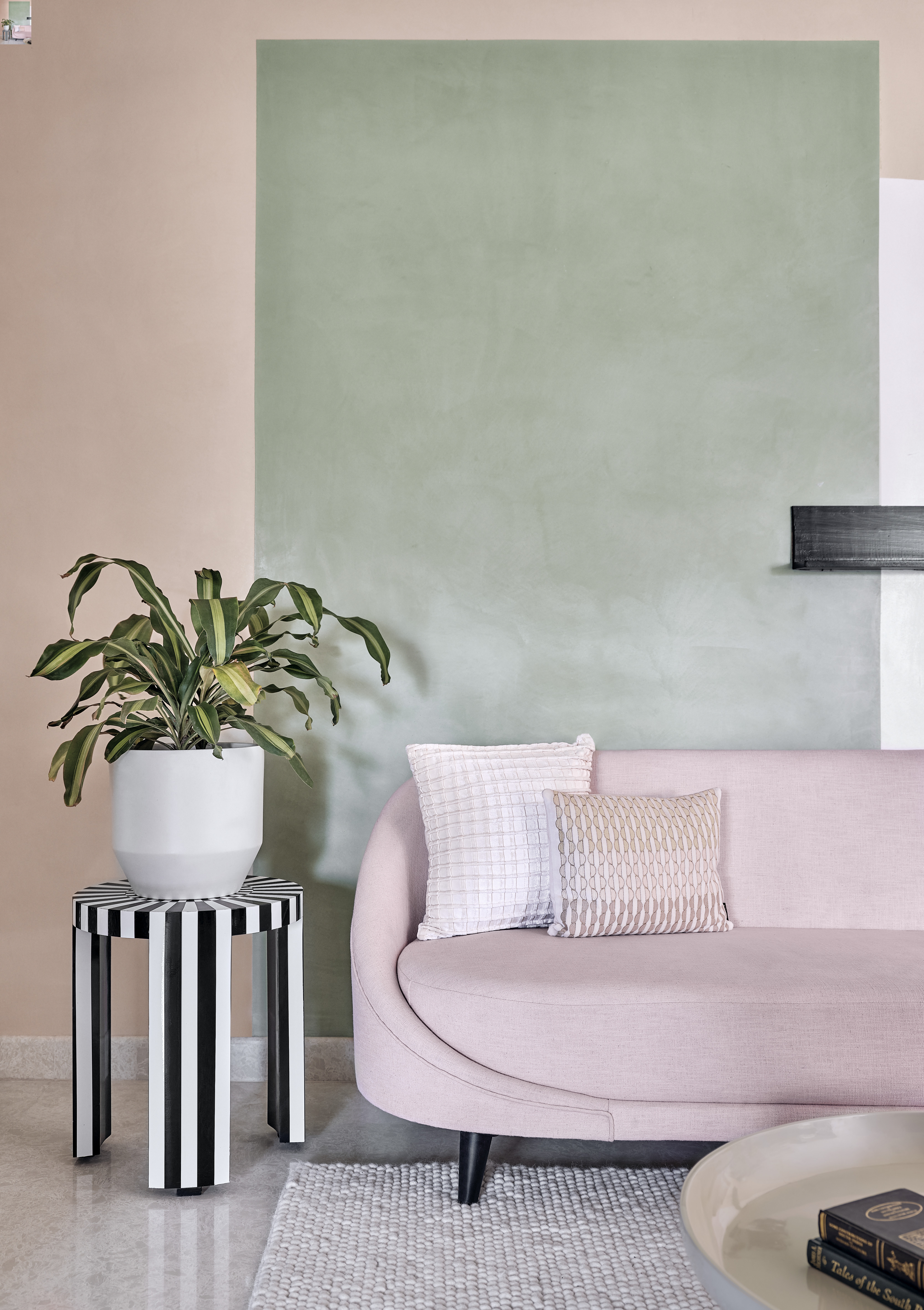
For a living room look that doesn't overload on this soft color palette, use pastels for color-blocking walls to create an accent wall in the living room. Here, a block of soft pastel green has been painted over mid-tone pink, to create the effect of a wallpaper or an art piece, framing the sofa, and giving the room a clear central focal point.
Light pink and green aside, there are many other wonderful color combinations you could try out. 'Some of the most on-trend pastels at the moment are lavender with sage green, pale yellow with charcoal grey, a rich caramel with pale dusty pink, or pastel blue paired with an avocado green for some fun and current color combinations,' says Amy Krane.
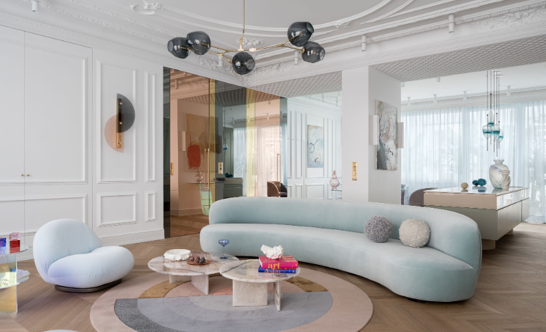
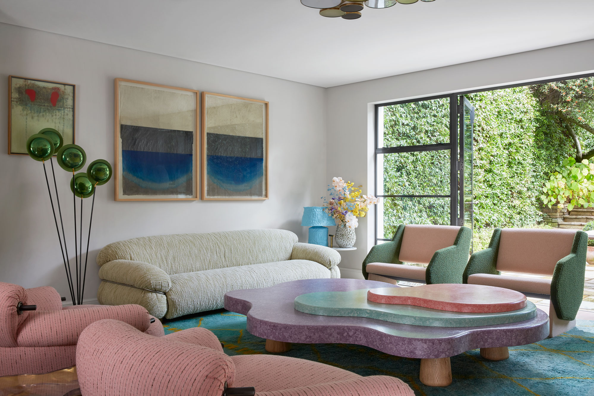
2. Introduce it on a statement sofa
Pastel tones are not only unabashedly cheerful but also have a warm, cocooning quality to them, especially when used on soft, curving living room furniture pieces. A sofa is the perfect way to introduce pastels - it's a prominent part of the room, but isn't as overwhelming as painting the walls, for example.
This interior designer chose a pastel blue for a sofa for its soft, recessive qualities. pieces. 'The client wanted a statement sofa and our overarching inspiration for the home was very 70's inspired so the Marenco was a great fit,' says Leah Ring, principal at Another Human. 'The client has a colorful art collection so we opted for a pastel color palette for furnishings so as not to overwhelm the eye. I loved the light blue fabric as I think it just adds to the cloud-like quality of the Marenco.'
3. Use muted pastels for a more grown-up look
'This mid-century modern apartment in Warsaw is characterized by a clean, minimalist aesthetic with simple lines and functional design elements,' says Monika Goszcz-Kłos, founder of Goszczdesign, who designed this elegant living room.
'I chose pastel shades of the sky, rounded forms, and unusual furniture. The color scheme in this apartment is characterized by pastel soft, muted colors that create a calming and soothing atmosphere with strong color accents by Glas Italia tables designed by Patricia Urquiola,' she says. 'Made of laminated and glued glass, they sparkle with different colors depending on the angle of incidence of light and the place of observation.'
4. Pair with simple warm neutrals
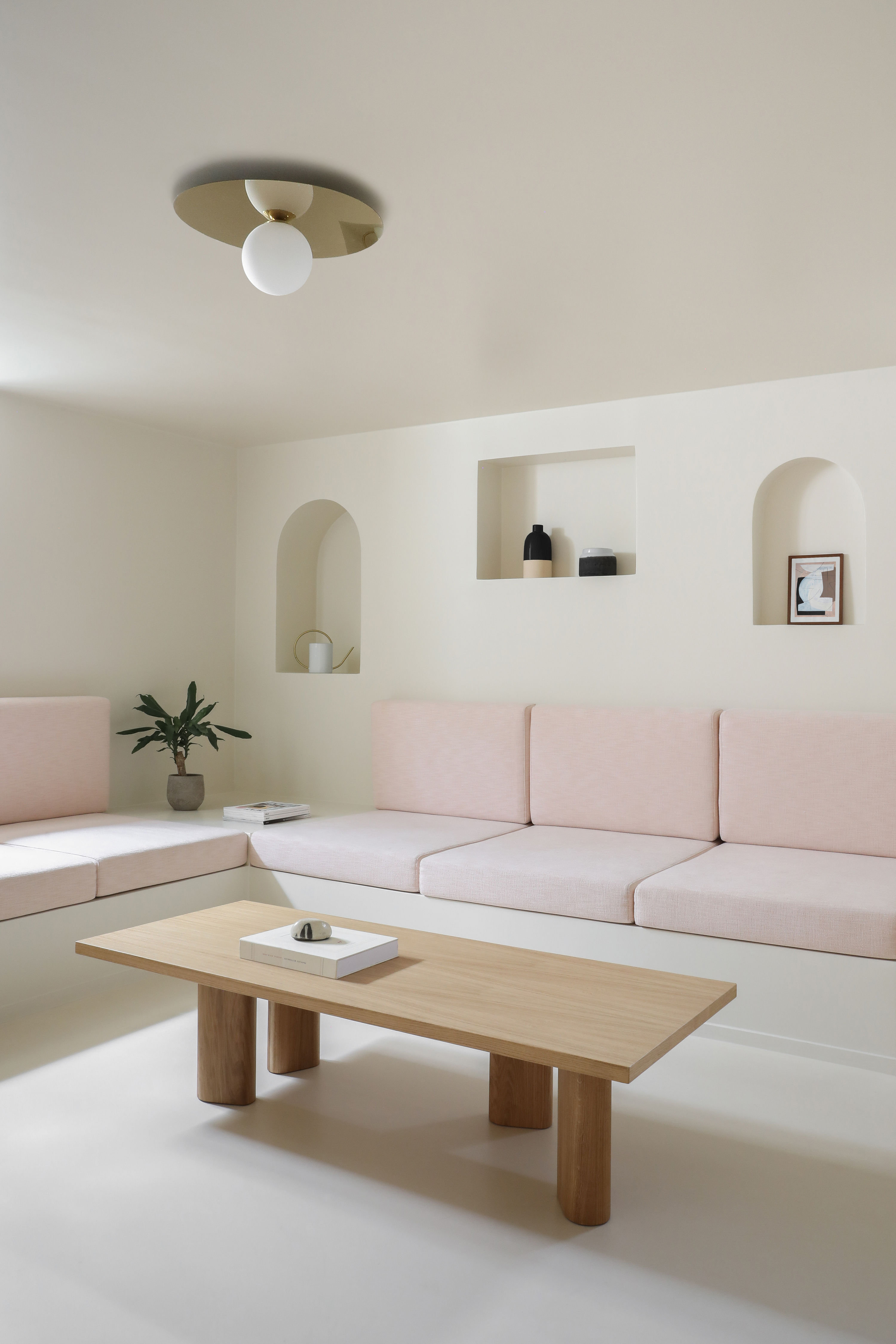
If you want to decorate with pastels, but worry about veering into child-like territory, keep things grounded with warm neutrals – preferably shades of beige or off-white. These can become a lovely and versatile foil for just about any other pastel color, which becomes a soft introduction that brings a little more depth and dimension that sticking to a purely neutral color scheme.
'This space is located in the basement of a home, where we designed a secondary living room with a TV,' says Hélène Pinaud, co-founder of Heju. 'We chose a nice, light beige for the walls and flooring to create a cocooning feeling here. To add a touch of modernity, we designed a large custom-made bench in pink fabric. The pastel creates an inviting and relaxing feeling.'
5. Use a contrast to avoid the scheme feeling too saccharine
If you're wondering how to design a modern living room with pastels, accenting them with deeper, more vibrant or rich colors is an effective way to modernize these shades. This way, you can be sure your pastels don't read like a nursery or playroom.
Choosing their deeper tones, or choosing a bold contrast will help take a pastel to a more grown-up space, as in this design where a chartreuse paint has been used on a room divider in a pastel living room.
'We knew that this room needed a light, bright scheme,' says Ellen Cumber, director of Golden Design. 'The beautiful soft pink wool sofa fabric was our starting point, and we layered up pastel colors around it. To prevent the overall scheme from becoming too saccharine, we added the deliciously acid bright color to the doors.'
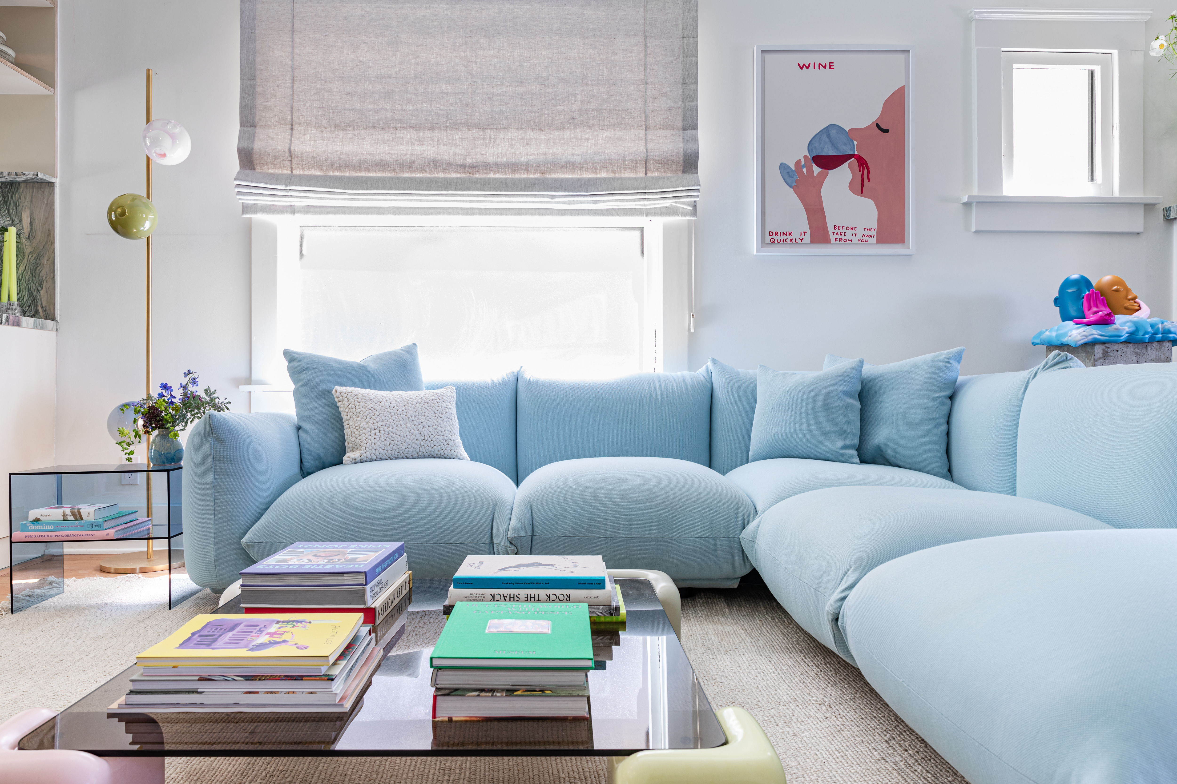
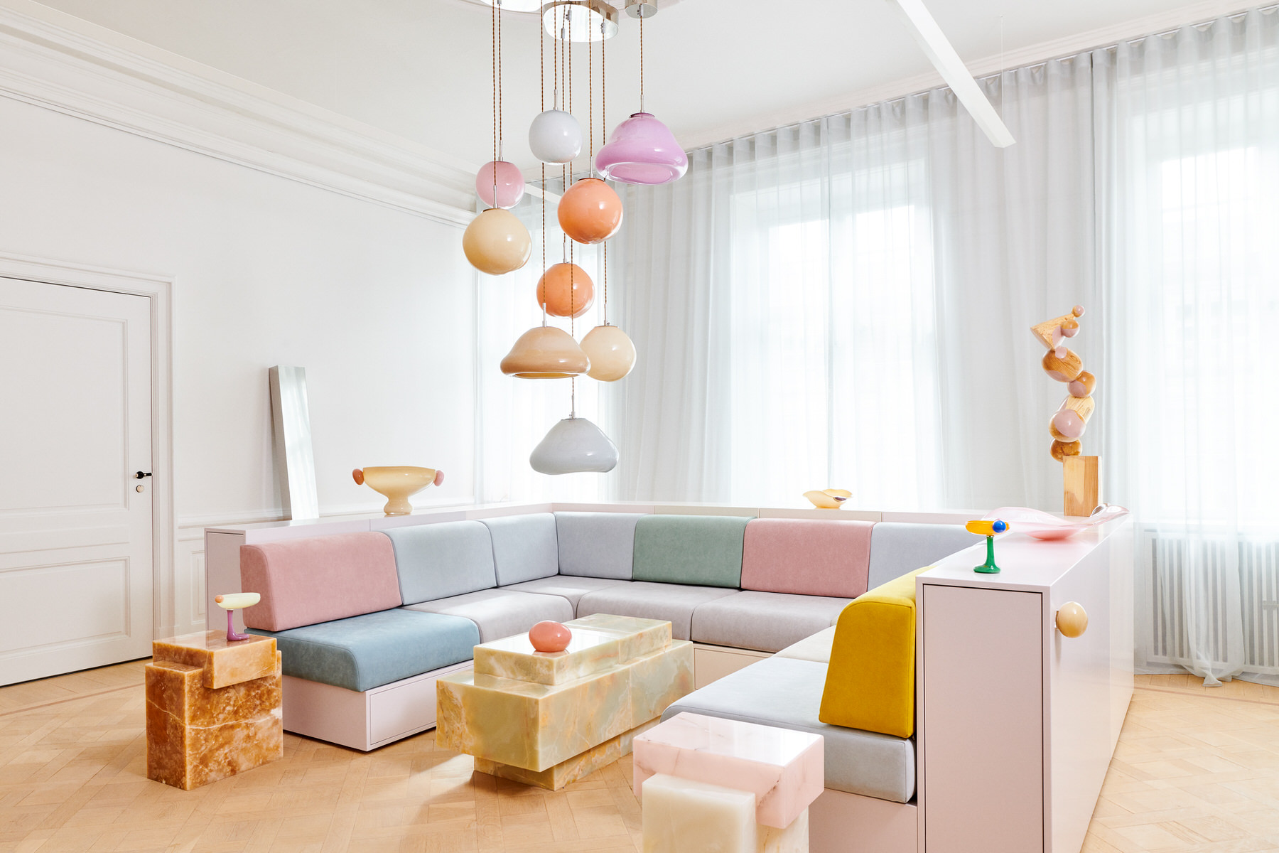
6. Add a sprinkle of color through decor
If painting walls feels too out there for you, consider adding pastels for sofa pillows or even artwork, like in this modern living room designed by Lundstrom Interiors. Adding pops of pastel hues with accessories is a great way to test out the power of pastels on a non-permanent basis.
If you want to give the room a more calming, cozy living room vibe, eliminate visual competition by concentrating on only two shades of pastels, such as blue and pink, and anchor it with a grey. The softness of the pastels when grounded by a base tone will lead to a soothing atmosphere.
7. Create a mural with pastel tones
Want to transform your living room with a big dramatic statement? Consider wall murals. Painted directly on walls, these energetic, modern designs can create a wonderfully layered interior, and create a feeling of being inside an art gallery.
Mix and match pastel tones, although remember, the sweet spot is always three. Anything more, and you run the risk of designing a room that looks too busy and chaotic. Since you're open to using pastels in a big, dramatic way, you could consider using more mid-tone pastels to add a warm vibe.
'My inspiration for this project stemmed from a trip to Milan, and I started choosing my palette based on earthy and pastel tones, ranging from roses, blues, and greens,' says Camila Fleck, founder of Arquitetura Camila Fleck. 'Between the project deadline and handover, we had just 45 days or so to complete this apartment. So we adopted many clever solutions to do up this 40 meter square apartment. I worked with a super simple and inexpensive Memphis-inspired paint technique and created arcs and curves on walls, that look super on-trend. In the living room, we used caramel tones for the mural and furniture for a distinctive look.'
8. Color drench in pastels

One great way of color-drenching walls with a single pastel tone without making the room feel too one-dimensional is by choosing various tones of the same color and playing them out across surfaces and elements. Different colors will help to buoy and balance one another. For a seamless look, paint the trim to match the walls too, and even consider painted inside storage niches, joinery, and on lighting pieces.
'This family room and entertainment area was designed as a bright and light space,' says Kumpal Vaid, founder of Purple Backyard. 'We chose a pink pastel theme for the room and developed a fun yet understated theme. The cement patterned tiles bring in elegance and the pink tone almost works as a neutral; much more modern than using the usual whites, browns, and blacks.'
9. Use a pastel across a ceiling
There's nothing more statement-making than a painted ceiling, that gives a room an umbrella effect, as though the colors are converging inwards, cocooning the room in softness and a warm hug.
Pastels are the perfect tones to create a feeling just like the one mentioned above. Light in color, these tones, unlike dark ones, will open up the room, and make it feel airy and ventilated. Painted ceilings also make a room appear taller, as it encourages a person to take in the entire dimensions of the space, creating the illusion of more height.
10. Create a balanced scheme
'One thing to keep in mind before using pastels is that colors have cultural associations so you need to be cognizant of what those are before you make up your mind to use them,' says Amy. 'While adding a single pastel color to a multi-color overall palette for a room is one thing, making a whole room pastel colors will often bring up connotations of a children’s nursery. You need to decide if that would bother you or not.'
When using pastels, you might need to make conscious choices to avoid some decor elements. Graphic wall prints, for example, may reinforce a childish scheme, for example, but in this designer by Korner interiors, sophisticated living room wall decor shifts the tone of the space entirely.
What colors go well with pastels?
If you're looking for living room accent wall ideas with pastels, or thinking of color-drenching the room with these soft tones, you're probably wondering what colors go with pastels. The good news is, this fashion-forward palette works wonderfully well with all soft and cool tones.
Largely, for a more coordinated scheme, choose pastels-on-pastels. So a pastel blue with pink, or a pastel green with yellow will do well. A pastel blue or green will also work well with a crisp white or even with coral.