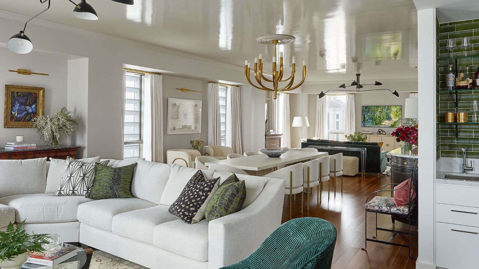
Never mix business with pleasure? We think that's a bit of a cop-out and anyway, aren't some rules just asking to be broken? The owners of this New Orleans apartment certainly thought so and wanted the space to function as a comfortable and welcoming pied-a-terre, but also as a workspace.
The private residence overlooks the Mississippi River and is close to the city's lively French Quarter. It's part of the iconic 34-storey building that now houses the Four Seasons Hotel, once the World Trade Center and recognized on the National Register of Historic Places. That alone puts the apartment among the world's best homes, and since the landmark tower was recently restored and enhanced to become a five-star hotel it's become a very desirable address indeed.
The owners bought the home in the early stages of the property's redevelopment, with plans to stay here when they're in town. They also needed to work from here so specified enough seating that they could host executive team meetings from the space. It needed all the practicality of a lock-up-and-leave, but the interior design had to bring the warmth and style of a desirable home from home.
Balancing the apartment's different functions was the challenge for designer Hattie Collins of Hattie Sparks Interiors and her response was to create a stylish and welcoming home, that draws on a modern southern vibe, but with traditional touches and a new sense of comfort. 'The goal was for the space to feel contemporary and warm, with a sprinkling of antiques,' explains the designer, 'all the while ensuring that the interiors felt cohesive with the distinctive style of the building itself.'
So what does this apartment teach us about balancing work and living space in an open plan?
1. Make an entrance with wow factor
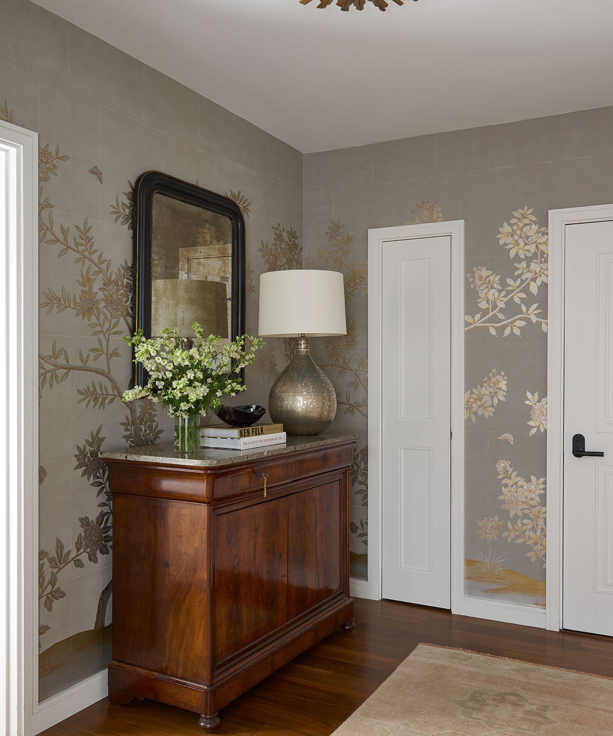
'The challenge was how to make a model unit in the New Orleans Four Seasons Hotel special and unique to the homeowners,' adds designer Hattie. 'The client purchased the unit as it was being built, and while the standard condo was top of the line and had beautiful bones, the modern high rise lacked a personal touch.'
The homeowners had requested a few 'wow' moments in the design, and the designer's entryway ideas certainly provide the wow factor and the previously missing personal touch. By adding in the opulent gilded wallcovering (from Gracie Studios), a vintage runner, and a mirror and 19th-century commode from Dop Antiques, topped with a lamp from Visual Comfort, the designer elevated the foyer way beyond the idea of a lock-up-and-leave. This is now a welcoming space with character.
2. Be bold and creative with space design
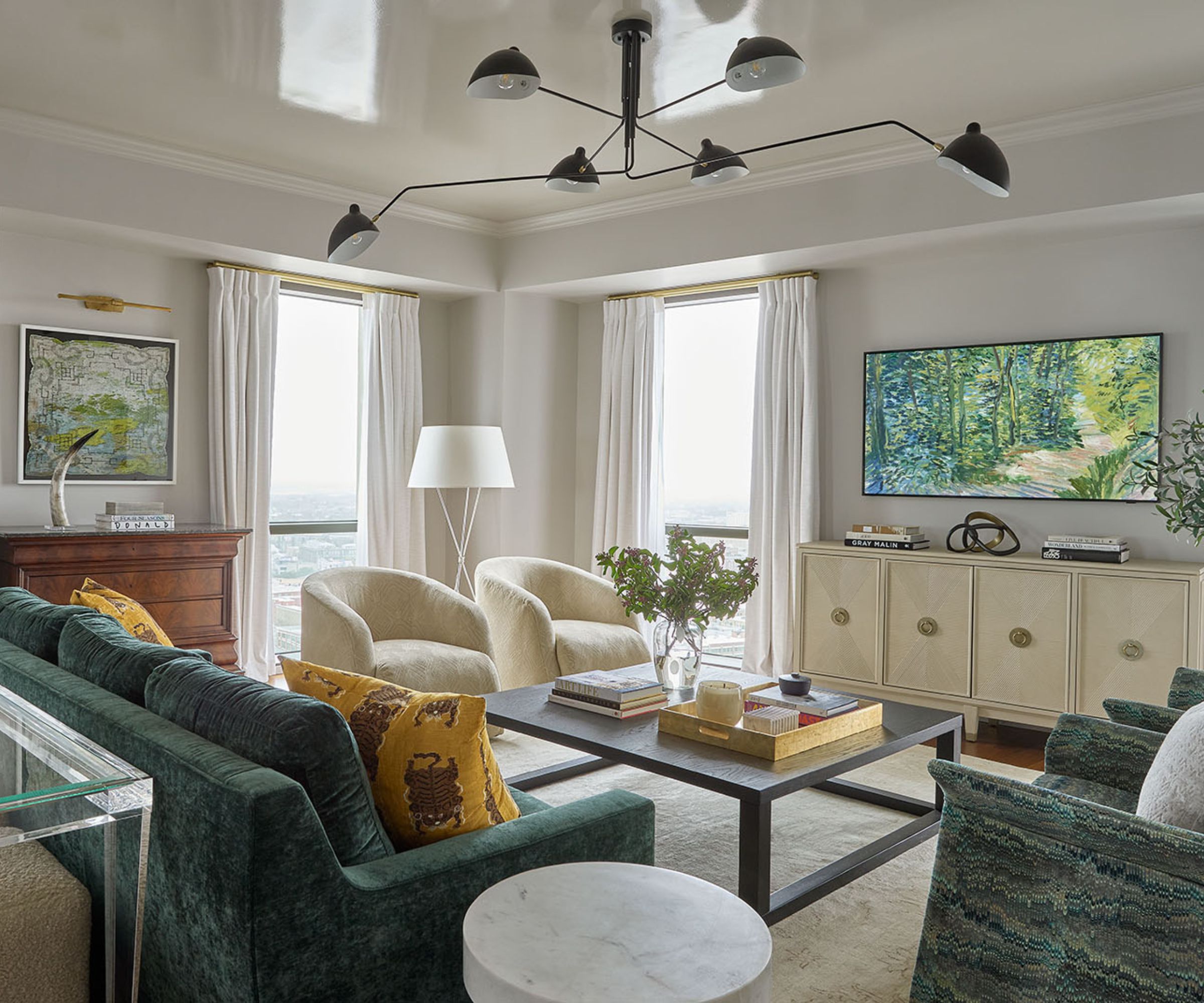
Designer Hattie Collins' living room ideas were bold and creative and putting them into practice meant reconfiguring the apartment to achieve the best balance between private and public spaces for this dual-purpose home. Making the best use of available space is essential, even in a part-time home, but it does take a little bravery, as Hattie explains.
'The unit had amazing views – downtown on one end and the river on the other, but these were originally separated by one of the bedrooms. Given that it’s the client’s pied-a-terre and not their primary residence, we proposed getting rid of the unnecessary third bedroom and creating one impressive great room where both views were visible. The client chose the view and we promptly knocked down the walls,' says the designer.
In this seating space within the great room, a teal sofa is paired with two cream armchairs, both colors which pick out those in the room's artworks. The great room's upholstered furniture was sourced from James Craig, Atchison Home, and Found Houston, all recovered in a variety of fabrics. The room's artworks include a Hunt Slonem painting and Marjorie Pierson mixed media sourced from Martine Chaisson Gallery. The antique rug is from NOLA Rugs. Case goods are a mixture of vintage and modern, from Jade New Orleans and LAM Bespoke.
3. Use style and color to unify areas of the home
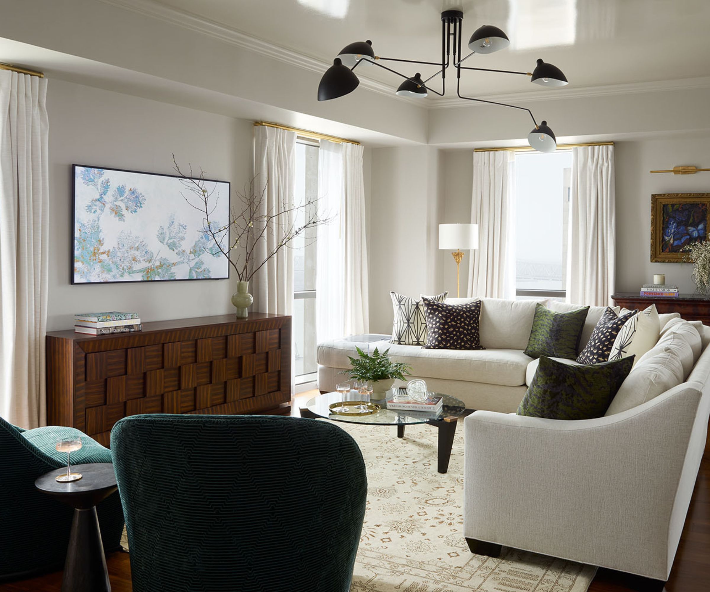
'We created harmony in the new, expansive great room, which now included two living areas and a dining room, through both thoughtful contrasts and through-lines in the light fixtures, art, color palette and textural fabrics,' says the designer. 'We juxtaposed clean millwork with beautiful antique case goods and traditional and transitional pieces in warm bronze and gold tones.'
Part of the success of this open-plan room, and the way it fits with the rest of the apartment, can be put down to Hattie Collins' approach to the color palette. With a white sectional sofa and teal armchairs, the colors in this seating space are almost a mirror image of the great room's other living area, and it's an excellent example of why designers use whole house color schemes. The lighting also ties the two seating spaces together, with Mouille fixtures above both areas. The other light fittings are from Visual Comfort.
4. Don't forget the fun elements
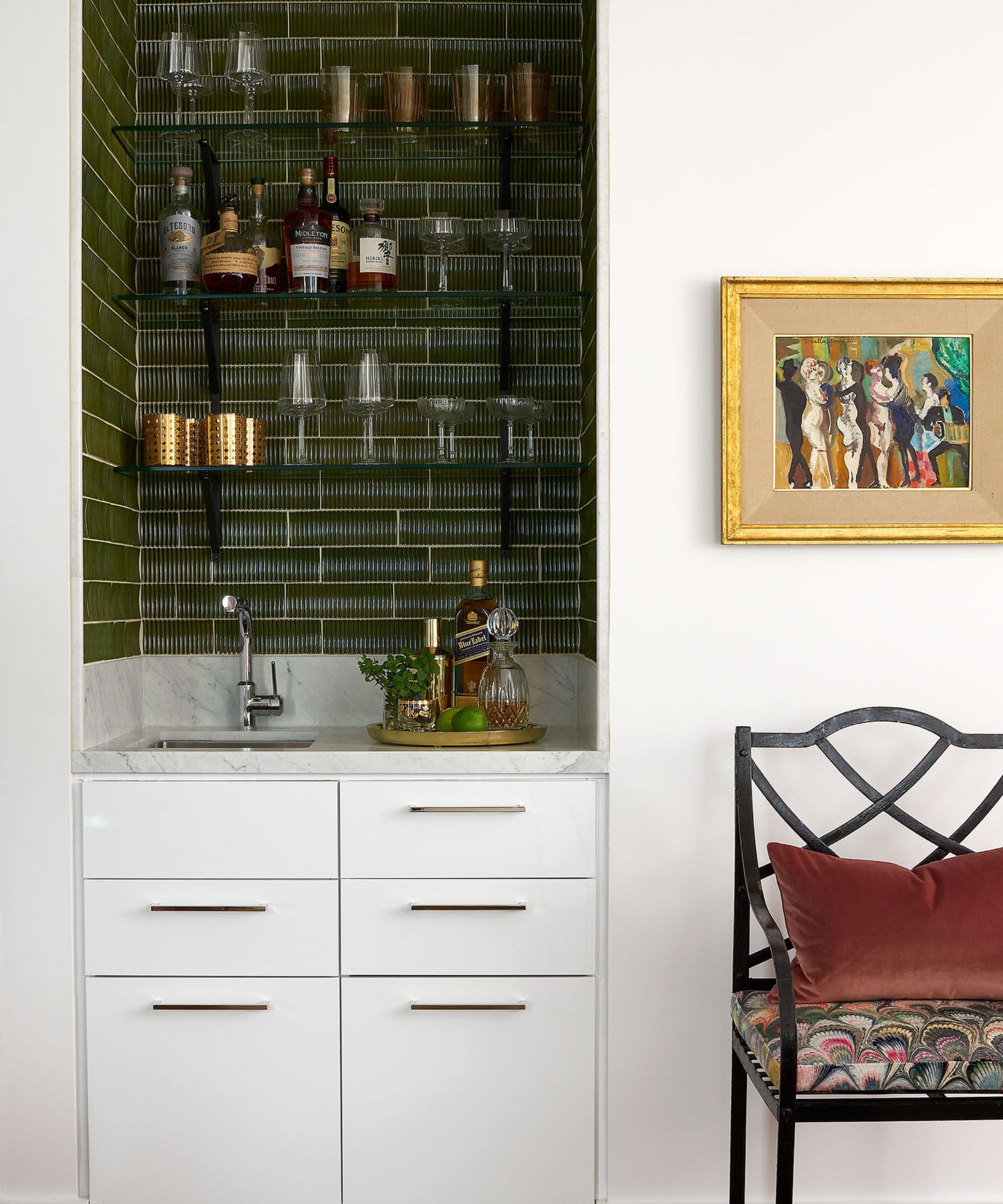
The fact that the designer found space for a home bar, albeit in this compact alcove set-up, adds another layer of luxury to the pied-a-terre and helps bring a sense of style and fun both to its entertaining function, and for when the owners are alone or just among family.
We love the neat arrangement of open shelves, dark tiles, and under-counter drawers and the bar's unobtrusive monochrome scheme.
5. Choose showstopping paint effects for a luxe look

With a multi-function, open-plan room like this there's always some debate over how to choose paint colors, but by selecting Farrow & Ball's classic Cornforth White for the walls, designer Hattie Collins could be sure the furnishings would be the stars of the show. In a paint effects masterstroke, the ceiling has a luxurious glistening finish, with Fine Paints of Europe lacquer, which reflects light back into the room and ensures the dining/boardroom table gets its share of jazz age glamor.
6. Check everyone's sitting comfortably
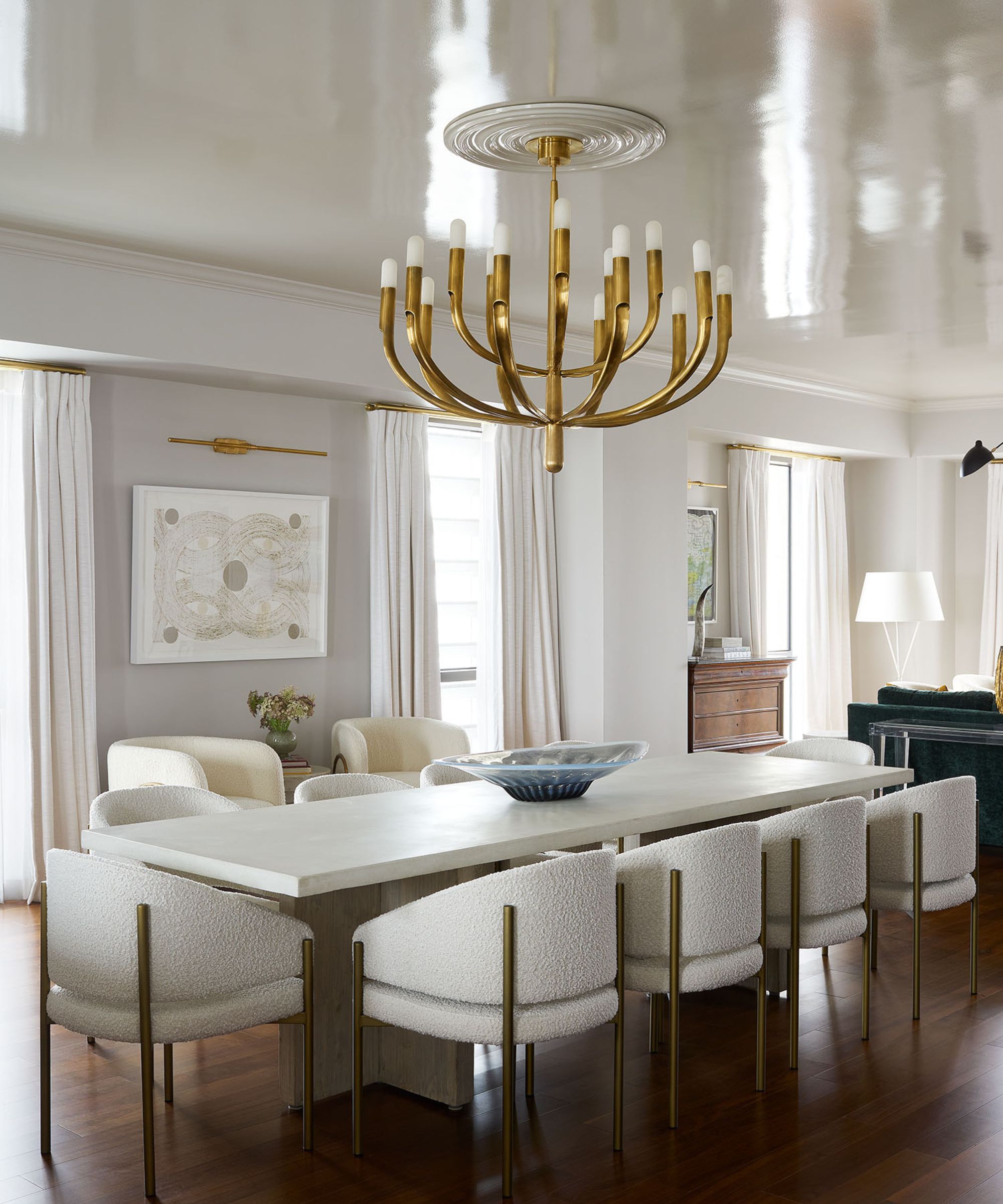
Hattie Collins' dining room ideas for this section of the great room had to double up as home office ideas, since the homeowner sometimes needs to seat 12 colleagues around the Villa Vici dining table for meetings.
The backdrop is more domestic and traditional, with an antique sideboard from Fireside Antiques. The burned paper piece from Katrine Hildebrant was sourced from the Martine Chaisson Gallery. The chandelier is from Visual Comfort and marks the difference for this more formal section of the great room.
7. Opt for a minimalist kitchen in multi-function spaces
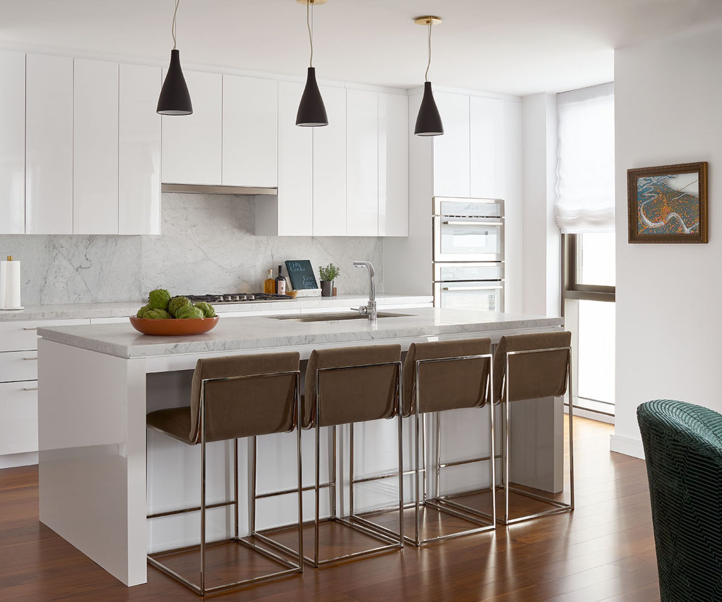
In an open-plan, multitasking living-kitchen-diner it works well to keep your kitchen ideas pared back and clean-lined, particularly in an apartment like this where there are some highly decorative and wow elements within sightlines. For this kitchen, specified and fitted as part of the developer's initial refurbishment of the building, designer Hattie Collins believes it also made good financial sense to keep it as it was.
'If I could have changed anything about the completed project,' she says, 'it would be some of the builder selections that were already in place when the client purchased the unit and didn’t make sense to remove. However, they did seem to fade into the background once we applied our design plan to the space.'
The designer's pragmatic approach saved time and money, and the simple white kitchen still has style but doesn't intrude on the business workspace element of the apartment.
8. Indulge bedrooms with luxury and personality
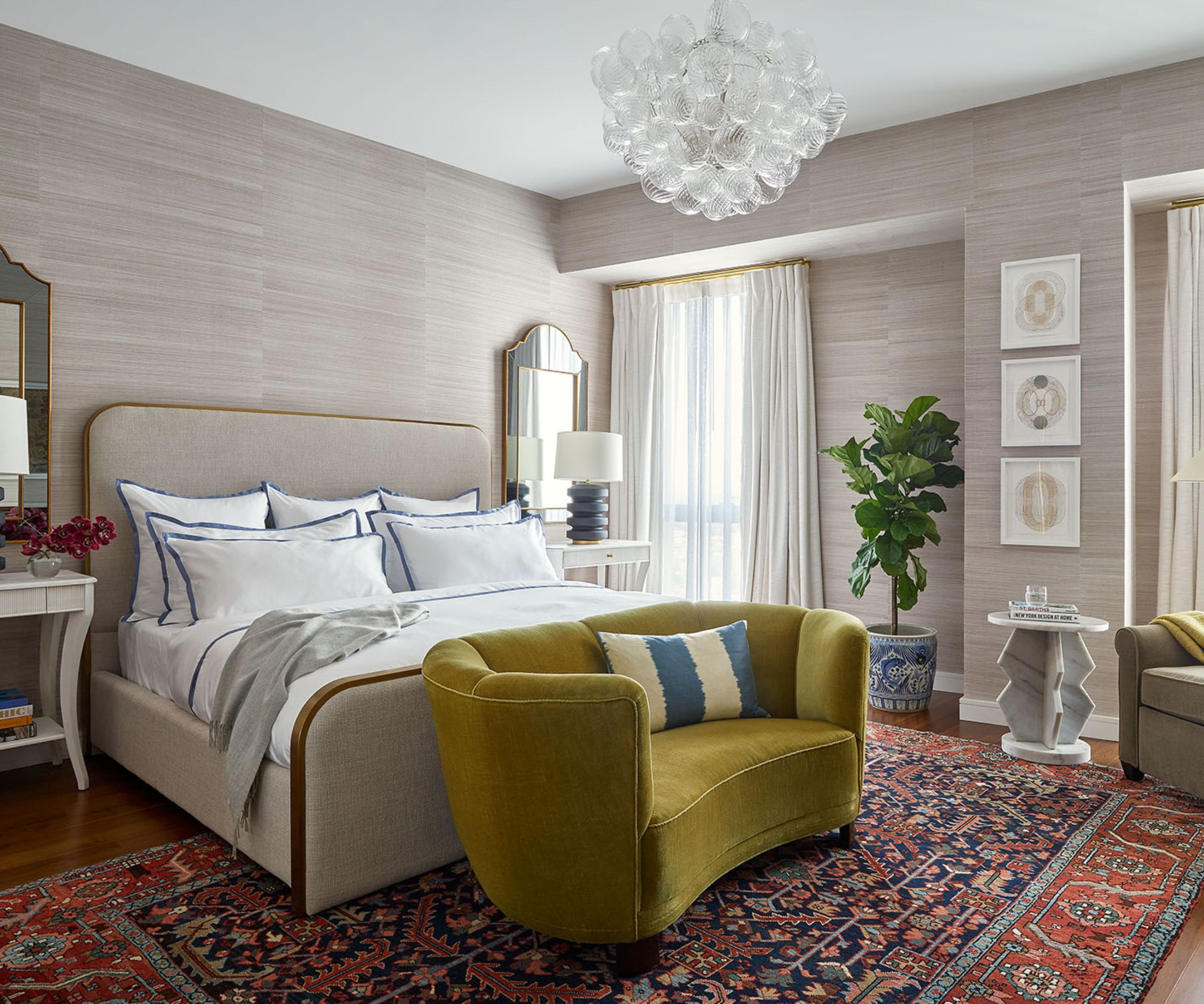
The public business areas of the New Orleans pied-à-terre are clear-cut white-walled affairs, brought to life with well-curated furnishings, artworks and vintage pieces. Meanwhile, the home's private spaces have extra personal touches and a more eclectic style. 'The mix was super important to me in this space, and it reinforced for me how powerful a few well-placed antiques and vintage rugs can be in a home,' says designer Hattie Collins.
Anyone looking for unusual bedroom ideas will surely be won over by the primary bedroom's beautifully textured Schumacher grasscloth wallcovering, which cocoons the room, and the 1940s Danish mohair loveseat, which adds a joyful splash of color alongside the antique rug from Nola Rugs.
Other key pieces include the Atchison Home nightstands and chair, Visual Comfort lamps and chandelier, and the Katrine Hildebrandt burned paper pieces, sourced from Martine Chaisson Gallery. The bedding is from Matouk.
9. Play with pattern to add warmth to guest rooms

We're often asked for tips on how to decorate a guest bedroom and in this much smaller second bedroom, we think designer Hattie Collins has got it spot on. Introducing a soothing pale green textured wallcovering (grasscloth from Schumacher) for the walls, with a darker green for the headboard, the scheme picks an accent color from the living rooms, and takes it a stage further. The patterned bedcover (a Schumacher x Matouk collaboration) ties the whole look together in a more playful way and, along with the vintage rug, adds character and warmth to the overall look.
Other key pieces include: Coley Home bed, Visual Comfort lamps and chandelier, Atchison Home nightstands, a Clark Derbes wall sculpture.
10. Add impact to a powder room with a bold wallcovering
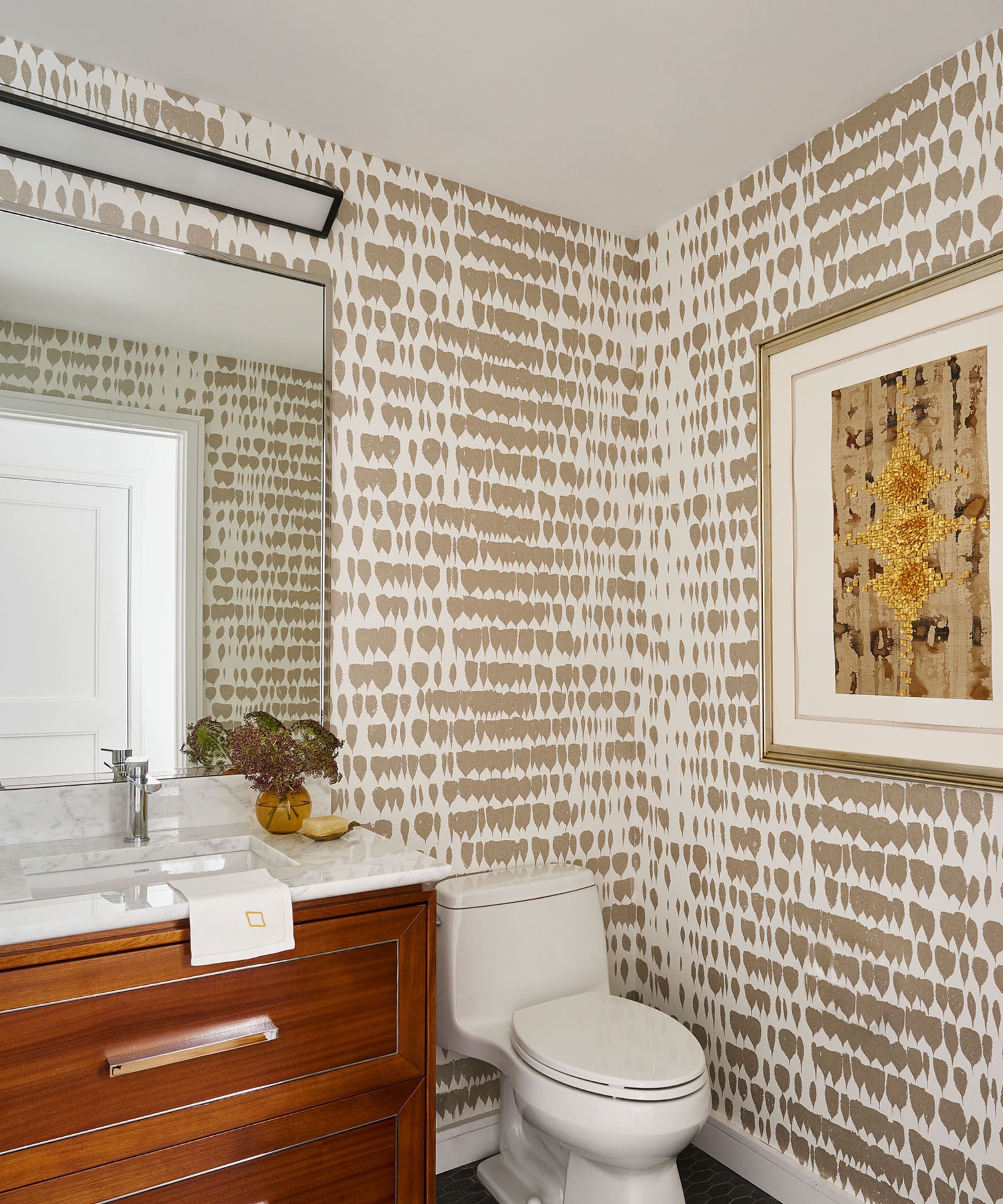
Designer Hattie Collins' powder room ideas were designed to pack a stylish punch and make a good impression on visitors. The unexpected moment here comes from the quirky Schumacher wallcovering and is combined with art from Andrew Fisher sourced at the Martine Chaisson Gallery. The scheme demonstrates how effective a striking wallcovering can look in a smaller space.
Interior design: Hattie Collins at Hattie Sparks Interiors
Photography: Alison Gootee
Styling: Page Mullins


