Choosing a new colour for your front door can be a lot of fun as you get to express your style and taste on the exterior of your home – not just in its interiors, as most of us are used to. And while most of the shades on the colour wheel are fair game to apply to your entryway, there are some front door colour mistakes that are best to familiarise yourself with first so that you can steer clear of them.
From the front door colour ideas that are best avoided to the best ways to treat certain types of front doors, these expert-approved tips cover almost every possible error you could make when picking out your next colourful front door idea to make over your entrance.
Front door colour mistakes to avoid
One thing to remember is that even if you’ve made one of these front door colour mistakes in the past, however recent or distant, it’s nothing to beat yourself up about or be ashamed of. Especially since some of these are quite surprising even to us – but when explained by our experts, they make total sense!
1. Going for white
Even though white is a classic when it comes to front door shades, surprisingly enough, most experts recommend avoiding this plain colour. Additionally, white is also one of the front door colours going out of style in 2025, so perhaps it’s time to branch out.
‘There’s only one colour I’d avoid on a front door – white,’ says Marianne Shillingford, creative director and colour expert at Dulux. ‘It’s arguably a classic choice but it’s not unique to you or going to brighten your day when you’re saying hello and goodbye to the place you call home.’
Sara D’Souza, content strategist and creator at Frenchic Paint, adds that it’s also not the most practical of colours, ‘Given it’s one of the highest traffic areas of the house, white is probably best avoided, as it will show up dirt and grime so easily.’
2. Being too bold for your own good
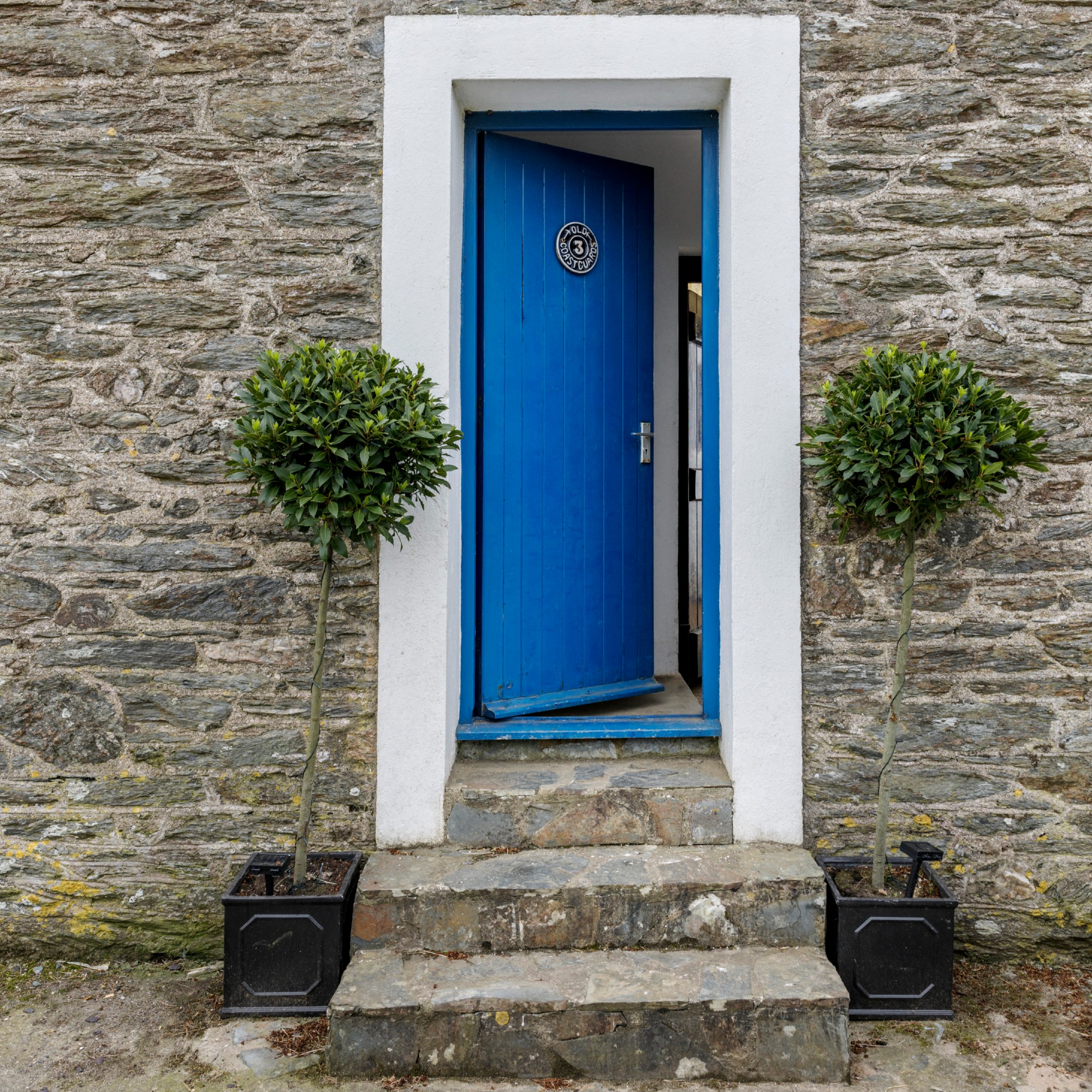
There’s nothing wrong with going for a vibrant colour for your front door – on the contrary, it’s actually encouraged and shades like the electric blue above would look beautiful on many homes. But there are certain bold shades that are simply too much, more specifically neon colours.
‘Super neon or fluorescent shades might be a bit too “look at me” for most homes – unless you’re running a retro diner,’ says Victoria Yardley of Victory Colours.
3. Opting for classic black

At this point, you might be thinking ‘what the hell?!’ as black is another very traditional and go-to front door colour all across the country. And yet, it’s found its way onto our list of front door colour mistakes as it turns out that similarly to white, it’s not the most durable and weather-resistant of shades.
‘I would recommend avoiding traditional black for front doors,’ says Michael Rolland, paint expert and managing director at The Paint Shed. ‘Not only has this colour been overdone, but as we lead into the summer months, these doors are typically more prone to warping due to increased heat absorption compared to their lighter counterparts. Black paint also tends to fade faster when exposed to the sun, requiring frequent touch-ups and showing scratches and dirt more visibly than other shades.’
4. Ignoring conservation areas
Conservation areas often have specific rules regarding front door colours, so it's definitely worth checking with your local council before you choose a colour for your front door ideas.
Generally, the rule is that all doors and windows must be sympathetic to the original character of the home and that includes colours. Some councils will have a list of preferred colours from reputable companies and the shades may need to tie in with the historic nature of the property.
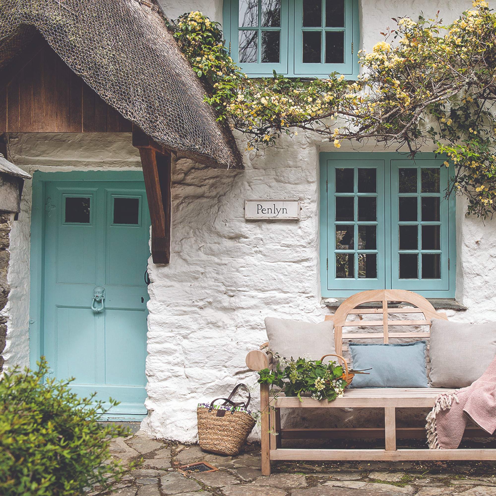
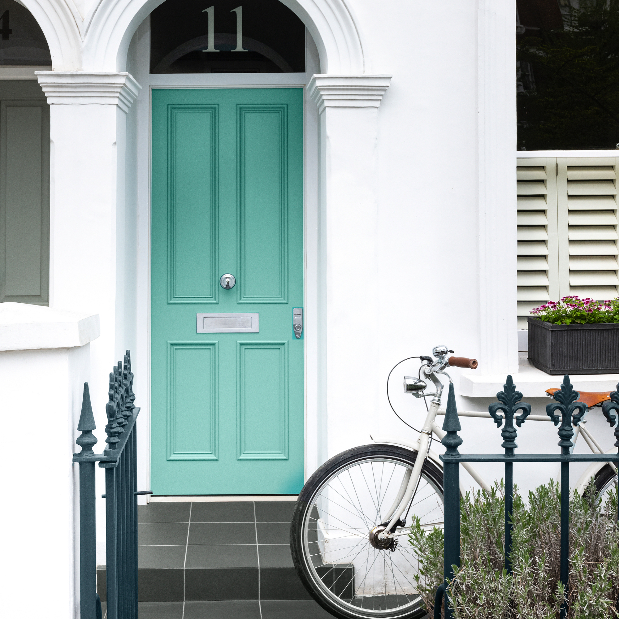
5. Choosing cool tones on a recessed door
If your front door is recessed within a front porch or some kind of cover, it's best not to paint it in a cool shade, as it might make the exterior feel a little cold visually.
Instead, take inspiration from the era of your home when you're looking for colour ideas and consider a warming shade of pink, coral or burnt orange. Look at your brick colour for inspiration too, traditional bricks work well with these shades as they add a natural warmth.
6. Not considering existing stained glass
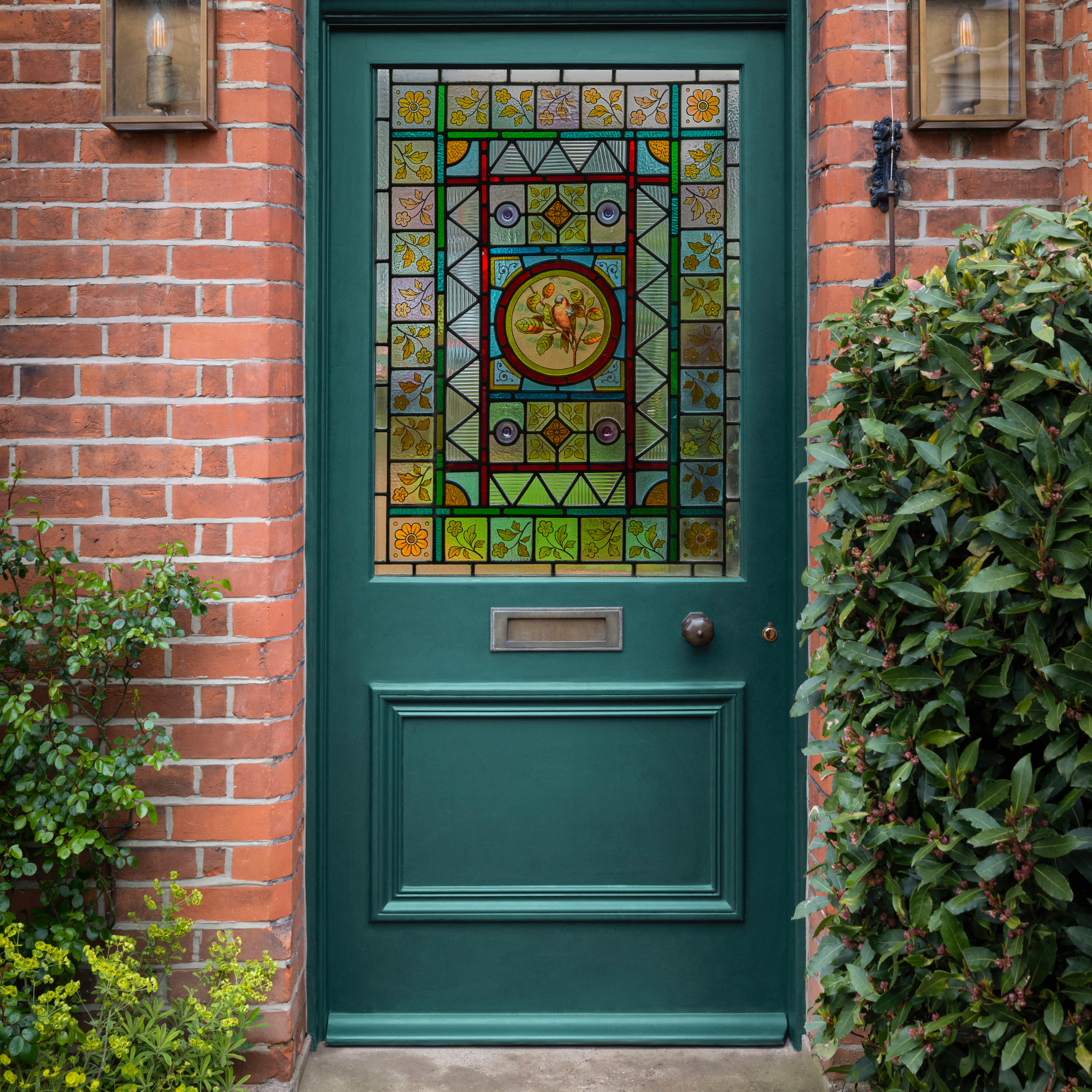
There's nothing more beautiful than an original stained glazed door, all those intricate pieces of coloured glass changing hourly as the lights flows through them.
'If you are lucky enough to have preserved an elegant period feature such as a decorative glass panel, celebrate it by picking out a colour from within the glasswork, or a darker tone of it,' explains Andy Greenall, head of design at Paint & Paper Library. 'This will create a harmonious frame that really enhances the front of your home.’
The beauty of choosing a colour in this way is that your choice could be vast depending on how many colours are in the stained glass, so pick a colour that really resonates with you to.
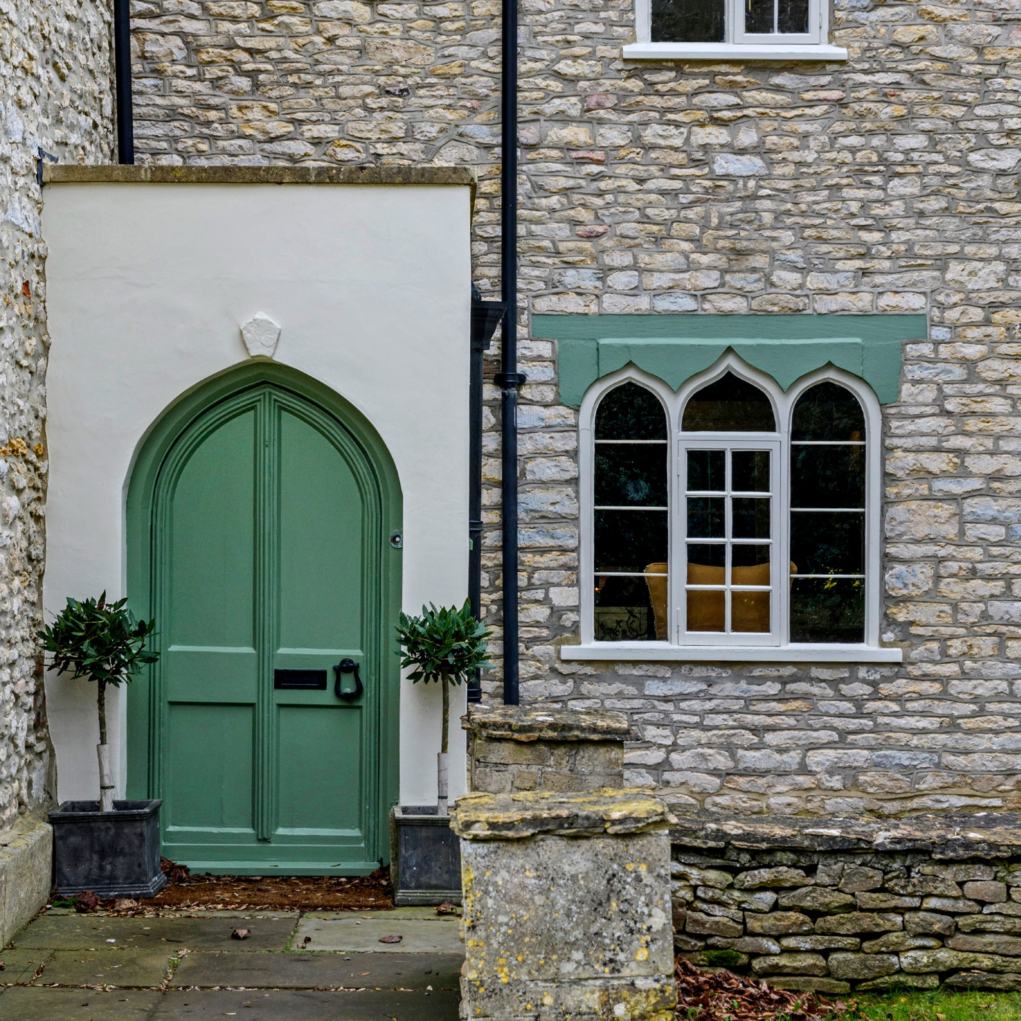
7. Sticking to one shade

A bold front door colour can be highlighted by a lighter shade painted on the surrounding stoneware. This allows the front door to take pride of place as it is the focal point.
'First impressions count, and your front door is no exception,' says Joanna Baumard, co-founder of window film company Purlfrost. 'For a striking and colourful look opt to paint the frame in a different shade to the door, not only will this add a pop of playful colour to your exterior, but it also helps to accentuate door hardware, stained glass panels or door number stickers.'
8. Not matching with windows
Rather like the trend of painting your walls to match your skirtings, you can apply the same interior design process to your exterior too.
It gives a lovely cohesive look that really adds value to the exterior of your home. It doesn't need to be a bright shade, if you're opting for this look then pick a colour that's more subtle and in keeping with the era of the property.
9. Thinking you can't be tonal
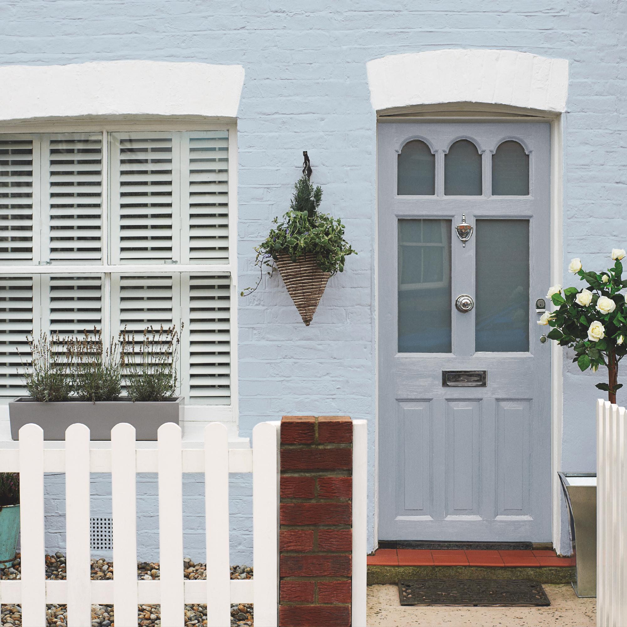
More often than not, we make our front doors stand out, with either bright or deep bold shades, which of course are striking in their own right. Another option that can look just as beautiful, is to paint your masonry a colour too, and match it tonally to your door.
A gently sky blue works wonders with a soft grey in a glossy finish. Other alternatives to consider are a tonal blue and pale pink, or why not choose two shades of the same colour like a pale coral and deeper shade for the door or two greens together?
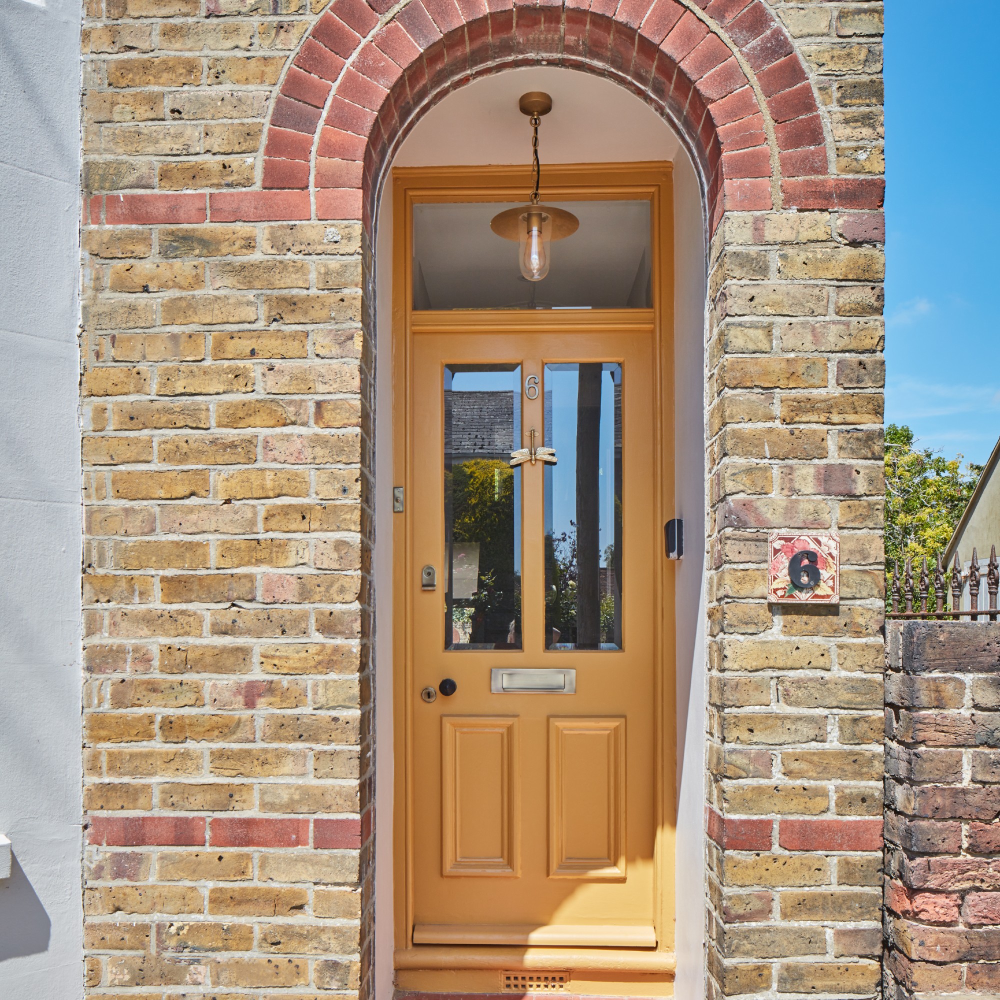
10. Failing to paint the surround
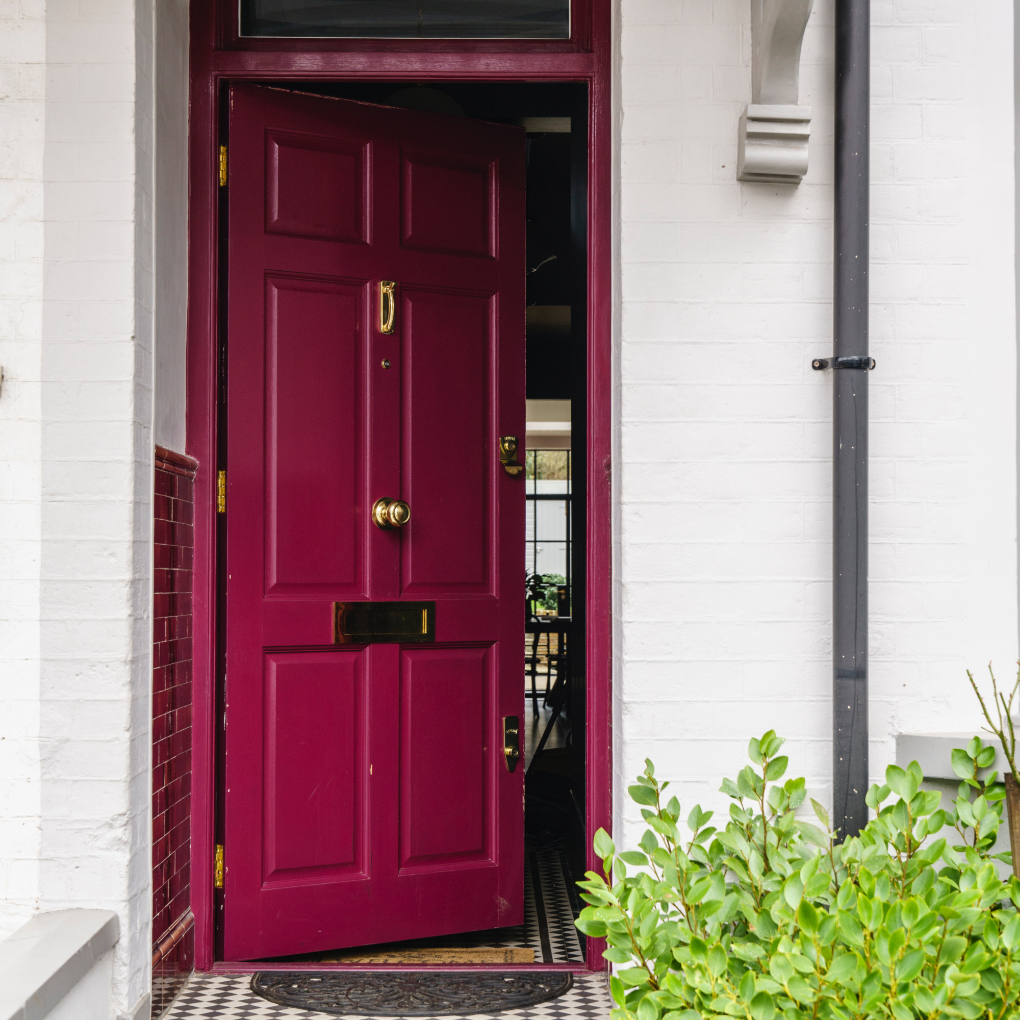
One of the most common front door colour mistakes is forgetting to paint the wooden frame around the door in the same colour. In fact, it makes for a lovely colour drenching moment.
'While most people tend to frame their front door in white, i.e. the surrounding architrave - it’s actually much better to commit to painting everything in one colour – it gives a better scale and avoids the sharp contrast from white to colour especially if erring towards darks,' says Patrick O'Donnell, brand ambassador at Farrow & Ball.
11. Using pale tones on a busy road
If you live on a busy road there's naturally going to be more general dust and debris that occurs from traffic passing by, so opting for a pale or white front door is a big no. Instead, choose a darker colour which will hide it better.
'When choosing a colour for your front door, consider the colour of other surfaces seen around it, such as the reddish hue of exposed brickwork, the natural shades of stone or, perhaps, painted render,' Andy from Paint & Paper Library says.
12. Playing it too safe
If you're restriction-free in terms of conservation rules and don't live in a listed property, then choose a colour that reflects your personality and style.
You don't need to play it safe if you don't want to, especially if your home is set back off the road or down a lane, no one will see your bold and beautiful choices if you're worried what they might think!
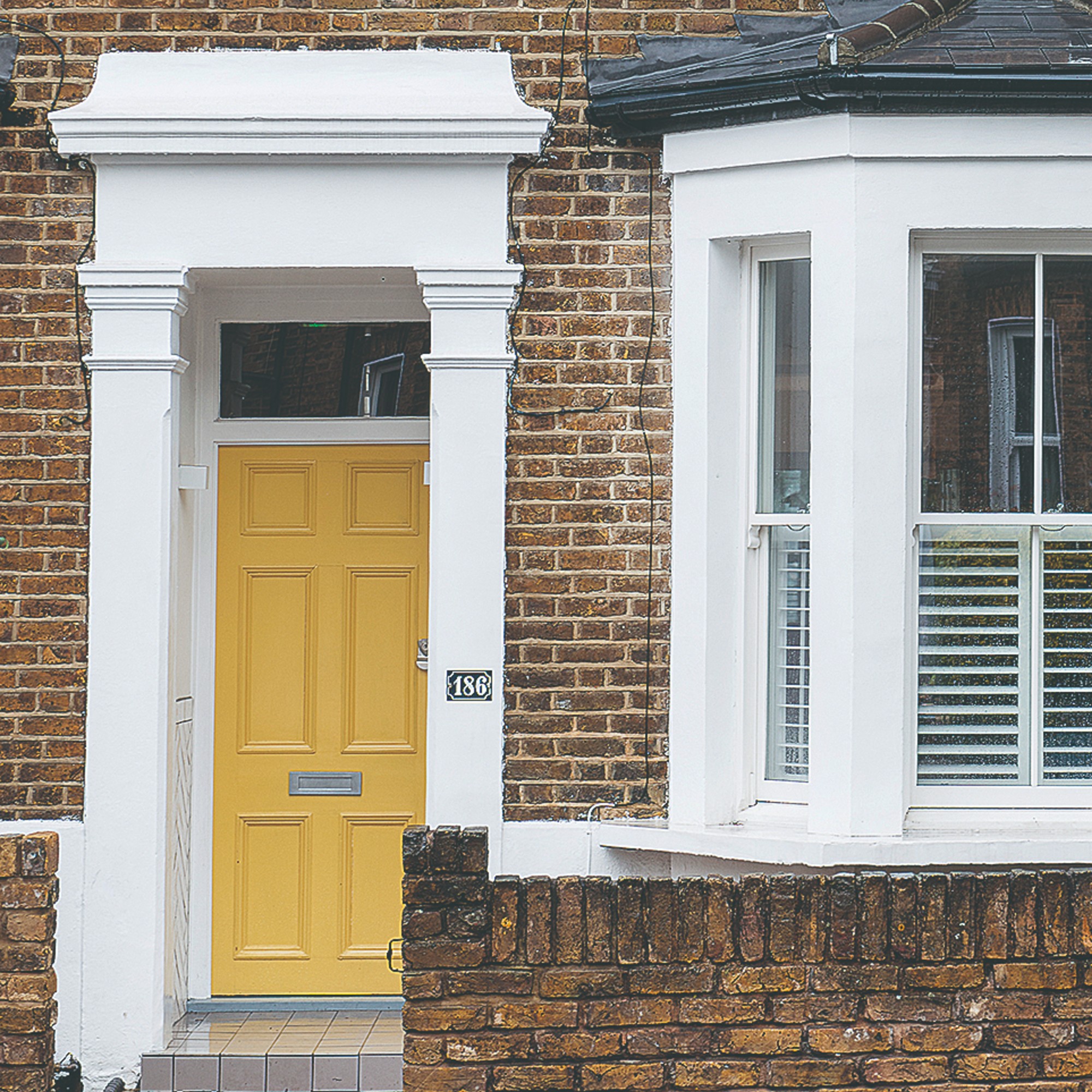
Sunshine yellow is perhaps one of the happiest colours to choose and one we feel sure will bring you joy every time you walk up your path. And if there was ever a time to go for a bright yellow front door, it's this year as Dulux's colour of the year, True Joy, is a bold and sunny yellow shade. Let that be your inspiration!
If you're after the perfect mood-lifting, sunny yellow shade for your front door, Dulux has just the one, also naming it its colour of the year.
A few brands do a vibrant orange shade as well as Farrow & Ball and their Charlotte's Locks - which, according to Michael at The Paint Shed, is one of the current bestsellers. And the exterior-friendly eggshell finish is perfect for a front door.
Since Pinterest's predicted cherry red to be the most in-demand shade of 2025, this deep and rich colour has been popping up everywhere, including front doors where it looks pretty unreal if you ask us.
13. Not thinking cohesively
If you love cohesion and live in a property that needs to retain it's authenticity then carefully consider your front door colour choices.
'When it comes to exterior design, maintaining a cohesive and harmonious look is key,' explains Jo Oliver-Singh, director of The Stone & Ceramic Warehouse. 'Painting your door a different colour when the rest of your exterior is monochromatic can be a mistake that disrupts the overall aesthetic balance of your home.'
'Monochromatic exteriors rely on the simplicity and elegance of a single colour palette to create a unified and seamless appearance. This design approach emphasises clean lines, architectural features, and the overall symmetry of the house. By introducing a contrasting colour to the door, you risk undermining this sense of harmony and visual cohesion.'
FAQs
How do I choose an exterior front door colour?
‘Selecting a new front door colour can be hugely satisfying, not least because the right shade always has the magic ability to look "just right",' muses Andy Greenall from Paint & Paper Library.
'Three important considerations are: the age and corresponding architectural style of the building, the colour of any natural materials that surround the door, and the design detail of the door itself (including the door furniture, be it shiny brass or rustic wrought iron).'
'Think about the environment your home is in,' adds Patrick O'Donnell from Farrow & Ball. 'Look at all your neighbours front door's, whilst I’m not advocating a homogenous street of blandness you probably won’t want to scream your individuality (or should you?) in a street of conformity.'
'If all dark navy blue or black look for something with nuance and interest whilst still fitting into the dark mould – an elegant chocolate shade, a sophisticated gunmetal blue or even a smart aubergine purple/black would look great,' he suggests.
What colour front door adds the most value?
Choosing a front door colour that will add value to your property is largely down to personal preference, though some say that black is a key colour as opposed to a bright shade that may put buyers off. If you are selling, then opt for shade that's easy on the eye but still has character, like mid blue or sage green.
So no shame, but have you made any of these mistakes before? Or are there any that we’ve missed and that you think should definitely be on here? Let us know.