Many of Farrow & Ball's paint colors have gained a cult following, with its most popular shades cropping up time after time in interior projects. While these go-to shades serve us well, we thought we'd take a deep dive into its lesser-known options.
Below, we've rounded up ten paint colors from Farrow & Ball you've likely not heard of before that interior designers love using in their projects. While these shades may not have garnered the reputation of shades such as Setting Plaster and Hague Blue, they're just as worth exploring.
From gentle neutrals to vibrant blues, read on to find some paint ideas for your next home decorating project.
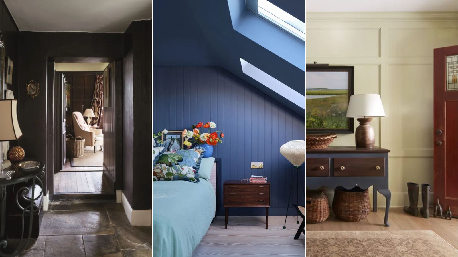
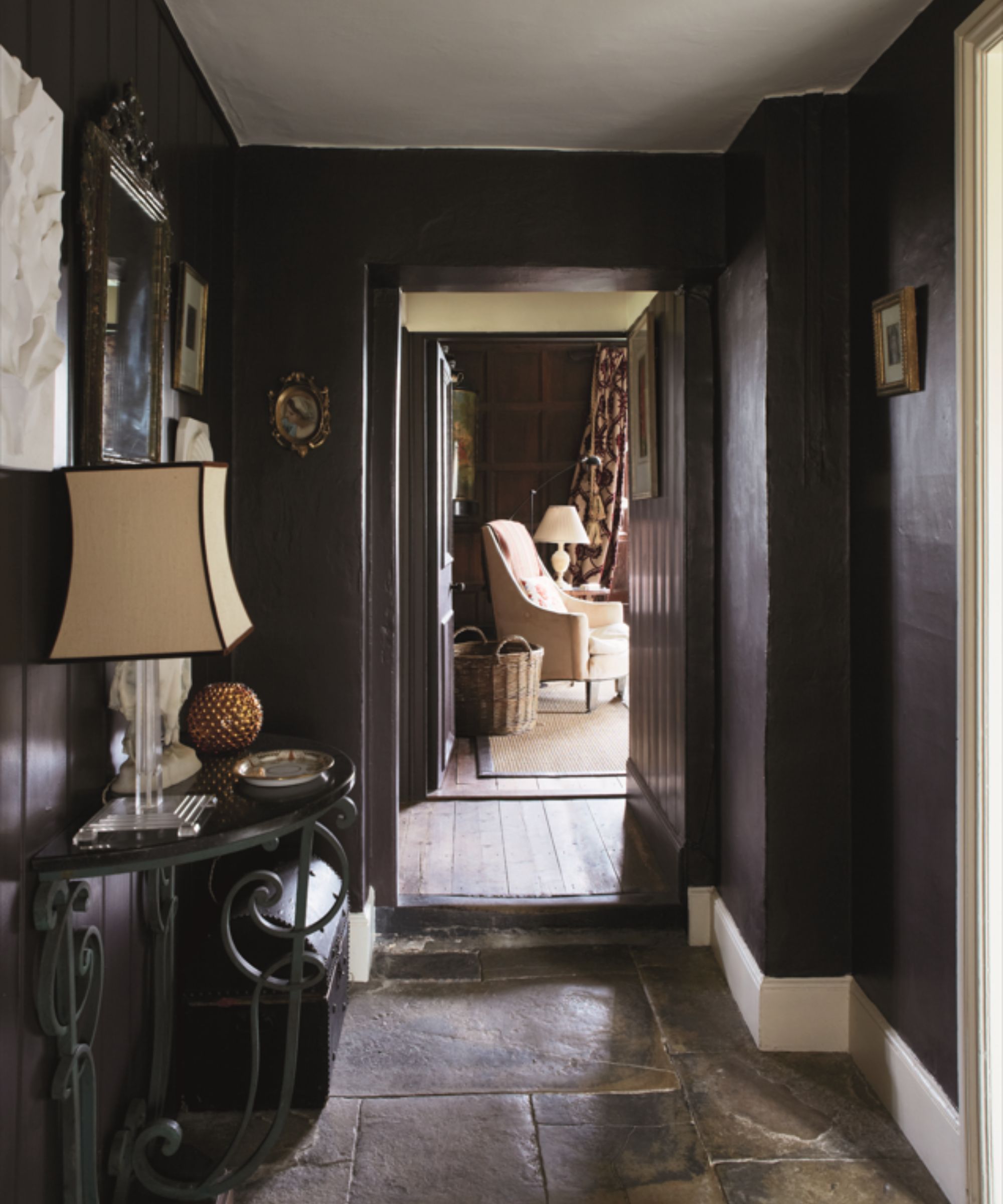
1. Off-Black
A favorite black paint for interior designer Tom Riker, founder of Chicago-based James Thomas is Off-Black, who shares:
'We love using Farrow & Ball's Off-Black for its versatility and sophistication. It makes a striking trim color or, when applied in a gloss finish, creates a luxurious, jewel-like effect in spaces such as a butler's pantry or pocket bar. The depth of color is incredible – rich and saturated, yet not quite a true black, which adds character to any room.'
2. Oxford Stone
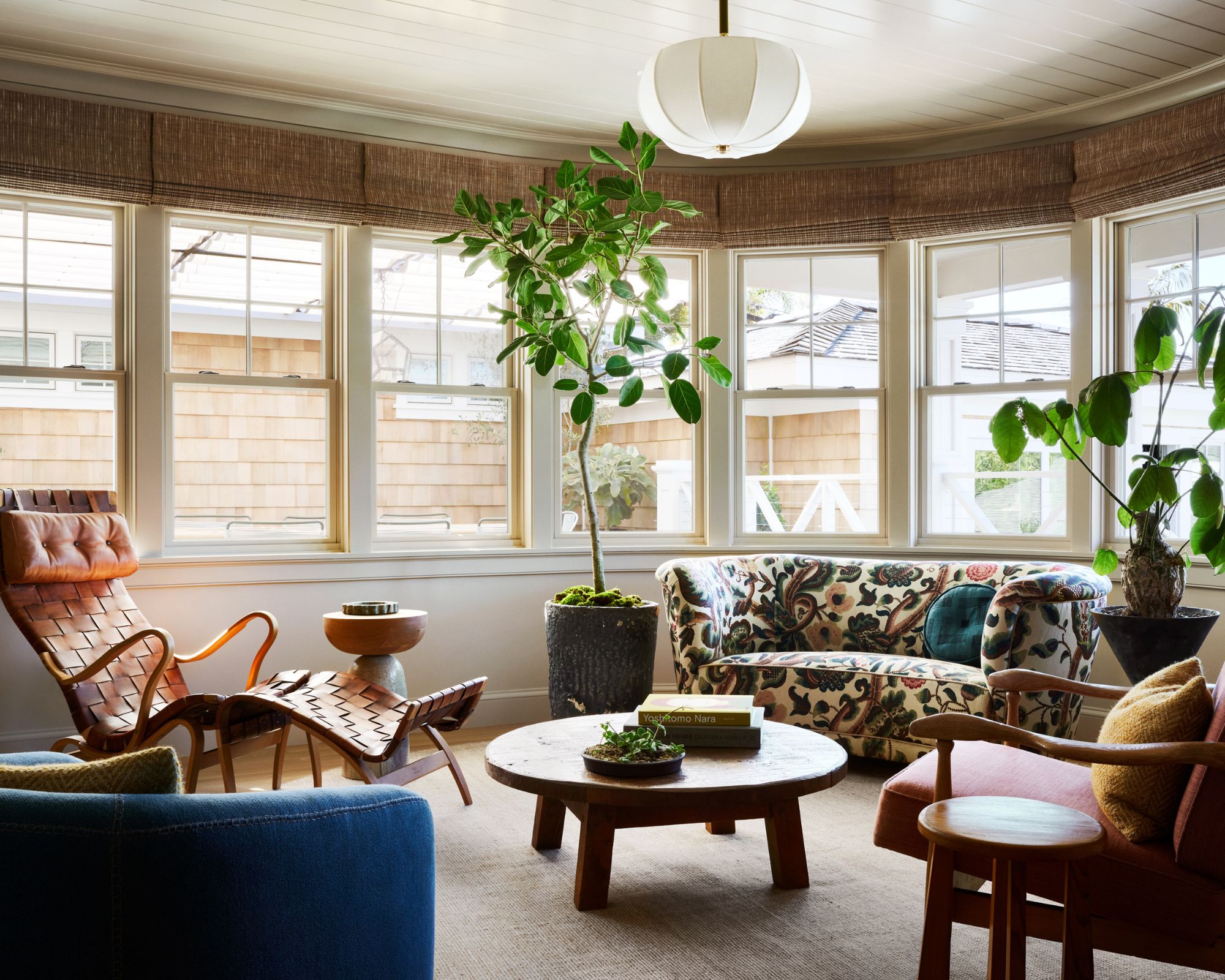
Oxford Stone is recommended by Lisa Berman and Melissa Rohani, co-founders of interior design firm Studio Gutow as a neutral paint alternative to white paints that offers more depth:
'Technically a taupe, we are fans of using Oxford Stone as a neutral backdrop in place of a standard warm white paint. It carries much more depth and earthy undertones than whites, and we loved how the light played on this color in the sunroom of our client's home. It is especially grounding against the playful patterns and saturated colors we used on the furniture in the space. It would make a lovely bedroom color as well, with its warmth and very subtle hint of color.'
3. Mahogany
Mahogany is a dark brown paint with a slightly muted finish. Nodding to the latest color trends, we wouldn't be surprised to see this one become a more widely known paint color.
'I use Mahogany a lot on stair railings and banisters as an alternative to black if people want a rich, warm wooden look but need to paint. It also looks great on millwork,' shares Chicago-based interior designer Claire Staszak of Centered by Design.
4. Wine Dark
Described by Farrow & Ball as its 'richest blue', Wine Dark is a bold yet deeply liveable blue paint.
'Wine Dark is a newer color and really beautiful on cabinetry or below a chair rail,' explains Claire Staszak. 'I also love it for a dramatic dining room, or if using a contrast paint for doors and trim. It's a fun way to be more colorful without having to pick yellow or red, for example, if you’re not a super bold color person.'
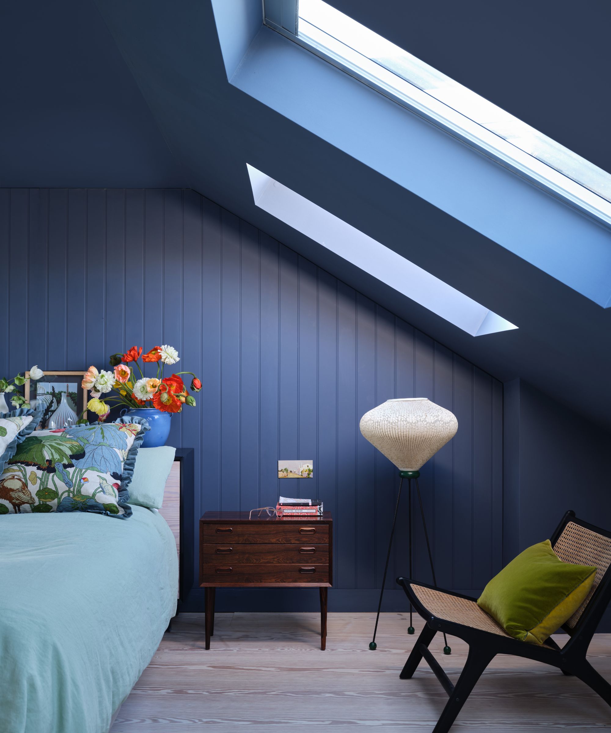
5. Skylight
Another blue paint by Farrow & Ball that we don't hear about so much is Skylight, a pale blue with gray tones.
'Skylight is our favorite shade for a bedroom because it's very soft and ethereal. We use it a lot when we want a calming space, and it's great for a living room or anywhere you'd like just a touch of color,' shares Claire Staszak.
6. St Giles Blue
At the brighter end of the color spectrum, designer Lara Apelian of Lara Apelian Studio loves St Giles Blue, a vibrant and uplifting shade:
'For this bedroom, we were inspired by the blue sea color in Picasso’s La Baignade (On the Beach) painting that I fell in love with when visiting the Peggy Guggenheim Museum in Venice, Italy. We used Farrow & Ball’s St Giles Blue which has a richness that is unprecedented in flat paints. St Giles Blue is both bold, playful, and timeless.'
7. Lichen
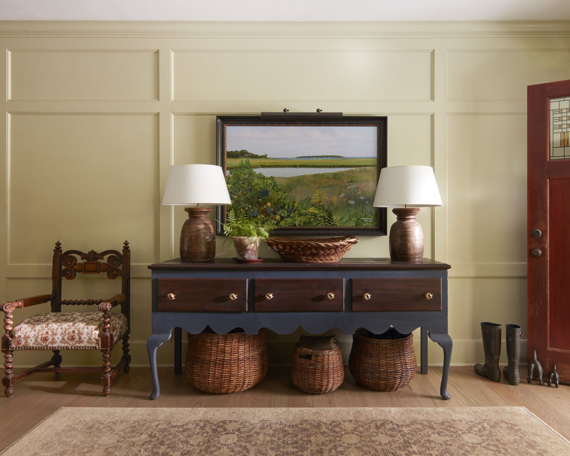
Farrow & Ball has many popular green paints, from Studio Green to Green Smoke, but Lichen is one of its lesser talked-about shades – a muted and relaxing hue that we could envision working as a neutral.
'I love Farrow & Ball's Lichen,' says interior designer Kathryn Hunt of Kathryn Hunt Studio, who used it on the walls of this entryway. 'It’s a subtle moss tone but leaves a cheery footprint.'
8. Teresa's Green
Teresa's Green is one to have on your radar if you're a fan of 'in-between' colors. An aqua shade that can read between green and blue, it was used in this kitchen designed by Laura W. Jenkins Interiors.
'I love using Teresa's Green from Farrow & Ball,' says designer Laura Jenkins of Laura W. Jenkins Interiors. 'It’s such a happy, clean green that pairs well with a wide range of colors, from blues to pinks. The tone has a brightness that isn't saturated but still holds a strong, distinct color story.
'I think the color is wonderful for kitchen cabinets, but it would also create a lovely atmosphere in a sunroom or bathroom.'
9. Mole’s Breath
'While a part of their signature palette, I don’t think Mole’s Breath by Farrow & Ball gets the credit it deserves!' says Steph Schlegelmilch, founder and principal designer at Studio Seva.
'It is a warm gray done absolutely right. There’s a level of sophistication that I love about this color and I love suggesting it for a quiet study or library room. I also think this color works great for a boy’s room that they can grow with.'
10. Arsenic
Lastly, Arsenic, a cheerful minty green, is a favorite for Tami Ramsay, co-principal and founder of the interior design studio CLOTH & KIND. If you love bold paint colors that make a statement or maximalist color ideas, this one may be for you.
'We are huge fans of Arsenic, a vivid, bold, and rich minty green that feels at home in both modern and traditional homes, but really loves a Victorian home,' says Tami. 'It is utterly fantastic in a room with old heart pine floors and can make a dark hallway sing with color and light. We have used this in a variety of ways, both as the hero color and to equal success as an accent trim color that steals the show.'
Whether your room color ideas are pared-back or bold, there are plenty of Farrow & Ball paints to suit your style. With any color, remember to test it before committing so you can see how it looks throughout the day.