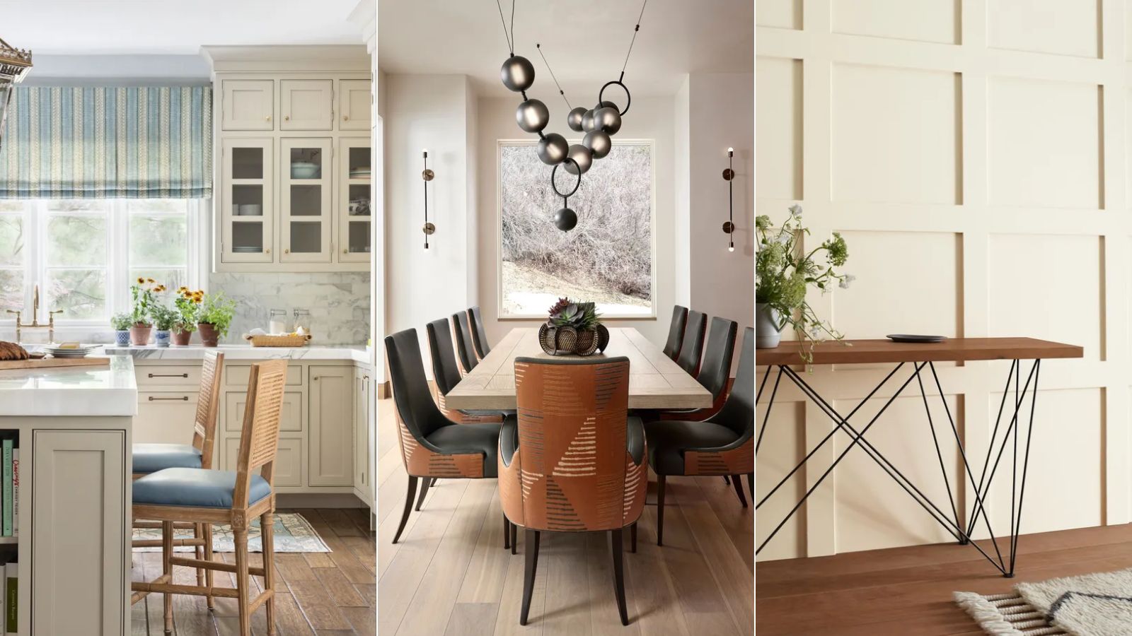
Warm neutrals are some of the best paints for creating pared-back schemes that feel cozy and welcoming.
However, choosing the best warm neutral paint for your interior project can be a minefield. From beige tones to earthy pinks and the varying levels of warmth specific to each shade, there's more choice than ever before.
To help narrow down the extensive range of warm neutral paint ideas, we asked interior designers for their top picks, which they turn to time and time again when decorating with neutrals.
10 best warm neutral paints
From off-whites to muted pinks, to help you pick the perfect palette for your room color ideas, we explore the best warm neutral paints favored by interior designers.
1. White Dove, Benjamin Moore
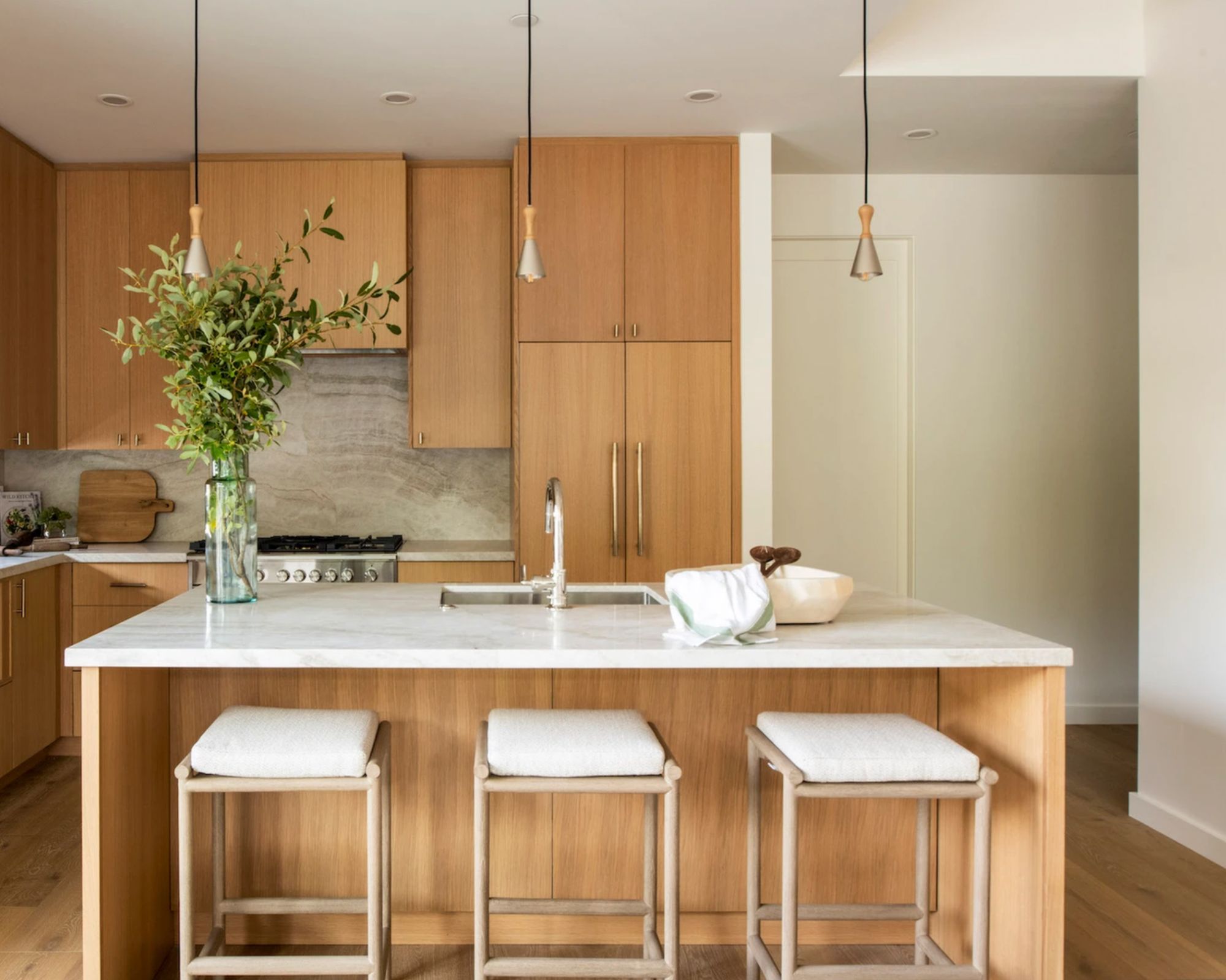
Beginning with a warm white paint, Benjamin Moore's White Dove is a firm favorite recommended by designers. 'This is an off-white with just the right amount of warmth, without being too creamy or too yellow,' explains Brandon Lange, Creative Director and Principal Designer at BZ Interiors.
Interior designer Sarah Latham of Latham Interiors used this warm white shade in this neutral kitchen, creating a calming look and pairing well with the warm wood tones. 'This tone works well with every wood tone – new or old – brightens dark rooms, and adds depth where it's needed,' says Sarah.
Clearly a favorite among designers, Joshua Smith, principal and founder of Joshua Smith Inc. explains how this warm white varies between different finishes: 'In a flat finish, it can lean a tinge towards cream in sunlight, but as a satin on trim or the ceiling, it’s the perfect shade to give a little age in the best way.'
2. Snowbound, Sherwin-Williams
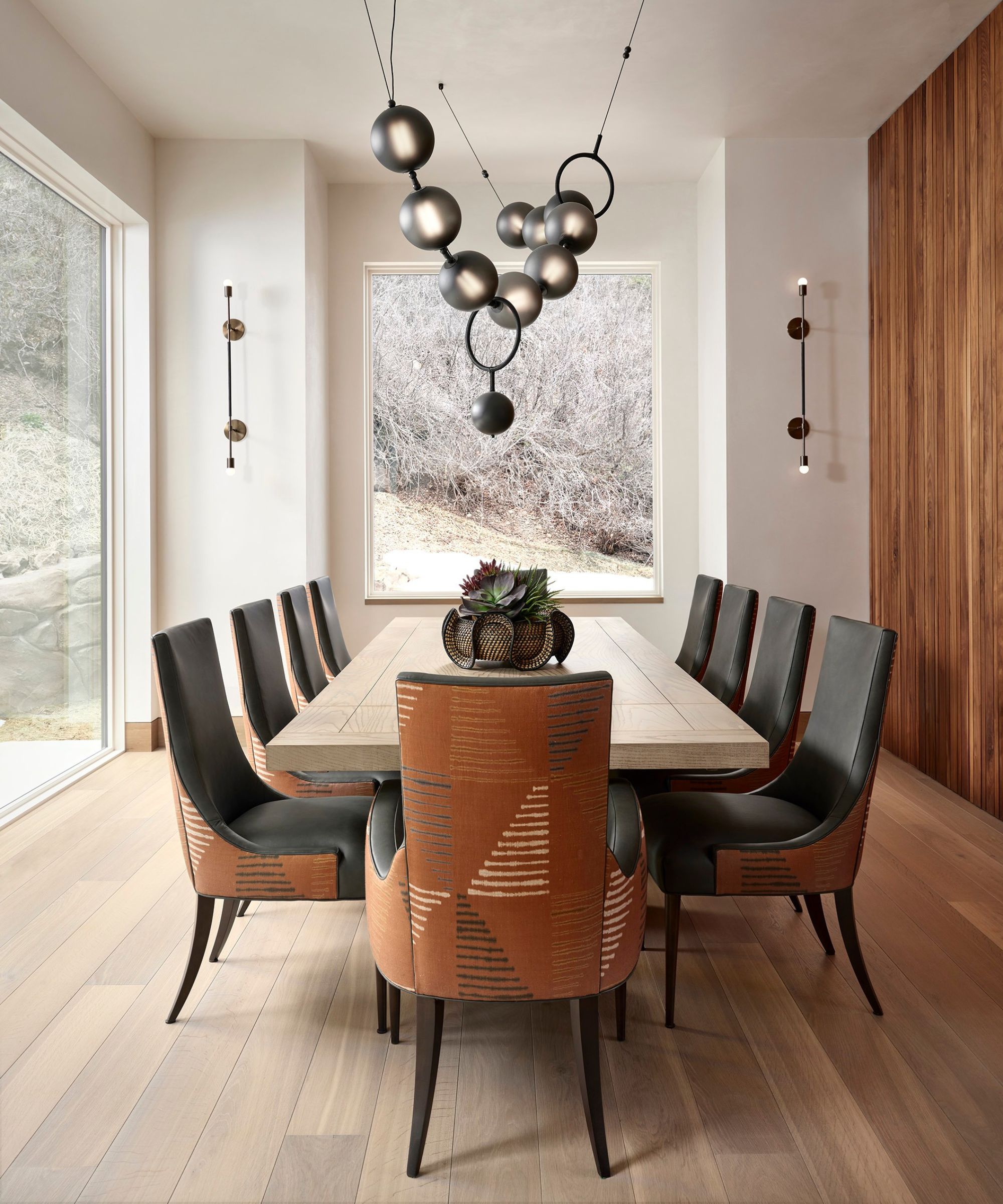
Interior designer Miranda Cullen, founder of Inside Stories used Sherwin-Williams' Snowbound on the walls in this dining room. Below, she shares why this shade is one of her favorite warm neutral paints:
'There are so many great choices out there but I would have to say our go-to warm neutral paint is Sherwin Williams' Snowbound. Its warm, creamy white base sets the stage for any beautiful interior.'
Here, we explain how to decorate with Sherwin-Williams' Snowbound to give you some room-specific ideas.
3. Drop Cloth, Farrow & Ball
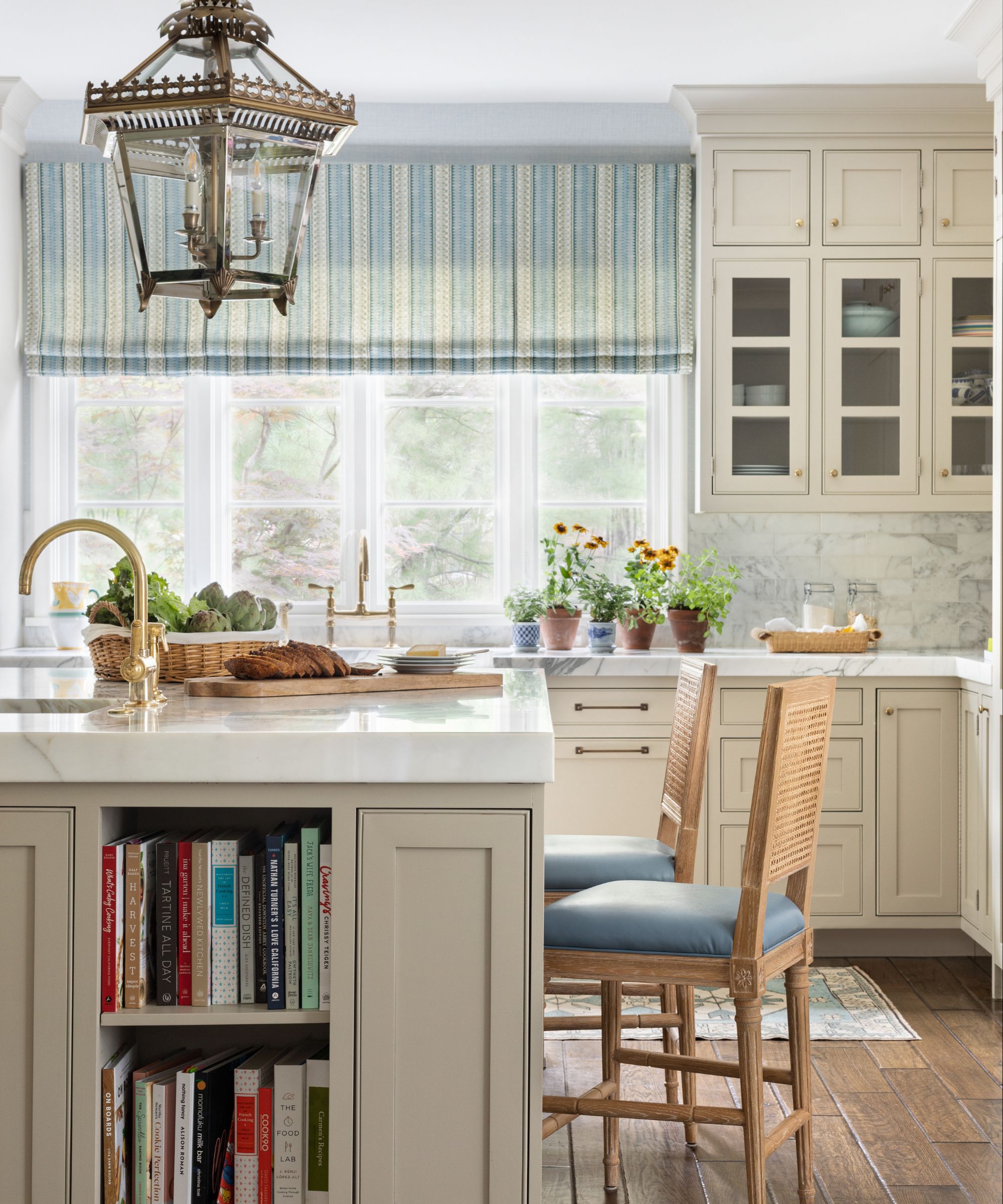
Farrow & Ball's Drop Cloth is a neutral paint that falls somewhere between a beige and a gray. While overly creamy warm neutrals can look dated, the addition of the gray tones in this shade gives it a modern look and feel, while still providing warmth to interior schemes.
This is interior designer Alexandra Kaehler's favorite warm neutral paint, who used it on the kitchen cabinets in this light and airy kitchen. She adds that it brings depth when used on the walls: 'It has so much warmth and dimension. Sometimes neutrals can be flat, but Drop Cloth adds a lot of interest.'
4. Balboa Mist, Benjamin Moore
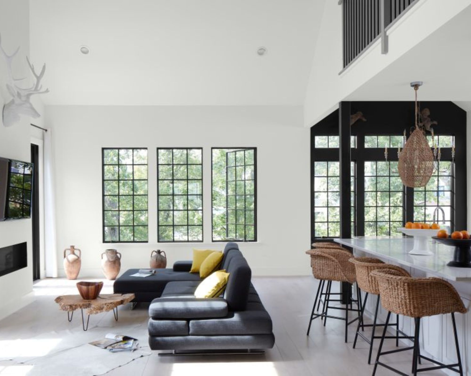
Decorating with gray is a great way to create a pared-back look throughout the home, but if the shade of gray is too cool, it can appear stark and cold. Instead, opt for warm-toned grays such as Benjamin Moore's Balboa Mist.
'This is a taupe-based neutral that will work universally with almost any color palette,' explains designer Brandon Lange. 'In darker spaces, it can feel moody, and in brighter ones, it adds just the right amount of depth.
5. Brooklyn Cowboy, Backdrop
For interior designer Carrie Moore, co-founder of North Carolina-based Carrie Moore Interior Design, Backdrop's Brooklyn Cowboy is a favorite warm neutral paint. An earth-toned beige, this is the perfect shade to channel the resurgence of decorating with beige.
'At its heart, this color is a beige, but it's enlivened by some orange and rosy pigments to make it feel very light and cheerful,' explains Carrie.
A warm-toned beige, Brooklyn Cowboy has an earthy look which makes it easy to incorporate throughout the home.
6. Swiss Coffee, Benjamin Moore
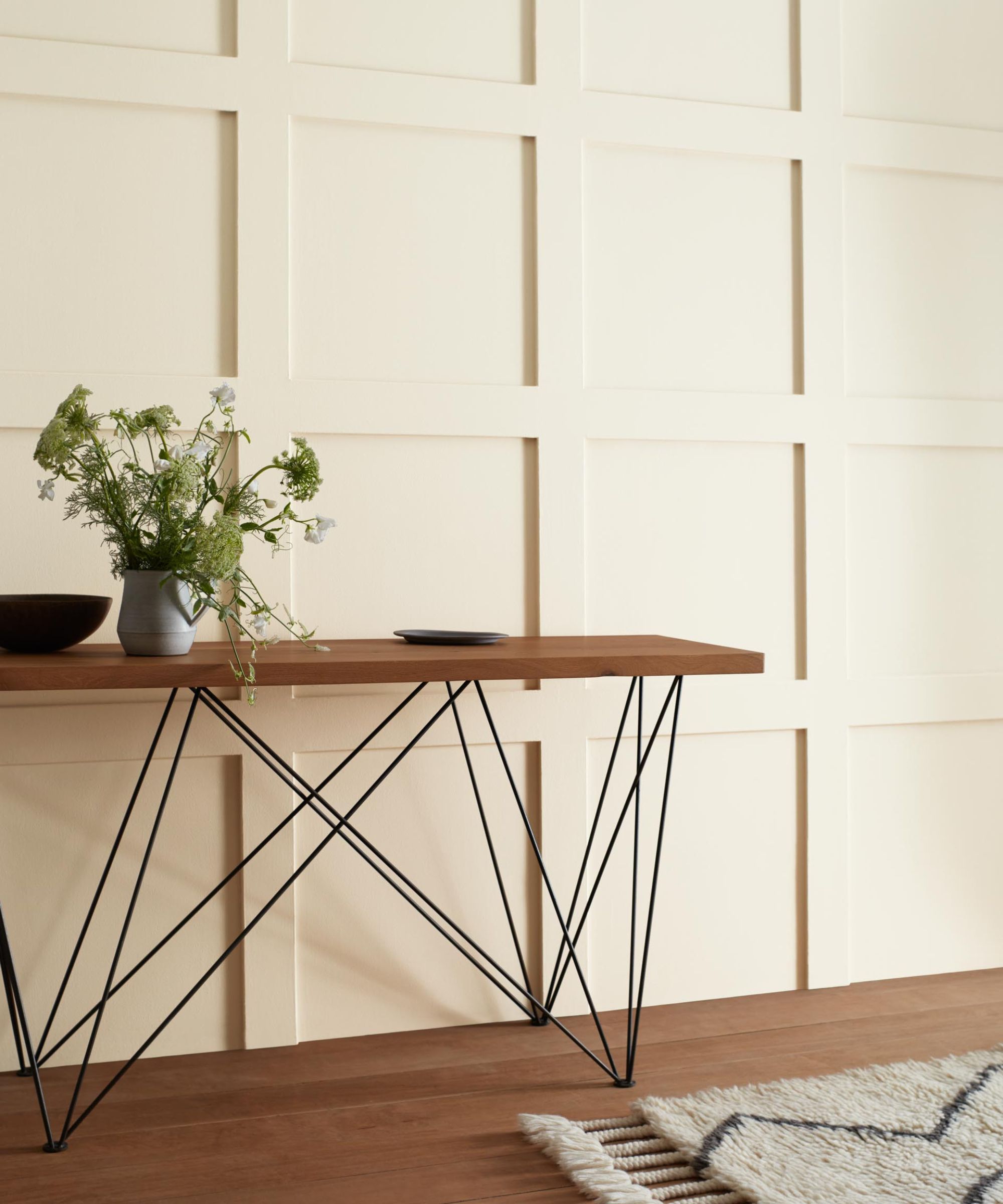
'I am a forever fan of Benjamin Moore's Swiss Coffee,' says interior designer Kathy Kuo. 'This paint is a really subtle warm neutral – it's off-white with undertones of gray, yellow, and green that combine to give a warm and inviting effect. I love that this paint can work equally well with a French country motif as it can a mid-century modern one.'
7. Modern Love, Backdrop
'I absolutely love using Backdrop's Modern Love, a flattering pink, as a neutral,' says interior designer Nicole Lanteri, Owner and Principal Designer of Nicole Lanteri Design. 'It hits the right balance between light and cozy and brings in an intentional, easy warmth to any space. This color organically complements other colors and textures, including natural materials, and adds dimension to any room. This color is so special and flexible we have used it on ceilings to add a layer of warmth when you're completely wrapped in the shade of a room.'
Modern Love is a muted and subtle shade of pink that adds the perfect amount of warmth to a room.
8. Matchstick, Farrow & Ball
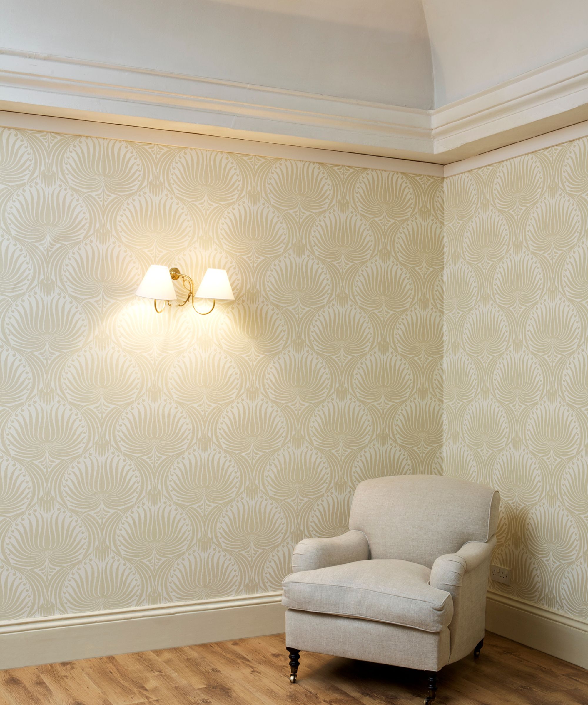
'One of my favorite warm neutral paint colors is Farrow & Ball’s Matchstick, says designer Margaret Donaldson of MDI Luxury Design.
'It is a light and airy neutral with subtle hints of warmth, which can be ideal for brightening up a room. This color can be used as the main color in a room or as a backdrop for bold accents.'
Taking inspiration from the color of unbleached wood, Matchstick is a go-to paint for a warm interior scheme, while steering clear of too many yellow undertones.
9. Shaker Beige, Benjamin Moore

'Another go-to neutral that I have been drawn to for over 30 years is Shaker Beige by Benjamin Moore,' adds interior designer Margaret Donaldson. 'It is an elegant beige neutral from their historical color collection that never disappoints. It is considered a mid-tone tan that is not too gray, not too yellow, and not too pink. Shaker Beige is a timeless classic that can add depth and warmth to any space while maintaining a neutral ambiance.'
10. Simply White, Benjamin Moore
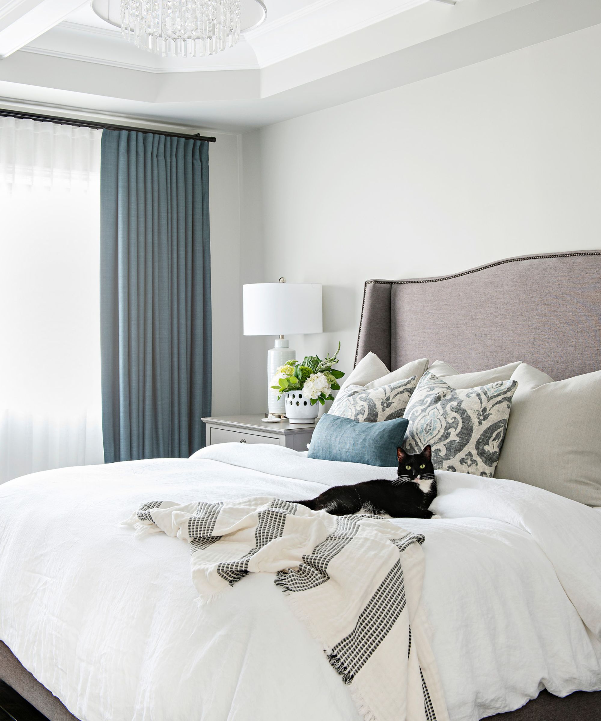
Lastly, Benjamin Moore's Simply White is another favorite among designers. While some white paints can create a sterile look when used in large and open spaces, Simply White has a touch of warmth which helps create a cozy feel.
This is a favorite warm neutral paint for designer Eugenia Triandos, Principal Designer at Hibou Design & Co., who praises it for its versatility: 'It's bright enough for it to feel clean but warm enough for a bare wall. It works well with a lot of other neutrals because the yellow undertone found in Simply White is a subtle one.'
Providing just enough warmth to create a welcoming feel, these warm neutral paints are endlessly versatile to use as backdrop colors throughout the whole home.
For more neutral color scheme inspiration, we explore how light brown is looking to be the new neutral for 2024.


