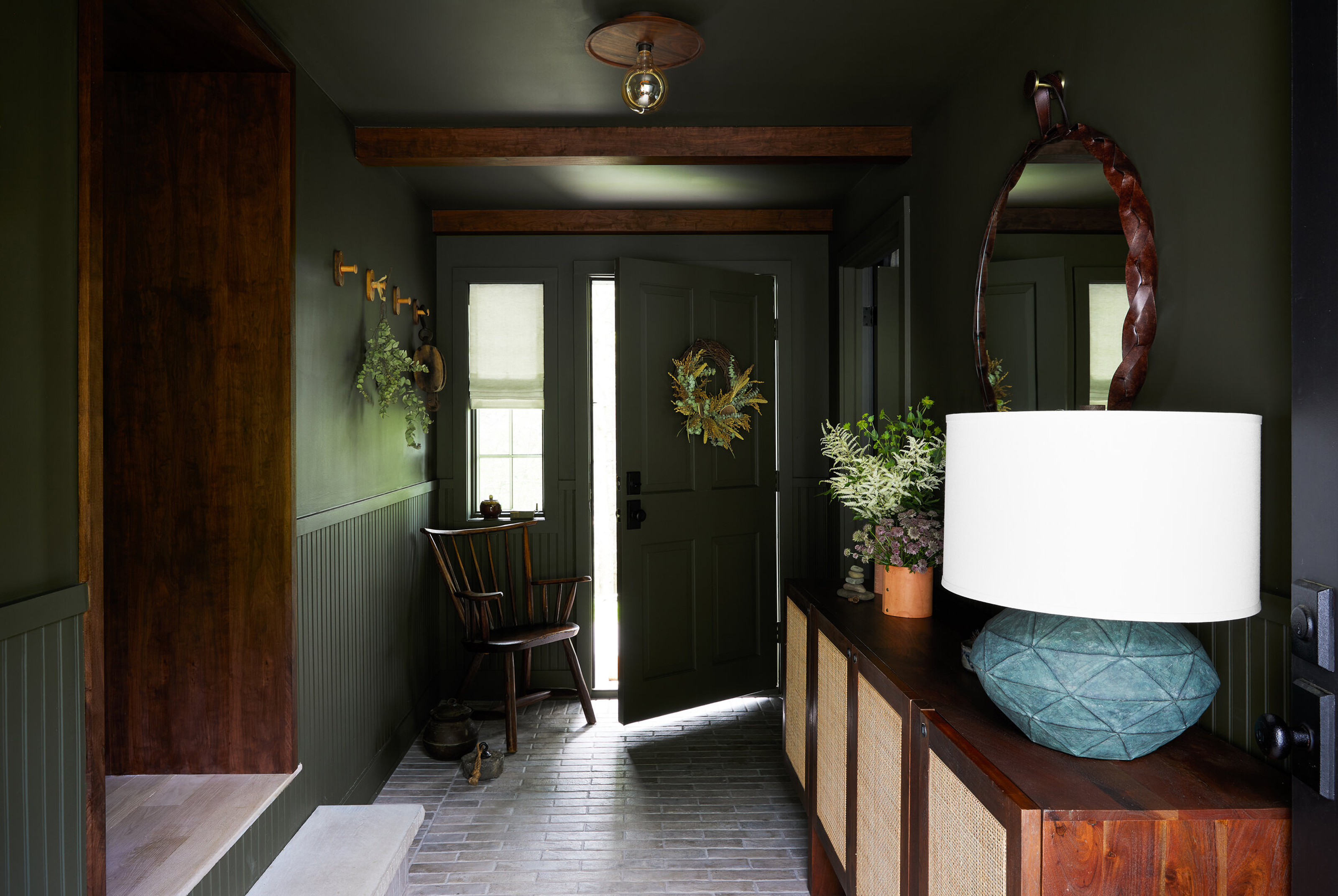
An entryway is such an odd part of the home. It's an area we spend so little extended amount of time in, and yet it's a room we (and any guests) see so much of, and walk through multiple times a day. We become a bit blind to the space, barely noticing it and yet it's probably the most used area in any house.
Now, a space becoming almost invisible can be a bit of a blessing when that space is lacking in square footage. But maybe if we gave the gateways to our home a bit more attention when it comes to decor and design, we can transform it from a space to quickly shuffle guests through, to a room that really holds its own. And a great place to start with a small entryway is getting the color right.
We spoke with designers about how they tackle small entryways and what colors work best to expand this space, make them feel light and brighter and give these long-neglected, but most trafficked spaces more focus.
How to choose the best color for a small entryway
As with all high-traffic areas, there is a bit of a balance to be had between form and function. As designer Irene Gunter says 'If your entryway is small, there is a higher chance of scuffing the walls. Therefore, it is important to strike a balance when choosing paint colors. I would not recommend using an overly dark or overly light color, as they both show marks right away. Instead, I suggest choosing a color somewhere in the middle.'
And have fun with this space, it's one of those rooms that you can afford to go a bit bolder with because it's not a room you have to sit and live in for long periods of time. Of course, neutrals are a safe choice for small entryways (and we will cover the best ones to go for here too) but don't be afraid to test out more vivid colors than other, more lived-in rooms, like a bedroom or living room, might not be able to handle.
'Pick colors that add a sense of identity to the space and have good saturation, which can make a significant difference in an entryway where there is little natural light. A paint color with low saturation tends to appear washed out in a poorly lit room. However, a paint color with high saturation can bring vibrancy, richness, and warmth to the space,' advises Irene.
1. Soft warm white
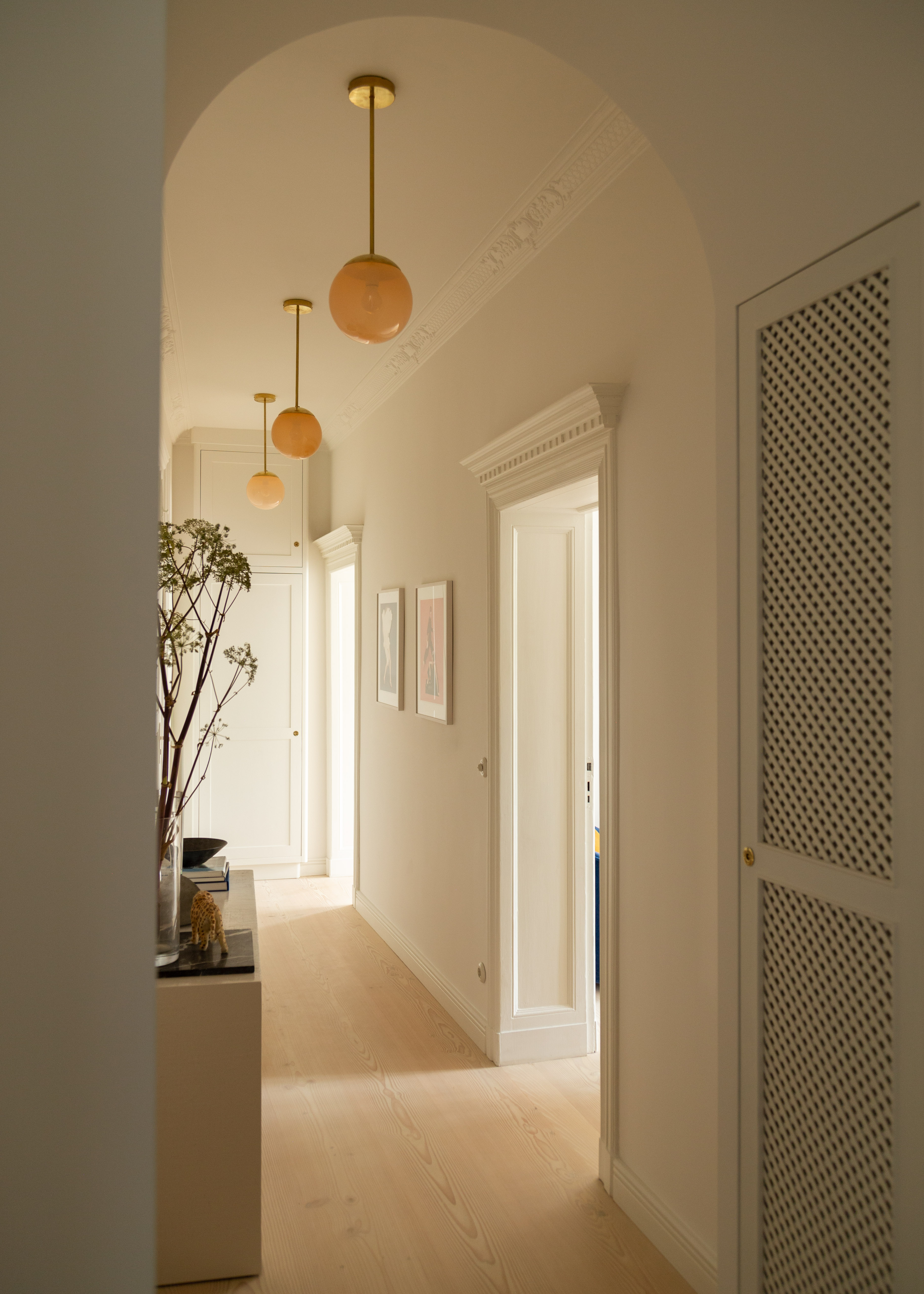
Most entryways, no matter what size are cooler-toned spaces that don't benefit from too much natural light, so if you are opting for a neutral keep it warm-toned. A crisp white might be the first color you think of when decorating a small space – lighter, brighter colors, lighter, brighter room, right? Well yes, when you have plenty of direct sunlight to balance out those cooler shades but in a smaller entryway you want to opt for creamy, yellow-toned neutrals like this soft warm white.
'This apartment had a lot of irregularity and lacked storage. We used a series of arches to hide mechanicals and create coat storage within them. We like the softness and visual rhythm we created through the finishes, pale pink blown glass, and the vintage furnishings.' explains Keren Richter, Co-Founder and Principal Designer at White Arrow.
Keren also notes when choosing a small entryway color, consider the colors of any adjoining rooms too. 'I think there are no rules where it concerns entryways, the bigger question is how it relates to subsequent spaces, if the room is enclosed or connected to others, and if you want to set the tone in a calm or dramatic fashion. We consider sight lines when choosing color and wallpaper and how rooms relate and where your eye will travel.'
2. Greige
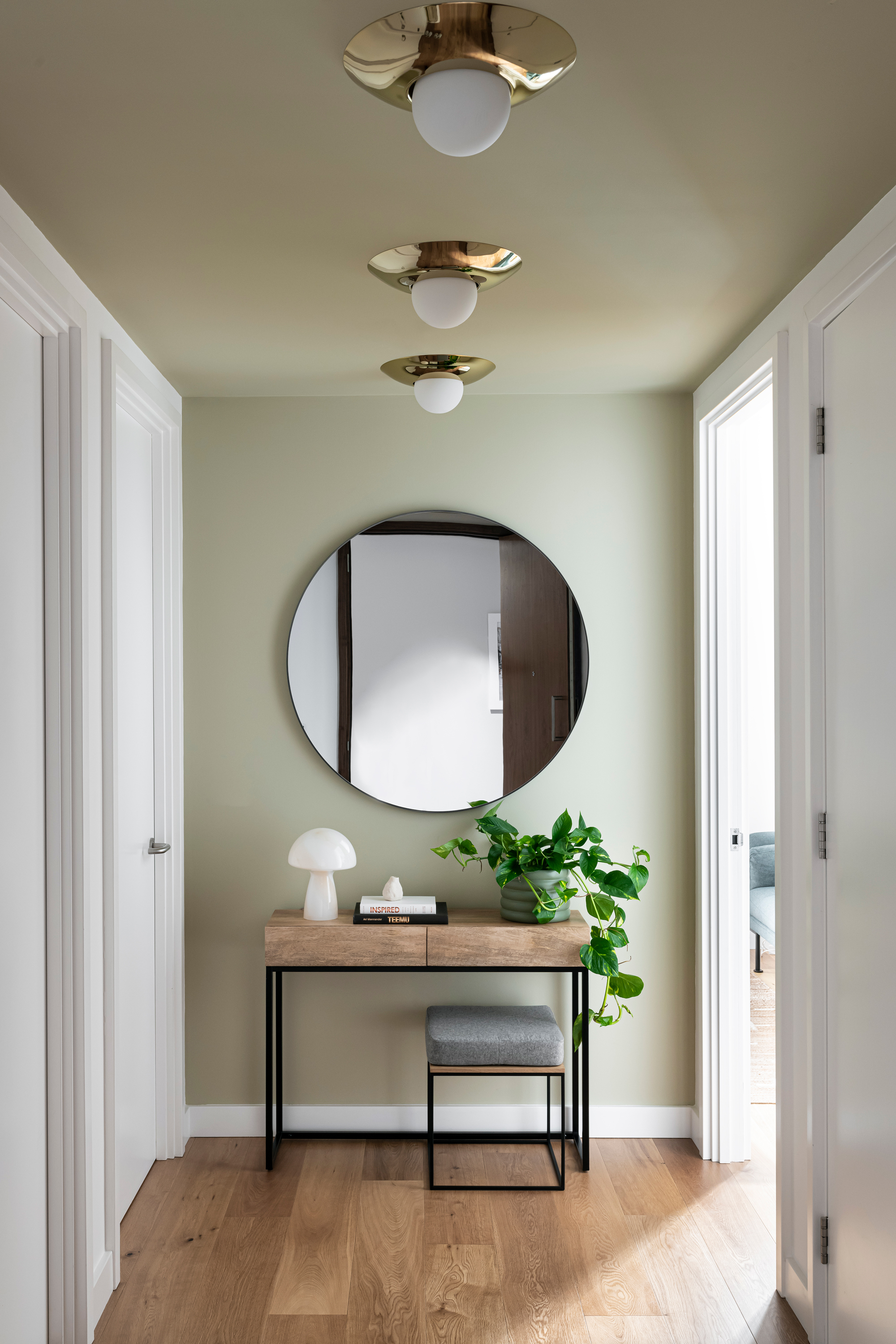
Griege doesn't sound like the most delicious color, but this mix of grey and beige, is the perfect combo for creating a warm neutral. Greige has a little more to it than a creamy white, a touch darker and more grounding, and looks wonderful when paired with pure white woodwork to freshen it up slightly.
'This hallway was empty and love-less as most new-build flats are, so it was our mission to add some interest and create a focal point. Putting this warm Greige color on the ceiling and back wall created an optical illusion that the hallway was longer. The mirror also helped bounce tons of light around and highlight the brass ceiling lights,' explain co-founders of Interior Fox Jen and Marr.
'We would always make sure to consider the amount of natural (or artificial) lighting when deciding on a paint color in a small space. Most entryways are dimly lit and unloved so we try to find a paint color that balances the type of light available,' adds Jen. 'Warm neutrals are an easy place to start as it's a subtle way to create a glow and elevate any artwork within the space. We use a bold or dark color to create visual architecture that may be lacking in a simple space, so consider painting the ceiling and one focal wall or painting larger borders around each door to make them feel larger.'
3. Light green
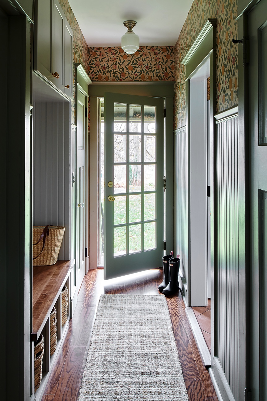
Wallpaper can instantly elevate a small entryway but the key to using busy pattern in a small space is to ground it by choosing a color to make your 'main' shade. Case in point, in this hallway designer Libby Rawes takes a gorgeous floral print and picks out the green in the pattern to use as a solid color on the paneling and woodwork. The lovely soft sage green is the perfect safe color for a small space, and the wallpaper (cleverly used just above eye level) adds character without overwhelming the room.
'I love to amp up the color, pattern, and personality in a small entryway,' says designer Libby. It’s a beautiful way to welcome guests into your home as well as a great place to add additional personality in a small dose. An entryway is often overlooked, but is really such a great place to create a design moment to transition into your space.'
'I chose the colors in this entry space to help transition from the adjoining kitchen and the laundry room as well to the outside. The wallpaper gives a bold pop in the space has a beautiful mix of yellow, and green with a touch of terra cotta that ties in with all the surrounding spaces and helps welcome you outside. Paired with darker wainscoting it creates a lot of character in a small space.'
4. Pale plaster pink
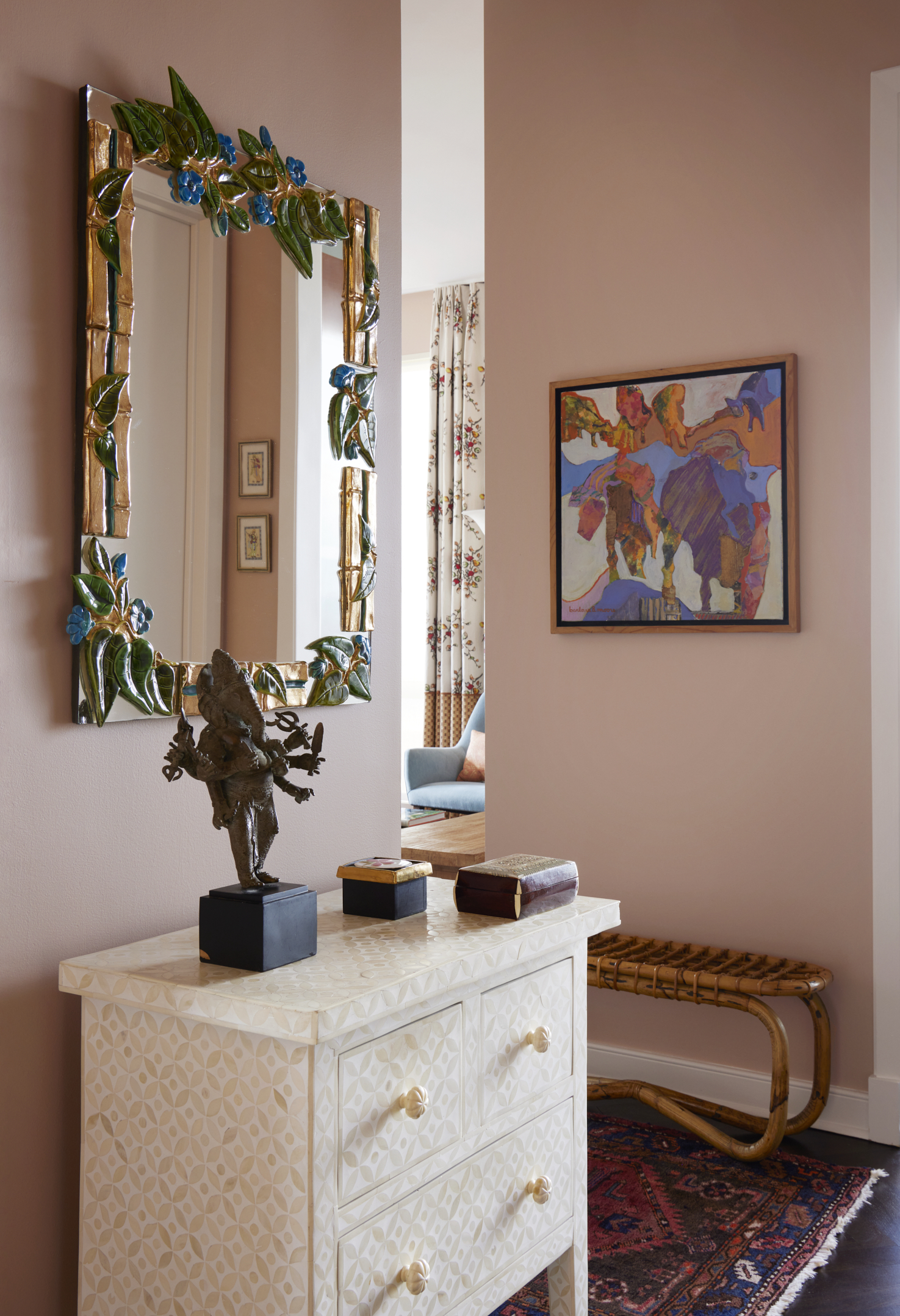
Those pale, plaster, terracotta-esque pinks are such a huge color trend right now, and what we love about these rosy shades is that they are both fun and colorful and yet act almost like a neutral. This makes them the perfect color for small entryways.
This entryway is in the home of interior designer Kati Curtis. The small area manages to reflect the fun and colorful spaces that lie beyond, despite the limited square footage. 'This entry is light and bright with a window that faces due west, so there are spectacular sunsets. The terracotta color reflects the color of the sun setting in the room.' she explains.
That's one thing to note about pink shades, they change so much depending on the light of the space. Kati's space is obviously filled with a lovely warm light, so the pink shows up as warm, but the same hue in a cooler-toned darker space will look bluer. If you are decorating an entryway that lacks direct light, choose a pink with brown undertones and go even closer to the terracotta pinks. Just always be sure to order swatches and see how different pink tones look in your space before you commit to a color.
5. Deep teal
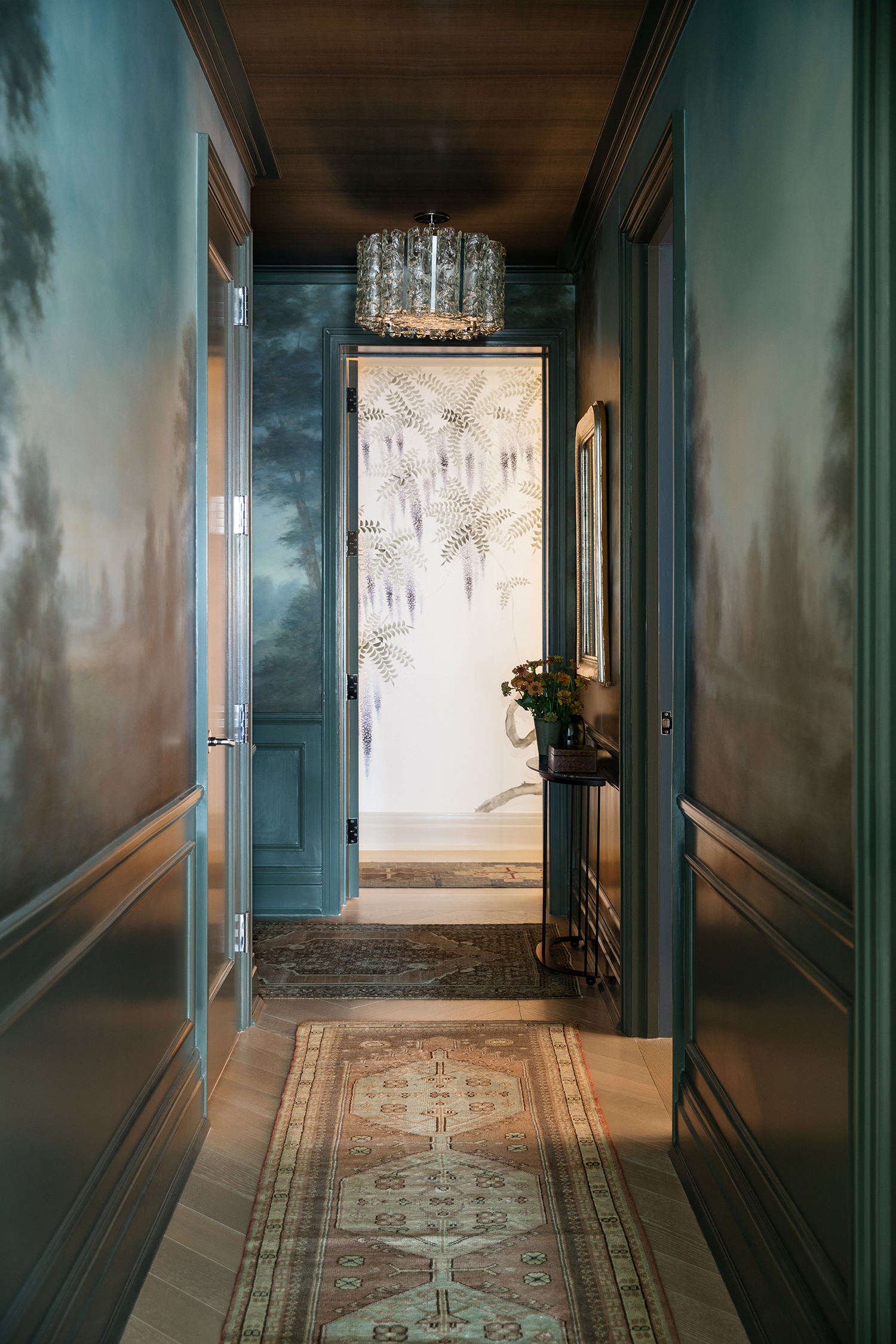
'Don't be afraid to go dark in a small entryway,' says Kati Curtis. 'Many people think that dark colors make a space feel smaller, but it's the opposite - dark colors expand spaces and make them feel more expansive. Make a statement – your entry should set the stage for the rest of your home.'
'This is a dark and narrow entryway. I wanted to open it up visually by adding the moody landscape hand-painted mural. I think of entries like Frank Lloyd Wright did, in that the entry should be a transition point between the outside world and the home. This entry transition from the busy streets of Manhattan to a dark and moody serene scene, and then further into the light and bright open living space.'
6. Moody beige

Neutrals can be dramatic too and in their darker forms can work perfectly in a small entryway. They add warmth and depth, and if you take the color over every surface they can trick the eye into thinking the space is larger. This beautiful velvety truffle hue used by Stelly Selway proves just how interesting an all-neutral color scheme can be in a smaller room.
'This is an Austin, TX craftsman bungalow built in 1915 that is stilted off of a hill and nestled within the tree canopy. When renovating the house, we wanted to neutralize what had previously been a very loud interior space and calm things down,' explains Benjamin Stelly.
'We were inspired by nomadic military camping gear, as it sits quietly within the natural landscape; we chose Behr's Light Truffle to complement both the natural world outside (foliage, sky blue, sunset pinks/oranges) as well as the raw materials (wood, earthen clay, Tuareg reed matting) that we were furnishing the interior with. As opposed to popular opinion, we tend to lean into more sumptuous and full-body color in smaller spaces and let shadow play an important role in sculpting our interiors.' adds Tanya Selway.
7. Dark grey
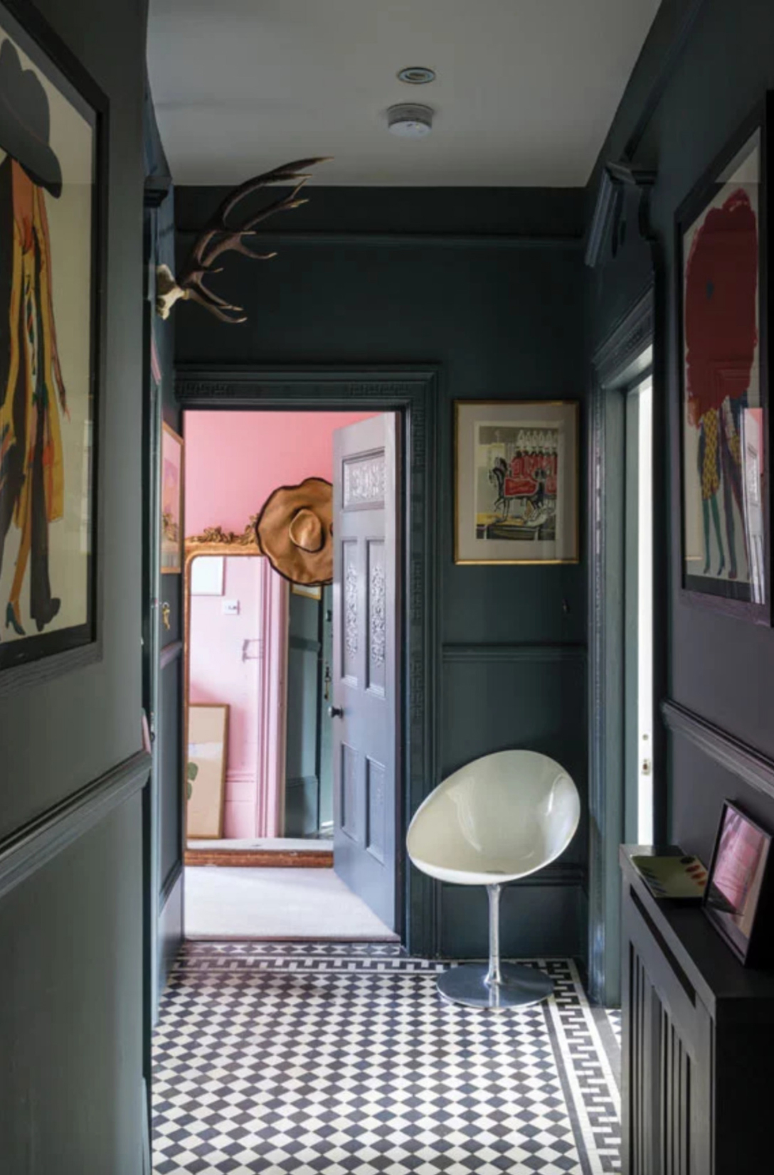
Dark colors can work in small spaces, sometimes they are a better option than lighter colors. Rather than try and fight the limited dimensions and lack of light, lean into them and turn a small entryway into a dramatic (in a very sophisticated way) entry to your home.
'You could play with the limitations of a hallway lacking in light and width, and venture into darkness with a color like Wine Dark which is fabulously dramatic but will make rooms leading off the hall feel lighter and brighter. Beverly, a deep and reassuring green, would be decadently smart and look wonderful paired with a soft white like School House White on woodwork,' suggests Patrick O'Donnell of Farrow & Ball.
Why this dark grey entryway works is because the color is taken over all the woodwork too. This creates that lovely cocooning effect, but it also helps 'expand' the space as it blurs the dimensions of the room. As Irene Gunter advises, 'paint the skirting, coving, and woodwork in either a matching color or a slightly lighter or darker shade. Doing so maximizes the feeling of scale. When things are painted in a matching or slightly different shade, it ties everything together and makes the space feel bigger.'
8. Forest green
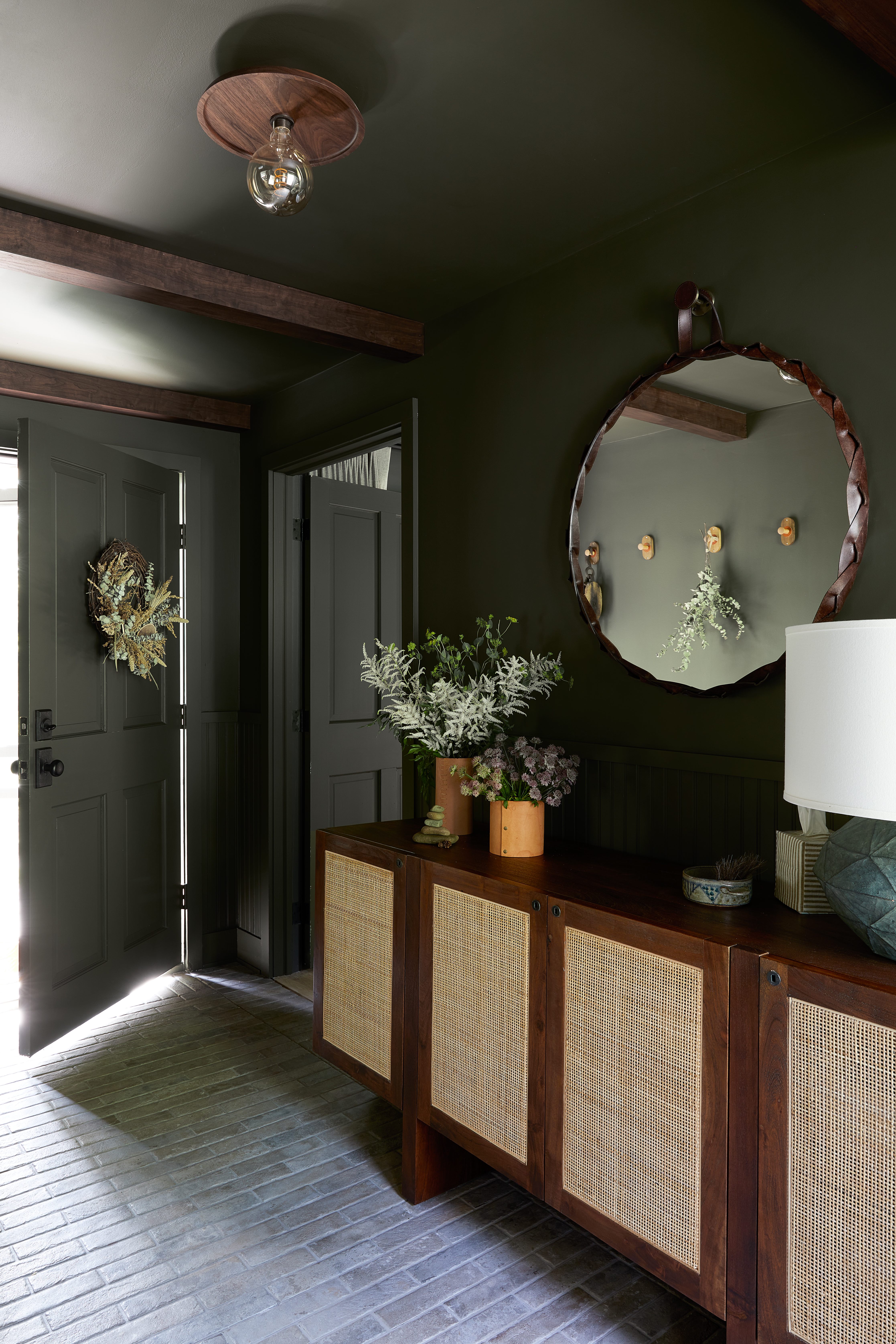
'This is our home in the southern Catskill mountains and I leaned into the forest's palette when selecting colors, quite literally! I took my Benjamin Moore paint fan on a hike around our property and matched colors that were prevalent to create our color story,' explains designer Becky Shea.
'This entryway is painted in Dakota Woods by Benjamin Moore and the rich walnuts and the tile floor provide a moody, relaxing vibe when you arrive home. I opted to paint the base, case, and ceiling in the same color so that the room almost feels like it's hugging you. As with all our designs, bringing nature inside helps to both elevate and soften the space. Fresh flowers are one of my favorites, but if you don't want the maintenance, don't shy away from dried floral bouquets. There are plenty of tasteful ones out there and they'll last a lifetime!'
'When choosing an entryway color consider the natural light and make sure to both check a paint swatch in the area where it would be applied before you buy the paint and also paint a small sample (~1 sq meter) on the wall itself. Once dry, the sample will show you the true color throughout the day as natural light changes so you can be confident in your choice,' explains Becky.
'If you have a snaking hallway, try samples in more than one location before committing. I recommend going with a flat finish in most circumstances due to its durability and ease of touch-up, though for a bit more movement similar to that of plaster, a limewash paint application can seriously elevate any entryway or space.'
9. Creamy yellow
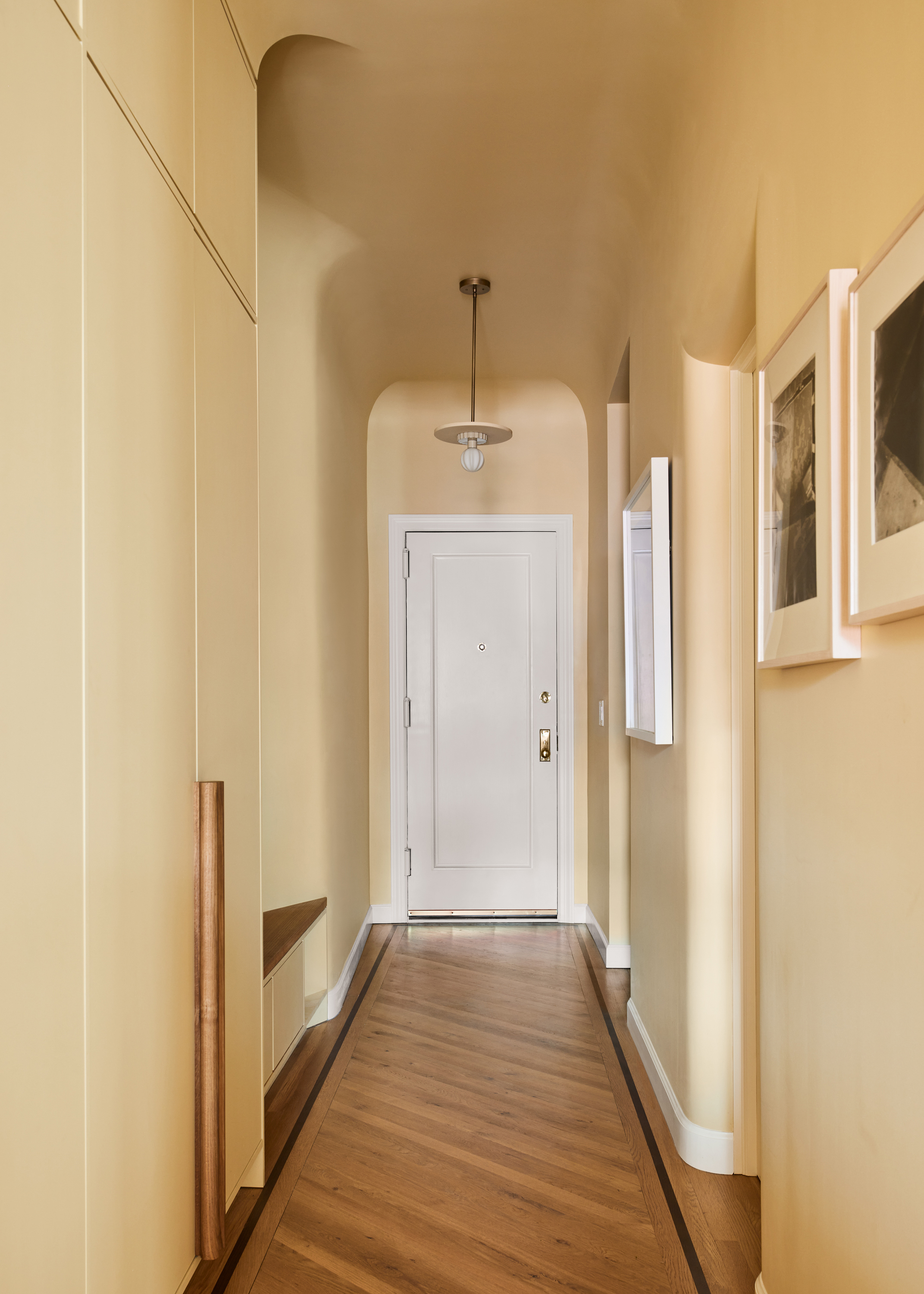
Yellow is such an underrated color, we don't see enough yellow. The interior design world does have a tendency to shy away from decorating with primary colors and while a pure, sunny yellow does have its place, it's understandable this can be a tricky shade to make work in every home. But a creamy, warm, pale yellow? That's a color for any home, any style, and any room. And works especially well in a smaller entryway.
'Embracing color for an entryway is a way to serenely welcome you home. They are the first space you see when entering and for guests, it is an instant preview of what the rest of the house will look like,' say Tal Schori and Rustam Mehta at GRT Architects. 'Entryways show insight to the character of the home and the homeowner’s personality. They are often a chance to be fun and bold, but having one strong design idea is enough. It should not feel busy or overcomplicated as they often become a dumping ground instead of a peaceful transition from the outside world to your home within.'
'Stepping into the apartment one is coming from a corridor with a lot of character including hand-laid decorative marble mosaic floors, a stone base, plastered walls, and charming lighting. We were looking for a color that balanced a bright, welcoming feeling without being in a word ‘white’. We aimed to create a transitional feeling with the coved moldings and warm, light yellow-toned plaster.'
10. Classic grey
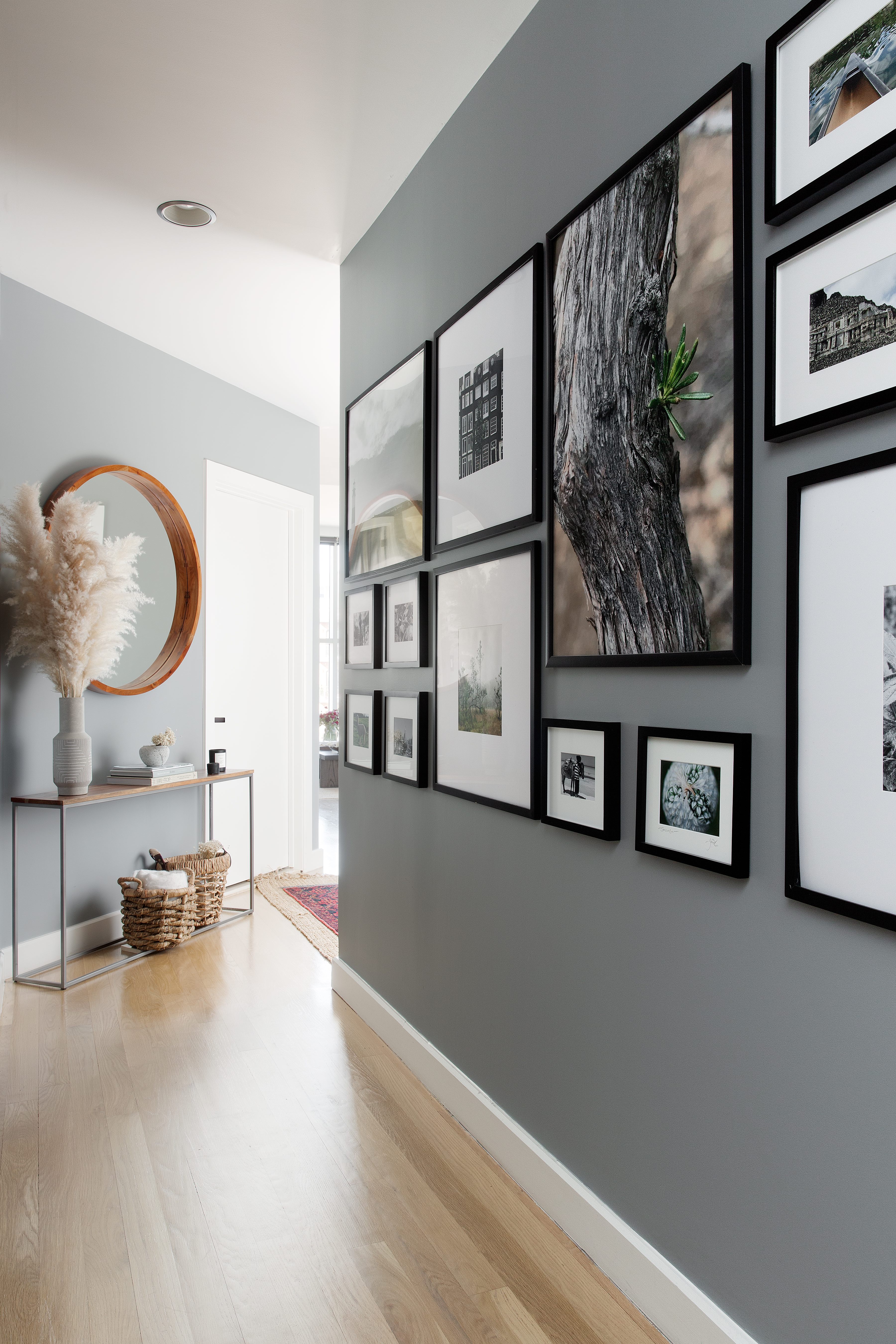
Timeless, elegant, and sophisticated, you just can't go wrong with a classic mid-grey. And it's a perfect shade for an entryway as it immediately invokes a feeling of calm and serenity, exactly what you are after when you enter a home. Contrast with some fresh whites and warm up the cooler tones with plenty of natural textures and wooden accents as seen in this hallway designed by Becky Shea.
'Our entryway provided the perfect opportunity for a gallery wall, which actually features only images taken by us. Neutrals meld seamlessly alongside rich, dark accents, creating a timeless, but cool aesthetic. Tones in a similar vein I'm really enjoying these days are Dolphin and Classic Grey by Portola Paints. Both are paint colors that bring a soothing feeling and neutral backdrop to any size entry,' explains Becky.
'I've been a big fan of painting the base molding the same color as the wall in recent years because it helps to elongate the space and provide the illusion of higher ceilings, especially in a smaller entryway. Someday we'll get around to completing that here! Other tried and true entryway colors I love that are moodier are Benjamin Moore Iron Mountain 2134-30, Graphite 1603, and Ashwood Moss 1484.'


