An international collaboration between over 100 astrophysicists has led to the creation of the largest 3D map of the universe to date. The map was put together by the Baryon Oscillation Spectroscopic Survey (eBOSS) team, which worked in groups to research, report, and compile over 20 years of analyses of our ever-expanding universe. Announced over the weekend by eBOSS's parent organization, Sloan Digital Sky Survey (SDSS), the resulting map not only details over two million galaxies and quasars, but also pinpoints the parts of space we don't know about — the places hidden by the Milky Way, for example, as well as the history of the expansion of the universe.
"We know both the ancient history of the Universe and its recent expansion history fairly well, but there's a troublesome gap in the middle 11 billion years," said cosmologist and team lead Kyle Dawson in a statement.
"For five years, we have worked to fill in that gap, and we are using that information to provide some of the most substantial advances in cosmology in the last decade."

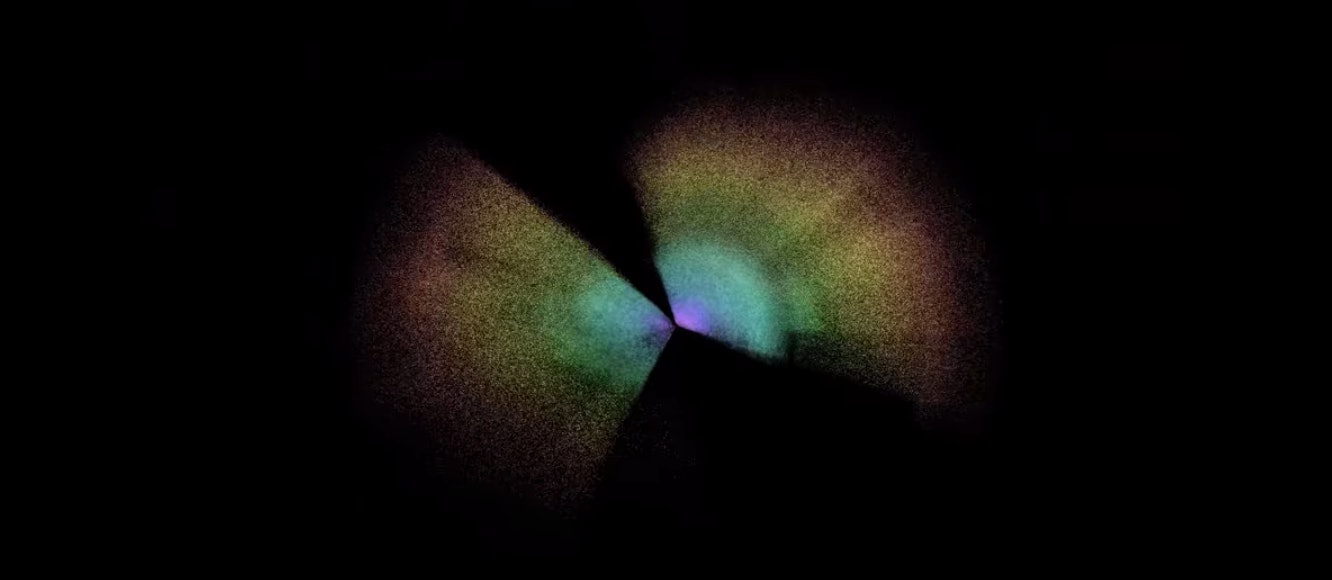
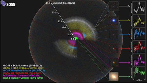
The map looks like a big soap bubble reflecting a rainbow of colors at the center and along its outer surface. The inside of the bubble looks fuzzy with specks, but don't mistake them for dust: These specks represent millions of galaxies and quasars.
Our galaxy, the Milky Way, is located in the center. Each section of color on the map represents a different class of galaxies that were studied during various periods of time noted in a colorful key at the bottom left of the map. In a column along the right of the map are examples of the typical galaxy you'd find in each of these sections.
The areas that have no color — the parts of the rainbow center that appear to have a large, pie slice cut out of them — are parts that scientists can't see because they're blocked by our own galaxy.
The 3D map provides more than just location data — it also gives us more info about the history of the universe. Whenever we see a star in the distance, we're basically time traveling. Light can only go so fast and the distance of the star is so great that by the time the light reaches our eyes the image we see is already an outdated picture of the star. So the location of galaxies in the colorful areas of the map not only denote the types of groups studied, but also gives researchers an idea about the expansion rate of the universe during its history.
They're like the rings of a tree trunk, in a way. When you look at the rings inside a tree, you can see the history of its environment — whether one year had a drought or a rainy season — as it grew. A similar concept applies to the expansion of the universe.
This constant and accelerating expansion is called the Hubble Constant — a phenomenon predicted to be caused by either a mysterious 'dark energy' in the universe or through Einstein's theory of general relativity. The vast amount of data used to create the map has also put a spotlight on previous measurements that don't seem to match very well, which calls for more research to figure out where the discrepancy lies.
"Only with maps like ours can you actually say for sure that there is a mismatch in the Hubble Constant," said Eva-Maria Mueller, lead interpreter of the SDSS sample results. "These newest maps from eBOSS show it more clearly than ever before."
But the mysteries surrounding dark energy and the Hubble Constant mismatch will be left for future projects or other research teams to ponder over. For now, eBOSS and SDSS will move on to the next phase of mapping over the next 20 years.
"These studies allow us to connect all these measurements into a complete story of the expansion of the Universe," stated Will Percival, eBOSS’s survey scientist, in a press release. The research team is already working on building the equipment they need to continue their study of the history of our universe.


.png?w=600)


