It might seem that the Twitter logo in its current form has been around forever. The blue bird design is well known and has even survived Elon Musk's takeover of the social media platform – at least for now. But the original Twitter logo was very different indeed.
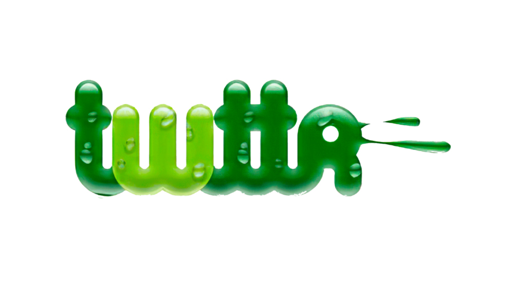
While Twitter is now synonymous with blue – in more ways than one after the rollout of the Twitter Blue paid verification service, the brand's colours were almost a soapy, slimy green complete with a water droplet effect, for some reason. Here we take a closer look at the Twitter logo history from 2005 right through to the present day. To learn more about logo design, see our guide to how to design a logo. And for more social media logo histories, see our pieces on the YouTube logo and the TikTok logo.
The first Twitter logo: 2005 – 2006
Is this the logo for a detergent? A sewer-based platform video game maybe? No, bizarrely this is the first Twitter logo. Quite a few of the tech and social media giants we know today had very different logos before they came to be well known (just see the Google logo for another example). The Twitter logo is another such example. This logo never made it into public use, and we think that's just as well.
Twitter was founded by Noah Glass and Evan Williams, who ran the San Francisco-based RSS-syndicated audio and video directory Odeo, Biz Stone and Odeo employee Jack Dorsey, who came up with the idea for what was originally planned as an internal messaging system for the company.
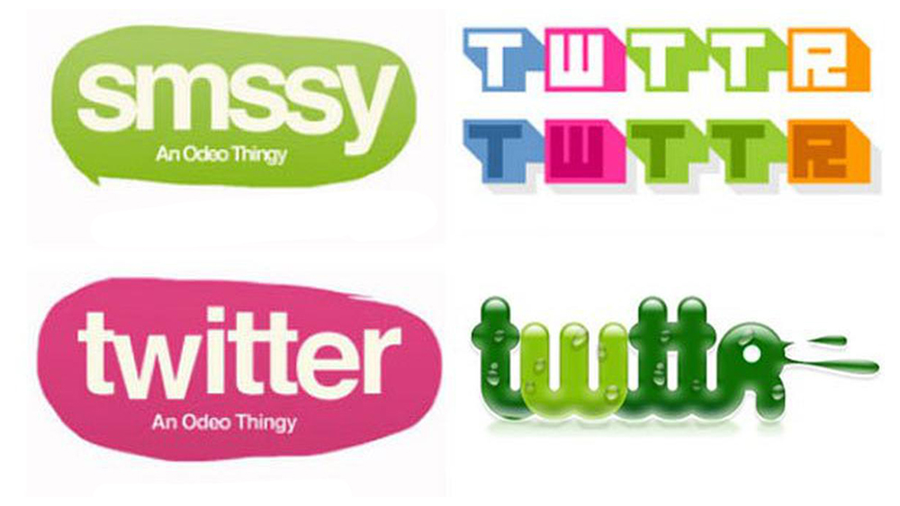
One surprise in the early logo designs – apparently created by Stone himself – is the name. Originally Twitter was going to be called Smssy (yes, really), and then Twttr. Several designs had the tagline 'An Odeo thingy'. The first tweet posted on March 21, 2006, was a message from Dorsey that read “Just setting up my twttr".
The first official Twitter logo: 2006 – 2010
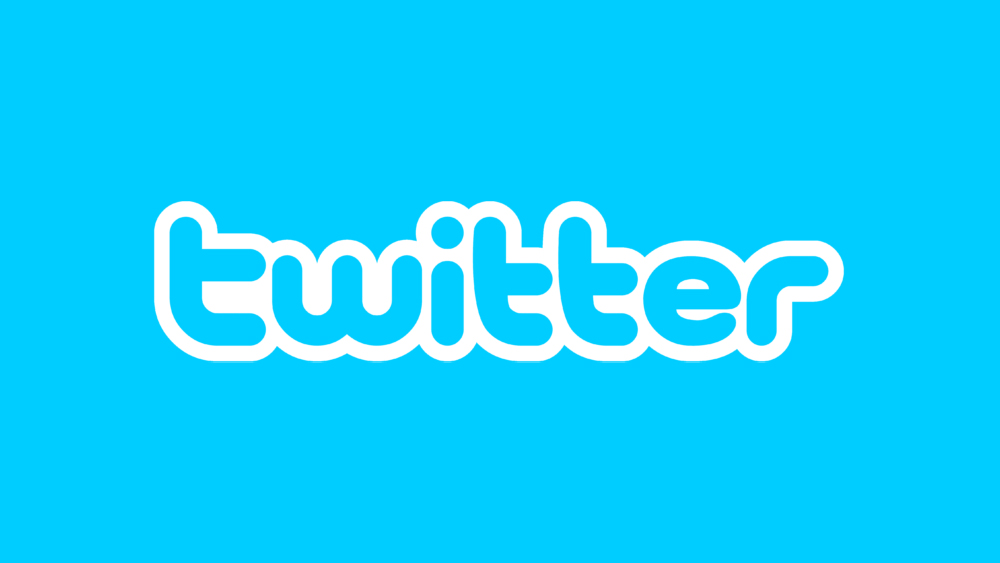
The first official Twitter logo to reach the public showed the final name “Twitter” in light blue. The font was designed by Linda Gavin, with smooth, rounded sans serif shapes that merge together, with a white outline creating a bubble-like effect. It was very much of its time. The company also bought a small graphic symbol of a light blue bird from Simon Oxley on iStock for $15. Named Larry after the basketball player Larry Bird, this wasn't part of the logo initially (something prohibited by iStock), but it appeared as an icon on the website.
The Twitter logo evolution: 2010 – 2012
Based on the existing bird image, Biz Stone designed a bird that Twitter could call its own. It had wings, a large white eye, and a sharp tail. He passed the idea on to designer Philip Pascuzzo, who took it up and, along with Douglas Bowman, refined the design, creating a bird that Twitter could add to its logo. The logotype was also updated and simplified with the slightly childish-looking white outline removed from the type.
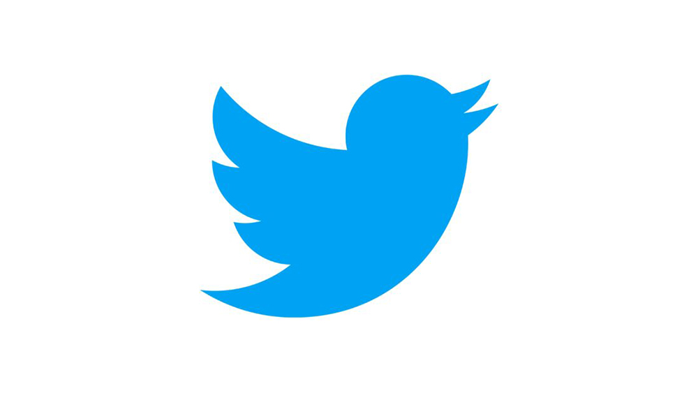
The Twitter logo today: 2012 – present
Finally, by 2012, the Twitter bird logo had become so well recognised that the company decided it could stand alone. It had reached the status of the Nike swoosh. The word 'Twitter' was removed from the logo, the blue colour was changed to #1da1f2 and the bird was refined by Martin Grasser in what was one of his first jobs after graduating from the Art Center College of Design.
Grasser is said to have drawn at least a thousand birds before achieving the proportions and simplicity he wanted. He sent Jack Dorsey 24 sketches, and Dorsey chose the winner (numbered '5CS', apparently) without a moment's hesitation. The Twitter logo design does not represent any specific bird, but Grasser has said it was inspired by a hummingbird beating its wings.
The shape is much more circular than a real bird – in fact, the design was formed by 15 circles superimposed in layers on top of each other, creating perfect curves in the beak, head, wings and chest. The bird is looking upwards, to represent hope, freedom and development, while the circles used to create it are said to represent connecting people and ideas.