It's been 50 years since Abba won the 1974 Eurovision song contest with Waterloo and were catapulted to international pop stardom. Accompanying them on that journey was the Abba logo, one of the best band logos in history.
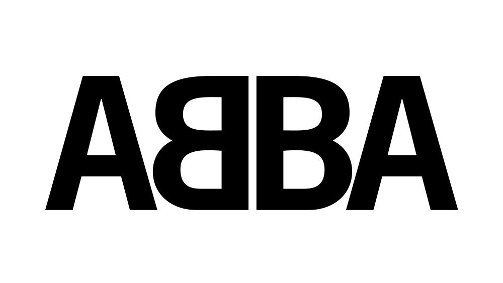
The current Abba logo is unmistakable with its mirrored 'B'. It feels times, and indeed, it's been around for most of the band's career. But it went through a lot of changes in the early years before the band settled on the ambigram we know. Here we look back at those changes and how Eurovision's most famous winners came to have an iconic brand identity (see our pick of the best Eurovision logos for more inspiration).
The Pre-Abba logo
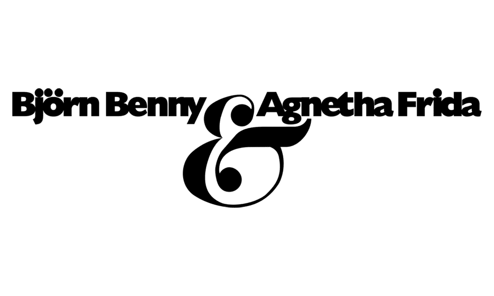
Founded in Stockholm in 1972, ABBA is a four-piece supergroup comprising Agnetha Fältskog, Björn Ulvaeus, Benny Andersson, and Anni-Frid Lyngstad. The group first performed and recorded under a moniker that was combination of their names: Björn, Benny, Agnetha and Anni-Frid, or Björn, Benny, Agnetha, Frida, with a logo to match.
The first Abba logo
It was soon decided to abbreviate the band's name to Abba, which was the first letters of the members' first names arranged as a palindrome. The logo above appeared on their first album, Waterloo, which was released in 1974, the same year that the single of the same name won Eurovision.
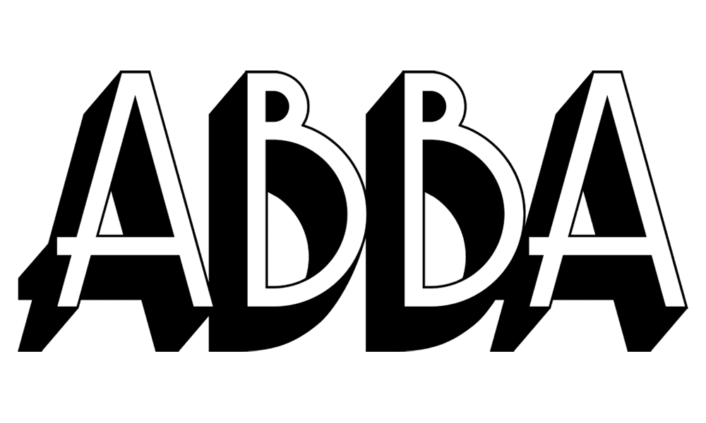
Abba logo variations
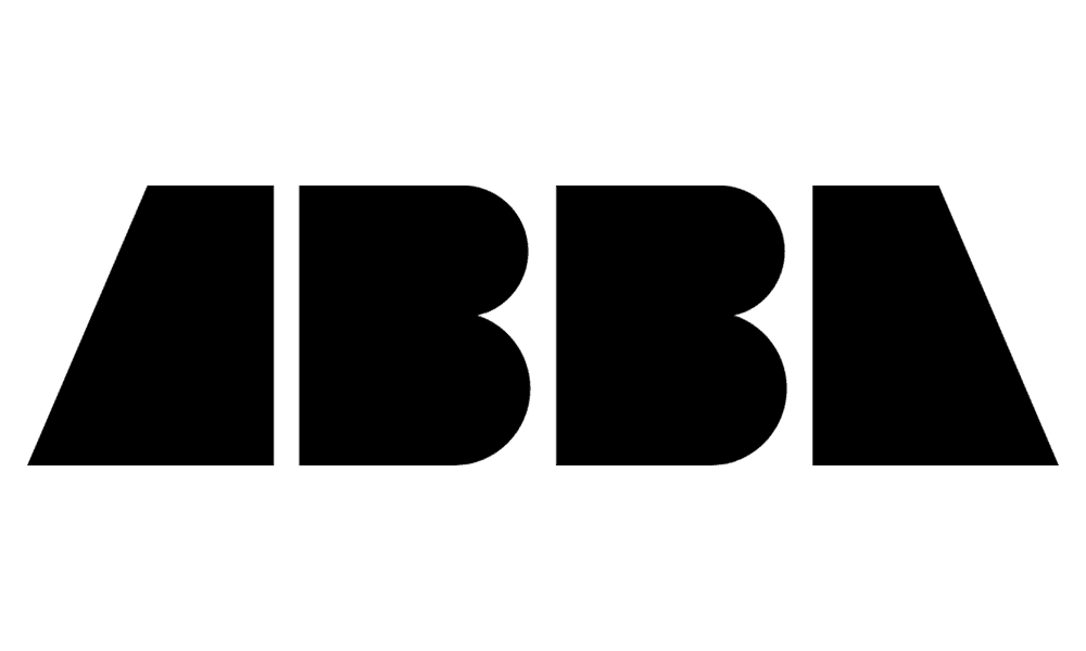
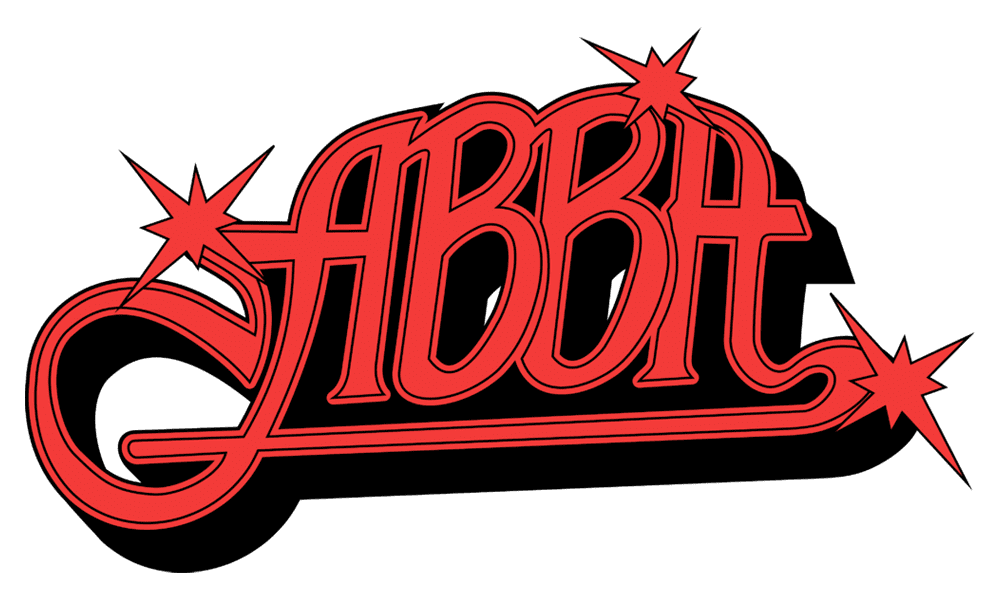
As Abba rocketed to stadom over the next two years, the band experimented with several logo designs between 1974 and 1976. Some were used on a single release, while others were used several times, sometimes concurrently.
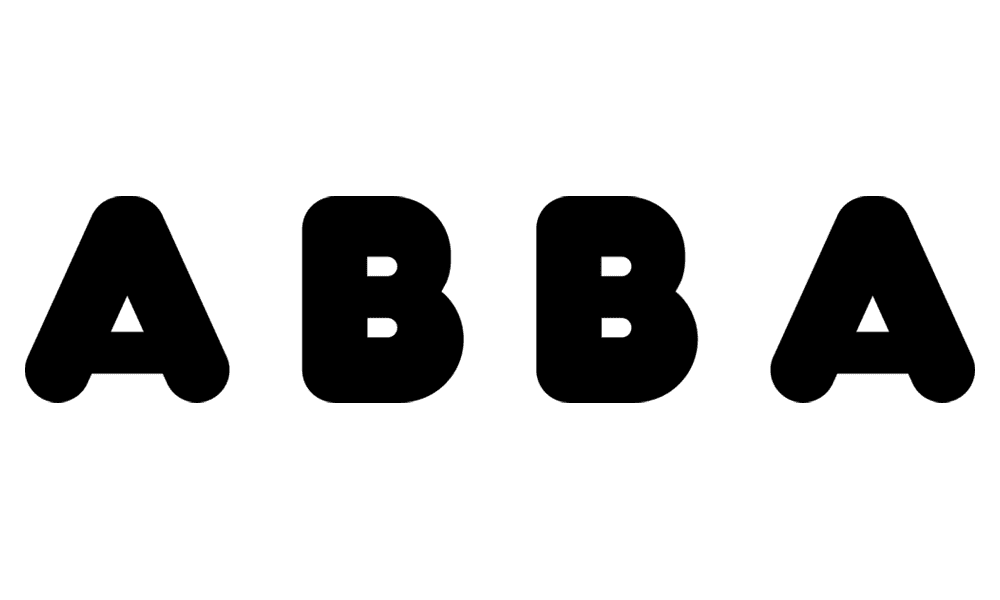
The Abba ambigram
In 1975, the release of Honey Honey was accompanied by the first use of the mirrored B. The bands name was already a palindrome, now it became an ambigram too, reading the same in both directions.
It's said that the idea came up during a photoshoot for a teen magazine called Bravo. The band were wearing velvet jumpsuits, obviously, and they each held up a sheet with initial letter of their name. But when he developed the shots, the German Wolfgang “Bubi” Heilemann discovered that Benny Andersson had reversed his letter 'B'. Heilemann recommended keeping it, which led Rune Söderqvist, who designed most of ABBA's record sleeves, to experiment with using it in the band's logos.
The Abba logo we know
The version of the the Abba ambigram logo that we know today first appeared on the French compilation album, Golden Double Album, released by Disques Vogue in May 1976, and it's been used on most releases since then.
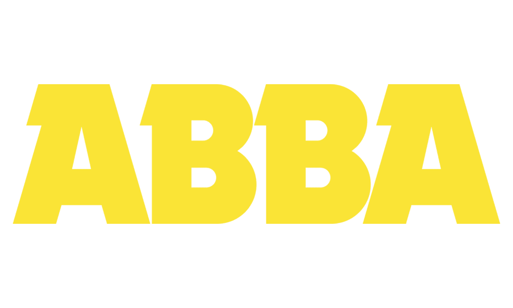
The Abba Gold logo
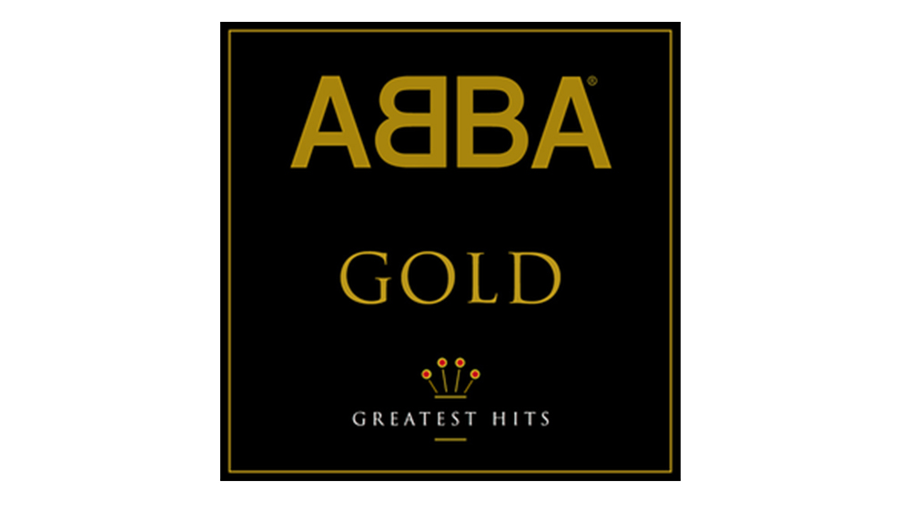
PolyGram used some variations after it bought the band's back catalogue, including using a different font for the 1992 Abba Gold: Greatest Hits compilation. However, the logo reverted back the classic design after Seagram's Universal Music bought PolyGram in 1998, including in later editions of Abba Gold.
For more design classics, see our pick of the best logos of the 1970s.