The best logos of the 1950s might be dated, but they still inspire graphic designers today. That's partly because the '50s were in many ways a time of profound cultural transformation and unabashed optimism. Emerging from the shadow of the Second World War, this colourful decade ushered in an era of post-war prosperity, cultural renewal and iconic design.
As the world embraced the promise of a brighter tomorrow, graphic design (known back then as 'the graphic arts') became more important to the creation of products, packaging and advertisements. With consumerism sweeping across the Western world, branding became less of an afterthought and more of a commercial imperative.
Visually speaking, the '50s were a time when sleek, futuristic aesthetics met the comforts of suburban living, and the results were typically a fresh blend of classic elegance and modern flair. In short, the best logos of the '50s were emblematic of a society bursting with confidence and creativity. We hope our selection, picked by a range of experts, inspires your own logo projects and if so, take a look at our guide on how to design a logo and check out our top picks for the best free logo makers.
The best logos of the 1950s
01. Lego
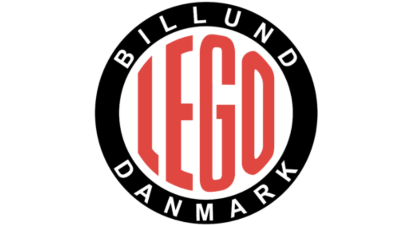
For half a century, Lego has been known for making plastic toy bricks, which encourage both kids and adults to express themselves and be creative in three dimensions. (If you're among them, see our guide to the best Lego sets). But it wasn't always this way.
Founded in 1932, the Danish company originally made wooden blocks. But after the Second World War, that all changed. "In a landscape of mass production, a lack of wood, and sudden availability of plastics in Denmark, the company’s moved to making the plastic bricks we know today," explains Marina.
"Then in the 1950s, the company marked the occasion with a logo that embraced the essence of the mass production age. This design moved away from the previous freeform italic typeface, to an industrial sans-serif wordmark that evoked a sense of accuracy and precision."
02. CBS
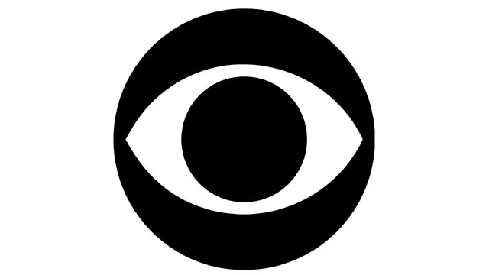
The US broadcaster CBS began life as a radio network, founded in 1927 as the Columbia Phonographic Broadcasting System (CPBS). A year later, it was rebranded as the Columbia Broadcasting System, and eventually became one of the Big Three American broadcast TV networks.
The CBS 'eye' logo is today known around the world thanks to globally syndicated programmes ranging from M*A*S*H to NCIS. It was designed by William Golden in 1951, creative director of the broadcaster’s advertising and sales promotion department.
"This logo was directly influenced by the ‘all-seeing eye’ hex symbols painted on the Shaker barns of Pennsylvania Dutch Country to ward off evil spirits," explains David Nathan Davies, design director at Design by Structure. "Both the concept and execution are simple, easily understood and perfectly suited to represent the visual medium of television."
Mario Kerkstra, creative design director at AMV BBDO, is also a fan. "One of the world's most recognisable logos, it embodies clean and modern design and is one of my personal favourites," he enthuses. "Most of all, I love its simplicity. The idea of using an eye to symbolise CBS ‘looking at the world’, combined with its black and white execution, makes it such a simple and powerful symbol.
"It’s also quite remarkable that over time it’s been applied in so many different ways without ever losing its identity and original intention," he adds. "The fact that the CBS eye has been unchanged since its release in 1951 is a pretty good indicator of its success and timelessness as an iconic logo."
"I love this logo," agrees Stuart Radford, executive creative director of Design Bridge and Partners. "It’s a masterclass in graphic design and achieves everything an iconic logo needs to.
"Simple. Tick. The immediacy of the eye makes a perfect symbol for the TV station. Unique. Tick. Reductive and stylised, it’s beautifully economical, there’s nothing you could remove – more importantly, there’s nothing you’d want to. Timeless. Tick."
Now in its 72nd year, this logo is seemingly nowhere near retirement. "Interestingly it was initially designed to be a campaign symbol to emphasise the station's focus on world news," notes Radford. "However, it proved so flexible and popular that the station adopted it as their symbol. They probably had no idea that it would become such an icon."
03. NASA
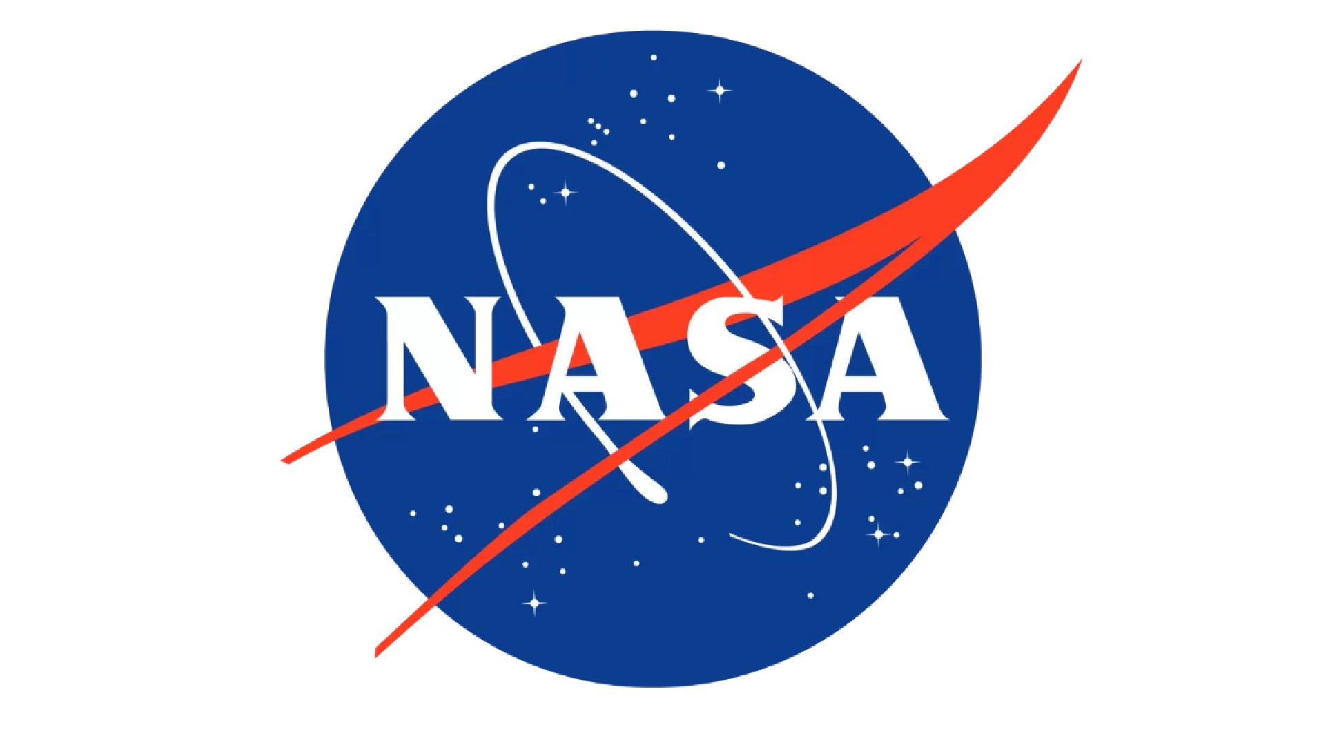
We tend to associate NASA, the National Aeronautics and Space Administration, with the 1960s when it achieved its historic goal of landing the first man on the moon. But the agency was first established by President Eisenhower in 1958, sporting a logo that would become truly iconic.
What's known internally as the 'meatball logo' – to distinguish it from the later wordmark, dubbed the worm logo – was designed by George Neago, an industrial artist working for the Lockheed Corporation's Missile Division in Palo Alto, California. His logo was selected in a graphics competition as the winning entry, then NASA updated it with the addition of a red vector. (The use of red, white and blue made the logo look suitably patriotic.)
"The NASA logo, much like the moon it aims for, rocketed into the design scene," says Petra Seiler Albrektson, executive creative director at B-Reel. "In an era of black and white conformity, NASA's futuristic insignia served as a cosmic burst of inspiration. With its sleek rocket and orbiting stars, it's emblematic of the space race – a logo that's truly out of this world."
04. Campaign for Nuclear Disarmament (CND)
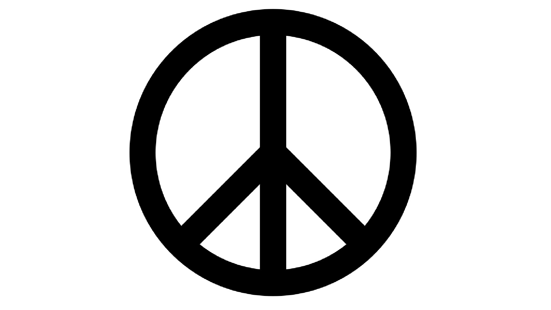
Nuclear weapons may have ended the Second World War in 1945. But the rise of the Cold War and the resulting nuclear arms race meant that for the first time, the survival of humanity as a whole was realistically under threat. And so many in Britain felt these weapons be put beyond use, and that we shouldn't wait for either our allies or enemies to do so.
Davies takes up the story. "In 1958 the first large-scale anti-nuclear march took place between London and Aldermaston in Berkshire. Gerald Holtom, a professional designer and graduate from the Royal College of Art, was responsible for designing the banners and placards protesters would carry. The symbol he created is bold and authoritative, constructed from three thick lines set in a circle that demands attention.
"The distinctive shape comes from the semaphore from the characters ‘N’ and ‘D’, representing nuclear disarmament. Holtom later wrote that he was inspired by Francisco Goya’s ‘The Third of May 1808’ painting, showing an individual in despair, with arms outstretched before a firing squad. In the 1960s the symbol was adopted by the American anti-war movement and later became a signifier for world peace: a true testament to the power of Holtom’s design."
These days, the CND symbol has spread beyond the specific issue of unilateral nuclear disarmament, and become a general symbol for the peace movement. In fact, it's probably the most widely used protest symbol in the world.
It's also become a fashion staple, harnessed by big brands like Gucci and Yves Saint Laurent, in ways that prompted the V&A's Christopher Breward to speculate in The Guardian that "Holtom is probably spinning in his grave now".
05. Pepsi
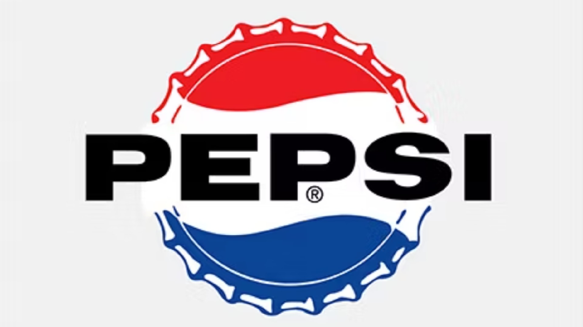
Are the cola wars purely about the taste of the drink? We'd argue that branding, too, has played a huge role too in the century-long fight between the two major rivals. And when it came to logo design, the 1950s was a pivotal period for Pepsi.
"For the first half of the century, the brand's logotype went through several iterations of swirly red typography that closely mimicked their largest rival, Coca-Cola," explains Oliver Maltby, executive creative director at Interbrand. "However, in the 50s Pepsi launched a new bottle cap to evoke patriotic feelings post-World War Two. The introduction of the red, white, and blue wave has now evolved to become an iconic design language that is now instantly recognisable across the world."
In short, this was the era Pepsi truly started to distinguish itself visually from Coke. "Its iconic circle logo, with its red, white, and blue colour scheme, helped move it away from its red rival and start to create its own design language," says Wayne Deakin, global principal at Wolff Olins.
And there's a broader point to be learned here. "It showcases the importance of adapting to the zeitgeist," Deakin notes. "Throughout its history, Pepsi's consistently updated its logo to remain relevant, but kept its core coming from a shared place. This willingness to embrace change while holding onto sufficient core culture is a valuable lesson for modern designers, emphasising the need to stay attuned to cultural shifts and evolving design trends."
06. Playboy
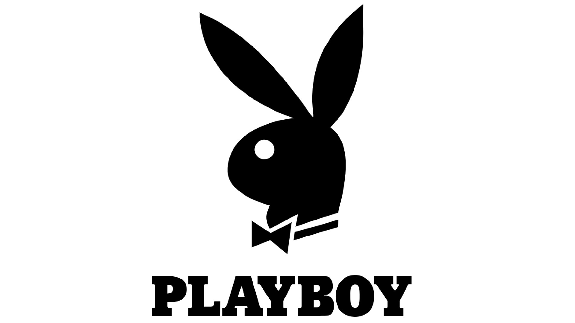
Founded in Chicago in 1953, Playboy was an American men's lifestyle and entertainment magazine that caused shock, outrage or excitement (depending on where you stood) with its centrefolds of nude and semi-nude models. It reached its peak in the 1970s, after which it gently declined under competition from the more pornographic magazines it had paved the way for.
The print version was closed in March 2020 and the publication went online only. But as a brand it remains fantastically valuable, thanks to the instant recognisability of its logo, which was originally designed by Art Paul and today adorns everything from clothing to perfume.
"Playboy is controversial and on the decline, but the bunny has been iconic for over half a century," says Tom Hume, associate creative director at Re, part of the M&C Saatchi Group. "It has everything you need to be memorable: a simple yet distinctive silhouette, a playful idea true to the brand and a disregard for stylistic clichés. As a result, the bunny has been living rent-free in consumer minds since 1953."
07. Levis
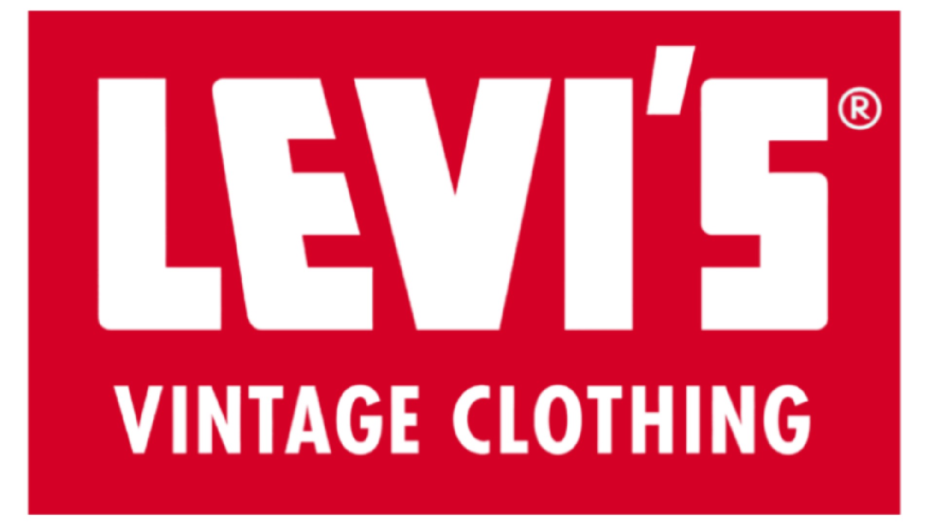
It's one of the great ironies of history that the California gold rush in 1848 lured around 300,000 people to California... but almost no one made money from finding gold. Many did make fortunes, however, servicing those newcomers and they included Levi Strauss and Jacob Davis. These entrepreneurial tailors quickly built a reputation as makers of denim that was sturdy, well–stitched and could survive tough working conditions.
In order to distinguish their own product from low-quality rivals, branding was vital. And since 1853, Levi’s has distinguished itself through a series of unique logos, including this striking white-on-red wordmark, which debuted in 1954.
"Imitation is the sincerest form of flattery," says Warren Beeby, chief creative officer at Rankin Creative. "Having established themselves as the best quality overalls money can buy – perfectly expressed by the horse-pull hallmark – copycat brands prompted the introduction of the Red Tab. A perfect combination of colour and form that’s differentiated it from the rest for nearly a century."
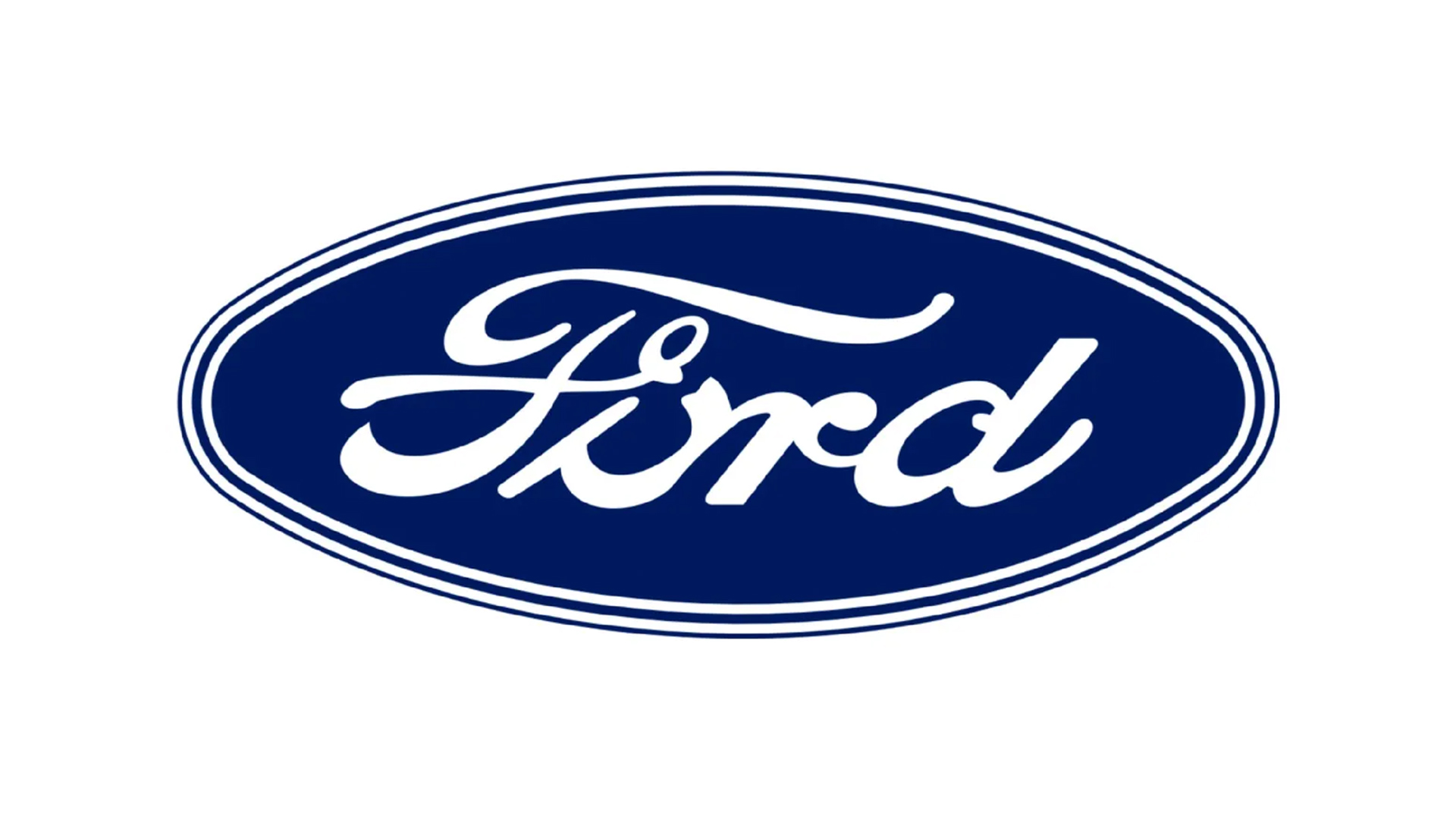
08. Ford
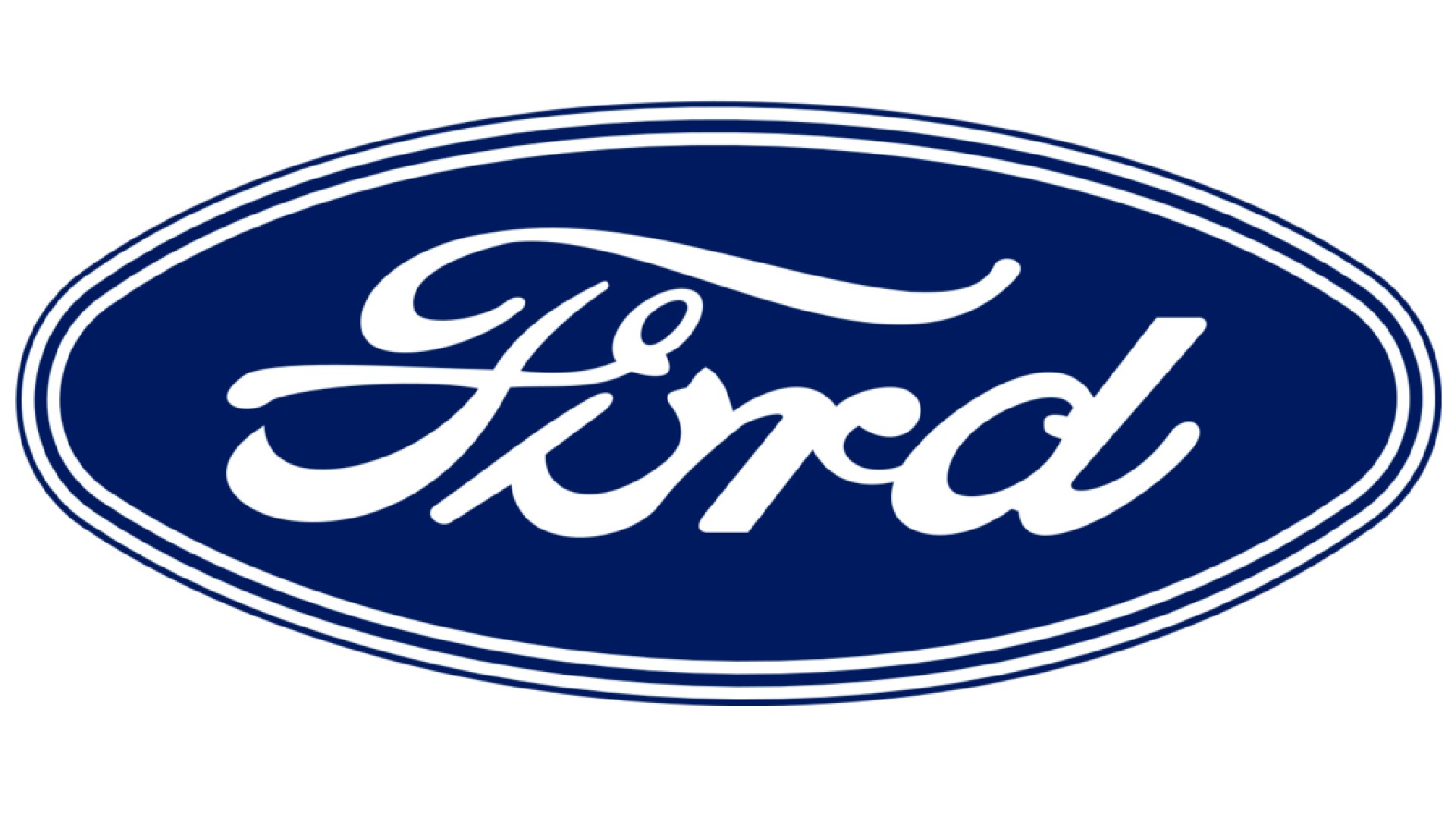
Founded in 1903, Ford changed the way the world manufactured not only cars but all types of goods. It was an ethos neatly summarised by founder Henry Ford much-quoted witticism: "You can have any colour you want, as long as it's black". Today, the company remains the second-largest US-based automaker (behind General Motors) and the sixth largest in the world.
"The classic Ford logo as we know it today, with the oval and script, emerged in the 1950s when it moved from a black-and-white brand to a Ford-blue brand," explains Deakin. "With only occasional tweaks this oval logo, with its scripted name, has been a hallmark of American automotive excellence ever since.
"It's a prime example of how a well-established brand can leverage heritage while still embracing modernity," he adds. "Designers can draw inspiration from this logo's ability to strike a balance between tradition and innovation while also embracing the logo as a useful physical identifier."
09. Pan Am

Founded in 1927 by two former U.S. Army Air Corps majors, Pan Am became the first American airline to fly worldwide and pioneered numerous innovations, including the use of jumbo jets and computerised reservation systems.
Although the company ceased operations in 1991, it remains an icon of 20th century history. And its circular logo, created by Charles Foreberg, Edward Barnes, and Ivan Chermayeff in 1955, remains a design classic.
As Marina Mylonadis, product designer at This Place puts it: "The Pan Am logo was emblematic of the 50s era. Angular, sharp serifs rang true with the modern movement seen across all design and architecture. Stepping away from the art deco pre-war era where designs were intricate and delicate, Pan Am moved towards clean lines, angular serif fonts and a bold, vibrant blue colour palette.
"In a time of rapid globalisation, the globe that had no borders was charged with optimism, marking the start of a new age of air travel," she adds. "This iconic logo resonated so much with its consumers that the design remained largely the same following this 50s redesign."
10. Braun

In the 1950s, Braun were kind of the Apple of the day; known for designing electronic gadgets that were both beautifully designed and very user friendly. And the minimalist aesthetic that made their products super-distinctive was also represented in their branding, including this 1952 logo designed by Wolfgang Schmittel.
Maximilian Brenner, senior strategist at This Place, takes up the story. "Schmittel simplified the Braun logo using stripped down, geometric forms," he explains. "His work reflects an era when designers focused on industrial production using straightforward tools like compasses and rulers. Braun's early products followed the same philosophy: they were 'simple, useful, and built to last,' creating a sense of cohesion across the brand’s products and communications."
11. IBM
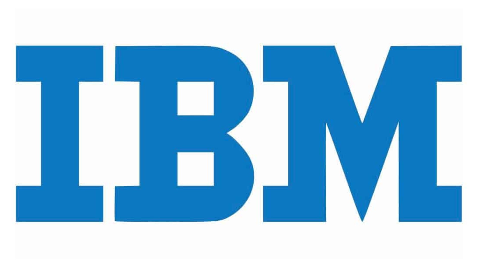
Long before Apple and Microsoft emerged, big tech was dominated by IBM. Founded in 1911 as a manufacturer of record-keeping and measuring systems, it was renamed International Business Machines in 1924 and soon became the leading manufacturer of punch-card tabulating systems.
Later the company moved into electric typewriters, calculators and personal computers, and by the 1960s and 1970s, it was producing 80 percent of computers in the US and 70 per cent of computers worldwide.
IBM's most iconic logo is the current, eight-bar logo designed in 1972 by graphic designer Paul Rand. But this design has its roots in Rand's earlier logo created in 1956, which itself drew on design elements put in place in the 1940s.
"IBM's logo, with its simple letters, has been a beacon of corporate elegance since the '40s," notes Deakin. "This iconic logo teaches contemporary graphic designers about the power of consistency. Over the decades, IBM has made minor tweaks but retained its core design elements. Even the use of blue has now been copied and become a staple of technology colours in every corner of the world. It reminds us that even in an era of constant rebranding, maintaining visual continuity can be a powerful strategy."
12. Colorforms
When we think of modernist logos by a master like Paul Rand, a toy brand is hardly what comes to mind. But Rachna Dhall-Haasnoot, creative director & partner at Made in Amsterdam, believes that the 1959 Colorforms logo is one of the greats.
"It was designed in 1959 during the post-war era when many iconic brands we recognise even today were born," she explains. At first glance, it looks like something a preschooler might have come up with, but that’s exactly the point. It’s a powerful demonstration of the product itself. I cannot think of another example where a brand aesthetic, product and target audience work in such perfect harmony.
"Imagine the designer sitting around playing with a box of Colorforms to give a simple toy an identity that would live and inspire generations," she enthuses. "It was modern in 1959. And it’s modern today. And more importantly, it’s child’s play."
Why classic logos matter
If you're wondering why all this matters, then we'll leave you with these thoughts from Deakin. "The 1950s offer a treasure trove of inspirations and jumping off points for today's designers," he explains. "Crafted before we had mass international media or social networks, they were often designed in isolation and so look more original to our modern eyes.
"As things become a bit lost in a global sea of sameness, I think they teach us about the enduring power of simplicity, the importance of consistency and adaptability and the impact of custom lettering; remember these are pre digital tools when things were still hand drawn and produced.
"In short, these iconic logos remain relevant in an ever-changing world, demonstrating that great design truly stands the test of time. Looking back at these classics, we can find not only inspiration but also a roadmap for creating logos that will resonate for generations to come."
Check out our logos throughout the decades series for more design inspiration – from the roaring 20s all the way to the best logos of the 2000s. If you fancy yourself as a bit of a logo buff, check out the deviously difficult logo quiz that stumped the internet.