Classic print ads never go out of fashion, and if its constant resurfacing on social media is anything to go by, Pepsi's 2021 'optical illusion' campaign poking fun at Coca-Cola is up there with the best. So perhaps it's little wonder that the brand has seen fit to bring it back.
The Better with Pepsi campaign saw the brand encouraging fast food diners to drink Pepsi instead of Coke by depicting the Pepsi logo hiding, thanks to some clever photography (and perhaps a touch of Photoshop), in packaging from various restaurants. And now, Pepsi is suggesting it should also be your drink of choice with rum. (Looking for more inspiration? Check out the best print ads of all time.)
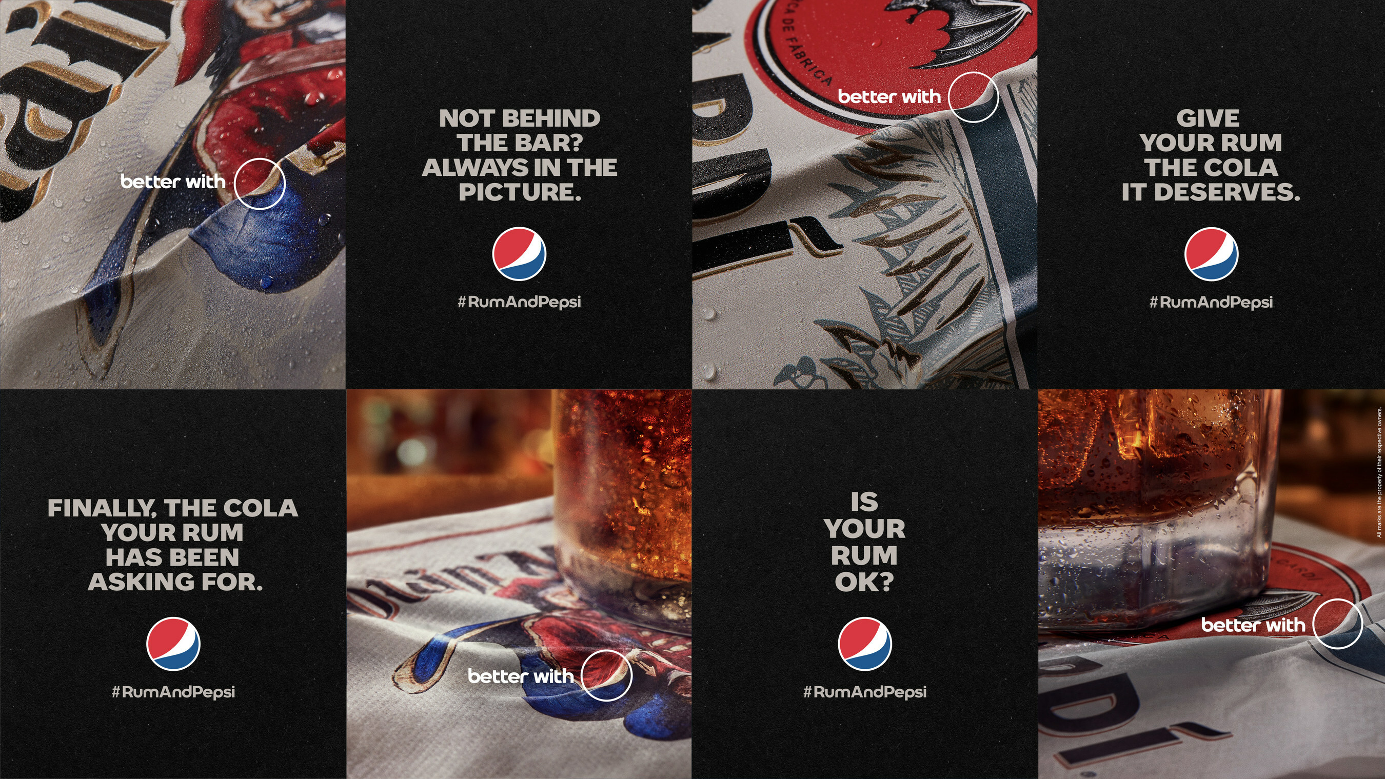
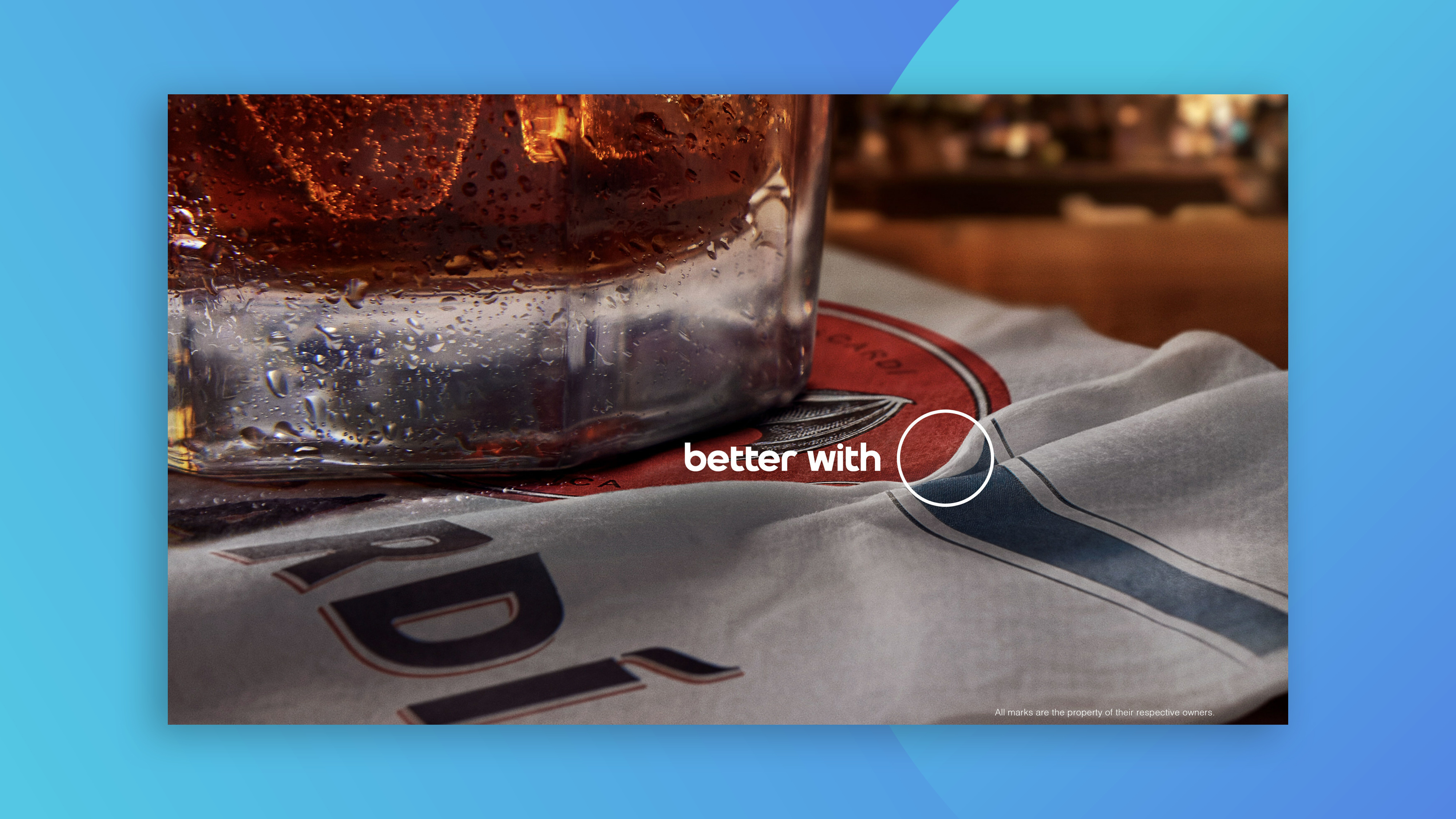
The concept is basically the same – the Pepsi logo is hiding amongst the folds and creases of famous rum brands' packaging, including Captain Morgan's and Bacardi. "Today, ahead of National Rum Month, Pepsi proudly raises a glass to its bold future and invites consumers to elevate their cocktail game by experiencing how rum is #BetterWithPepsi," announced PepsiCo. "By revealing the fact that our logo is already hidden within some of the most iconic rum brands was a fun way to bring this truth to life - after all, while Pepsi may not always be behind the bar, it should always be in the picture!"
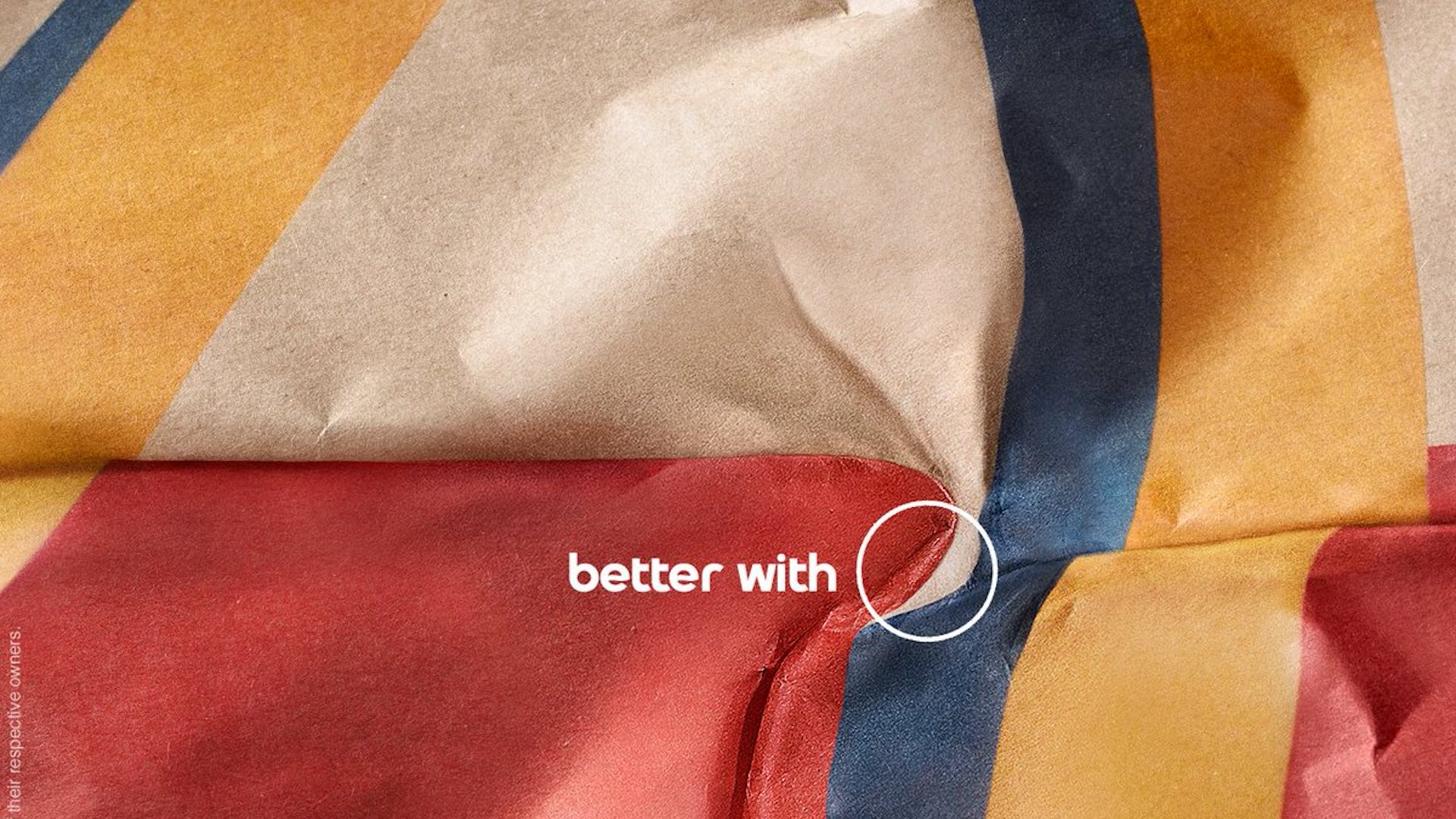
While the campaign by creative agency Alma is almost as successful as 2021's (fast food bags arguably lend themselves to more easily to the 'creased' concept – here the designers have had to rely on what look like rum-branded beermats), it's a little confusing to see Pepsi launch a new campaign with an old logo. Pepsi launched a comprehensive rebrand to much fanfare earlier this year, introducing a simple, text-based wordmark. The company calls this campaign a "cheers" to the previous design, but actively pushing an old logo after revealing its replacement is a move you probably won't find in the rebrand rulebook.
But hey, it's a fun campaign and with the adoration heaped on the first version, it's easy to see why Pepsi couldn't resist rolling it out one more time.

