
Color is a powerful home tool: much like furniture and decor can dictate a mood or ambiance, color choice is crucial to setting the tone (pun intended) for a space. The beauty of this aspect of design is that within each color lies a range of shades that can evoke specific emotions. This stands especially true for blue; a hue that can be bright and cheery or deep and refined.
How I Met Your Mother star and comedian, Neil Patrick Harris has matched his humorous energy with the former. The actor posted a video of his dining room to his Instagram page, and it's impossible to miss the powder blue cabinets contrasting his otherwise neutral space.
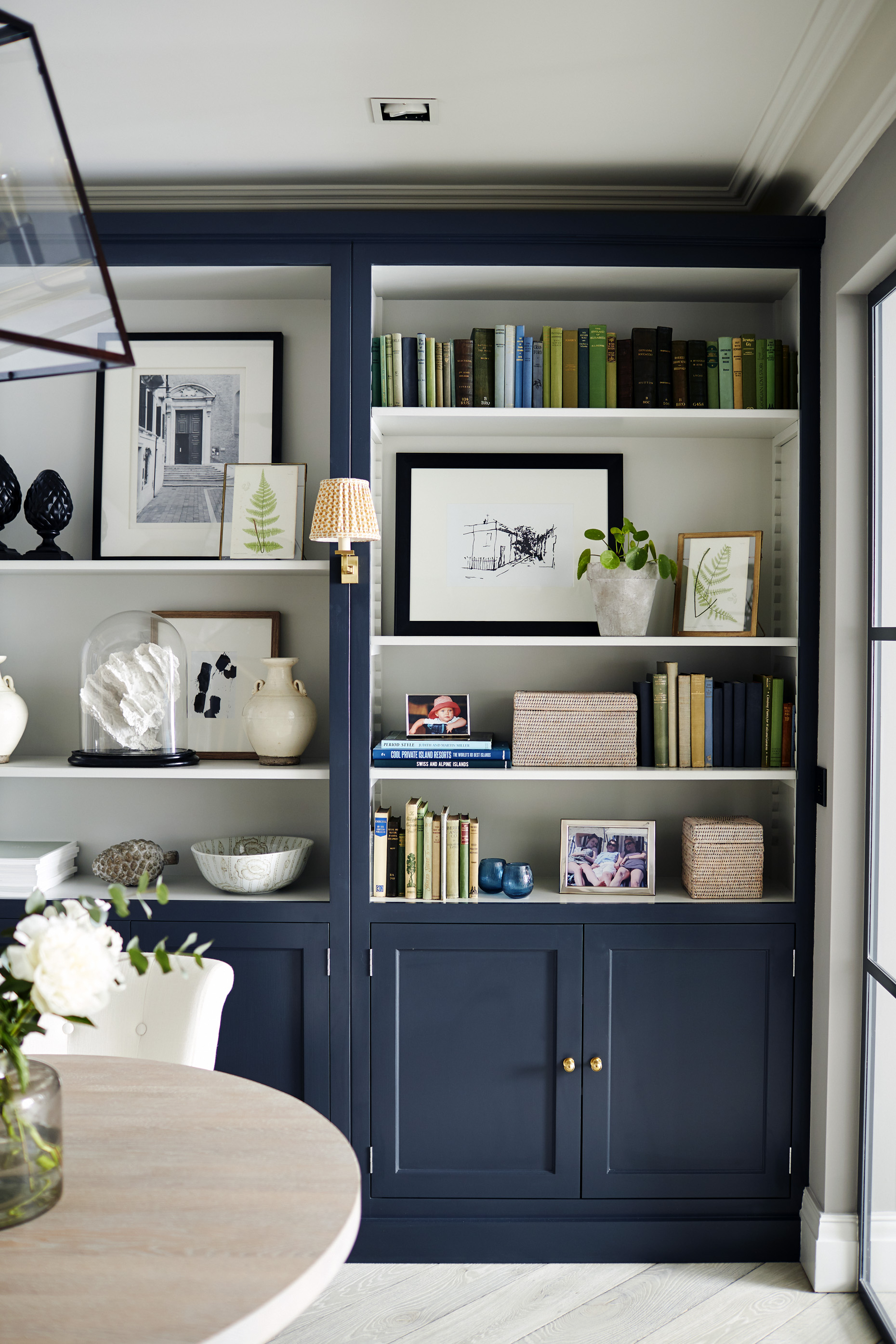
The light blue in Harris' space creates a playful yet tasteful ambiance that's already no stranger to setting color trends. Experts say that lighter shades tend to bring serenity, while darker ones can rejuvenate – but all are incredibly popular this year.
'Blue tends to evoke a softer, calming mood and is mentally soothing,' says Grayson Knight, Principal Designer at Layered Dimensions Interior Design. 'However, bolder, more pigmented hues of blue can promote energy and creativity, making it great for home offices and game rooms.'
Decorating with blue is highly versatile as well, practically acting as a neutral. However, in order to maintain visual interest, Knight recommends not only considering which colors will go with blue, but which textures, too.
'Blue can work with all colors,' the designer says. 'Well-saturated hues of blue complement and contrast alike beautifully with strong contrasts of white, yellow/ greens, and rich wood tones. The key to complimenting color is adding layers of depth, such as stained wood or unlacquered metals.'
We see this technique in Harris' dining area, where the blue-painted cabinets are complemented by black handles, and juxtaposed by wood beams along the walls.
While a lighter, relaxed blue can work well in a bedroom, or the aforementioned darker shade is practical in an office, Knight says that communal areas of the home are well-suited for blue hues of all sorts.
'In 2024, we are seeing homeowners bring more personality to their interiors,' Knight says. 'Living and dining rooms can stand to handle a punch of color, so use these spaces to highlight your style. Well-balanced hues that bring depth and saturation are great options. I love Waterloo and Searching Blue by Sherwin Williams and Van Deusen Blue by Benjamin Moore.'
Shop the edit
Below, find Knight's blue paint recommendations, which are sure to spruce up a living or dining room.