Has pink ever gone out of style? It seems like the hue has found its way onto ‘colors of the year’ lists almost annually, albeit in different guises, from millennial to plaster. The latter has become something of a neutral, cropping up in interior designers’ projects again and again to provide a warm backdrop to a scheme.
When we asked designers about their favorite color for 2024, pink was the hue that cropped up the most – but despite the phenomenon of Barbiecore last year and the sickly sweet shades that went with it, this year’s iteration, rosy mauve, is far more sophisticated. Soft, subtle and with a hint of lilac to it, this particular color trend is finding its way onto designers’ project wish lists – and they had plenty of ideas for how to use it.
Why do designers love mauve?
For Glasgow-based interior designer Flora Hogg, also a color consultant for UK paint brand Craig & Rose, rosy mauve is an ‘effortlessly harmonizing’ shade. ‘It offers a warm embrace which I think everyone is looking for when they step into their homes and possesses a soothing, organic presence for a cosy, nostalgic feeling,’ she says. ‘Lady Emma from the Craig & Rose 1829 Vintage Collection is a particular favourite – a beautiful, subtle mauve hue, revealing hints of lavender and sukara when bathed in light.’
‘I’m a life-long lover of pink, and right now for 2024 that love has morphed into an obsession with rosy-mauve,’ says Gaia Guidi Filippi of Dallas, Texas-based practice Gaia G Interiors. ‘It feels so evocative and nuanced to me – it has both depth and intrigue.'
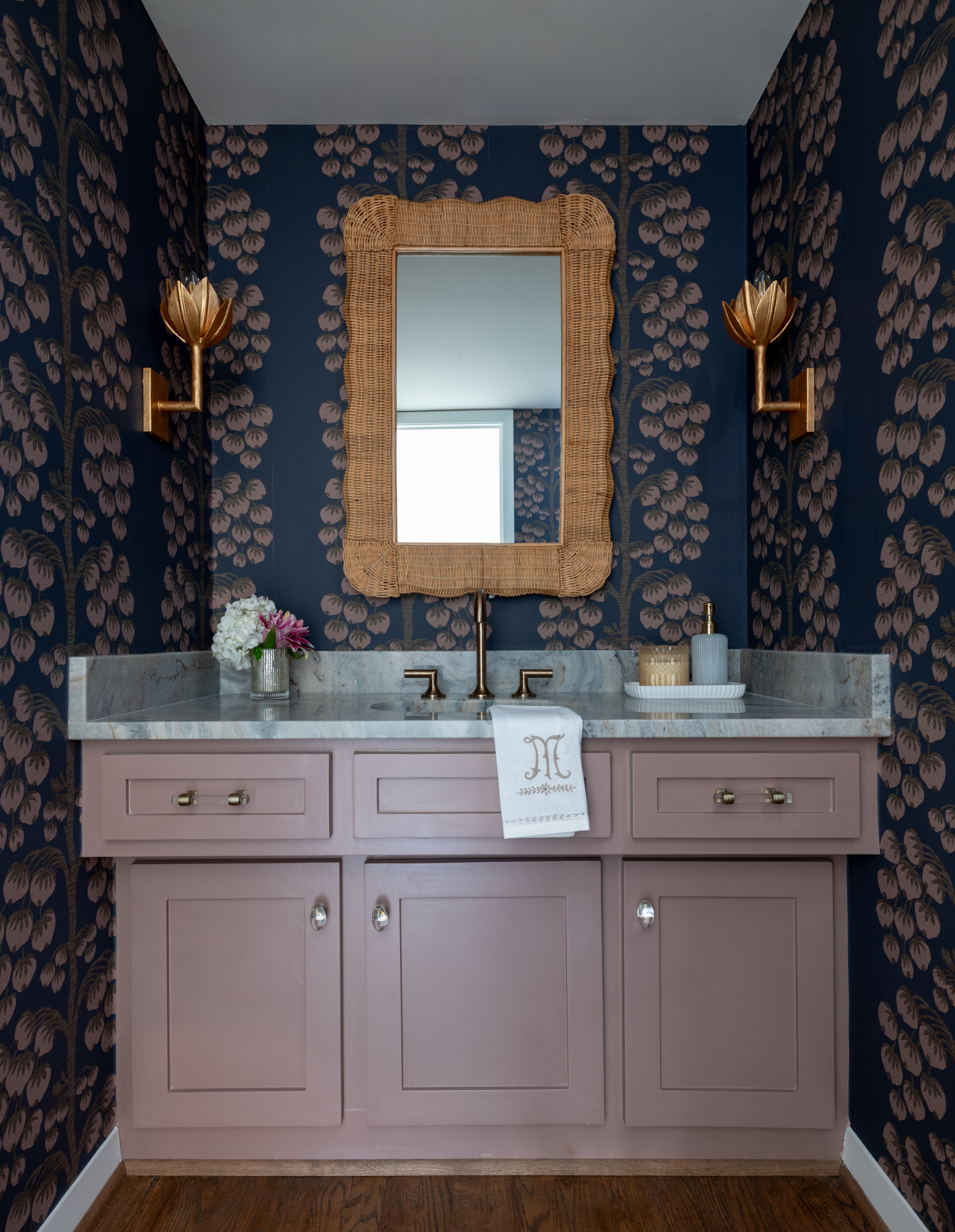
While it's sometimes tricky to find colors that go with pink, this shade is much easier to work with: 'I love the way it pairs like a neutral with rich browns, charcoal to black, inky blues and moody greens,' adds Gaia Guidi Filippi. 'There’s a whole spectrum of them, with undertones ranging from red to purple to brown, that I have been playing with for various projects depending on the overall mood and use, but we recently used Sherwin Williams’ Cocoa Berry on a powder bathroom vanity (above), paired with the deep indigo ground in the wallpaper we selected, and the result was simply stunning.’
For Brittny Button, founder and principal of Los Angeles, CA studio Button Atelier, mauve was one of many shades of pink introduced to her Mesa Bungalows project. ‘The hue imbues a hit of youthfulness, energy and dynamism that these bungalows needed,’ she says. She took inspiration from the Old Hollywood vibe of Jayne Mansfield’s Pink Palace while conceptualizing the project. ‘Adding different dimensions of pink throughout the interior felt right, whether it’s pink veined marble countertops, wrapping a bedroom in rose-like lime-wash walls or utilizing a peachy pink paint for focal walls. There’s a cinematic mystique to the allure of this rosy hue.’
How to use rosy mauve
1. Pair with deep browns and wood tones
The key to using rosy mauve in a grown-up way is to pair the shade with deeper tones that balance out its 'pretty' nature. '[Mauve] is delicious as a backdrop for lacey accents and washed-out woodwork,' says Flora Hogg. 'Couple with darker brown tones like Clove Brown to give an old-world charm'
'We are definitely feeling a move towards warmer hues that are comforting and embracing,' adds Gail Race, a BIID-registered interior designer based in West Sussex, UK. 'I’m especially loving Tea Rose and Brown Betty from Atelier Ellis: they feel earthy yet fresh and contemporary. I could see these two color working well on both walls and joinery, combined with the delicate Faded Blossom to balance the composition.'
2. Layer with deeper pinks and reds
We've seen mauve used alongside peach, salmon and plaster; this color is at its best when paired with pink and red shades, hues that are adjacent to it on the color wheel. 'Currently, I’m loving Dunn Edwards DE 5149 Rustique – it’s a little more towards the salmon side, not Barbie whatsoever,' says Californian interior designer Pamela Nast. 'We’re adding it in homes in a way that’s soft and subtle with upholstery, pillows, pink amethyst slabs, and accessories.'
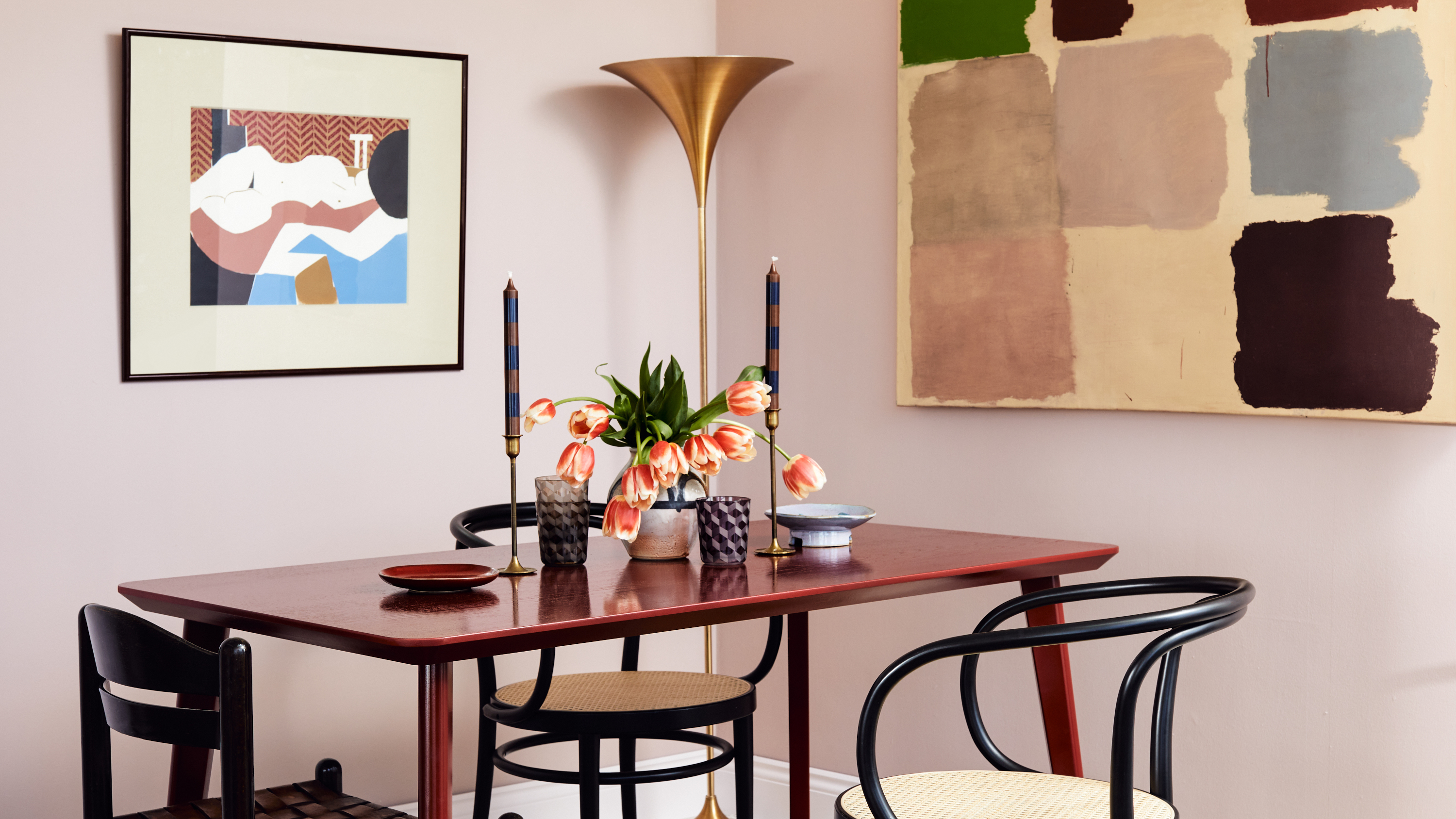
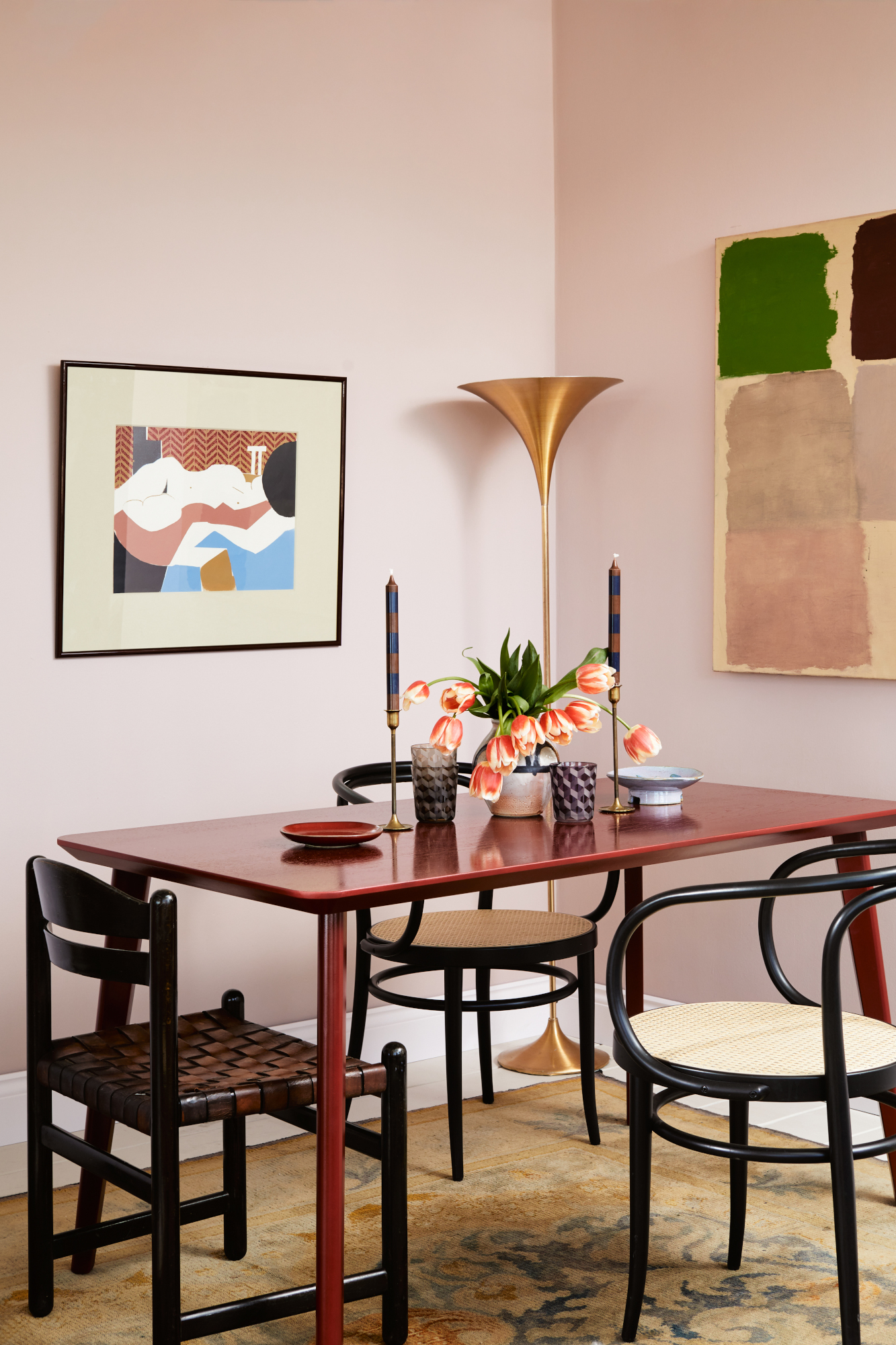
Pictured above, a delicate mauve – Pale Lilac – is paired with a rich burgundy table for a look that feels layered and indulgent. That red shade is Mylands' Huguenot. 'This rich paint has an incredibly alluring darkness and depth, with undertones of orange and magenta that combine to create a layered shade that stands out in any space,' explains CEO Dominic Myland.
3. Drench a room in the shade
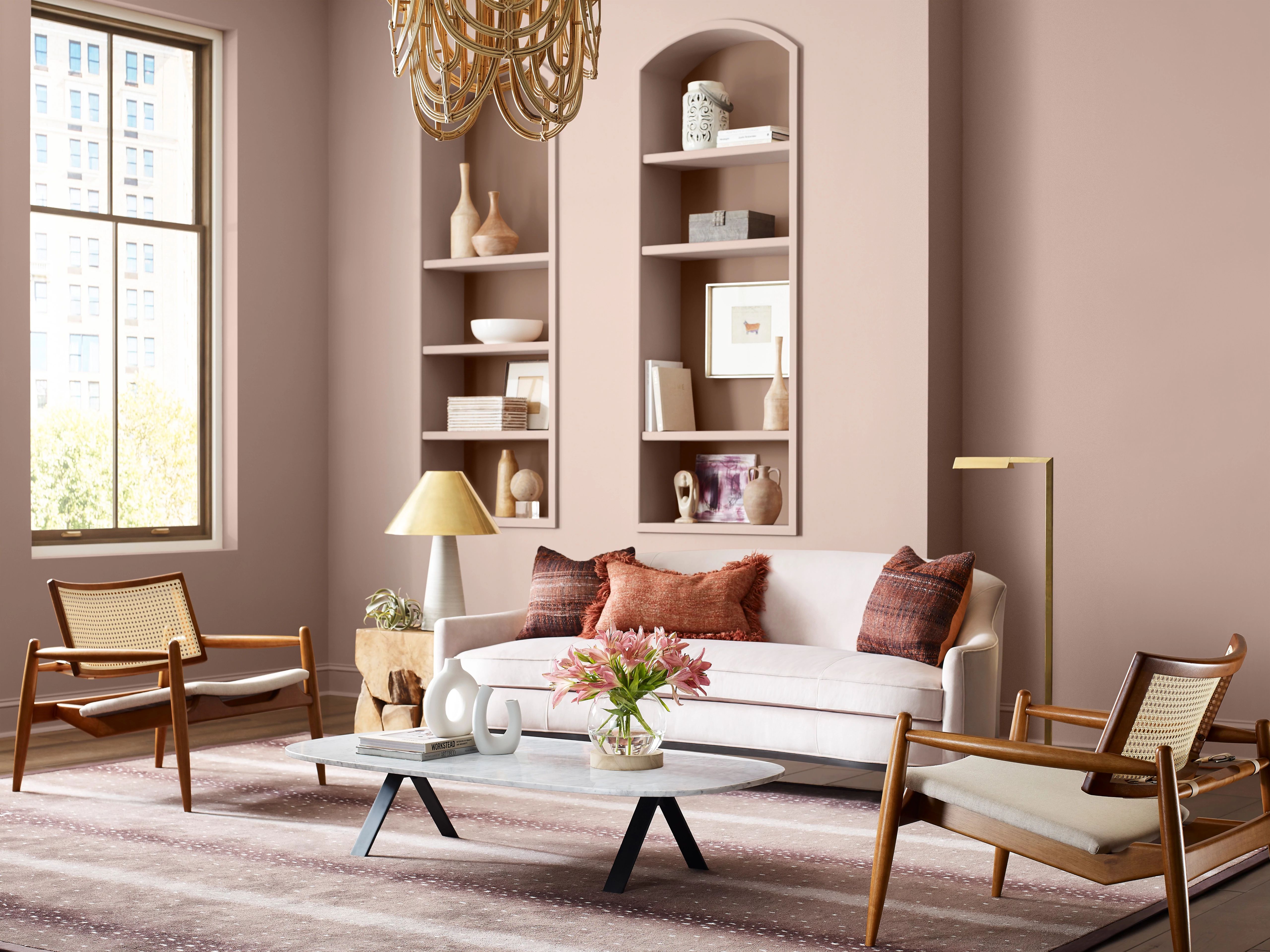
As with many mid-toned colors, using it all-over rather than as an accent is often much more effective. 'Since I find it to be a very approachable color, it doesn’t need to be used sparingly in a home,' agrees Gaia Guidi Filippi. 'My preference is to paint drench a room – whether large or small – in it instead. I love most shades of this color best when paired with deep, dark colors of drapery fabric and upholstered furniture, as well as richly veined marble.'