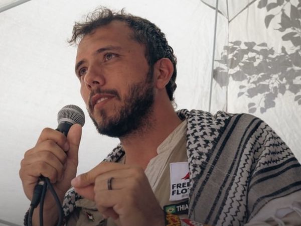
Think film and TV and you imagine VFX and CGI, but behind the visual effects is some astute graphic design that brings worlds and history to life. One of the leading creatives working in film and television is Gina Alessi, a US-based graphic designer who has worked on the biggest Netflix, FX Network and Apple TV+ shows.
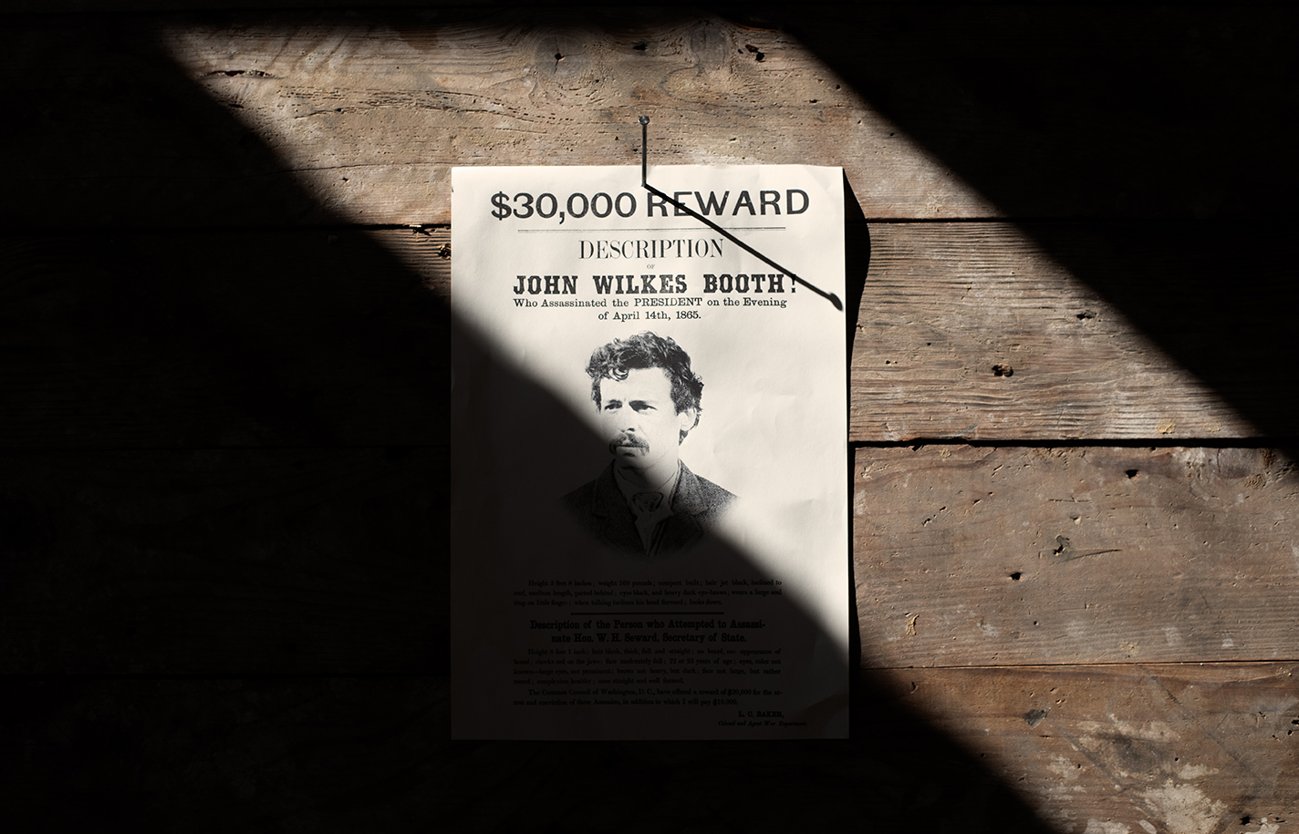
Gina's impressive credits include For All Mankind, American Horror Story and most recently Manhunt for Apple TV+, which follows the hunt for Abraham Lincoln's assassin, John Wilkes Booth. The artist's talent for creating realistic fictional brands, props, murals, signage, and even carpets and hand-bound books, was turned on bringing historically accurate details to life in Apple TV+'s 1865-set drama.
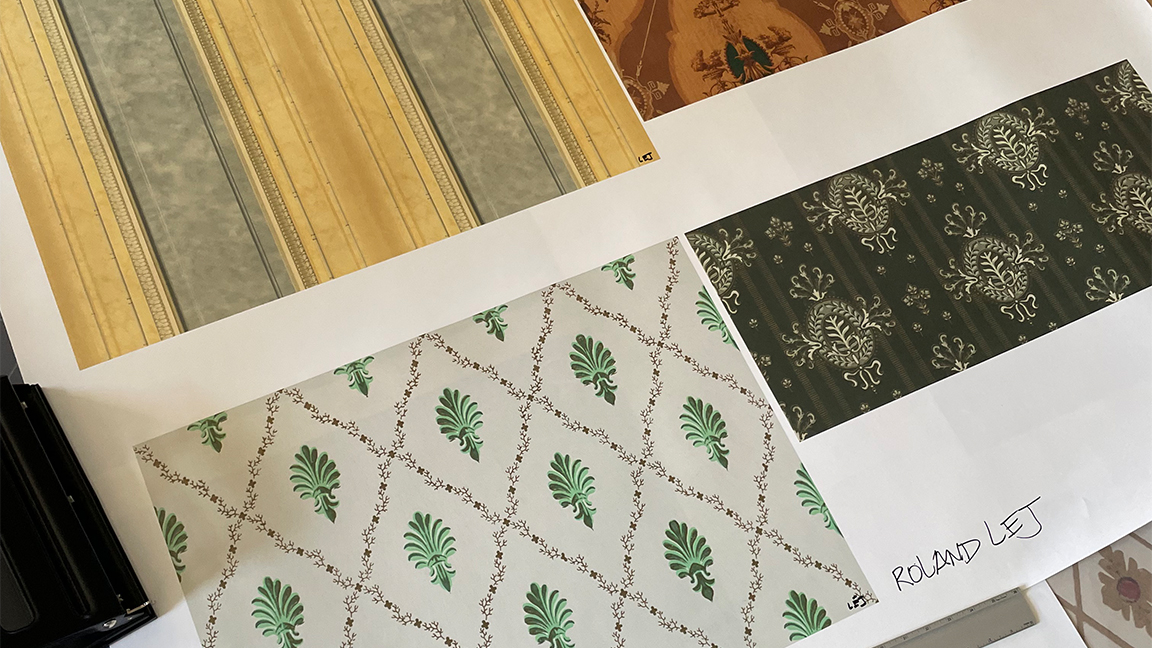
The complexity of the show is staggering, with textile pattern designs and wallpapers becoming ever-present ways to build the show's sense of place and story. Working in Photoshop, on iPad with Procreate and using Adobe Illustrator, as well as on countless 'scraps of paper' Gina's team recreated near lost designs from America's past, like artistic archeologists piecing together history one wanted poster and bed textile at a time.
Gina tells me Manhunt "was the most ambitious project I’ve gotten to work on" explaining how there's "something so special about bringing a world to life that is so different from our own. Or in this case, bringing the past back to life".
She continues: "I learned so much about the events and people that shaped our nation’s history, for better or worse – and how the events of the Civil War and Reconstruction still affect American life today, for better or worse. It’s important that we don’t forget this history. I think our art department definitely felt a responsibility to tell this story as authentically as possible. So that’s what we set out to do."
You can find our more about Gina's career, and what a graphic designer actually does in film and TV on her Instagram account, #aGraphicDesignerMadeThat. Or take a look at her website that acts as a first-of-it’s-kind online school to mentor and train new graphic designers for the entertainment industry. But for now, read how Gina and her team approached designing the world of Manhunt.
How the graphic design in Manhunt was made
Creative Bloq: What does a graphic designer do on a TV show like Manhunt?
GA: I acted as the lead graphic designer on Manhunt, an expansive, nine-month limited series that transformed the cobblestone streets of Savannah, Georgia into a Civil War-era crime scene.
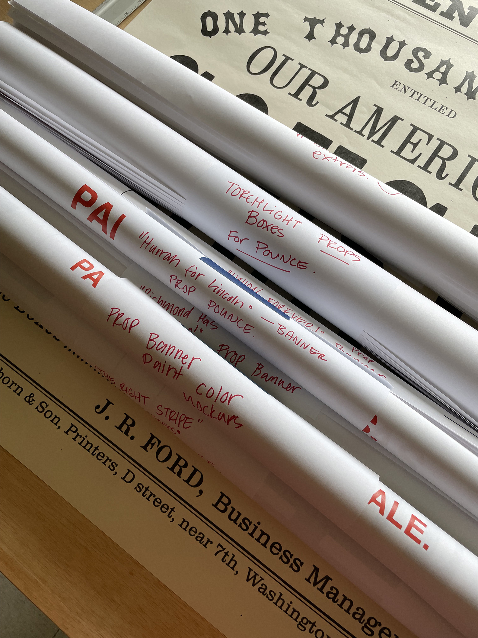
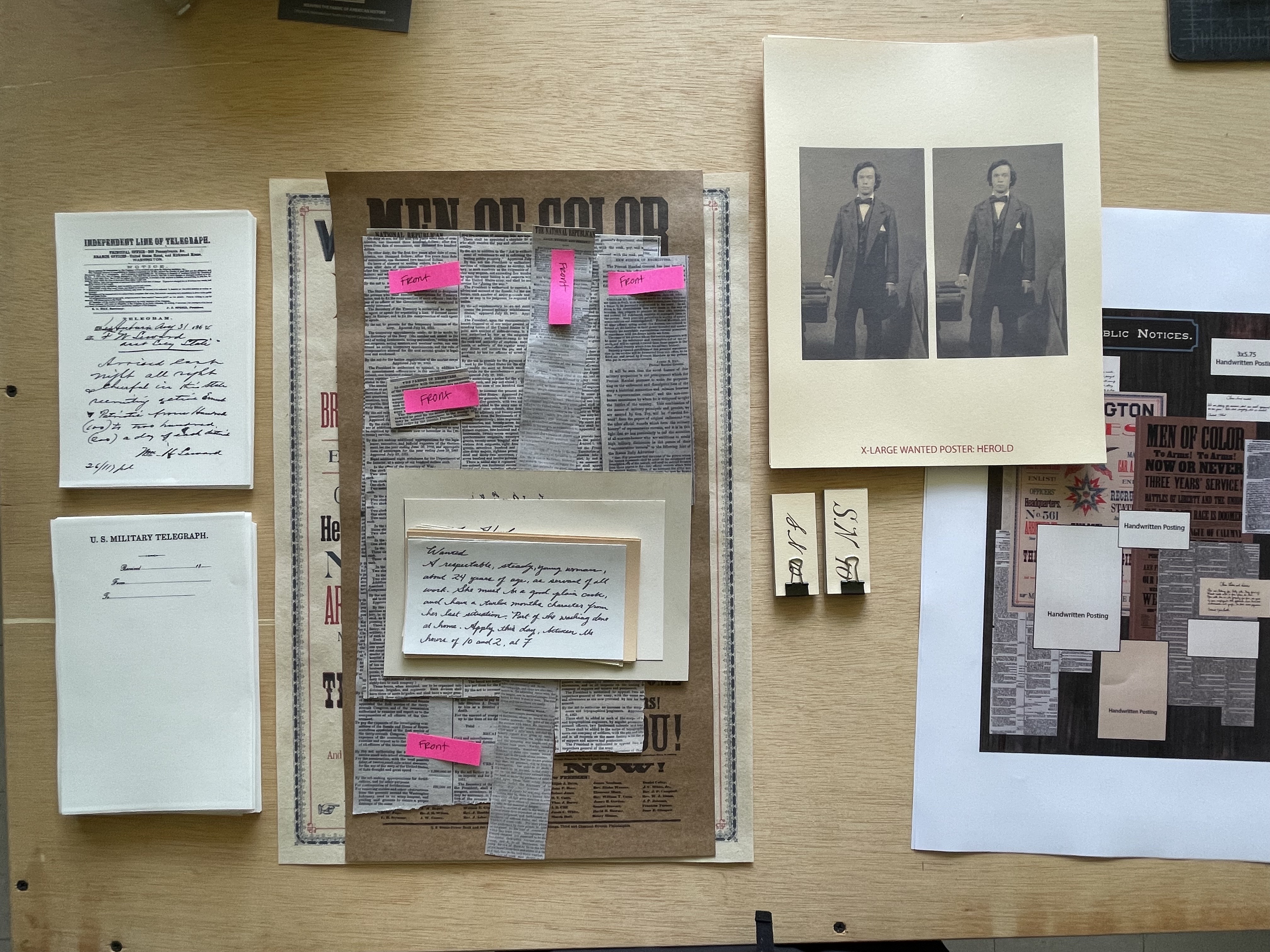
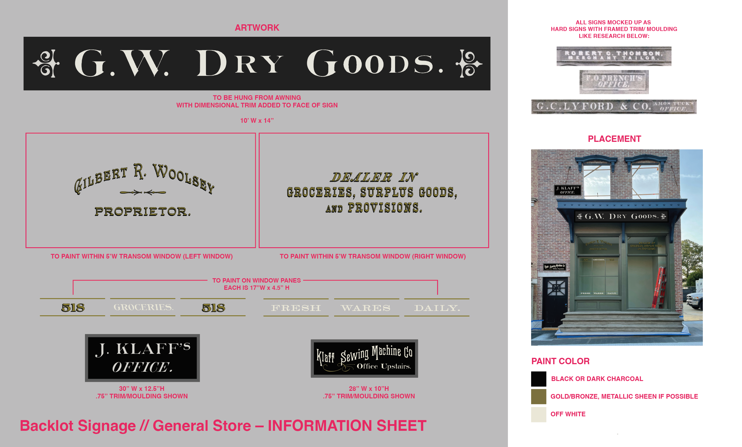
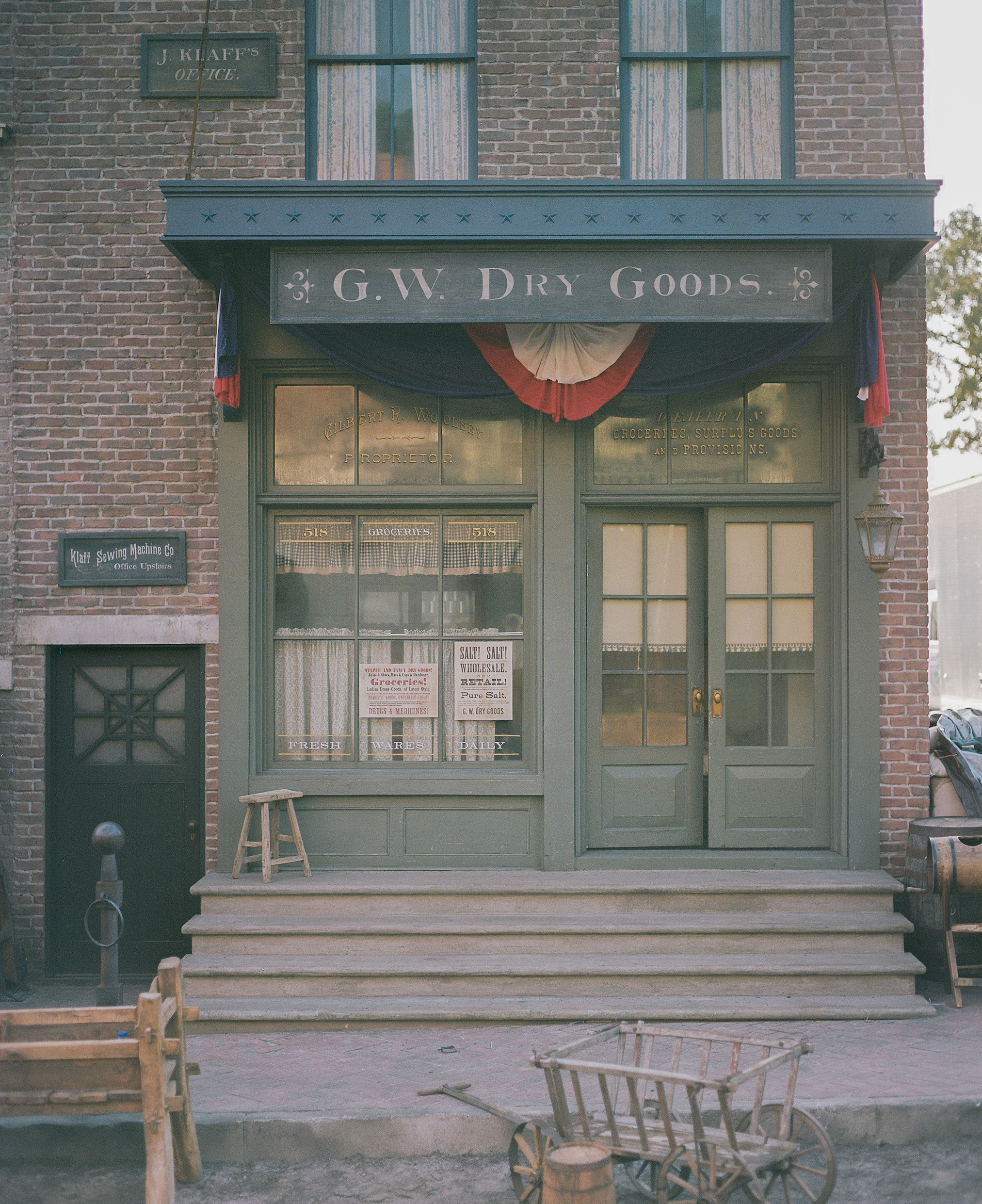
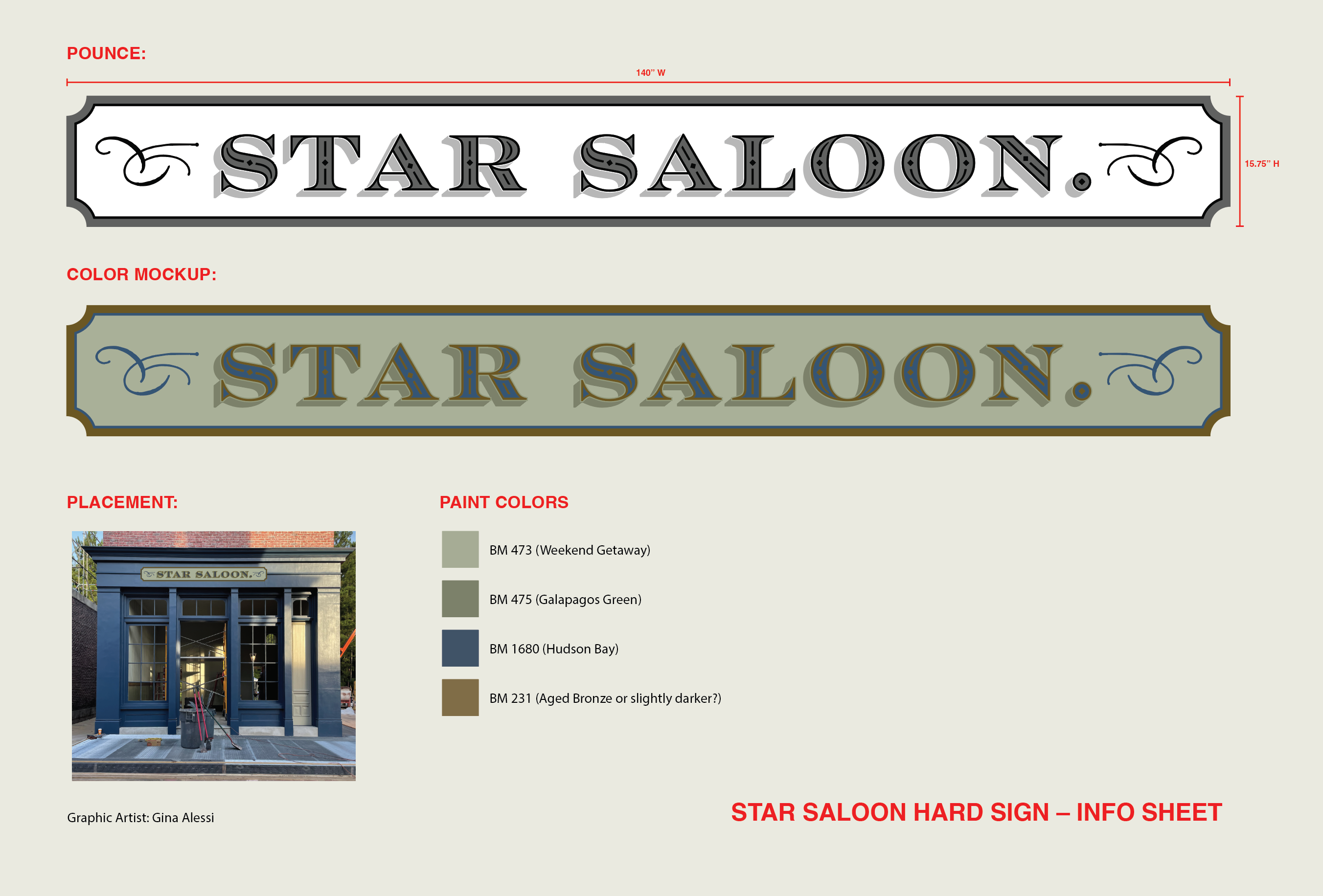
My graphics team effectively functioned as our own mini-department, and getting to see what the three of us could create together was incredible. From wallpaper-drenched interiors, dozens of antique maps, urgent telegrams, newspapers, custom carpets, hand-bound book props, painted canvas banners, police wagons, and store signage… every scrap of paper, every painted sign, and every graphic detail in the show was meticulously cared for and crafted by a small but fierce graphics team.
CB: What were the unique challenges you faced while working on Manhunt?
GA: I like to say that graphic design for film and television is a weird, wonderful, and demanding job – and Manhunt was an exceptionally rigorous job. You can think of this show as a high-stakes crime thriller, set in the height of Civil War-era America.
The graphics team was responsible for creating so many of the little clues and pieces of evidence that showrunner Monica Beletsky used to weave this story together. The sheer quantity of graphics we produced for Manhunt was remarkable. Even in the short trailer, a keen observer might catch dozens of graphics flash by – a book. A chalkboard. A message decoder. Wallpaper.
I wouldn’t say that the quantity of graphics we produced was a unique challenge per se – that's something that film graphic designers deal with on every show we work on. But to create that many graphics to the level of quality we were aiming for, and to have so many hero graphics (or, graphics that carry significance within the storytelling), the variety of items we were making… that was a real challenge. And of course, we were doing it all on a very tight schedule.
CB: What was your process for creating graphics that fit the tone and style of the show?
GA: For a historical show like this, everything we do, across all departments, is guided by research. It could look like scouring the internet to learn about the history of photography (so that the photo filters we use on our actor's wanted poster mugshots looked as believable as possible) or flipping through an ancient book of wallpaper samples from the 1800s to better understand how wallpaper was made in that period. Every detail in this show was guided by heavy research.
If I couldn't find period-accurate reference images for a particular project, then I would supplement my research with my general knowledge of design methods and history. In graphic design, we have a saying: form follows function. That means that how something looks should never be more important than its reason for existing in the first place. In filmmaking, the primary function of any piece of design is to contribute to the story being told.
CB: Were there any specific inspirations or references you drew from for Manhunt?
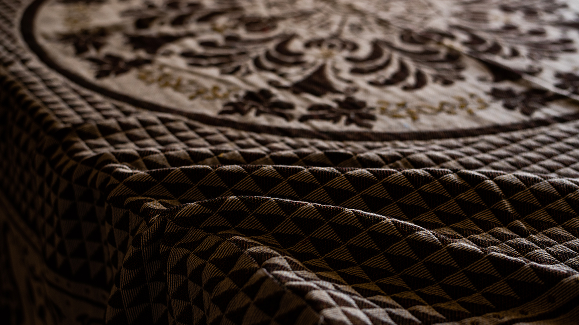
GA: It's amazing that 157 years after Lincoln's death, almost to the day – I was sitting in an office surrounded by flurries of research images and script pages, using every creative skill and tool at my disposal to painstakingly recreate details that have nearly been lost to history, such as redrawing the pattern on the blanket that Abraham Lincoln died on.
I went to great lengths to faithfully recreate the original blanket, with only one or two grainy antique photos to use as reference. I did add one small detail of my own though, my small way of honouring Lincoln's legacy – iris flowers – to symbolise courage, hope, wisdom, and the idea that change, though difficult, is often a force of good. We also gathered as many antique photographs of city streets and signage that we could find.
CB: Were there any particularly memorable moments you had while working on the show?
GA: A show this big is bound to come with some stressful days. I certainly had my fair share! I take a really honest approach when it comes to sharing my experience working in the film industry with others. There are good days and bad ones. I think we all have moments where we stop and wonder whether we’re doing the 'right' thing with our careers.
On Manhunt, I was in the midst of having one of those moments, feeling a bit burnt out, when a great film friend of mine asked, “have you taken a break to visit set recently?” It occurred to me that I had not, and that I actually hadn’t been to visit a set in a long time.
So one day I shut down the computer and went out to our Washington DC backlot set. And it blew me away. One minute I was parking my car at some industrial business park in rural Georgia. The next minute, I had turned a corner and was in the heart of downtown Washington, D.C. – circa April 14th, 1865.
There's nothing quite like the feeling of stepping back and seeing the incredible effort that was put in by our team – walking through the set, and being fully transported to another era. Moments like that really make me proud of what film crews can accomplish. As our fearless production designer Chloe has said – "It is a hard job. But there's a difference between hard and bad. It's good to do hard things. If it wasn't hard, filmmaking wouldn't be what it is."
CB: How did you balance a creative vision with considerations like budget and deadlines?
GA: In my film graphics course I teach students that filmmaking is a creative endeavour, but at the end of the day we have to remember that it is also a business. And it's a BIG business, too. So it can feel at times like creative priorities and the business of getting it all done are at odds with each other.
In the US, film graphic designers don't deal too much with budget (that falls under the art directors' purview!). But deadlines are the biggest driving force behind how I schedule my graphics projects, what I prioritise, and when I decide to call for reinforcements. My goal is always to achieve the best creative outcome with the time, resources, and workforce we’ve been given.
But part of the fun of the job is coming up with clever solutions to get things done and done quickly. It is Hollywood after all! There’s an element of 'movie magic' at play — smoke and mirrors and little tricks to creating content that is believable on screen and economical to produce on a tight schedule.
CB: What software or tools did you primarily use in your graphic design work?
GA: Almost everything I created for Manhunt was made with Adobe Illustrator, Photoshop, and I did a lot of sketching and process work on iPad and Procreate. I didn't have a Wacom tablet at the time, but I have a Cintiq now and I imagine it would have made quite a difference.
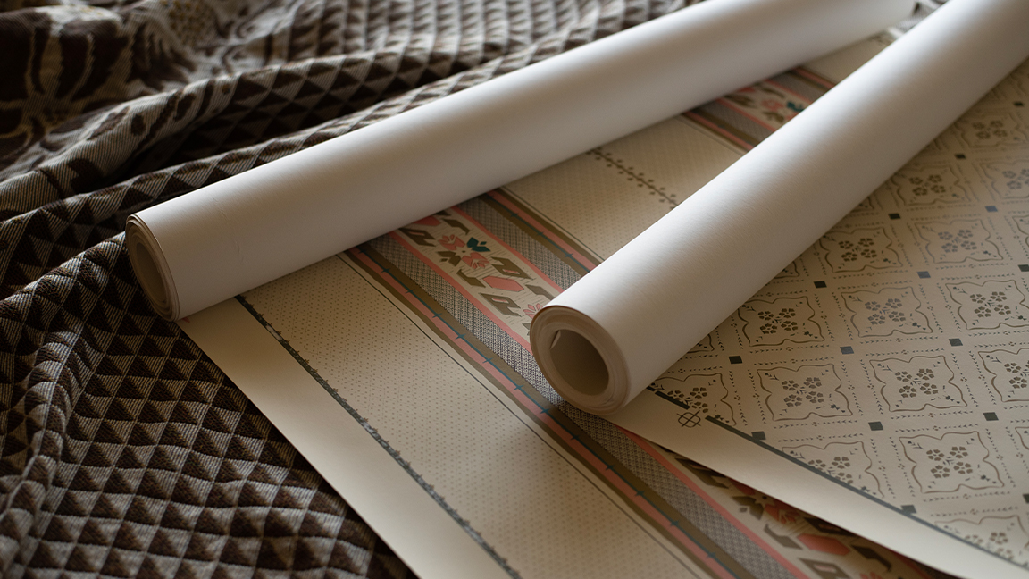
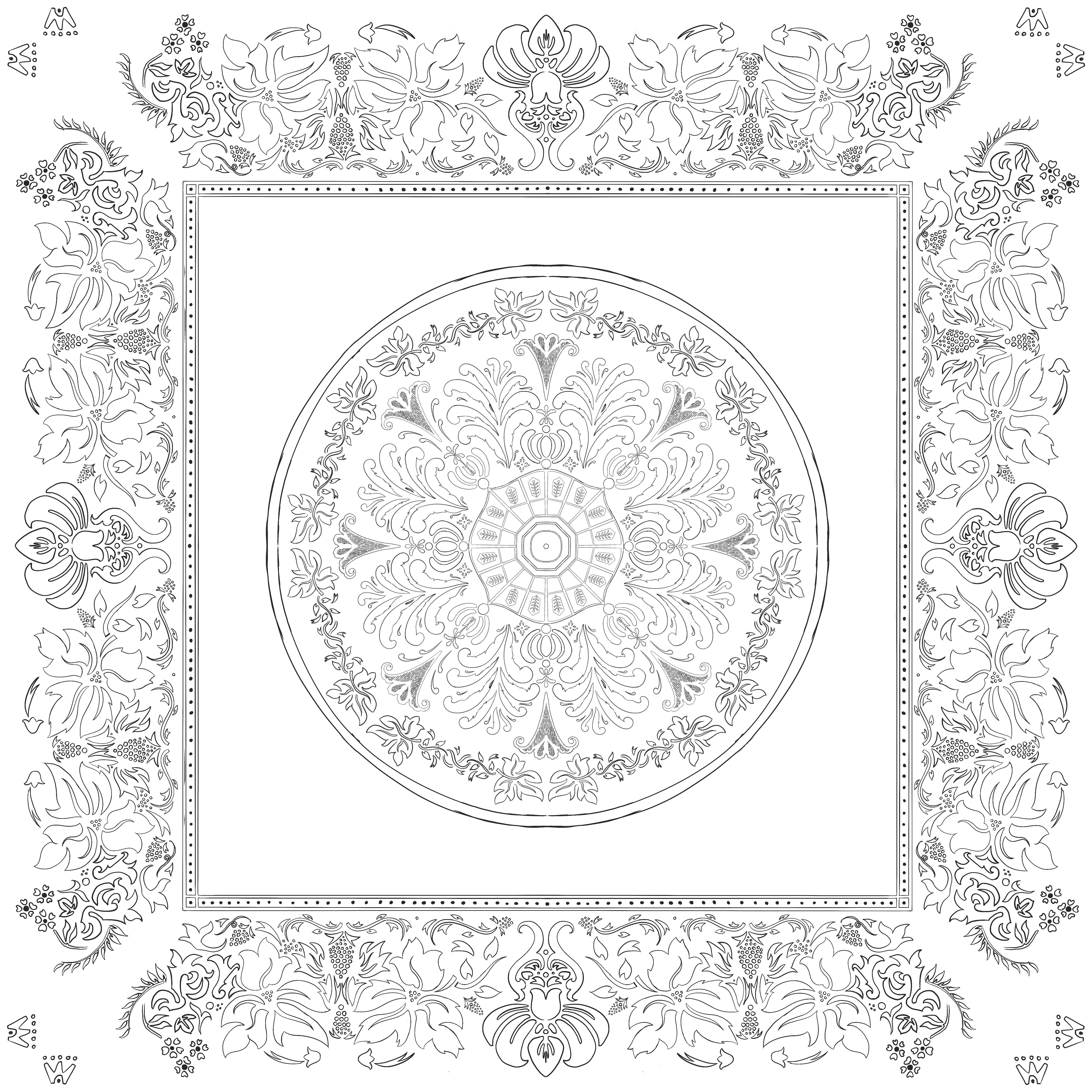
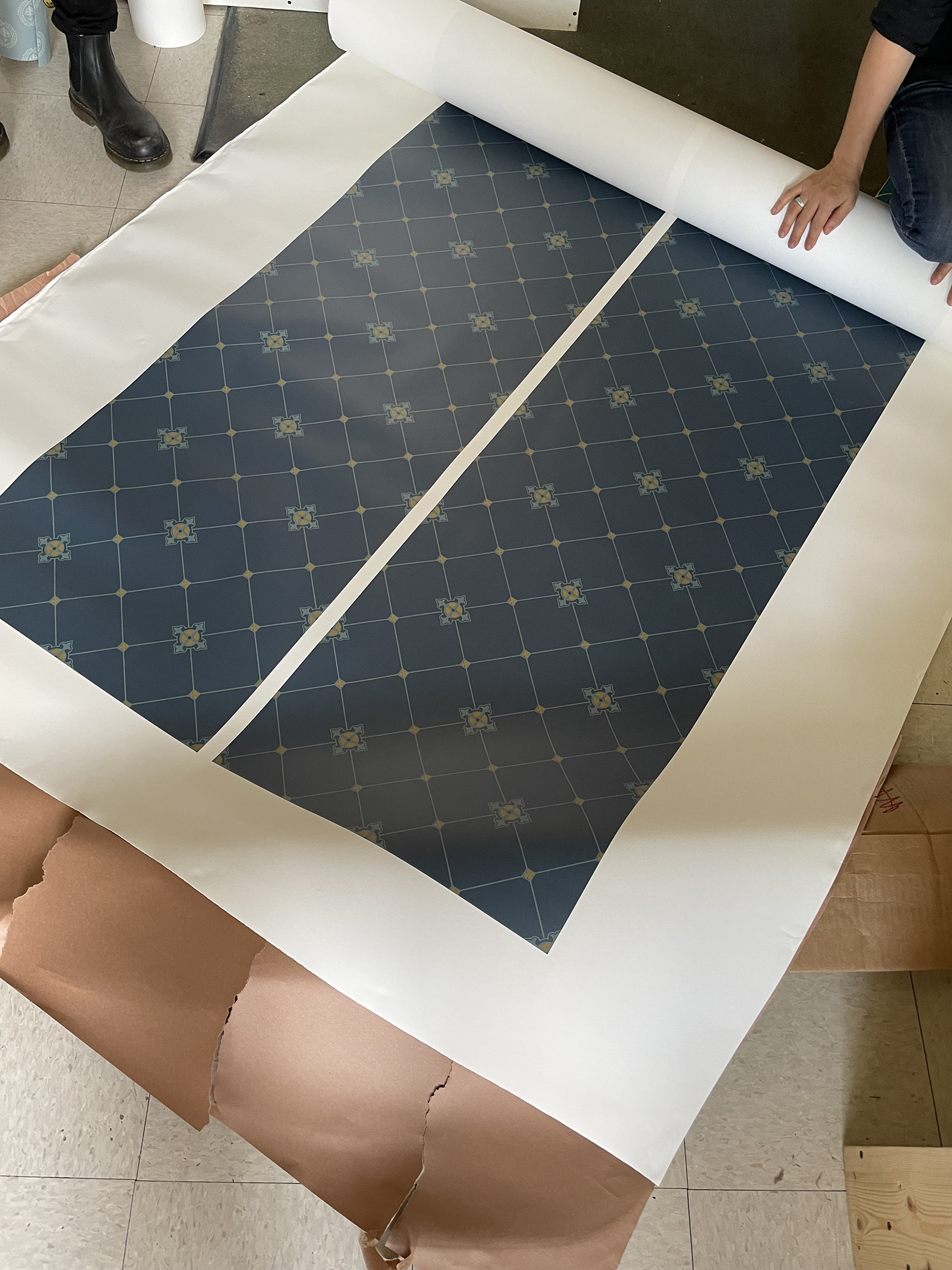
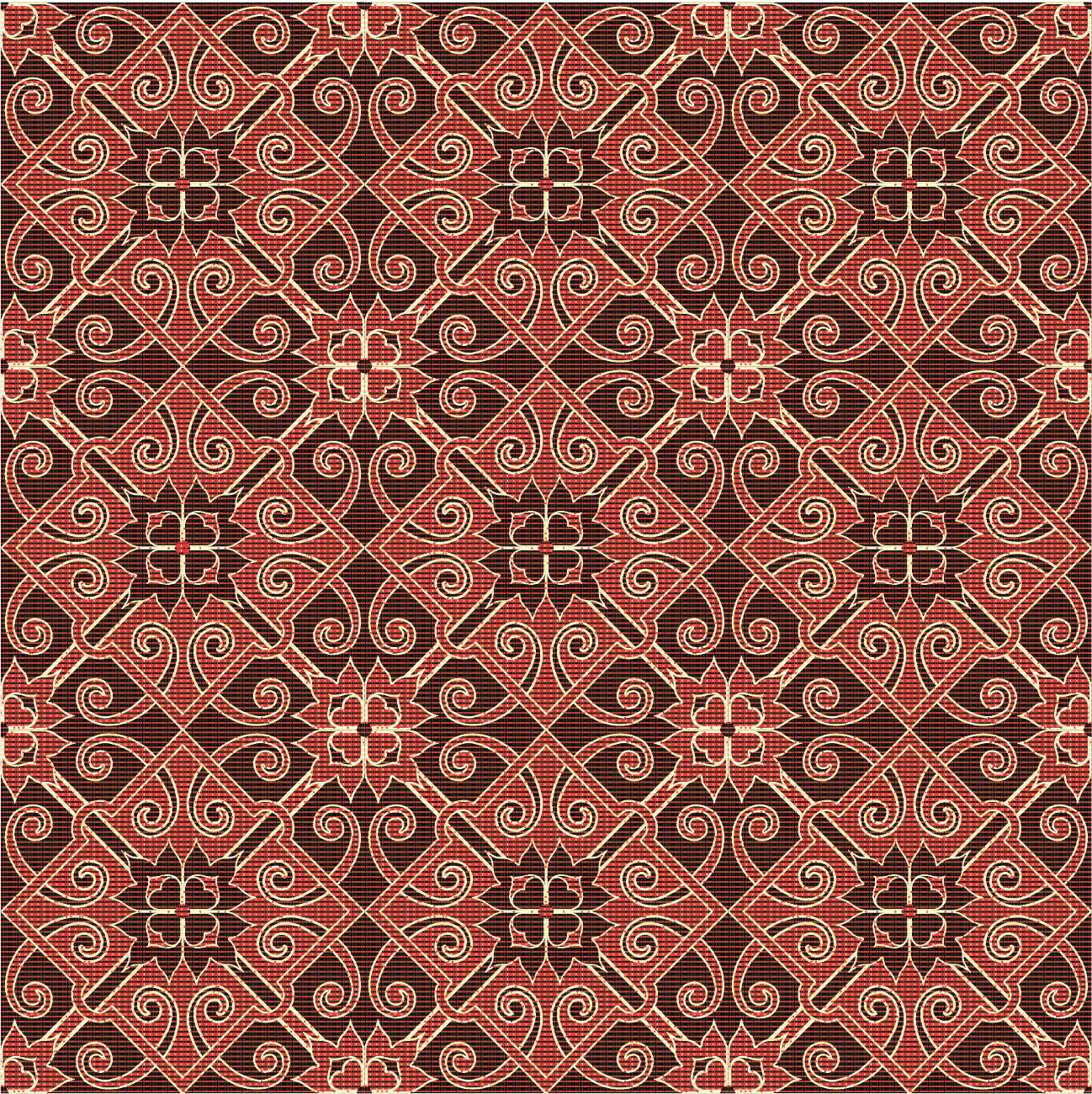
I absolutely had to learn some new workflows, particularly when it came to creating seamless patterns for wallpapers. We did a lot of surface pattern design in this show which was a brand new area of design for me. I had to learn and adapt quickly – but that's part of the job!
One of the fun things about working on Manhunt was getting the opportunity to lead a graphics team. It can come as a surprise, but that's actually a rare thing in American art departments. On Manhunt, we had two other designers on the team – David Tousley and Sarah Stimpson. Having them along for the ride was great – each of us had our own unique skills and specialties and different approaches to our projects.
David used traditional pen and ink tools and writing instruments to draft all of the handwritten letters and telegrams you'll see in the show. Sarah is a wizard at digital painting and created beautiful 'oil paint' portraits featuring Hamish Linklater as Abraham Lincoln.
CB: How much fun was it to engage with historical designs and renew them for the show?
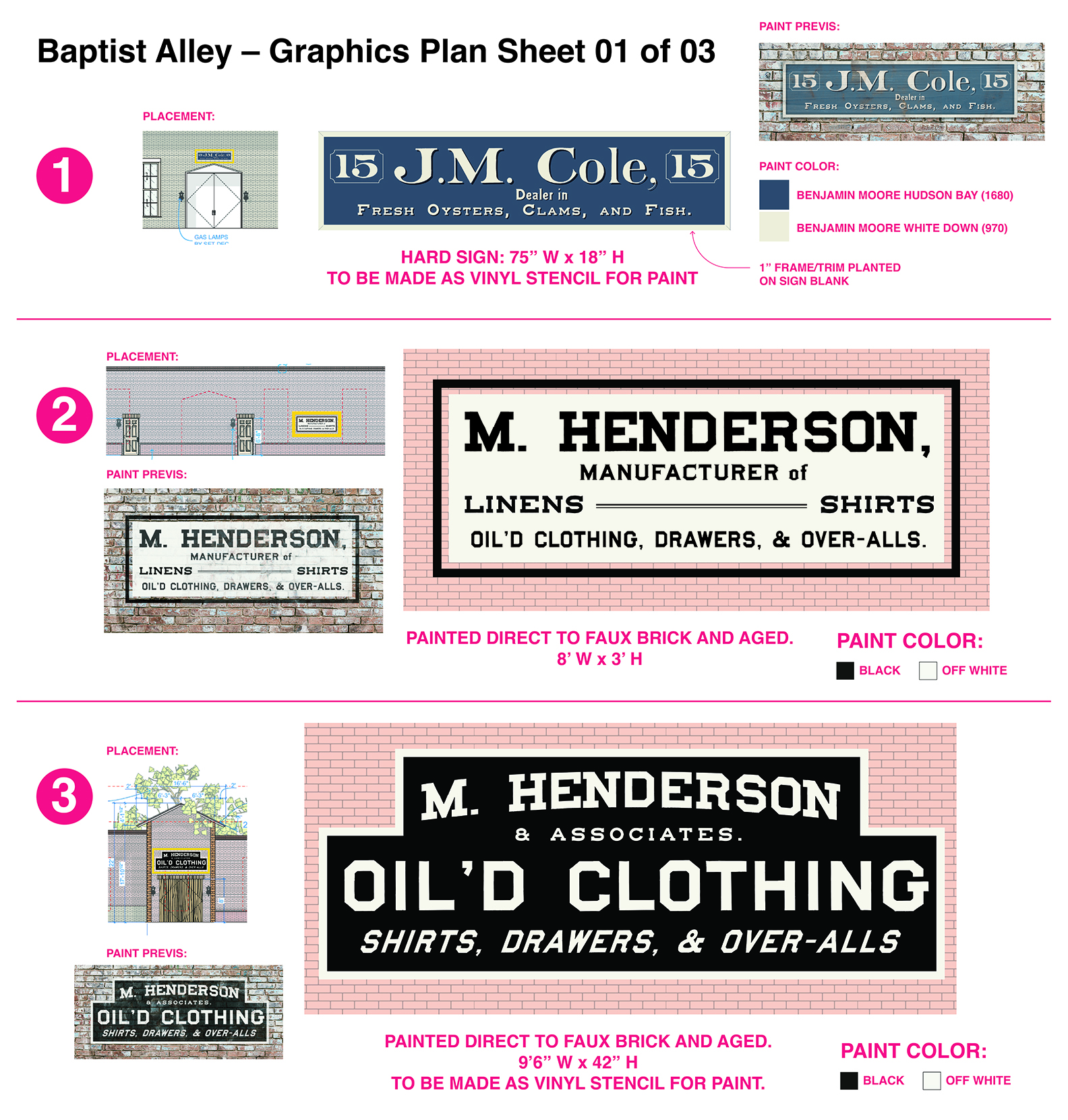
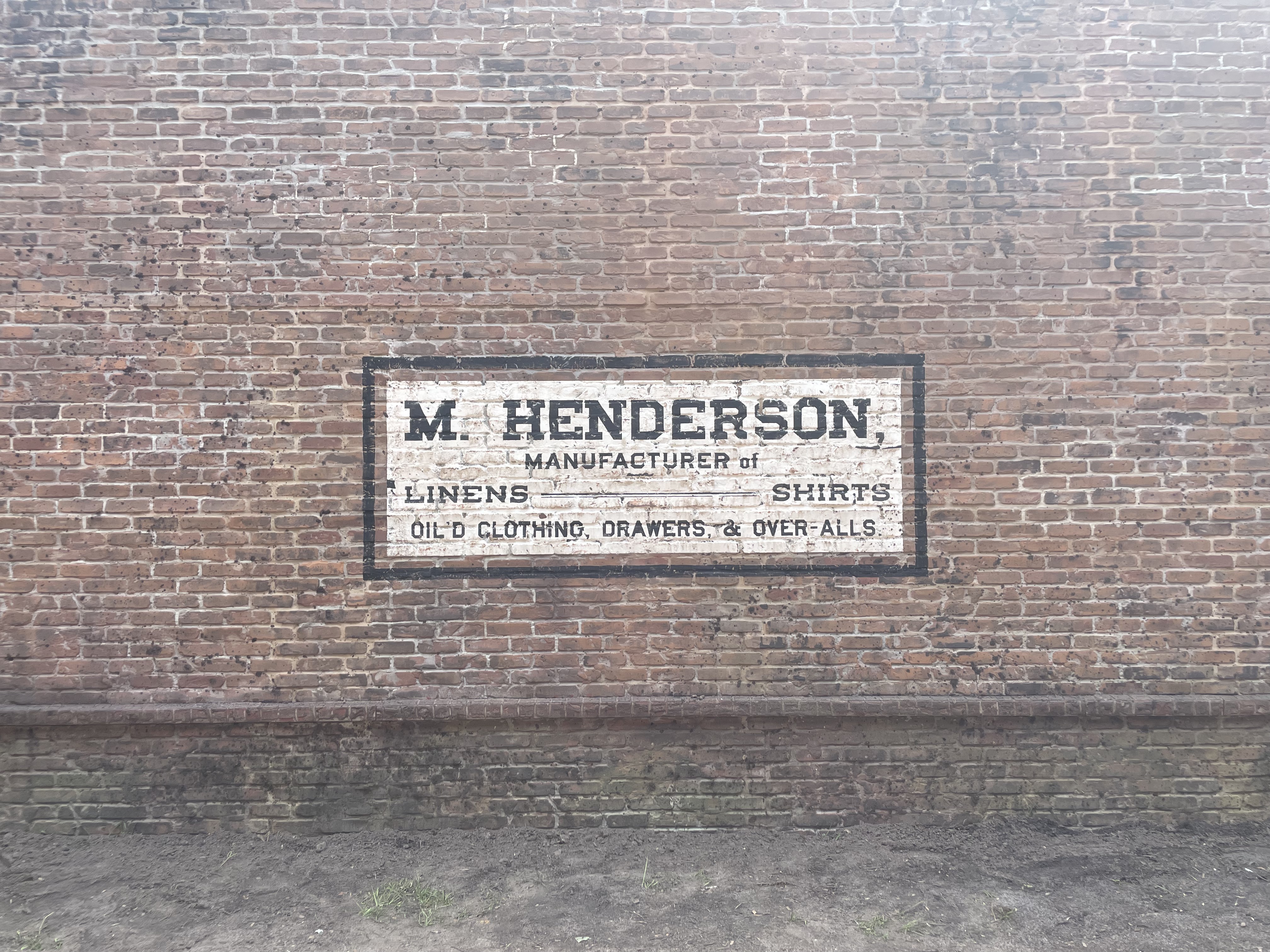
GA: I absolutely loved digging into this time period. My favourite part was probably researching and recreating the aesthetics of hand-painted signage of the time. We also employed a time-saving technique we affectionately called 'wallpaper resurrection'.
So instead of hand-drawing every antique wallpaper pattern you see in the show, my graphics teammate Sarah Stimpson and I would utilise scans of real antique wallpaper scraps. We’d restore them in Photoshop and set them up as clean, seamless swatches that we could send to our vendors to print as wallpaper rolls. So many of the wallpapers you see in the show were actual, real wallpaper patterns from the era that were literally brought back to life and used on set.

CB: Were there any specific design elements or motifs that were recurring throughout the show?
GA: Colour! Our Production Designer Chloe Arbiture was really focused on the intentional and liberal use of colour in this series. We have a tendency to think of the past like a sepia-toned photograph. We’re just used to seeing the past through a monochromatic filter. But when you’re designing for the past, you have to put those instincts out of your mind.
One of the things I teach my students is that when you think of a time period – Ancient Greece, for example – the first thing that pops into your head is probably not accurate. When I said 'Ancient Greece' just now, you probably immediately pictured those polished white marble statues that you can find at museums. But in that time period, researchers think the statues were actually painted vibrant, maybe even gaudy colours. The 1860s were also a vibrant time, and it was a real treat seeing how Chloe’s use of colour came together on set.
CB: Were there any last-minute changes or unexpected developments?
GA: 'Last-minute changes and unexpected developments' might be the dictionary definition of filmmaking, honestly! In our world, unexpected change is par for the course. Maybe a scene is cut or added last minute.
Maybe a shooting location falls through or an actor is unavailable, which could cause our entire shooting schedule to shift. Maybe the director has a request that comes across your plate on the morning of a shoot. Being nimble and having the ability to think on your feet is a major asset in this industry, but it takes some practice.
As I progressed into my career I learned that if you expect the change to come, you can be more prepared to pivot and adapt when it does.
Visit Gina's portfolio website to discover more of her amazing work in film and television, and advice on how you can follow her into a new creative career.