Officially, 20th Century Fox no longer exists, having been rebranded to 20th Century Studios, but its logo history is still worth examining, especially as it's one of the best entertainment logos we know of.
Here, we look at the main variations of the 20th Century Fox logo over the years. First, we look at the black and white logos and then move on to the coloured logos, which were used in the movies.
Black-and-white logos
The original logo (1935-1968)
This early version of the logo doesn't have the searchlights we associate with the brand. That said, searchlights were used in the onscreen logo and the first print logo.
Stripped right back (1945-1972)
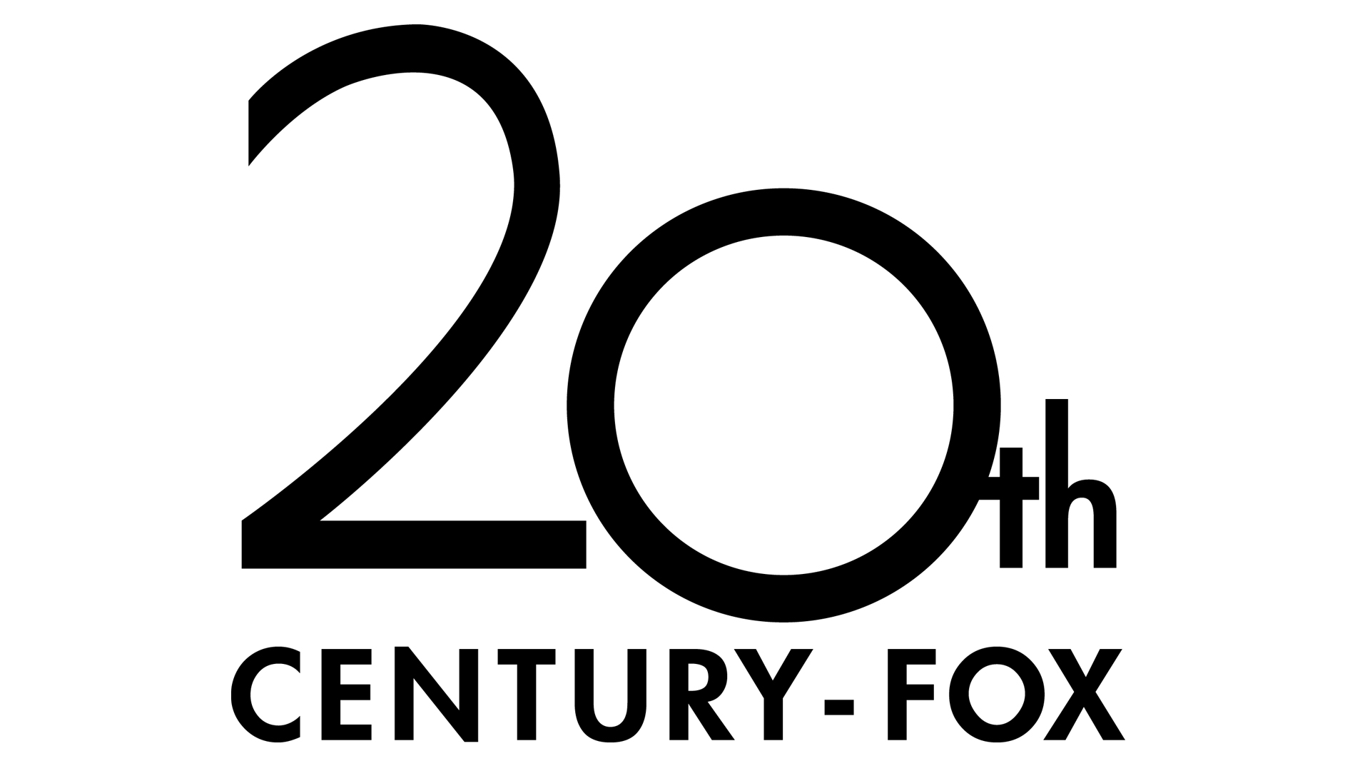
In this version of the logo, the entire structure was removed and simplified text was used. This version is arguably not as iconic as the other, better-known iterations, and it doesn't really show what the company does.
With an arch (1972-1982)
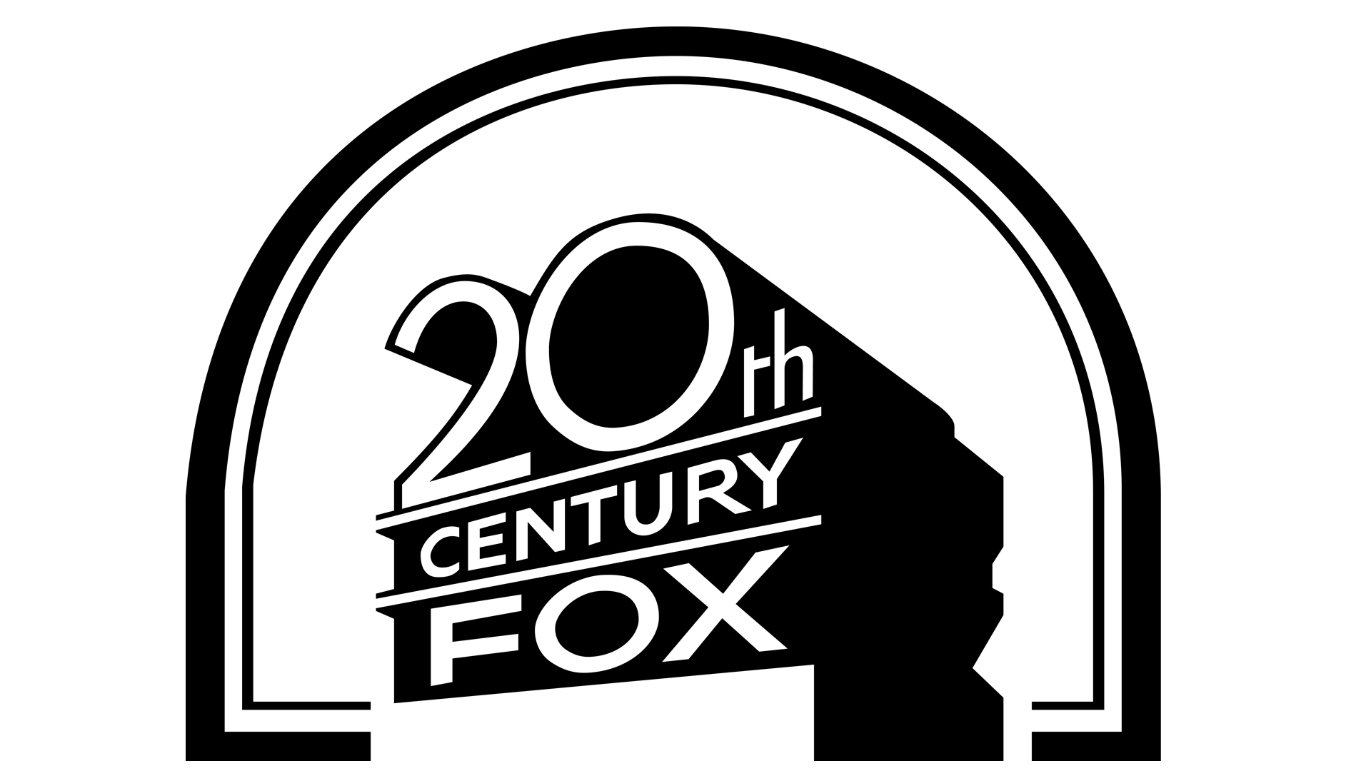
With this version of the logo, the structure was brought back, along with a large arch over the logo. I think the arch is unnecessary, plus the arch competes for attention with the logo.
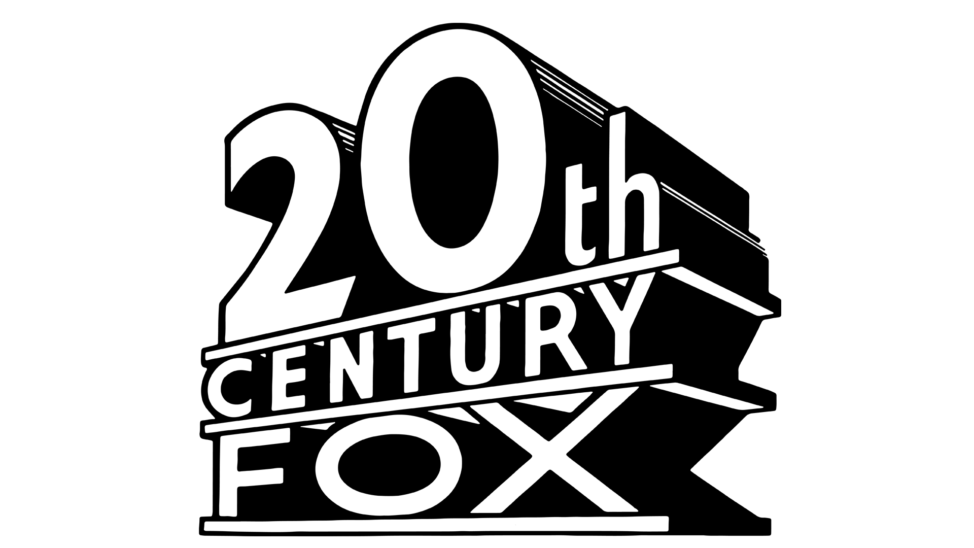
The searchlights appear (1989-1994)
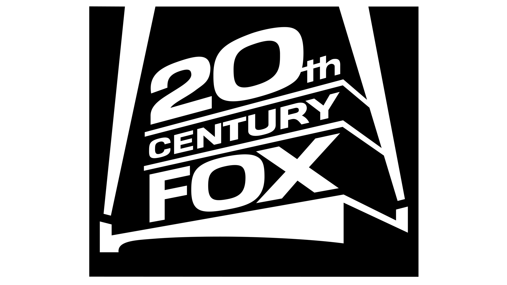
This logo marked the first appearance of the searchlights in a print logo. The hyphen between Century-Fox was dropped from the company name after Rupert Murdoch's News Corporation purchased the company in March 1985. The design is bold and simple, with nothing extra.
A few tweaks made (1986-2021)
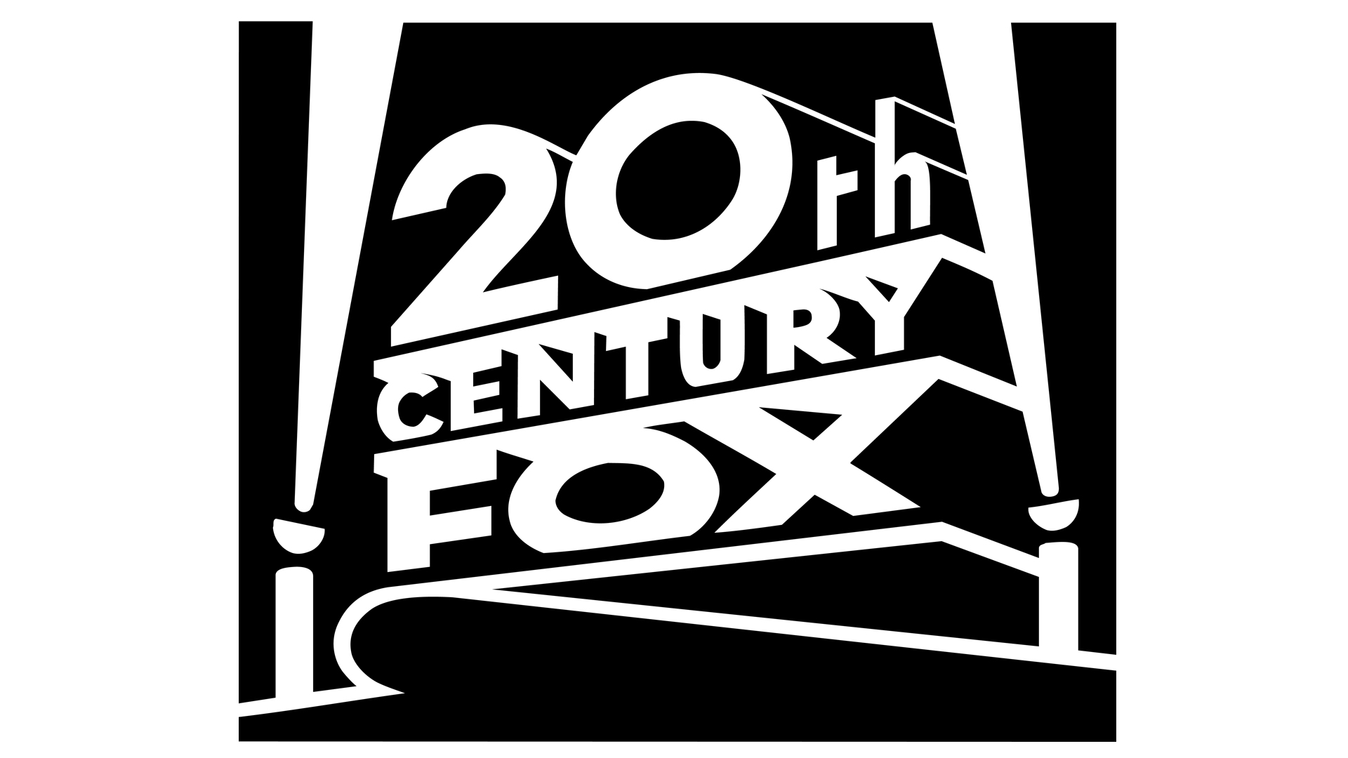
With this version, the border has its rounded corners removed, the letters were changed and extra elements were added to the base of the searchlights. The last time this logo was used was with the Brazilian film Amarração do Amor, which was released on 14 October, 2021.
Change to Studios (2020-present)
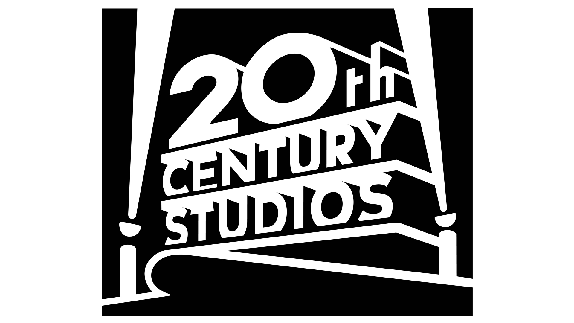
On January 17, 2020, 20th Century Fox was renamed to 20th Century Studios. This came after Disney bought the company assets. The logo design is the same, but the word 'Fox' has been replaced with 'Studios' and the word 'Century' has increased in height so that everything fits.
Change to 21st Century Fox
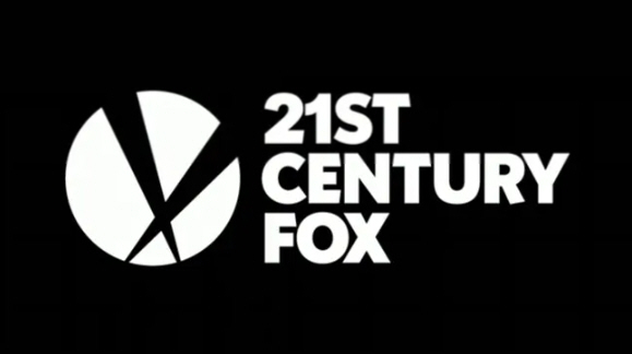
But that wasn't the only change. Pentagram designed the new logo for the renamed news and entertainment division, 21st Century Fox, reimagining the famous searchlights into something a bit different. 21st Century Fox serves as the umbrella company for 20th Century Fox, and movies released through that brand still retain the 2009 monolith design.
This is a clean design, and feels reminiscent of some of the earlier black and white logos.
Colour logos
Light beams galore (1933-1953)
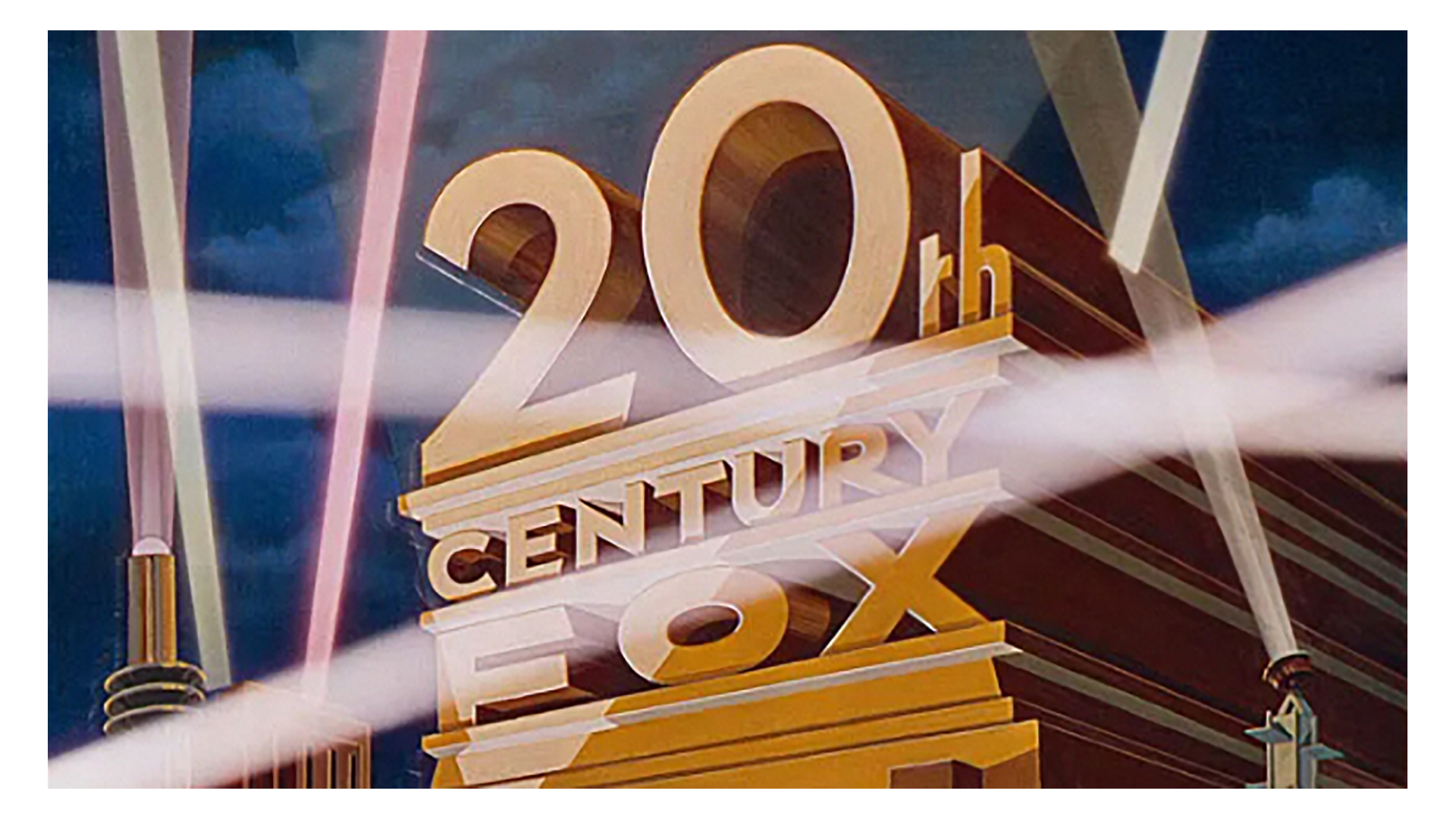
The first logo for the studio was painted in 1933 by Emil Kosa Jr. He was a skilled and popular watercolor artist. He later worked as a matte artist for the studio and also created the ruined Statue of Liberty for The Planet of the Apes. Overall, I like this logo, but I feel the crossing light beams interfere with the look and feel of the image.
On a tilt (1953-1981)
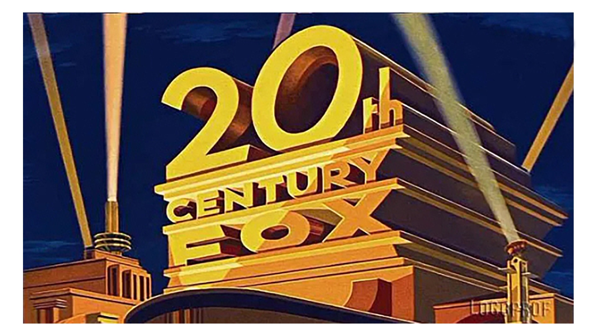
This logo was repainted by Rocky Longo in the 1950s. This happened when Fox started releasing movies in the widescreen Cinemascope format. One change to this logo was making the '0' in '20th' tilted to improve the proportions with the wider aspect ratio. Once seen, that tilt cannot be unseen.
The tilt is gone (1981-1994)
Longo repainted the logo again in the 80s. This time he straightened the '0'. And while the change was welcome, I’m amazed it took so long.
The sky's the limit (1994-2009)
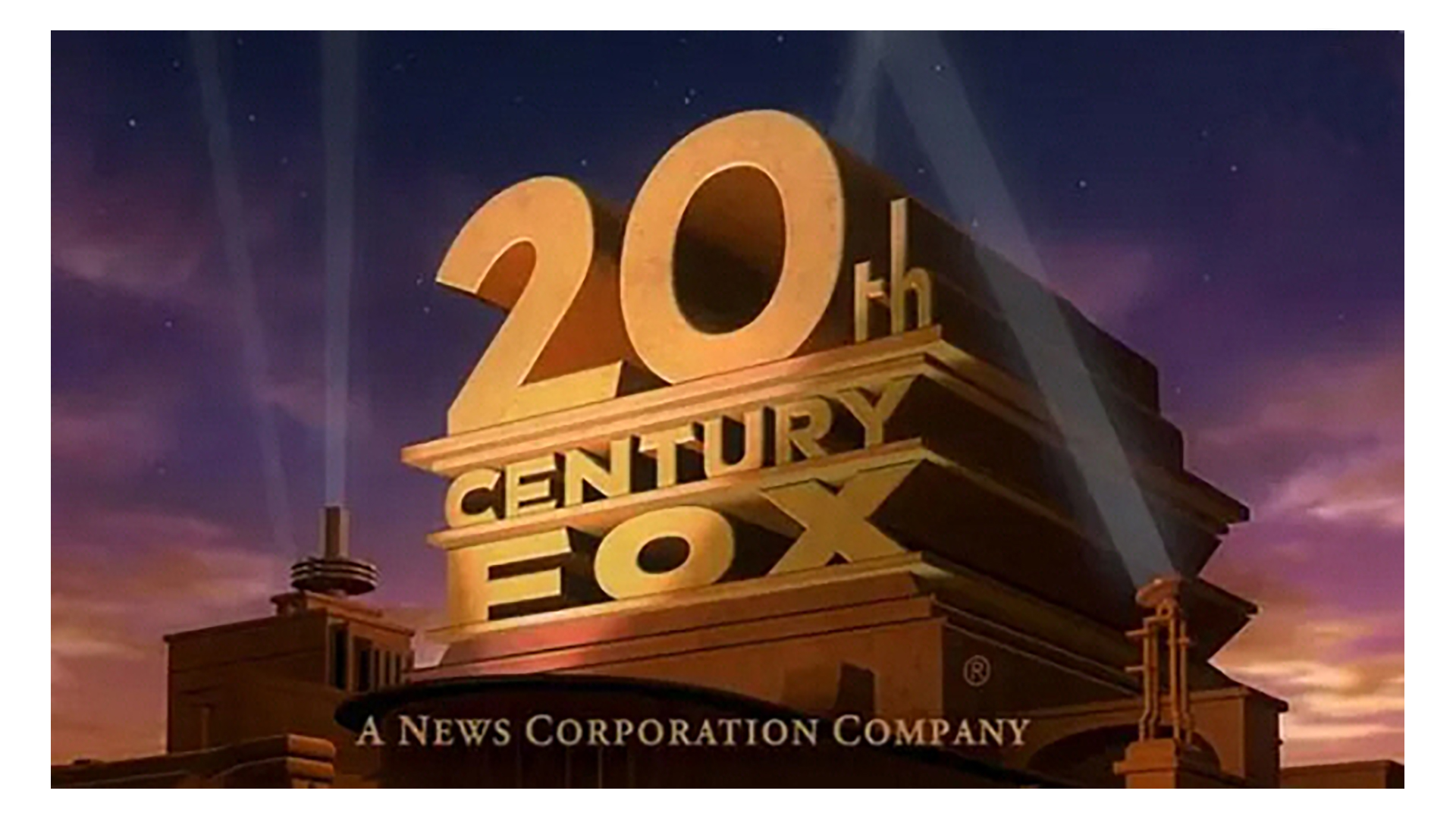
In this next logo, which was used for a 21 second animation, the logo was straightened, and more sky appeared above it. The structures on the left and right at the base were repositioned and were made less distinct. With this version, the words 'A News Corporation Company' appear at the base of the monolith for the first time.
Overall, I like the new look. The logo really stands out, and the searchlight beams were dialled down in intensity, so they do not compete with the logo for attention.
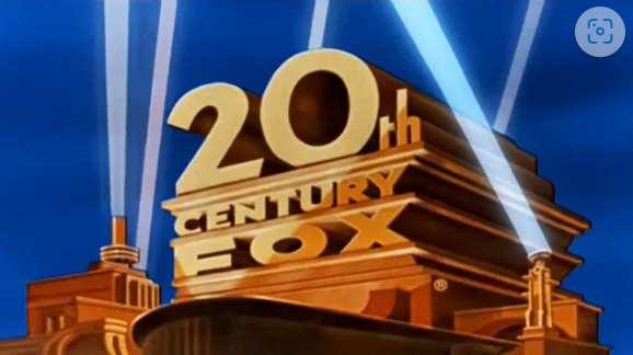
Going for gold (2009-2020)
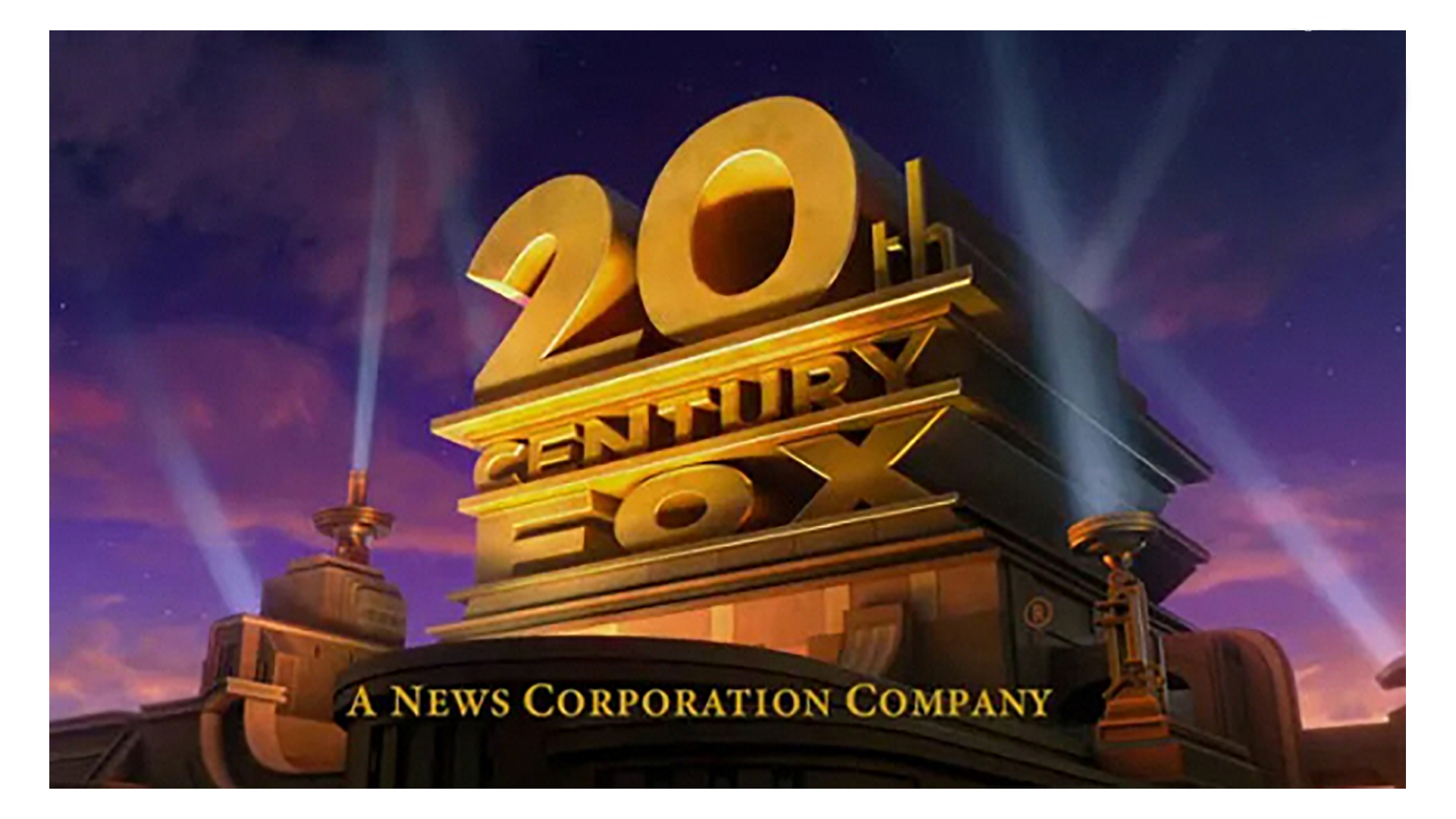
Before 20th century Fox rebranded to 20th Century Studios, there was this logo. Note how it was tilted to the left and the lights were repositioned. The intensity of the gold colour was also punched up a bit. When the lights were moved, I feel the front light is competing with the logo for attention, never a good thing from a design perspective.
This version of the logo was created by CG animation house Blue Sky Studios and was used before James Cameron's Avatar.
Custom versions of the logo
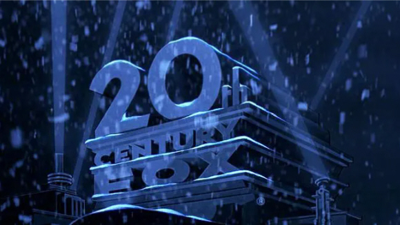
With some films, Fox allowed filmmakers to customise the monolith. An example is this snow-covered variation for Tim Burton's film, Edward Scissorhands. Looking at this logo, one can almost feel the sense of chill emanating from the logo. The monochromatic look also adds to the starkness.
For more logo histories, see how Twitter, Google and Apple logos have changed through time.