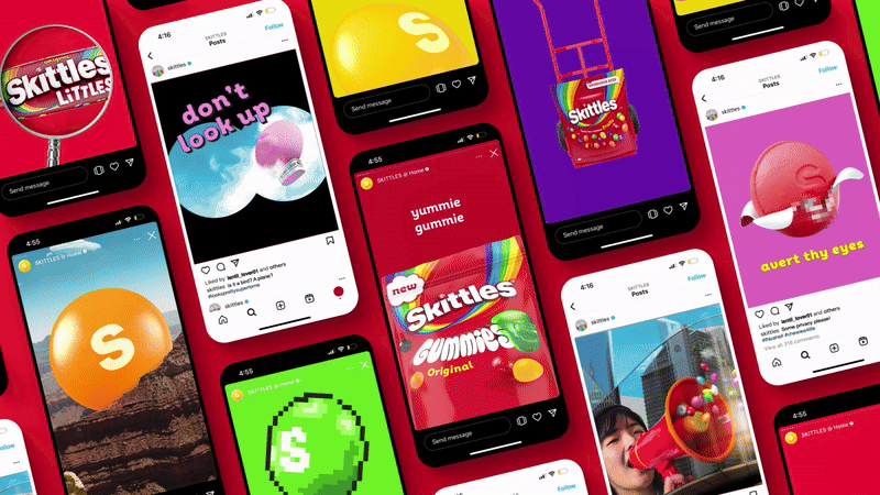
Skittles has embraced the nonsensical in a delightfully colourful brand revamp. The new look is bigger and brighter than ever, bringing the iconic taste of the rainbow into an exciting new era. Creating a refreshed foundation for immersive storytelling, the new look encapsulates Skittles' playful brand with flying colours.
The best logos are an embodiment of the brand, and Skittles' new identity is no different, brimming with personality and vivid visuals. Encapsulating the brand's creative spirit, the fresh packaging and dynamic design are paired with a welcome dose of silliness, effortlessly blending Gen Z absurdity with a legacy of quirky design.

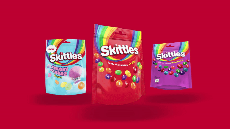
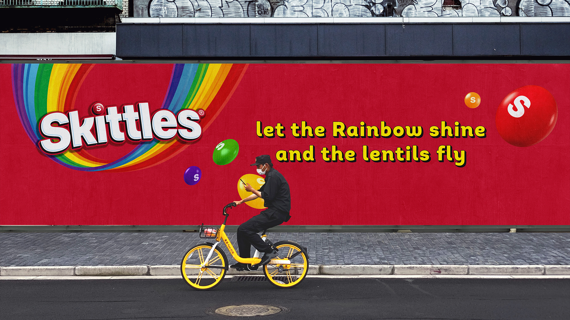
Created by global design consultancy Elmwood, the new brand identity is bursting with creative flavour. The packaging design has been transformed by new characterful typography, with subtle tweaks to the wordmark giving the logo a more dynamic feel. Across the design, the iconic sweeping rainbow has been infused with a new vibrancy, while the lentils (yes, that's their official name) have been transformed by a dynamic cascading composition, giving the packaging a nonchalant flowing movement.
"It was crucial for us to evolve Skittles’ master assets to make them more fluid and distinctive to consumers," Paul O’Brien, Design Director at Elmwood London, tells Creative Bloq. "We didn’t want to lose the equity of Skittles that the brand has been building since 1974. The challenge we embarked on was to redesign the rainbow to flex and have fun but remain iconically Skittles across global markets," he adds.

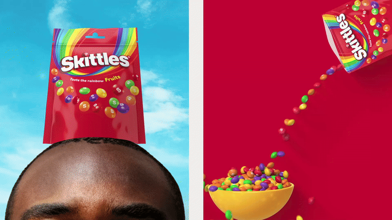
The brand revamp centres around the concept of the 'nonsensical' as a design aesthetic. It's a flexible tool to tap into the absurdist humour of the next generation, bringing a contemporary Gen Z spirit that feels candid and fresh. The nonsensical opens up avenues of creativity that are delightfully non-corporate, giving the brand a charismatic appeal against the competition.
"It provides an entertaining release from common sense, bringing a joyful and freeing feel whilst staying true to the core feel of Skittles," says Paul. "Nonsensical unwraps boundless opportunities for the brand to stay relevant in contemporary culture by channelling trends and talking points in an effusive tone – magnifying Skittles' fun-loving persona to stand out with every generation of consumers," he adds.
When asked about what he was most proud of throughout the project, Paul told Creative Bloq "I’m so proud of the refresh we delivered for Skittles, using an amplified design system and revamped packaging design to reimagine how we taste and experience the rainbow, allowing us to escape from common sense and celebrate the nonsensical – all whilst remaining iconically Skittles and not losing the brand’s heritage in the process."
For more brilliant branding, check out the stunning national park rebrand that's packed with natural symbolism. If you're after more packaging design inspiration, check out Milk and More's adorable carton designs.