Creating a dust jacket that stands out amid a store packed full of bestselling books is a tremendous challenge, especially if it’s an older title. To compete with flashy new releases publishers will periodically redesign the jacket’s artwork.
This might be done to highlight an anniversary or build anticipation for a TV or film adaptation. Fortunately, the WondLa trilogy is celebrating both, with a TV series debuting on Apple TV+ later this year. Since I’m not just the author but the illustrator as well, I felt that this was an exciting opportunity to revisit old friends and introduce them to a new generation of young readers.
Along with the design team, I had to keep in mind the essence of the story and who the intended audience is. The first book from the trilogy, The Search for WondLa, is a middle-grade science-fiction story that has added fantasy elements. Its intended audience is 10 years old and up.
I looked at current jackets for that age range to figure out how to create a package that feels familiar while presenting something new and fresh. For me, that was designing a cover inspired by art nouveau motifs and classic Star Wars movie posters, rendered in a style akin to modern-day graphic novels. It’s also a refresh based on the first edition hardcover jacket art from 2010.
01. Draw from inspiration
To appeal to the widest audience possible, I decided on a montage design, inspired by old movie posters from my youth. I wanted the protagonist, Eva Nine, featured prominently at the top, and to also include some of the aliens, creatures and robots that are primary characters in the story. I added some of the strange vegetation as well to give a sense of the otherworldly setting.
02. Take inspiration from the masters
I wanted to anchor the characters in a central, circular design, like the composition used in illustrations from master artists such as J.C. Leyendecker, Alphonse Mucha and Norman Rockwell. A central graphic can easily be scaled to give adequate space for the titling and author’s name. At this point, I’m thinking about how to combine the separate elements – the art, titling, author, tagline and background – into one cohesive package
03. Consider a refresh
When I rendered the jacket art for the original release of The Search for WondLa back in 2010, I was at a disadvantage because it was completed before the book was illustrated; done so the publisher could pre-sell the book. At that point, I wasn’t adept at drawing the characters. However, after illustrating three novels I was much more confident updating the design.
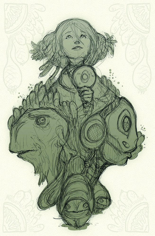
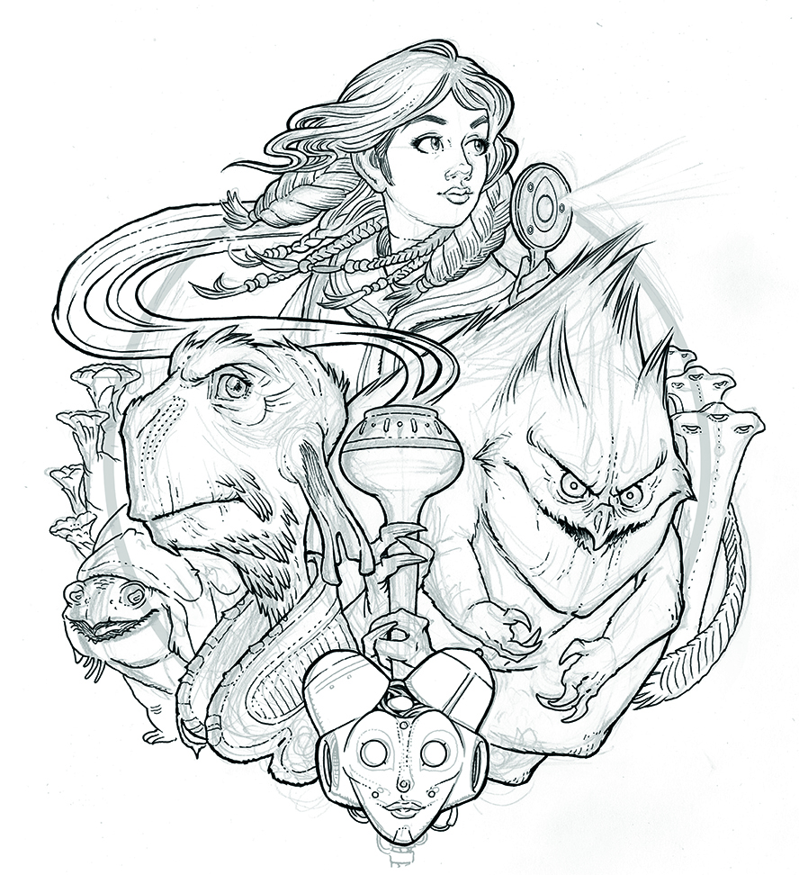
04. Sketch old friends
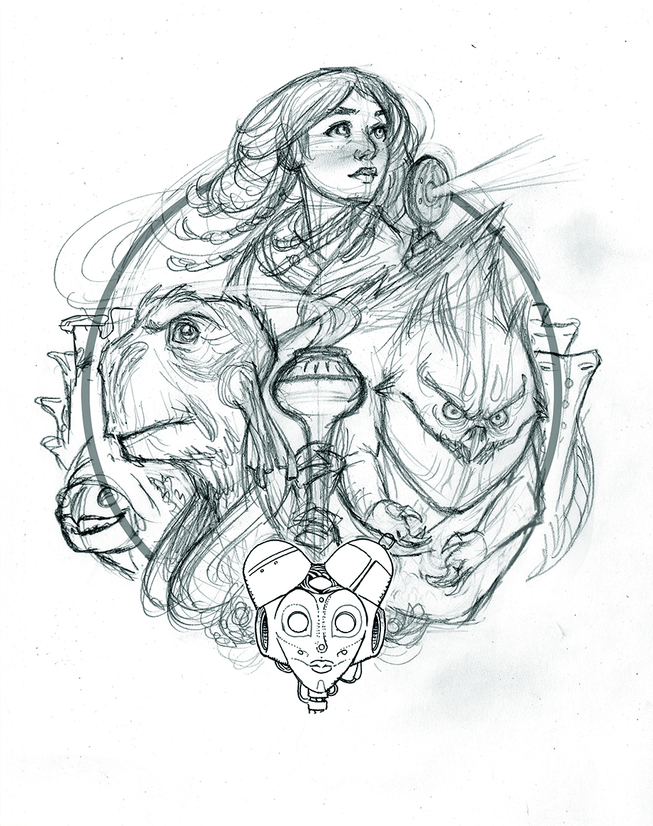
I used the original composition as my starting point. If you compare the two, you can see that here the characters are pushing out from the circular border and breaking it more dynamically than the original. I also added more characters and explored the symmetry of the silhouette. This is all about fitting puzzle pieces in an exciting composition that flows around the central circle.
05. Remember the purpose
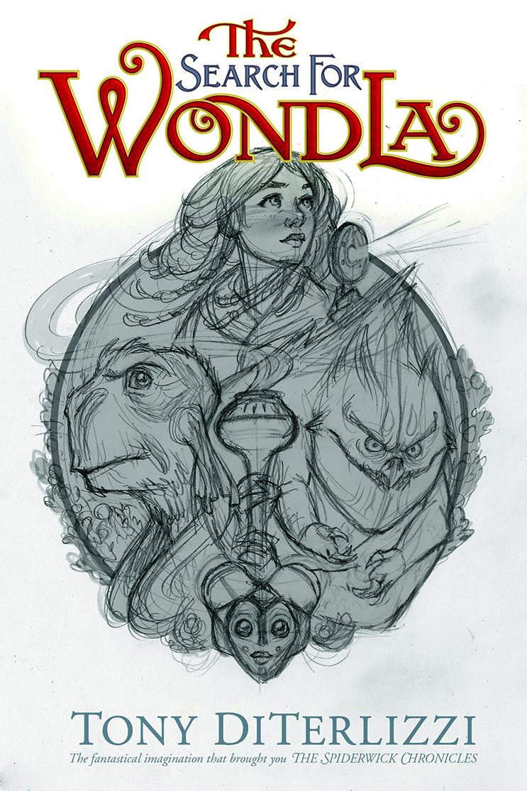
From the start, I looked at the relationship between the image and the titling. This must read as one unified package, not just an enticing piece of art. What does the buyer see first? Where do their eyes travel next? How do we get them to pick up the book to learn more? Once it’s off the shelf, you’re halfway to a book sale.
06. Use traditional inks
Although digital brushes have come a long way in the 30 years that I’ve been a professional illustrator, I like to ink traditionally. I’ve chosen different types of pens for different effects. For instance, I used old-fashioned crow quill pens when illustrating The Spiderwick Chronicles to emulate art from the 19th century. For the WondLa books, I used Staedtler Pigment Liners on a sheet of vellum laid directly over the sketch.
07. Define the elements
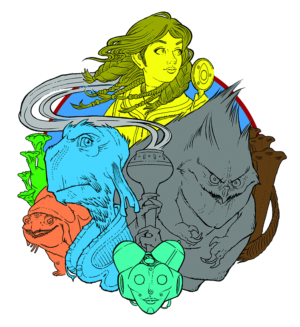
The ink drawing was scanned in, and I began work in Photoshop. Like a comic book artist, I flatted the colours so I’d have silhouettes of the various characters and elements. This aids the process of colouring as I can now easily select individual elements and work on them separately or in combination.
08. Create a colour palette
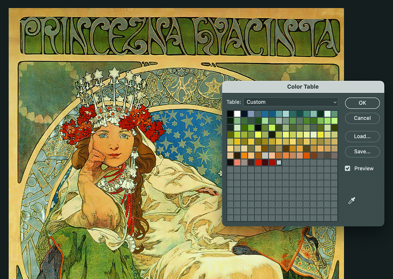
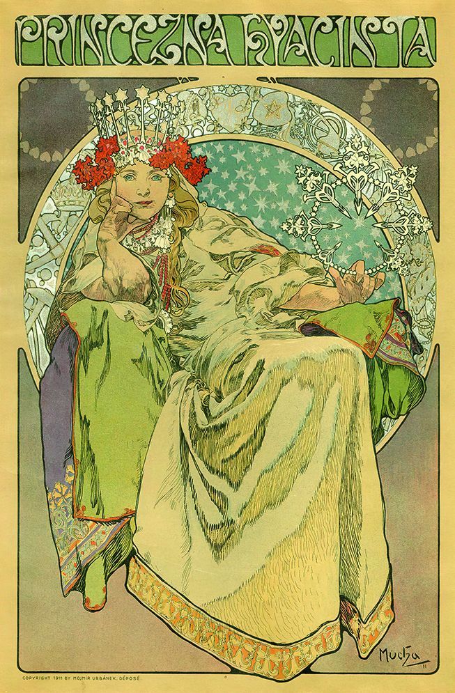
There are many ways to come by a harmonious palette for your digital colourisation. My preferred method is to create it from my inspiration, in this case Alphonse Mucha’s 1911 poster for the ballet Princess Hyacinth. I indexed the colour in Photoshop and saved the colour table as a palette that I imported directly into my swatches. I customised it further from there, but this is where I started.
09. Get back to the drawing board
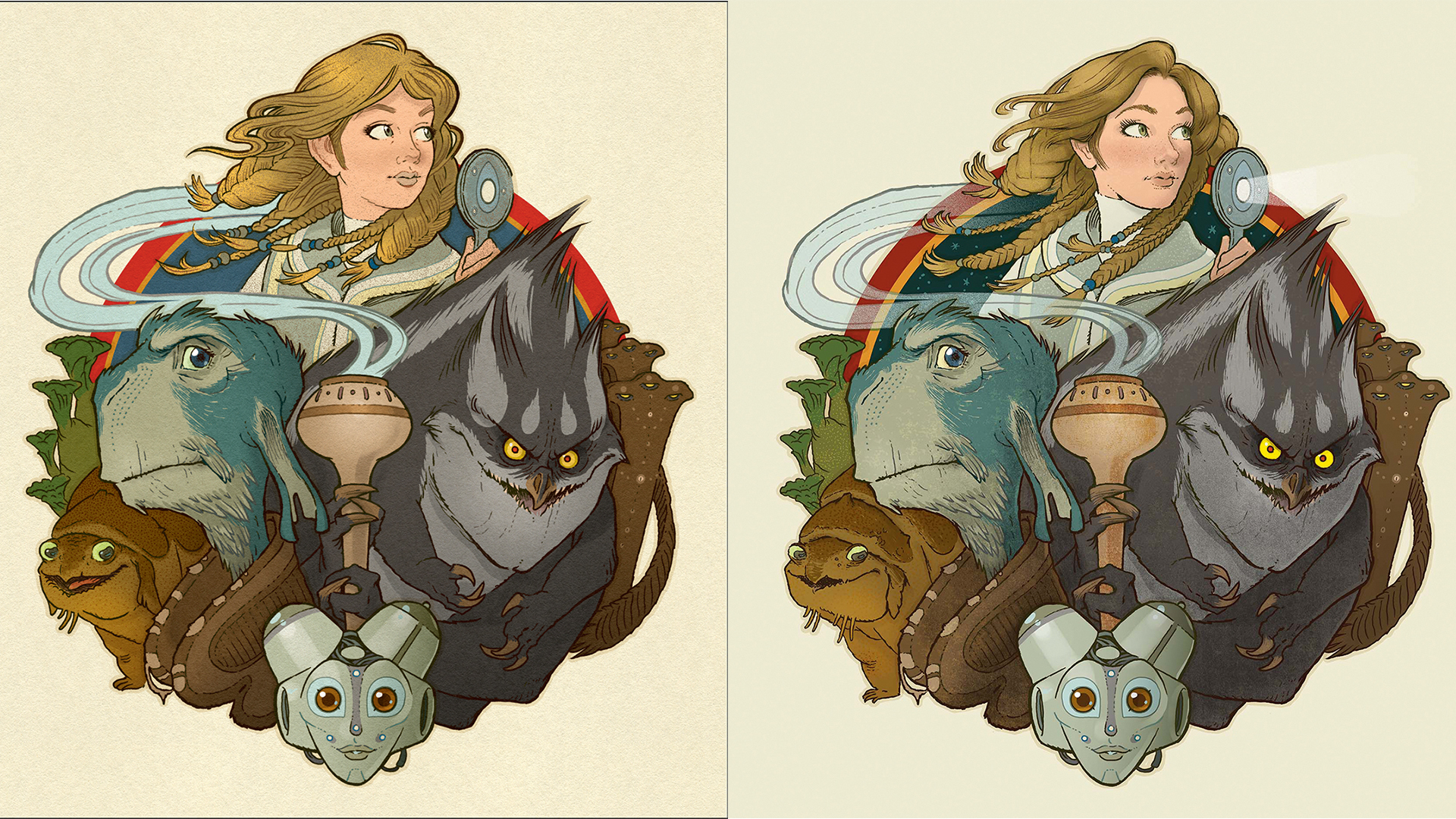
The importance of managing your time is the opportunity to step away from your work and return with fresh eyes to see if the piece is satisfactory. Once this piece was coloured, I took the weekend off and returned only to realise that I didn’t care for the drawing of Eva. Not only that, but I felt the Mucha-inspired palette was too muted and might not appeal to a young reader.
10. Begin deeper exploration of the image
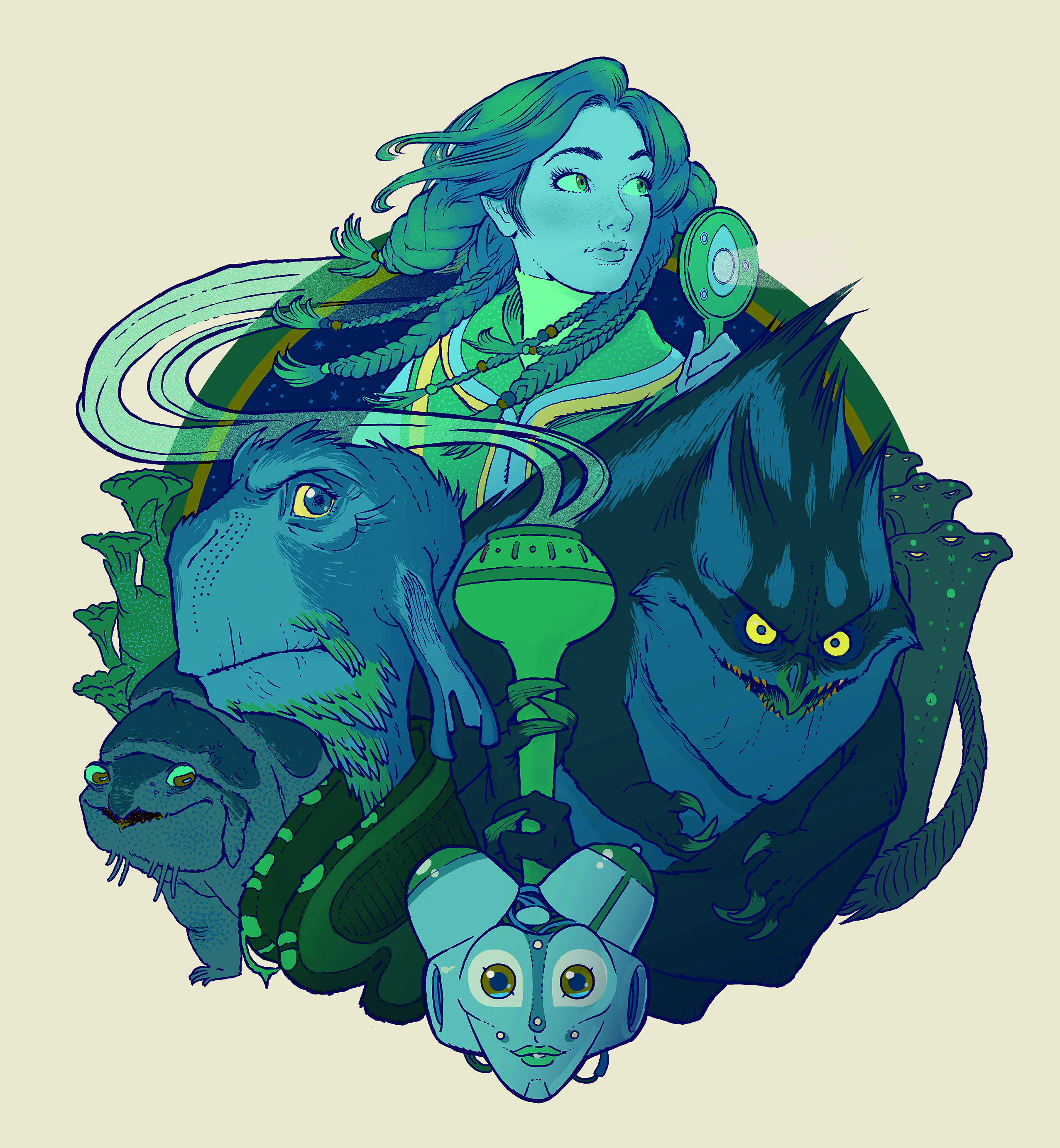
I abandoned my initial colour scheme and colourised an alternate image using a limited palette. I knew we wouldn’t print this version, but I needed to shake up my process by trying something risky and new. In doing so, a couple of aspects stood out: I loved the colour of the blue line work, and I preferred the image without all the dingy textures I’d used in the previous iteration.
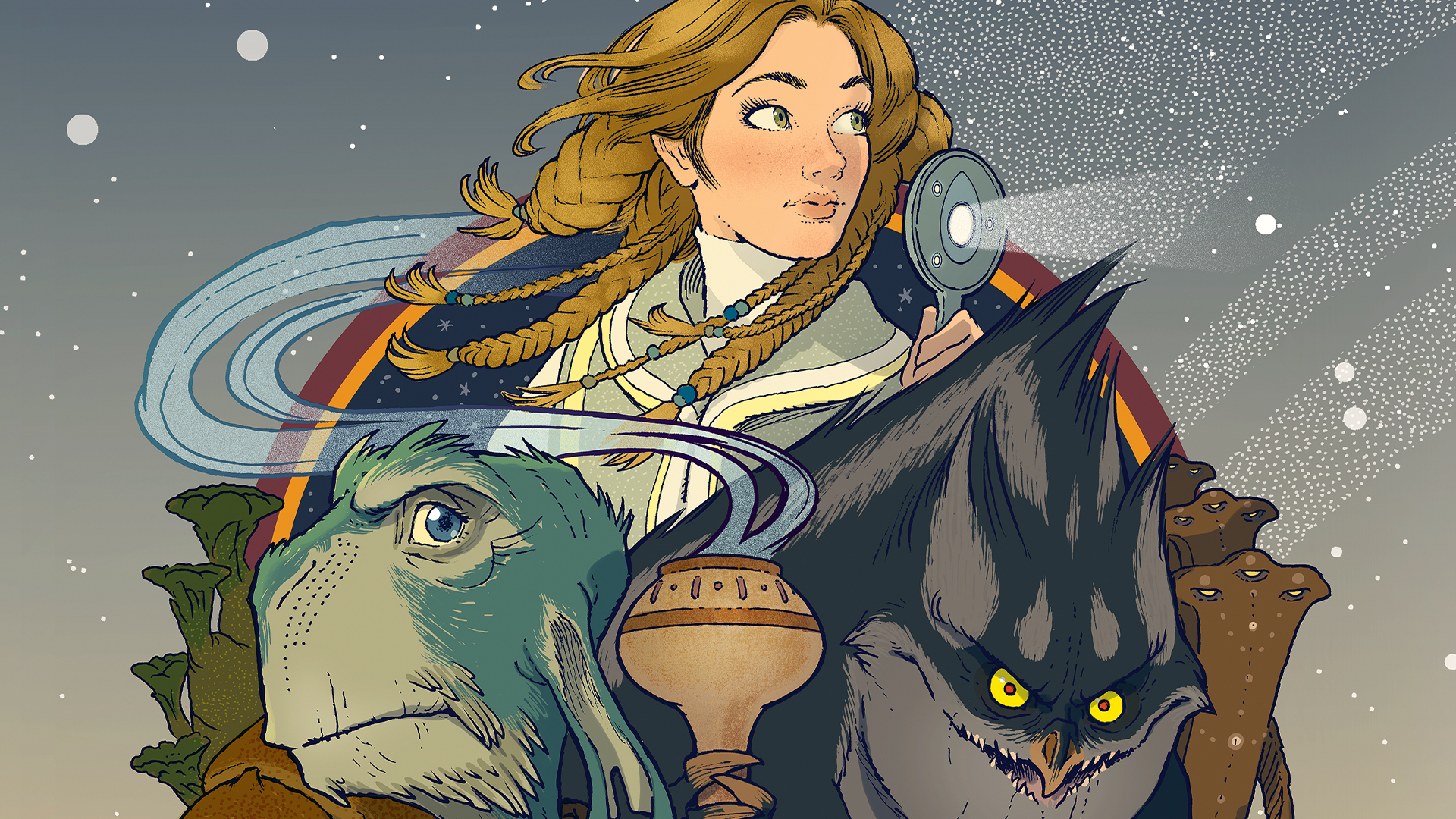
11. Review the updated version
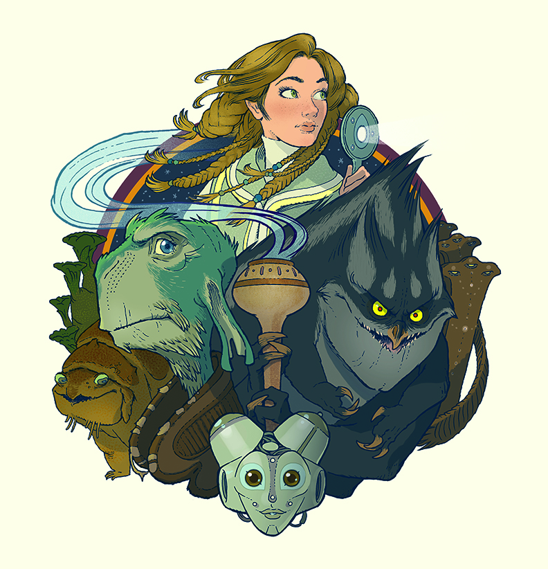
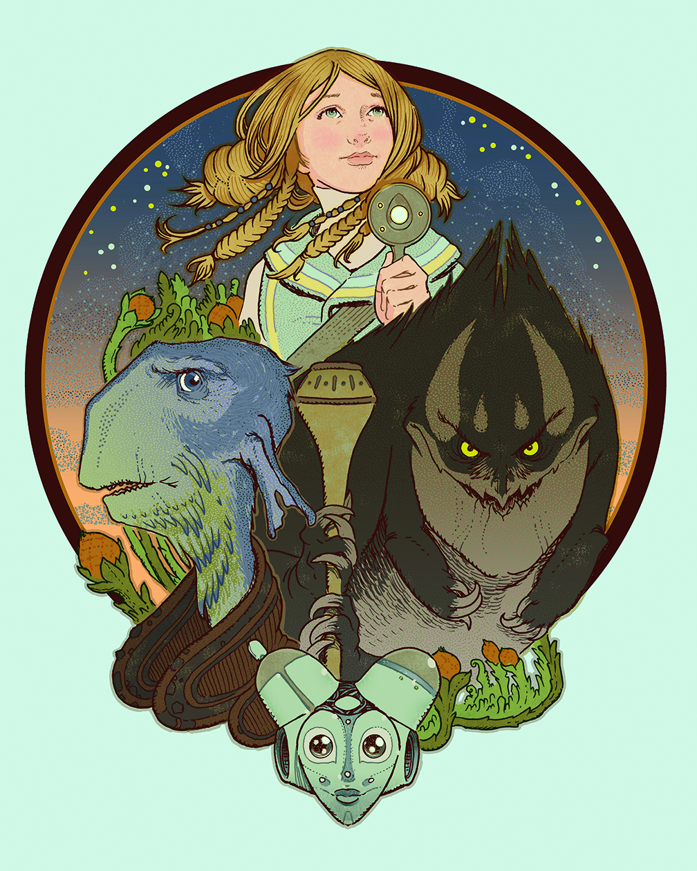
This is close to the final artwork printed on the cover of the book. It integrates aspects from my original inspiration as well as ideas gathered during my exploratory process. For me, these little discoveries – like the blue line work and redrawn Eva – are some of the most exciting experiences of creating. There’s some texture here, but it’s used sparingly and is a custom brush from True Grit Texture Supply.
12. Make your background selection
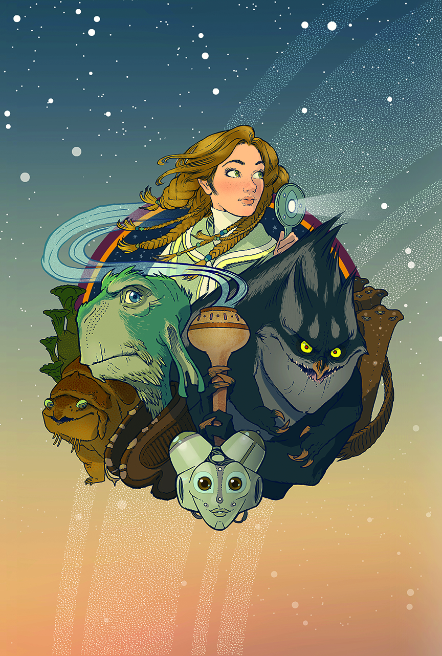
But I’m not finished. Remember, the central illustration is but one component for the entire jacket. Inspired by the dusky sunset imagery of Star Wars, I decided on a simple gradient for the background complete with
a star field and planetary rings. The central image is a separate layer so art director Lizzy Bromley could scale and nudge the art to fit the titling and text in her design.
13. Consider the finished package
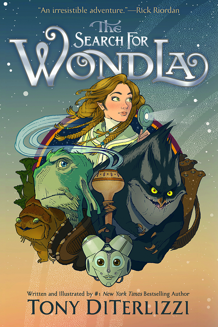
Here we see the results of Lizzy’s work. If you read the cover from top to bottom, you’ll see how hard it’s working to sell you this book. From the testimonial blurb at the top, the beautiful foil-printed typography by Tom Kennedy of Letterhead Fonts, to my tagline and name, the jacket is enticing young readers to pick up this book from the shelf.
14. Make additional variant covers
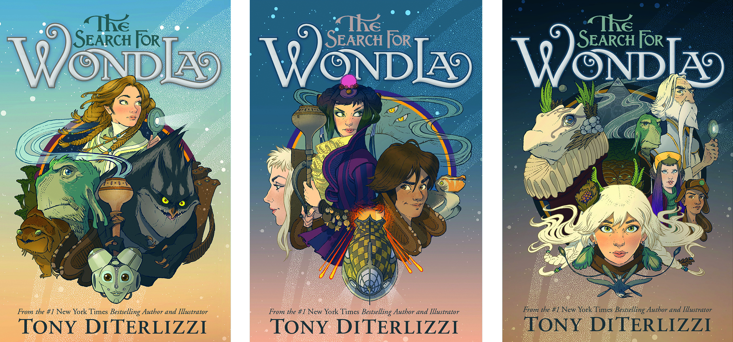
This cover was one of three that work together as a whole, but we varied the design to keep each unique. For instance, I deepened the background on each subsequent jacket to reflect the increasing dark tone of the story. The chance to revisit these titles after a decade was a rare and exciting experience, and allowed me the opportunity to continue to produce the highest quality books for readers.
This content originally appeared in ImagineFX magazine, the world's leading digital art and fantasy art magazine. ImagineFX is on sale in the UK, Europe, United States, Canada, Australia and more. Limited numbers of ImagineFX print editions are available for delivery from our online store (the shipping costs are included in all prices).