There are several colour pairings that we have all been told should never be paired, whether it’s in a home or in an outfit. And that’s because they supposedly don’t go together. But with a recent shift towards all things fun and bold within the interiors space, this has also changed how we look at colours. And we, with the help of interiors and paint experts, found 6 colour combos that shouldn’t work but now do.
Or perhaps these colour combinations have always worked and we just prescribed a set of rules that weren’t necessary, despite the fact they are based on carefully studied colour theory. If you’re looking for a living room colour scheme that’s a little bit outside the box, then look no further.
So without further ado, these are the 6 colour combinations you may have thought incompatible but they actually can look great together, as recommended by interior design pros.
6 colour combinations that shouldn’t work but do
‘There are some colour combinations that have previously been labelled as “incompatible”,’ says Lucy Mather, interiors expert at Arighi Bianchi. ‘This is on the back of principles of guidelines such as using the colour wheel and colour harmony schemes. But greater experimentation in interior design and the increasing popularity of “unexpected interiors” means that there are no rules. And I love this. I think the fact that interior design can be personal and unique is why it’s such an exciting realm.’
But as fun and exciting as an unexpected bedroom colour scheme can be, Anjelica Delfino, paint and interiors expert at Valspar Paint, advises to be intentional and considerate with it. ‘There’s beauty in chaos! Carefully mismatched colours can truly transform any room, bringing it to life with vibrance and charm. Colour clashing can be fun, but it’s a hard line to walk.’
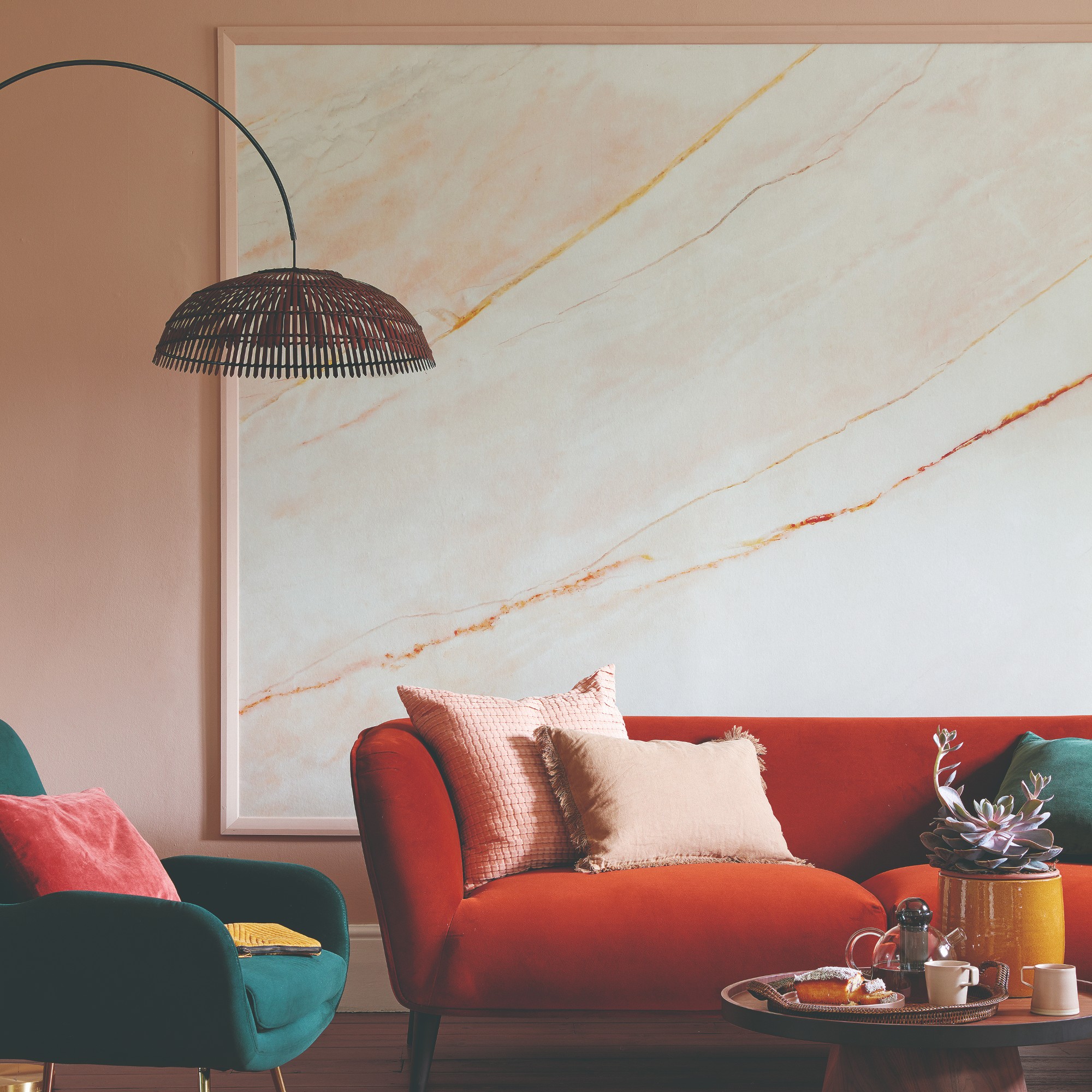
1. Orange and purple
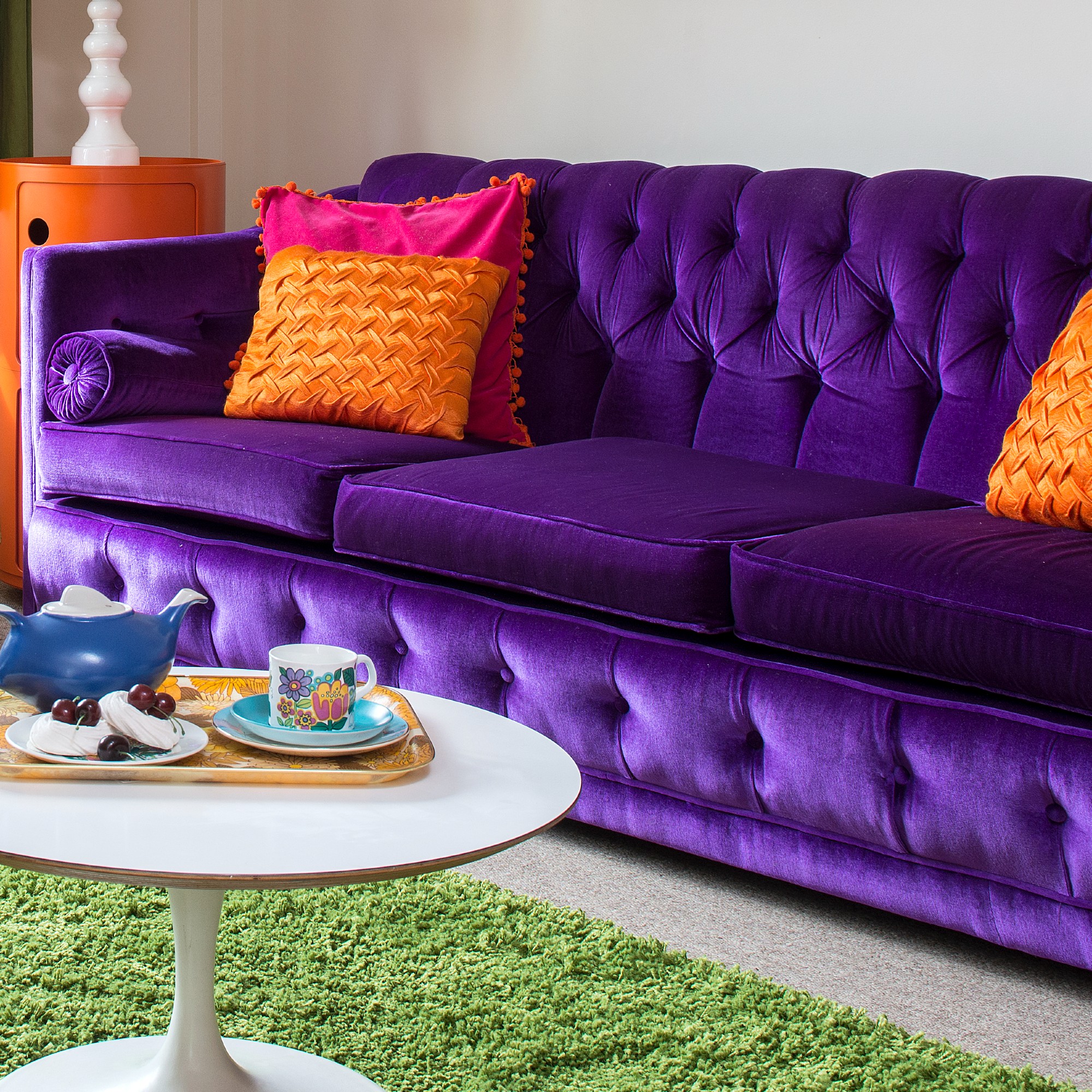
Orange and purple are both very strong colours which is why they can be harsh on the eyes, seemingly fighting for attention. But there’s a trick to combining colours like these.
‘Adjust the proportion of each colour within a scheme, choosing a dominant tone and using another as more of an accent to create visual interest and avoid overwhelming a space,’ says Chelsea Clark, head of marketing at Lust Home.
Another tip is to opt for the right shades of the colours in question. ‘The key to successfully combining seemingly mismatched colours is balance and proportion. Use in a way that shows that you’re adding personality to the space, and use your own instincts – there are so many shades of orange that could actually work well with purple hues. Incorporate varying shades of the primary colour that you’re either intentionally clashing or combining to create your look, and experiment with different shades and tones of each colour to find the right balance,’ Lucy says.
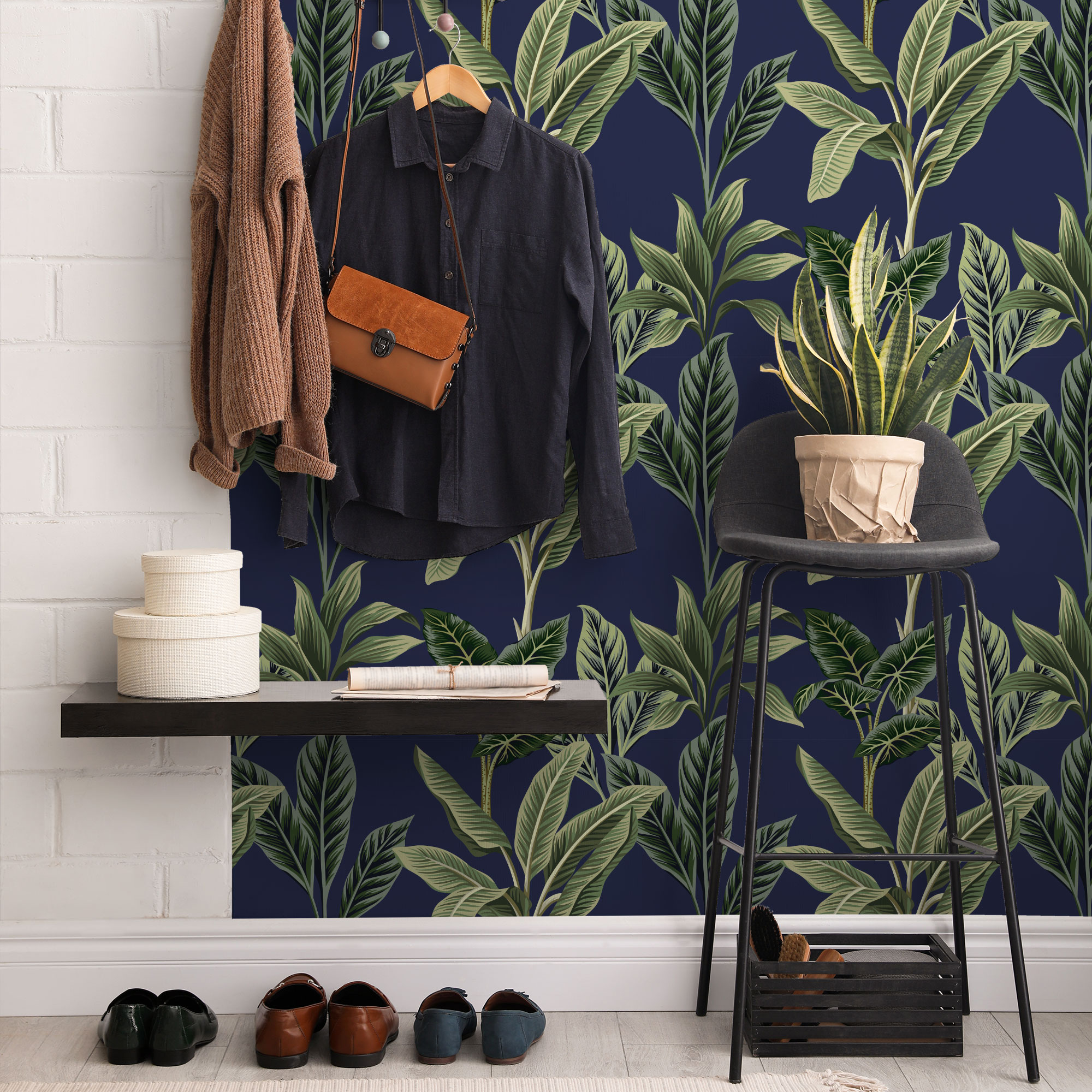
2. Navy blue and black
Navy blue and black is a very commonly known colour combo that’s always been a big no-no. It’s perhaps because they are both very dark, demure colours. But actually, pairing them can create a very sophisticated look. Especially as they have a similar undertone.
‘One of the examples would be navy blue and black,’ Lucy says. ‘Rules have also advised to mix colours based on their temperature — whether they are warm (e.g. red, orange, yellow) or cool (e.g., blue, green, purple). Mixing warm and cool colours can create visual interest, but be mindful of the overall mood and atmosphere you want to achieve.’
Sam Sutherland, Flitch interior stylist, adds, ‘Breaking traditional rules can yield surprising results. But balance is key—use varying shades, textures, and accents to tie the colours together cohesively.’
3. Pink and red
The pairing of pink and red is the perfect example of a colour combo that has always been thought of as clashing. And yet now, it’s one of the biggest home decor trends.
‘A particular colour combination that I’m seeing a lot of is the use of pink and red though, and it’s an in-your-face mix of warmth,’ Lucy exclaims.
Anjelica agrees, ‘Red and pink are close to each other on the colour wheel which can make them sit uncomfortably together. Yet, if you embrace the clash, the result is bold, with red and pink marrying wonderfully to make for a pleasing design statement.’
She adds that it makes for the perfect bathroom colour scheme, too.
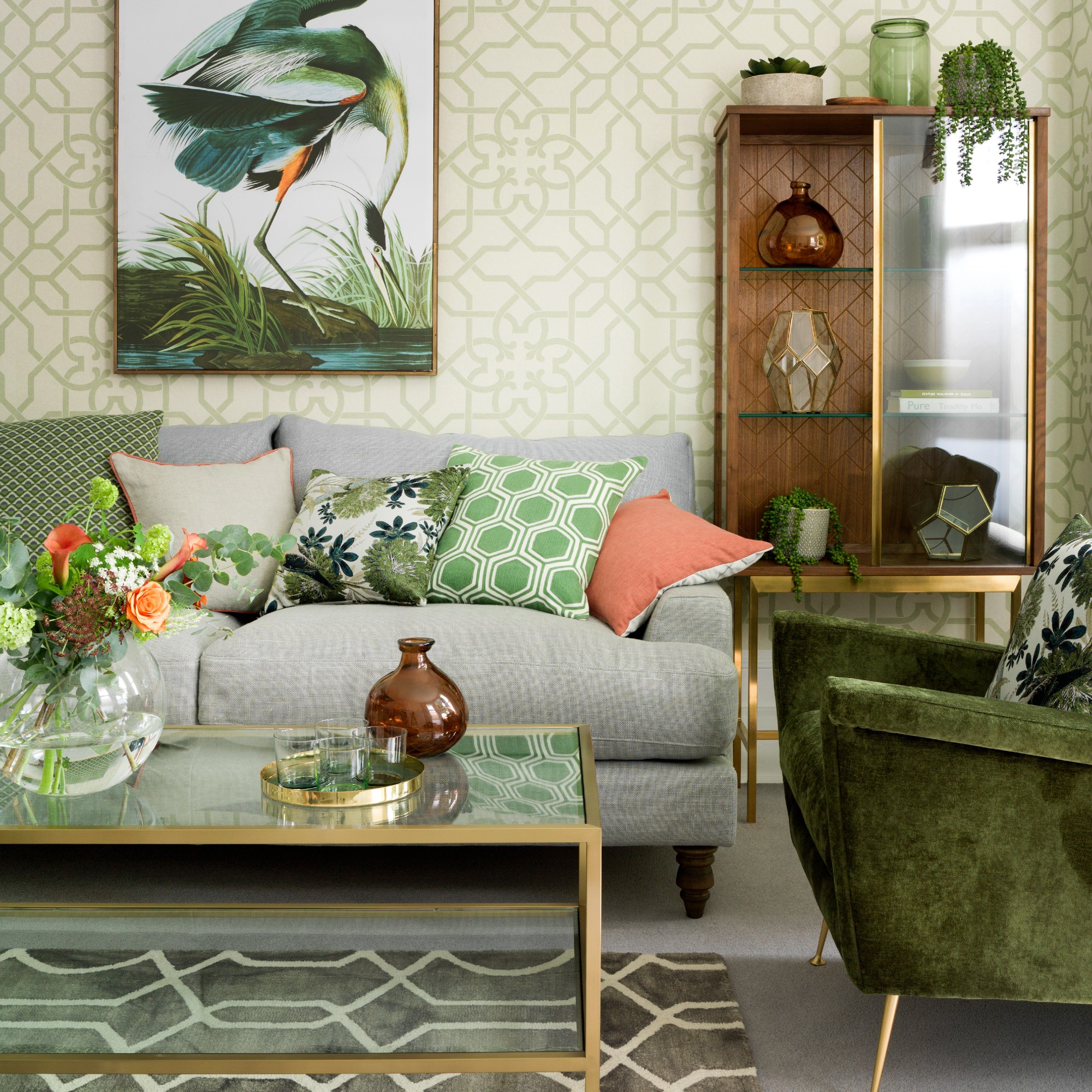
4. Blue and green
Speaking of the colour wheel, this is also the reason behind blue and green pairing always having been labelled as unsuitable.
‘Colours that sit opposite each other on the colour wheel are considered complementary (e.g., blue and orange), while colours next to each other are analogous (e.g., blue, green, and teal),’ Lucy explains.
Sam confirms, ‘Pairing unexpected hues like blue and green can create dynamic and visually stimulating interiors.’
5. Olive green and terracotta
Olive green is a recent colour trend. And while currently, pairing it with shades of terracotta seems only natural, this hasn’t always been the case apparently.
‘Before placing them together, olive green and terracotta don’t look like they would work. However, paired together. The rich warmth of the terracotta and muted tones of the olive create a balanced colour palette,’ Chelsea says.
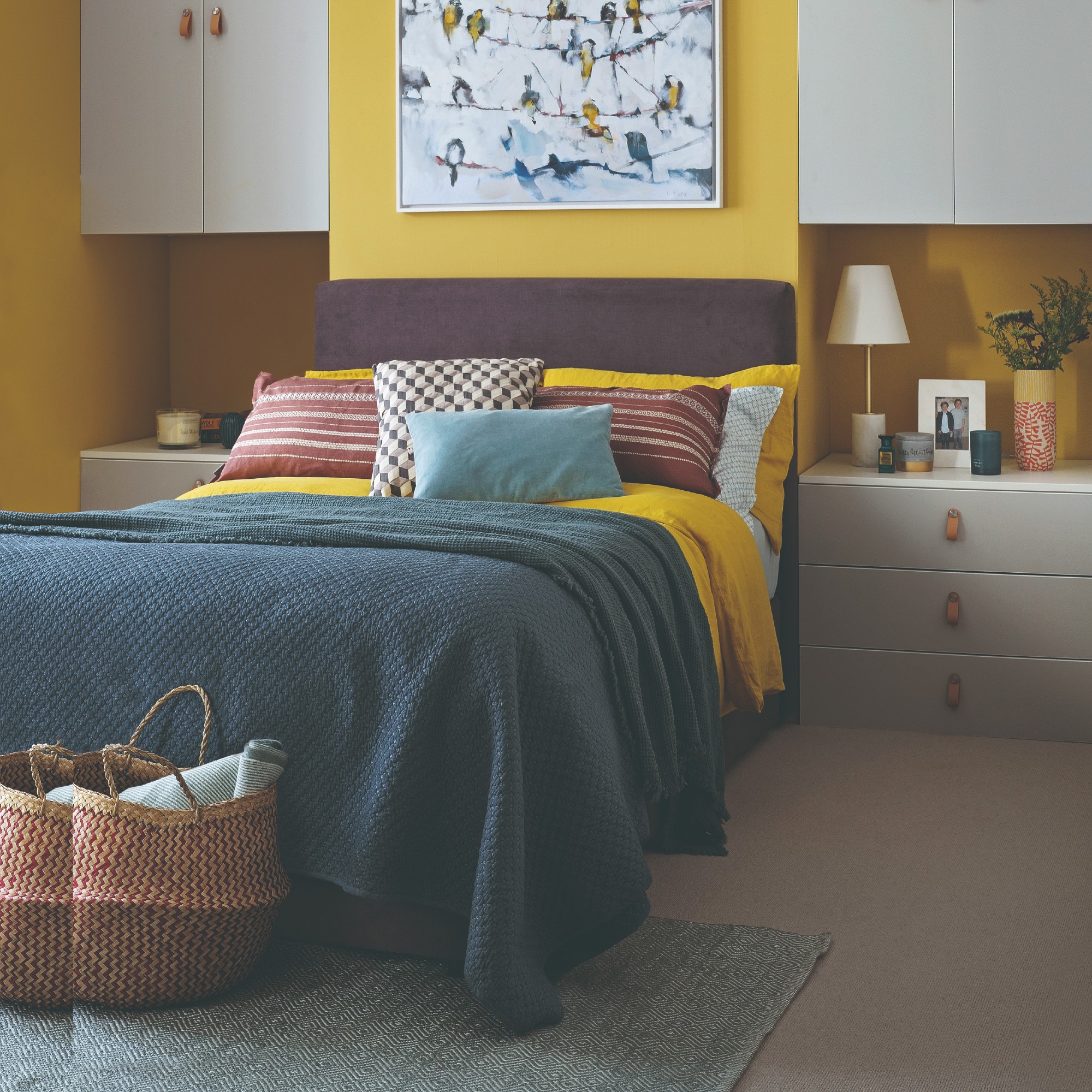
6. Purple and yellow
Similarly to the purple and orange combo, putting together purple with yellow is a similar situation of strong hues that could clash if done wrong. But when done right by choosing the right shades, both of the colours can really sing and bring a room alive.
‘Purple and yellow is certainly not an easy colour combination to pull off, but when used well it has a really luxurious and plush look. With interior trends like old money and regency-core becoming increasingly popular, they can create an eclectic environment that works as both a family home and a stylish showcase,’ Anjelica says.
Get the look
While most of the time, you would incorporate these colours by pairing different elements, there are also homewares that already do that for you by combining them in a single item. These are our top picks.
At the end of the day, it’s all about experimentation and seeing what works for you, your style and your taste. Just have fun with it!